Tool: set_section_styles
238 examples where the agent called this tool.
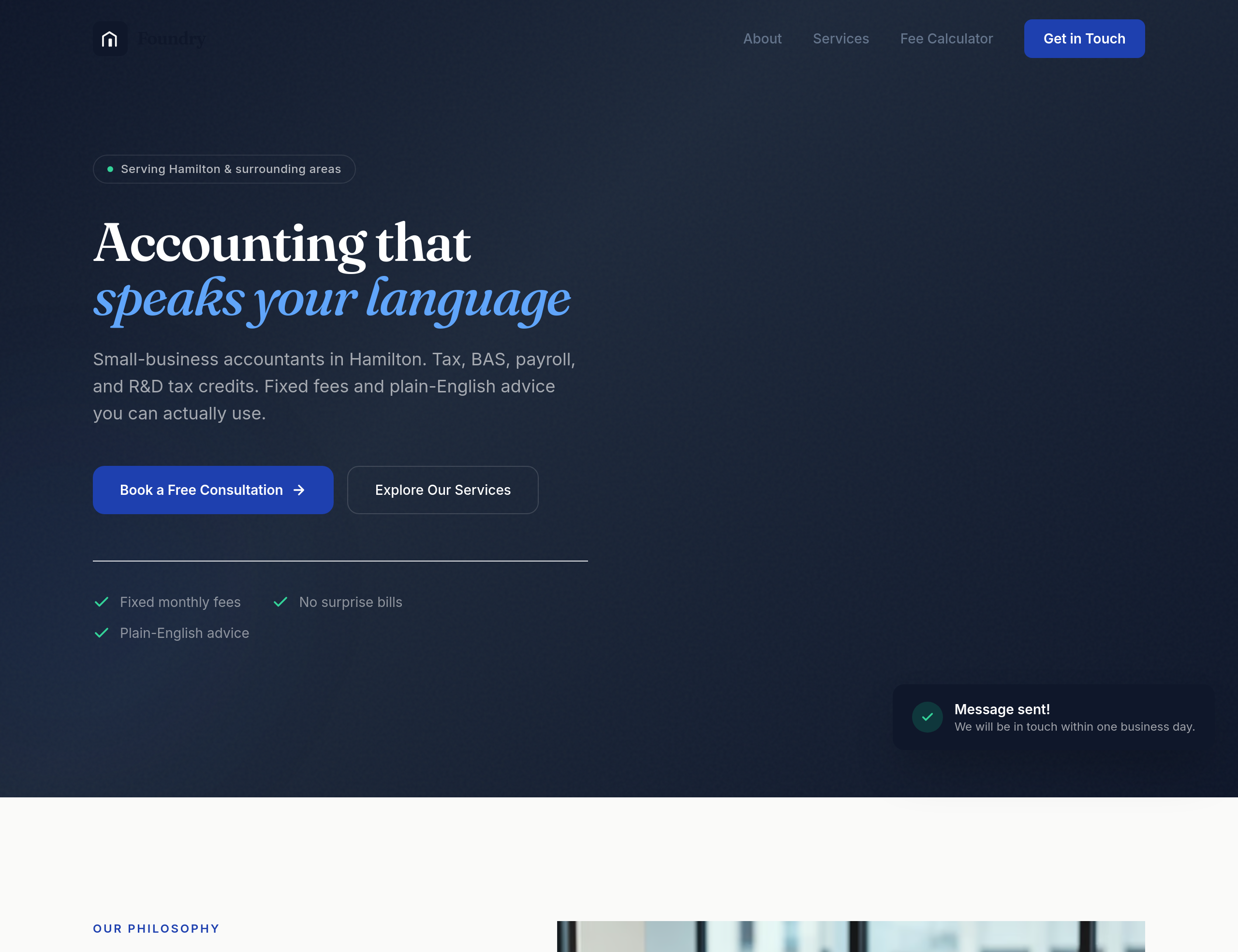
Before
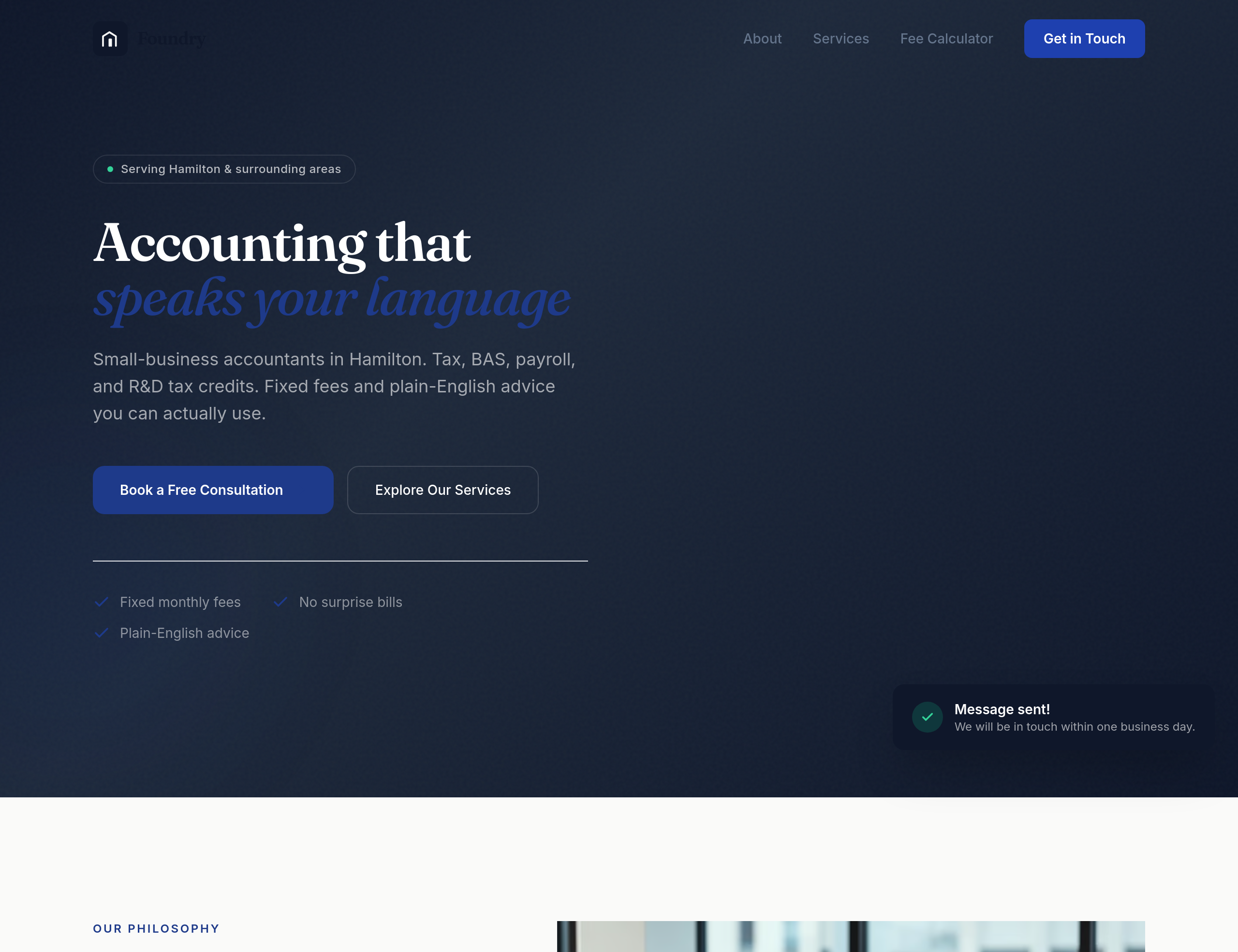
After
the design feels too corporate-blue — use a warmer navy + cream palette
Before
After
the design feels too corporate-blue — use a warmer navy + cream palette
Before
After
the design feels too corporate-blue — use a warmer navy + cream palette
Before
After
the design feels too corporate-blue — use a warmer navy + cream palette
Before
After
the design feels too corporate-blue — use a warmer navy + cream palette
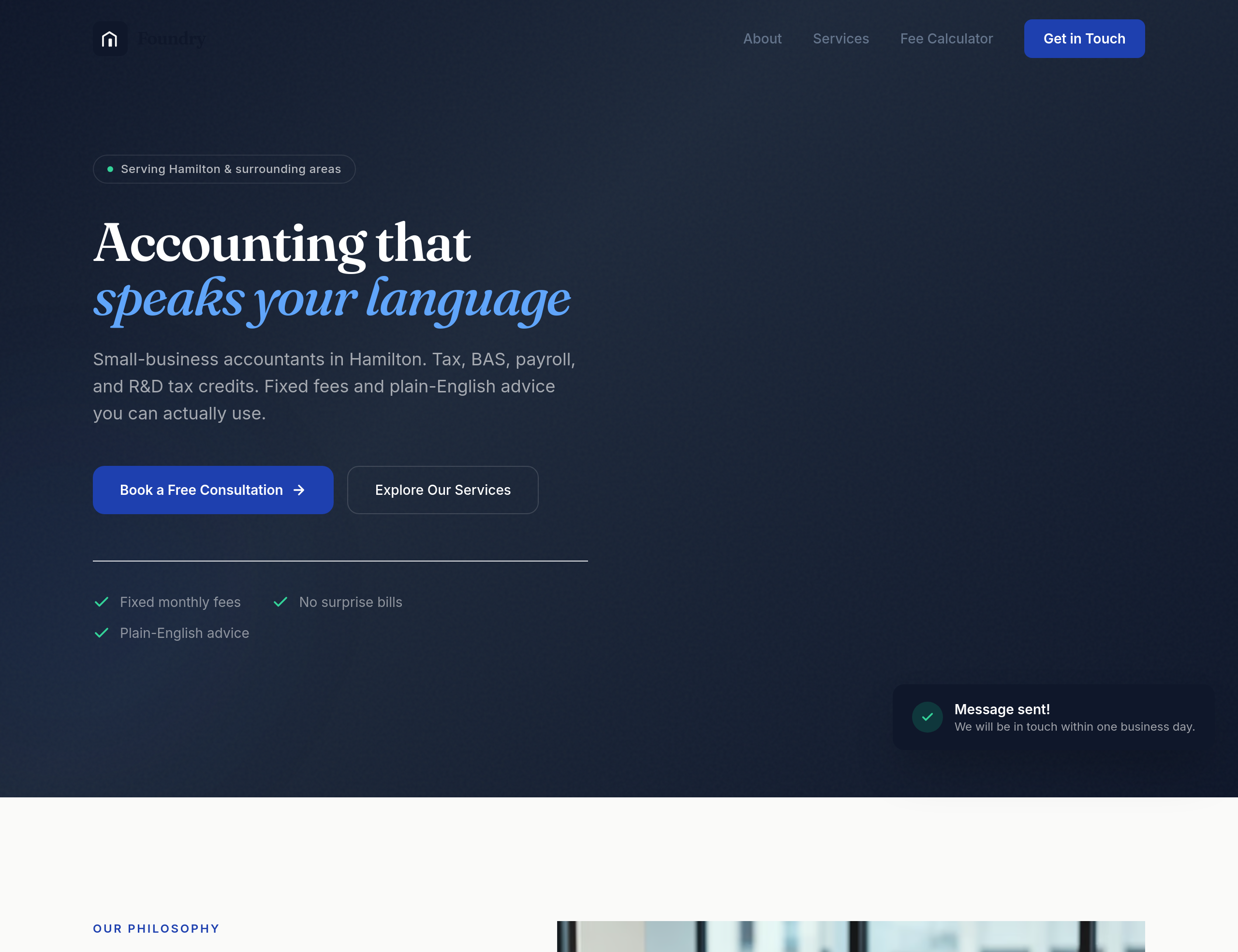
Before
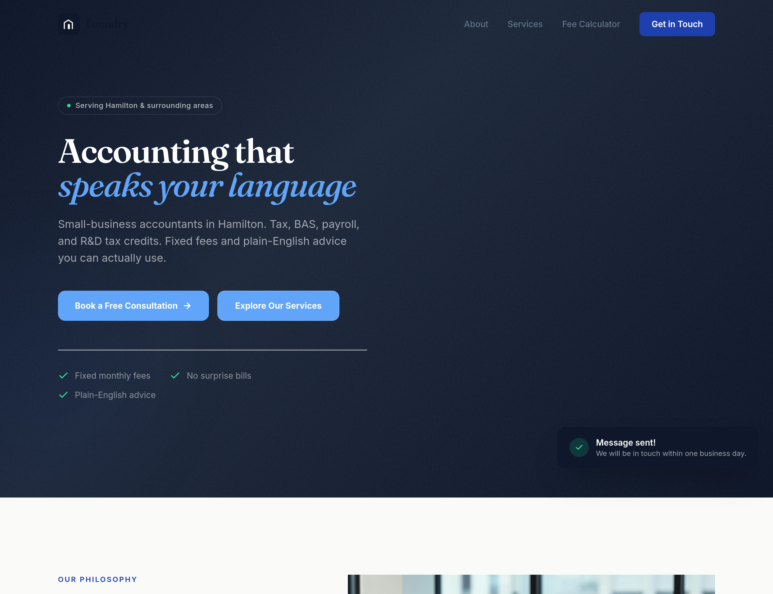
After
the buttons feel generic — give them a subtle accounting-blue with a confident weight

Before

After
the button colours have low contrast against the background — bump them to meet WCAG AA

Before

After
the body text is too small for older readers — bump to 18px minimum
Before
After
the body text is too small for older readers — bump to 18px minimum
Before
After
the body text is too small for older readers — bump to 18px minimum
Before
After
the body text is too small for older readers — bump to 18px minimum
Before
After
the body text is too small for older readers — bump to 18px minimum

Before

After
the focus outline on interactive elements is invisible — add a clear focus ring
Before
After
the focus outline on interactive elements is invisible — add a clear focus ring
Before
After
the focus outline on interactive elements is invisible — add a clear focus ring
Before
After
the focus outline on interactive elements is invisible — add a clear focus ring
Before
After
the focus outline on interactive elements is invisible — add a clear focus ring
Before
After
the focus outline on interactive elements is invisible — add a clear focus ring
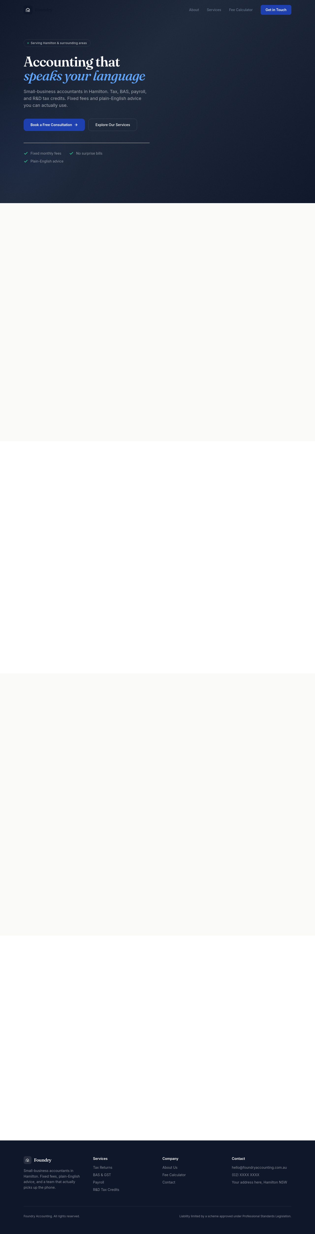
Before

After
add a seasonal banner — 'Christmas bookings open' with a link
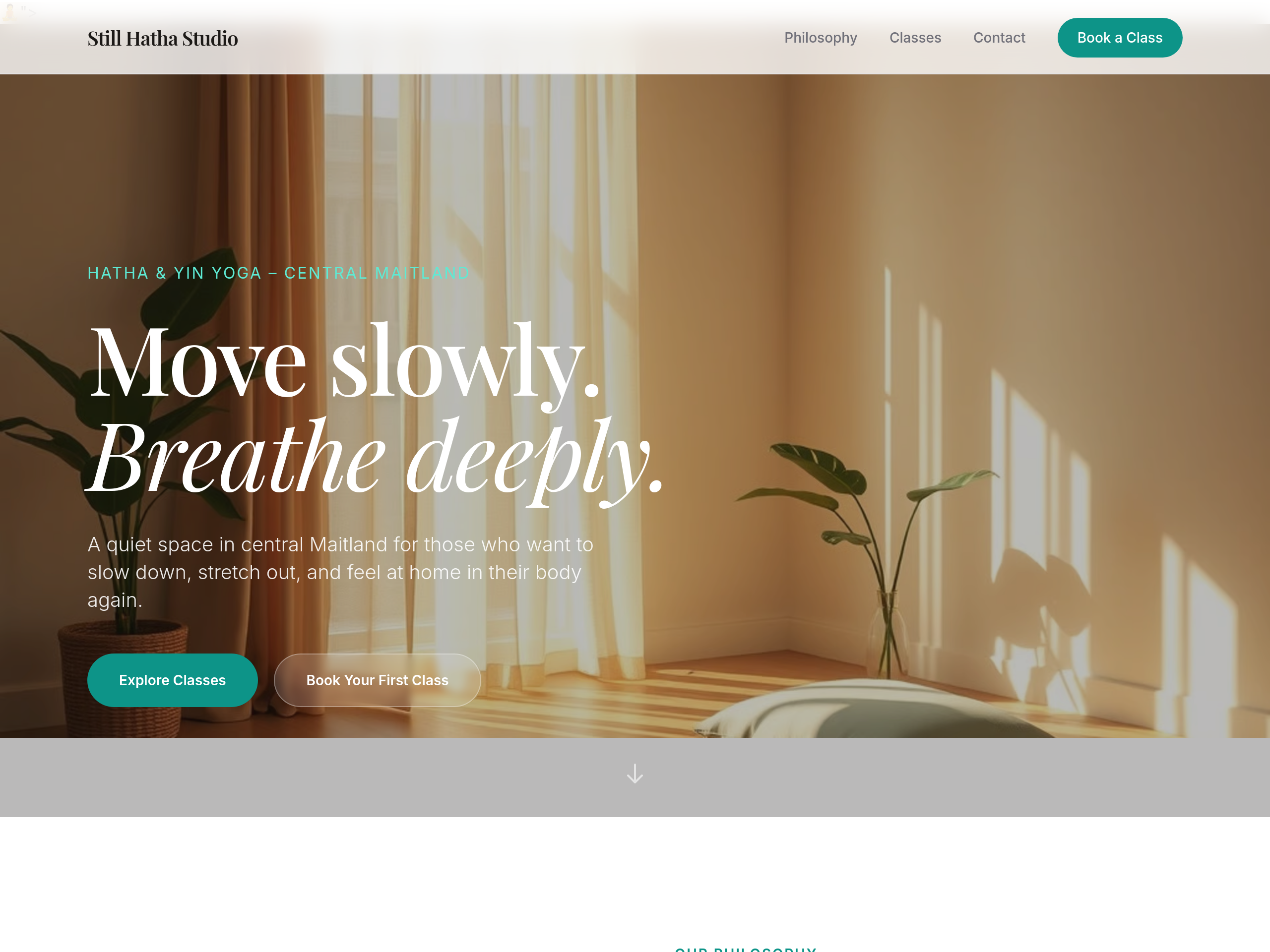
Before
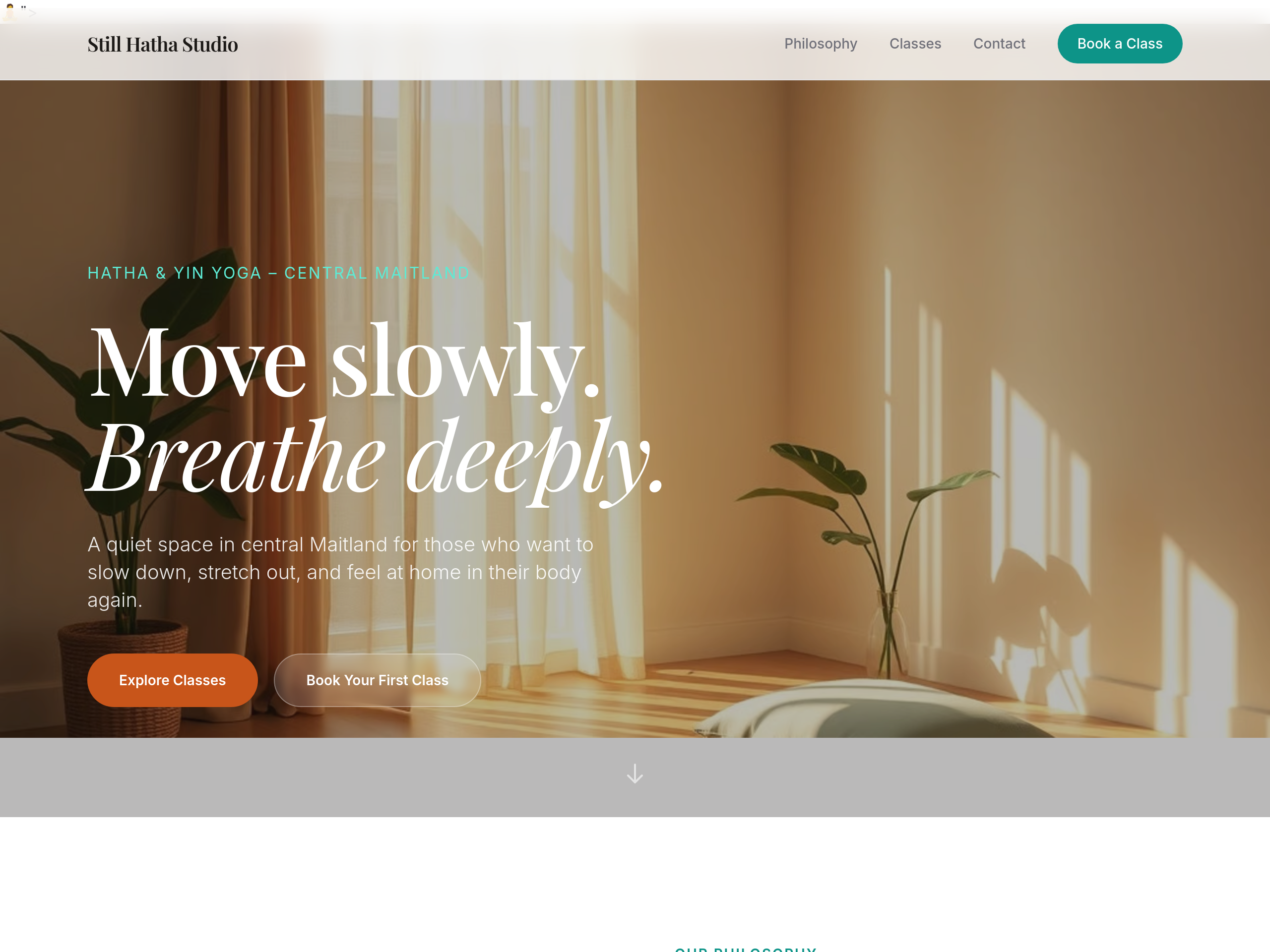
After
change the primary button colour from green to a warm terracotta
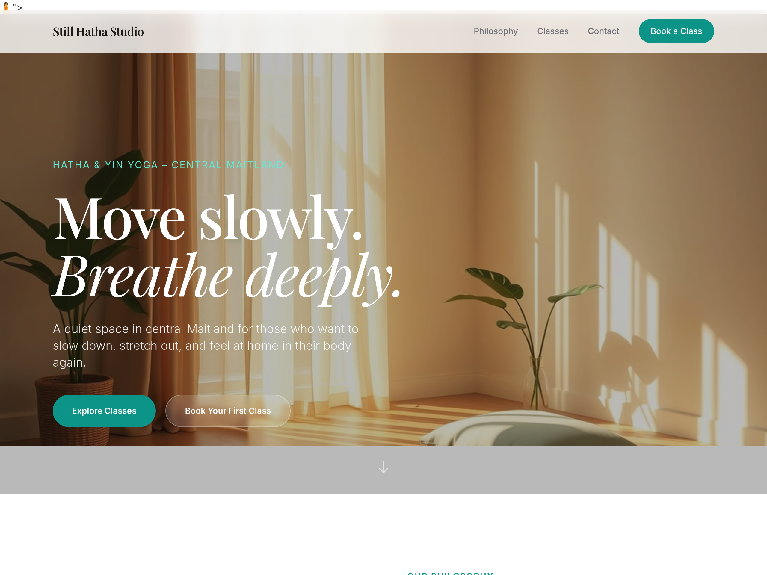
Before
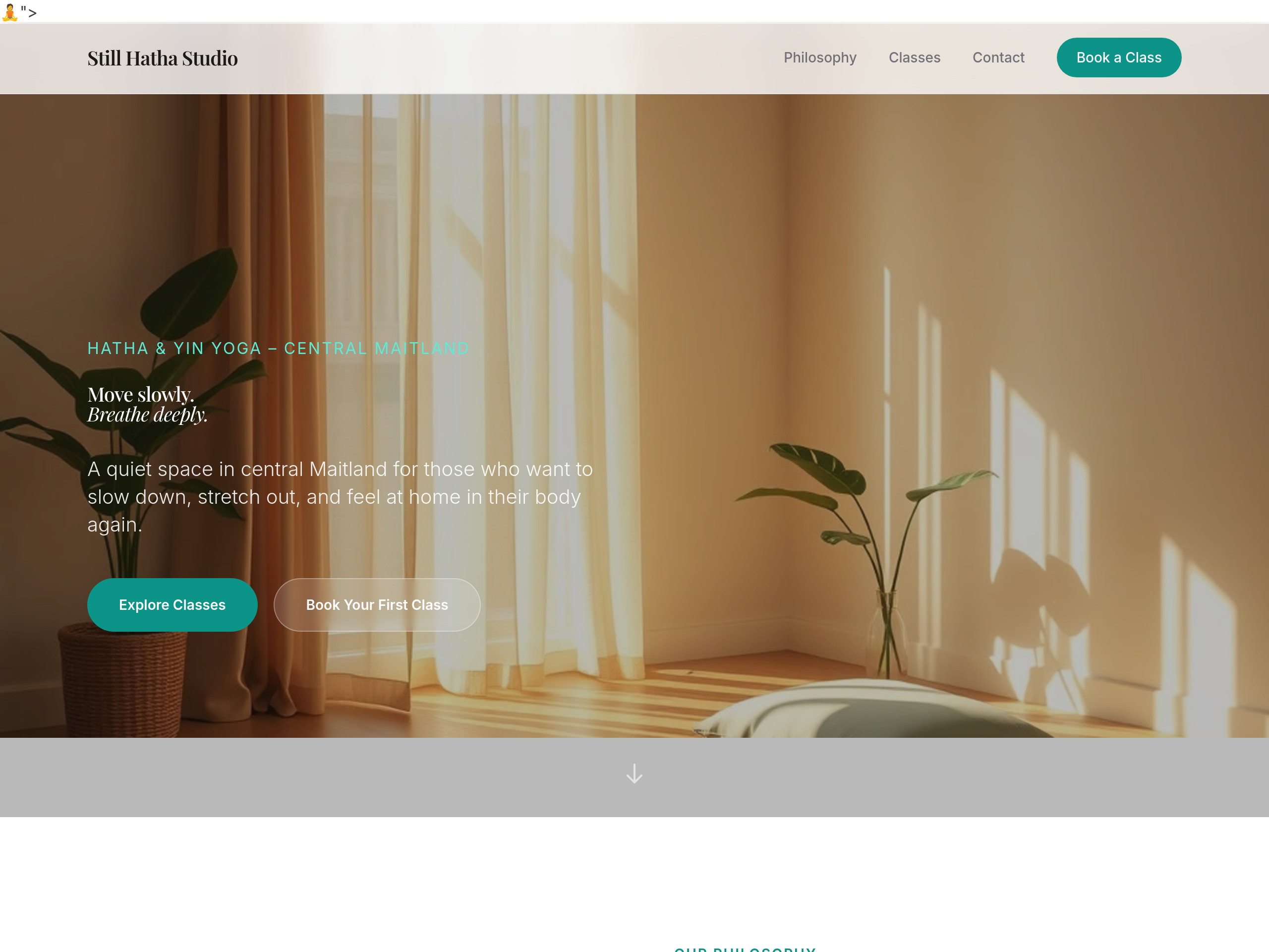
After
make the headings 25% bigger throughout
Before
After
make the headings 25% bigger throughout
Before
After
make the headings 25% bigger throughout
Before
After
make the headings 25% bigger throughout
Before
After
make the headings 25% bigger throughout
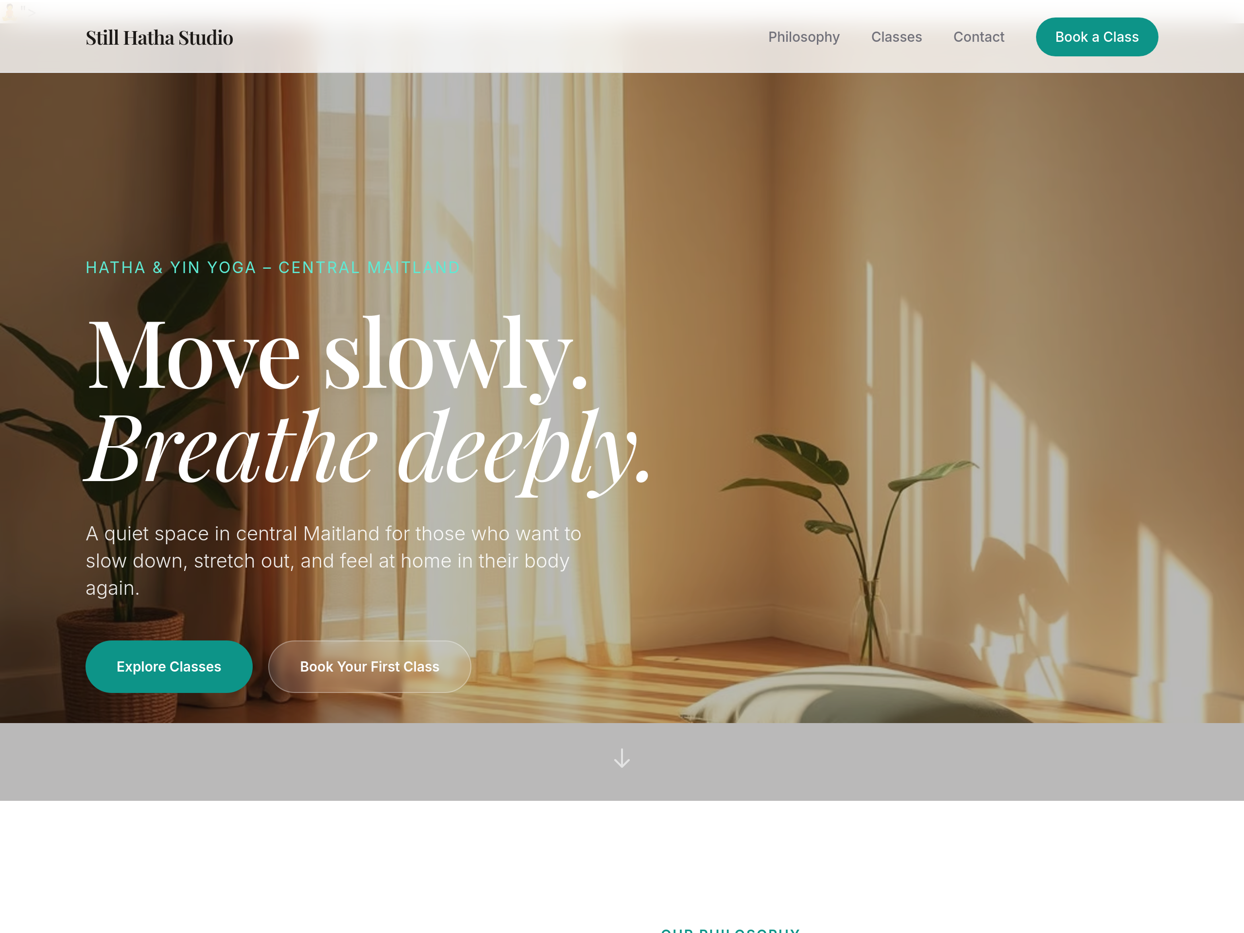
Before
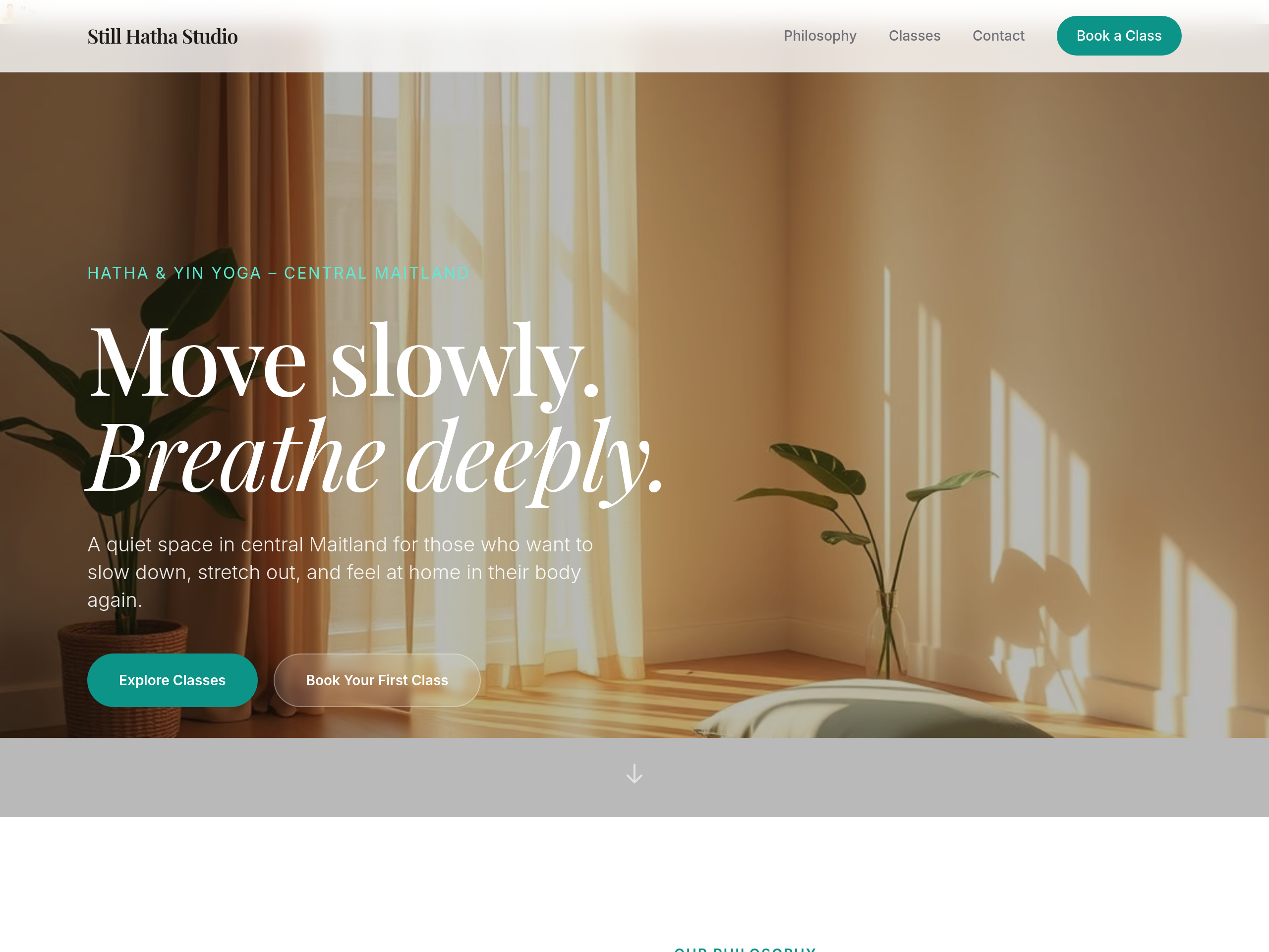
After
the body text colour is too light — bump contrast for accessibility
Before
After
the body text colour is too light — bump contrast for accessibility
Before
After
the body text colour is too light — bump contrast for accessibility
Before
After
the body text colour is too light — bump contrast for accessibility
Before
After
the body text colour is too light — bump contrast for accessibility
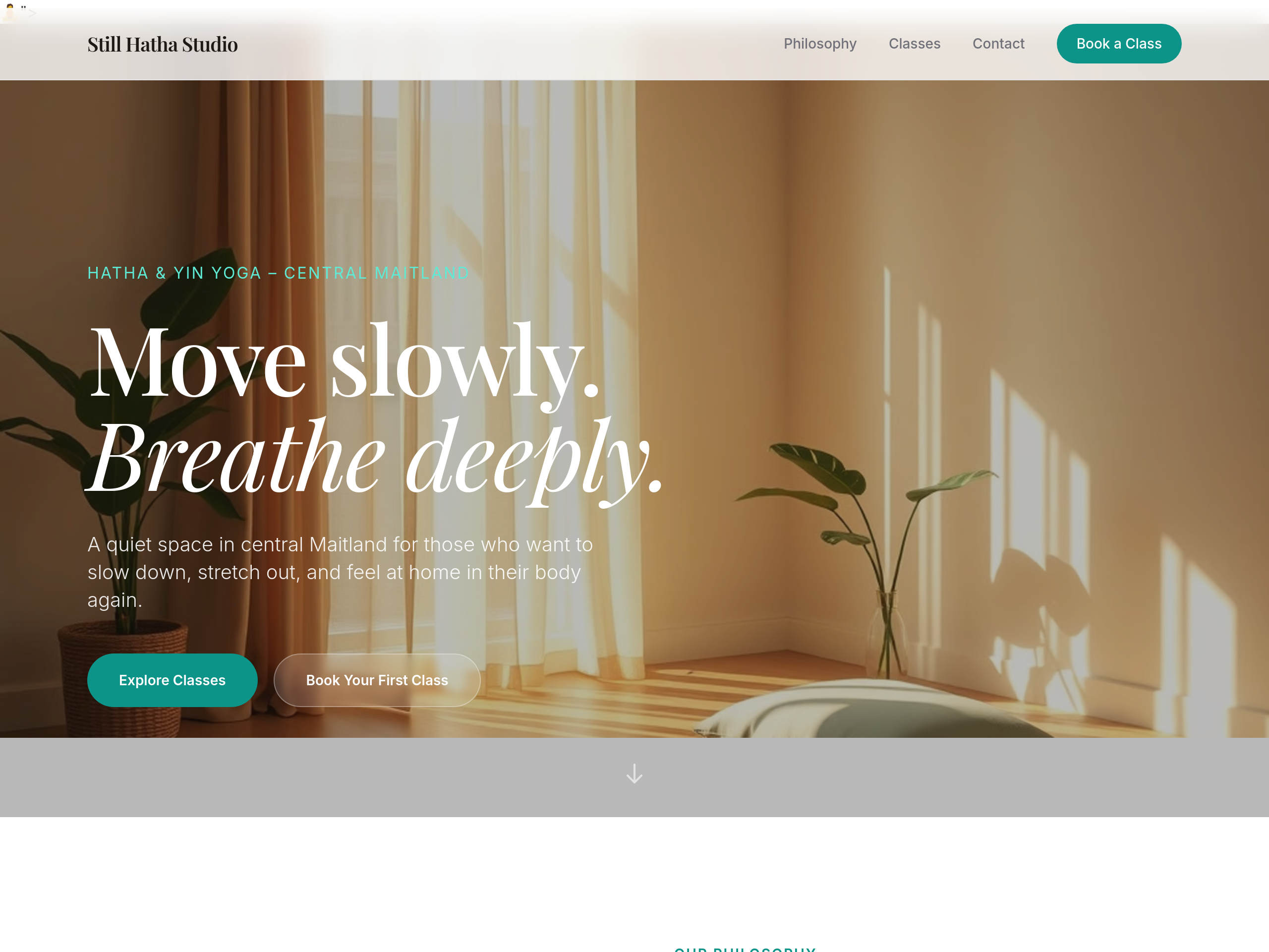
Before
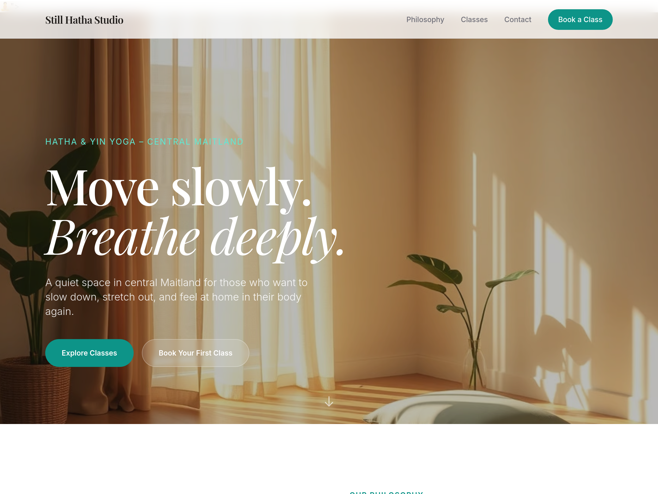
After
the hero image is too small — make it full-width edge-to-edge
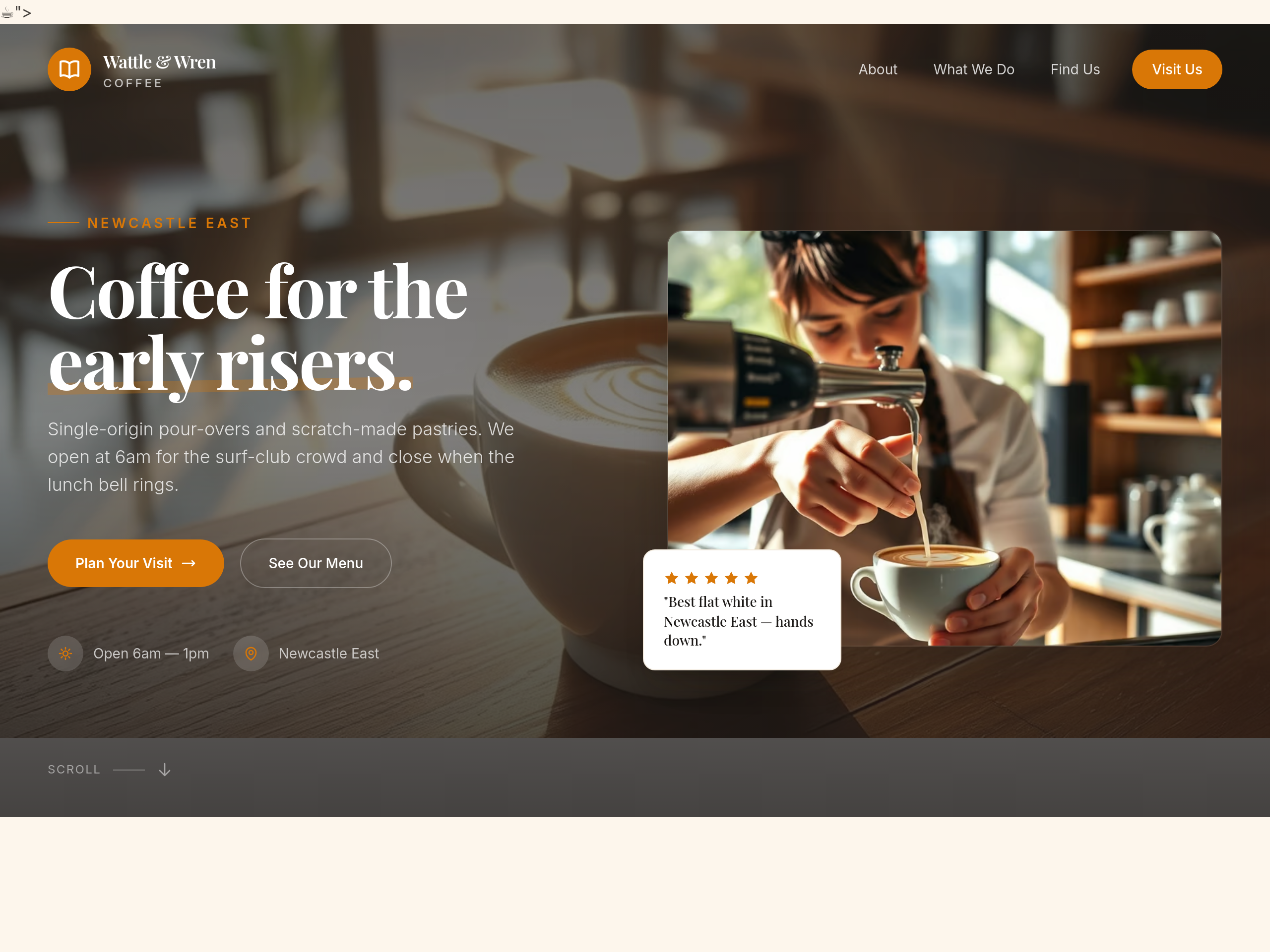
Before
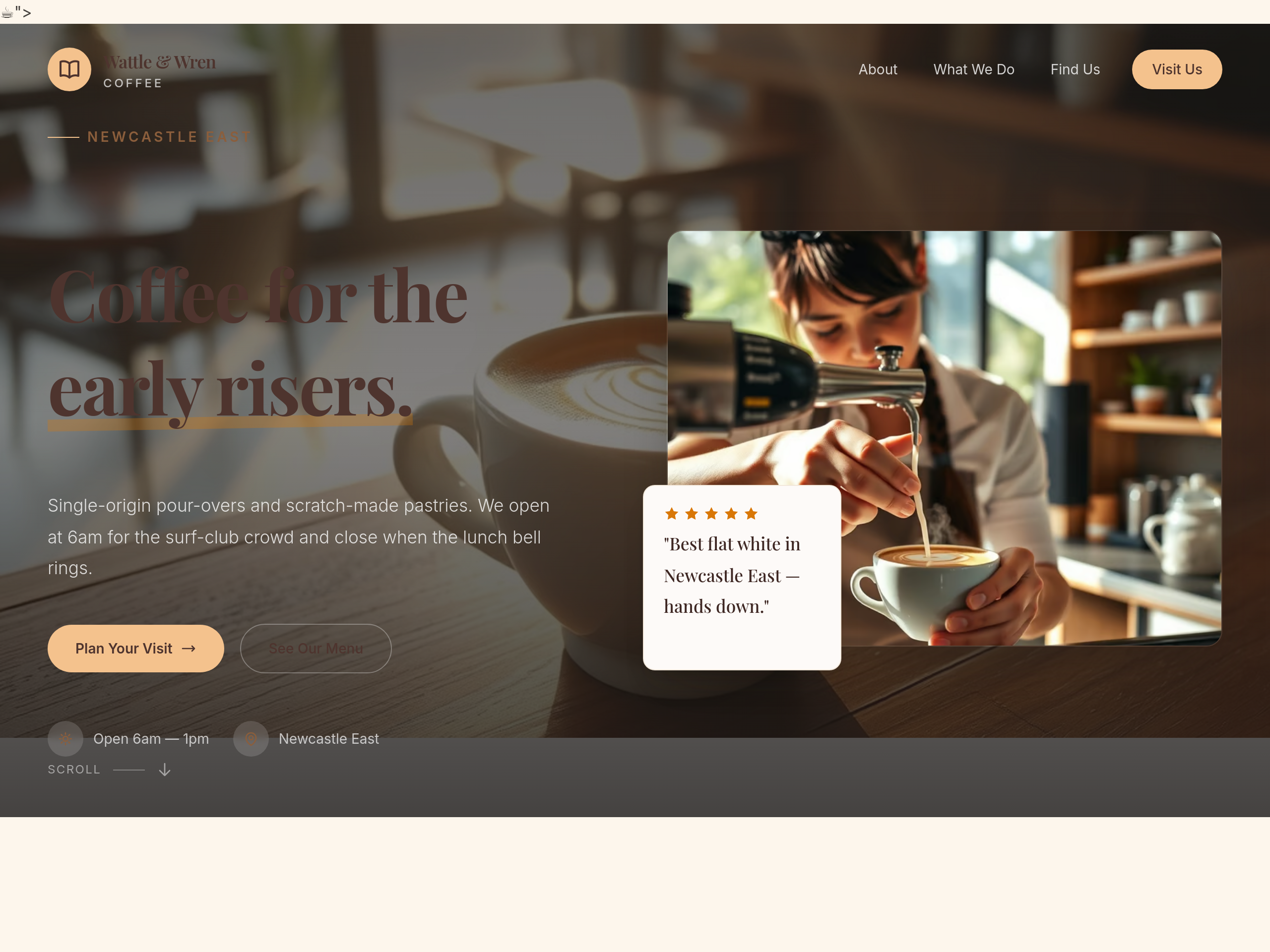
After
make the whole site feel like Sunday morning — slower pace, longer paragraphs, breakfast focus
Before
After
make the whole site feel like Sunday morning — slower pace, longer paragraphs, breakfast focus
Before
After
make the whole site feel like Sunday morning — slower pace, longer paragraphs, breakfast focus
Before
After
make the whole site feel like Sunday morning — slower pace, longer paragraphs, breakfast focus
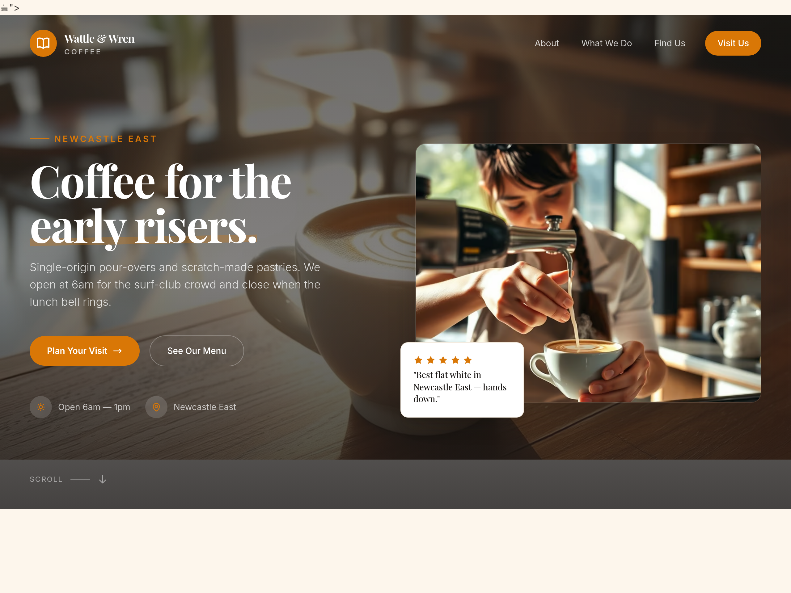
Before
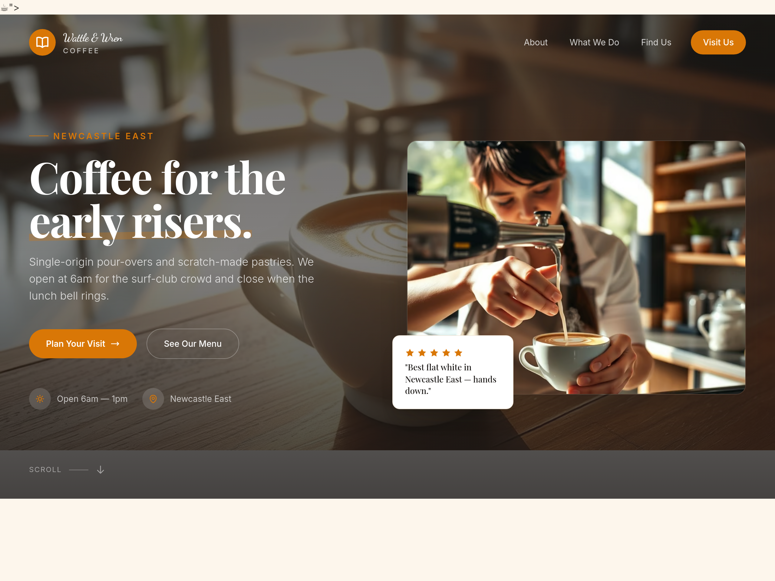
After
use a hand-written script font for the cafe name in the hero
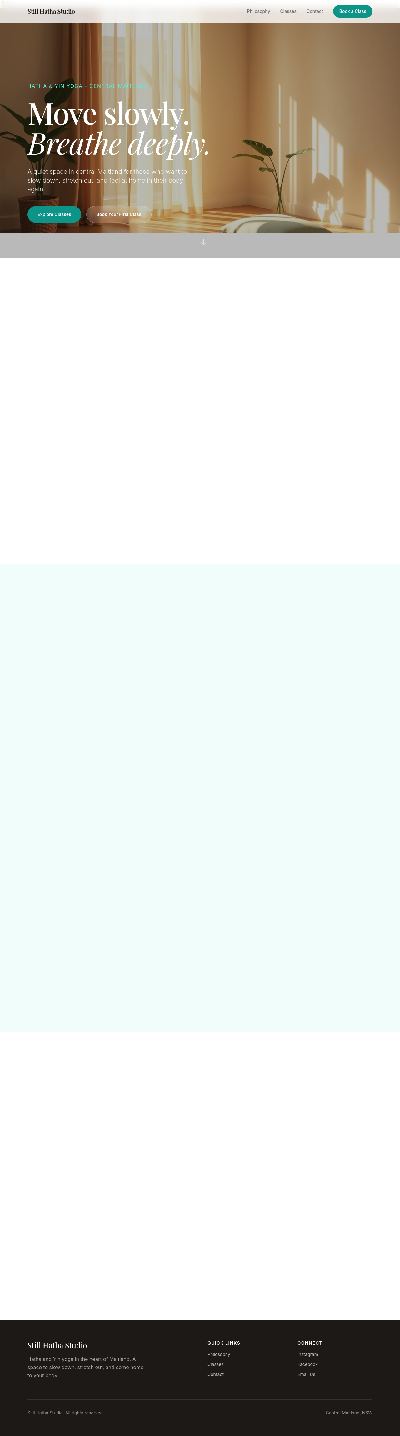
Before

After
add a sticky header that's transparent at top, solid white when scrolled
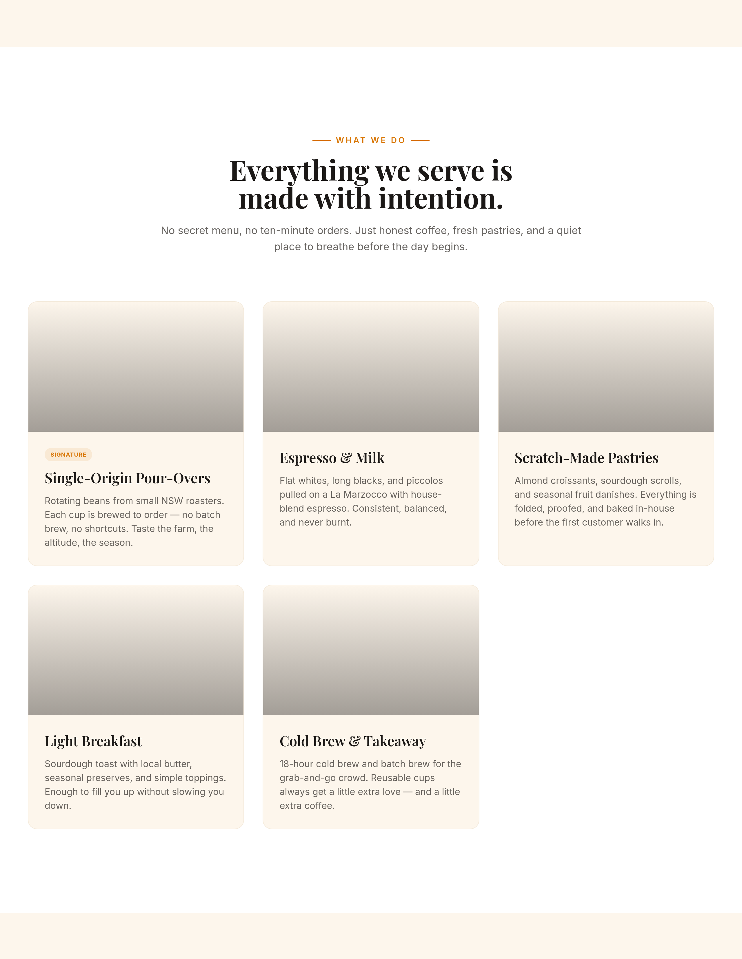
Before
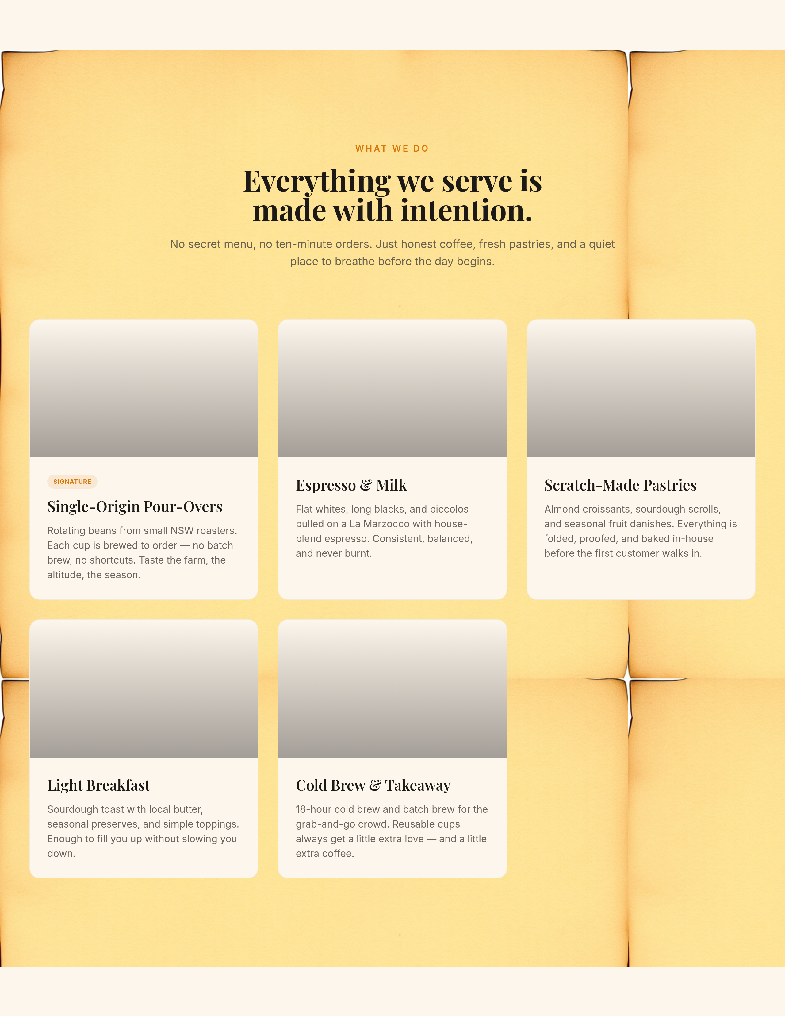
After
add a soft kraft-paper background texture to the menu section

Before

After
the colours feel sterile — soften with warm beige + sage
Before
After
the colours feel sterile — soften with warm beige + sage
Before
After
the colours feel sterile — soften with warm beige + sage
Before
After
the colours feel sterile — soften with warm beige + sage
Before
After
the colours feel sterile — soften with warm beige + sage
Before
After
the colours feel sterile — soften with warm beige + sage
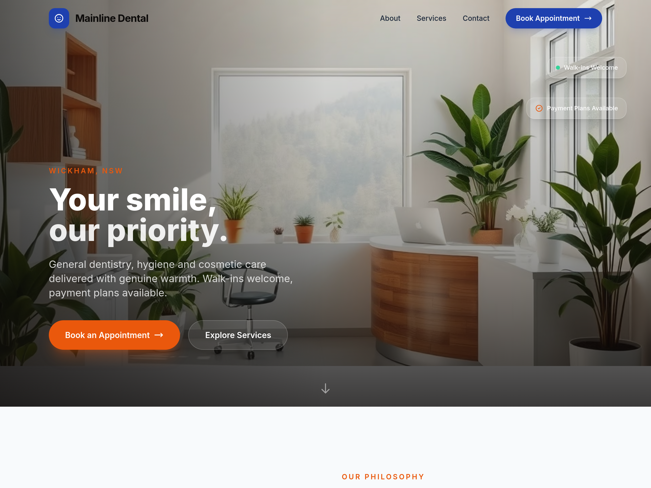
Before
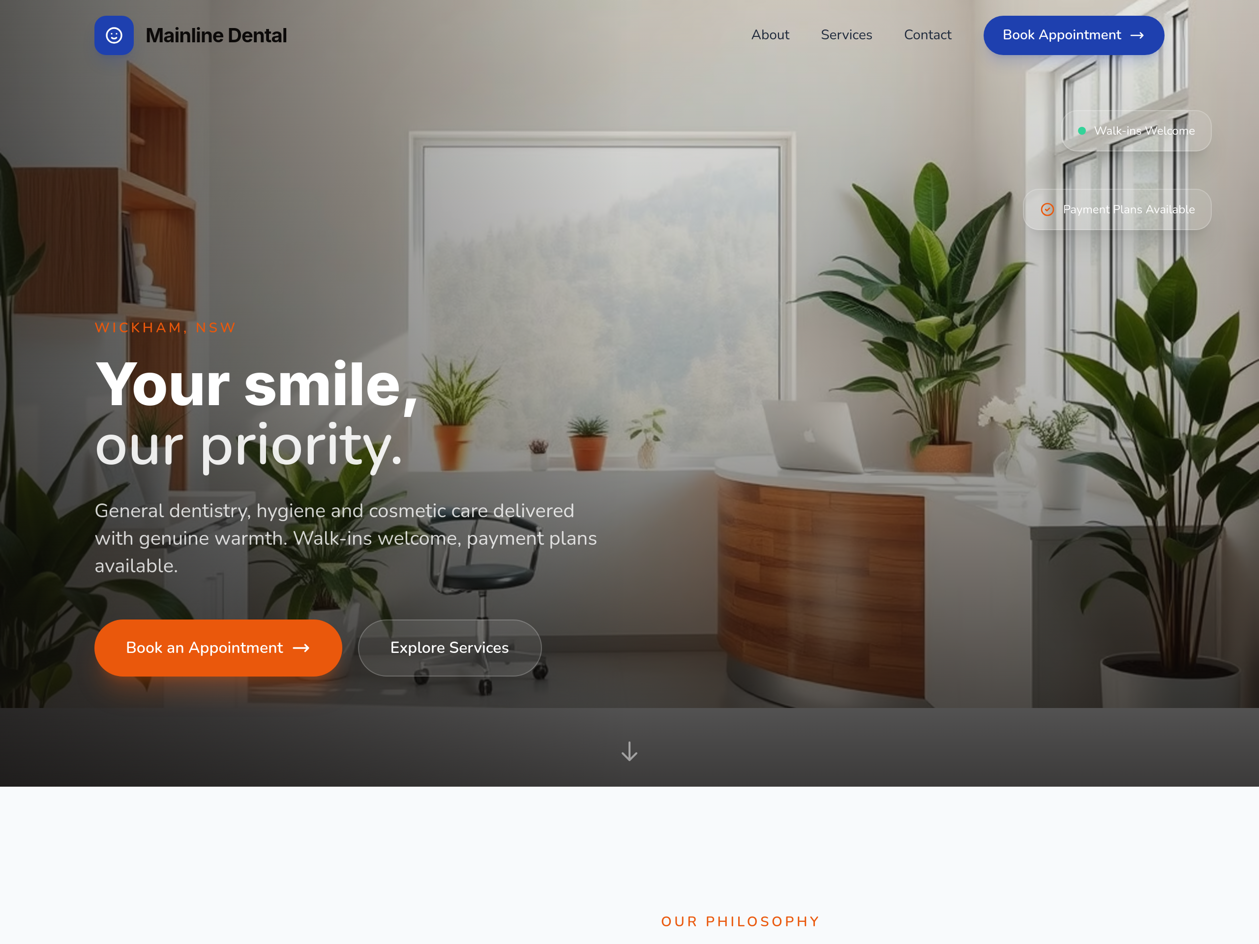
After
make the typography feel friendlier — rounded sans serif
Before
After
make the typography feel friendlier — rounded sans serif
Before
After
make the typography feel friendlier — rounded sans serif
Before
After
make the typography feel friendlier — rounded sans serif
Before
After
make the typography feel friendlier — rounded sans serif
Before
After
make the typography feel friendlier — rounded sans serif
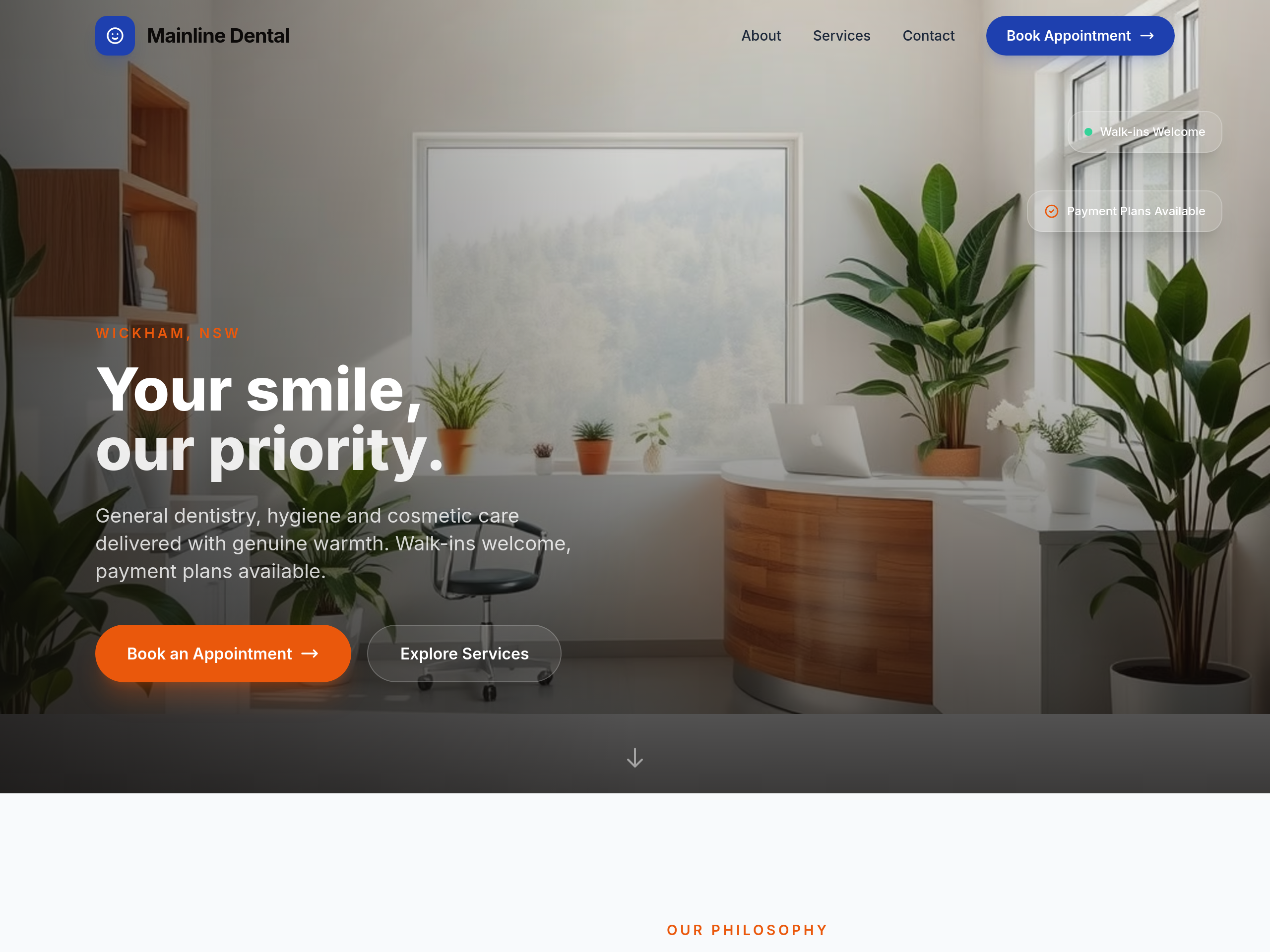
Before
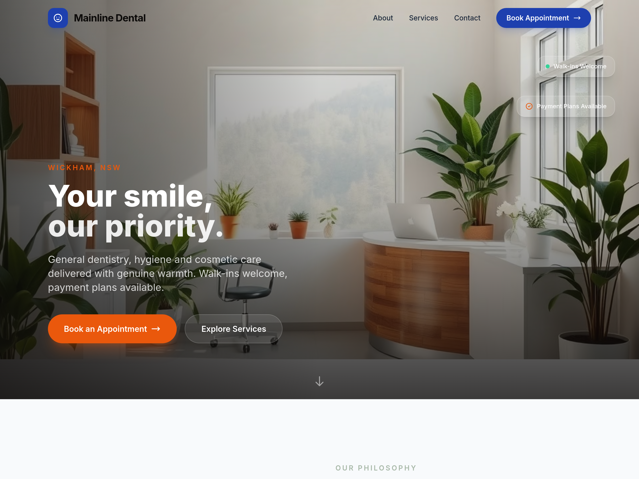
After
the colours are too clinical — soften with warm beige + sage green accents
Before
After
the colours are too clinical — soften with warm beige + sage green accents
Before
After
the colours are too clinical — soften with warm beige + sage green accents
Before
After
the colours are too clinical — soften with warm beige + sage green accents
Before
After
the colours are too clinical — soften with warm beige + sage green accents
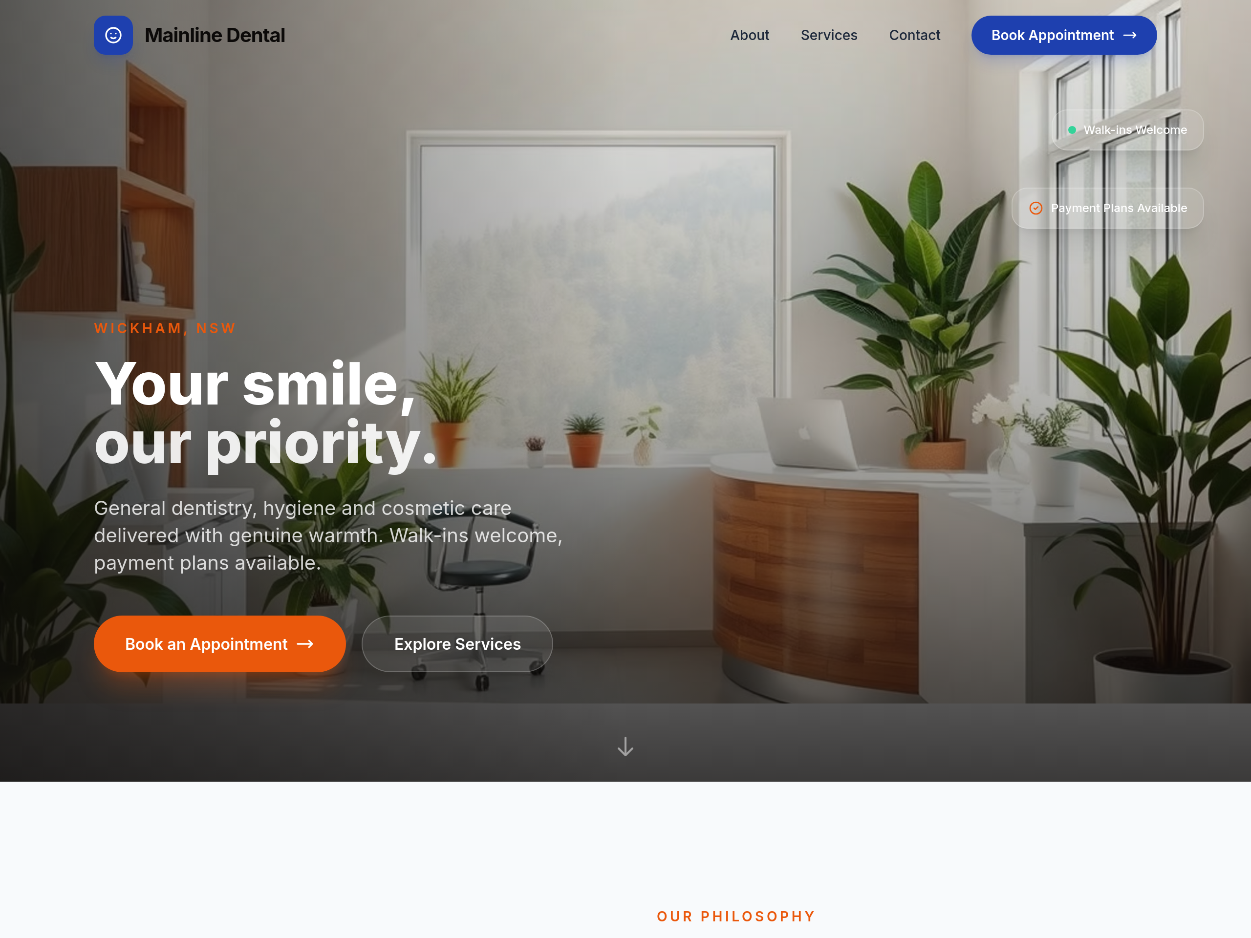
Before
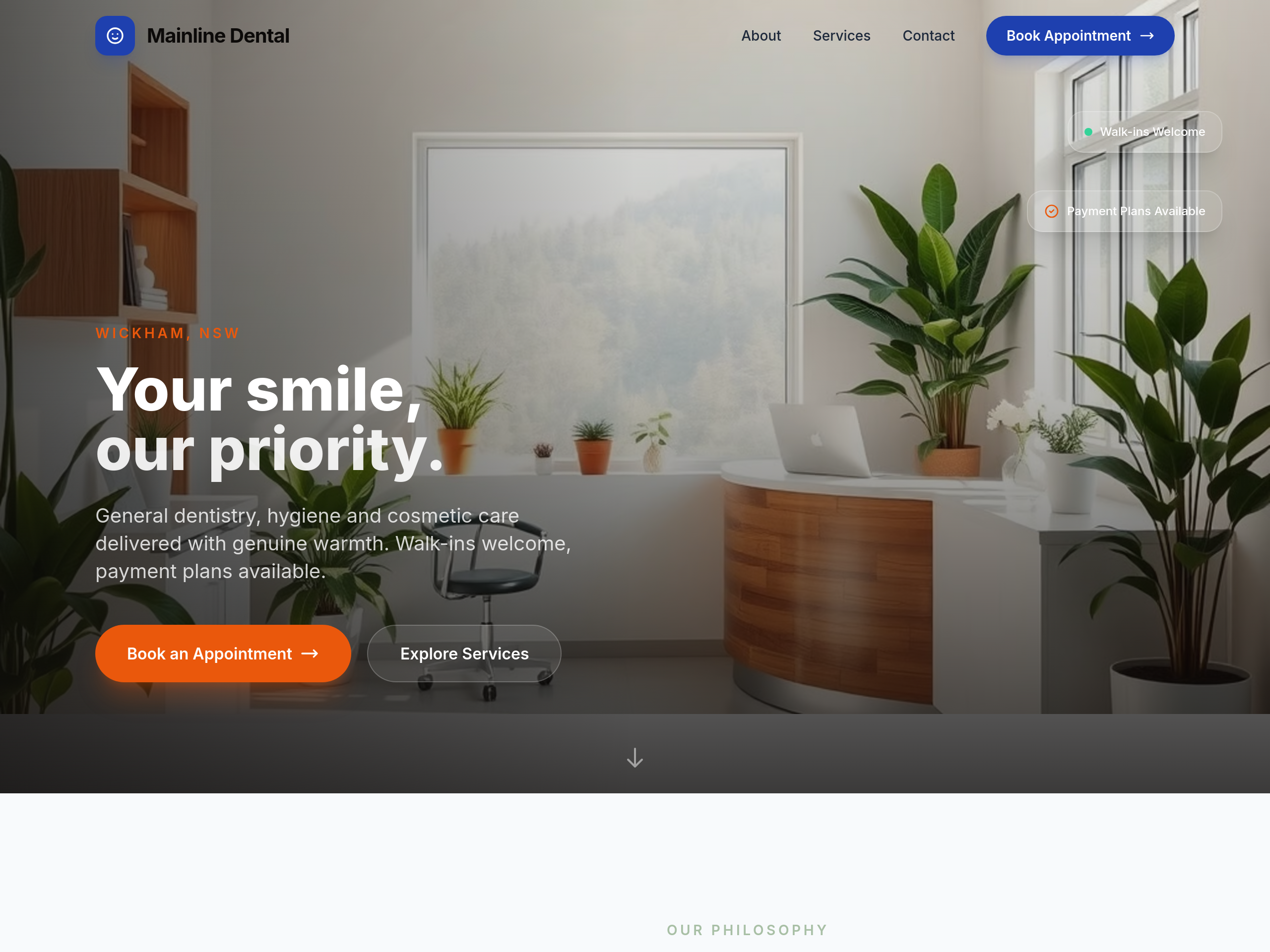
After
too clinical-blue — soften with sage + cream for calmer feel
Before
After
too clinical-blue — soften with sage + cream for calmer feel
Before
After
too clinical-blue — soften with sage + cream for calmer feel
Before
After
too clinical-blue — soften with sage + cream for calmer feel
Before
After
too clinical-blue — soften with sage + cream for calmer feel

Before

After
the colours feel too utility — try a more premium dark navy + electric-yellow accent
Before
After
the colours feel too utility — try a more premium dark navy + electric-yellow accent
Before
After
the colours feel too utility — try a more premium dark navy + electric-yellow accent
Before
After
the colours feel too utility — try a more premium dark navy + electric-yellow accent
Before
After
the colours feel too utility — try a more premium dark navy + electric-yellow accent
Before
After
the colours feel too utility — try a more premium dark navy + electric-yellow accent
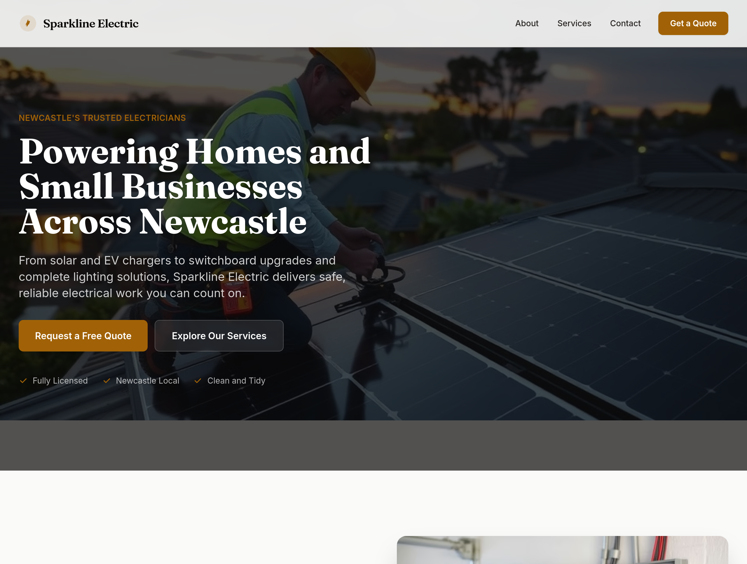
Before

After
the colours feel utility — use deep navy + electric yellow accents for premium feel
Before
After
the colours feel utility — use deep navy + electric yellow accents for premium feel
Before
After
the colours feel utility — use deep navy + electric yellow accents for premium feel
Before
After
the colours feel utility — use deep navy + electric yellow accents for premium feel
Before
After
the colours feel utility — use deep navy + electric yellow accents for premium feel
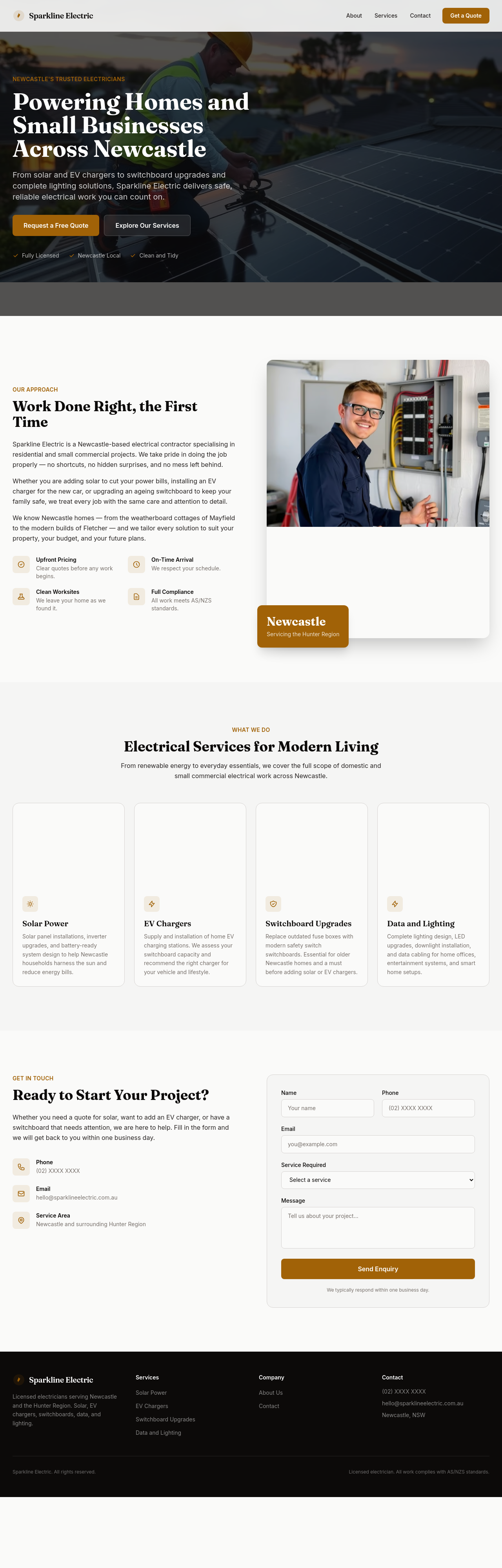
Before
After
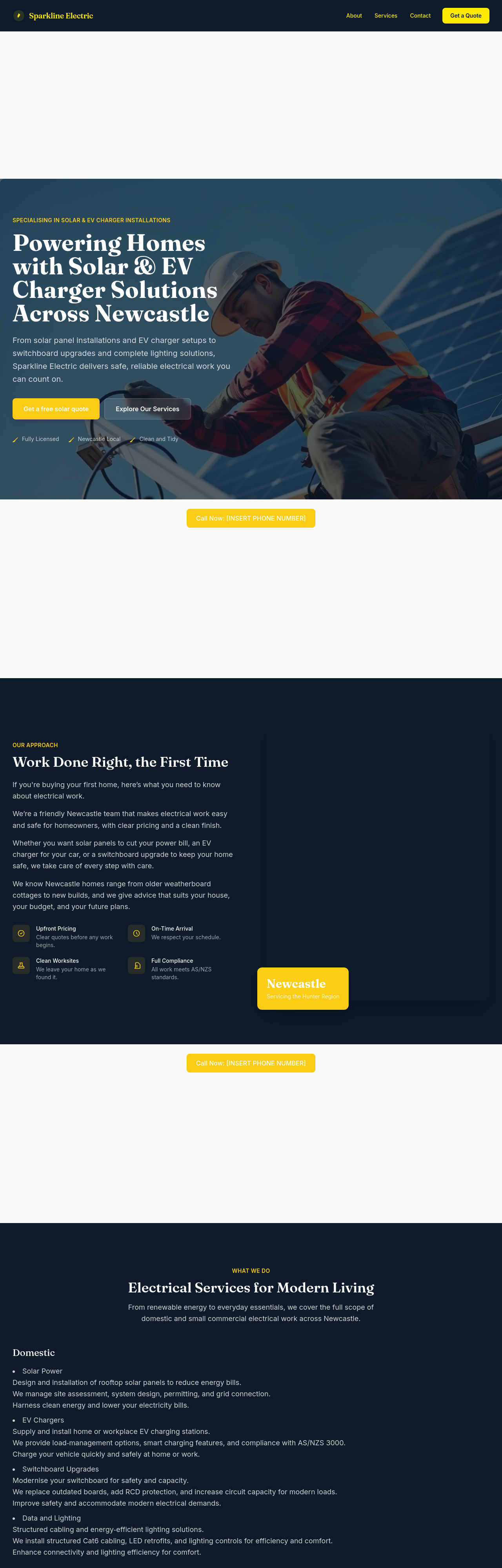
add LocalBusiness JSON-LD with type:Electrician + Newcastle service area

Before

After
undo, then make it warmer instead

Before

After
change the colours to bllue not green
Before
After
change the colours to bllue not green
Before
After
change the colours to bllue not green
Before
After
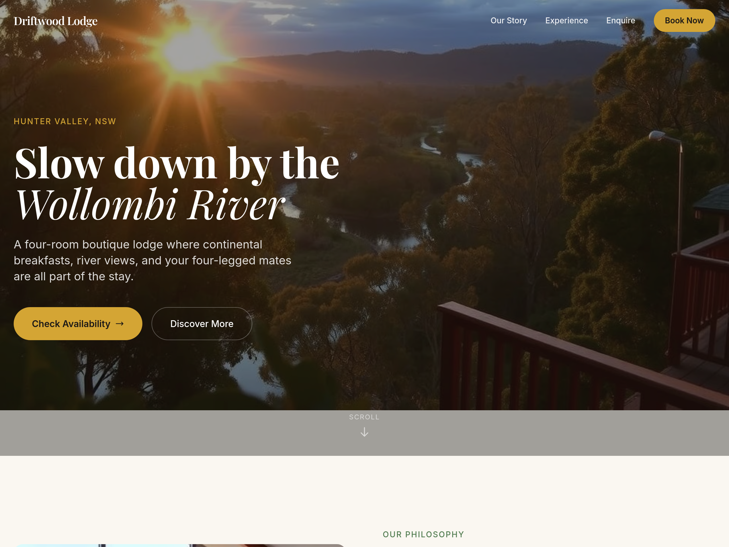
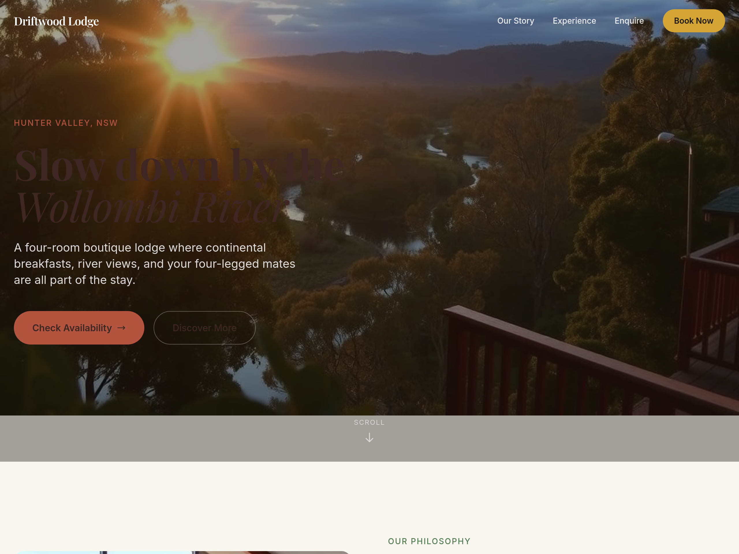
change the colours to bllue not green
Before
After
the colours are too cool — warm everything up with sandstone + clay tones
Before
After
the colours are too cool — warm everything up with sandstone + clay tones
Before
After
the colours are too cool — warm everything up with sandstone + clay tones
Before
After
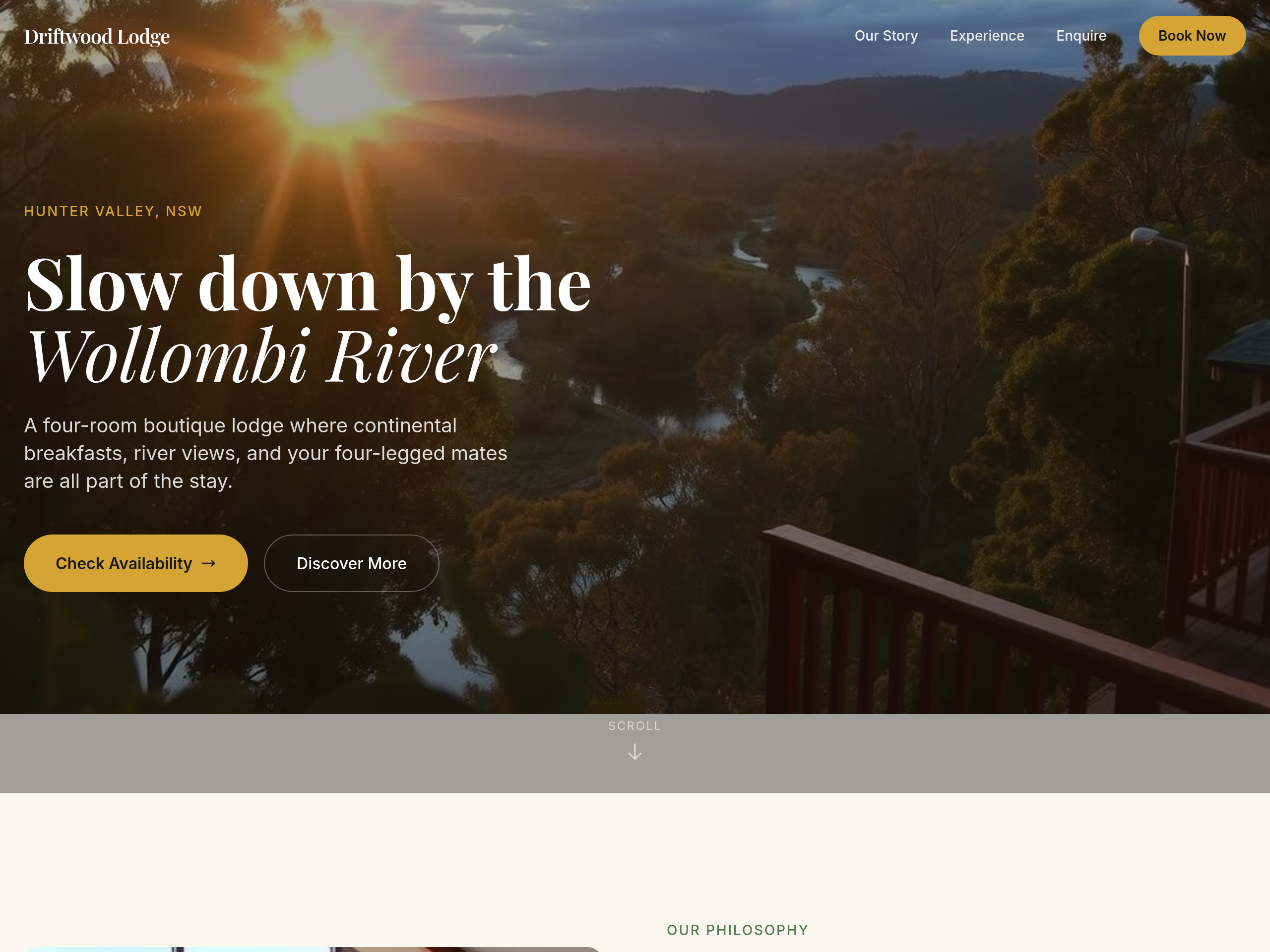
the colours are too cool — warm everything up with sandstone + clay tones
Before
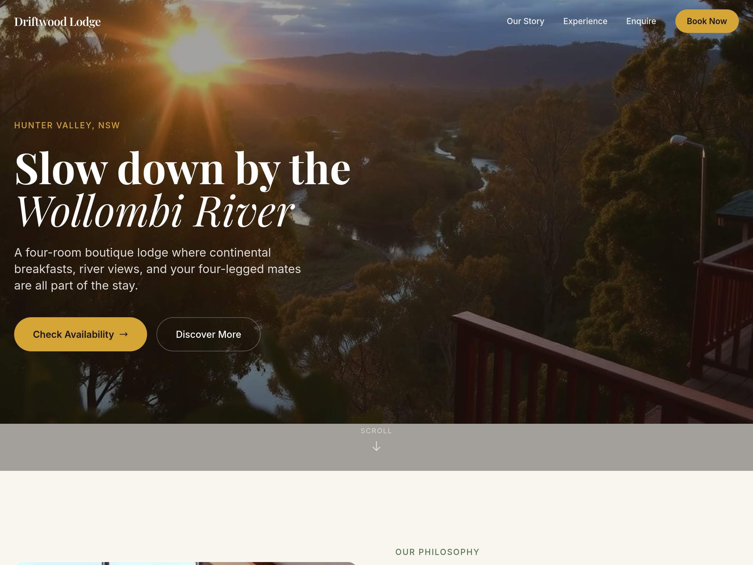
After
use a serif font for the headings — feels more boutique
Before
After
use a serif font for the headings — feels more boutique
Before
After
use a serif font for the headings — feels more boutique
Before
After
use a serif font for the headings — feels more boutique
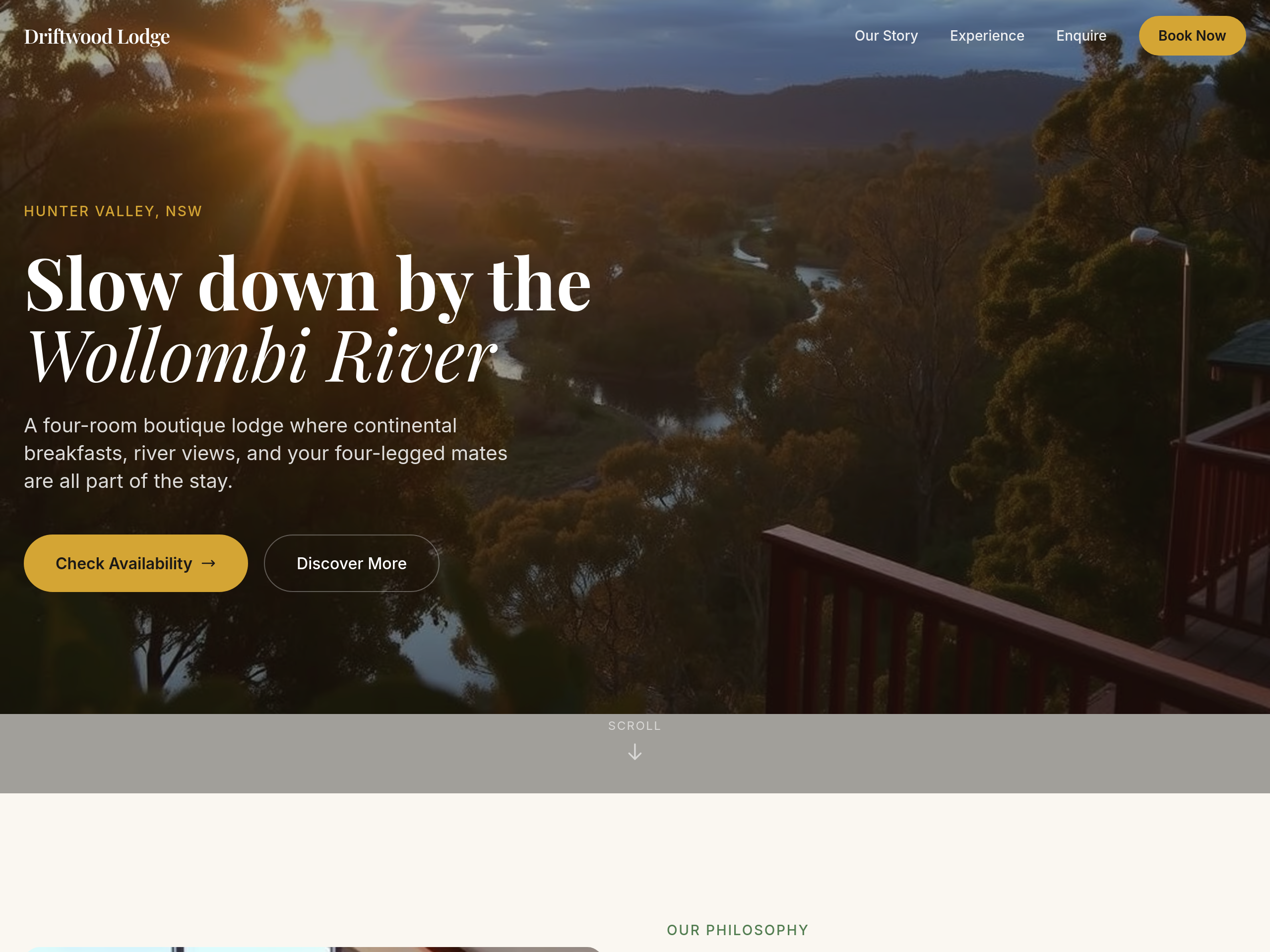
Before
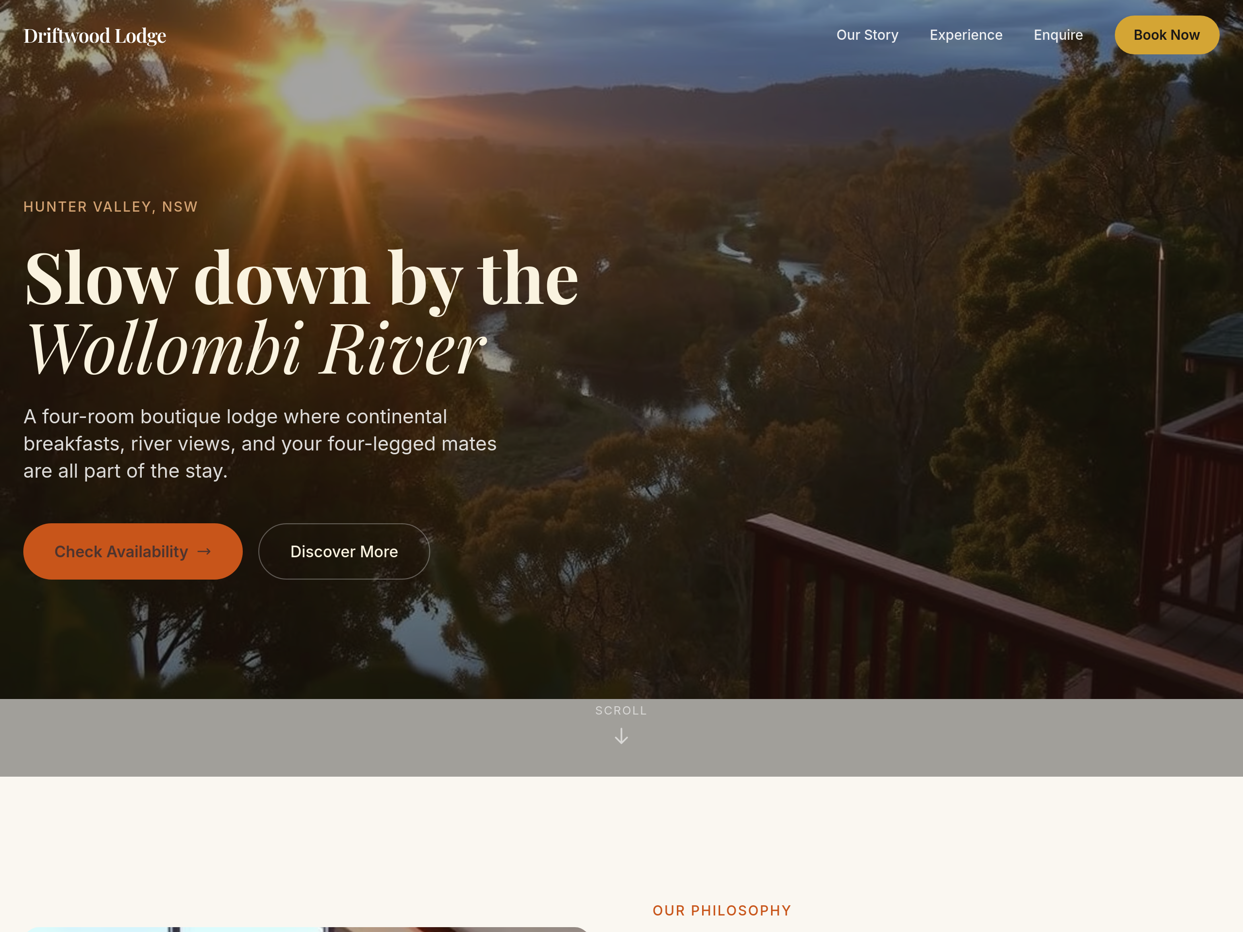
After
the colour palette is too cold — warm everything to earthy tones
Before
After
the colour palette is too cold — warm everything to earthy tones
Before
After
the colour palette is too cold — warm everything to earthy tones
Before
After
the colour palette is too cold — warm everything to earthy tones
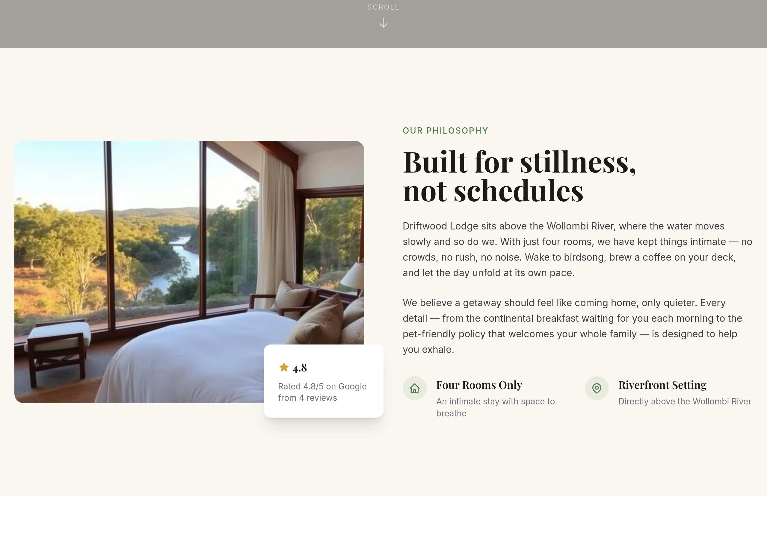
Before
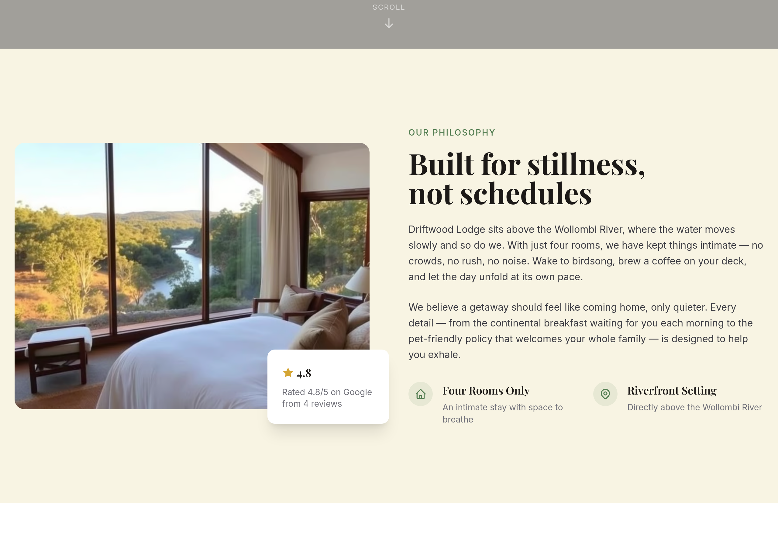
After
add a subtle parchment-style background to the about section
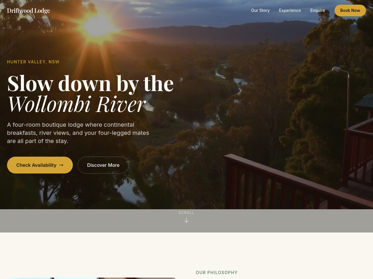
Before
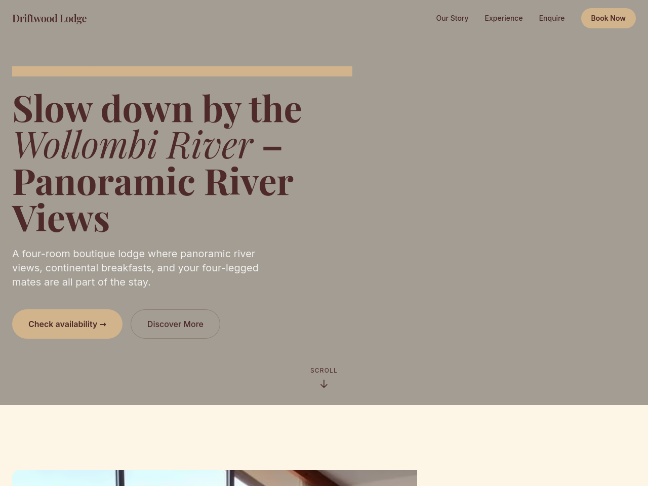
After
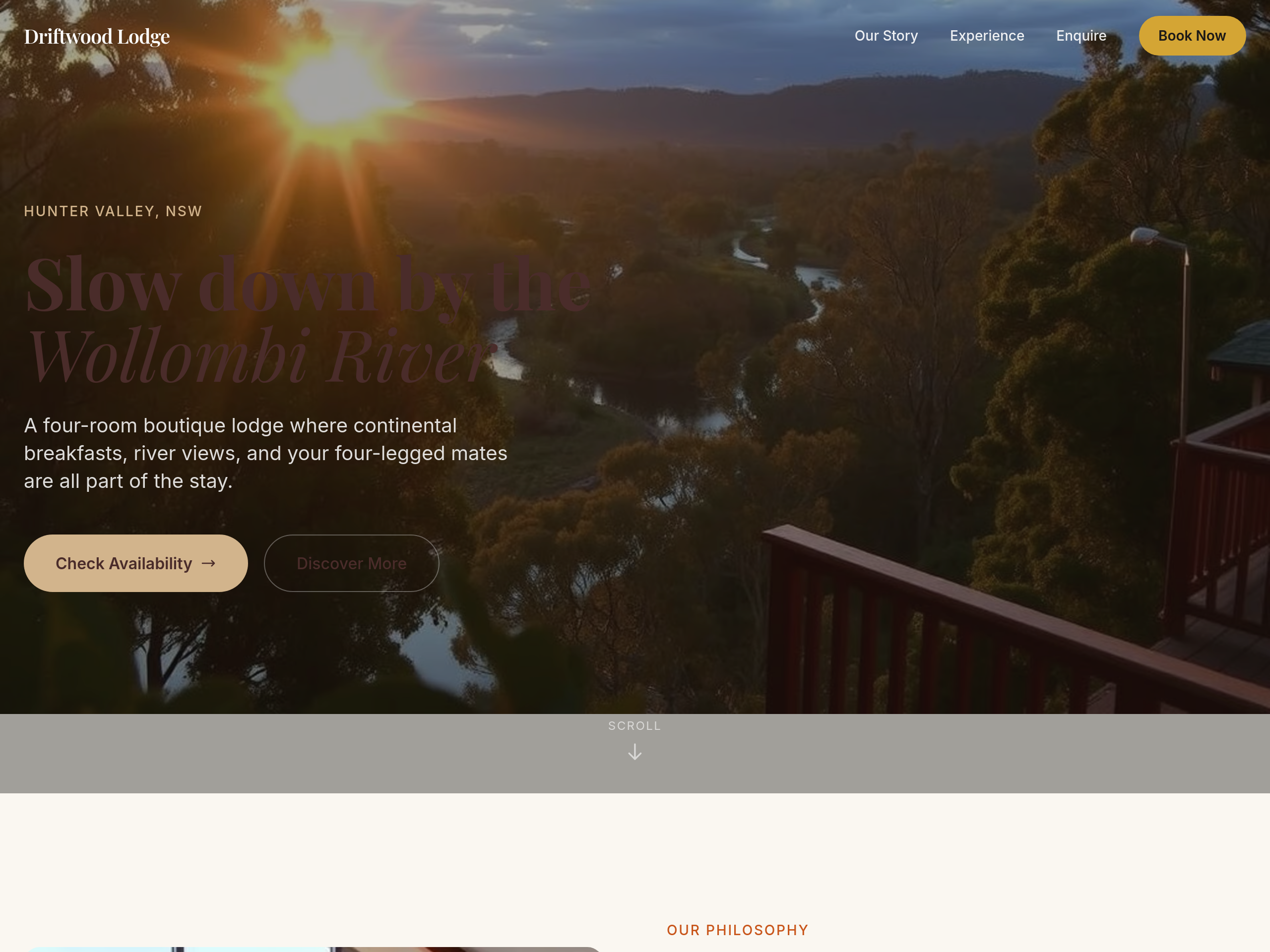
add a hero gallery of 4 images rotating: river view dawn, breakfast plate, room interior, deck at sunset
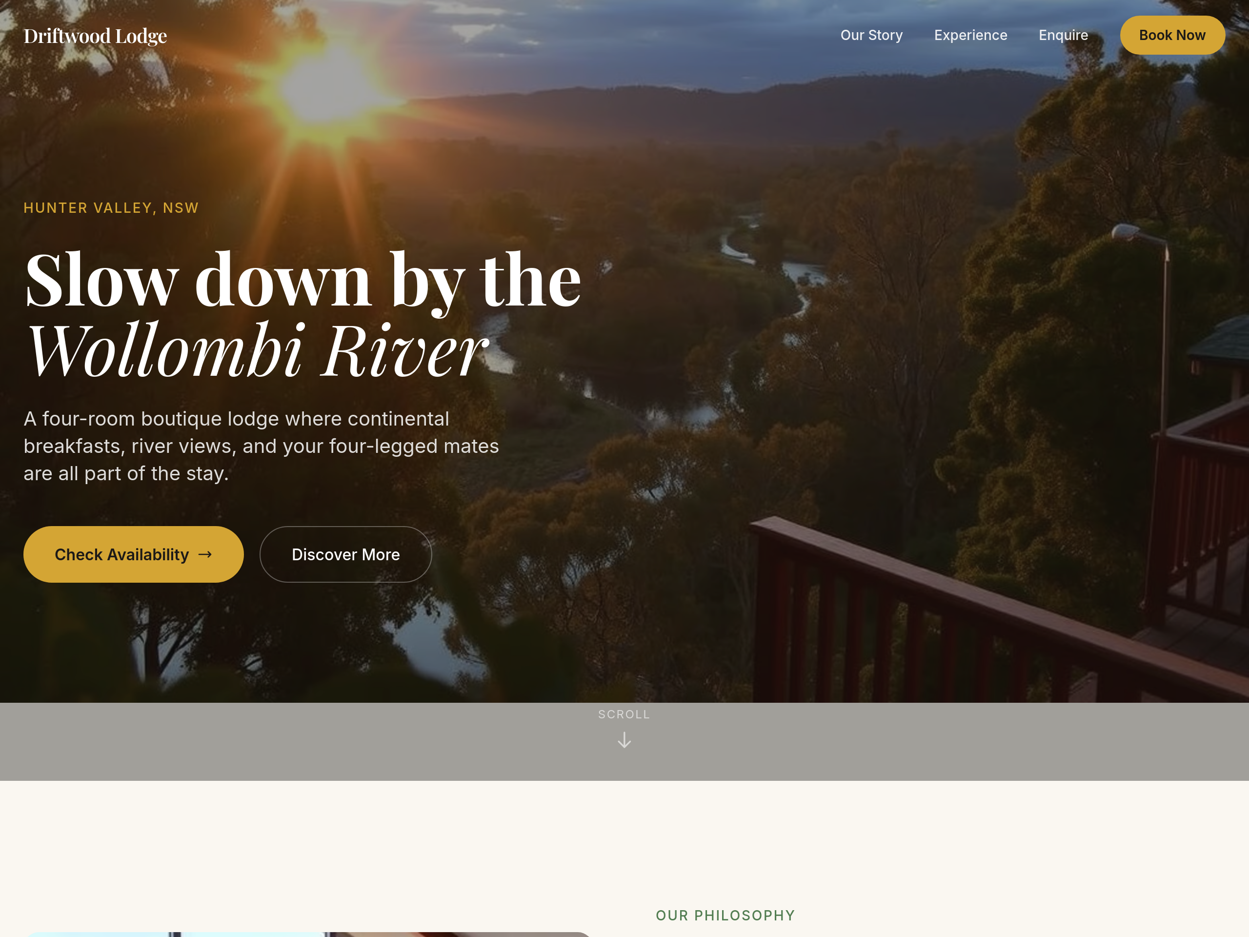
Before
After
the colour palette is too cool — warm everything with sandstone + clay tones
Before
After
the colour palette is too cool — warm everything with sandstone + clay tones
Before
After
the colour palette is too cool — warm everything with sandstone + clay tones
Before
After
the colour palette is too cool — warm everything with sandstone + clay tones

Before

After
the whole site needs to feel more premium — typography, colours, spacing, copy
Before
After
the whole site needs to feel more premium — typography, colours, spacing, copy
Before
After
the whole site needs to feel more premium — typography, colours, spacing, copy
Before
After
the whole site needs to feel more premium — typography, colours, spacing, copy
Before
After
the whole site needs to feel more premium — typography, colours, spacing, copy

Before

After
on mobile the hero is too tall — let it auto-fit instead of 100vh

Before

After
the contact info wraps awkwardly on phones — stack address, phone, email vertically below 600px

Before

After
the buttons are tiny on touch screens — make them at least 44px tall

Before

After
add a subtle fade-in animation as sections scroll into view
Before
After
add a subtle fade-in animation as sections scroll into view
Before
After
add a subtle fade-in animation as sections scroll into view
Before
After
add a subtle fade-in animation as sections scroll into view

Before

After
the CTA button feels static — add a gentle hover lift and scale

Before

After
remove all animations — accessibility-first, prefer reduced motion
Before
After
remove all animations — accessibility-first, prefer reduced motion
Before
After
remove all animations — accessibility-first, prefer reduced motion
Before
After
remove all animations — accessibility-first, prefer reduced motion

Before

After
unify the heading sizes — they're all different — use h1 56px, h2 36px, h3 24px
Before
After
unify the heading sizes — they're all different — use h1 56px, h2 36px, h3 24px
Before
After
unify the heading sizes — they're all different — use h1 56px, h2 36px, h3 24px
Before
After
unify the heading sizes — they're all different — use h1 56px, h2 36px, h3 24px

Before

After
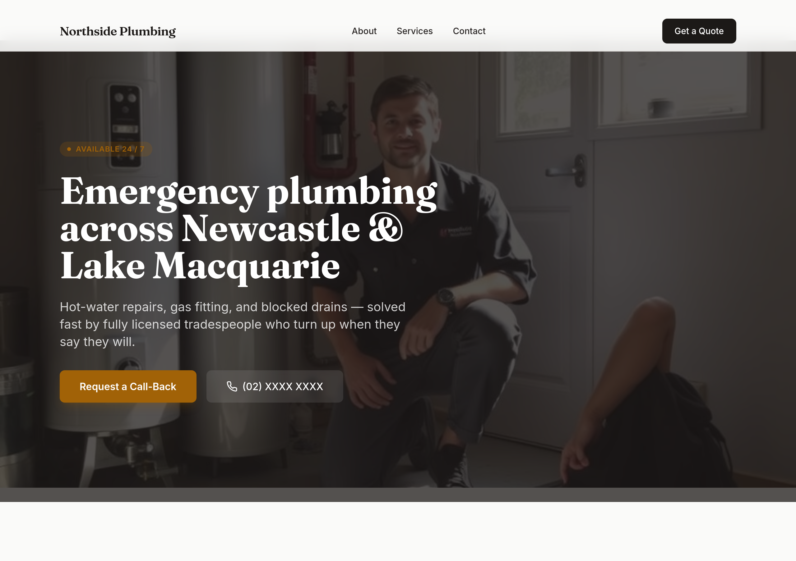
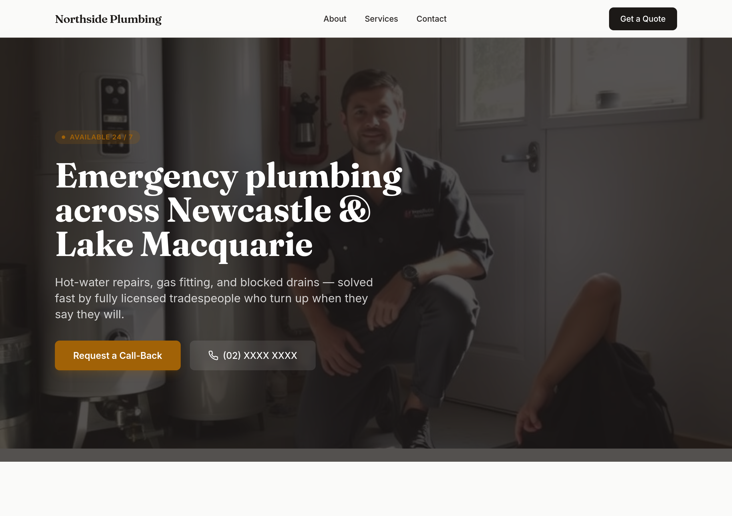
the brand has 3 different greens — pick one and use it everywhere
Before
After
the brand has 3 different greens — pick one and use it everywhere
Before
After
the brand has 3 different greens — pick one and use it everywhere
Before
After
the brand has 3 different greens — pick one and use it everywhere
Before
After
the colours are too soft — use bold orange + dark navy
Before
After
the colours are too soft — use bold orange + dark navy
Before
After
the colours are too soft — use bold orange + dark navy
Before
After
the colours are too soft — use bold orange + dark navy
Before
After
the colours are too soft — use bold orange + dark navy
Before
After
the colours are too soft — use bold orange + dark navy
Before
After
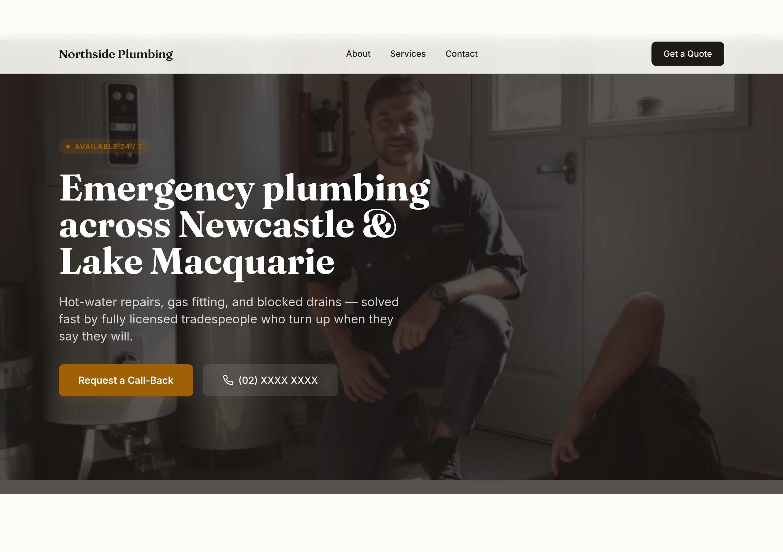
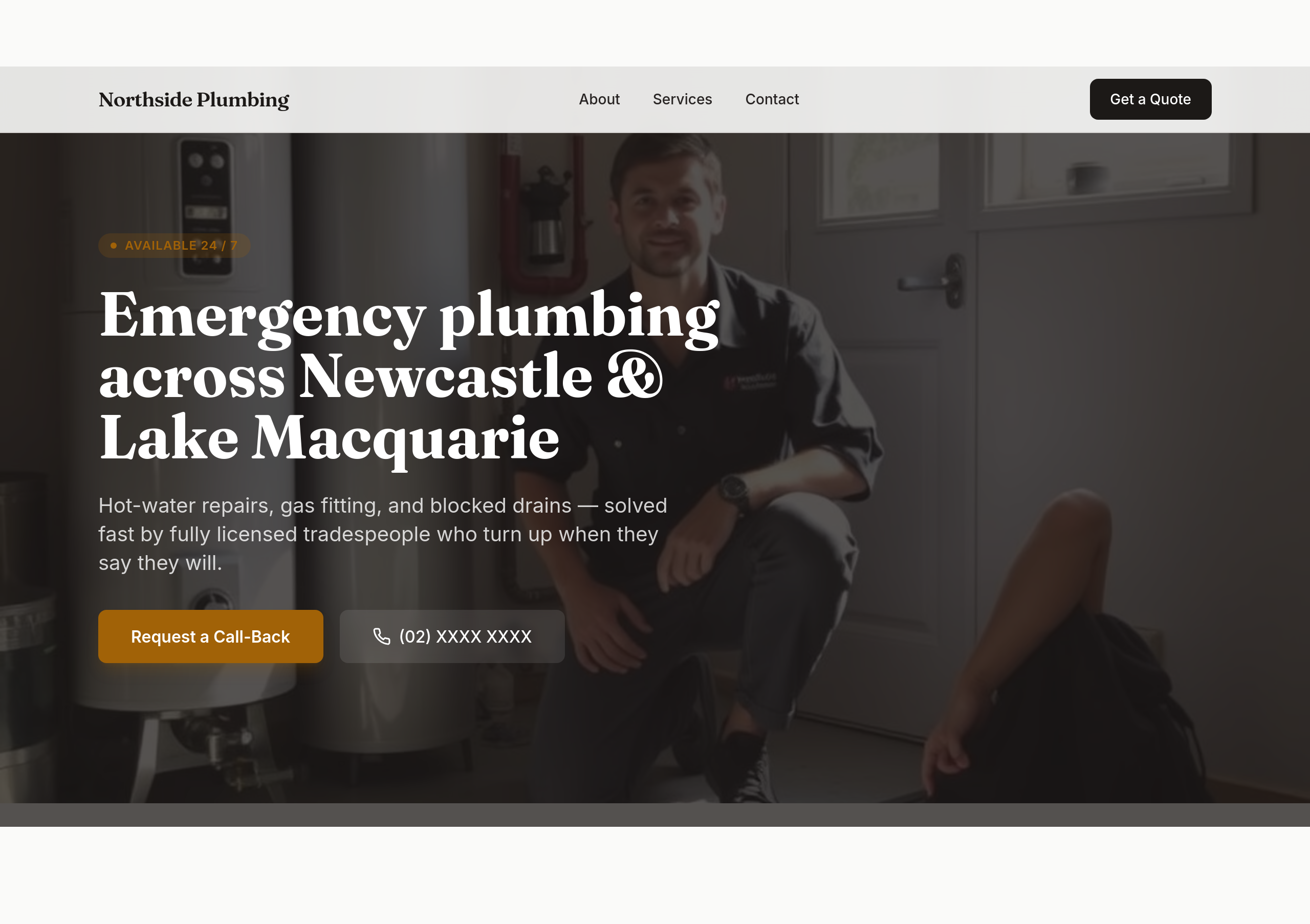
make the phone number BIG in the hero — it should be the most prominent thing

Before

After
the colours are bland — bold orange + dark navy, high contrast, tradie-confident
Before
After
the colours are bland — bold orange + dark navy, high contrast, tradie-confident
Before
After
the colours are bland — bold orange + dark navy, high contrast, tradie-confident
Before
After
the colours are bland — bold orange + dark navy, high contrast, tradie-confident
Before
After
the colours are bland — bold orange + dark navy, high contrast, tradie-confident
Before
After
the colours are bland — bold orange + dark navy, high contrast, tradie-confident
Before
After
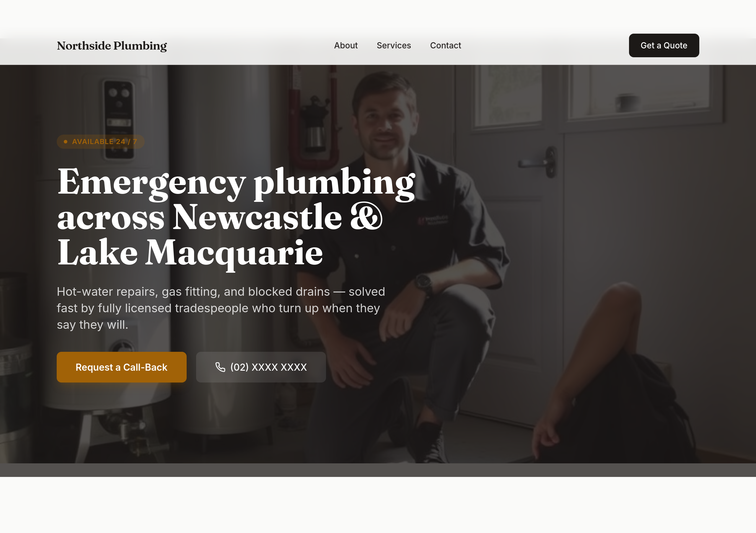
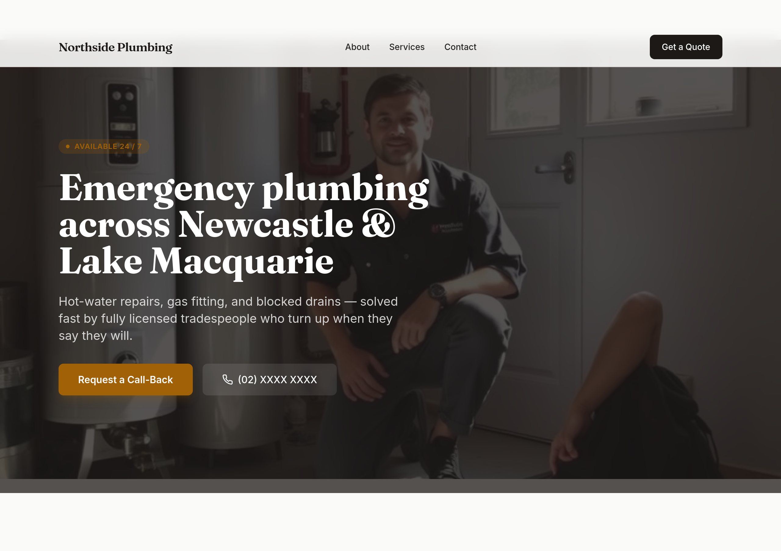
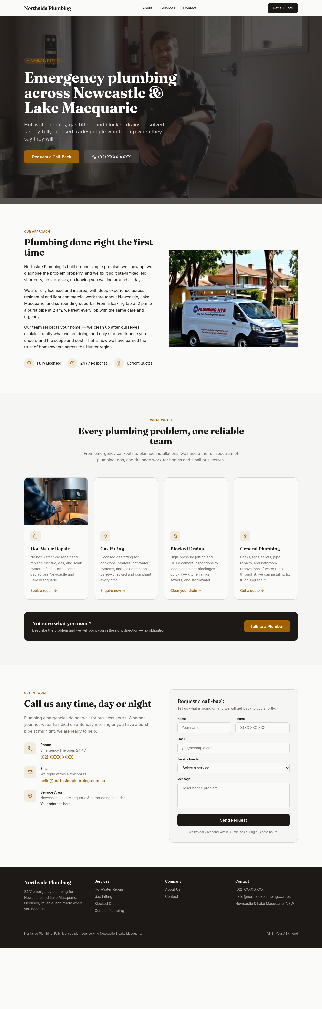
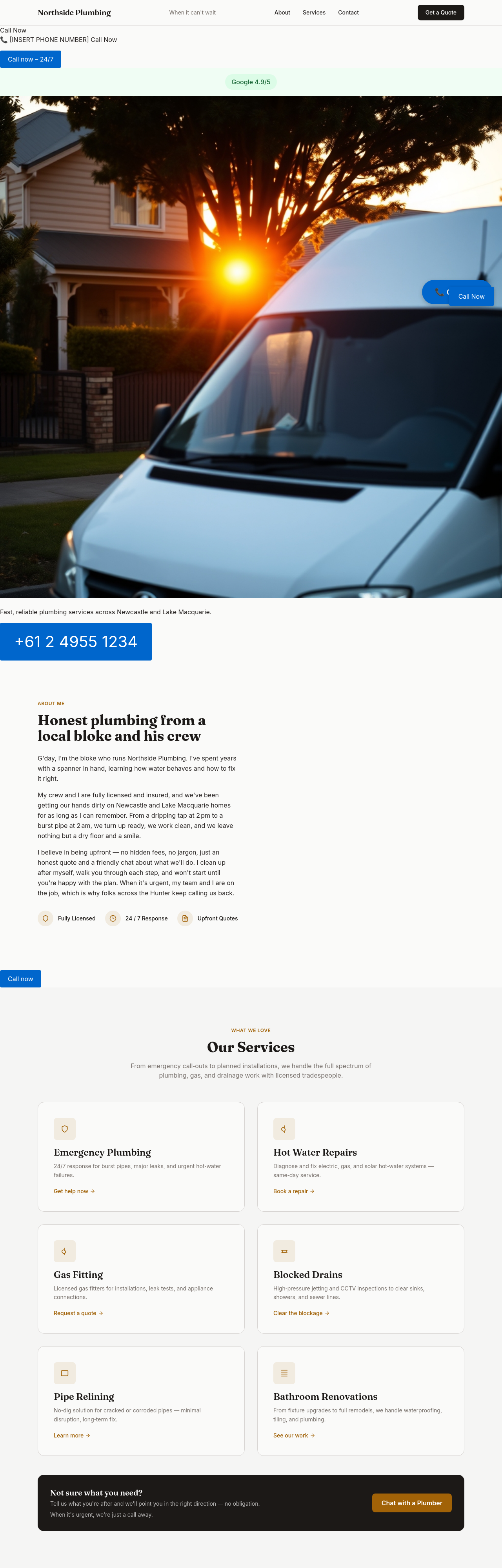
the phone number should be the biggest text on the page in the hero
Before
After
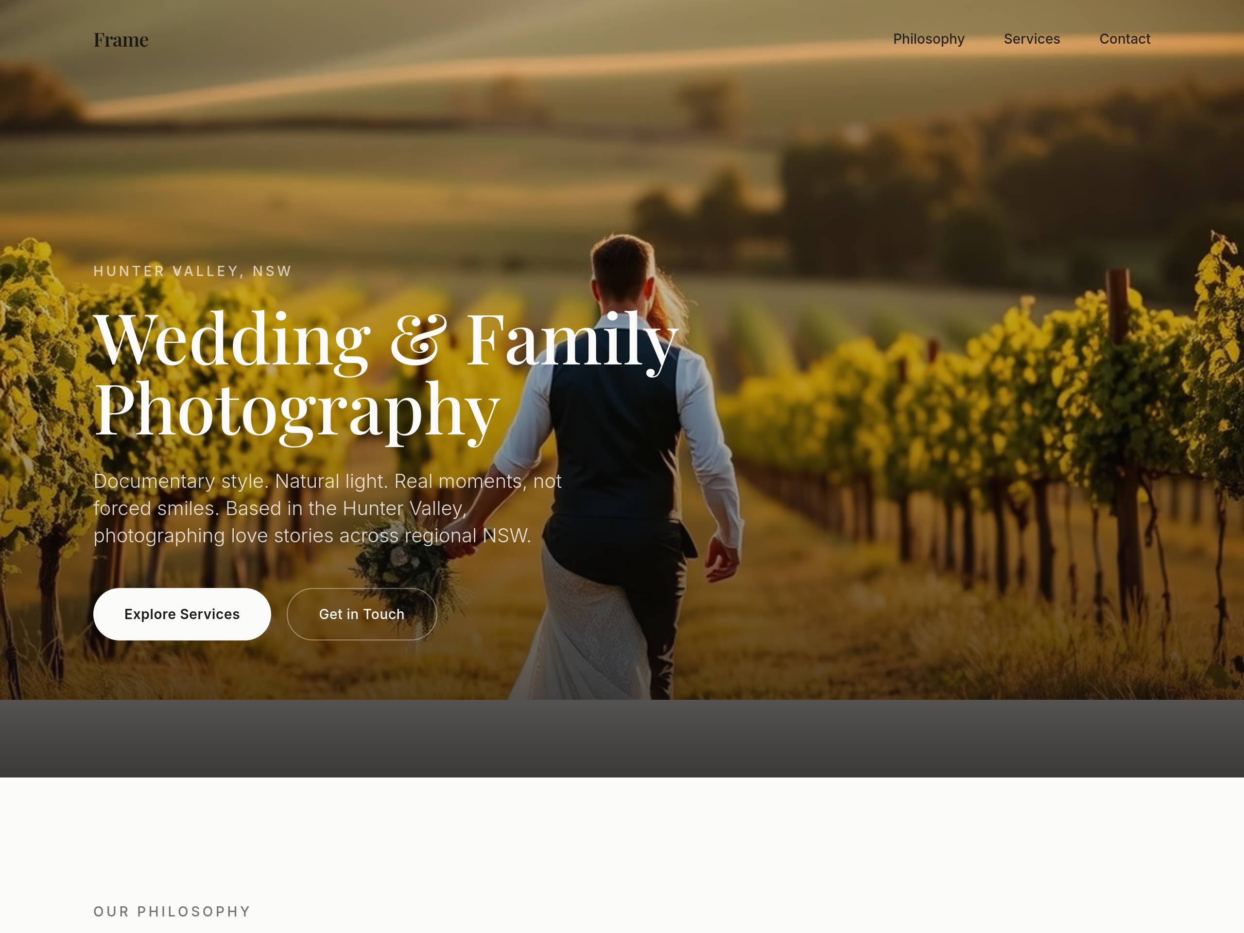
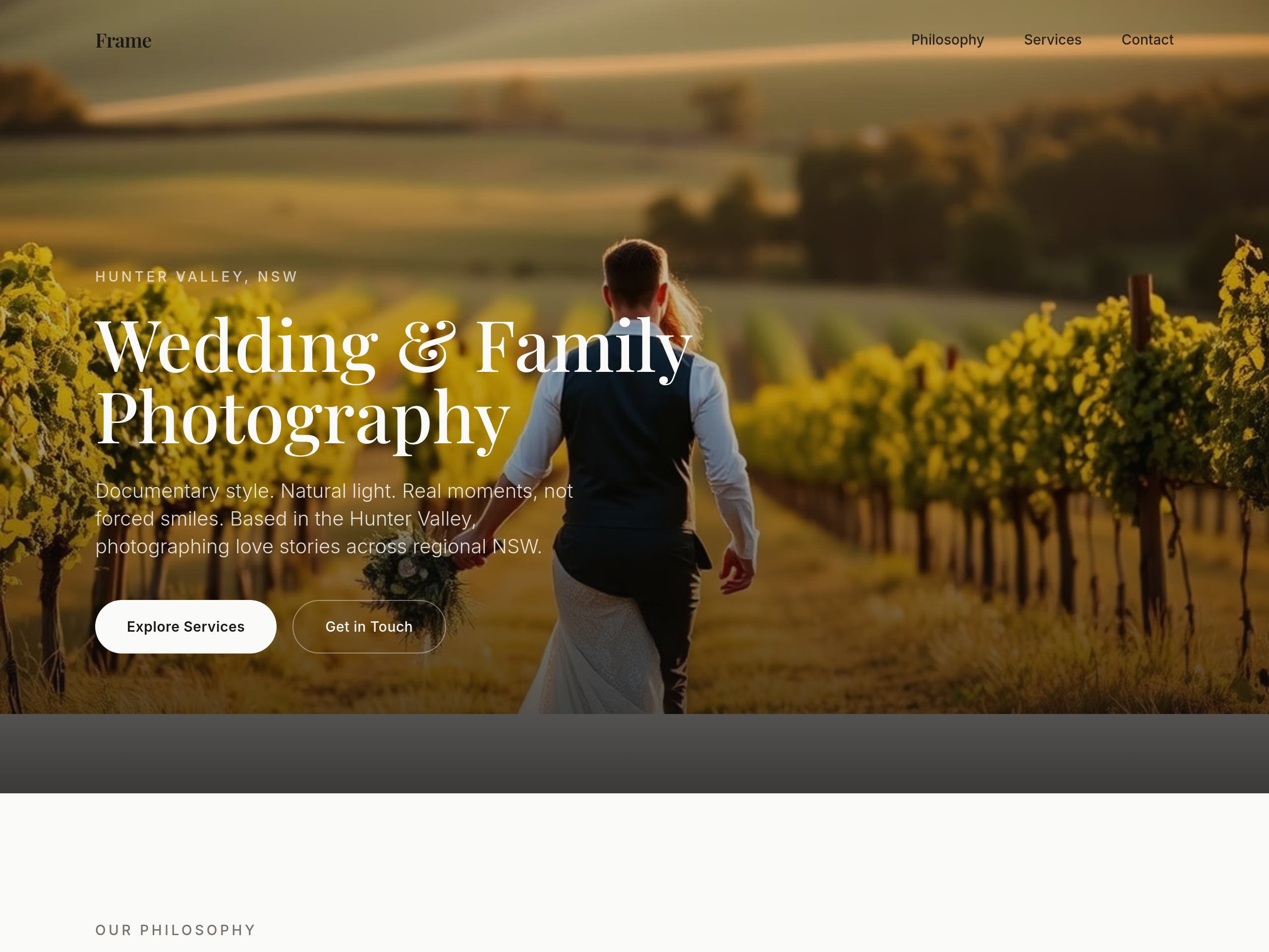
add 6 wedding moments in a masonry grid: rings, dress detail, ceremony kiss, candid laugh, sparklers, family group
Before
After
the type is too modern — switch to a classic serif headline + clean sans body
Before
After
the type is too modern — switch to a classic serif headline + clean sans body
Before
After
the type is too modern — switch to a classic serif headline + clean sans body
Before
After
the type is too modern — switch to a classic serif headline + clean sans body
Before
After
the type is too modern — switch to a classic serif headline + clean sans body
Before
After
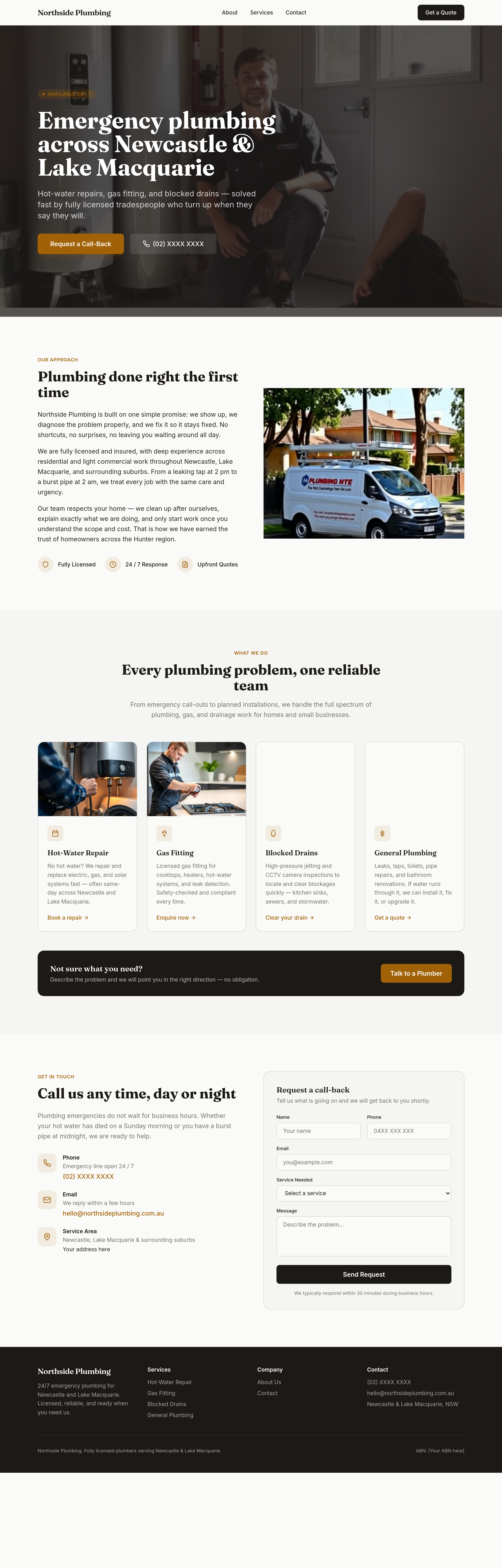
the type is too modern — switch to a classic serif headline + clean sans body
Before
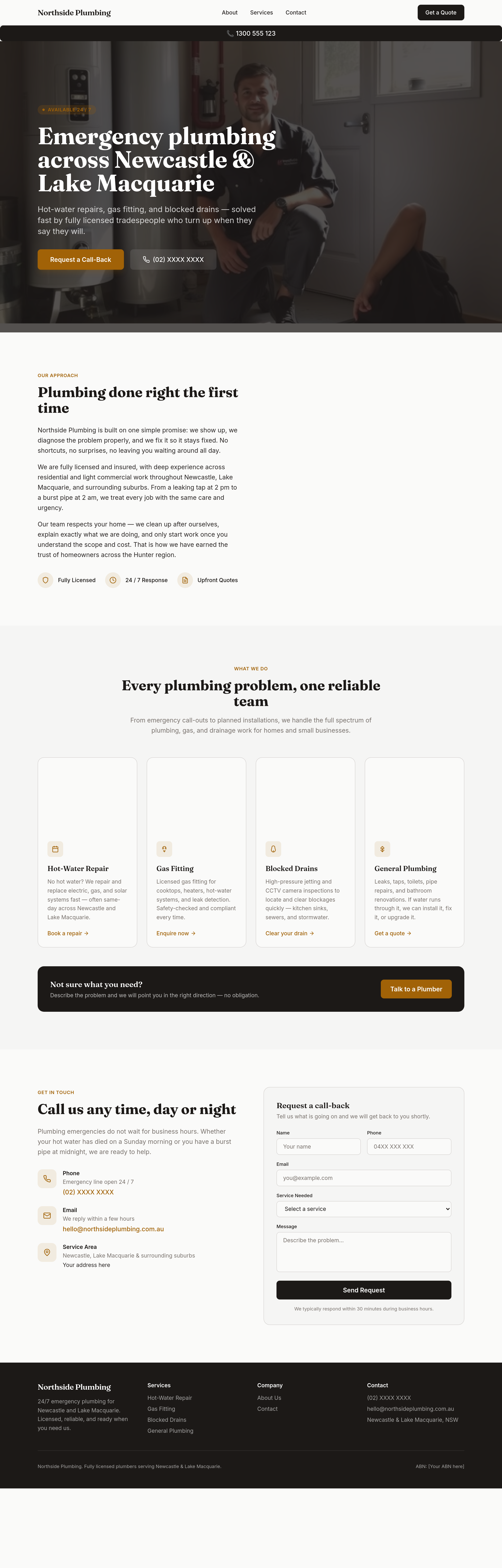
After
sticky phone button bottom-right on mobile that becomes a header bar on desktop
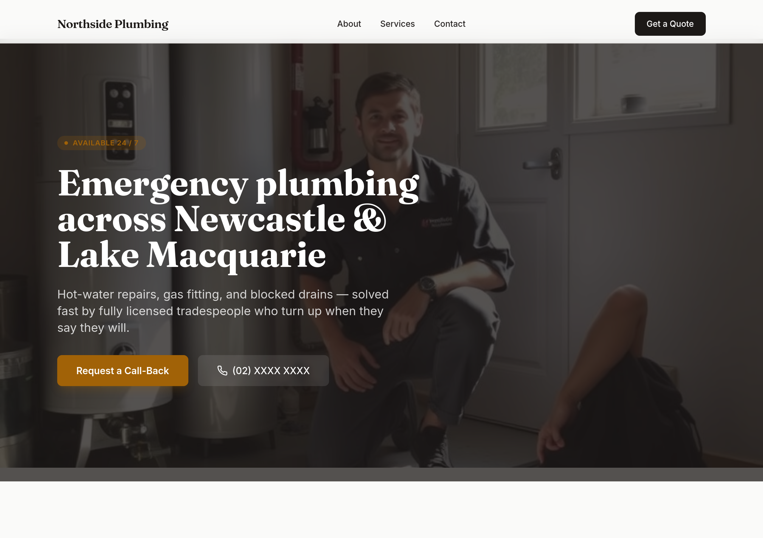
Before
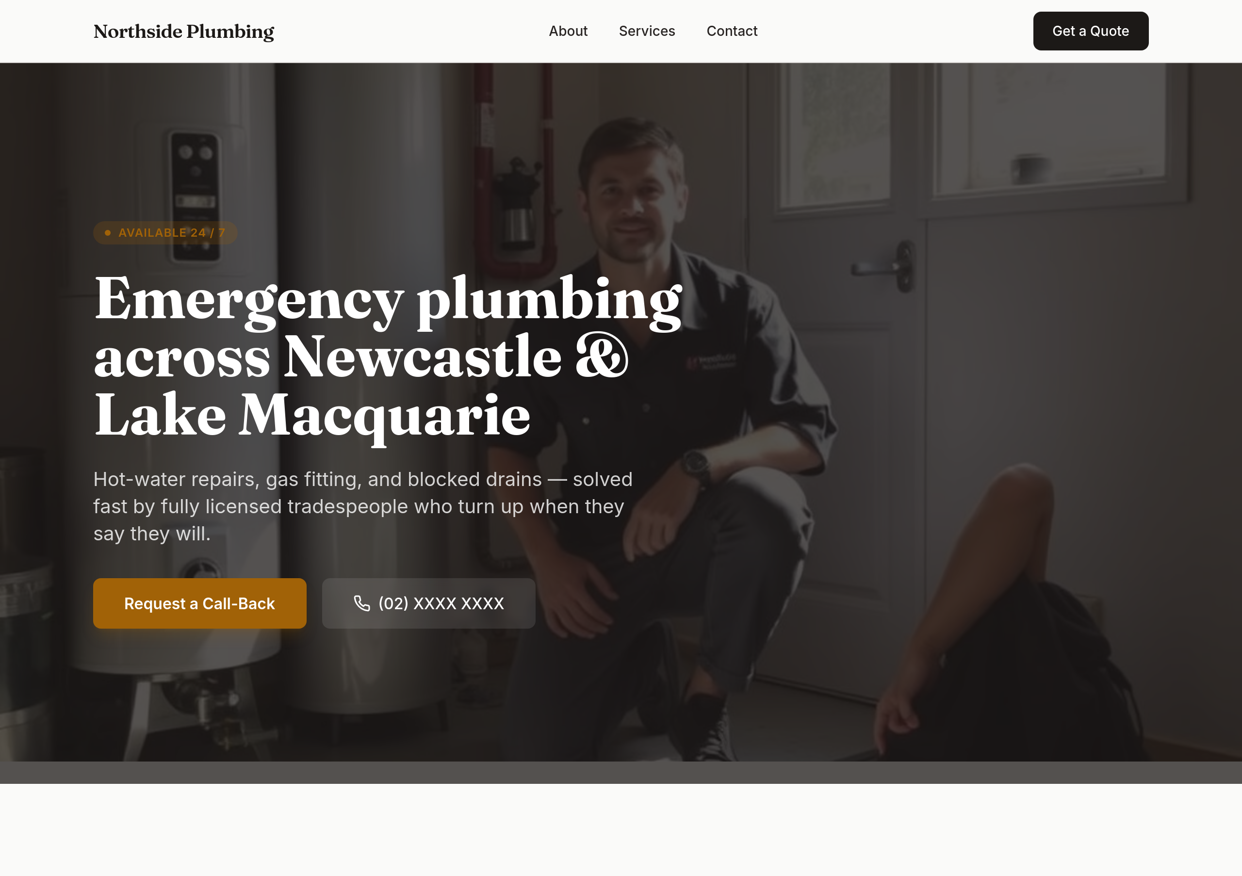
After
the colours are flat — use bold orange + dark navy for tradie confidence
Before
After
the colours are flat — use bold orange + dark navy for tradie confidence
Before
After
the colours are flat — use bold orange + dark navy for tradie confidence
Before
After
the colours are flat — use bold orange + dark navy for tradie confidence
Before
After
the colours are flat — use bold orange + dark navy for tradie confidence
Before
After
the colours are flat — use bold orange + dark navy for tradie confidence
Before
After
the colours are flat — use bold orange + dark navy for tradie confidence

Before

After
the colours are too saturated — soften to cream + dusty rose
Before
After
the colours are too saturated — soften to cream + dusty rose
Before
After
the colours are too saturated — soften to cream + dusty rose
Before
After
the colours are too saturated — soften to cream + dusty rose
Before
After
the colours are too saturated — soften to cream + dusty rose
Before
After
the colours are too saturated — soften to cream + dusty rose
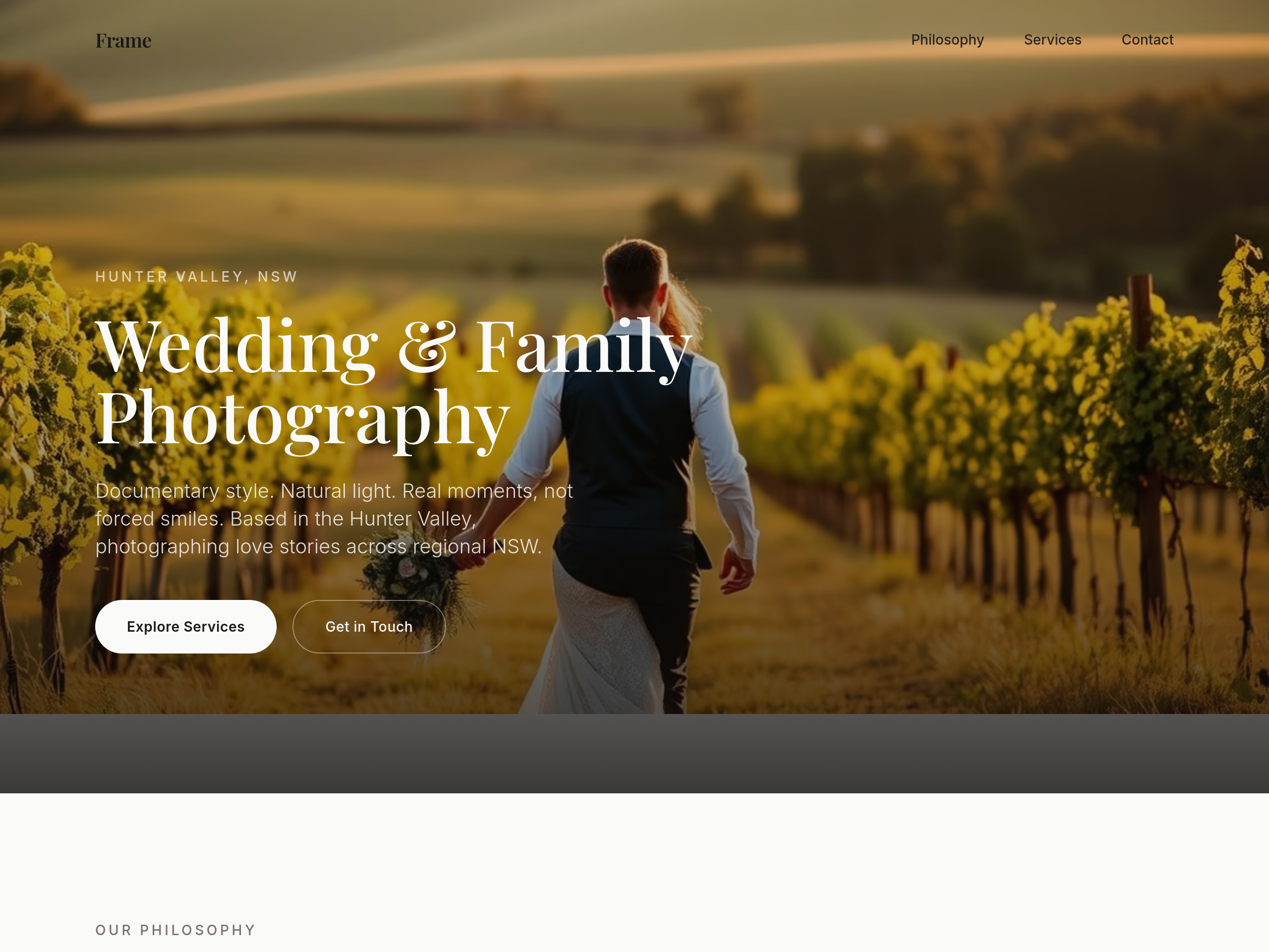
Before
After
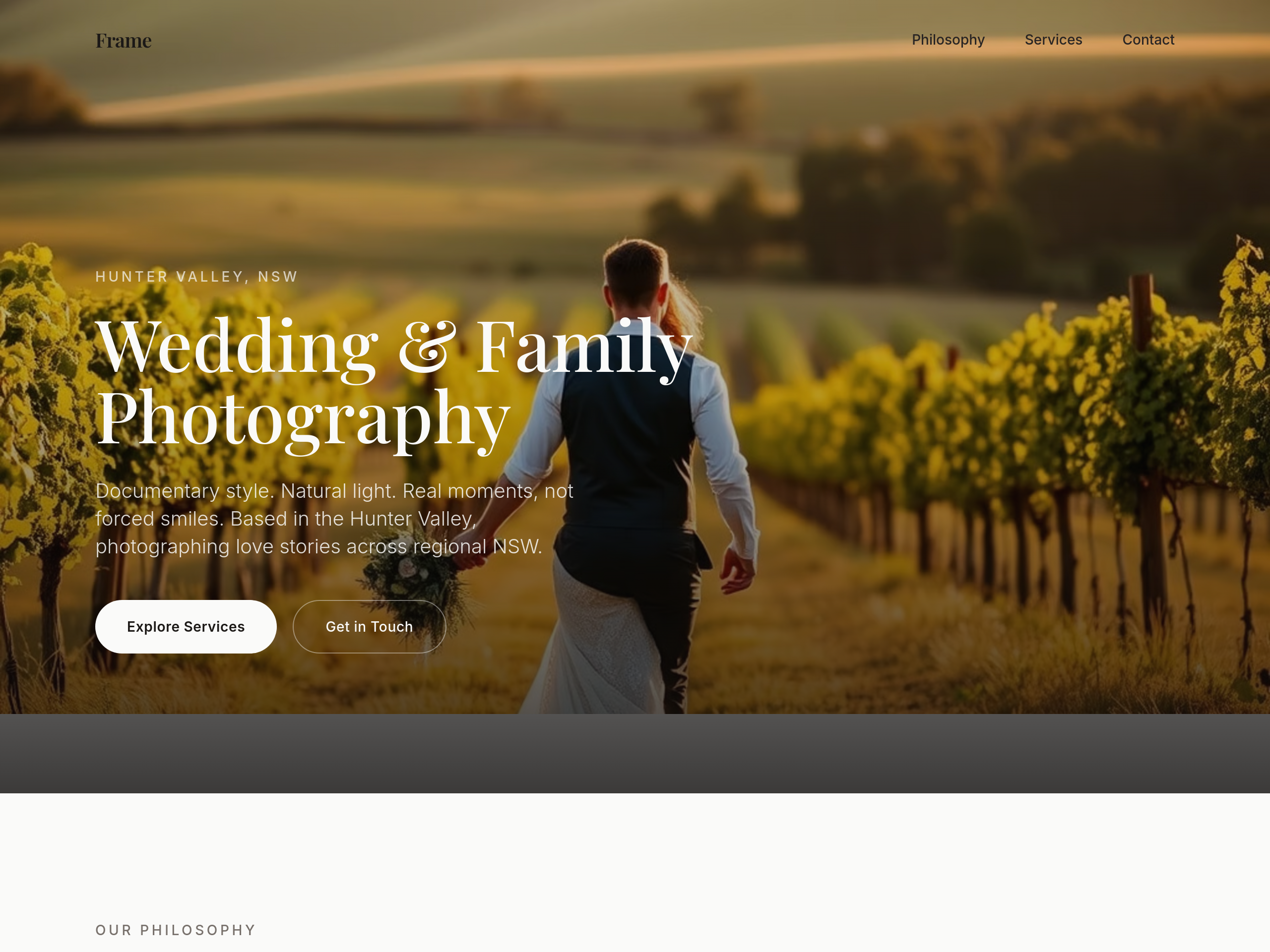
use a serif heading font — feels more editorial
Before
After
use a serif heading font — feels more editorial
Before
After
use a serif heading font — feels more editorial
Before
After
use a serif heading font — feels more editorial
Before
After
use a serif heading font — feels more editorial
Before
After
use a serif heading font — feels more editorial
Before
After
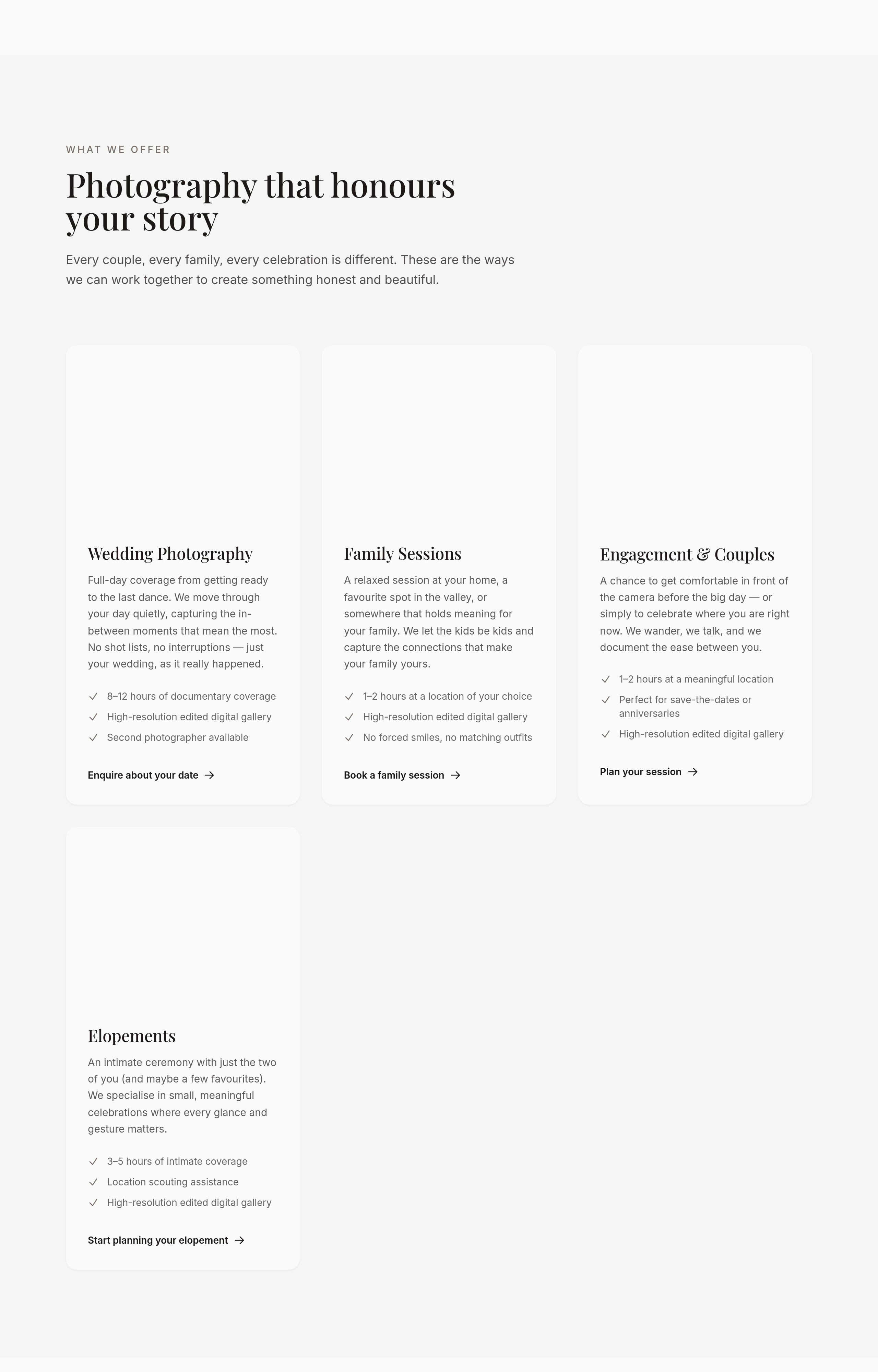
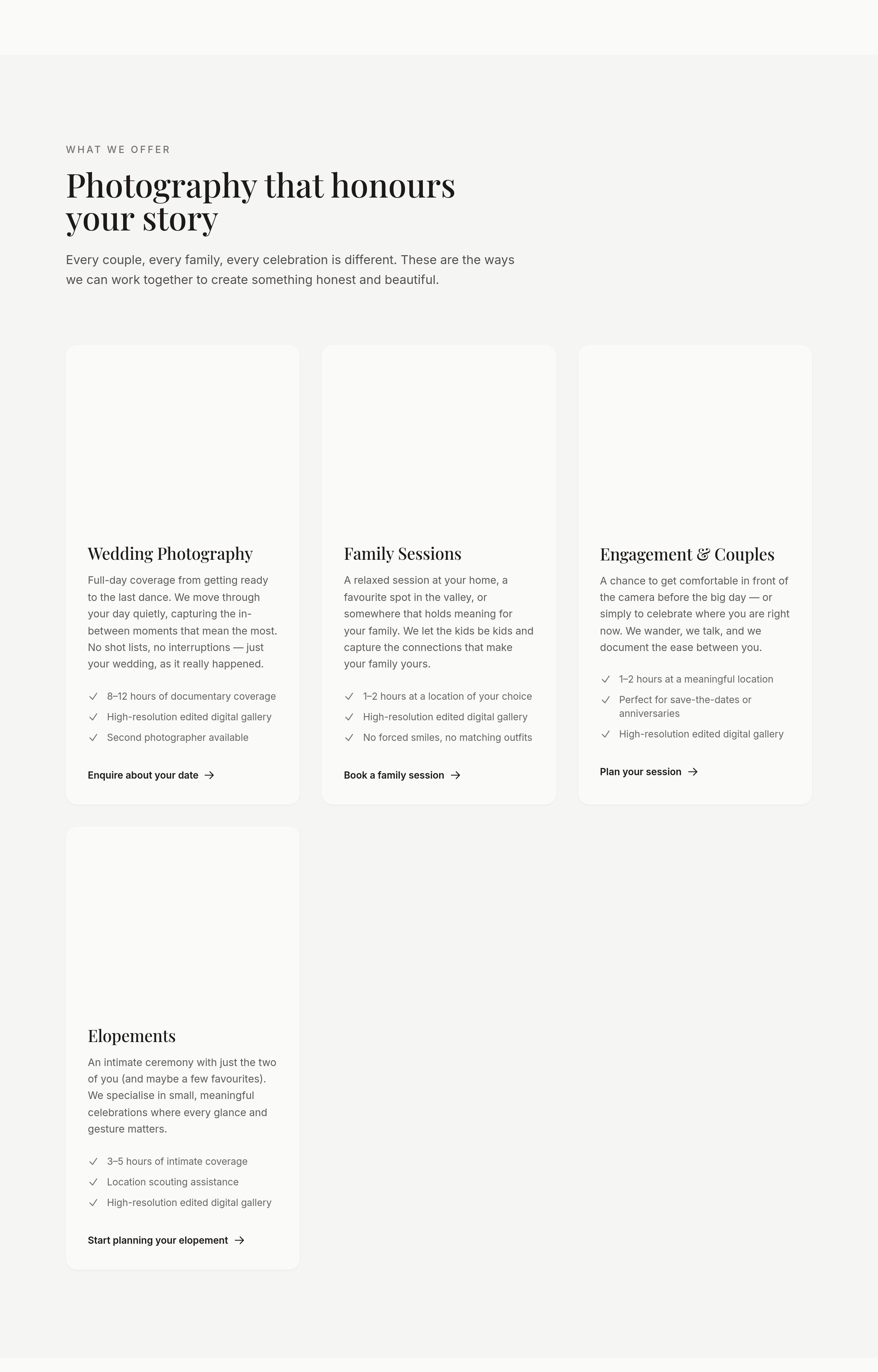
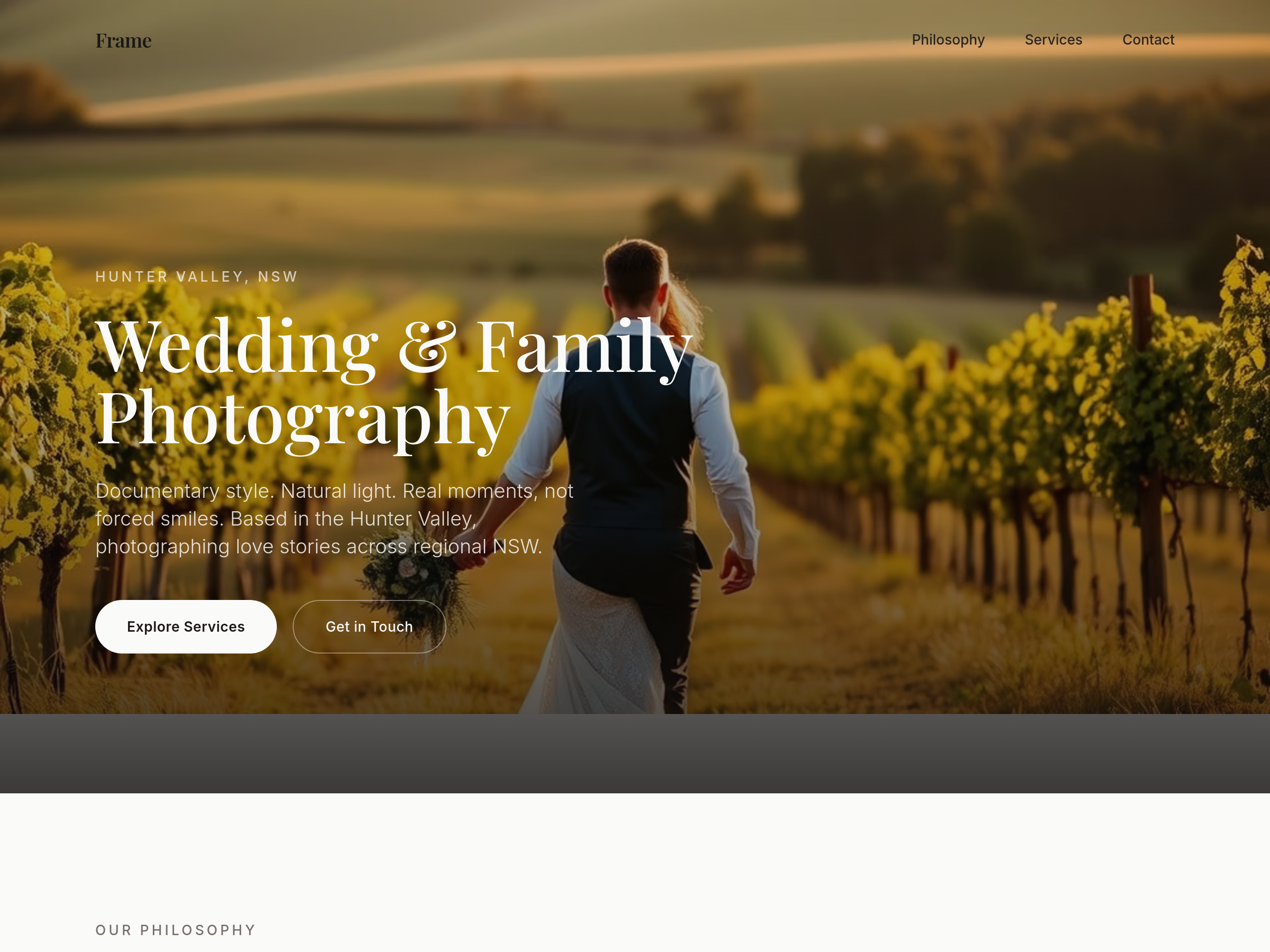
the portfolio should be a masonry grid, not uniform tiles
Before
After
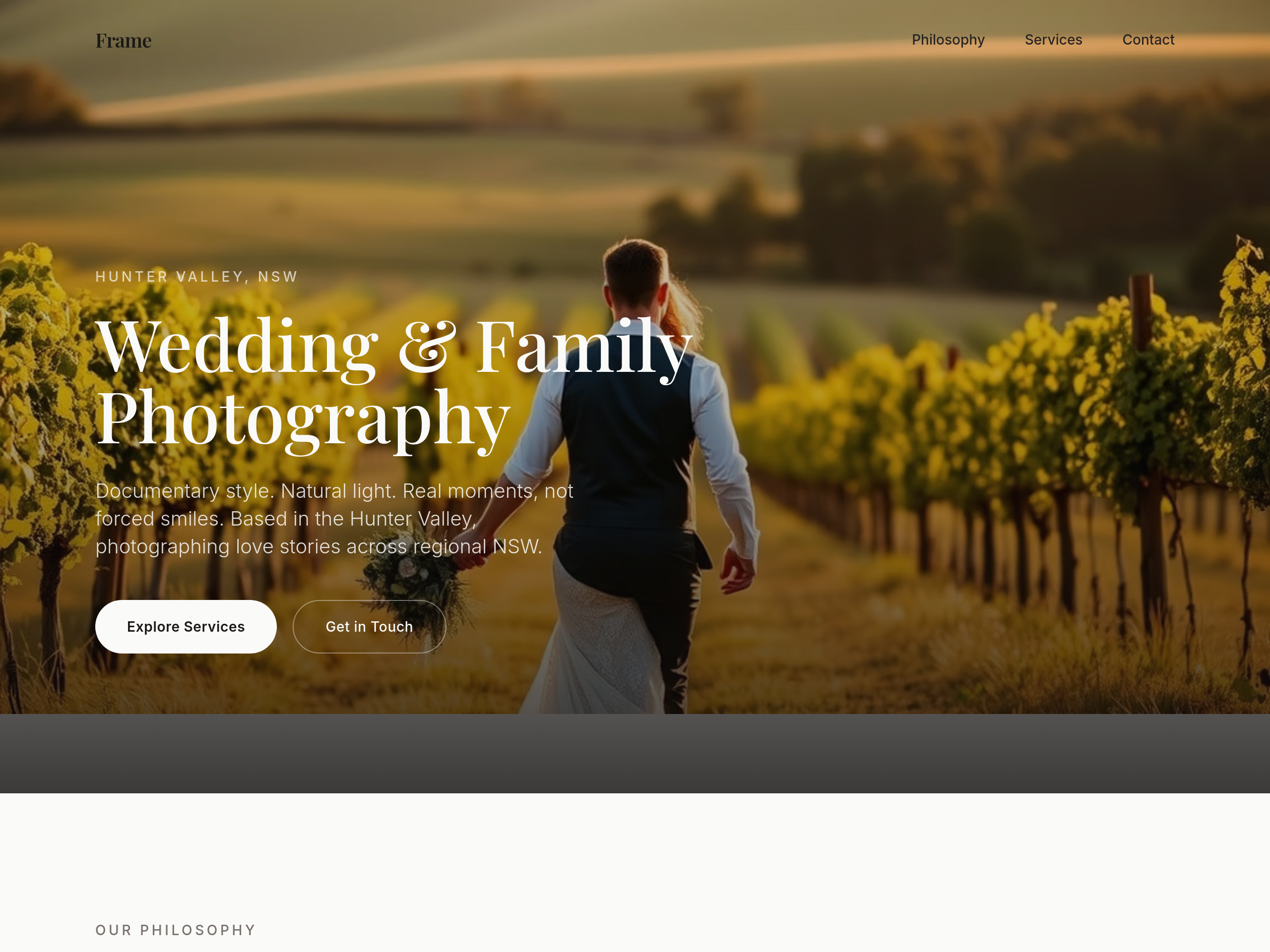
the type is too modern — switch headings to a classic serif (think editorial wedding magazine)
Before
After
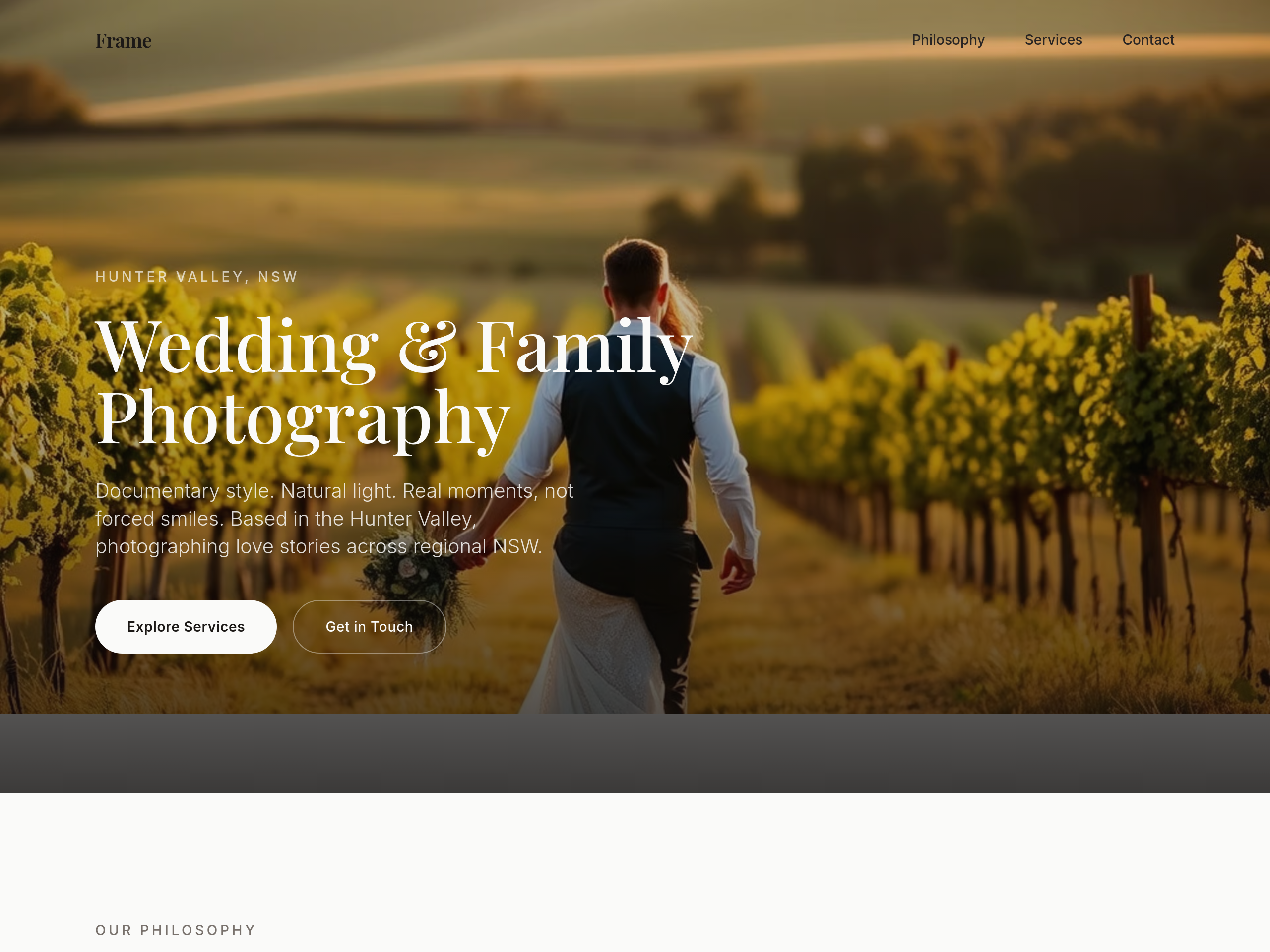
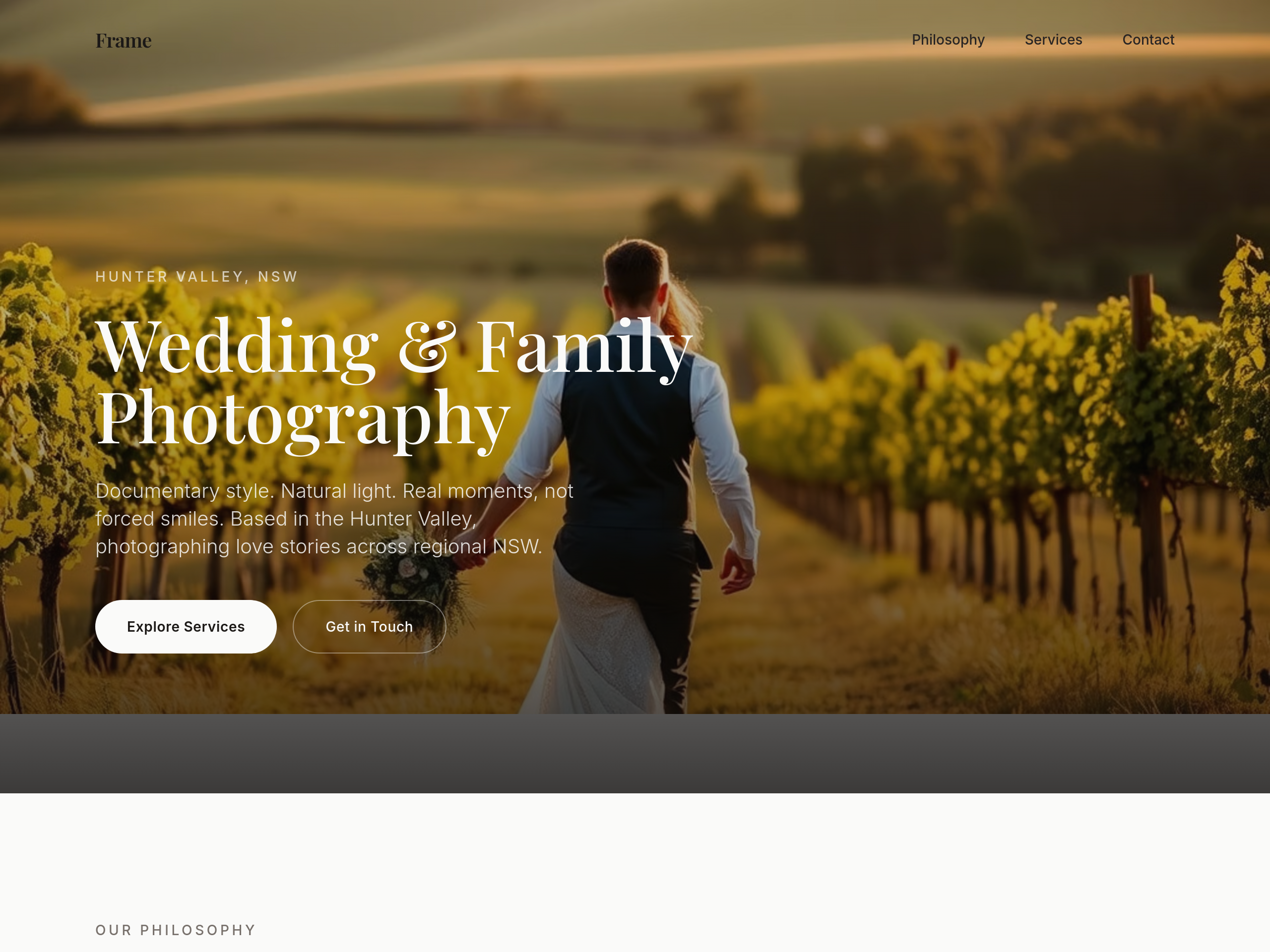
the type is too modern — switch headings to a classic serif (think editorial wedding magazine)
Before
After
the type is too modern — switch headings to a classic serif (think editorial wedding magazine)
Before
After
the type is too modern — switch headings to a classic serif (think editorial wedding magazine)
Before
After
the type is too modern — switch headings to a classic serif (think editorial wedding magazine)
Before
After
the type is too modern — switch headings to a classic serif (think editorial wedding magazine)
Before
After
add subtle film grain texture as a CSS overlay on every image
Before
After
add subtle film grain texture as a CSS overlay on every image
Before
After
add subtle film grain texture as a CSS overlay on every image

Before

After
the colour palette is too cool — soften to ivory, dusty rose, warm grey
Before
After
the colour palette is too cool — soften to ivory, dusty rose, warm grey
Before
After
the colour palette is too cool — soften to ivory, dusty rose, warm grey
Before
After
the colour palette is too cool — soften to ivory, dusty rose, warm grey
Before
After
the colour palette is too cool — soften to ivory, dusty rose, warm grey
Before
After
the colour palette is too cool — soften to ivory, dusty rose, warm grey

Before

After
the body text feels small — bump from 16 to 18px
Before
After
the body text feels small — bump from 16 to 18px
Before
After
the body text feels small — bump from 16 to 18px

Before

After
all the headings are the same weight — vary: h1 700, h2 600, h3 500
Before
After
all the headings are the same weight — vary: h1 700, h2 600, h3 500
Before
After
all the headings are the same weight — vary: h1 700, h2 600, h3 500
Before
After
all the headings are the same weight — vary: h1 700, h2 600, h3 500
Before
After
all the headings are the same weight — vary: h1 700, h2 600, h3 500
Before
After
all the headings are the same weight — vary: h1 700, h2 600, h3 500

Before

After
the letter-spacing on headings is tight — add 0.5px tracking to balance the serif
Before
After
the letter-spacing on headings is tight — add 0.5px tracking to balance the serif
Before
After
the letter-spacing on headings is tight — add 0.5px tracking to balance the serif
Before
After
the letter-spacing on headings is tight — add 0.5px tracking to balance the serif
Before
After
the letter-spacing on headings is tight — add 0.5px tracking to balance the serif
Before
After
the letter-spacing on headings is tight — add 0.5px tracking to balance the serif

Before

After
the primary green clashes with the accent yellow — pick a softer accent
Before
After
the primary green clashes with the accent yellow — pick a softer accent
Before
After
the primary green clashes with the accent yellow — pick a softer accent
Before
After
the primary green clashes with the accent yellow — pick a softer accent
Before
After
the primary green clashes with the accent yellow — pick a softer accent
Before
After
the primary green clashes with the accent yellow — pick a softer accent

Before

After
text-on-coloured-backgrounds is unreadable — bump contrast to WCAG AA
Before
After
text-on-coloured-backgrounds is unreadable — bump contrast to WCAG AA
Before
After
text-on-coloured-backgrounds is unreadable — bump contrast to WCAG AA
Before
After
text-on-coloured-backgrounds is unreadable — bump contrast to WCAG AA
Before
After
text-on-coloured-backgrounds is unreadable — bump contrast to WCAG AA
Before
After
text-on-coloured-backgrounds is unreadable — bump contrast to WCAG AA
Before
After
text-on-coloured-backgrounds is unreadable — bump contrast to WCAG AA

Before

After
the hero is too tall — reduce padding-top to 96px from 200px

Before

After
the cards have hard 1px borders — switch to soft 2px shadows for depth

Before

After
buttons have sharp corners — round to 8px for friendlier feel
Before
After
buttons have sharp corners — round to 8px for friendlier feel

Before

After
images have no border-radius — round to 12px for a cohesive look
Before
After
images have no border-radius — round to 12px for a cohesive look
Before
After
images have no border-radius — round to 12px for a cohesive look

Before

After
add a kraft-paper texture to the contact section for warmth

Before

After
buttons have no hover state — add subtle lift + darker shade
Before
After
buttons have no hover state — add subtle lift + darker shade

Before

After
images in the gallery should zoom slightly on hover (1.05x)

Before

After
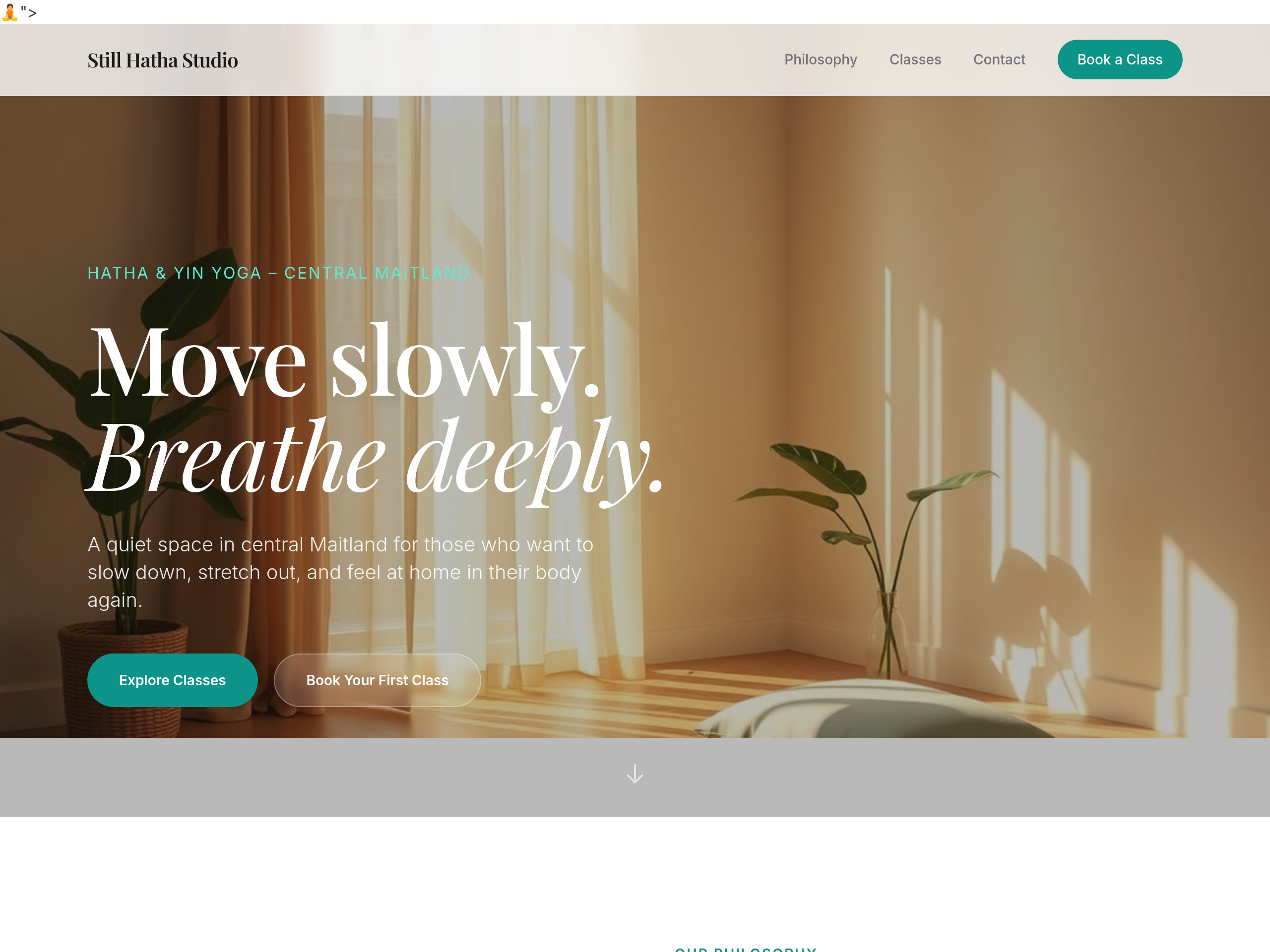
the CTAs are static — add a gentle pulse on the primary button
Before
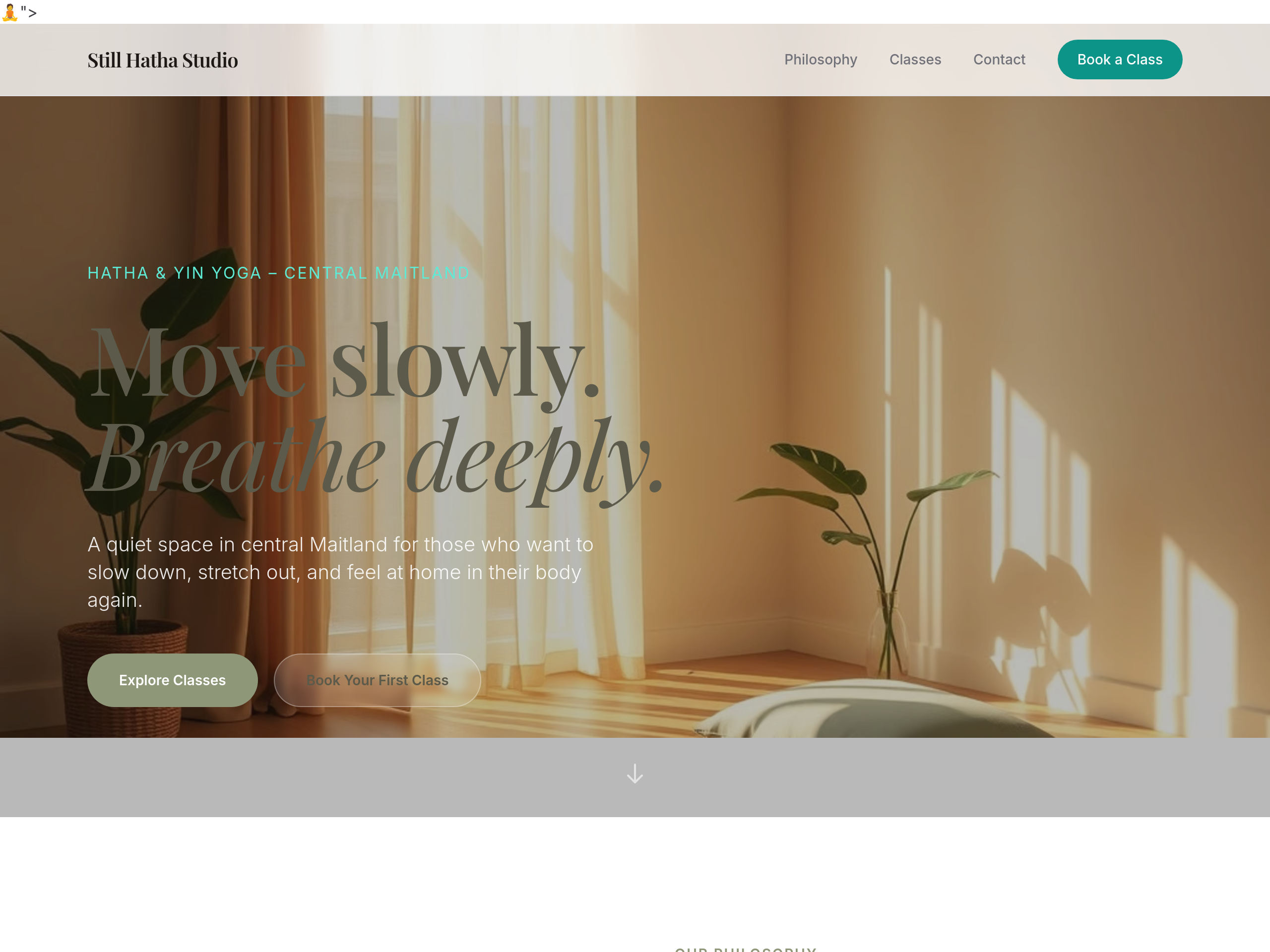
After
the palette is too pink — use earthy sage + warm linen tones
Before
After
the palette is too pink — use earthy sage + warm linen tones
Before
After
the palette is too pink — use earthy sage + warm linen tones
Before
After
the palette is too pink — use earthy sage + warm linen tones
Before
After
the palette is too pink — use earthy sage + warm linen tones
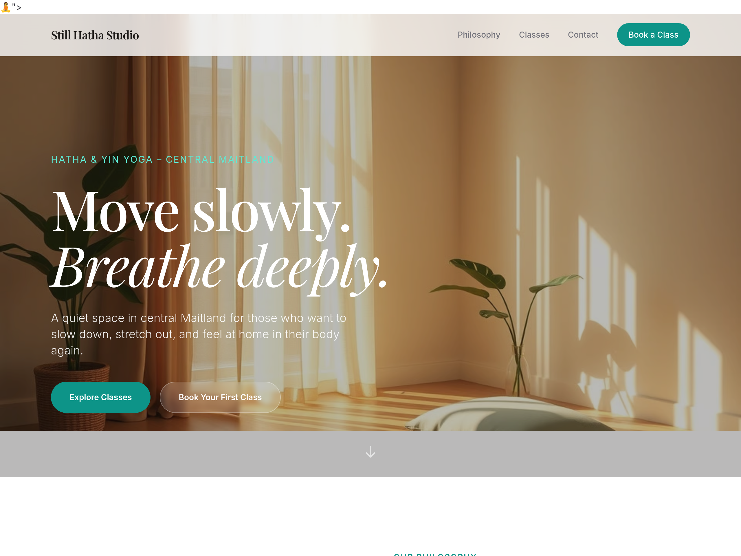
Before
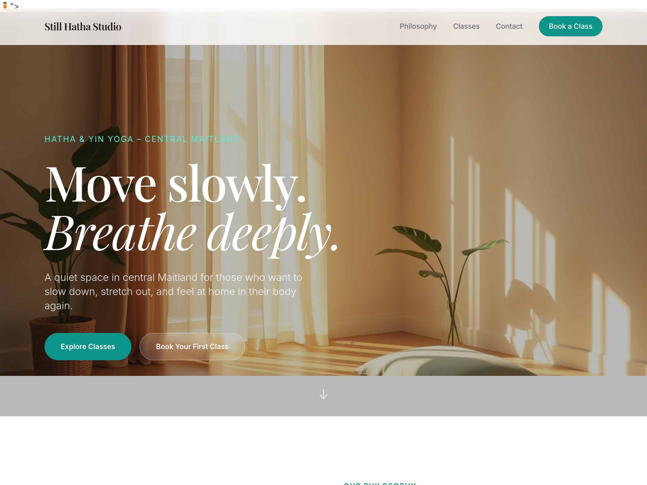
After
use a soft serif for headings — feels more grounded
Before
After
use a soft serif for headings — feels more grounded
Before
After
use a soft serif for headings — feels more grounded
Before
After
use a soft serif for headings — feels more grounded
Before
After
use a soft serif for headings — feels more grounded
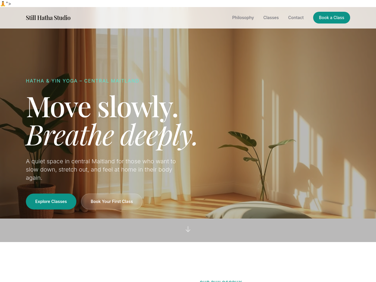
Before
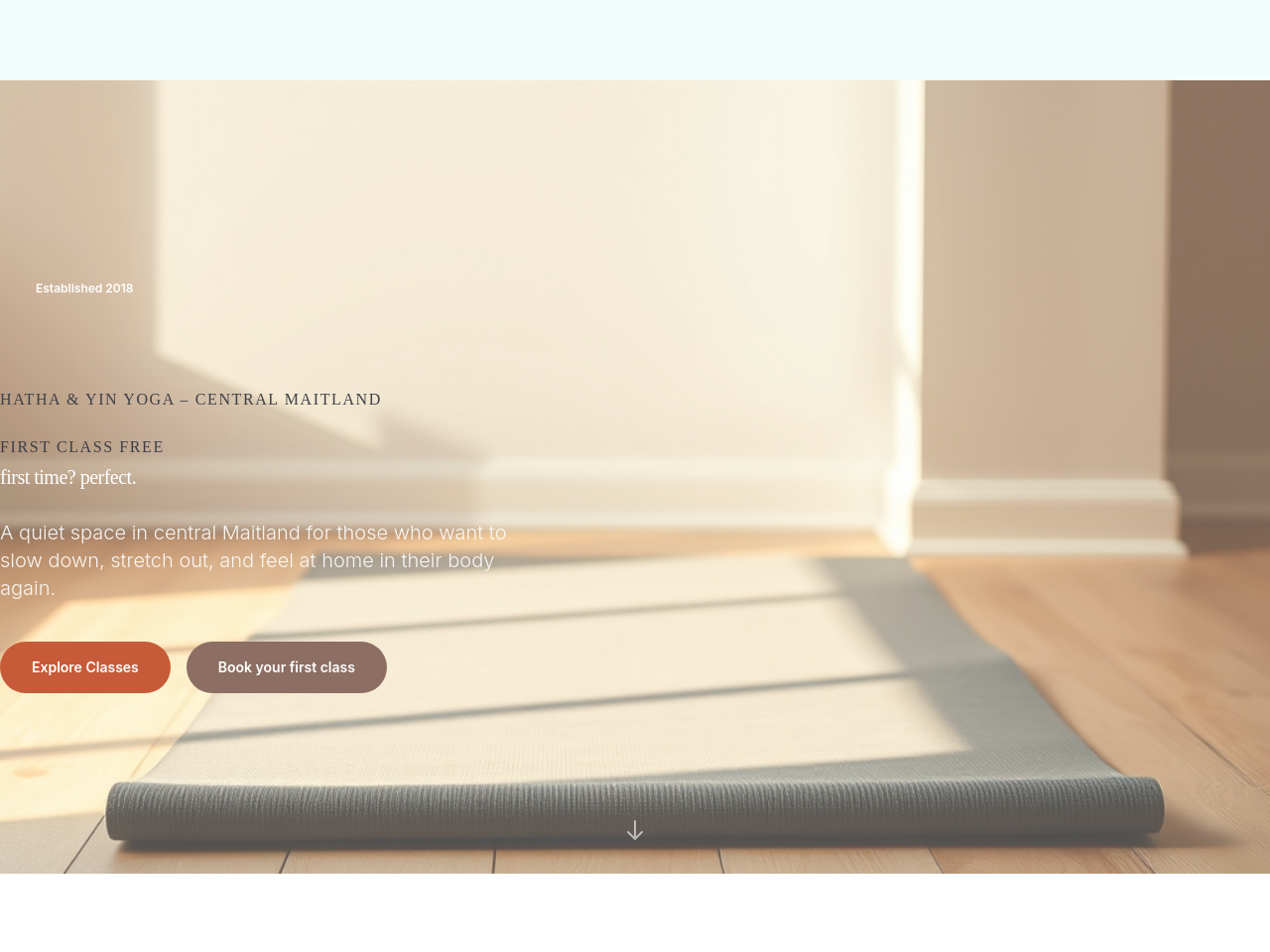
After
add 'Book your first class' CTA in the hero — make it warm not urgent
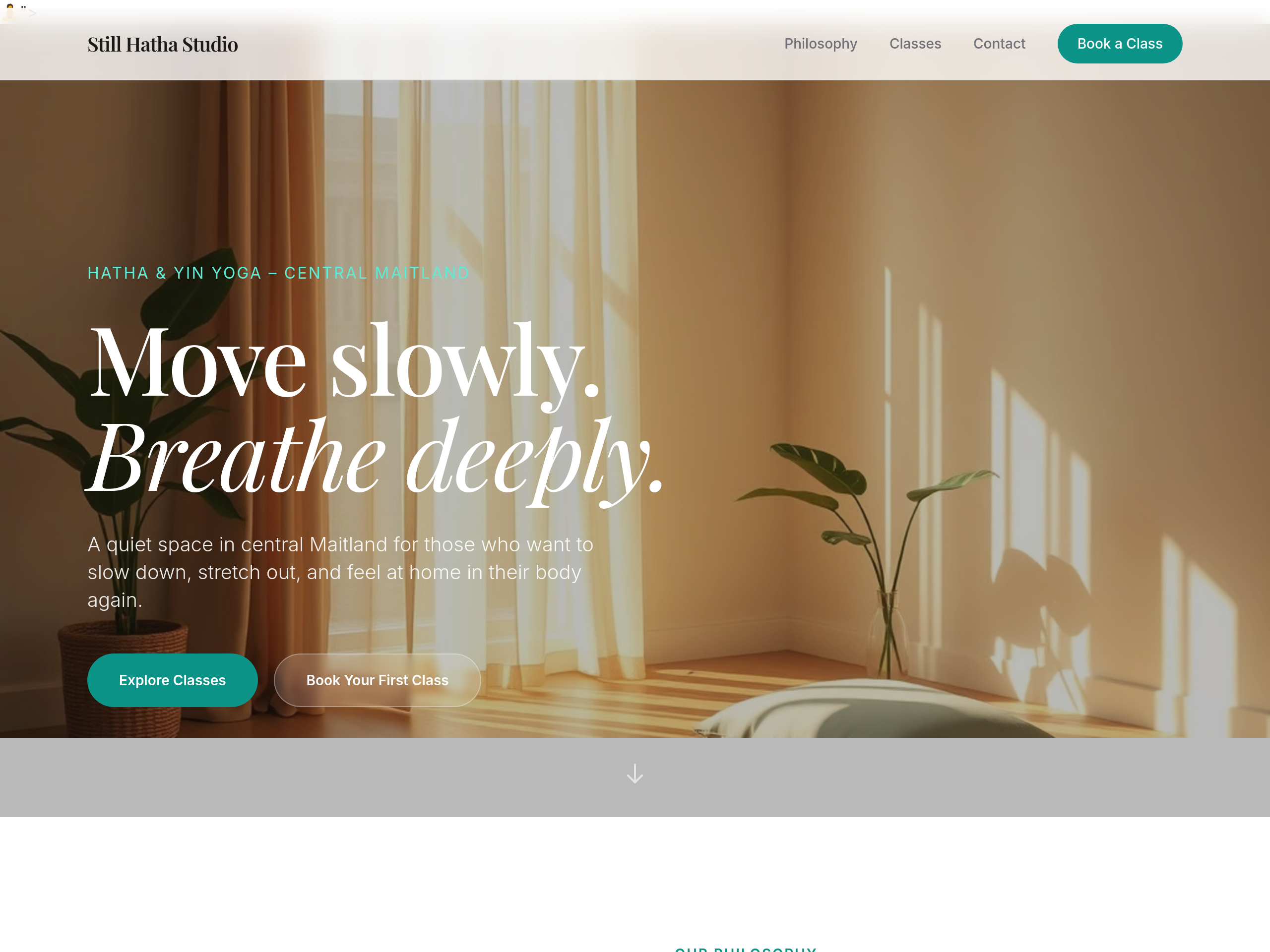
Before
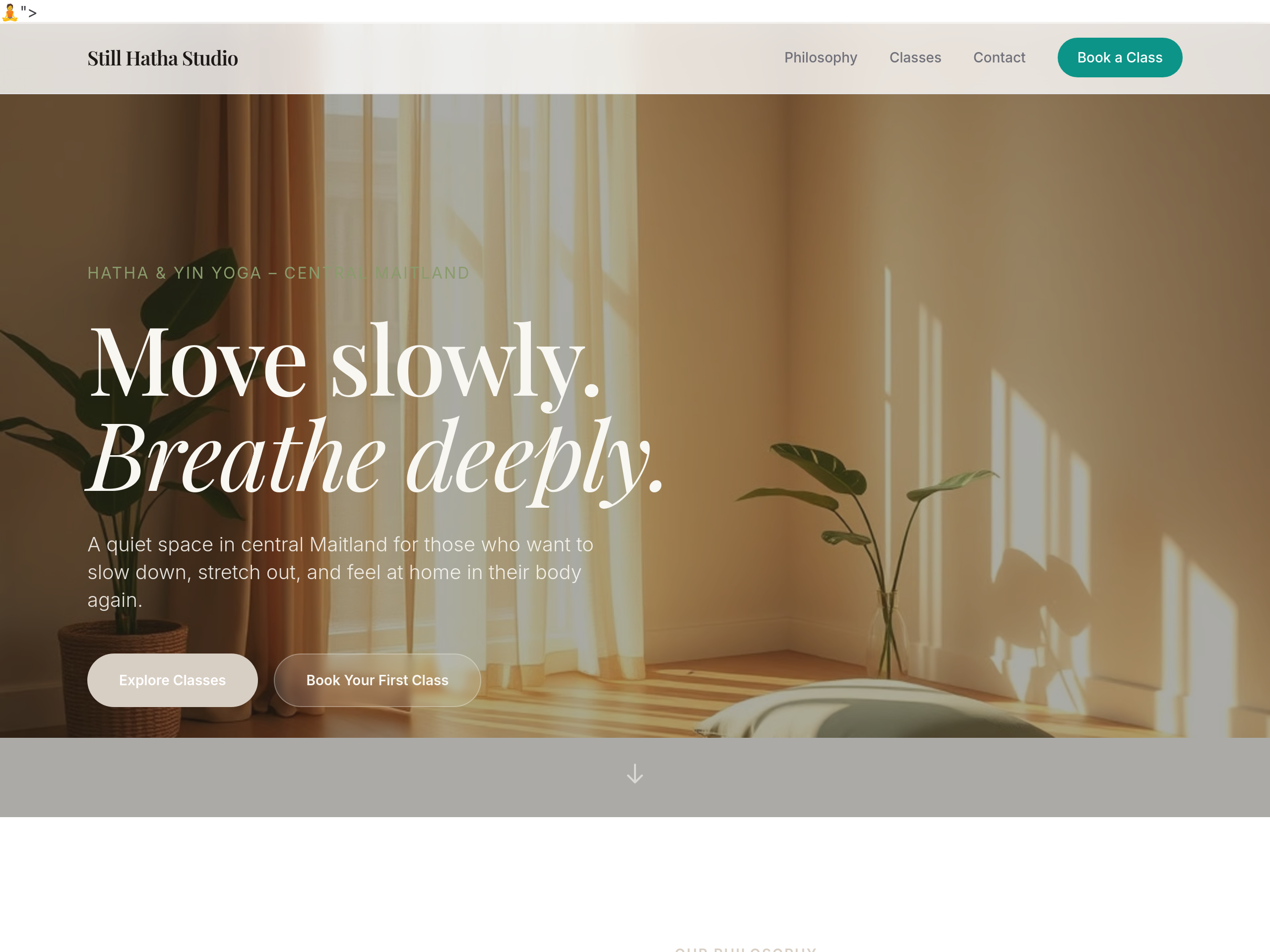
After
the colour palette is too pink — warm earthy sage + dusty linen tones
Before
After
the colour palette is too pink — warm earthy sage + dusty linen tones
Before
After
the colour palette is too pink — warm earthy sage + dusty linen tones
Before
After
the colour palette is too pink — warm earthy sage + dusty linen tones
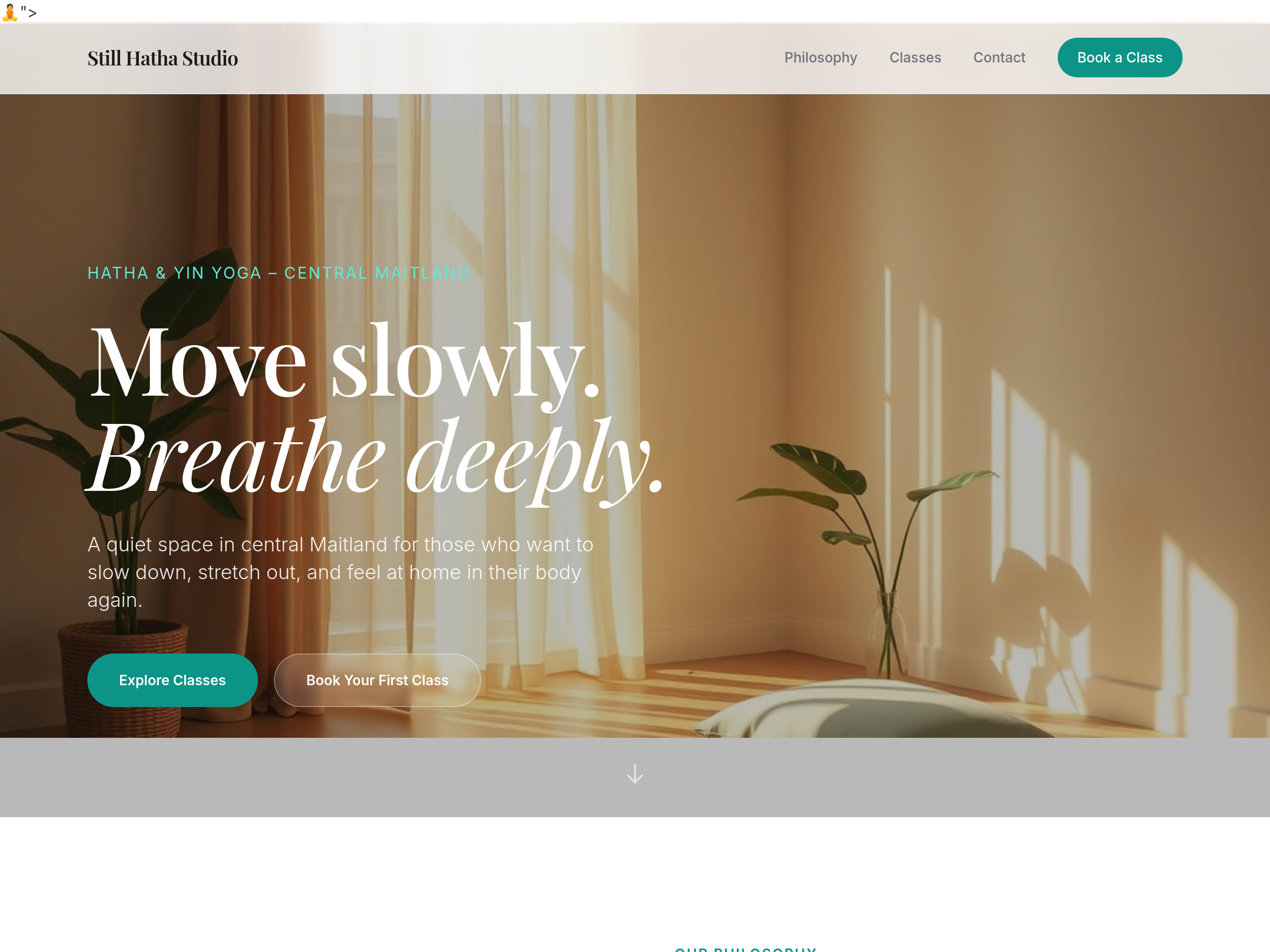
Before
After
the colour palette is too pink — warm earthy sage + dusty linen tones
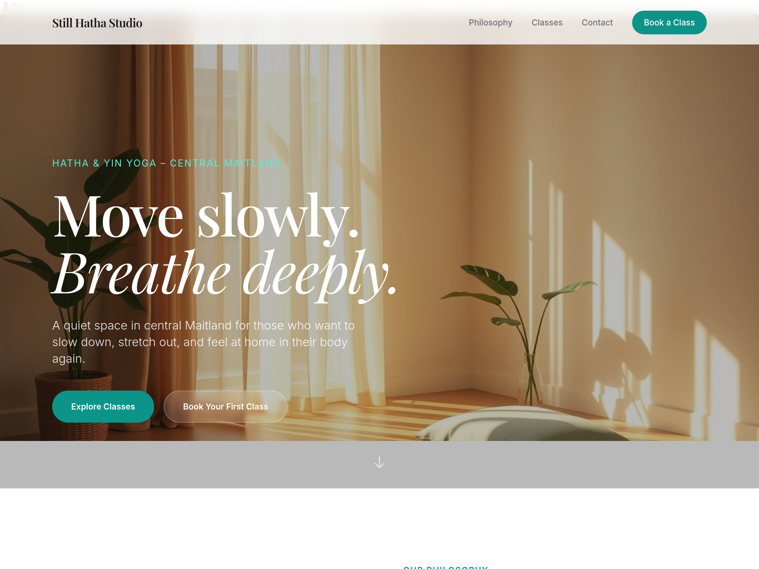
Before
After
the headings feel commercial — use a soft humanist serif
Before
After
the headings feel commercial — use a soft humanist serif
Before
After
the headings feel commercial — use a soft humanist serif
Before
After
the headings feel commercial — use a soft humanist serif
Before
After
the headings feel commercial — use a soft humanist serif