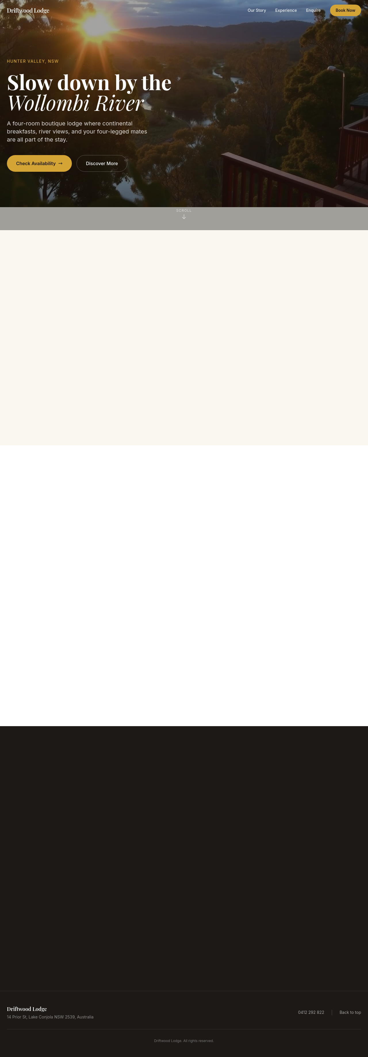
on mobile the hero is too tall — let it auto-fit instead of 100vh

Agent's response
I’ve updated the **hero** section on `index.html` so its height now auto‑fits content instead of using a fixed 100 vh minimum. The change replaces the `min-h-screen` class with an inline `style="min-height: auto;"` on the section tag, allowing the hero to shrink to the height of its content on mobile.
The edit is saved as a draft—please review it in the editor and publish when ready.
Tool calls
list_sections step 1
{
  "page": "index.html"
}
read_section step 2
{
  "page": "index.html",
  "section": "hero"
}
update_section step 3
{
  "page": "index.html",
  "section": "hero",
  "html": "<section id=\"hero\" class=\"relative flex items-center overflow-hidden\" data-flare-id=\"e9925757e3aa\" style=\"min-height: auto;\">\n    <div class=\"absolute inset-0\">\n      <div class=\"swiper mySwiper\">\n        <div class=\"swiper-wrapper\">\n          <div class=\"swiper-slide\"><img src=\"/images/ai-1779243439699-river-view-dawn.png\" alt=\"River view dawn\"></div>\n          <div class=\"swiper-slide\"><img src=\"/images/ai-1779243445701-breakfast-plate.png\" alt=\"Breakfast plate\"></div>\n          <div class=\"swiper-slid