sticky phone button bottom-right on mobile that becomes a header bar on desktop
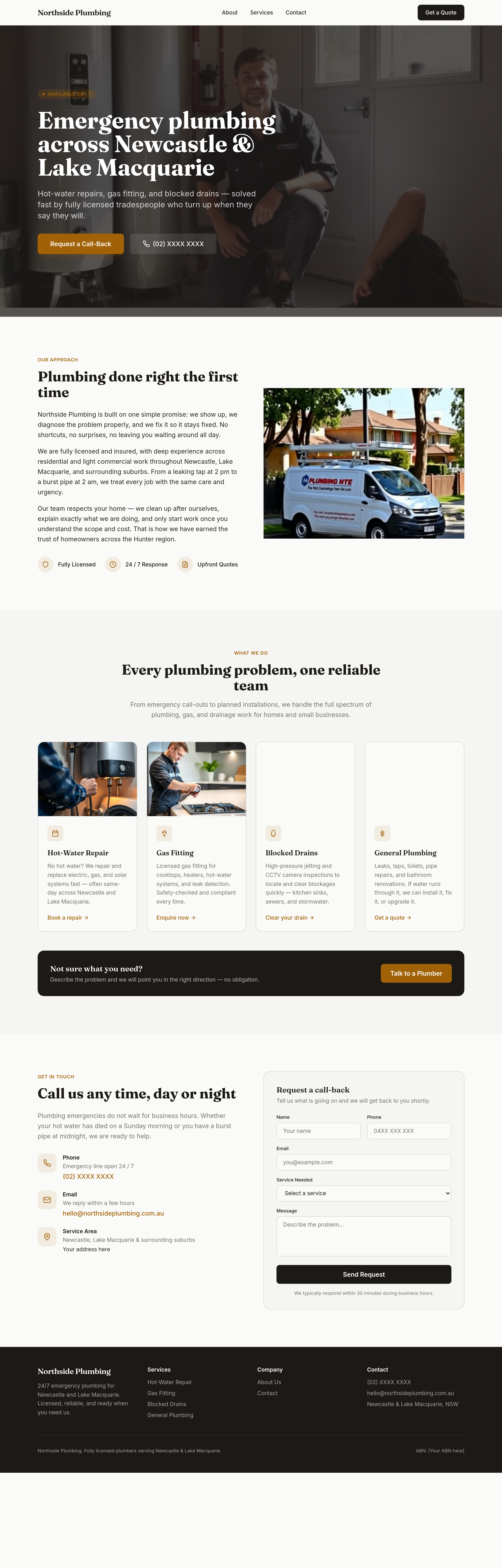
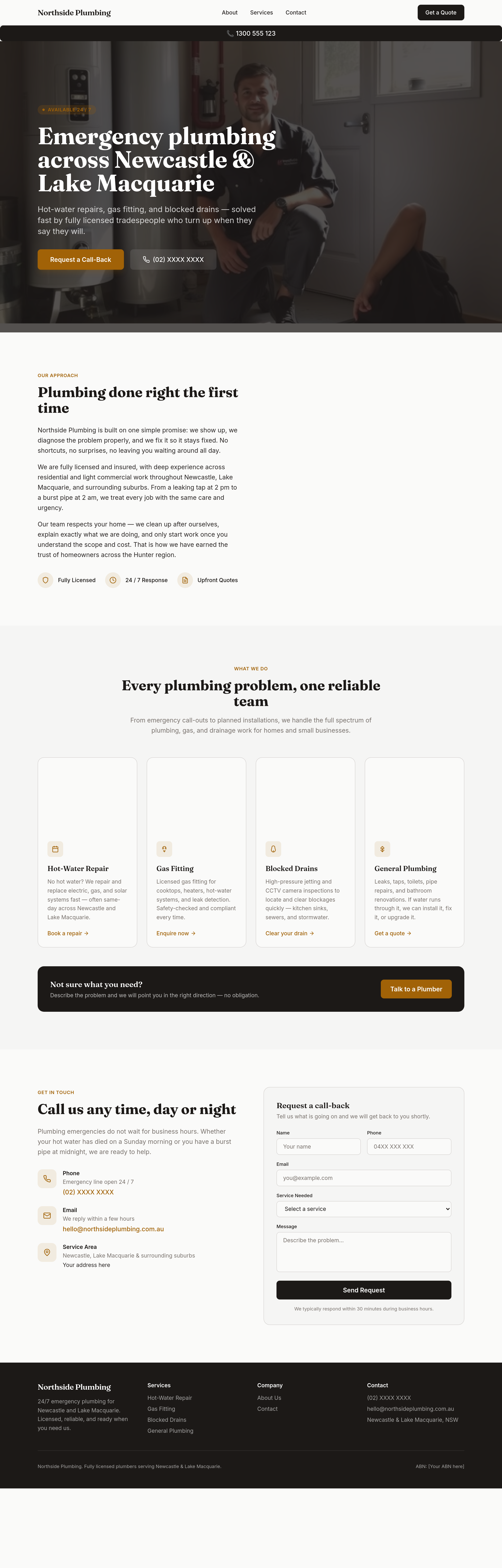
Agent's response
I’ve added a new “phone‑sticky” section just below the site header. It contains a telephone link (📞 1300 555 123 – replace with your real number) that:
* On mobile (≤ 767 px) appears as a fixed button in the bottom‑right corner.
* On desktop (≥ 768 px) expands into a full‑width fixed bar at the top of the page, matching your site’s primary colours.
The section and its responsive styling are now in the draft ready for you to review and publish. Let me know if you’d like to adjust the breakpoint, colours, or the phone number itself.
Tool calls
list_partials step 1
{}
list_sections step 2
{
  "page": "index.html"
}
read_section step 3
{
  "page": "index.html",
  "section": "header"
}
add_section step 4
{
  "page": "index.html",
  "name": "phone-sticky",
  "label": "Phone sticky button / header bar",
  "html": "<section class=\"phone-bar\">\n  <a href=\"tel:1300555123\" class=\"block bg-primary text-white px-4 py-2 rounded-lg font-medium flex items-center justify-center gap-2\">\n    📞 1300 555 123\n  </a>\n</section>",
  "position": "after",
  "refSection": "header"
}
set_section_styles step 5
{
  "page": "index.html",
  "section": "phone-sticky",
  "css": ".phone-bar {\n  display: none;\n}\n/* Mobile: show as fixed bottom-right button */\n@media (max-width: 767px) {\n  .phone-bar {\n    display: flex;\n    position: fixed;\n    bottom: 1.5rem;\n    right: 1.5rem;\n    z-index: 999;\n  }\n}\n/* Desktop: show as header bar */\n@media (min-width: 768px) {\n  .phone-bar {\n    display: block;\n    position: fixed;\n    top: 0;\n    left: 0;\n    right: 0;\n    height: 4rem;\n    display: flex;\n    align-items: center;\n    justify-content: center;\n    z-index: 999;\n  }\n  .phone-bar