layout
30 examples.
Showing all 30
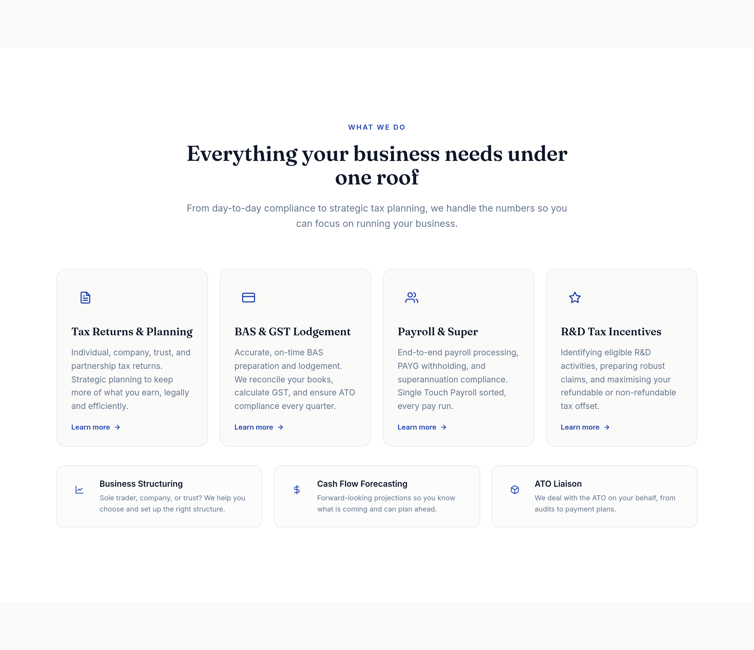
Before
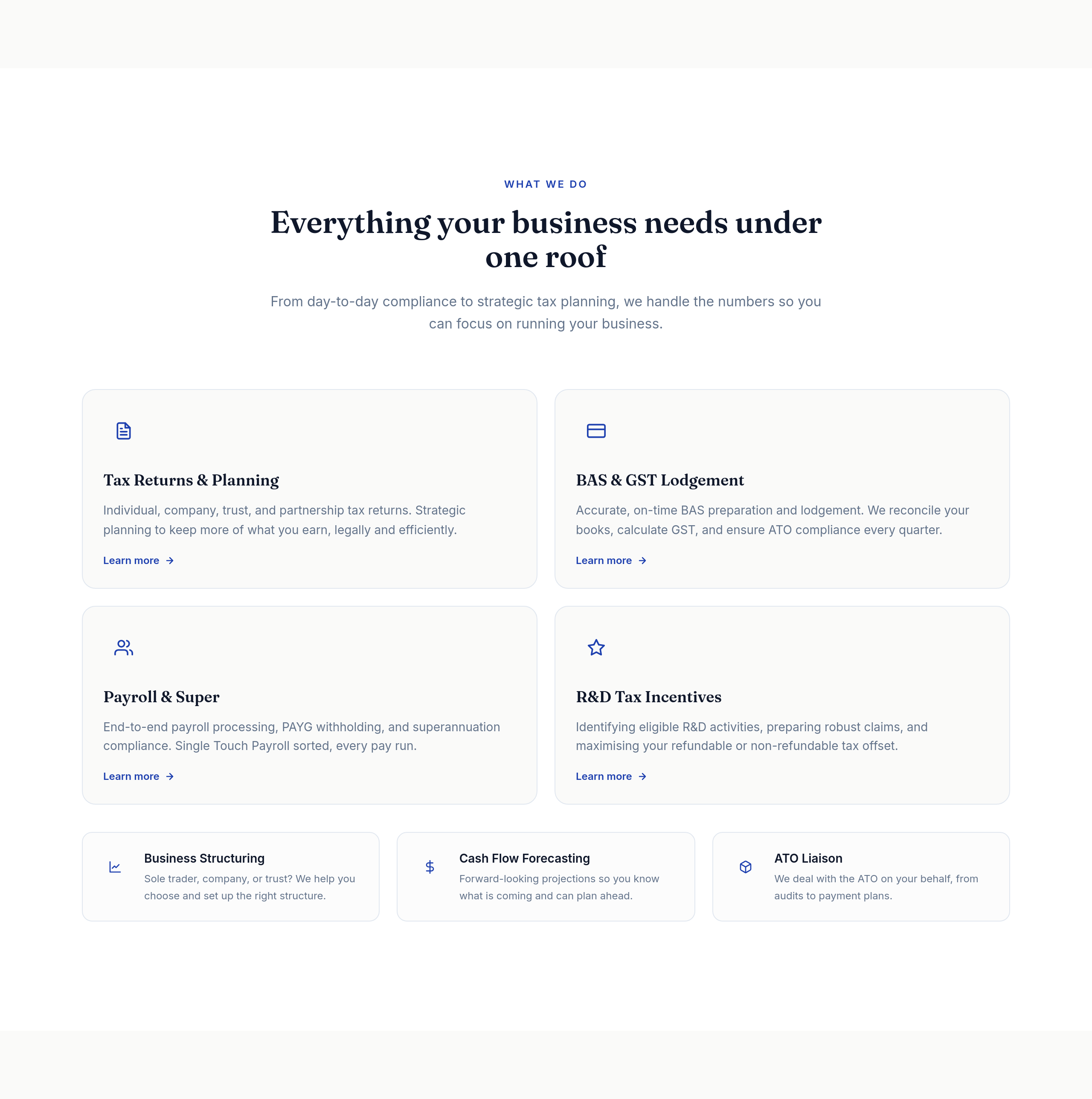
After
the services grid is 4 columns — too cramped, change to 2
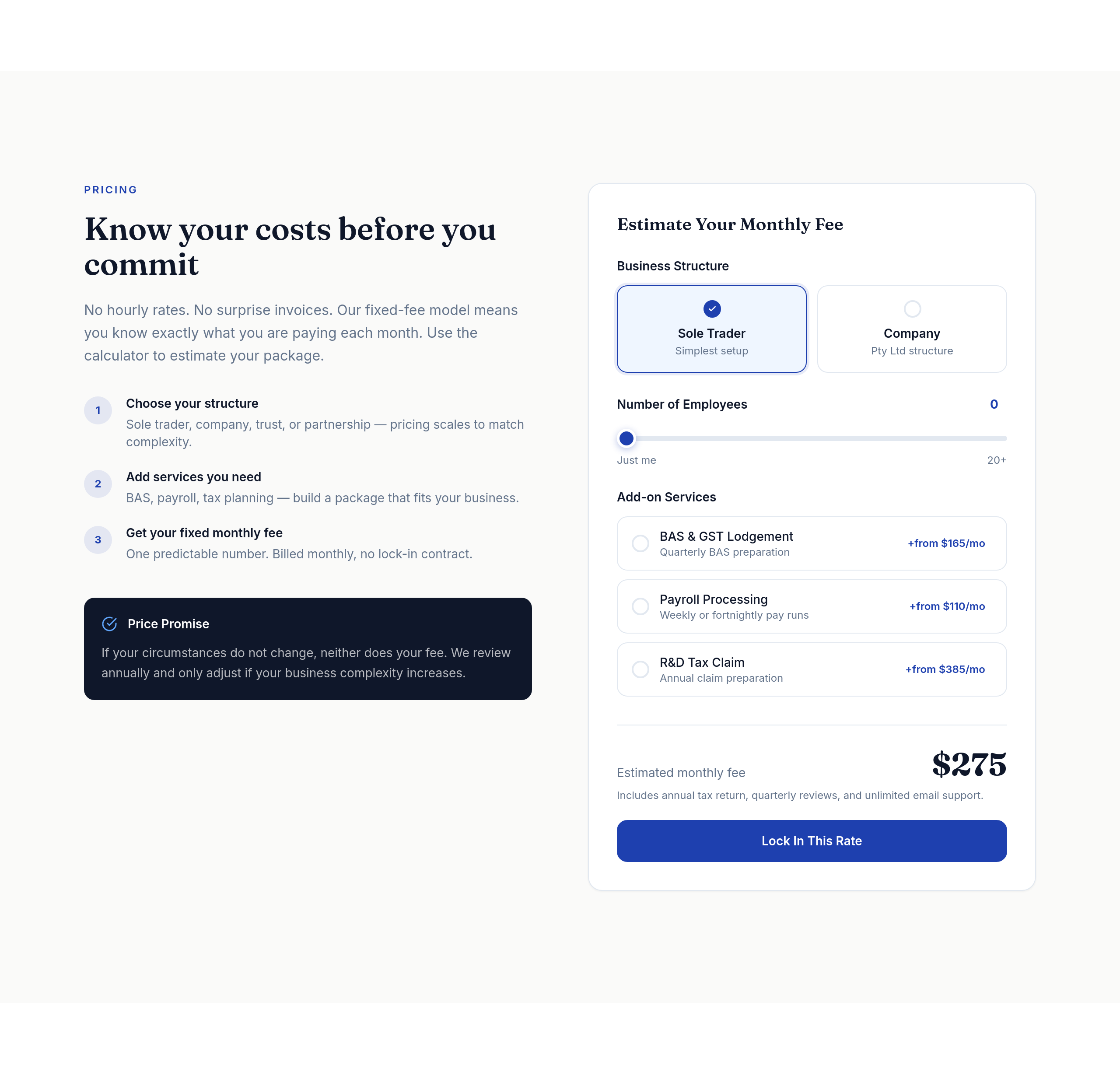
Before
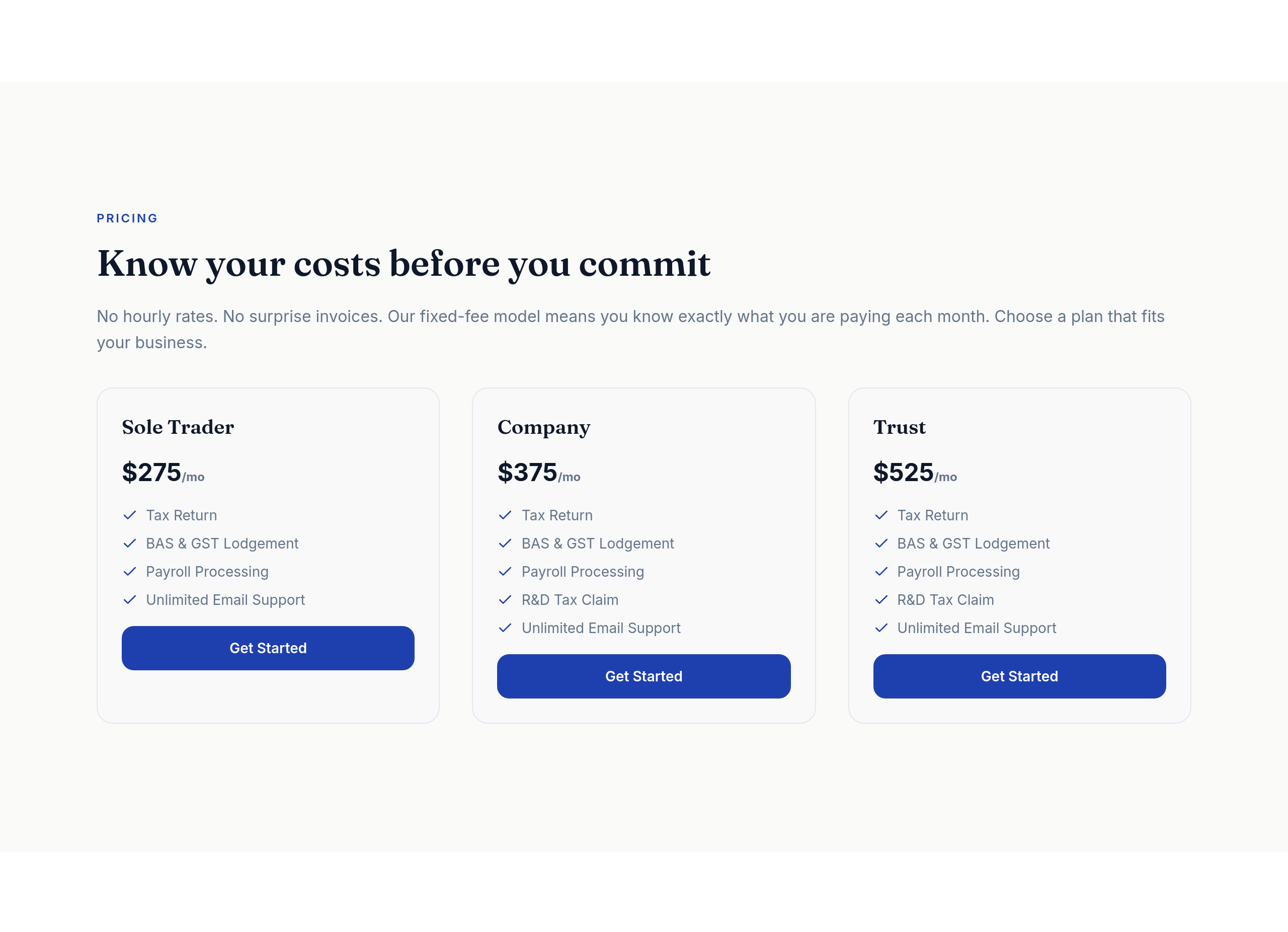
After
the pricing tiers should be a clear 3-column comparison table on desktop
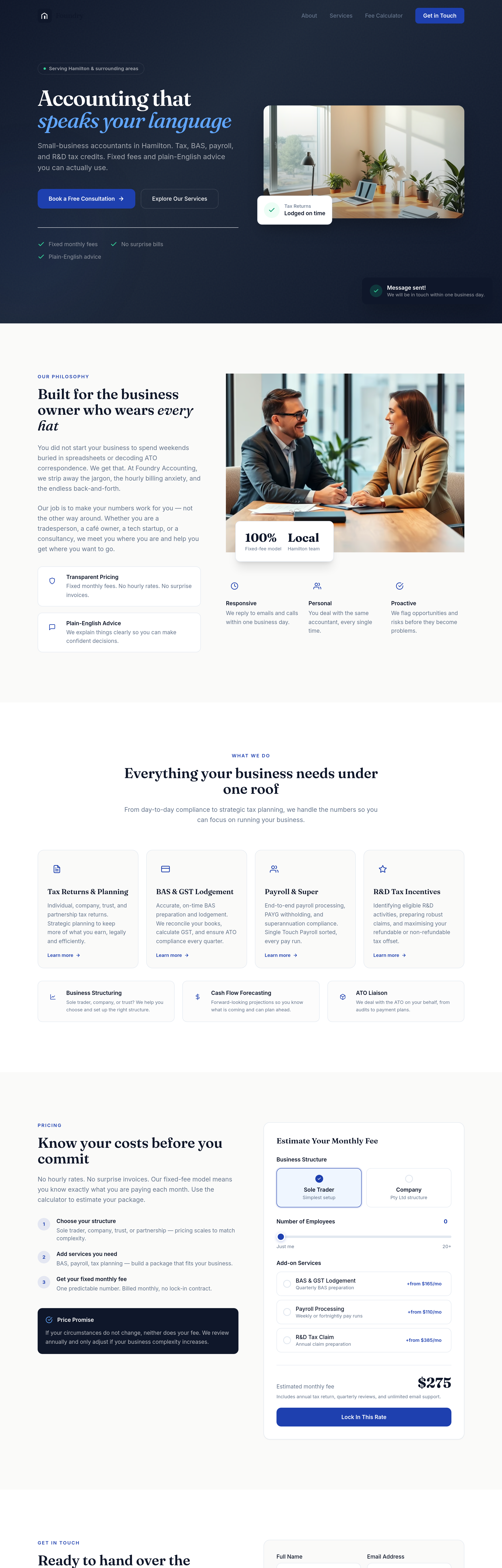
Before
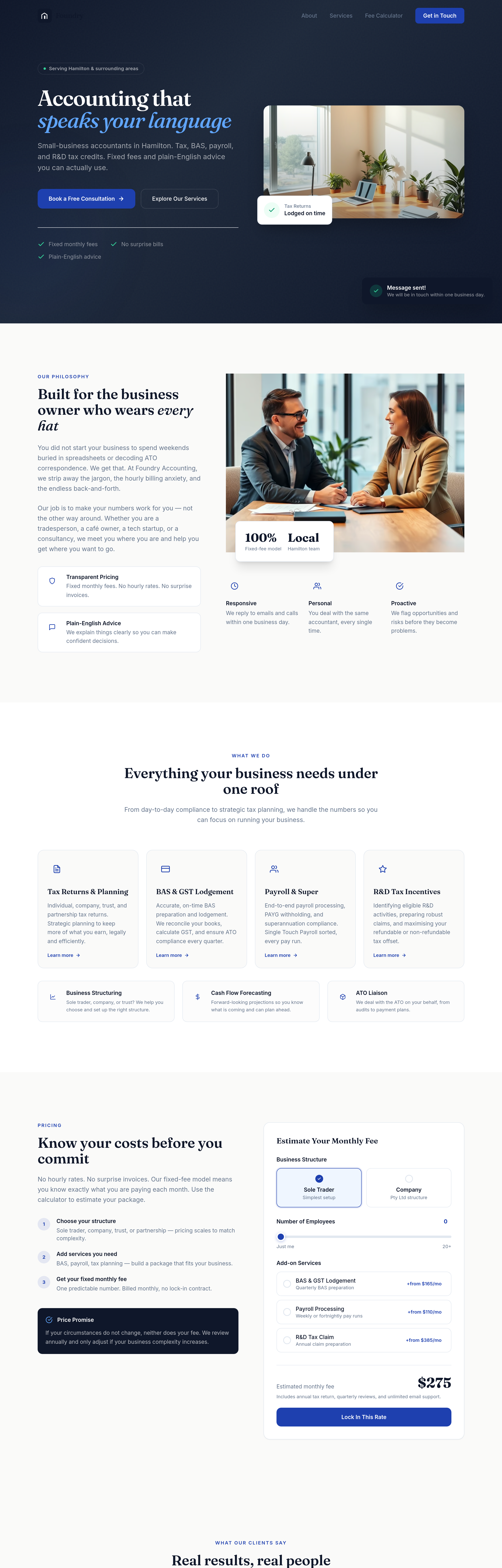
After
add testimonial cards in 3 columns under each pricing tier
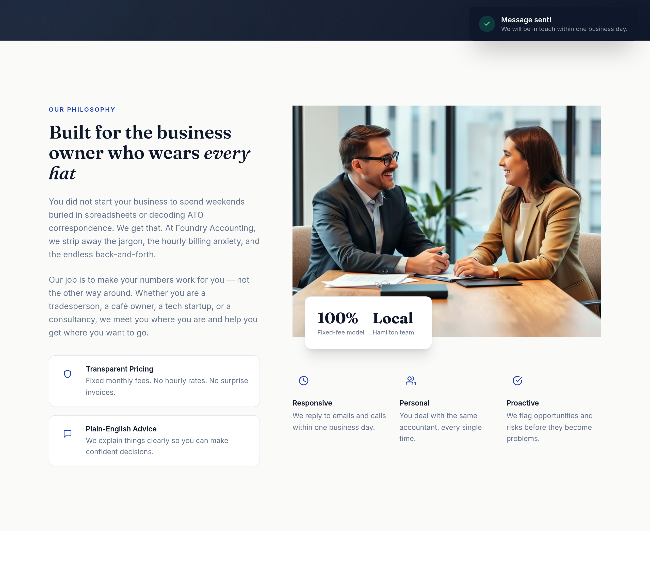
Before
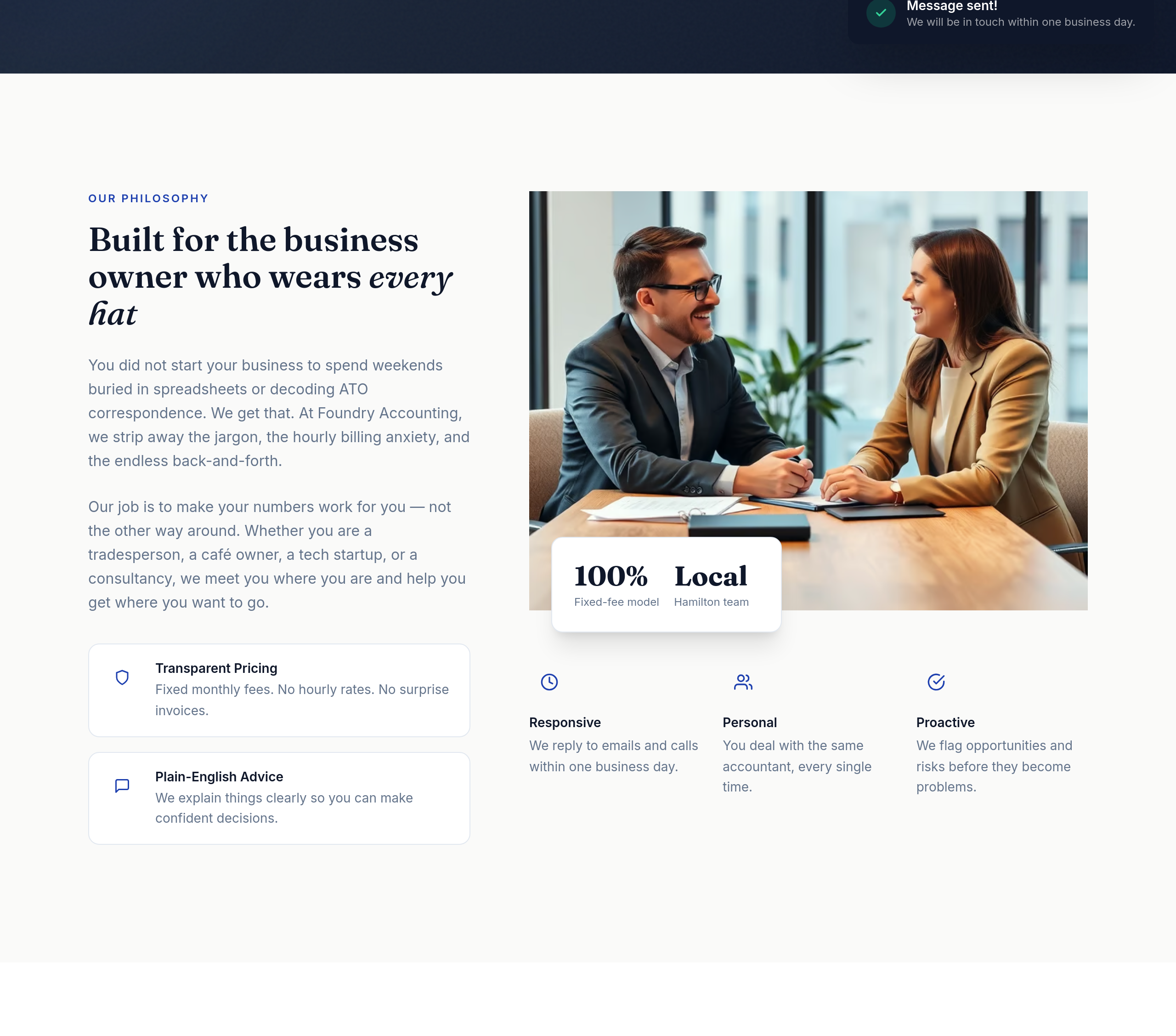
After
the value props read as a wall of text — split into 3 columns with icon + headline + 1-liner
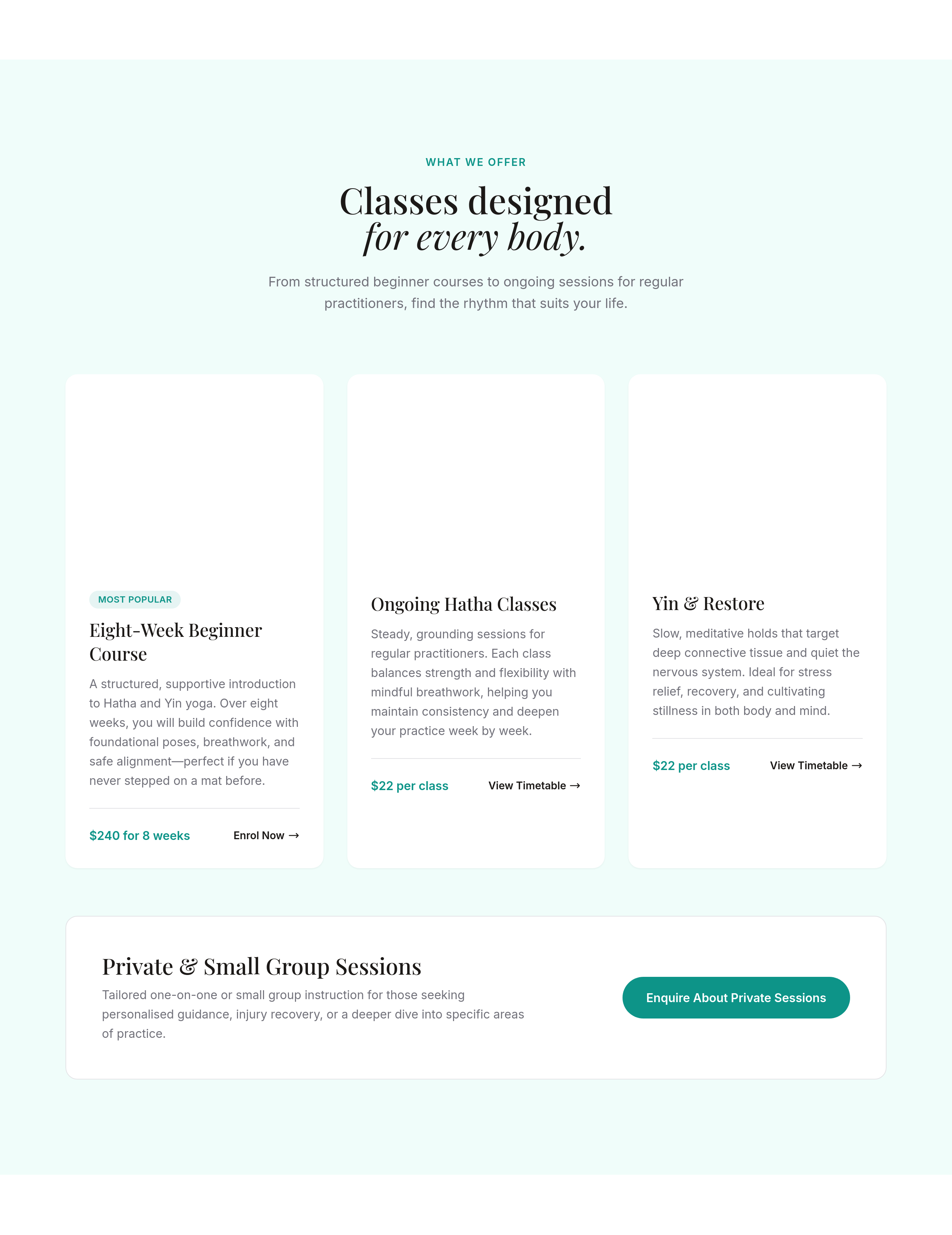
Before
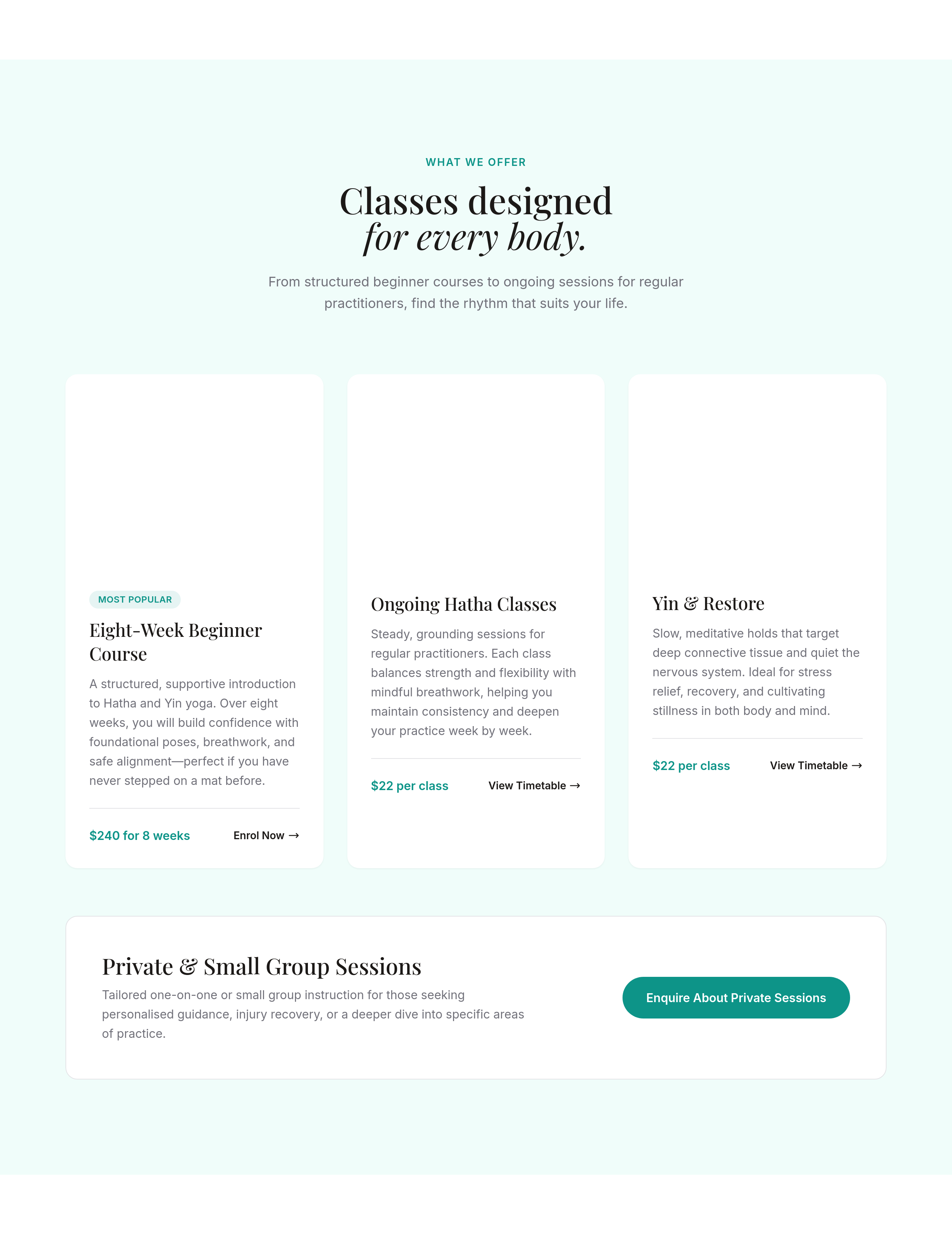
After
the services section is 1 column — make it 3 columns on desktop, stays 1 on mobile
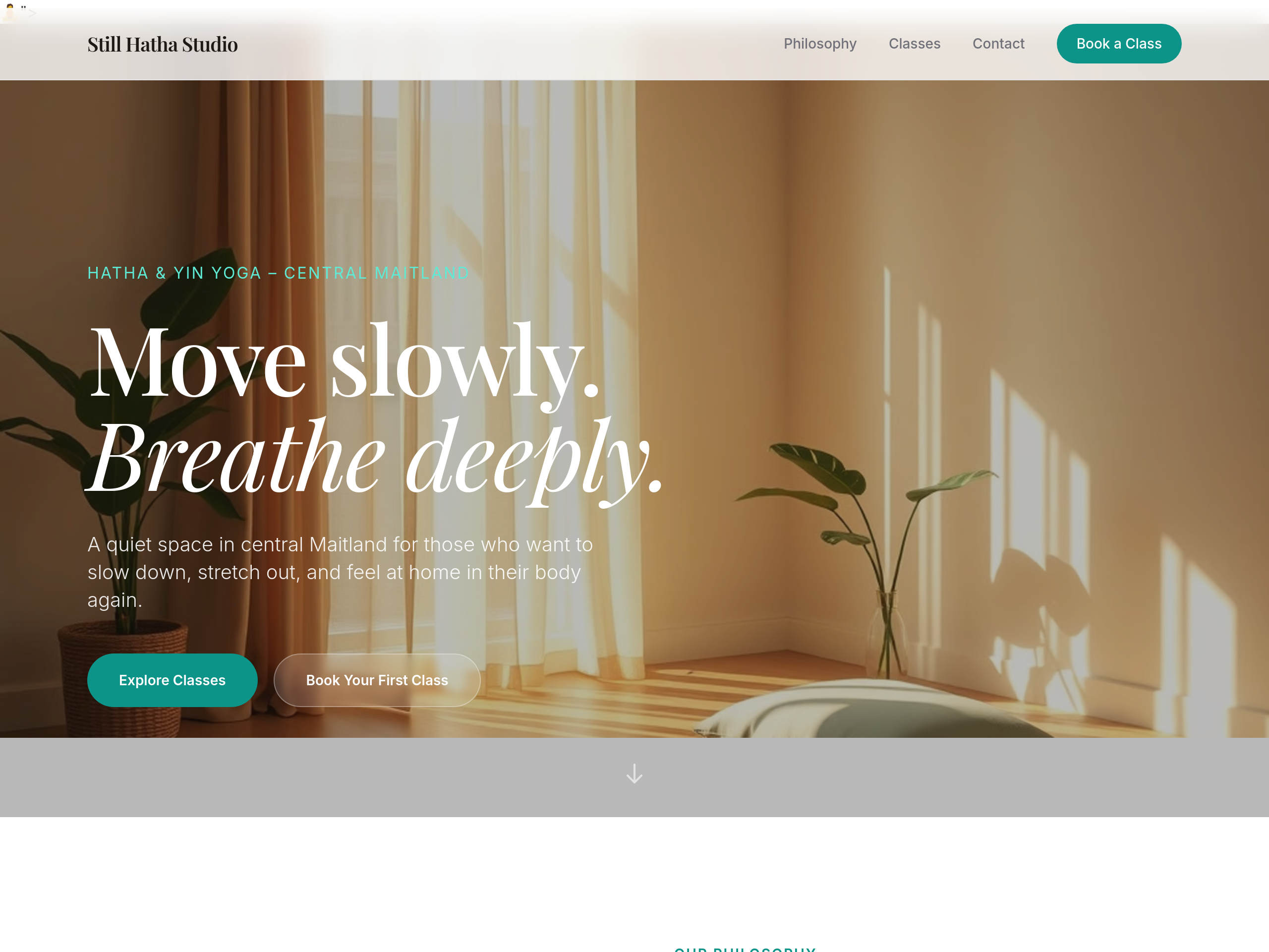
Before
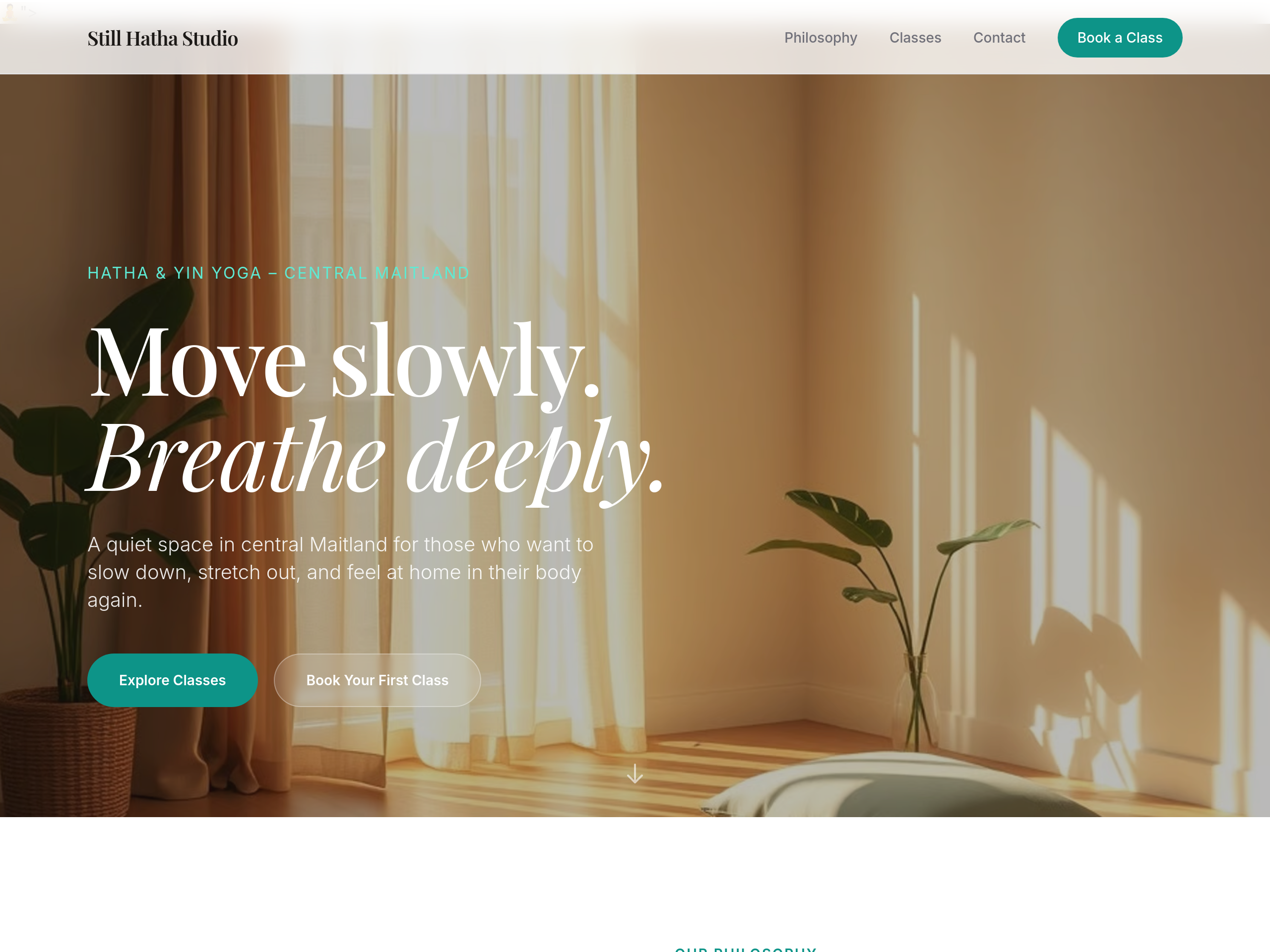
After
the hero image is too small — make it full-width edge-to-edge
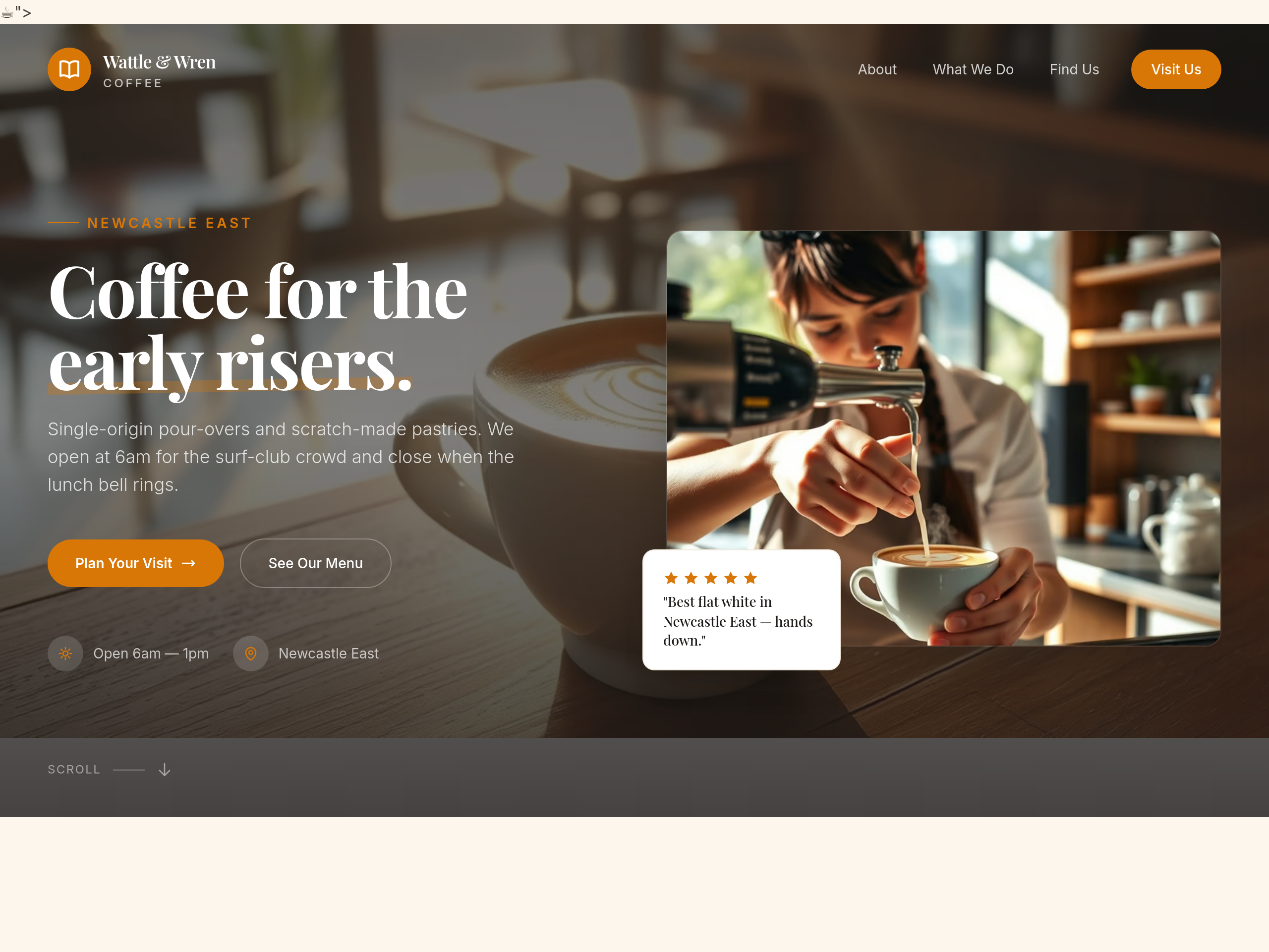
Before
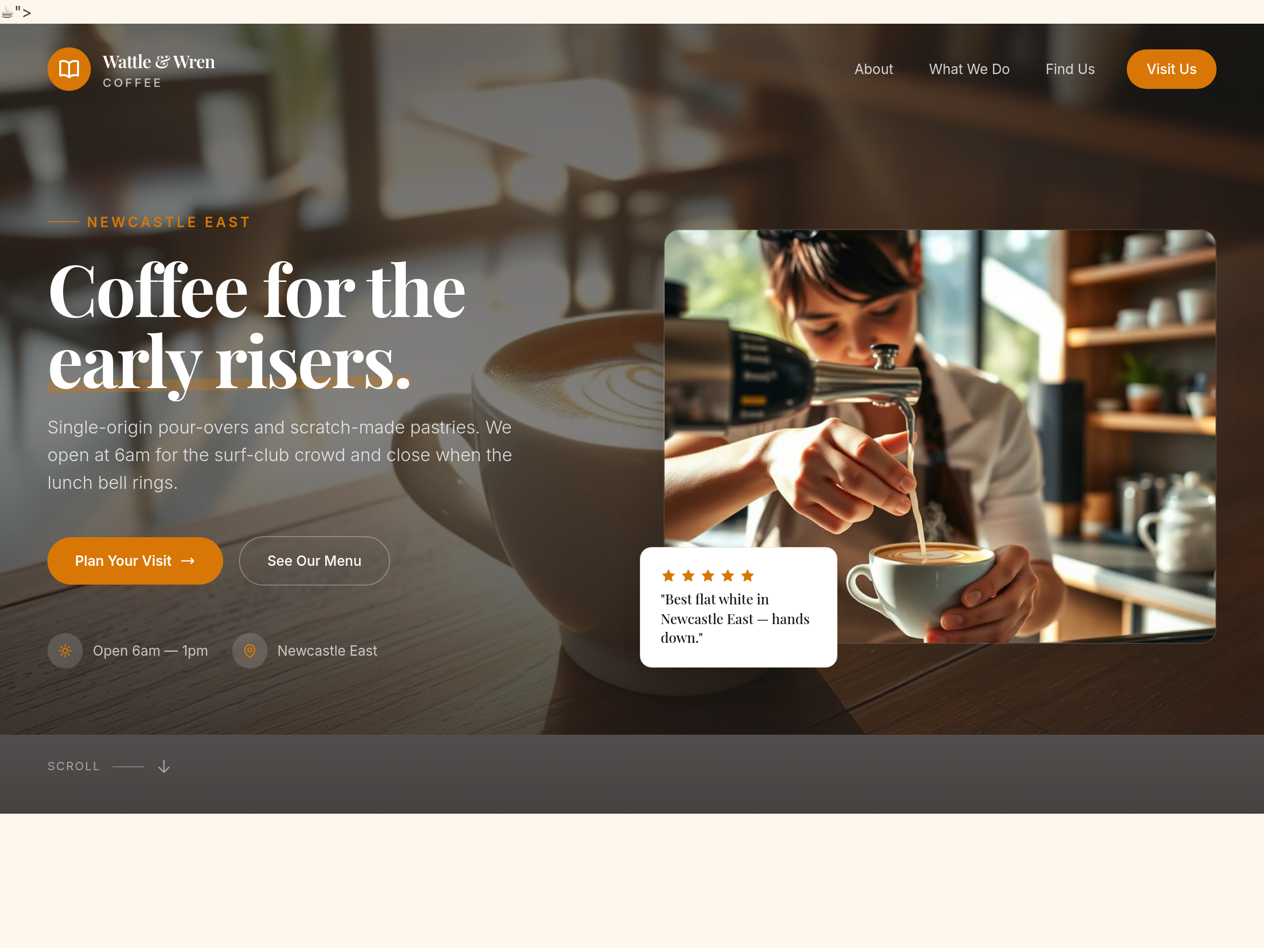
After
the hero is centered — make it left-aligned with image on the right
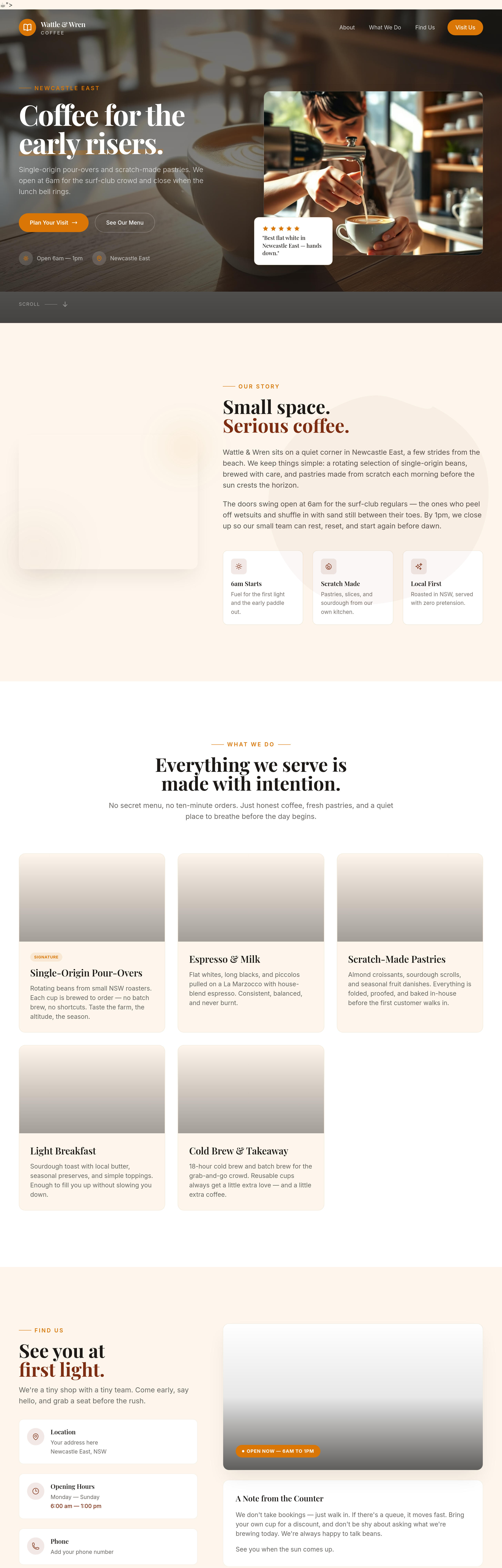
Before
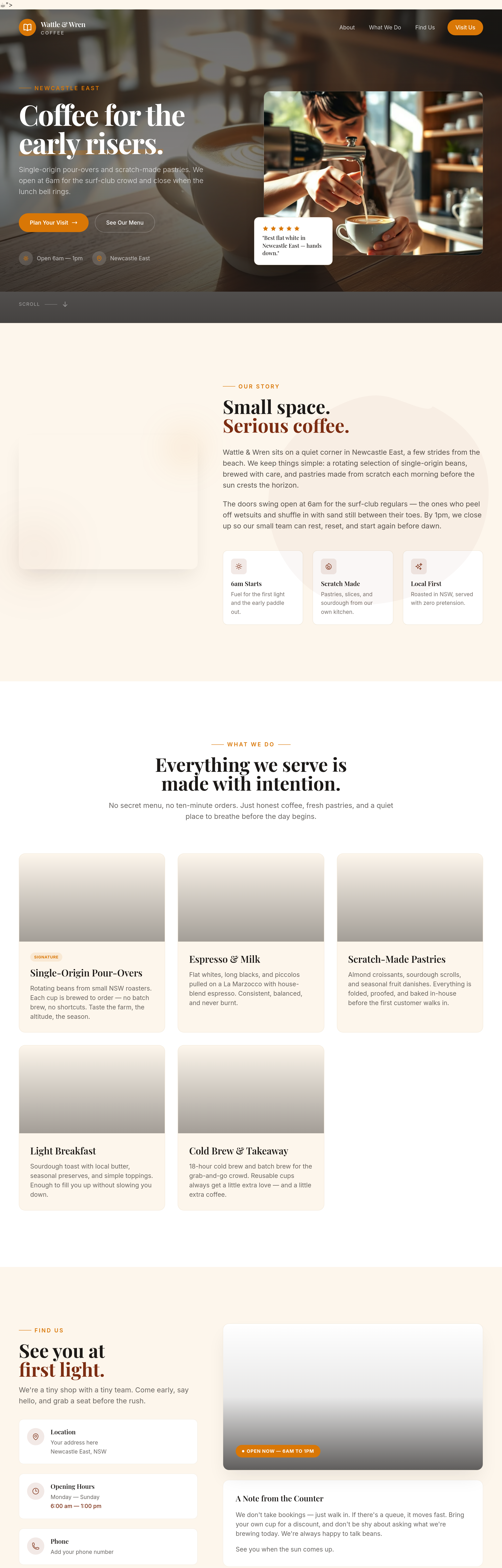
After
add proper container max-widths so text doesn't span the full screen on wide monitors
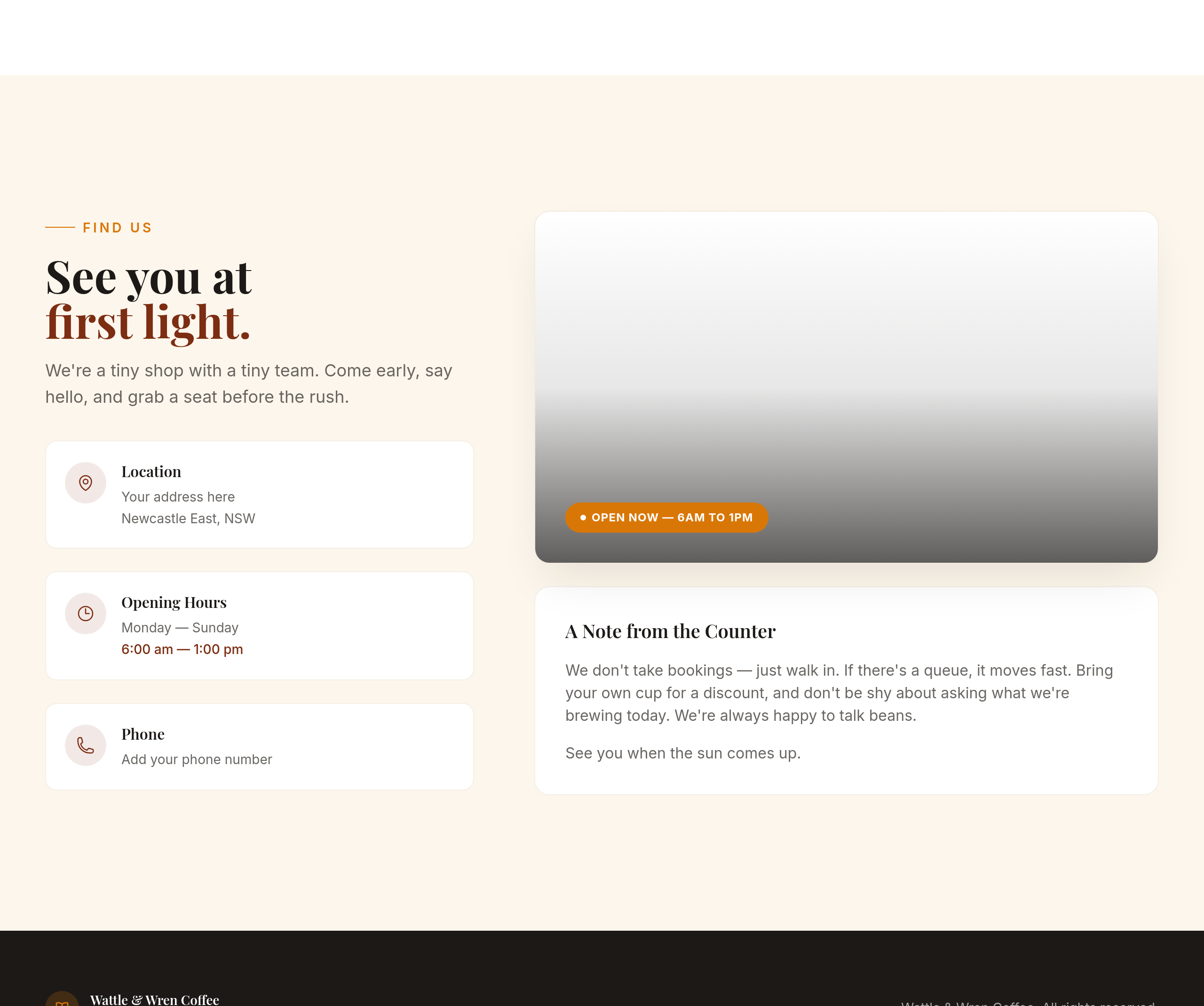
Before
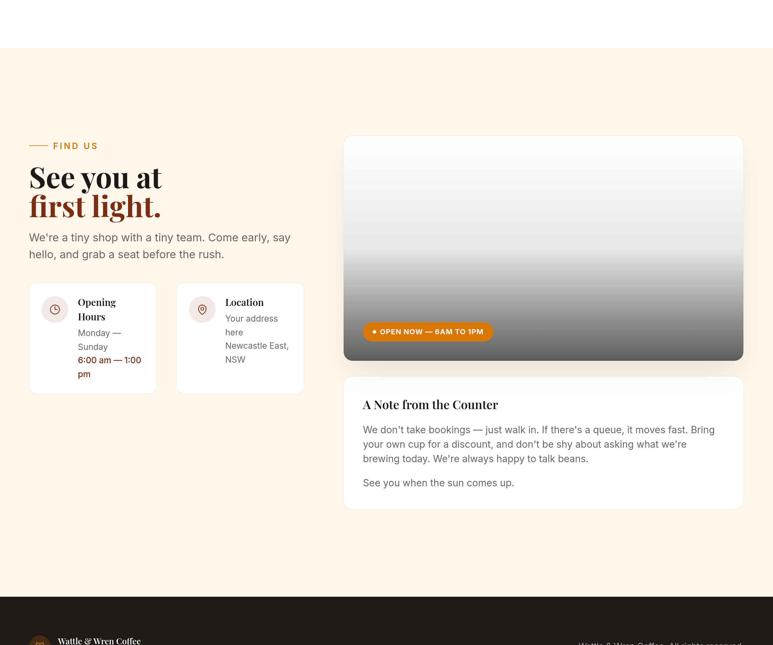
After
the contact section is text-only — add a 2-column layout with hours on the left, address on the right
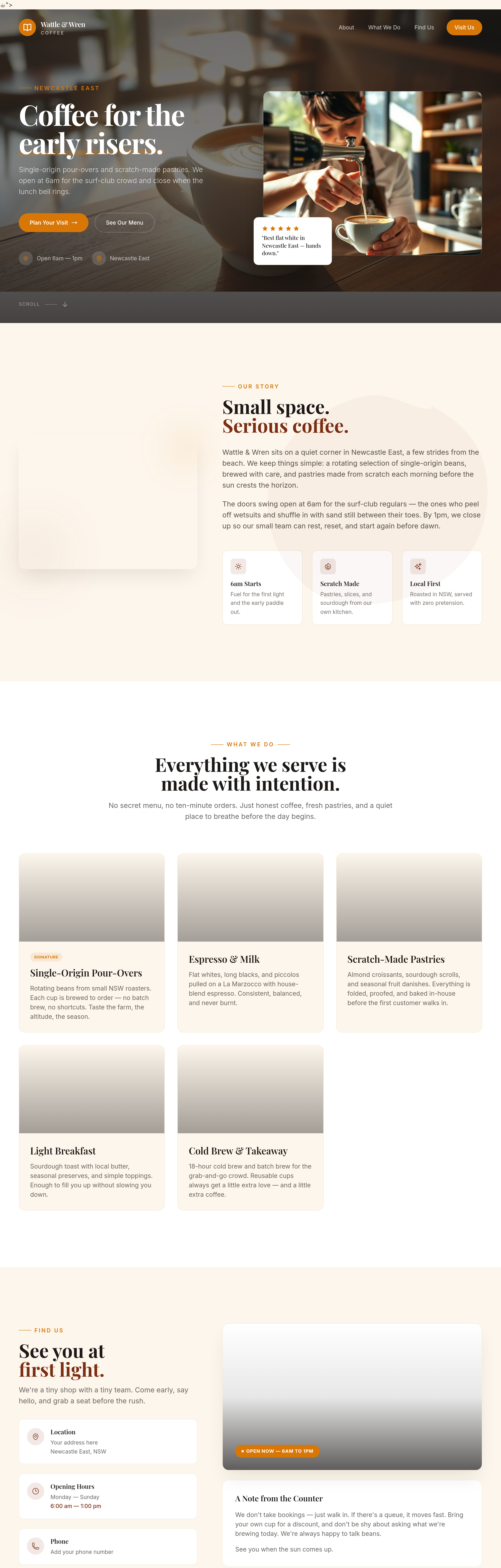
Before
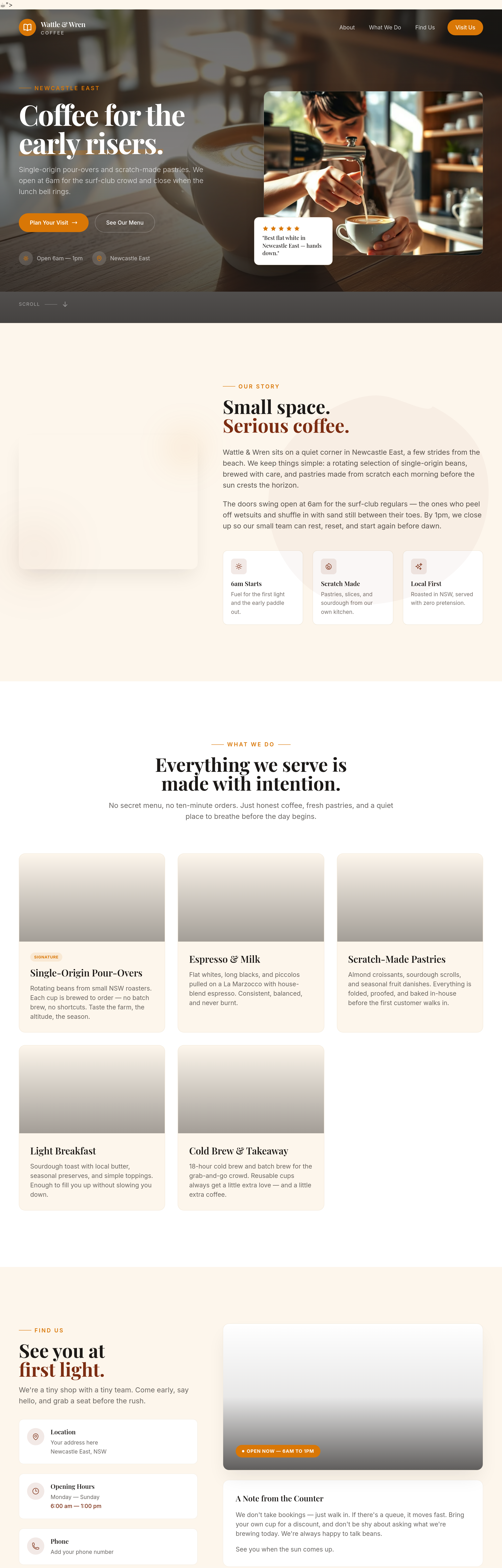
After
the menu section should be 2 columns on desktop — coffee left, food right
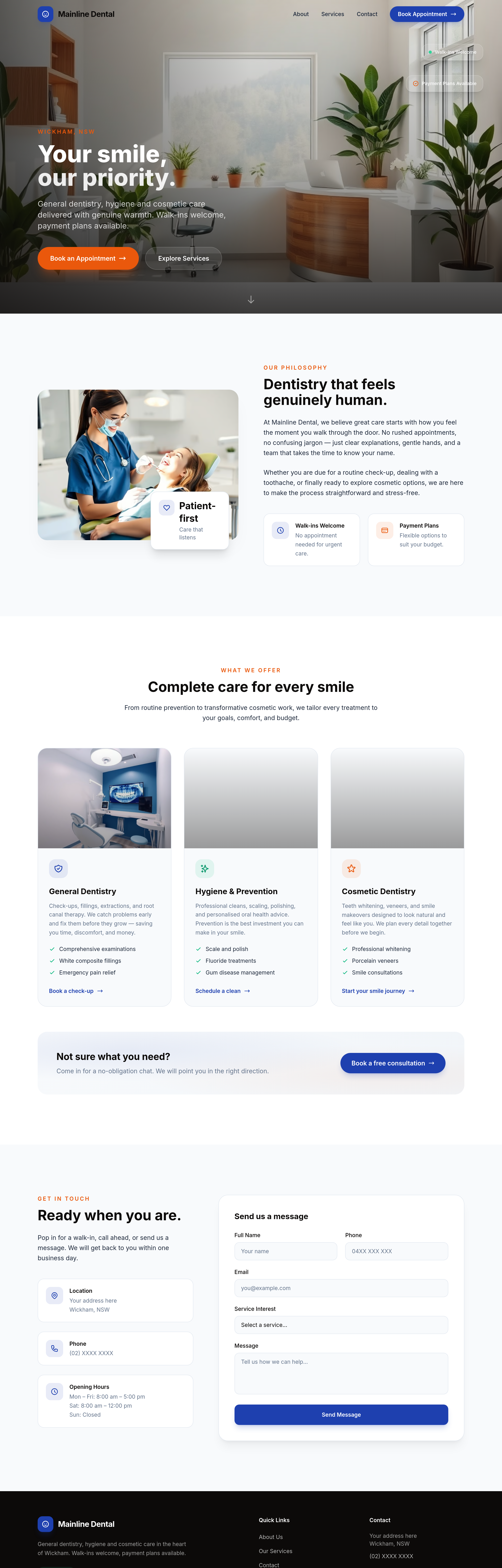
Before
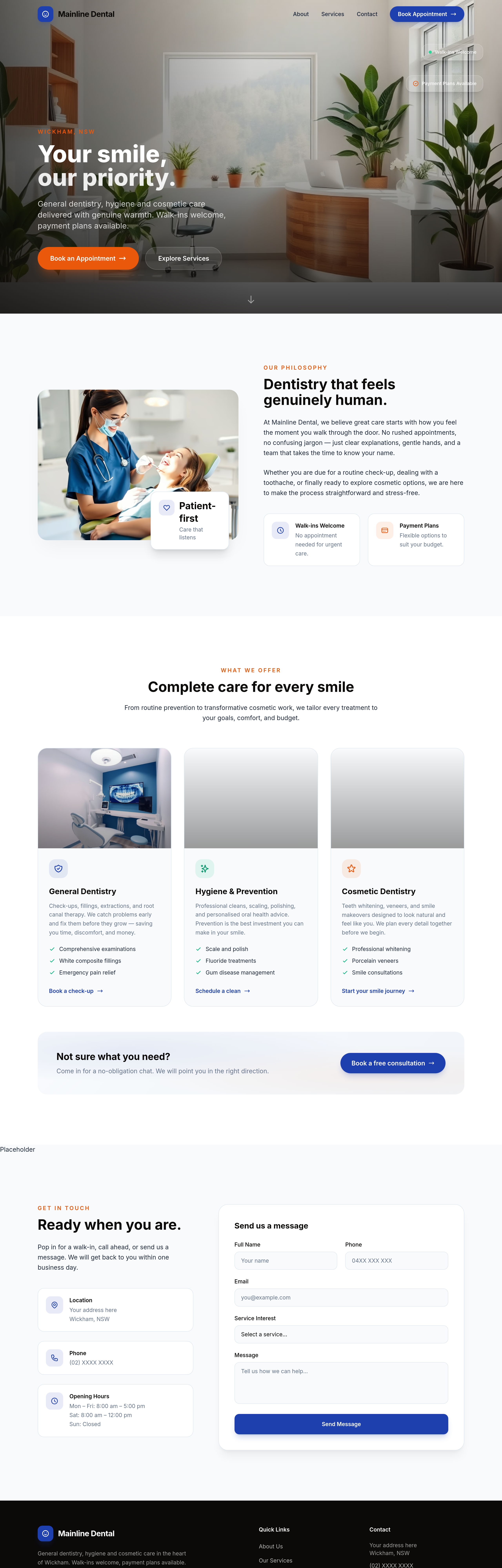
After
the team section should be 4 photo cards in a row, not stacked
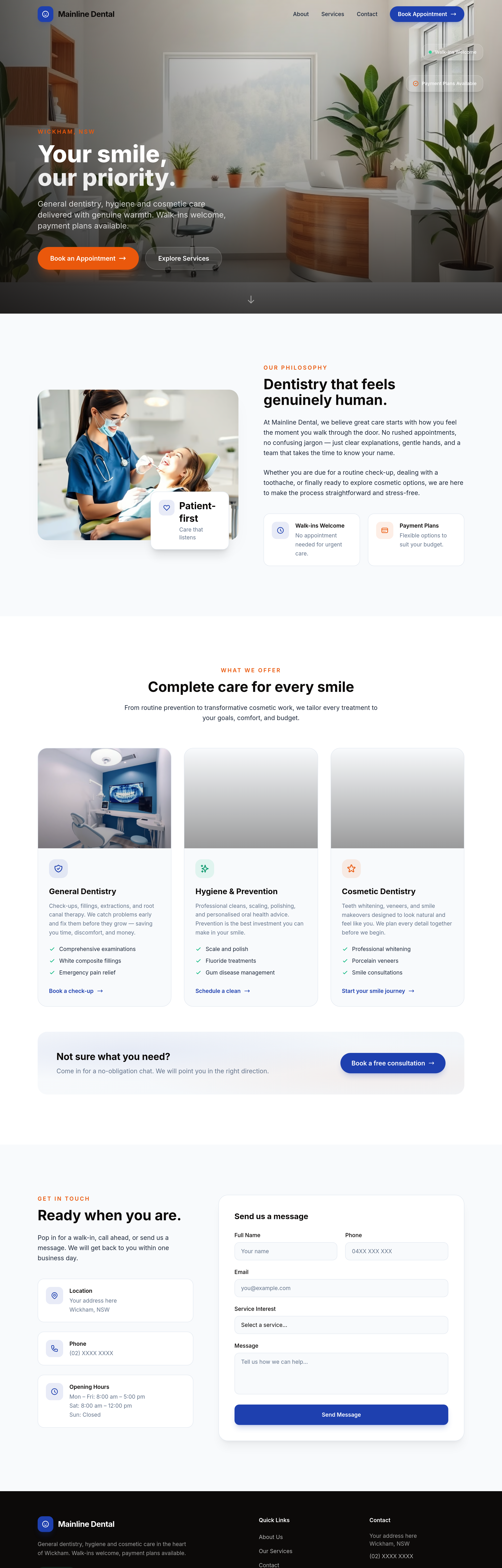
Before
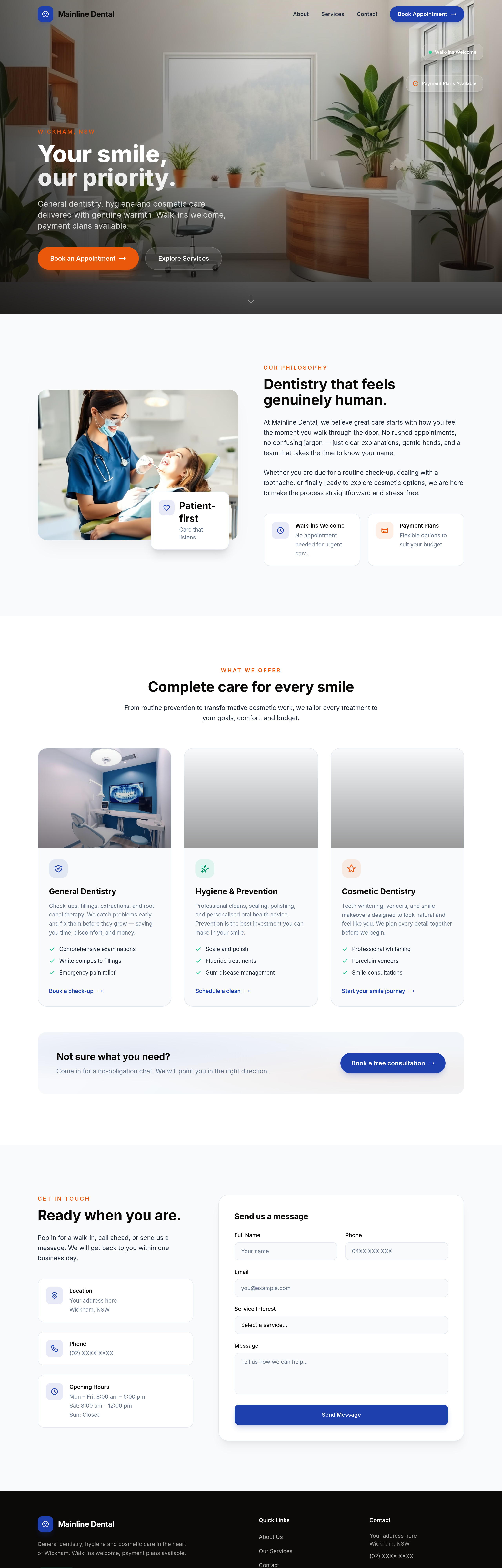
After
the procedures section is dense — break into expandable accordion items per procedure
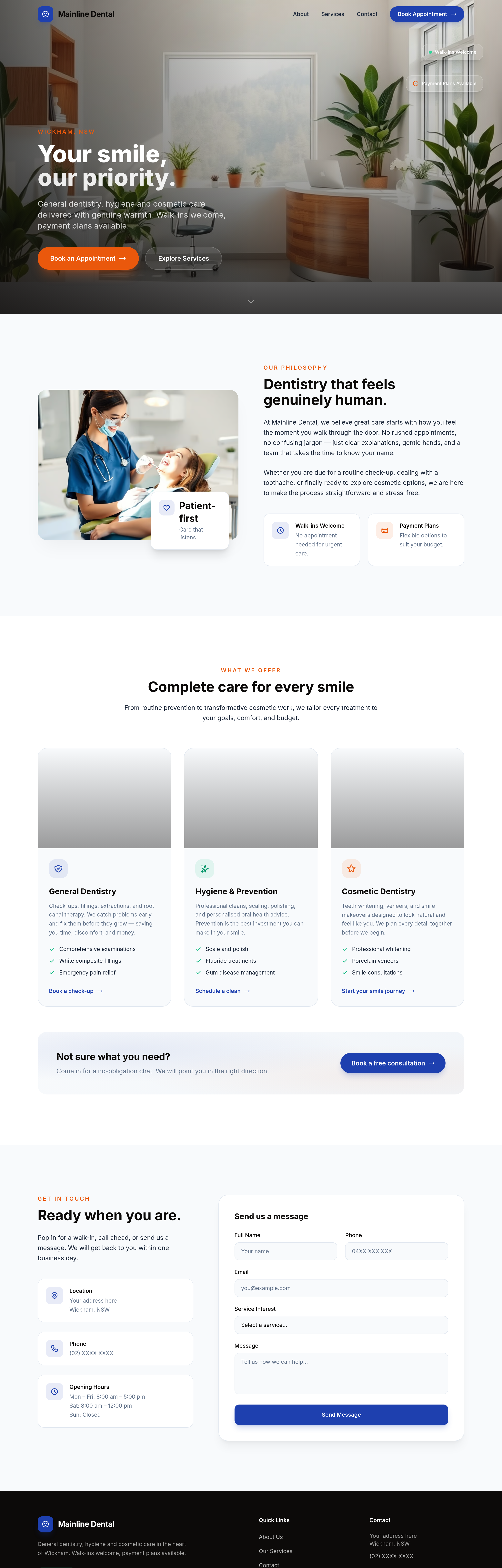
Before
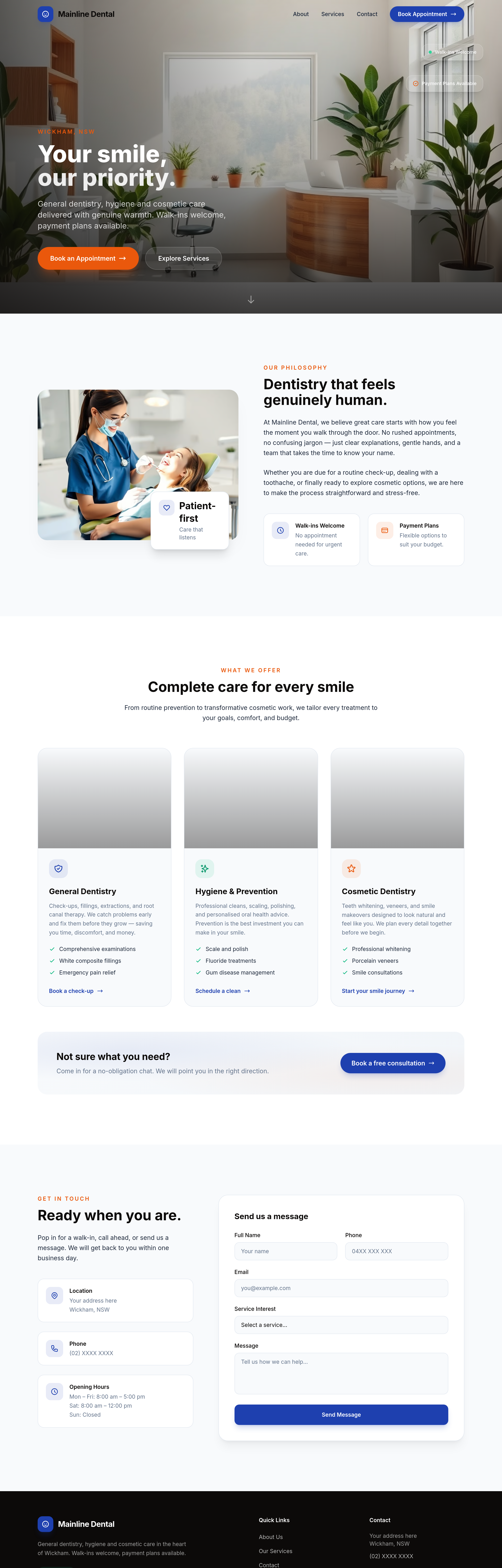
After
the procedures list should be expandable accordions with detail behind each
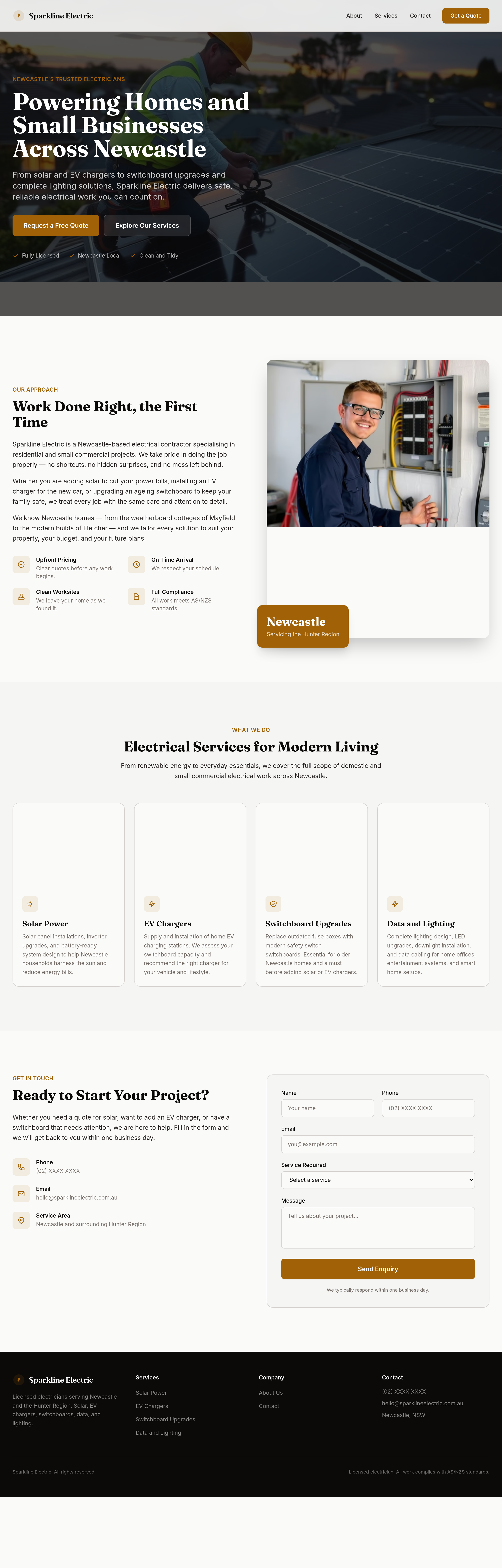
Before
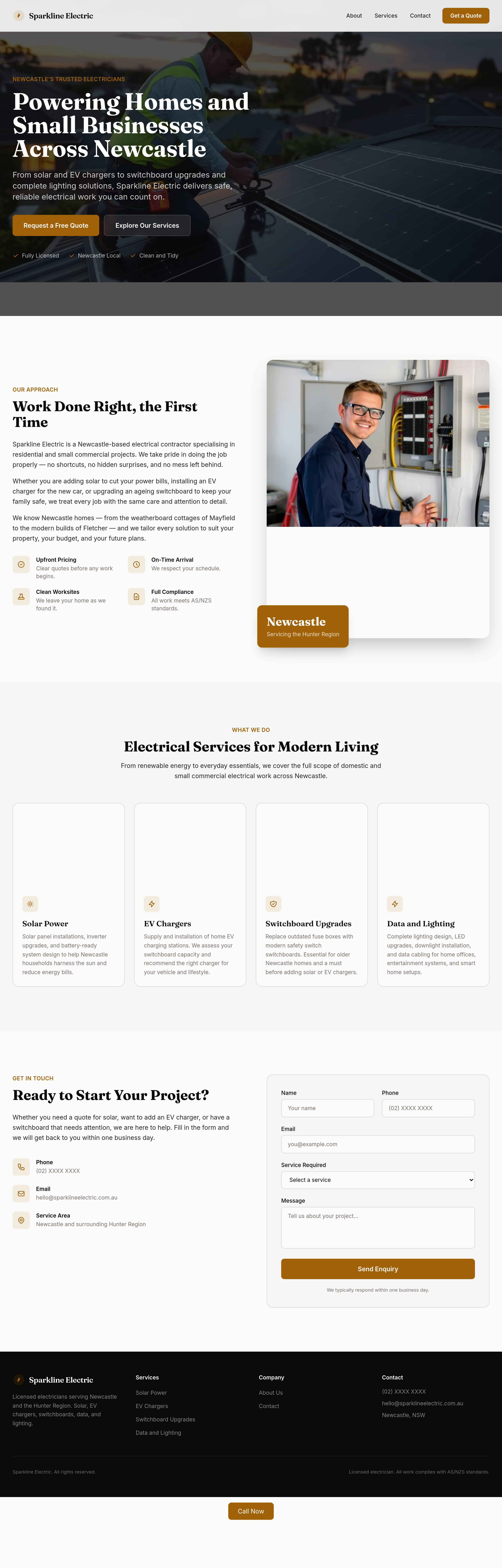
After
the services grid is too dense — split into 'Domestic' and 'Solar + EV' as two visual rows
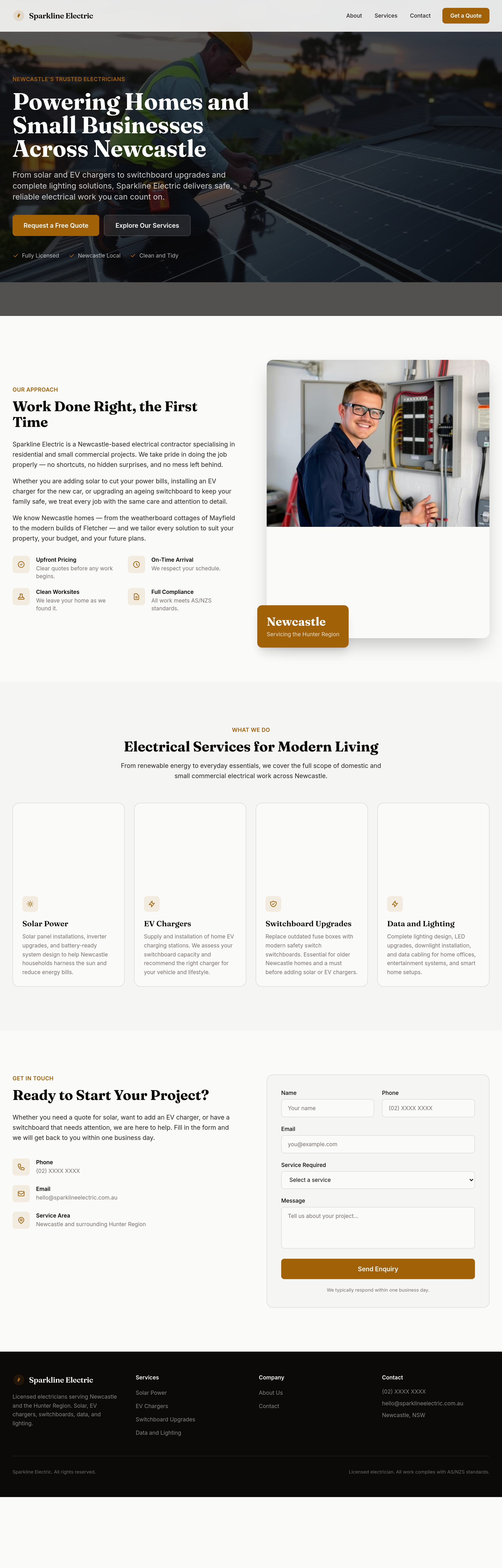
Before
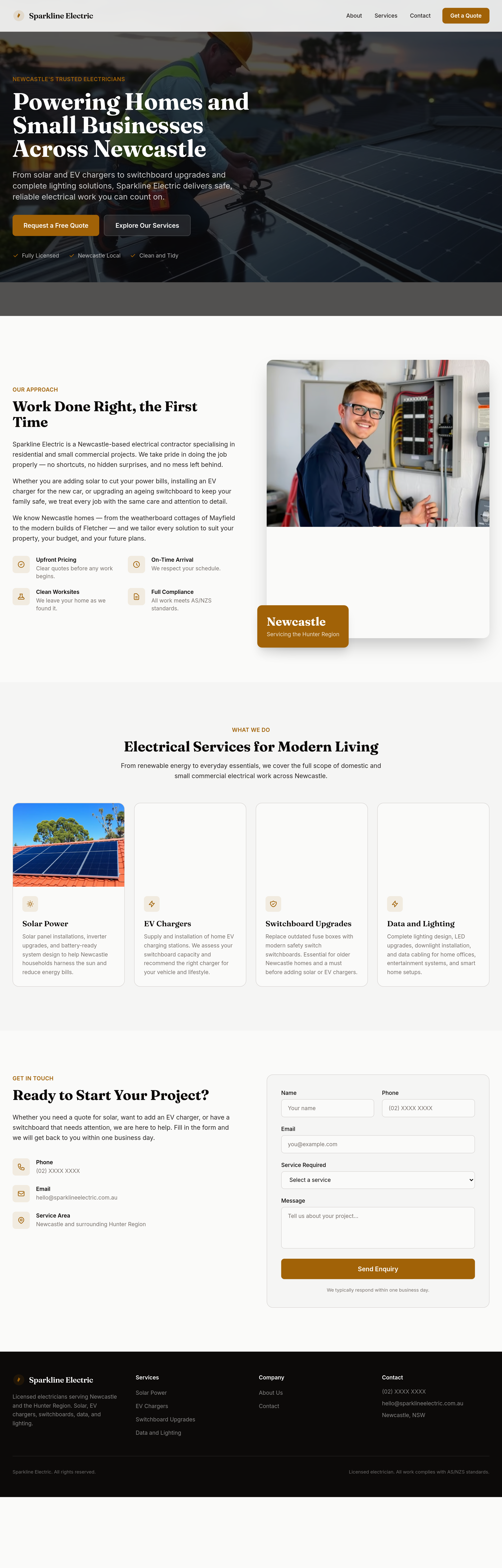
After
split the services grid into two distinct sections: 'Domestic' and 'Solar + EV'
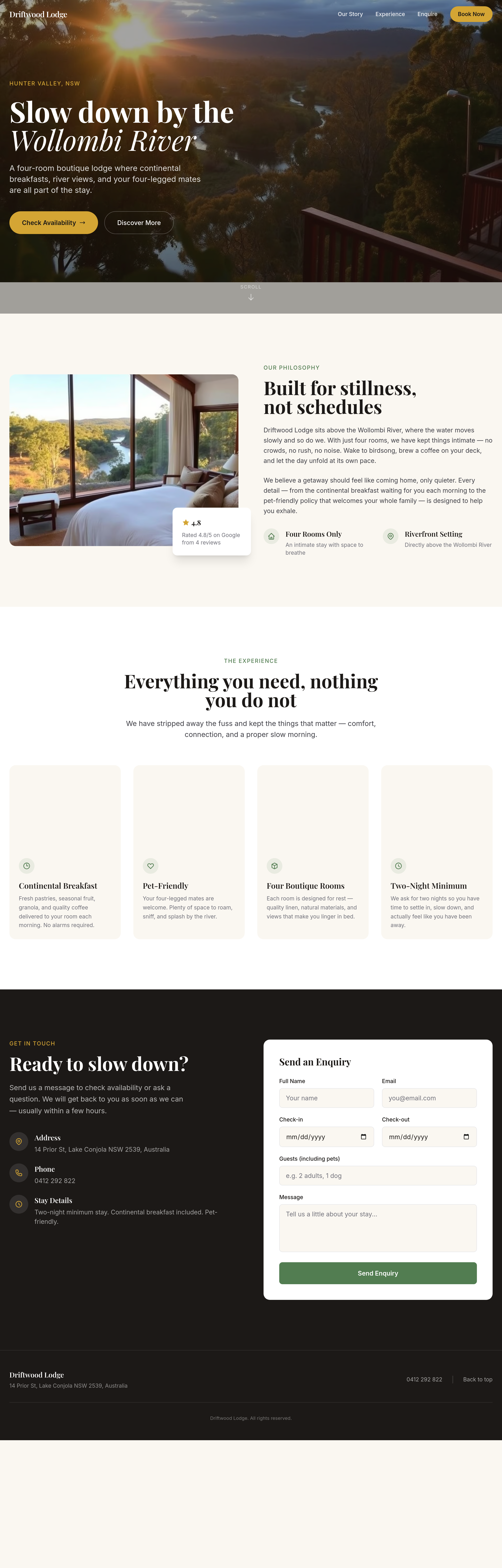
Before
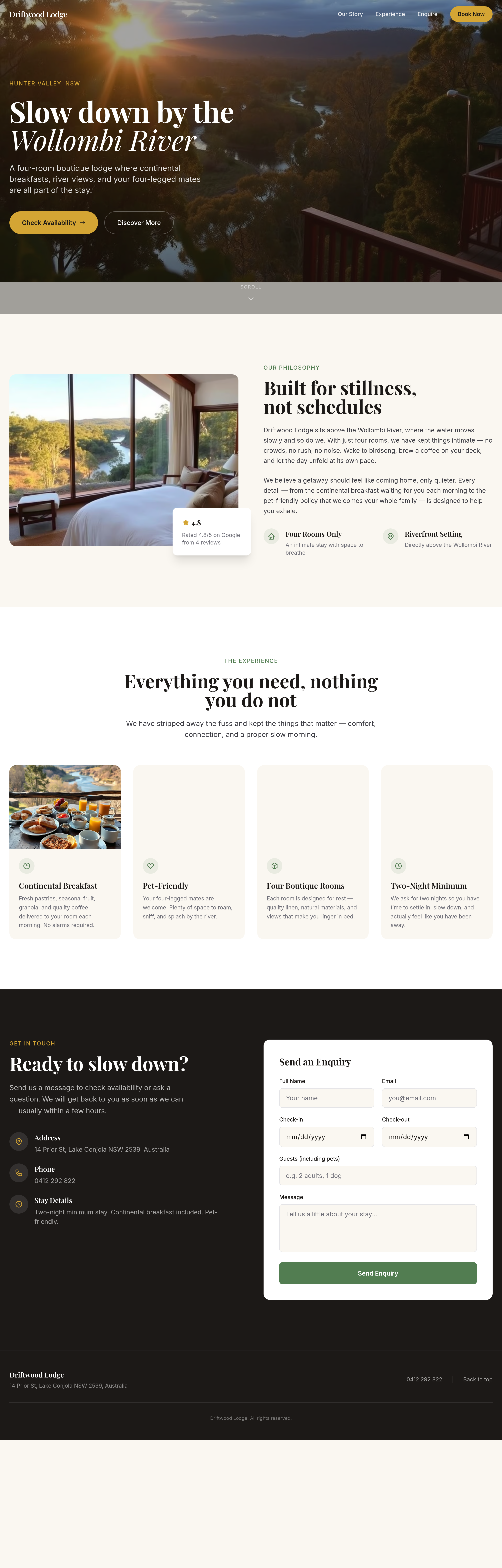
After
the rooms grid is 2 wide — change to 3 wide on desktop
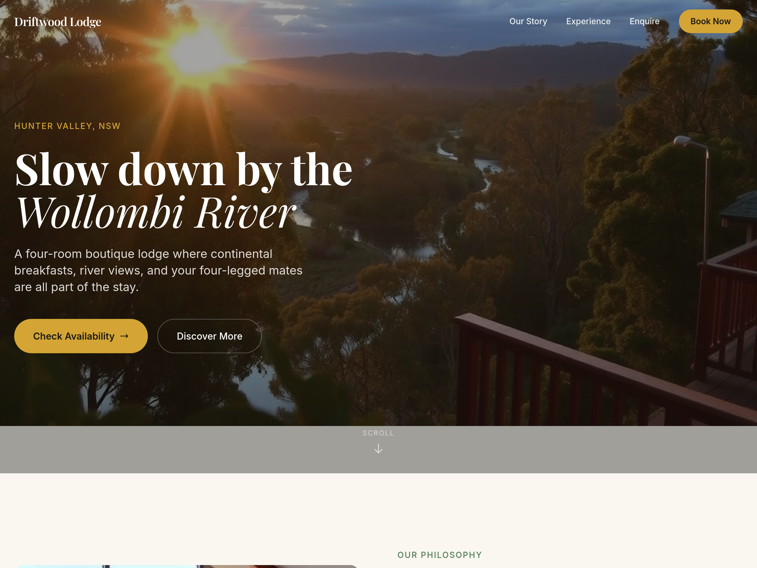
Before
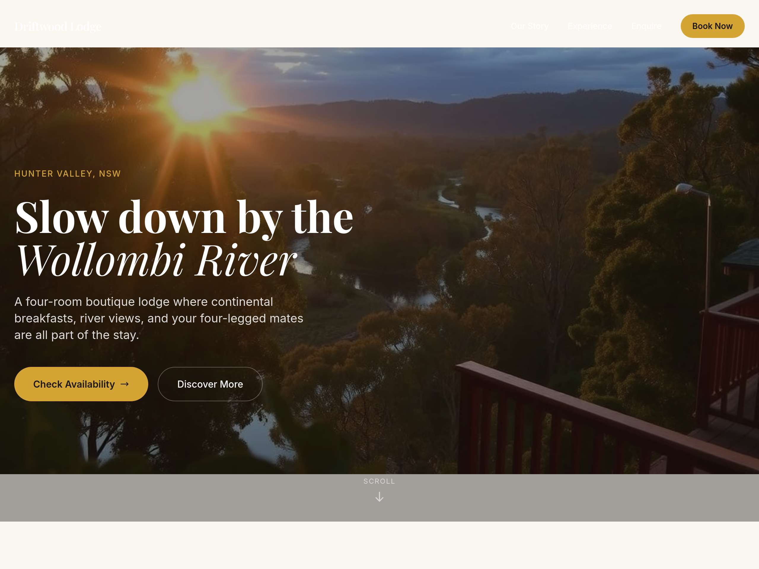
After
add 80px more space above and below the hero
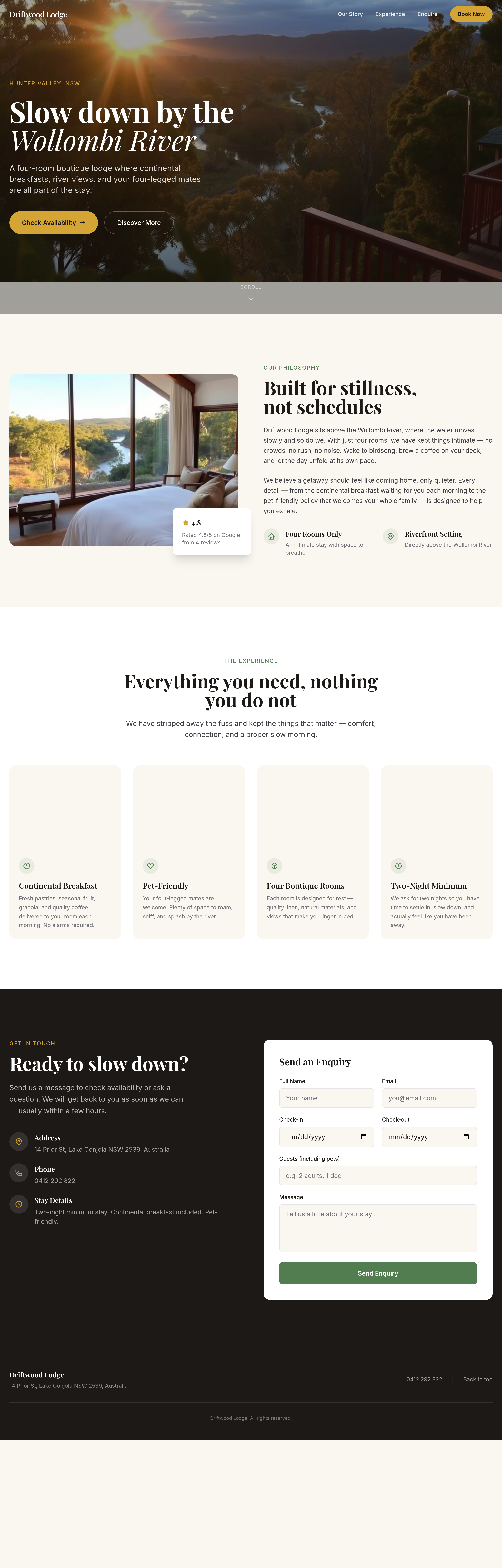
Before
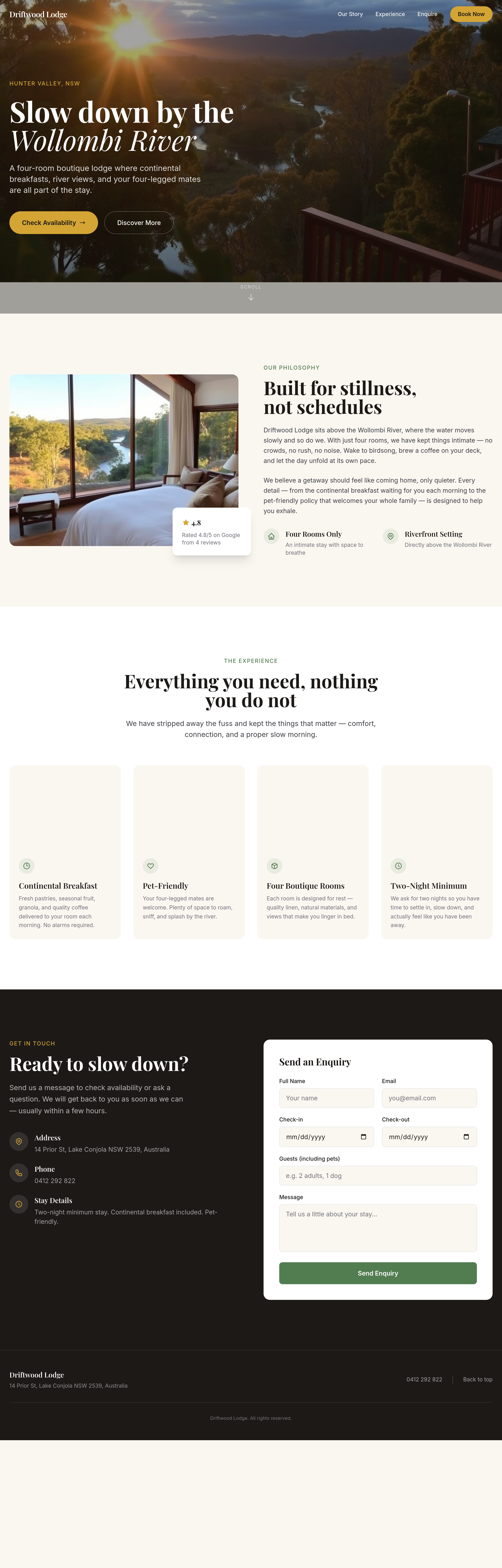
After
the booking widget area is empty — add a clean 'check availability' form
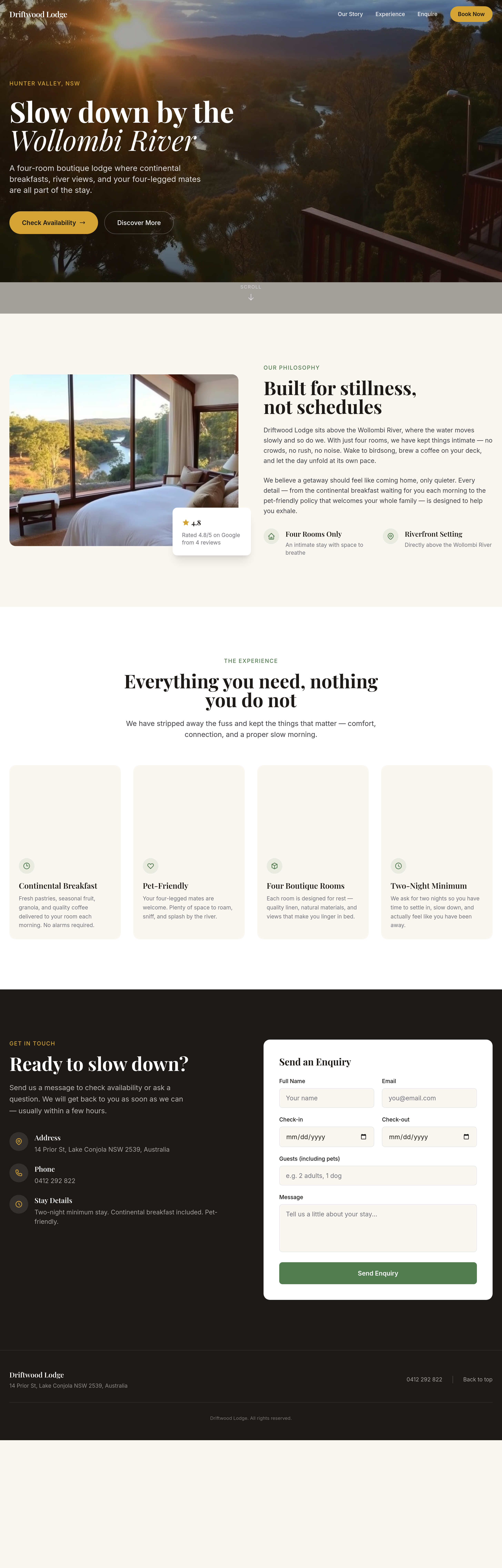
Before
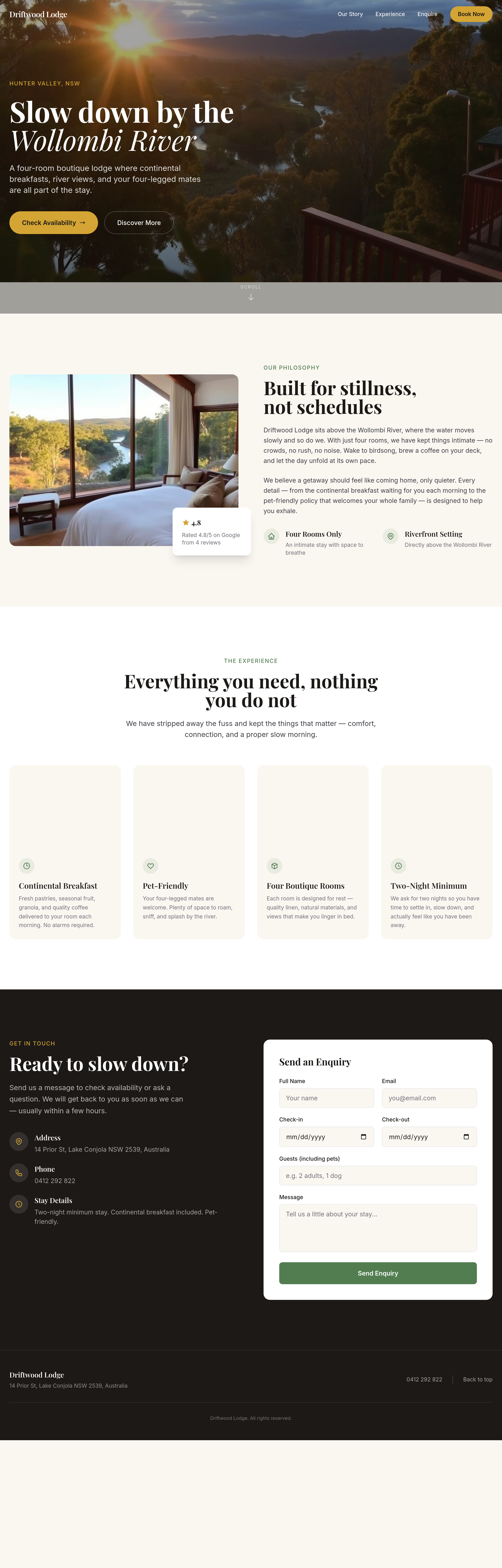
After
the rooms section has too much white space — tighten it up
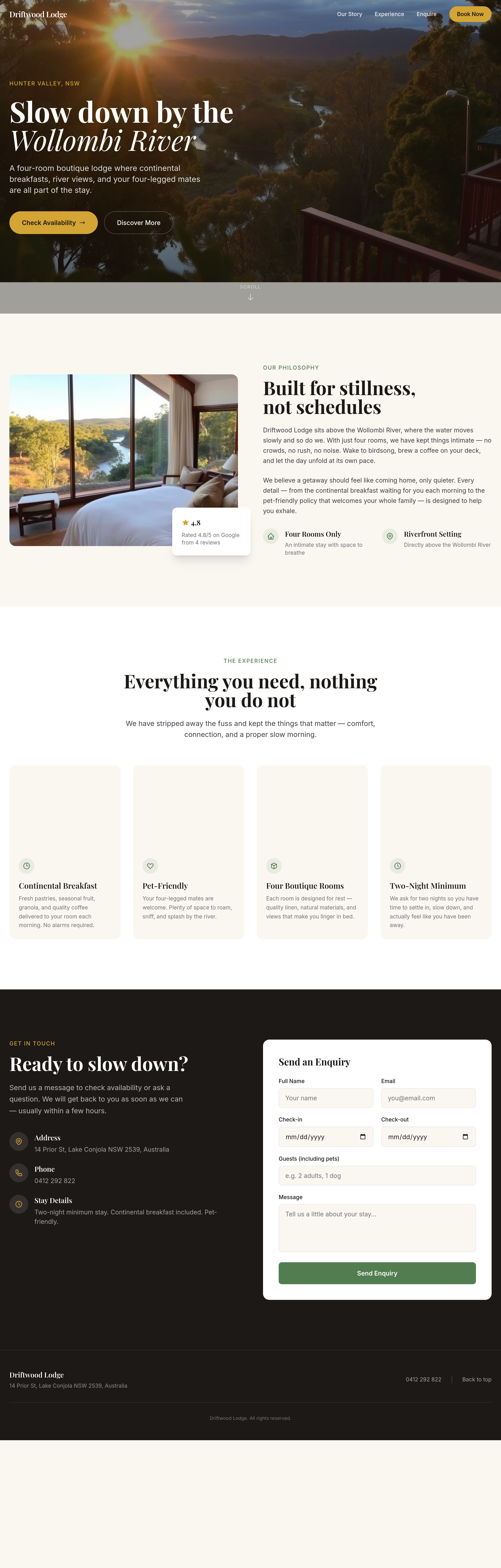
Before
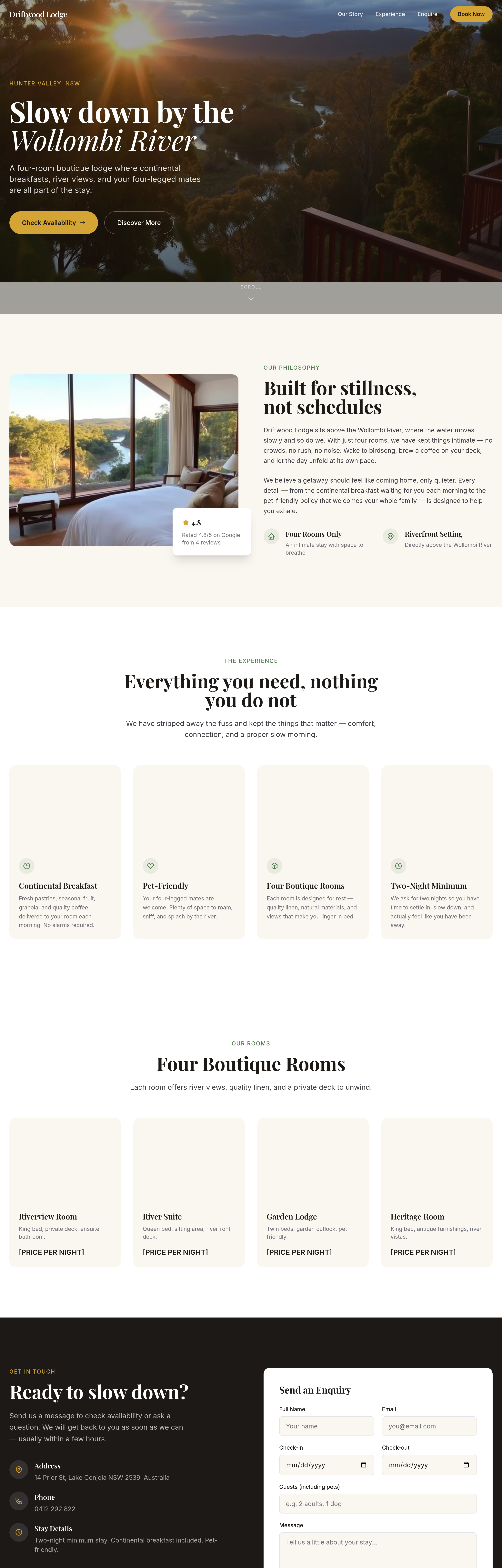
After
the rooms grid should show pricing per night clearly without clicking through
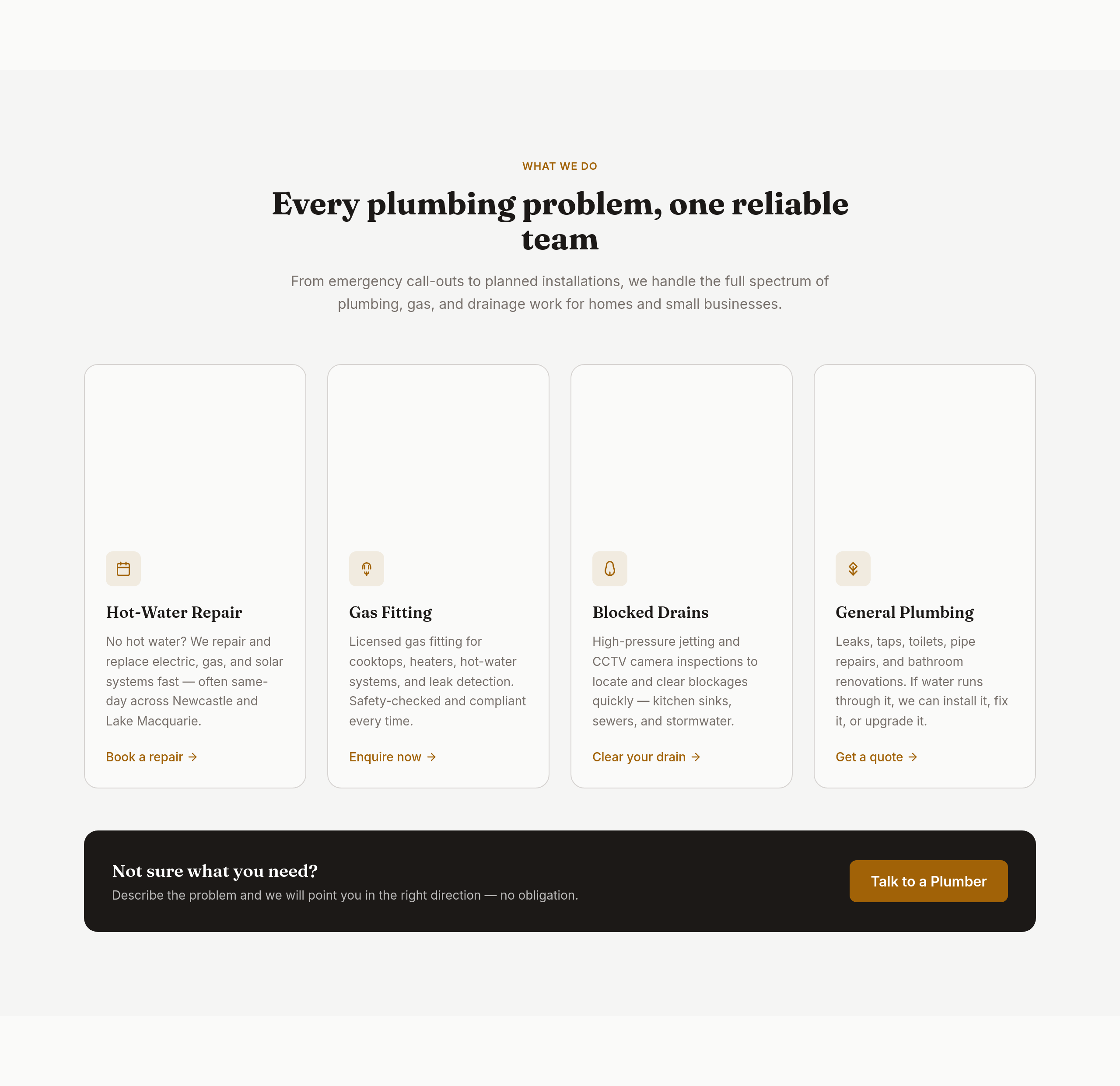
Before
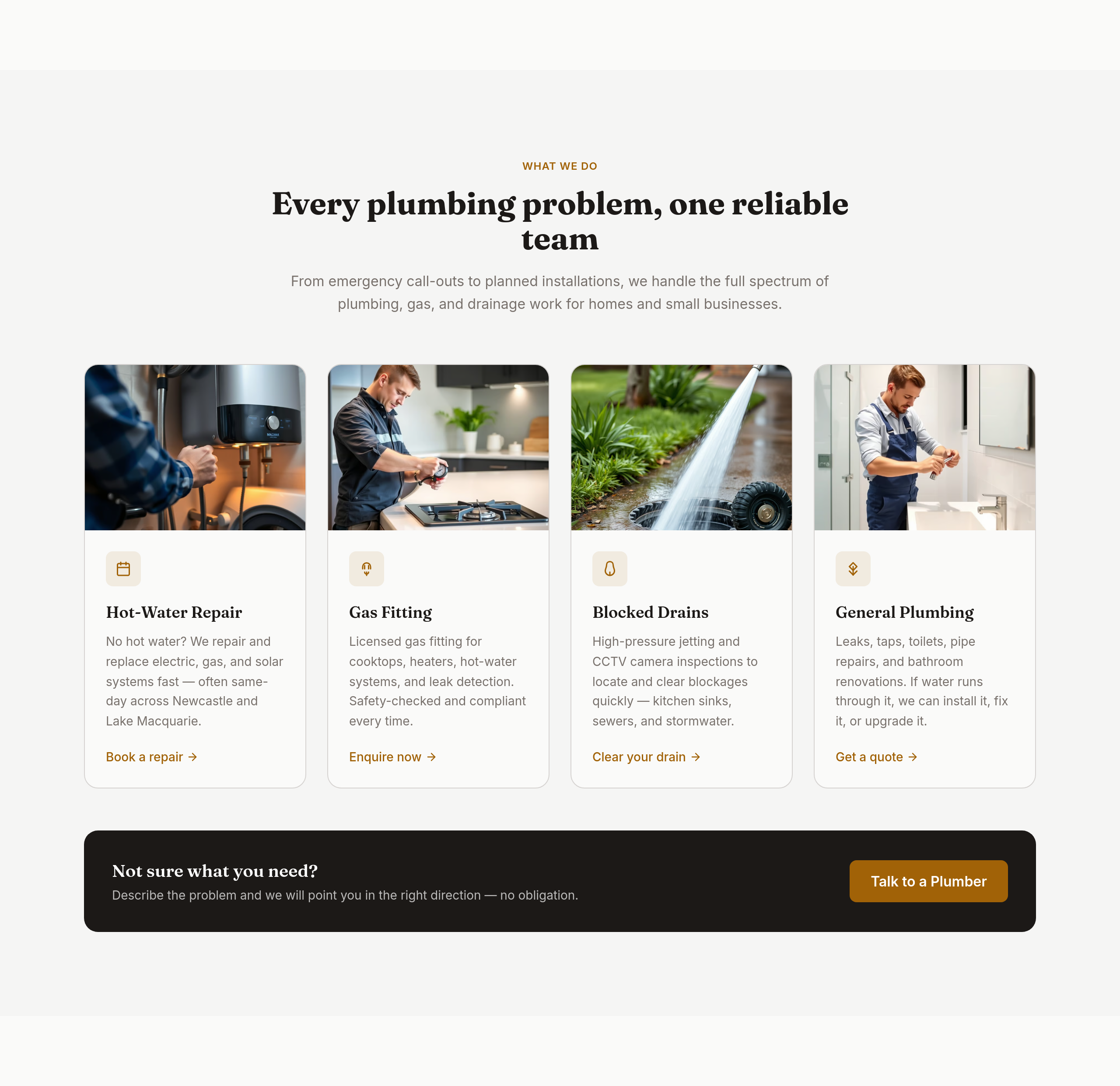
After
the services grid should be 4 wide with icons
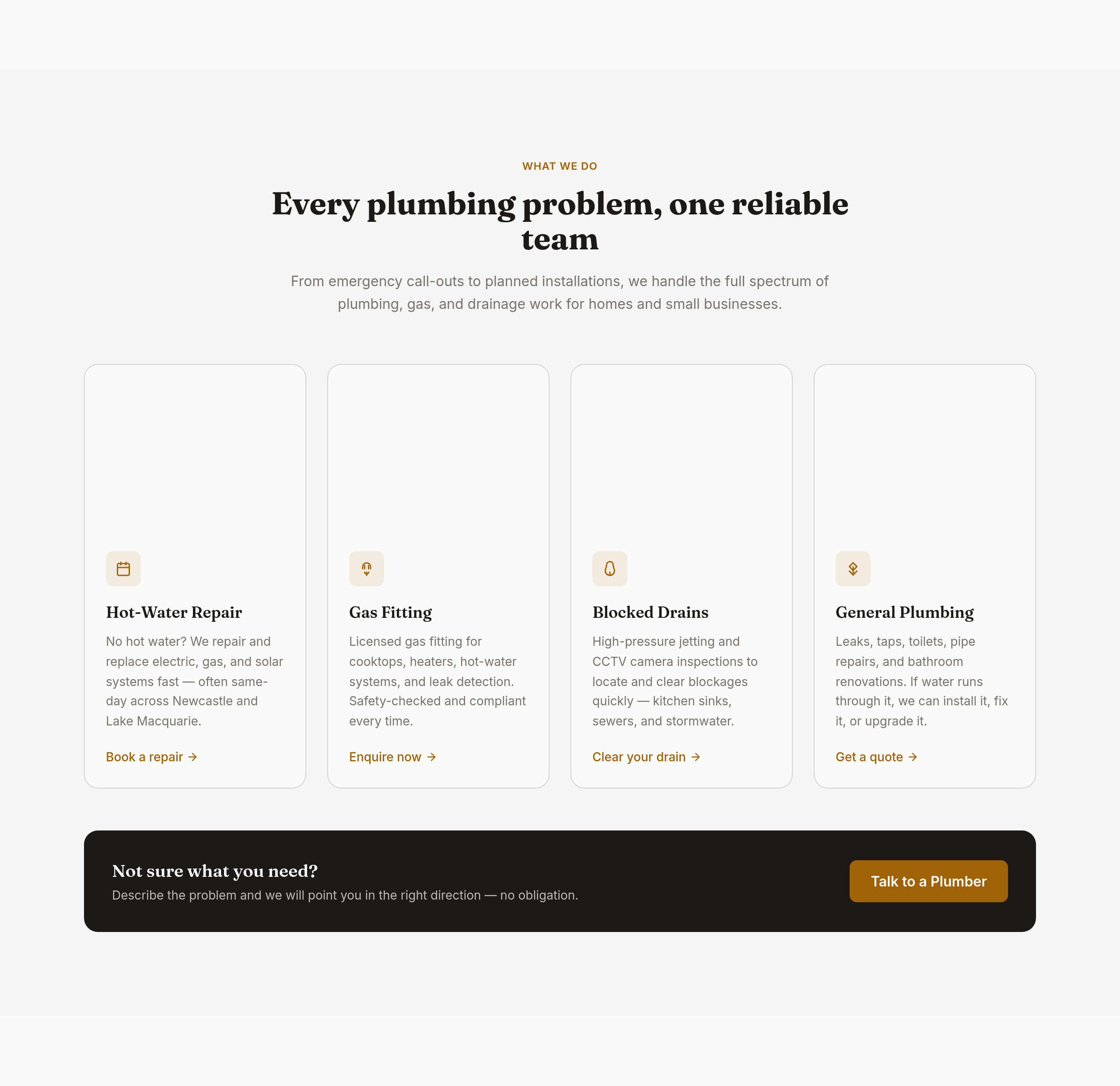
Before
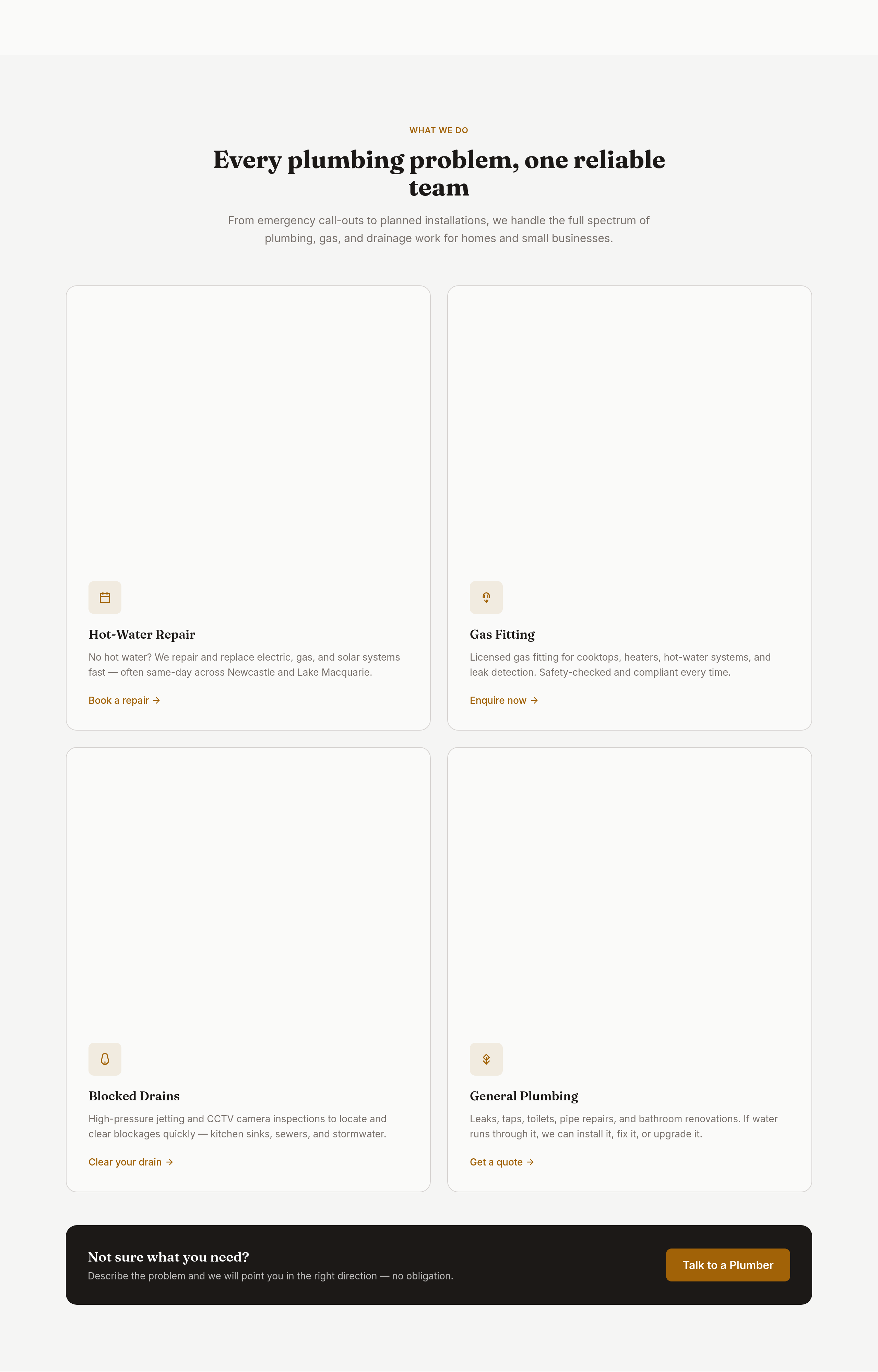
After
the services grid is 3 columns — too many; make it 2 columns of bigger cards with icons
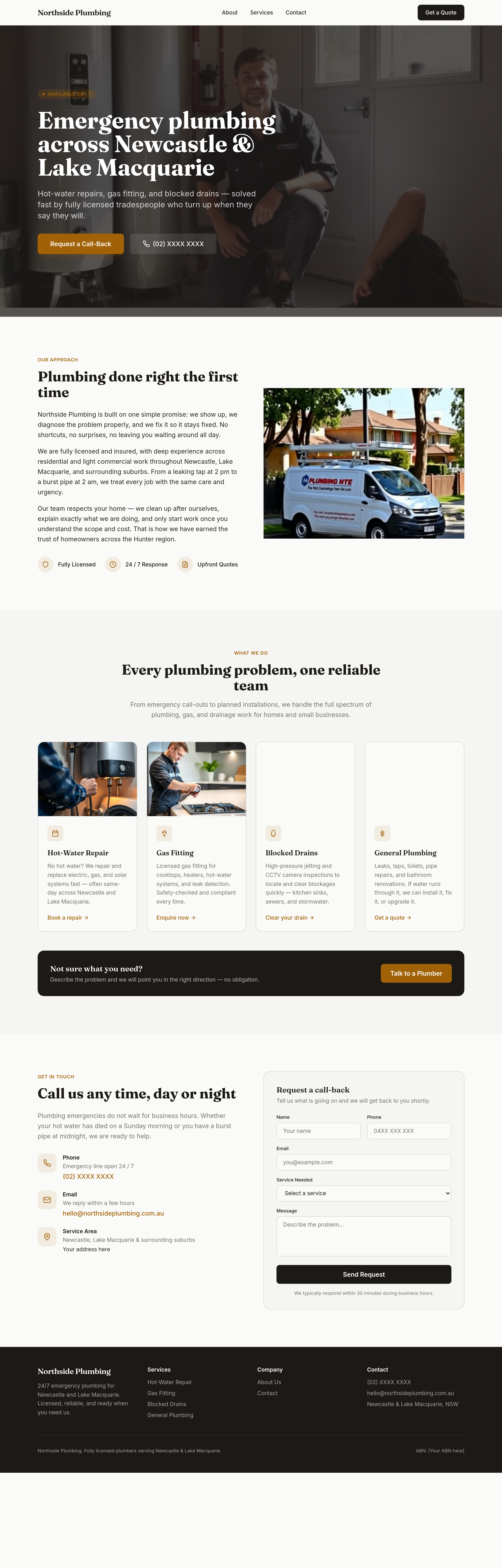
Before
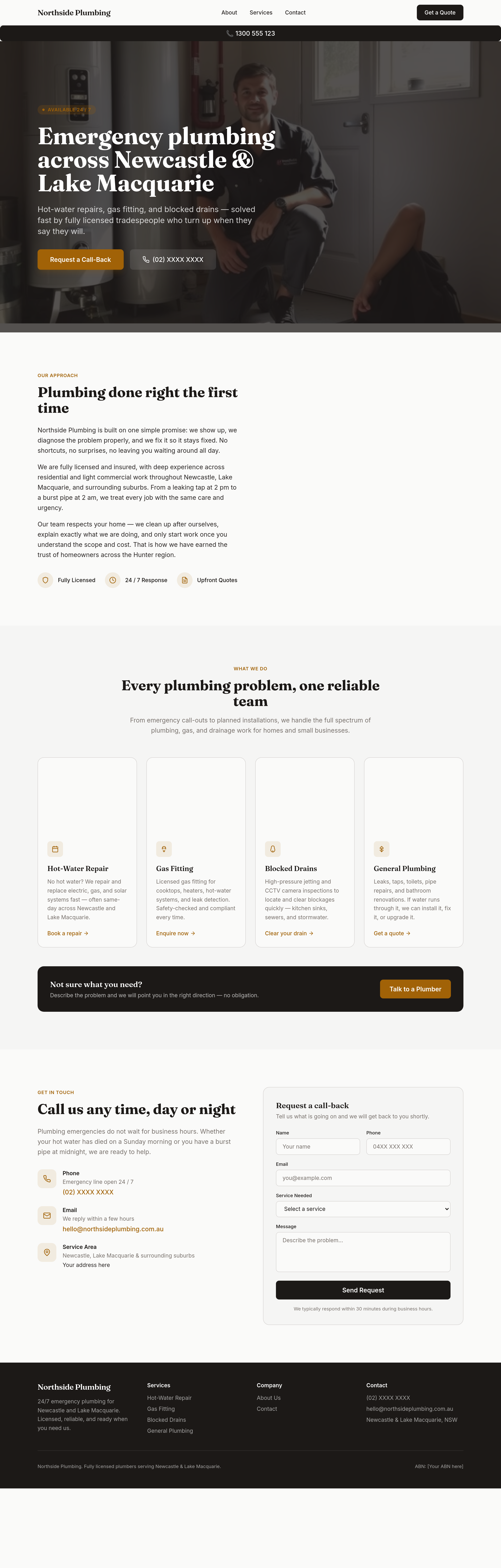
After
sticky phone button bottom-right on mobile that becomes a header bar on desktop
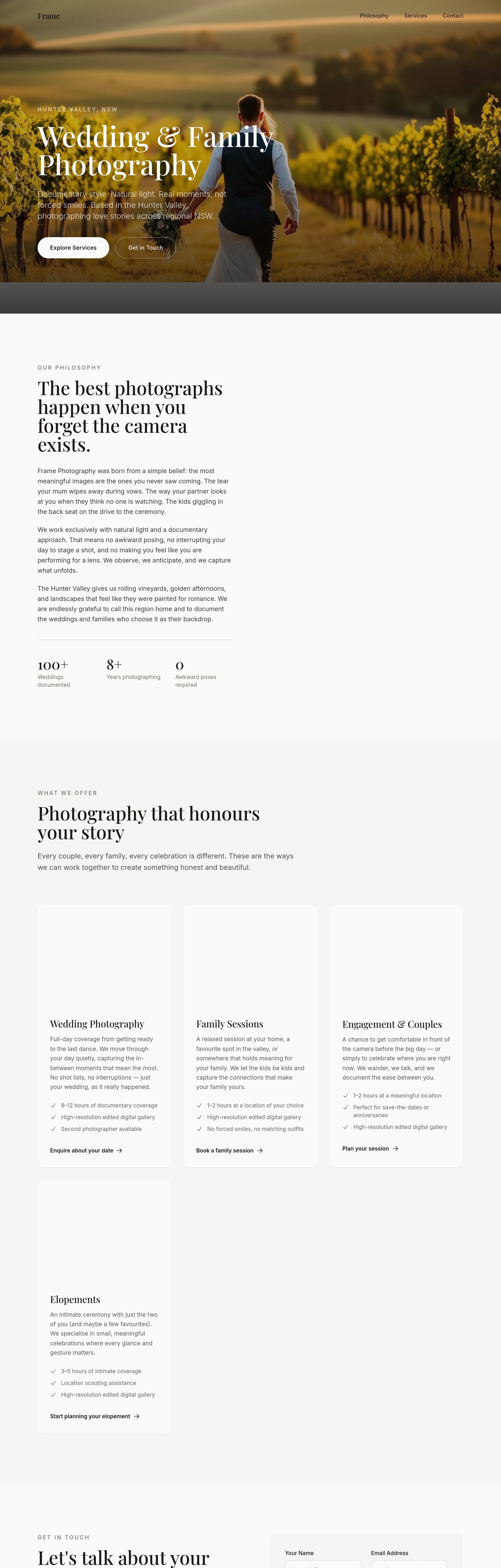
Before
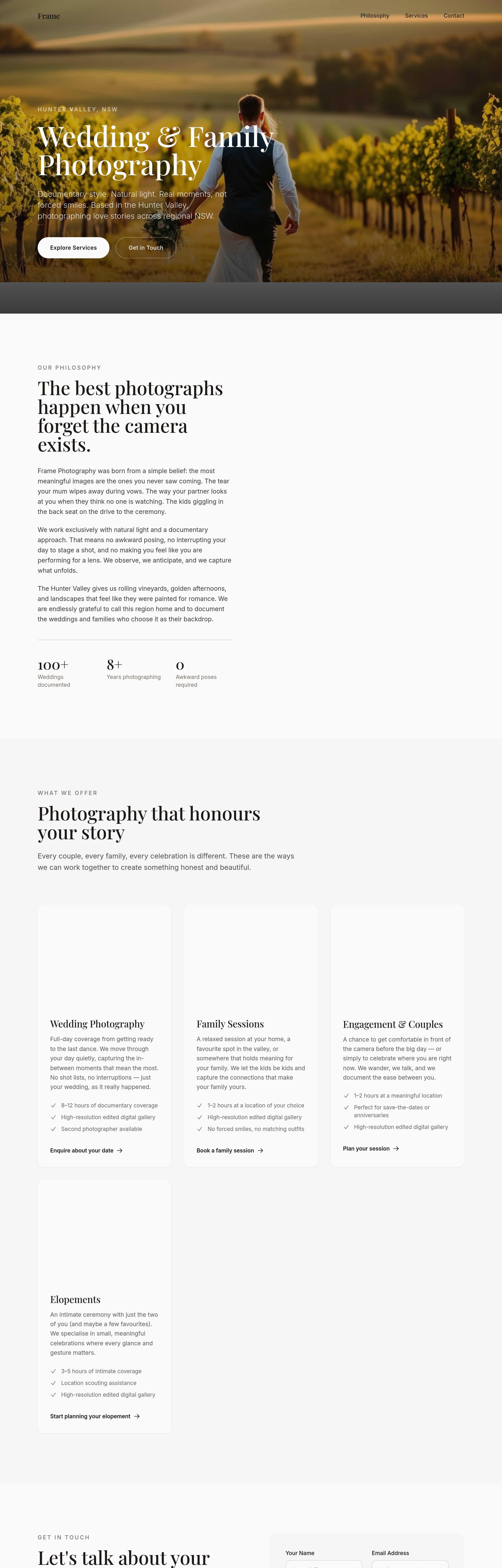
After
the portfolio grid loses impact at 4 cols — change to 3 with bigger images and breathing room
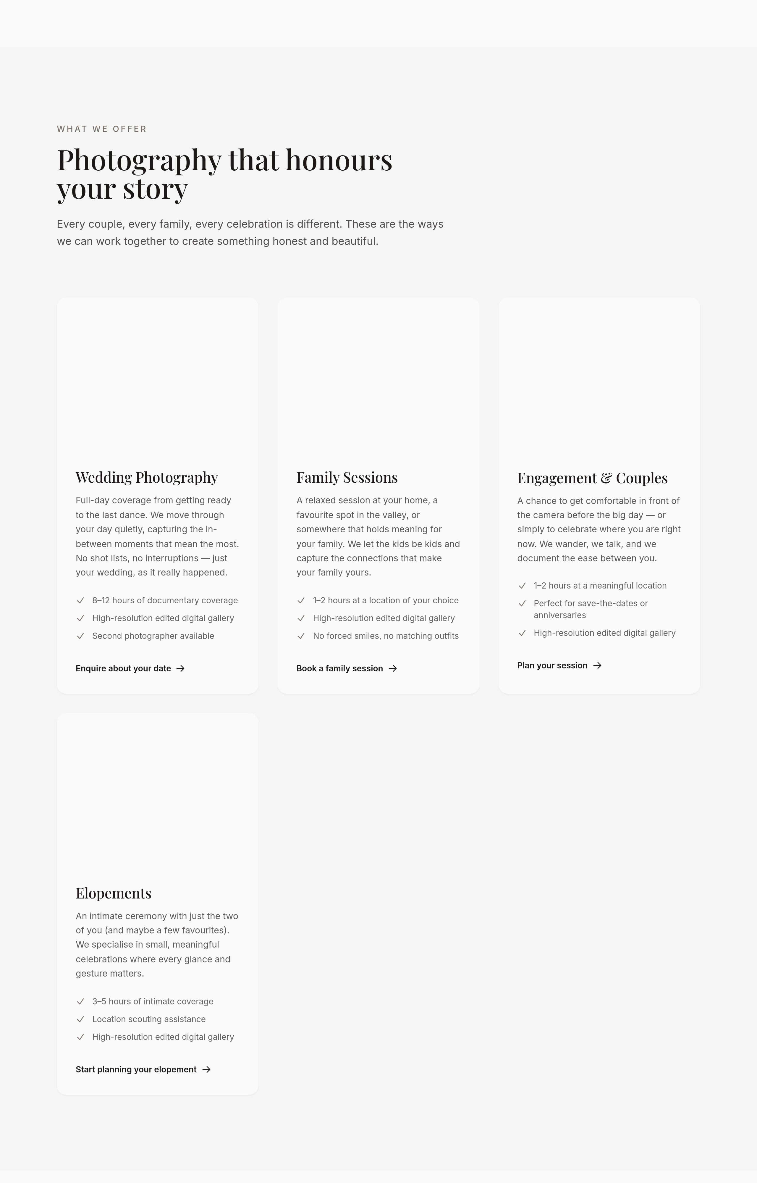
Before
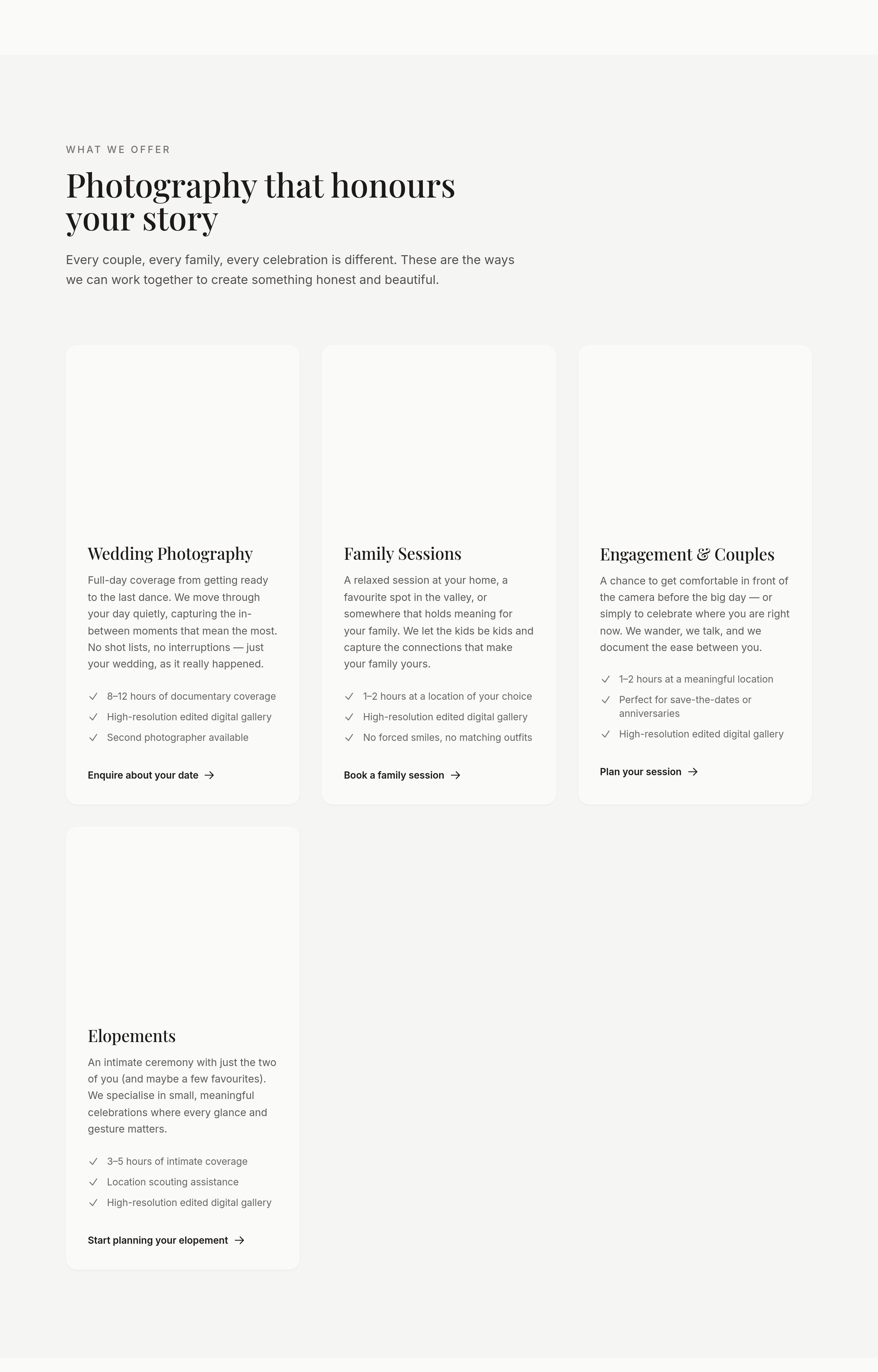
After
the portfolio should be a masonry grid, not uniform tiles
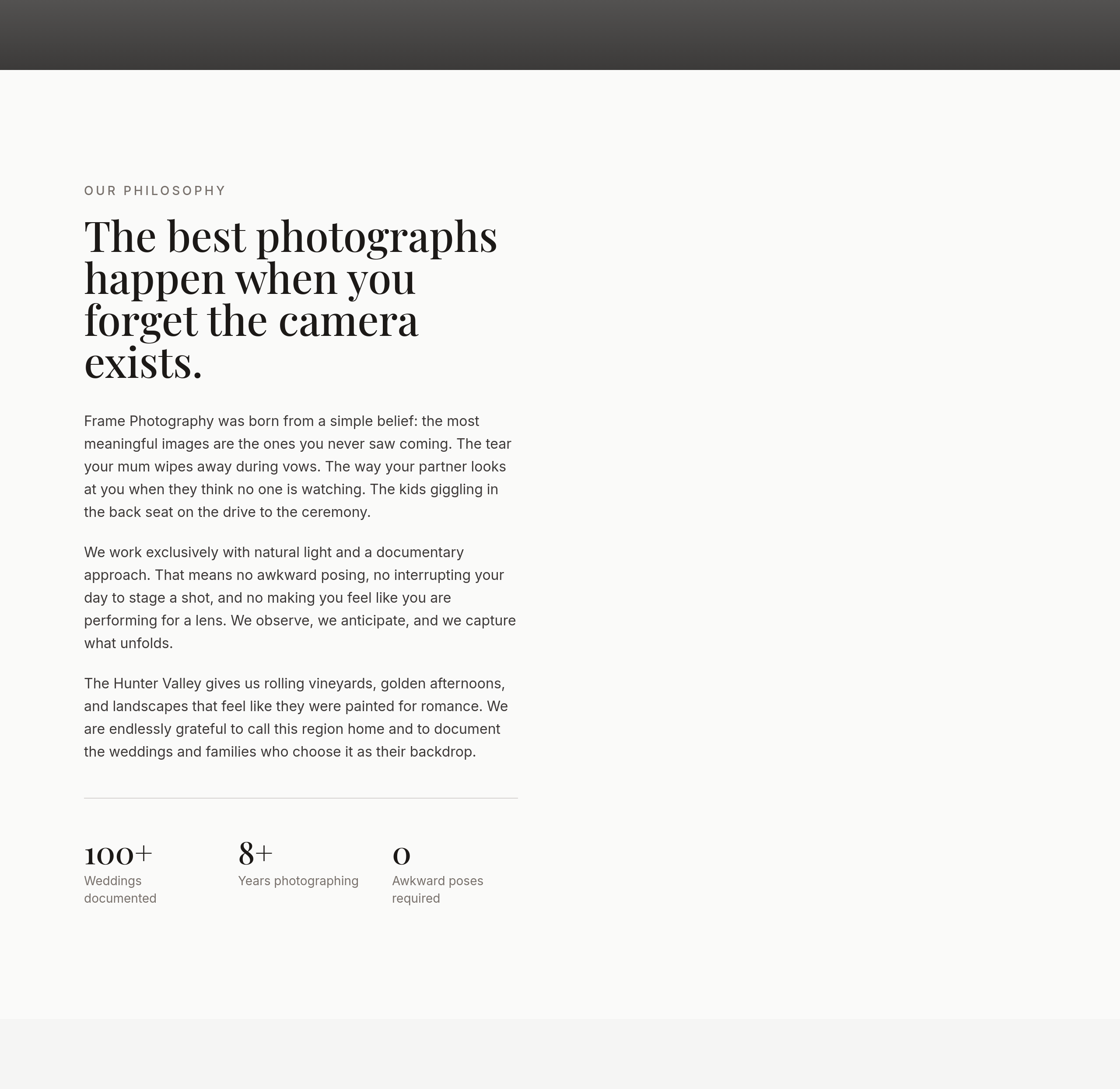
Before
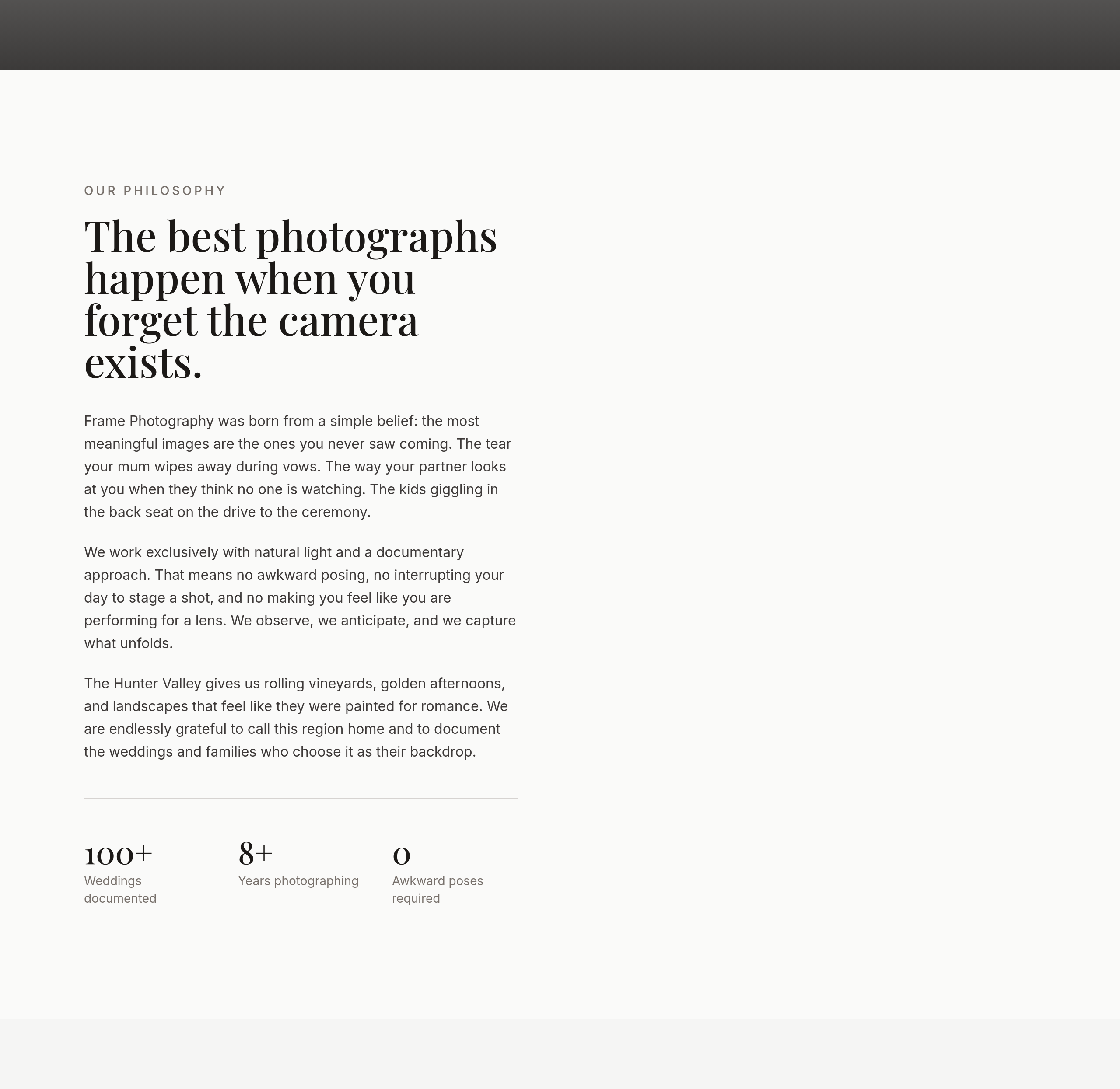
After
the about photo is small — make it half-width on desktop
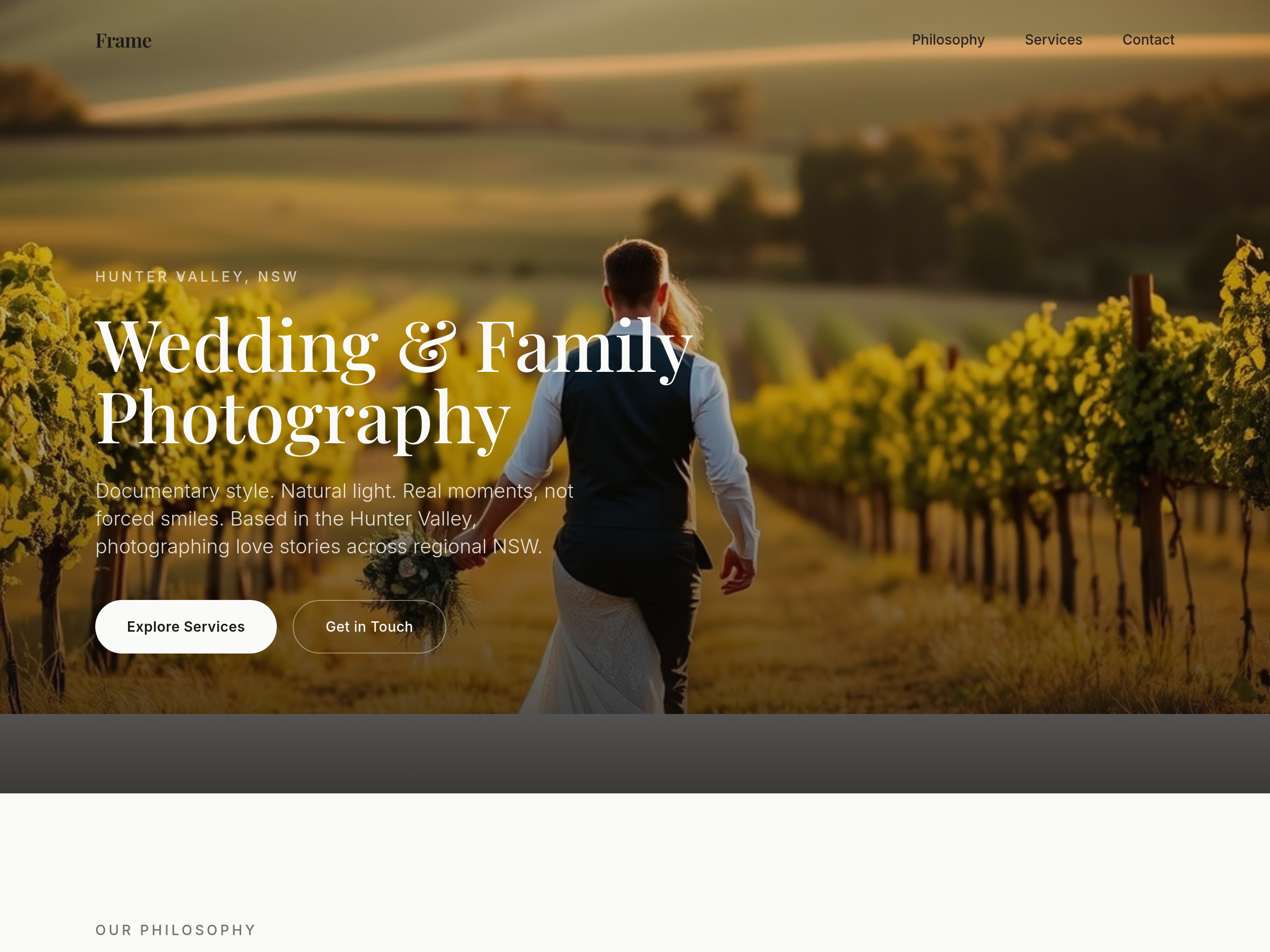
Before
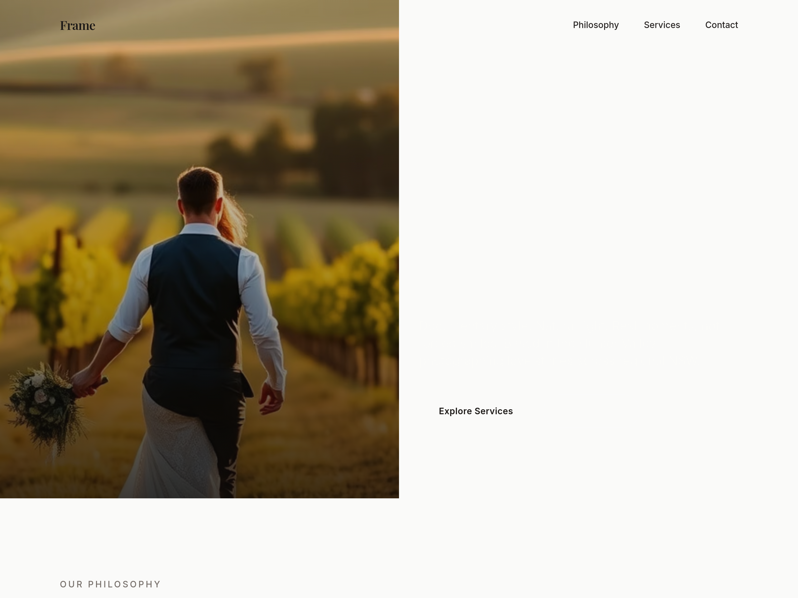
After
the hero is centered — make it a 2-column layout with copy left, image right
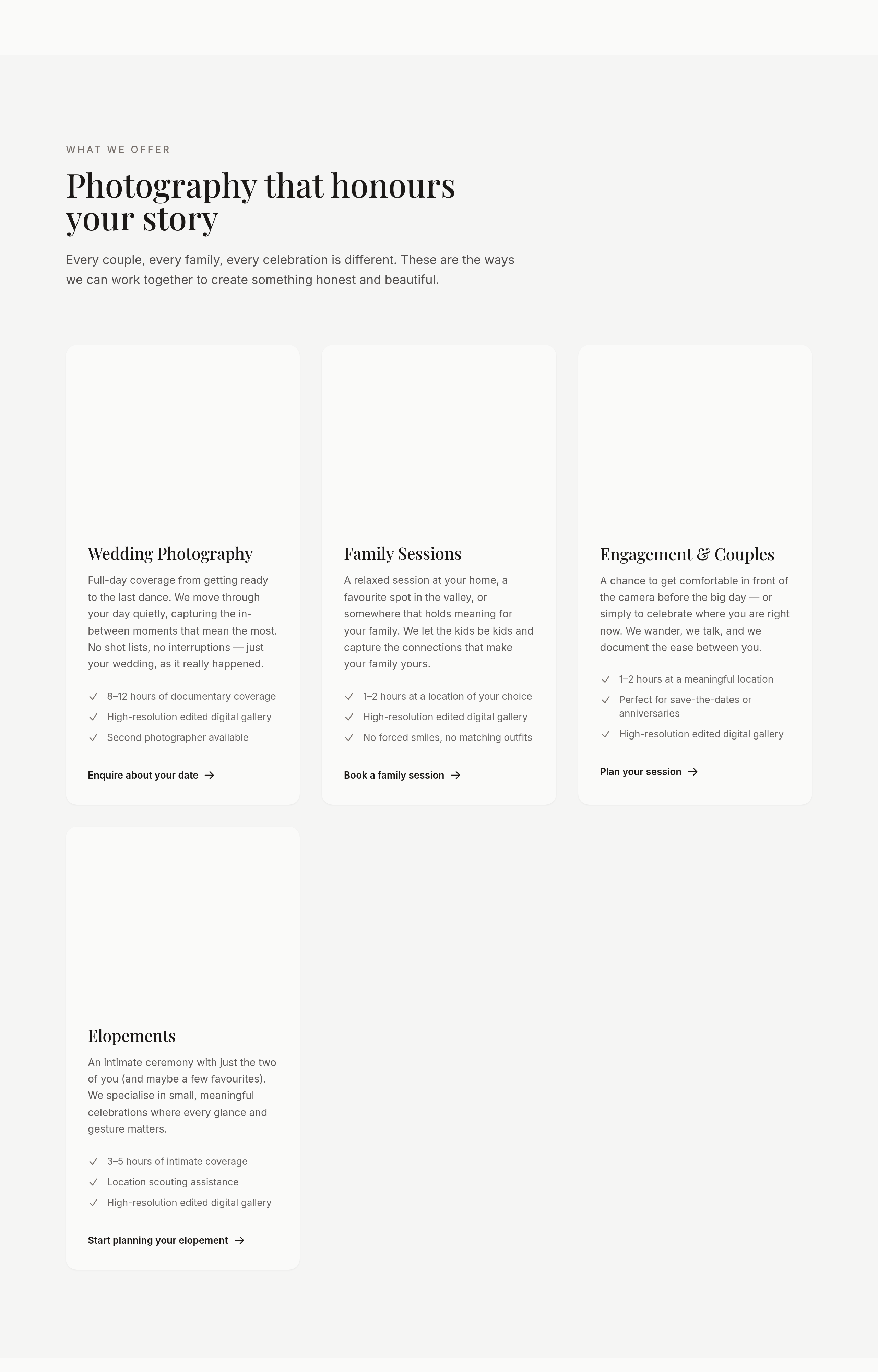
Before
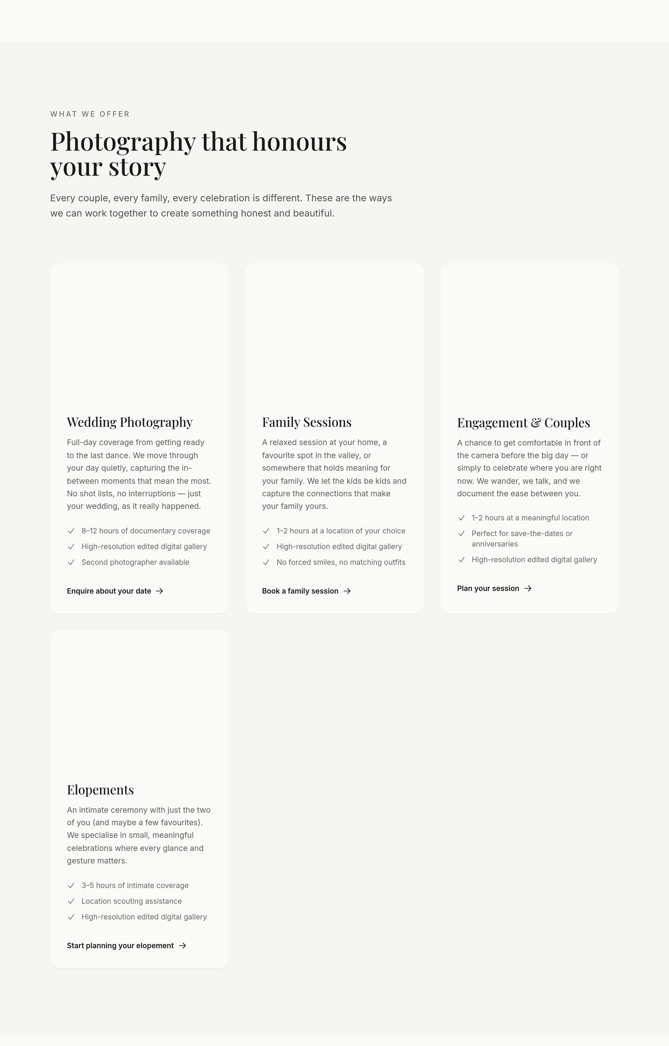
After
the portfolio should be 3 columns desktop, 1 column mobile, with no captions on mobile
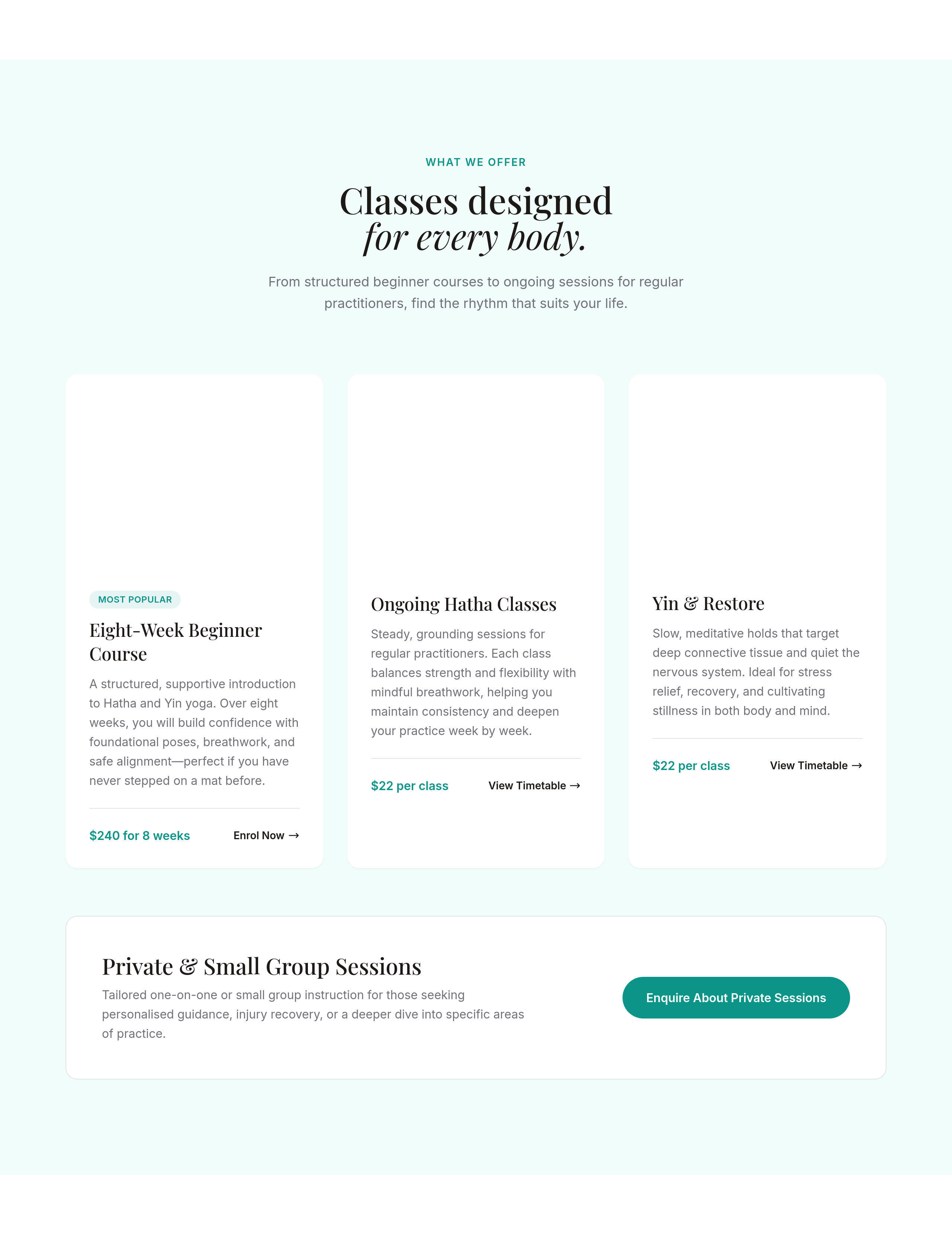
Before
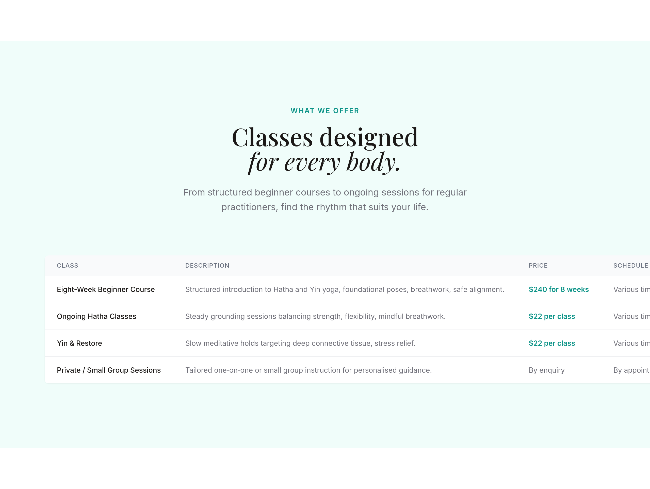
After
the class schedule should be a clean table, not paragraphs
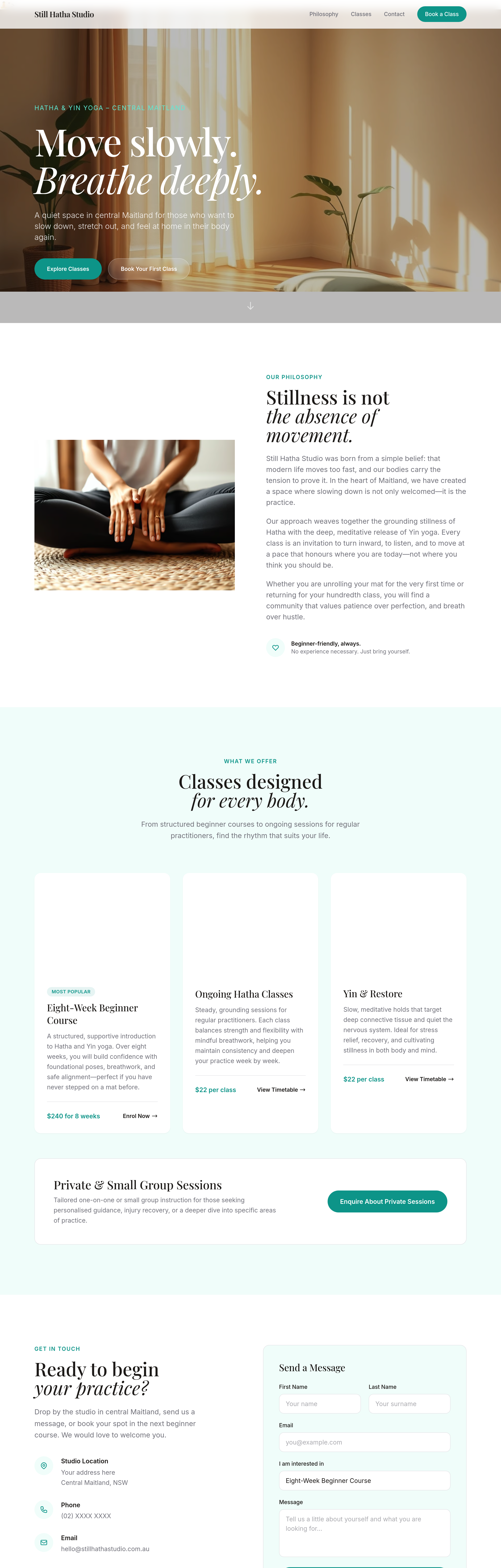
Before
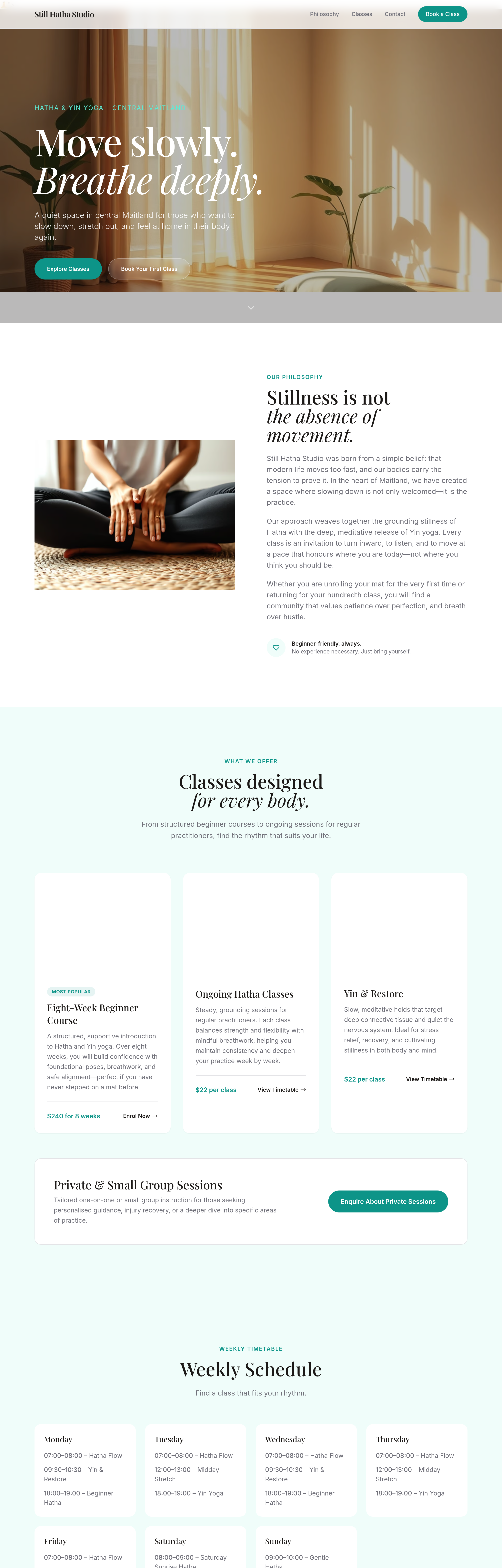
After
the schedule should be a clean week-grid layout, not paragraphs