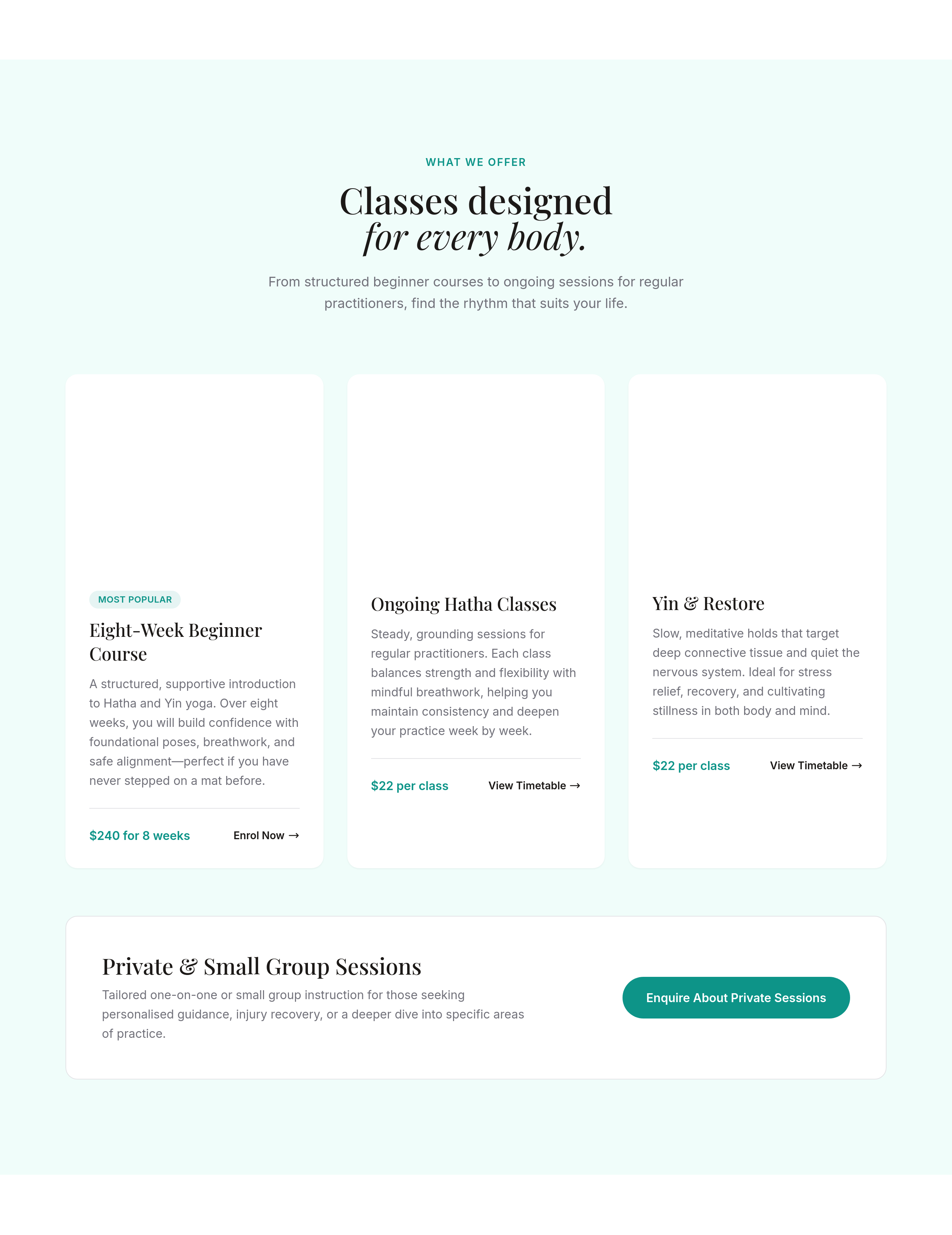
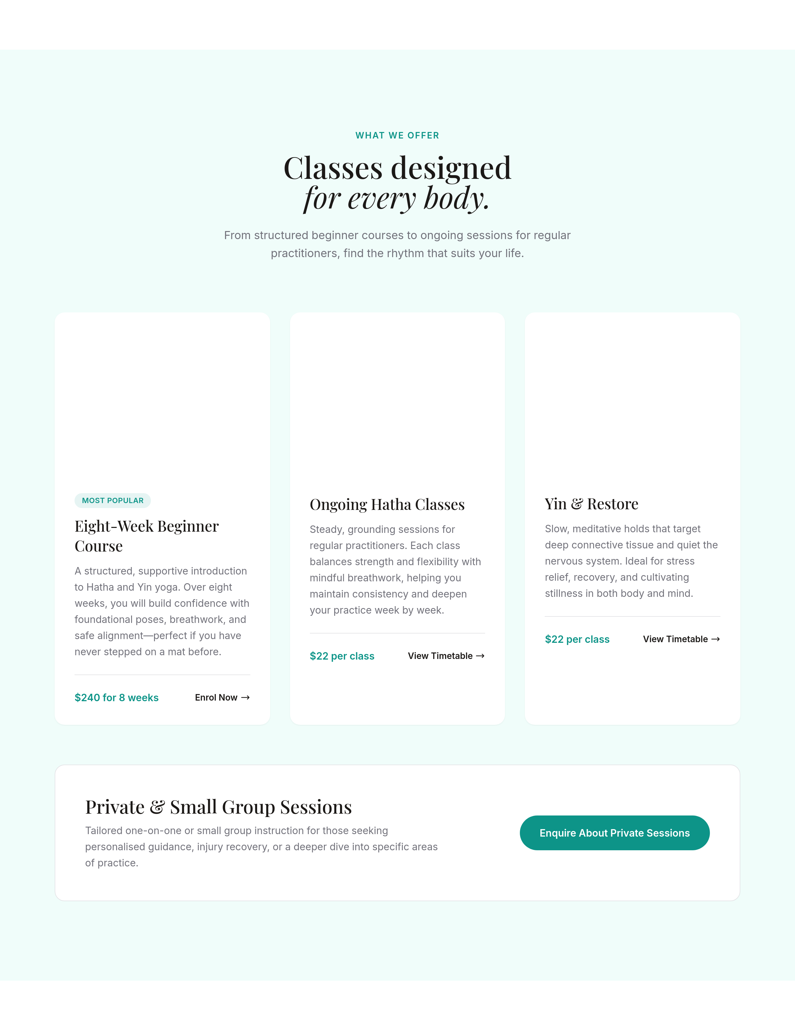
the services section is 1 column — make it 3 columns on desktop, stays 1 on mobile
What changed: services
View full page before/after
Agent's response
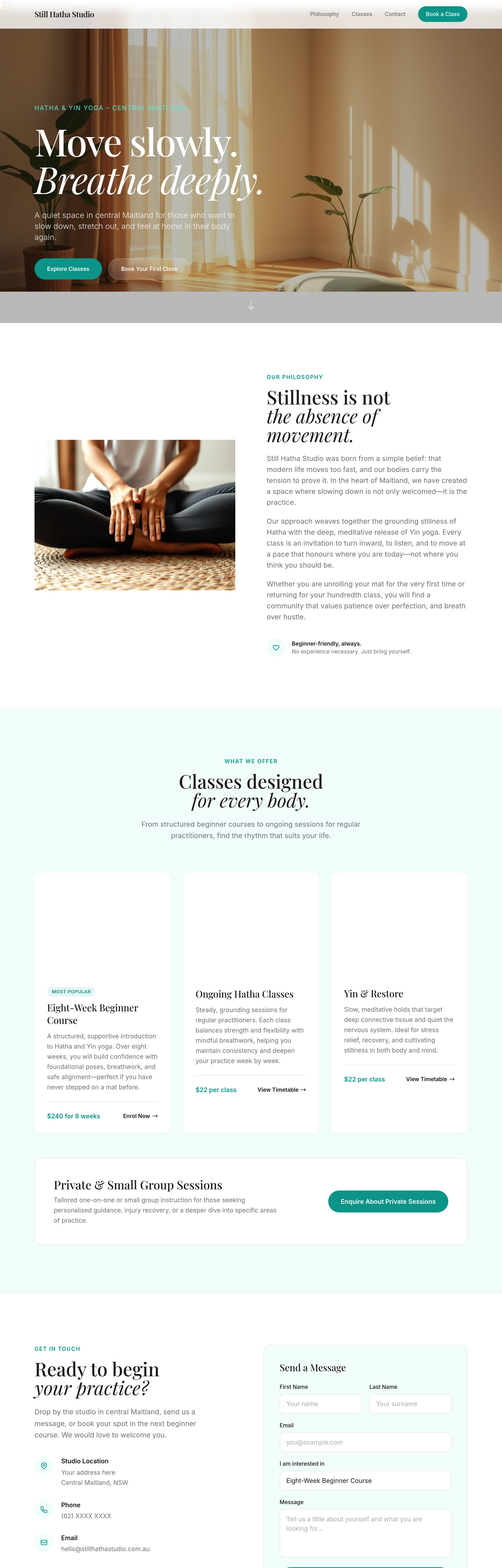
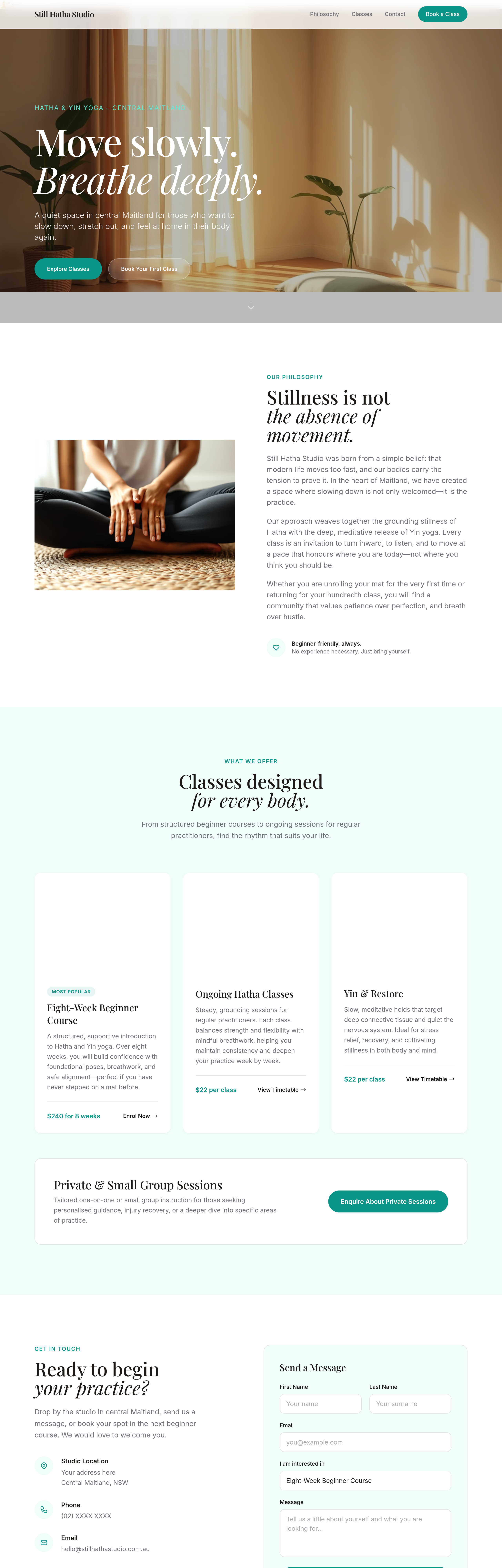
I’ve updated the **services** section so the grid uses `lg:grid-cols-3` instead of `md:grid-cols-3`. This means the layout will show **one column on mobile and tablet**, and switch to **three columns on desktop screens (≥1024 px)**. The change is saved as a draft—you can review and publish it when ready.
Tool calls
list_sections step 1
{
  "page": "index.html"
}
read_section step 2
{
  "page": "index.html",
  "section": "services"
}
change_class step 3
{
  "page": "index.html",
  "section": "services",
  "fromClass": "md:grid-cols-3",
  "toClass": "lg:grid-cols-3"
}