the hero is centered — make it a 2-column layout with copy left, image right
What changed: hero
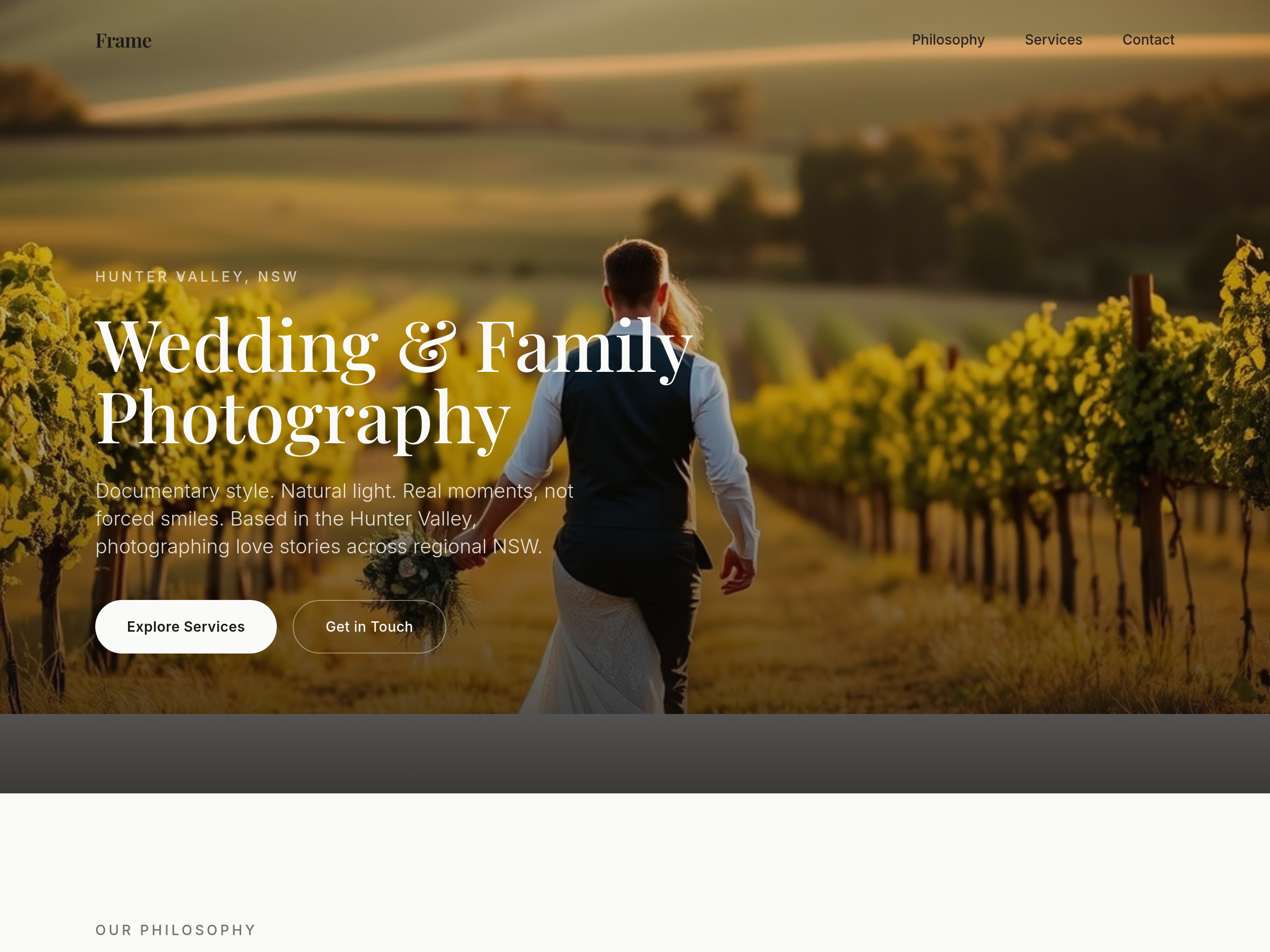
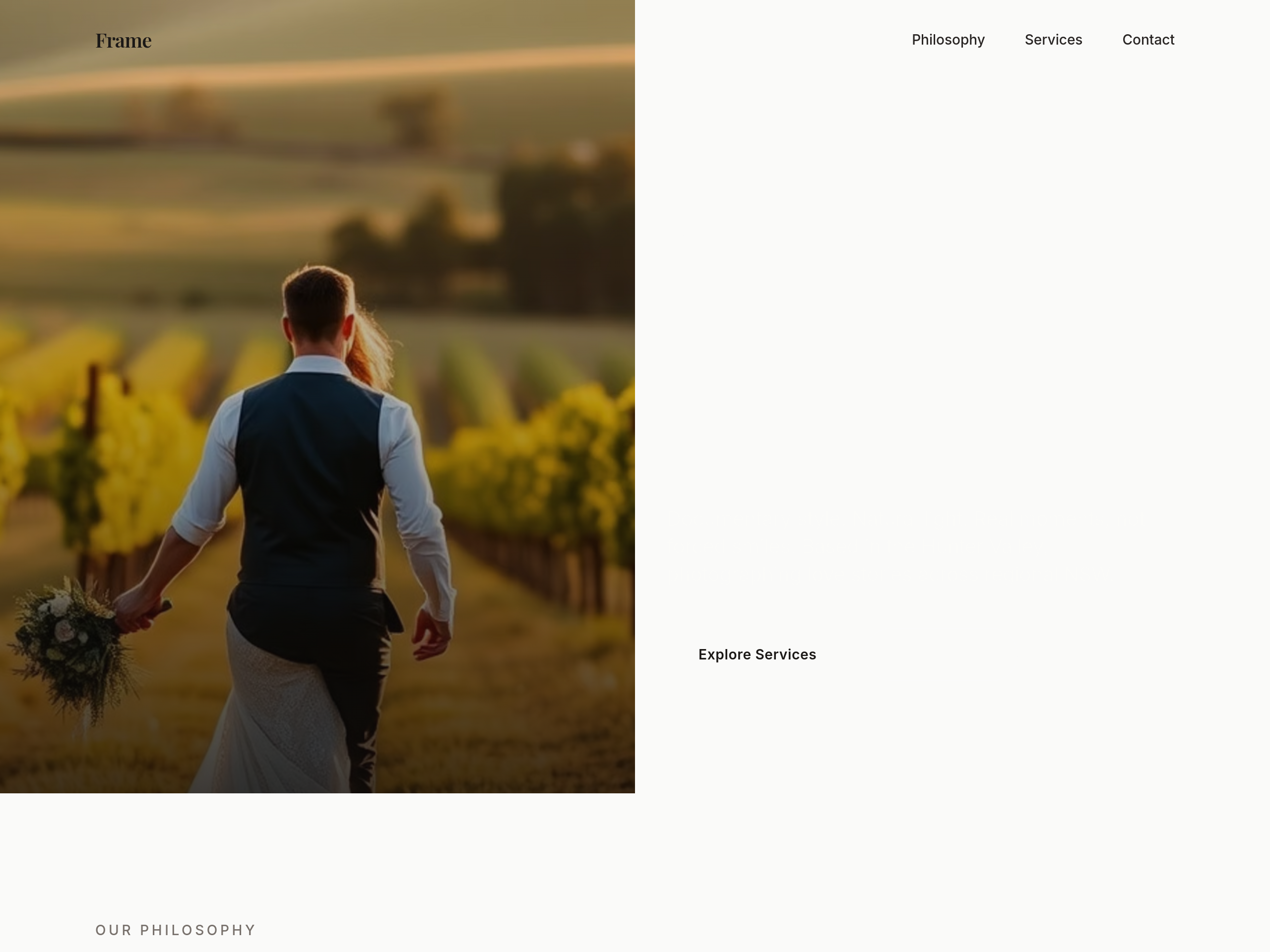
View full page before/after
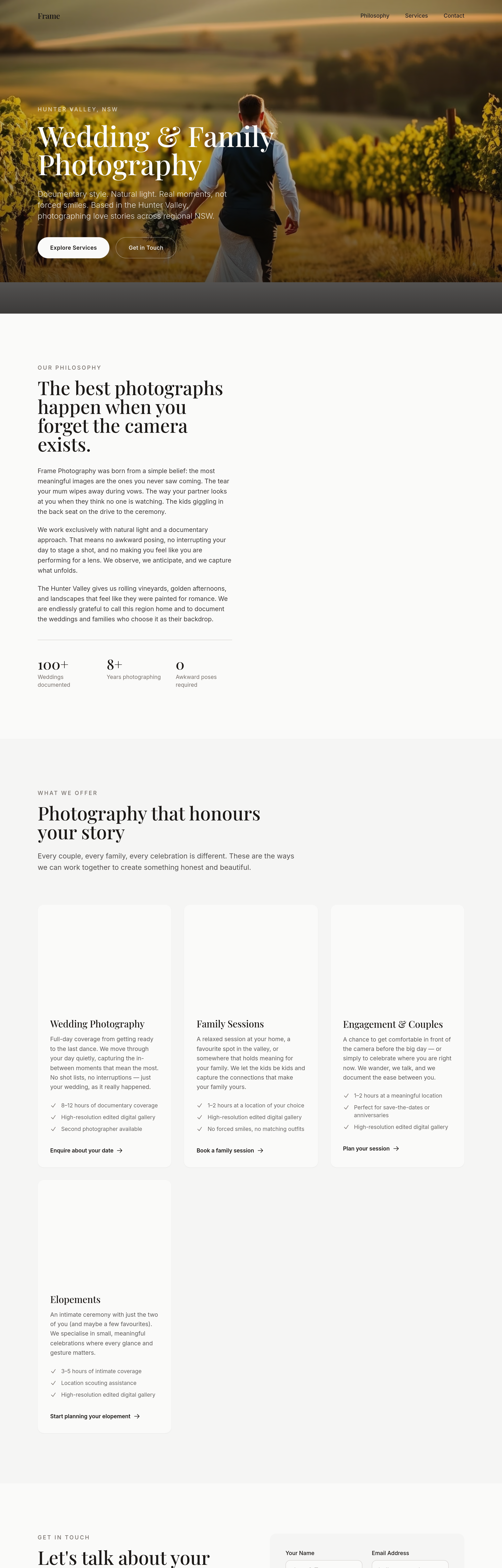
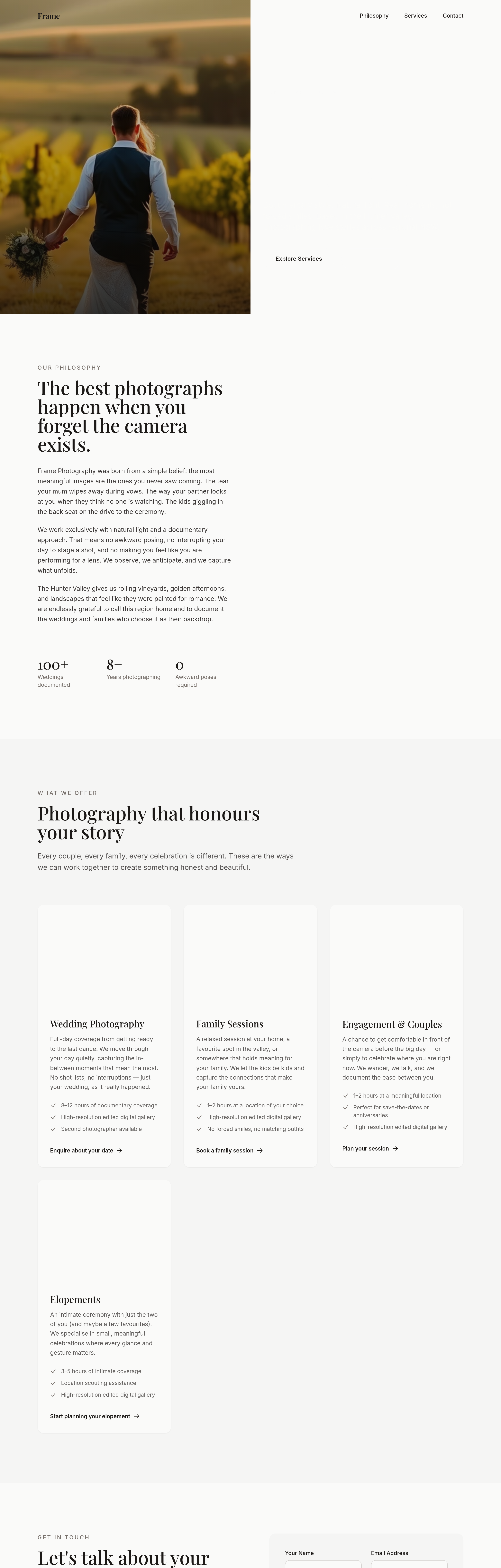
Agent's response
The hero section on your homepage has been rewritten to a responsive two‑column layout. On narrow screens the image sits above the text; from medium‑up the image appears on the right and the copy on the left, preserving all existing content and styling. The draft is ready for your review.
Tool calls
list_sections step 1
{
  "page": "index.html"
}
read_section step 2
{
  "page": "index.html",
  "section": "hero"
}
update_section step 3
{
  "page": "index.html",
  "section": "hero",
  "html": "<section id=\"hero\" class=\"relative min-h-screen flex flex-col md:flex-row overflow-hidden\">\n  <div class=\"relative w-full flex-none md:w-1/2\">\n    <img src=\"https://imagedelivery.net/6m4_IfDgOeP1pak8rs9ggw/2f9d1d2f-512a-4776-90d4-416b2994a800/hero\" srcset=\"https://imagedelivery.net/6m4_IfDgOeP1pak8rs9ggw/2f9d1d2f-512a-4776-90d4-416b2994a800/thumb 400w, https://imagedelivery.net/6m4_IfDgOeP1pak8rs9ggw/2f9d1d2f-512a-4776-90d4-416b2994a800/card 800w, https://imagedelivery.net/6m4_IfDgOeP1pak8rs9ggw/2f9d1d2f-512a-4776-90d4-416b29