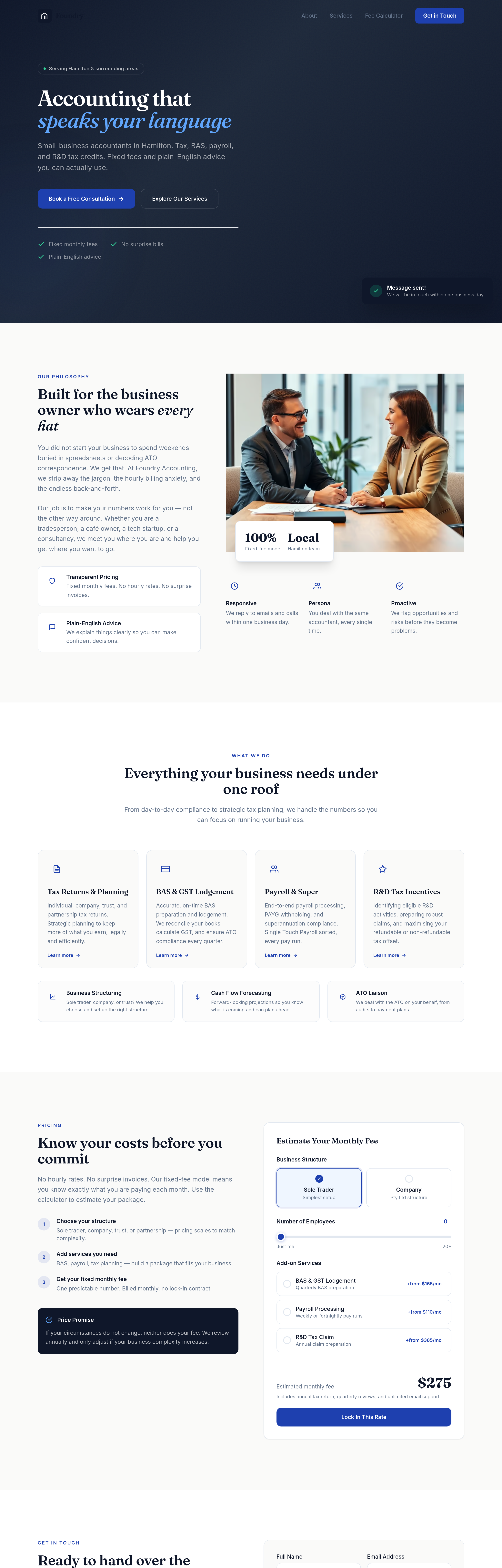
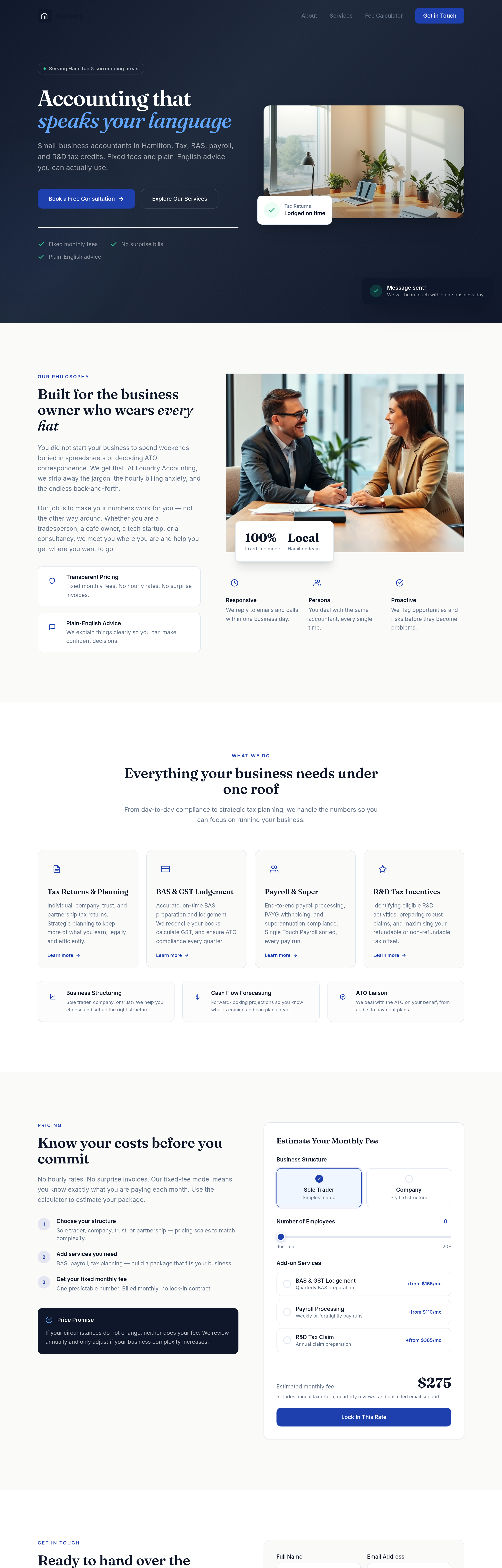
the value props read as a wall of text — split into 3 columns with icon + headline + 1-liner
What changed: about


View full page before/after
Agent's response
I’ve updated the “About” section so the three value‑prop blocks (Responsive, Personal, Proactive) now display in a three‑column grid on all screen sizes, with left‑aligned text. Each block keeps its icon, heading, and one‑liner description.
Drafts are ready for your review. Let me know if you’d like any further tweaks!
Tool calls
list_sections step 1
{
  "page": "index.html"
}
read_section step 2
{
  "page": "index.html",
  "section": "hero"
}
read_section step 3
{
  "page": "index.html",
  "section": "about"
}
read_section step 4
{
  "page": "index.html",
  "section": "services"
}
text_replace step 5
{
  "page": "index.html",
  "section": "about",
  "old": "mt-14 sm:mt-16 grid sm:grid-cols-3 gap-6",
  "new": "mt-14 grid grid-cols-3 gap-6"
}
text_replace step 6
{
  "page": "index.html",
  "section": "about",
  "old": "text-center sm:text-left",
  "new": "text-left"
}