the services grid is 3 columns — too many; make it 2 columns of bigger cards with icons
What changed: services
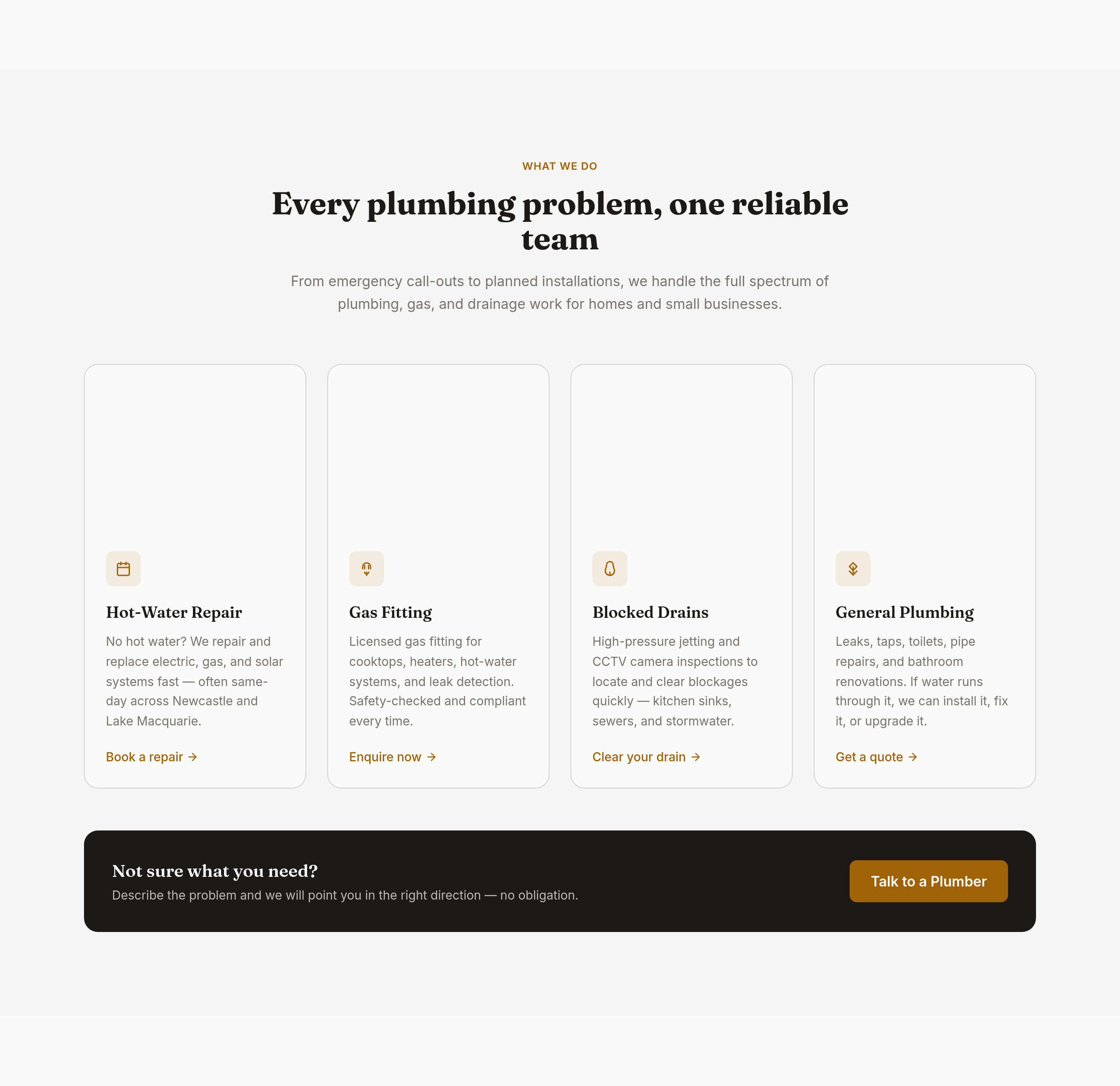
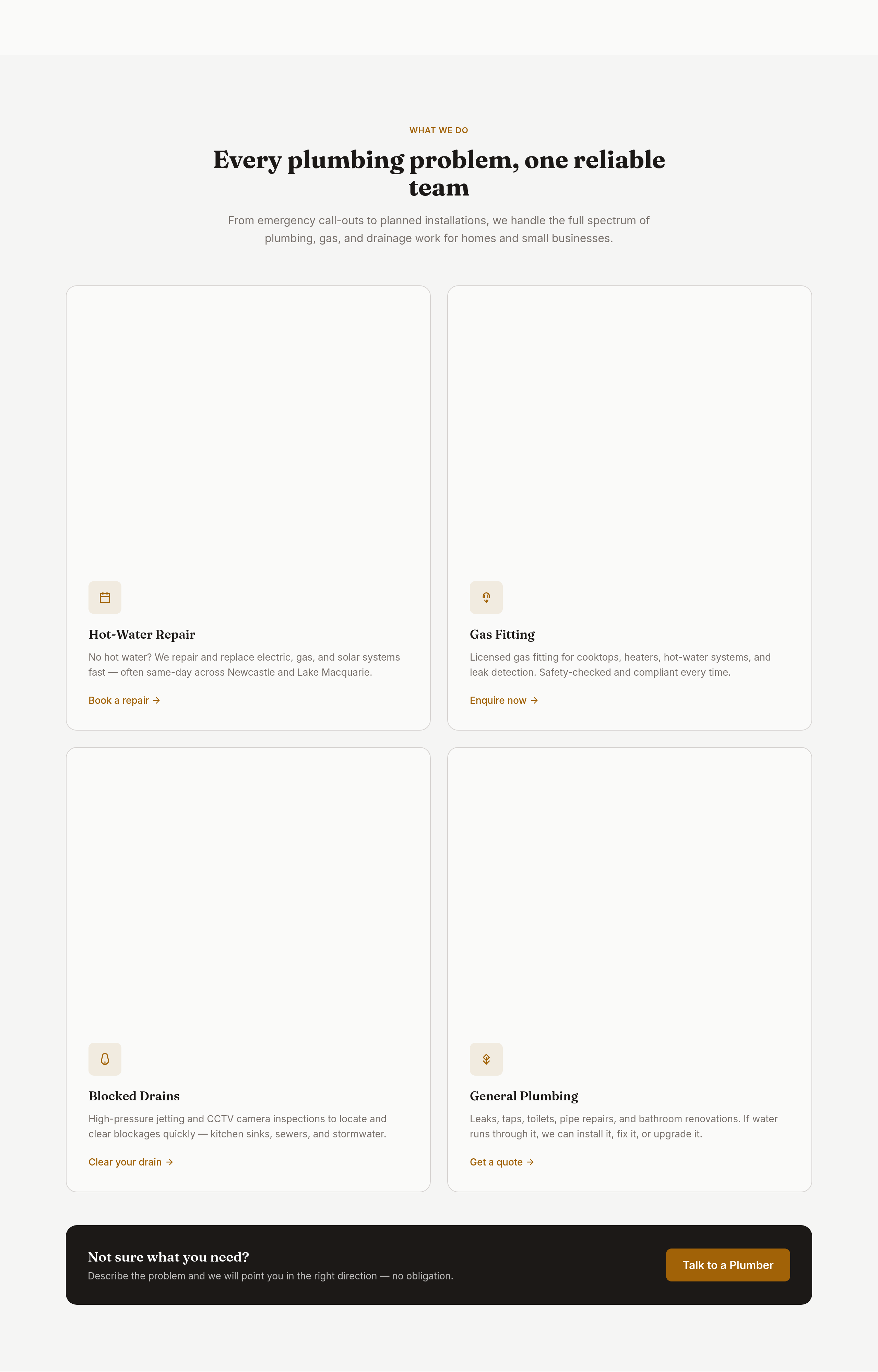
View full page before/after
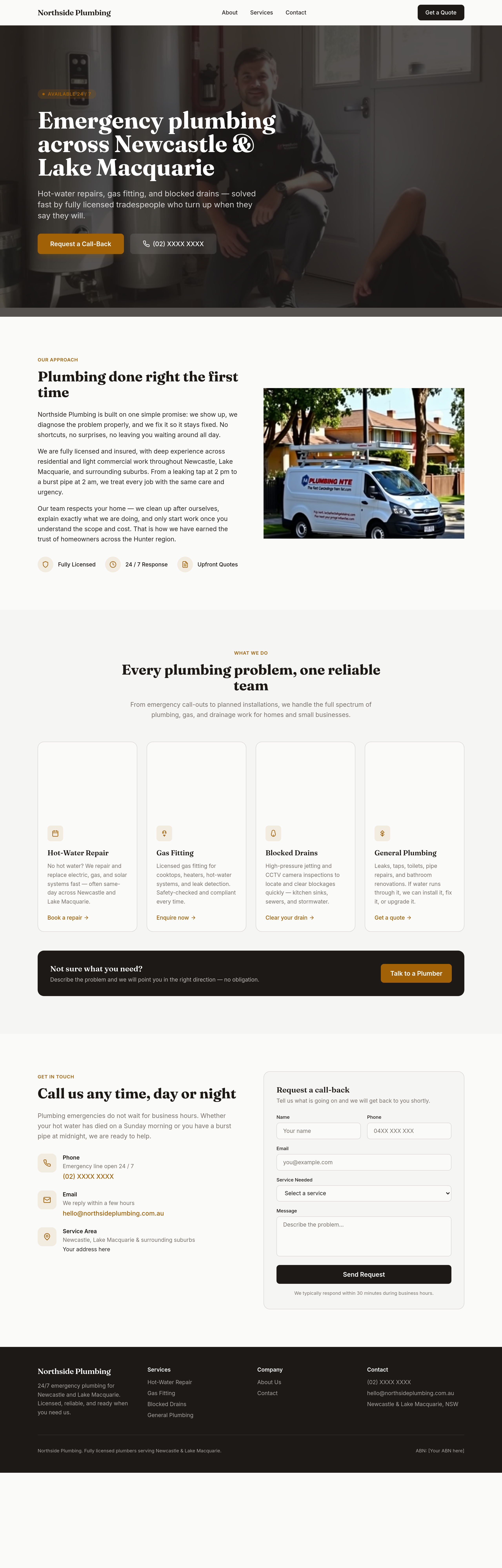
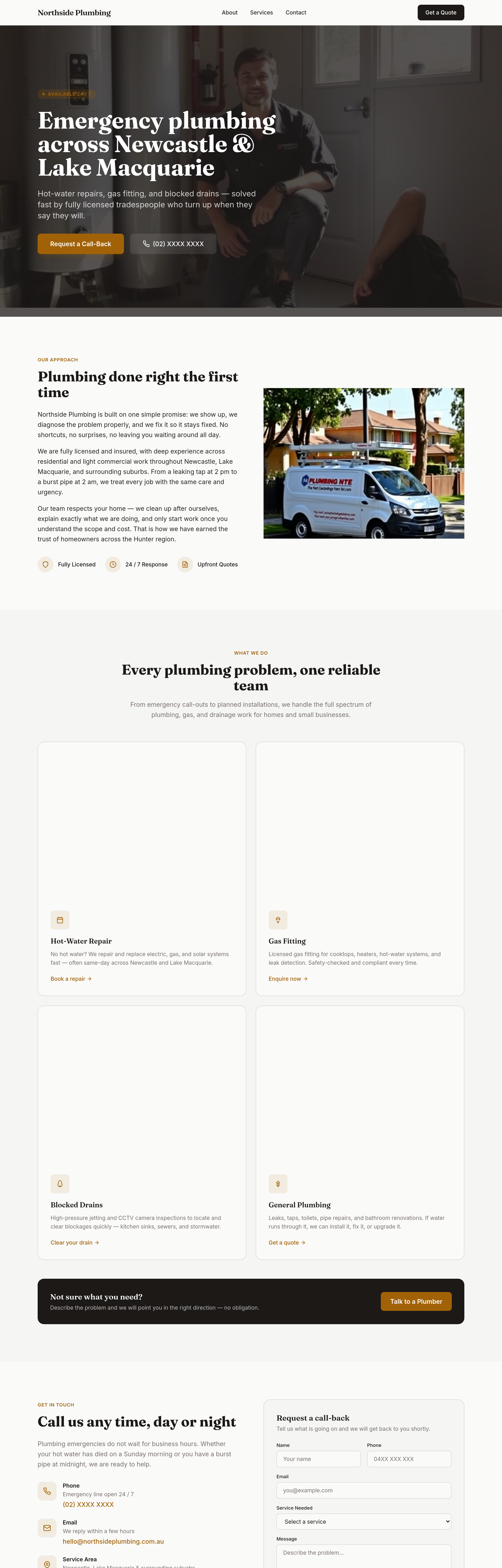
Agent's response
The services grid on the homepage has been updated to show two columns on larger screens (changed from `lg:grid-cols-4` to `lg:grid-cols-2`). Each service card now has increased padding (`p-8` instead of `p-6`) and larger icons (`w-12 h-12` instead of `w-10 h-10`) for a bigger, more prominent look. The draft is ready for your review.
Tool calls
list_sections step 1
{
  "page": "index.html"
}
read_section step 2
{
  "page": "index.html",
  "section": "services"
}
update_section step 3
{
  "page": "index.html",
  "section": "services",
  "html": "<section id=\"services\" class=\"py-20 sm:py-24 bg-surface\">\n    <div class=\"max-w-6xl mx-auto px-5 sm:px-8\">\n      <div class=\"text-center max-w-2xl mx-auto mb-14\">\n        <span class=\"text-accent text-xs font-semibold uppercase tracking-wider\">What We Do</span>\n        <h2 class=\"font-display font-bold text-3xl sm:text-4xl text-primary mt-3 mb-4 leading-tight\">\n          Every plumbing problem, one reliable team\n        </h2>\n        <p class=\"text-muted leading-relaxed\">\n          From emergency call-outs to p