plumber
57 examples run against cap-plumber.flarepages.au.

Before

After
all images should have descriptive alt text — replace any 'image' or empty alts with real descriptions

Before

After
the button colours have low contrast against the background — bump them to meet WCAG AA

Before

After
the body text is too small for older readers — bump to 18px minimum
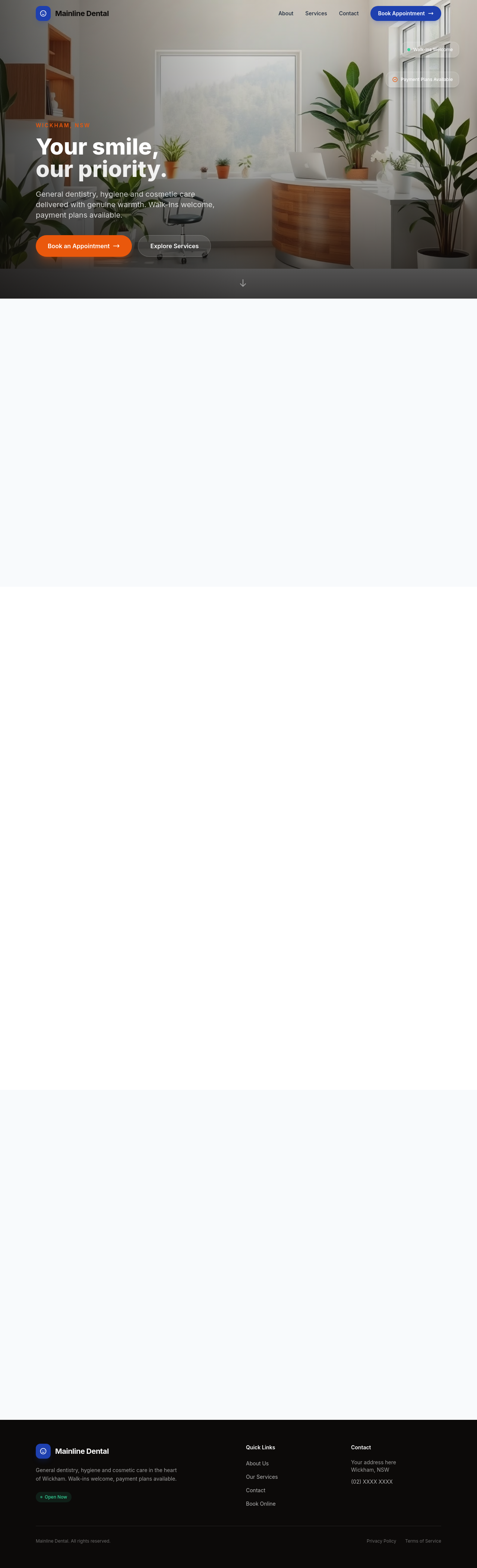
Before

After
add aria-labels to icon-only buttons so screen readers can announce them

Before

After
the focus outline on interactive elements is invisible — add a clear focus ring
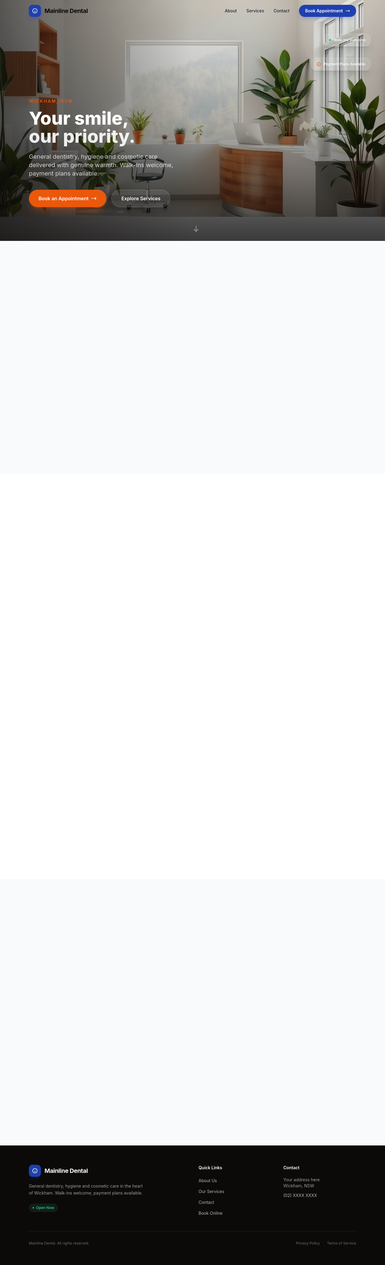
Before

After
the form has no labels — every input needs a visible label

Before

After
the section heading hierarchy is wrong — make sure there's exactly one h1 then h2s for sections
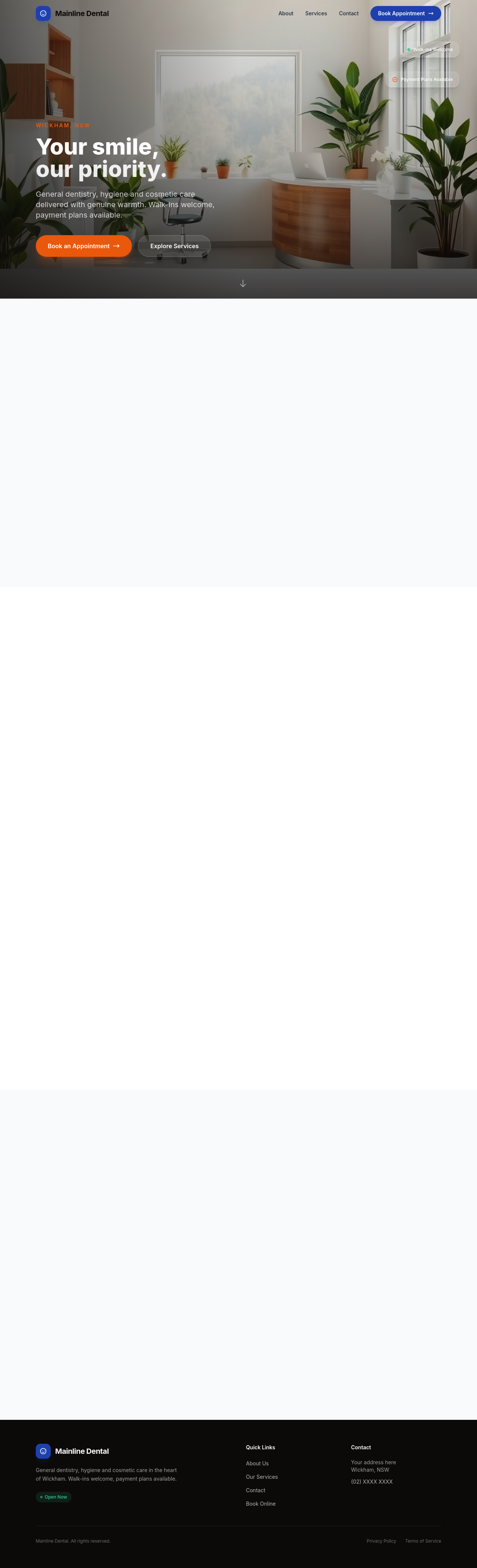
Before

After
add a 'skip to main content' link at the top for keyboard users

Before

After
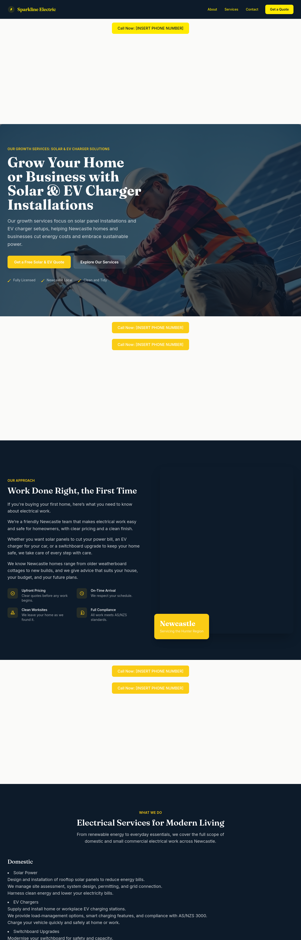
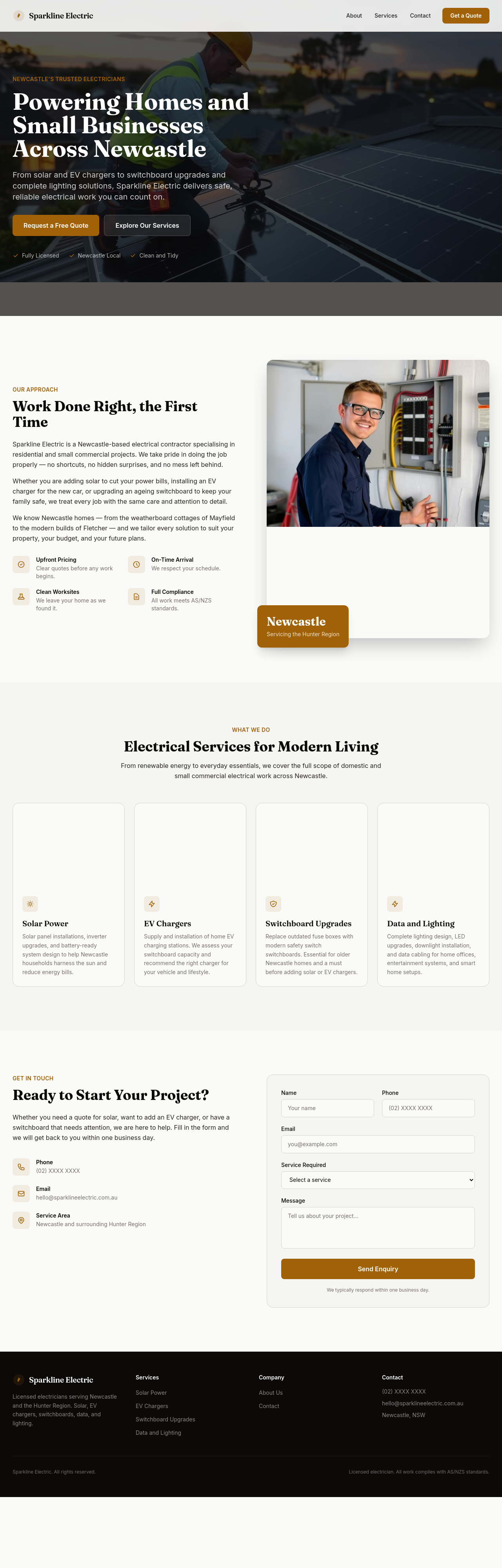
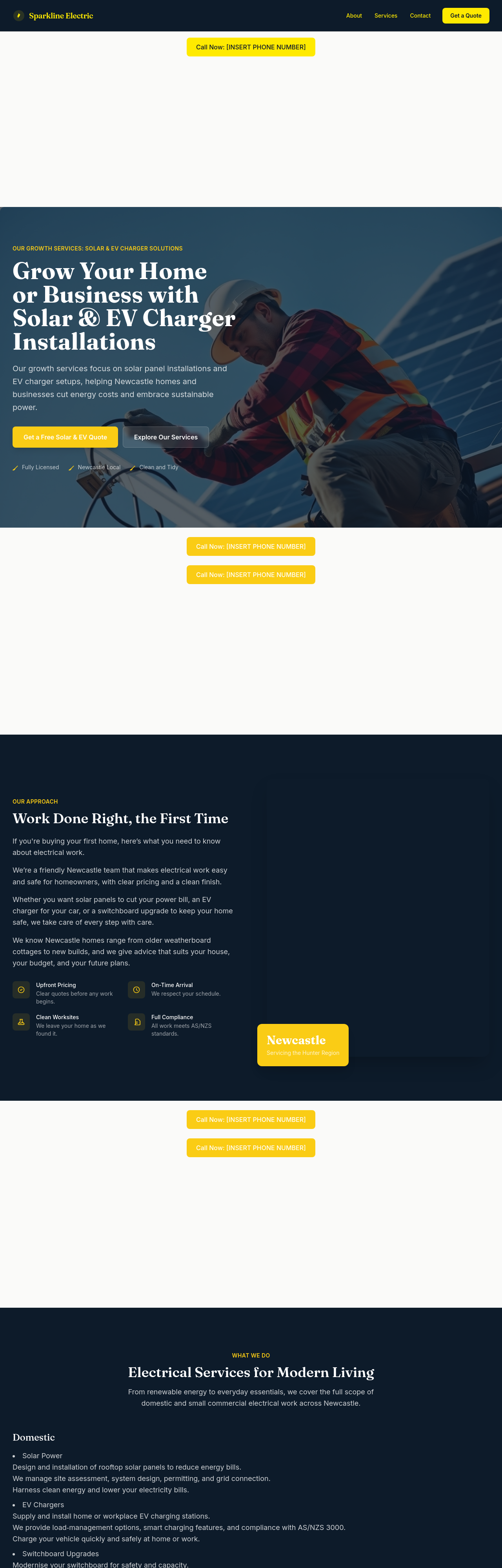
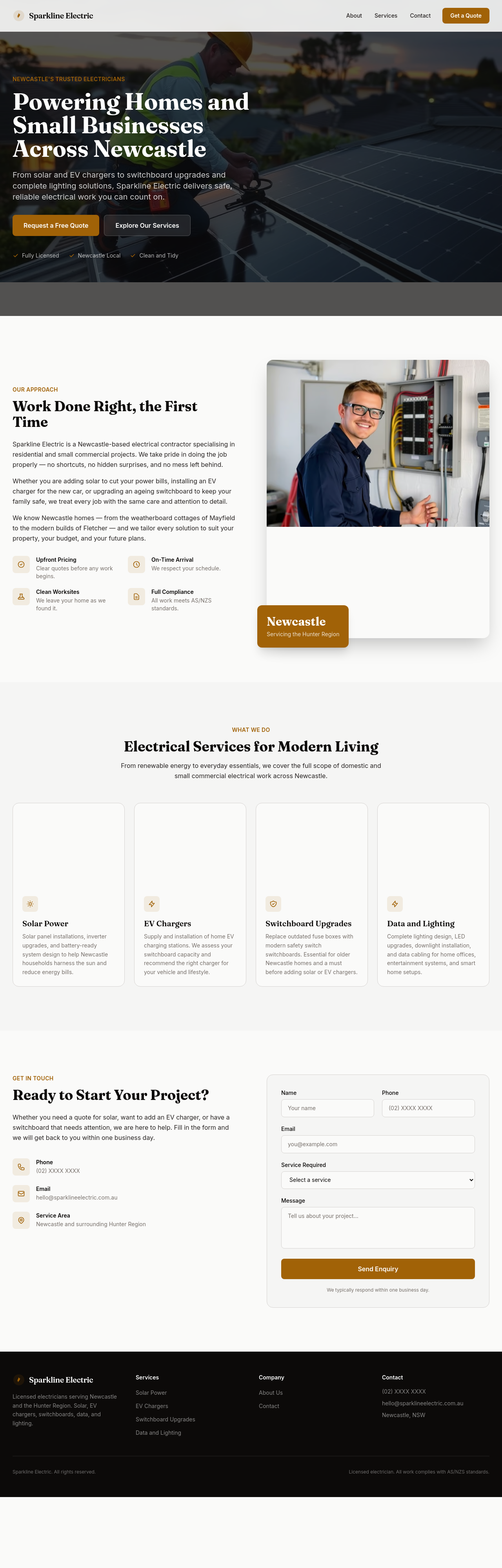
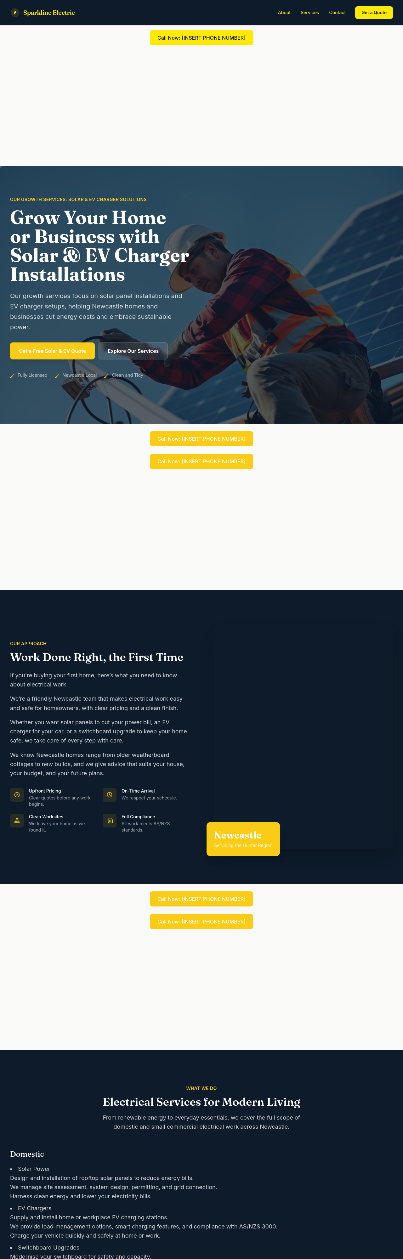
the hero is too generic — emphasise solar + EV chargers as growth services
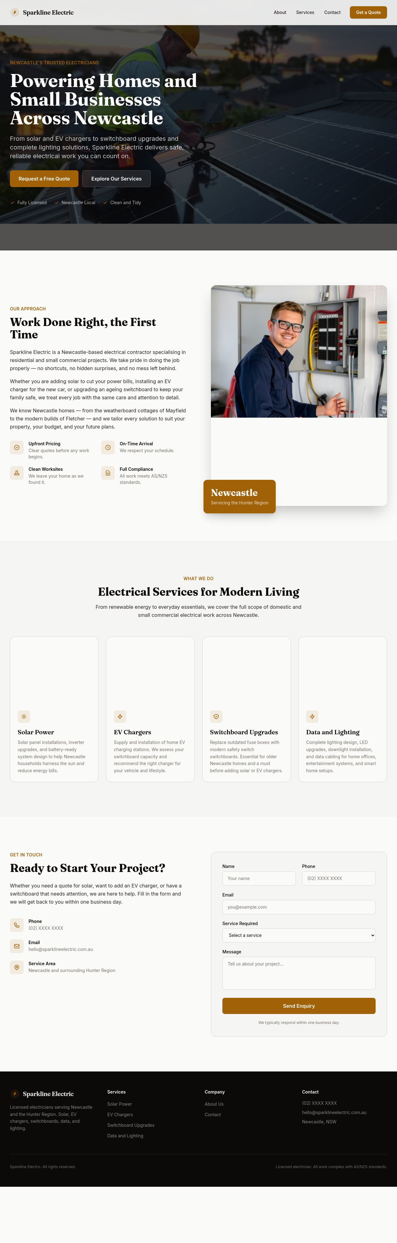
Before
After
add a solar section — explain panel install, battery storage, government rebates, payback period
Before
After
add an EV charger section — home install, choice of brands, $1500-$3000 typical install
Before
After
rewrite the services list to separate domestic, small commercial, and renewables

Before

After
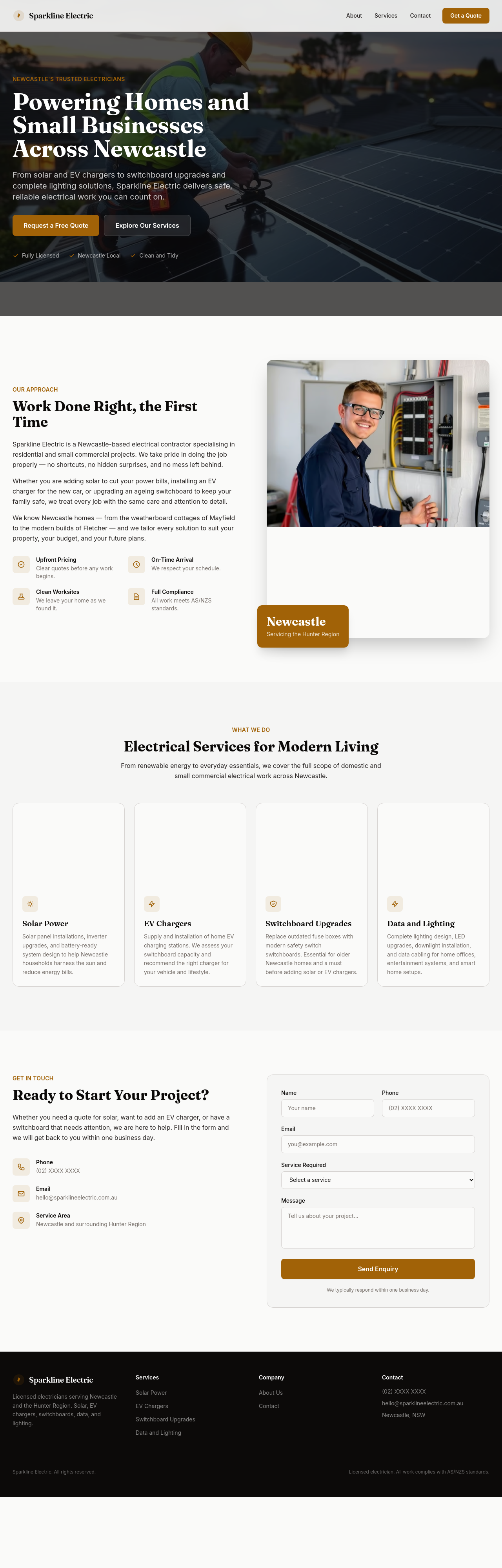
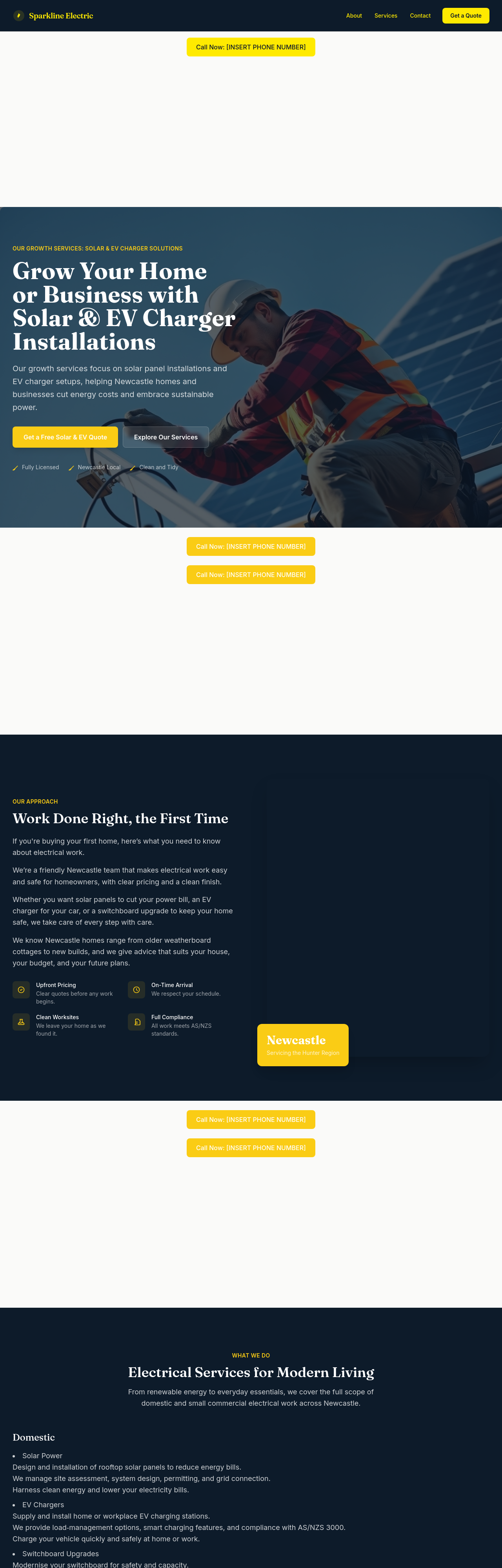
add a 'book a quote' CTA in the hero AND mention licensed-electrician credentials in the footer
Before
After
add a section explaining switchboard upgrades — when you need one, why, typical cost range
Before
After
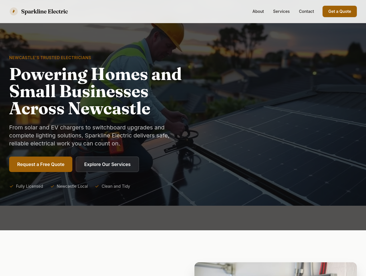
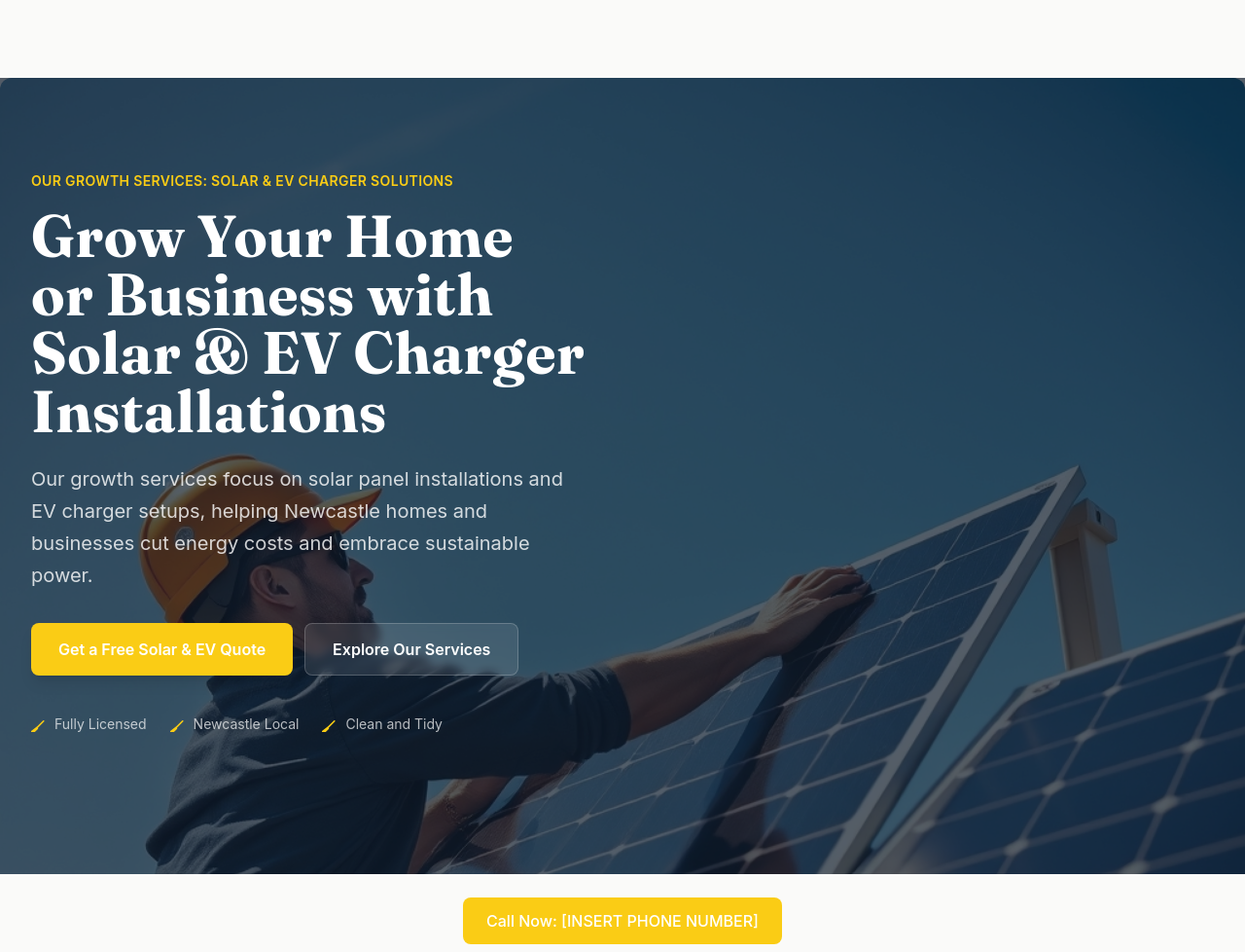
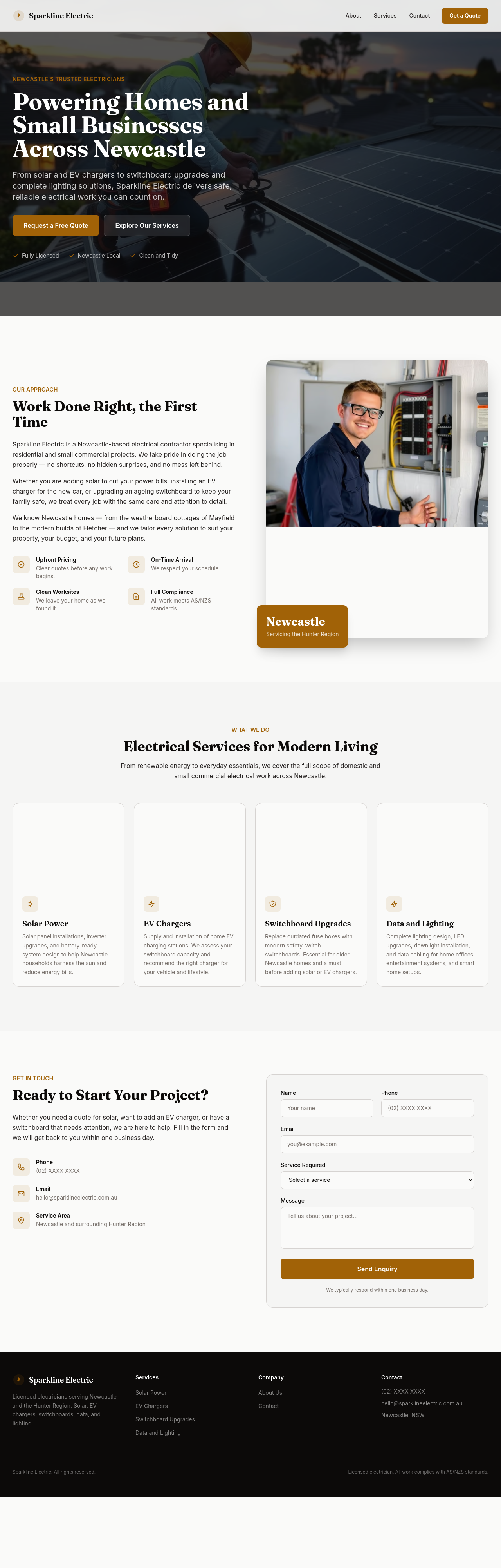
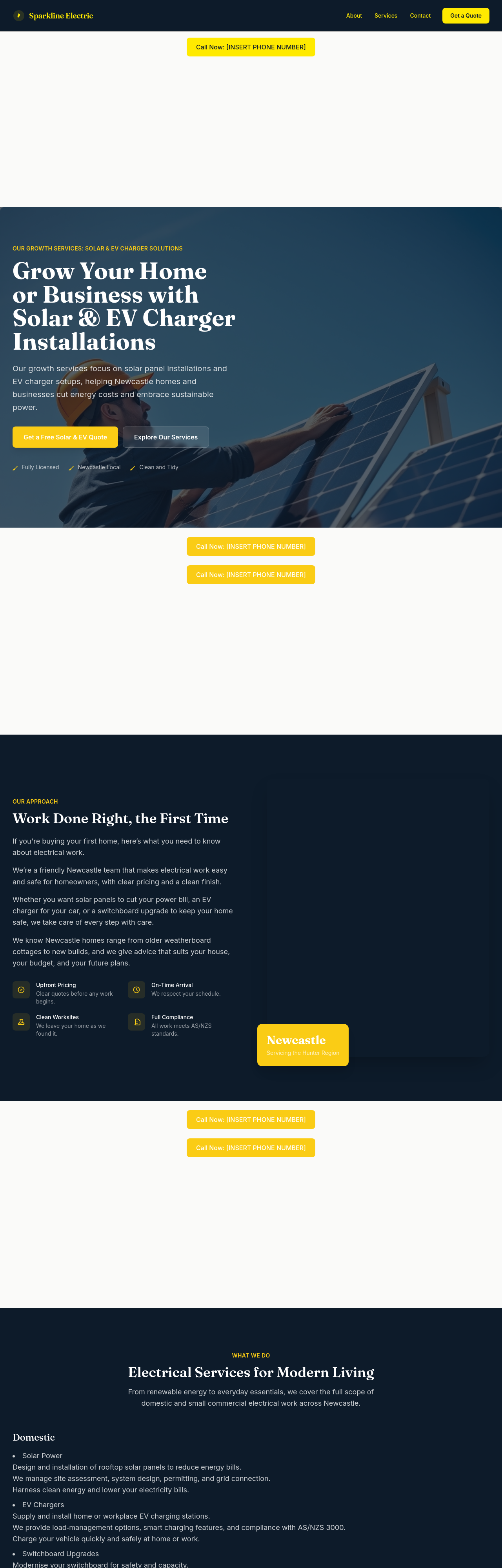
add a hero image of an electrician installing a rooftop solar panel under blue sky — bright, professional, Australian context
Before
After
add a small case study — recent residential solar + battery install with kW size, cost, savings
Before
After
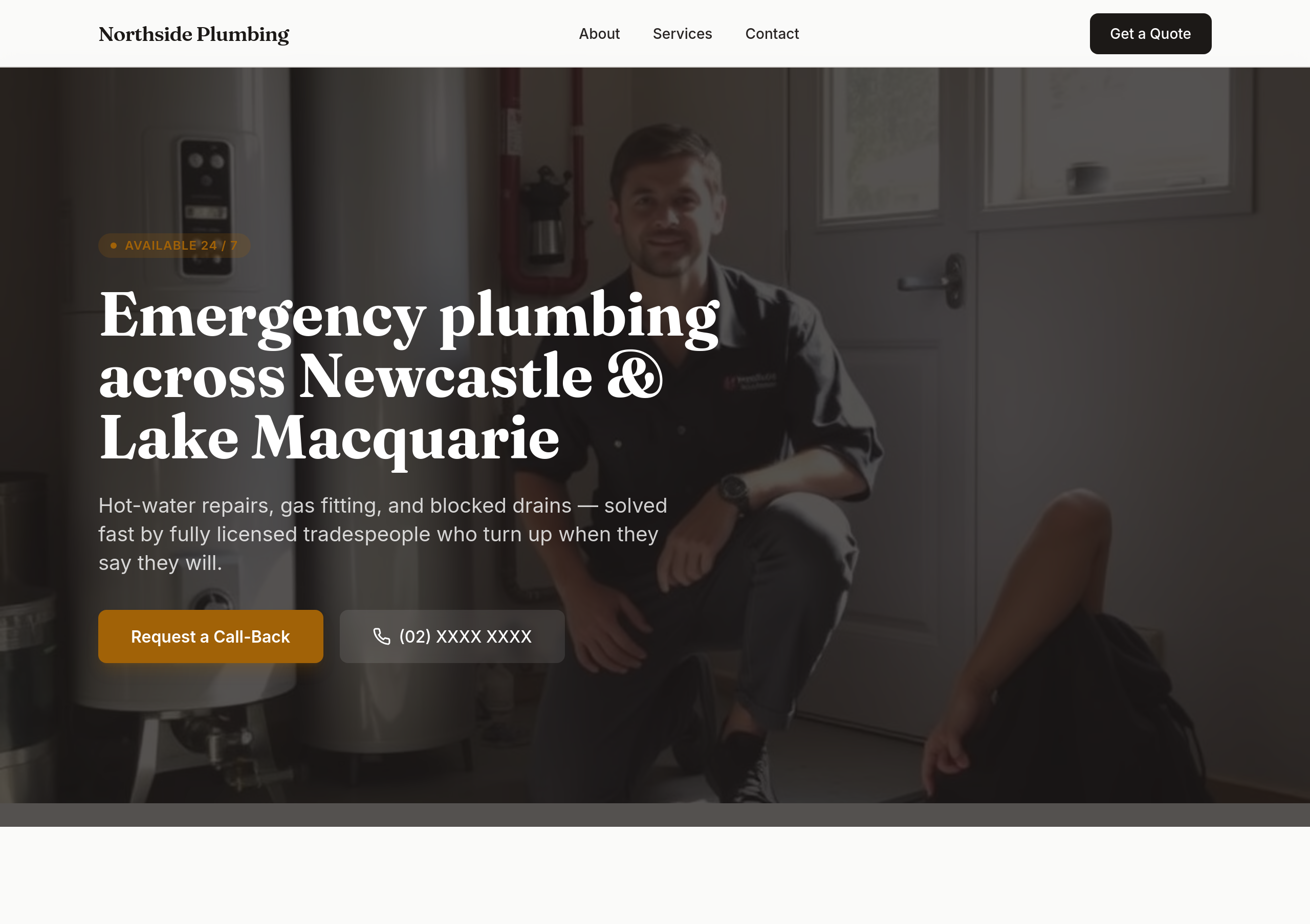
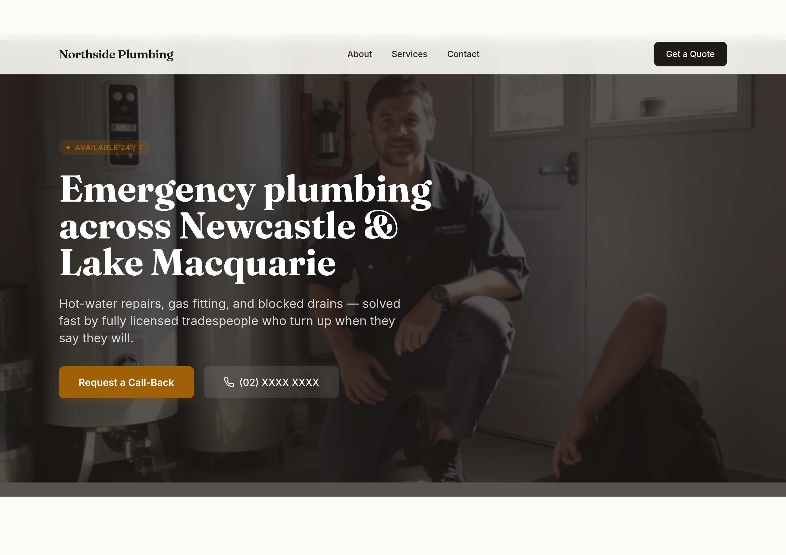
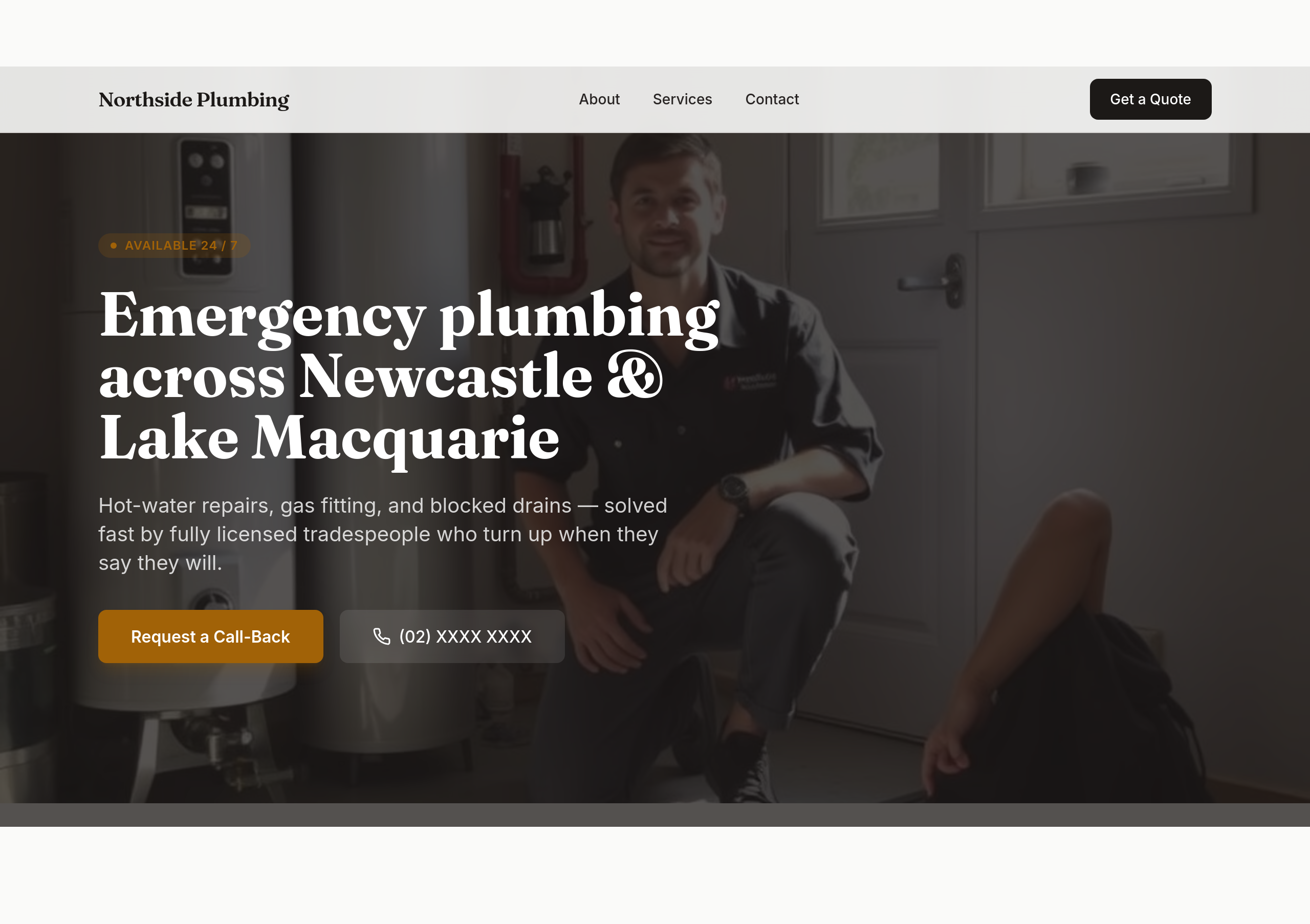
the colours are too soft — use bold orange + dark navy
Before
After
make the phone number BIG in the hero — it should be the most prominent thing

Before

After
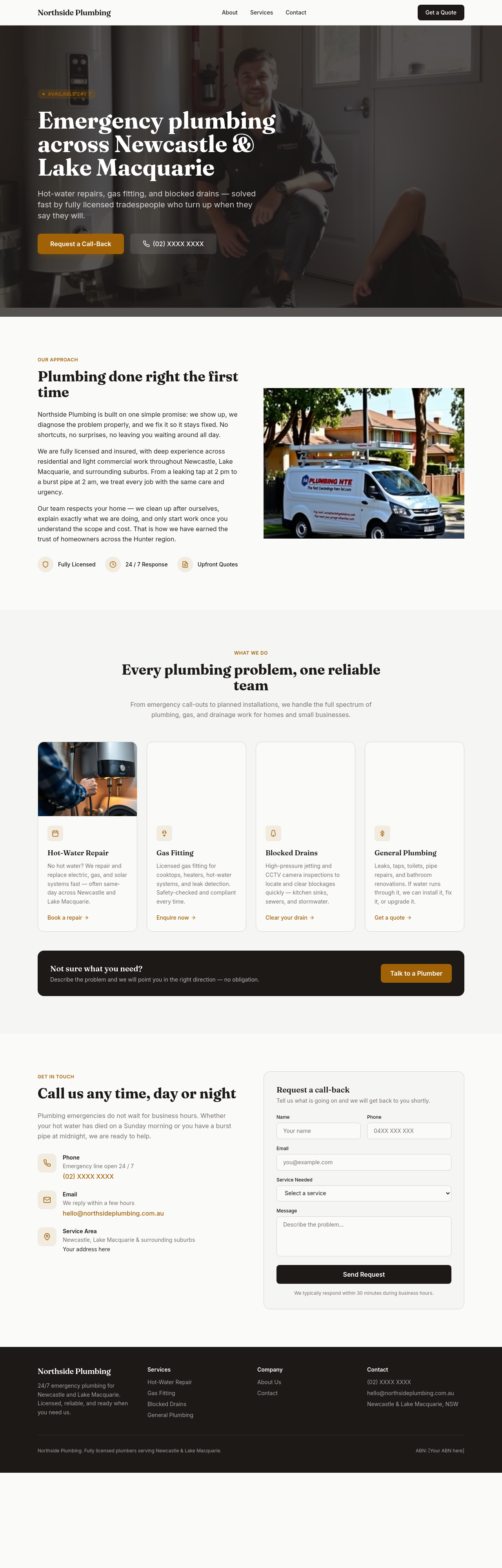
add a 'Call now' tel: link in 3 places: hero, sticky header, footer
Before
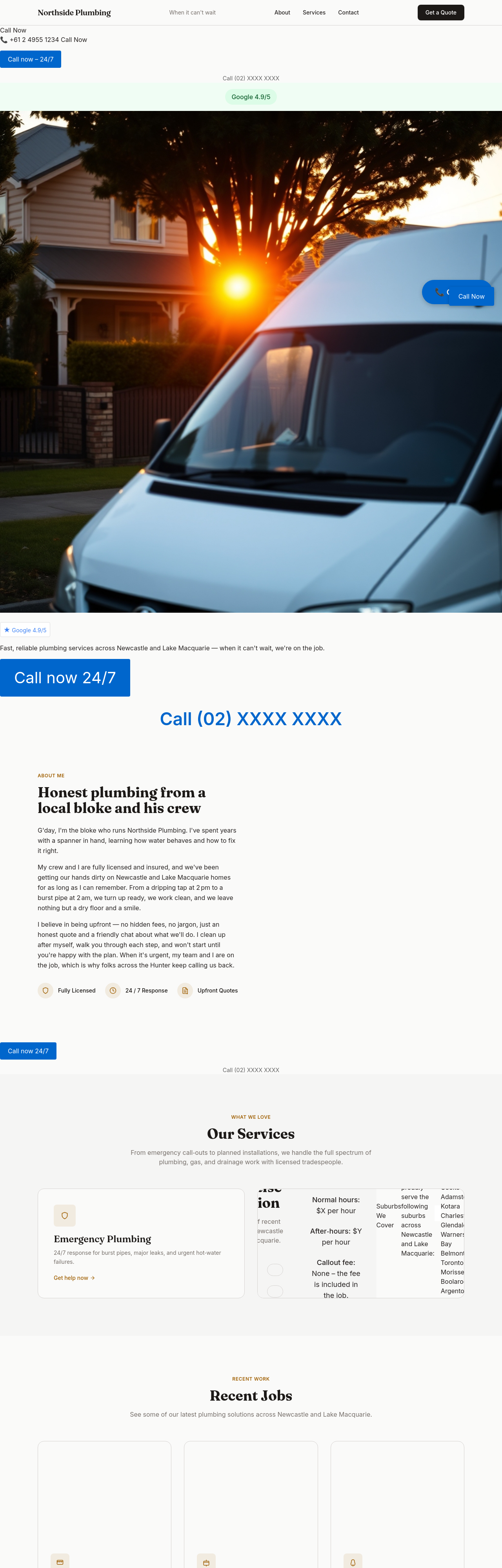
After
add a 'Quote within 60 min' CTA — make it a guarantee, not just a promise
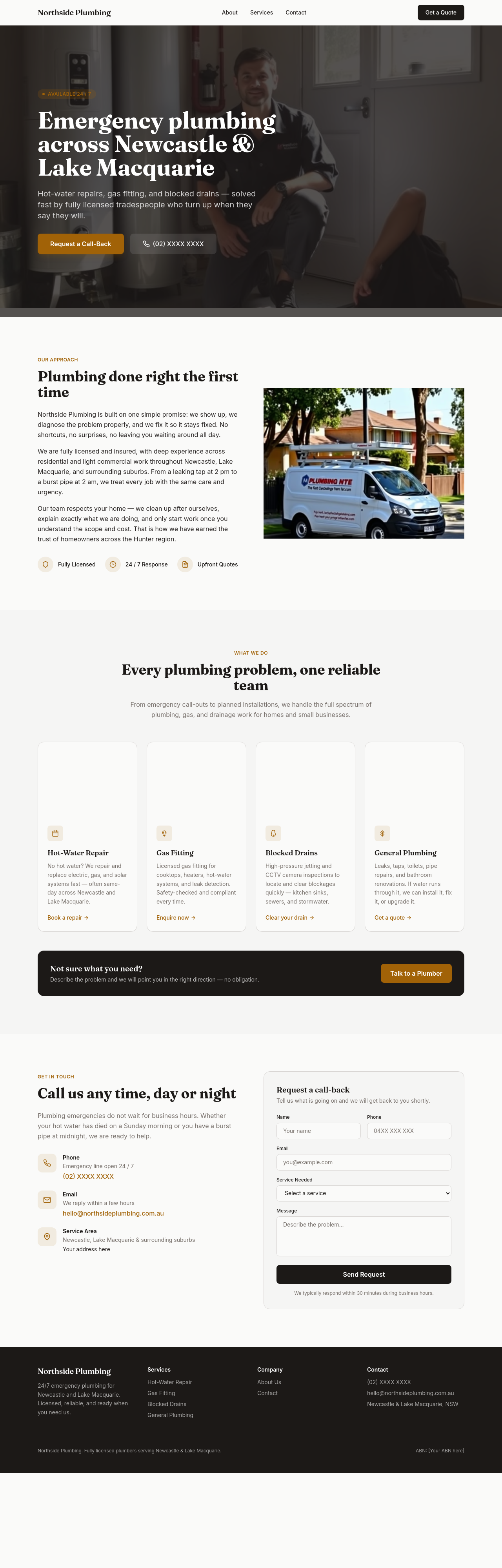
Before
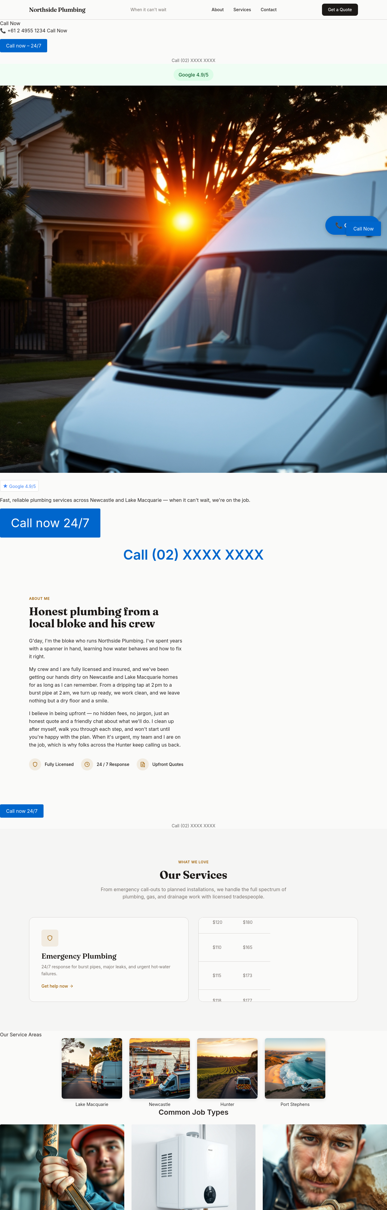
After
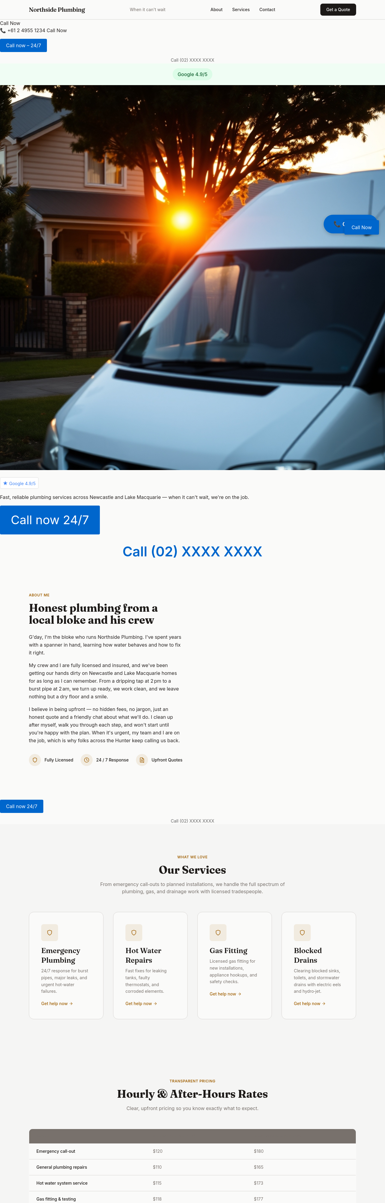
add an hourly + after-hours pricing table — be transparent
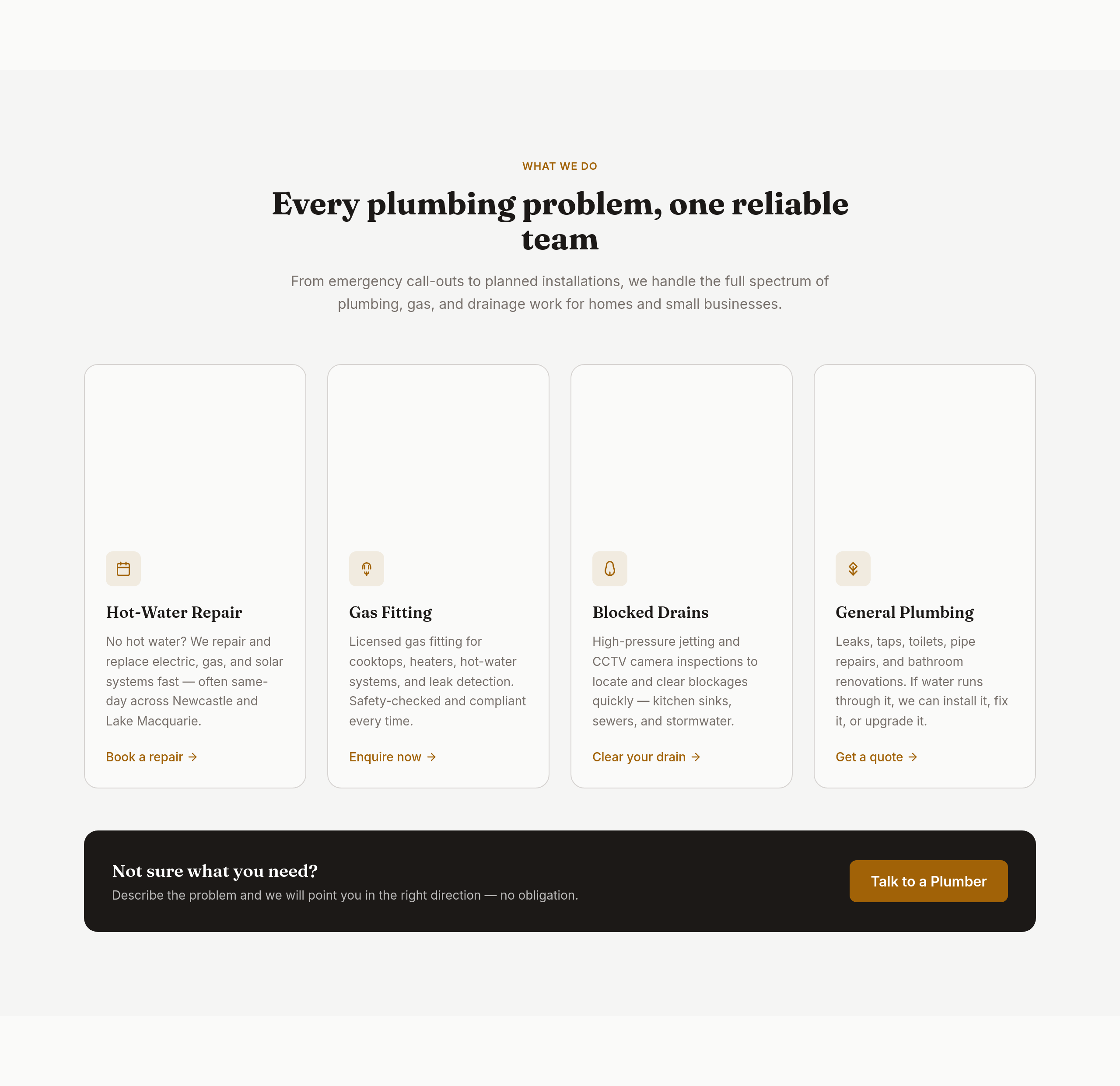
Before
After
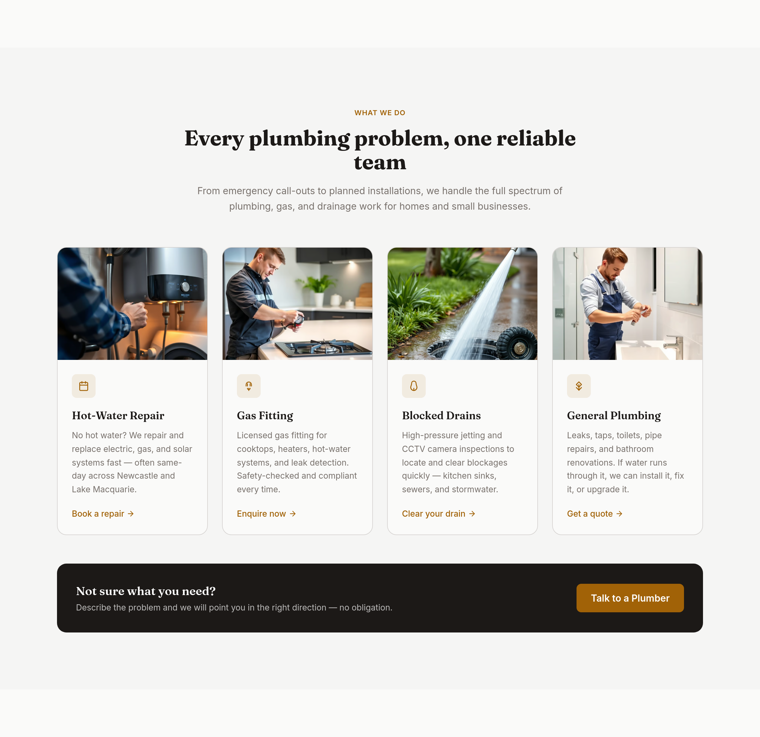
the services grid should be 4 wide with icons

Before

After
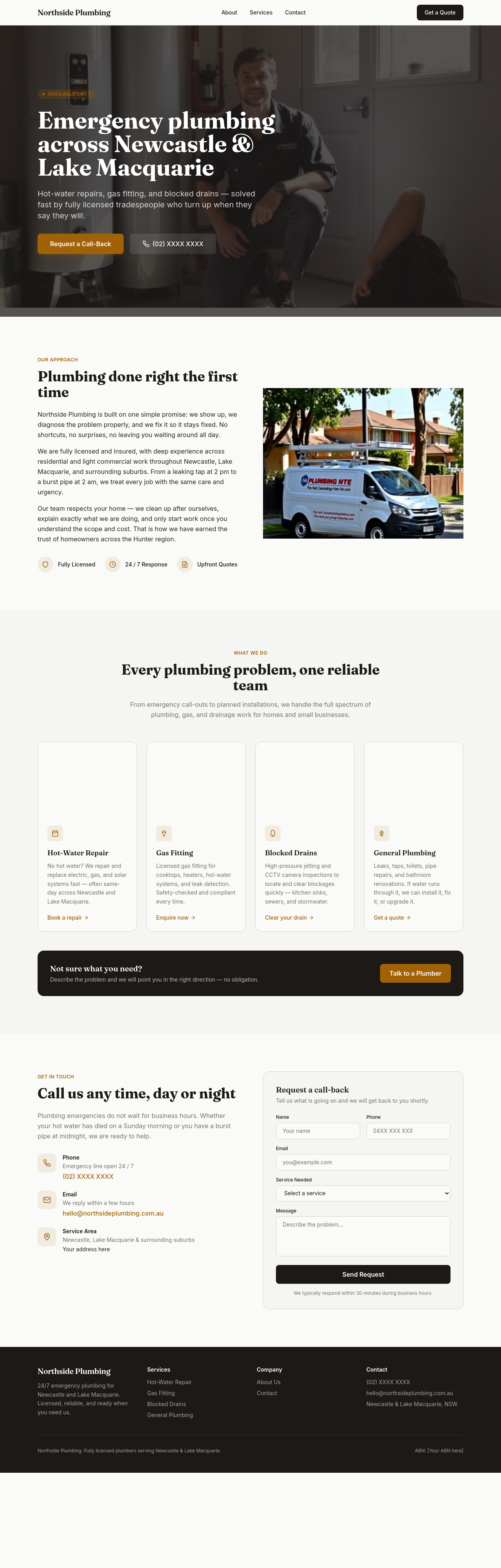
the title should mention 'emergency plumber Newcastle 24/7'
Before
After
add a /service-areas page listing suburbs with response time estimates
Before
After
add a /licences page with our licence number + insurance certificate placeholder
Before
After
add a 'reviews' section with placeholders for 3 Google reviews
Before
After
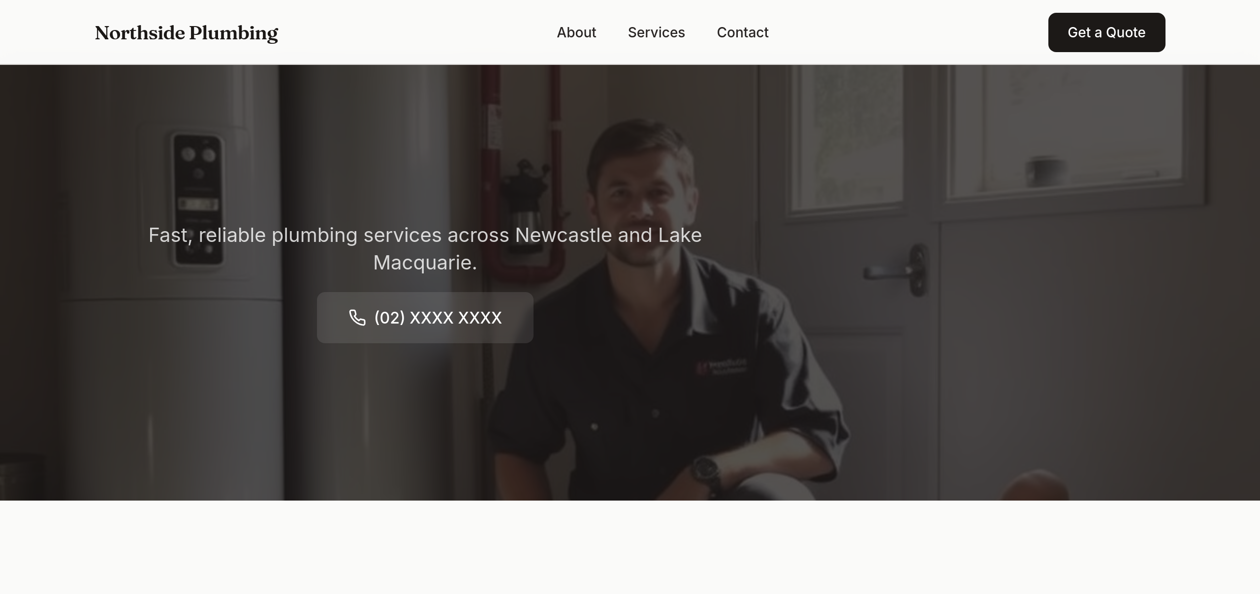
rewrite the hero as a single short sentence + a phone number — that's it
Before
After
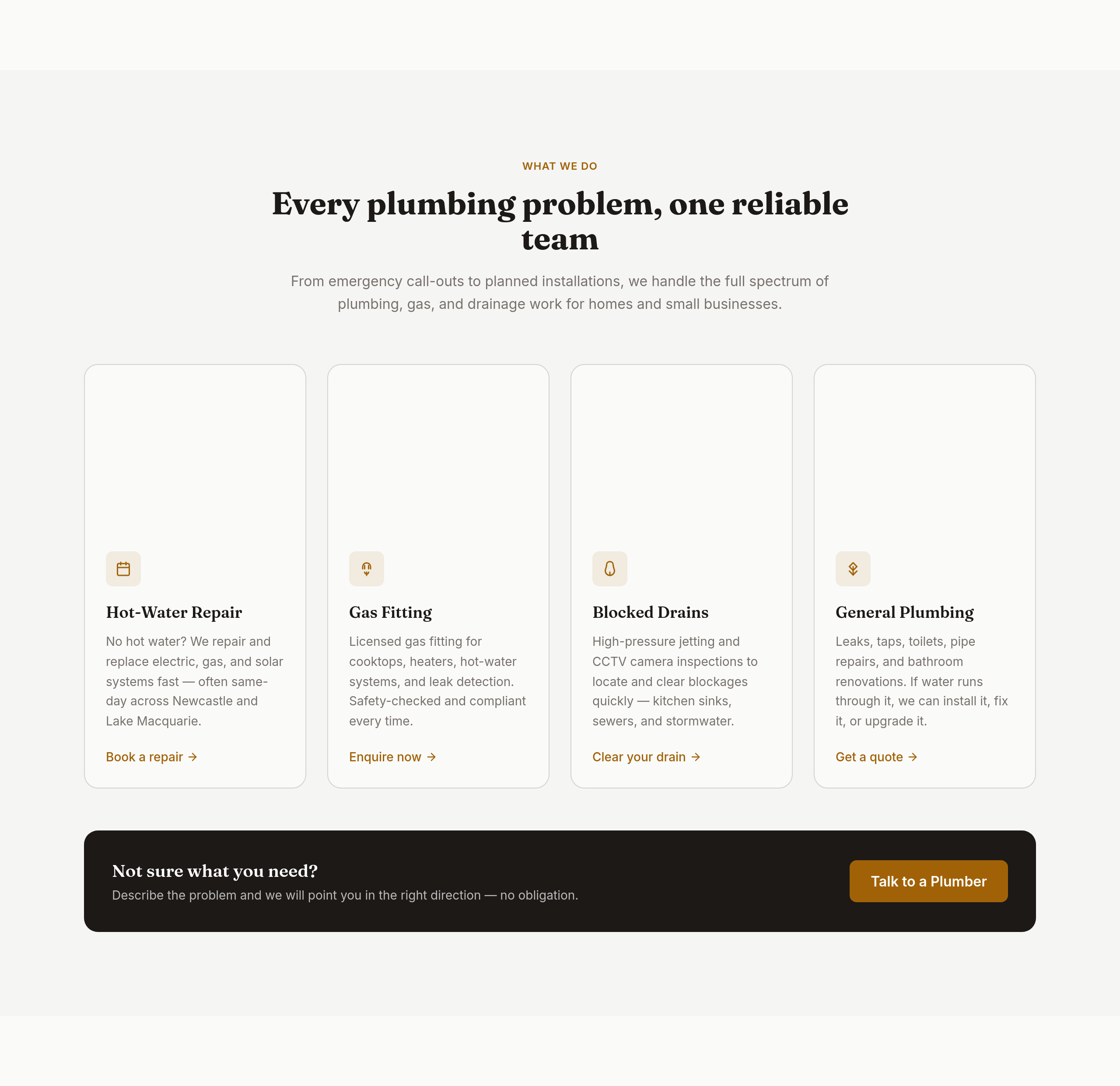
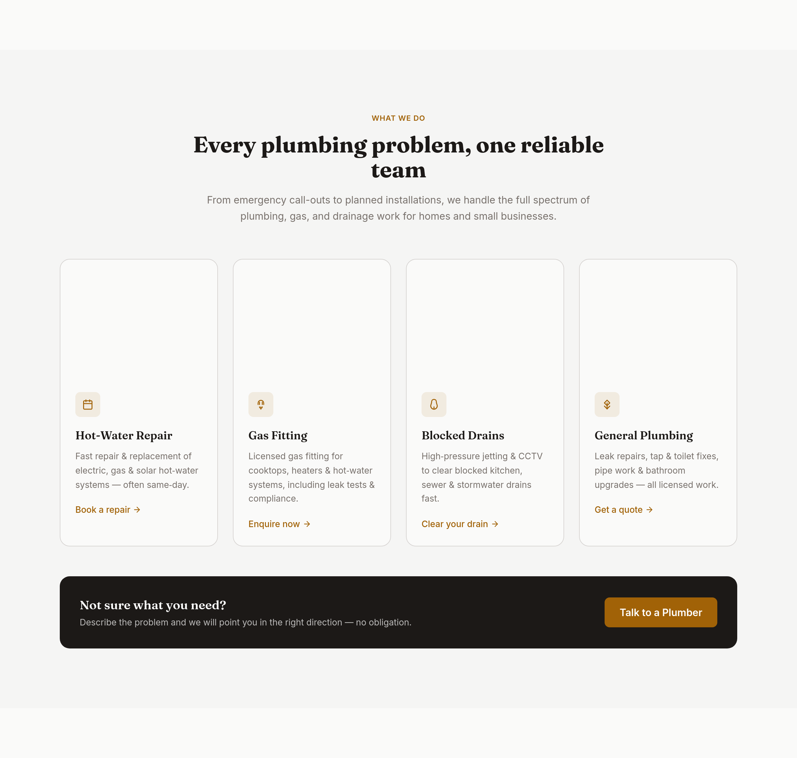
the services copy is generic — name every type of job we handle with one-line context
Before
After
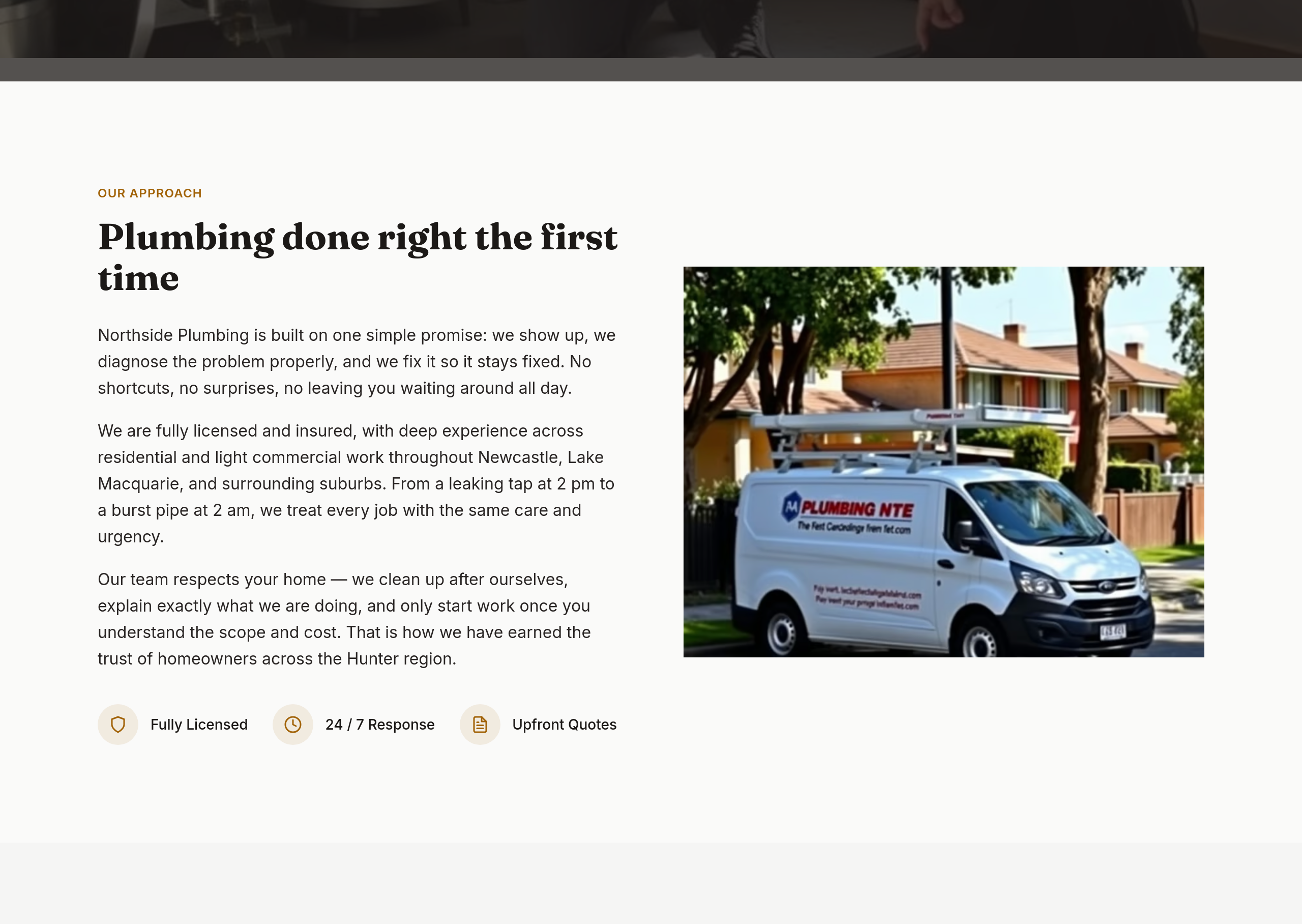
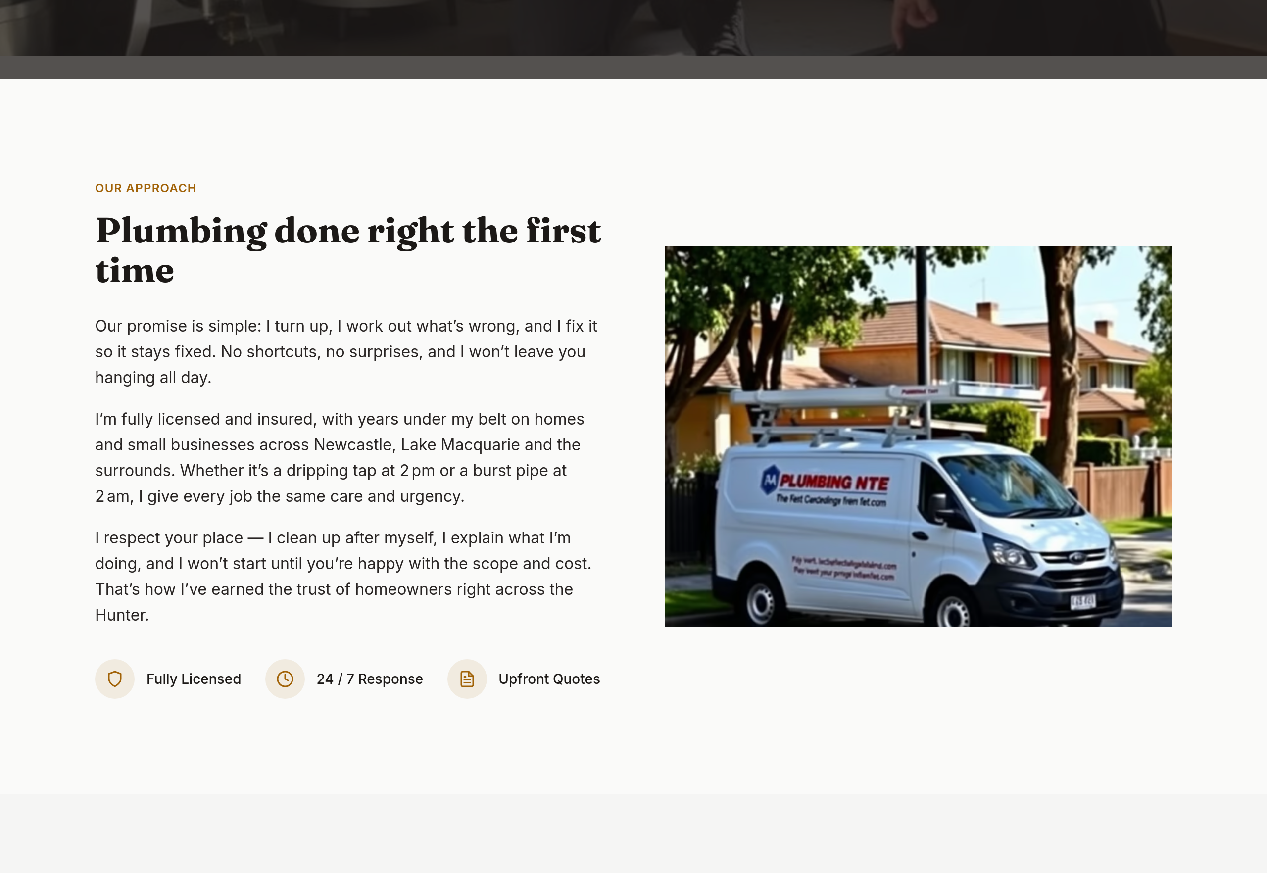
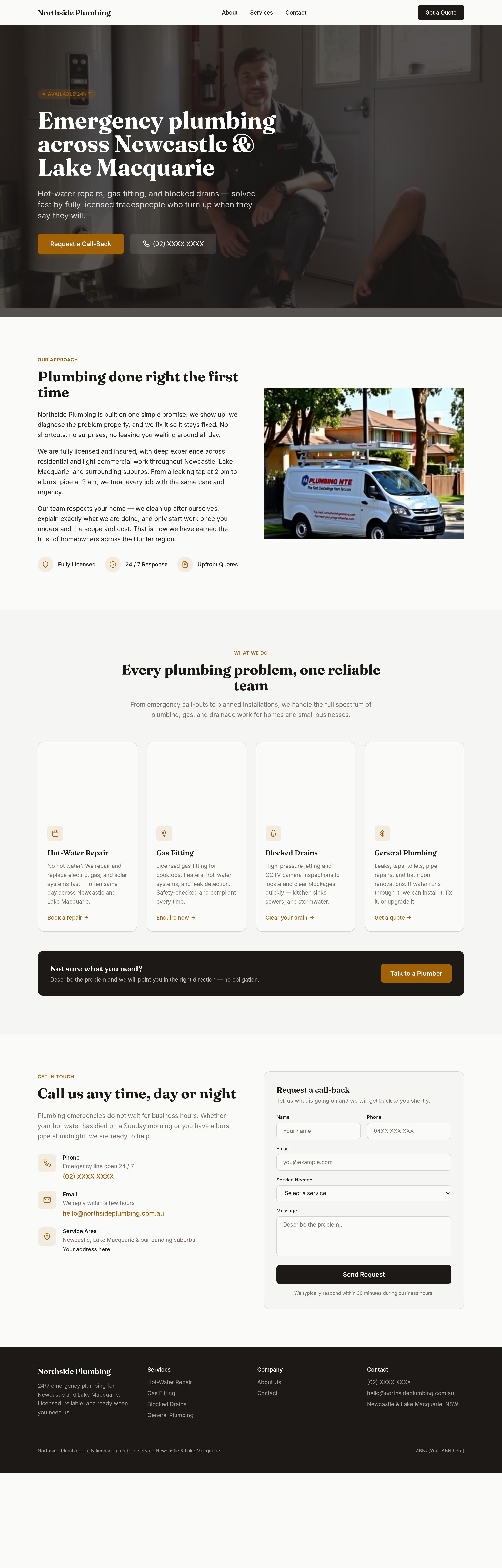
the about section is stiff — make it sound like one tradie introducing his crew
Before
After
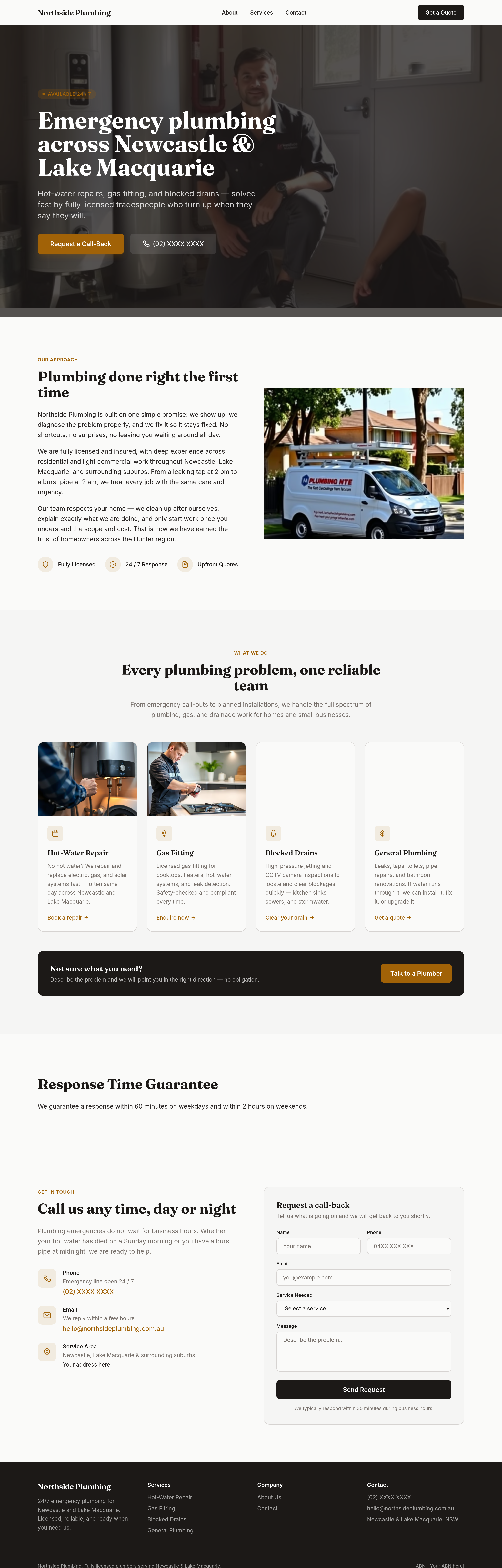
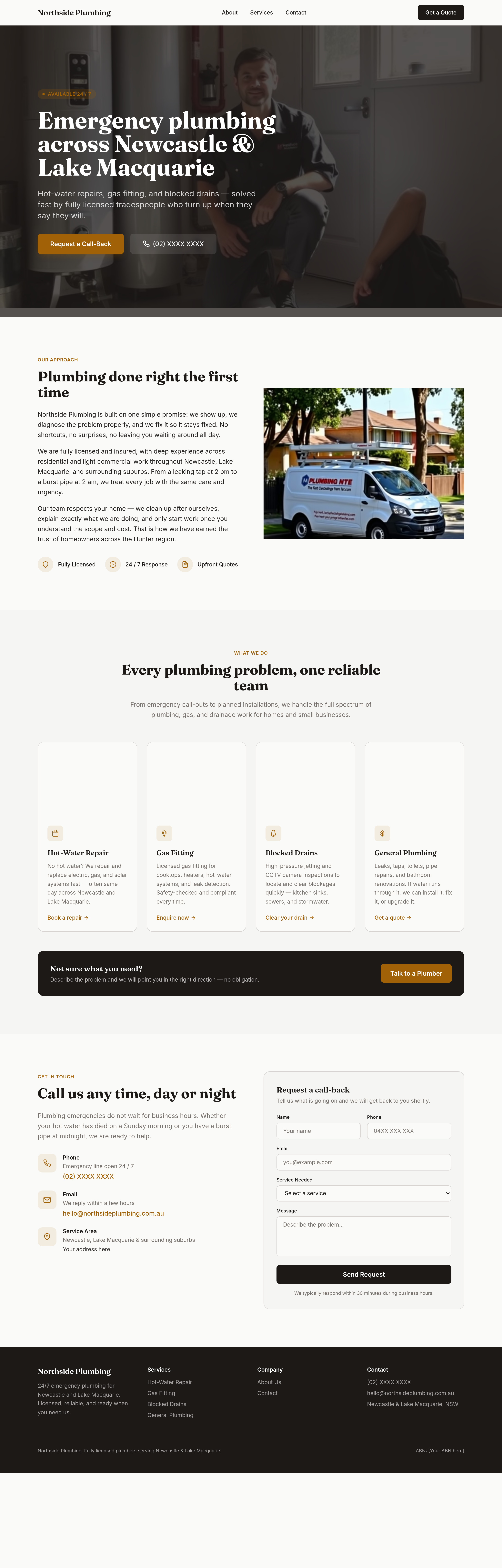
add a 'response time guarantee' section — within 60 minutes weekdays, 2 hours weekends
Before
After
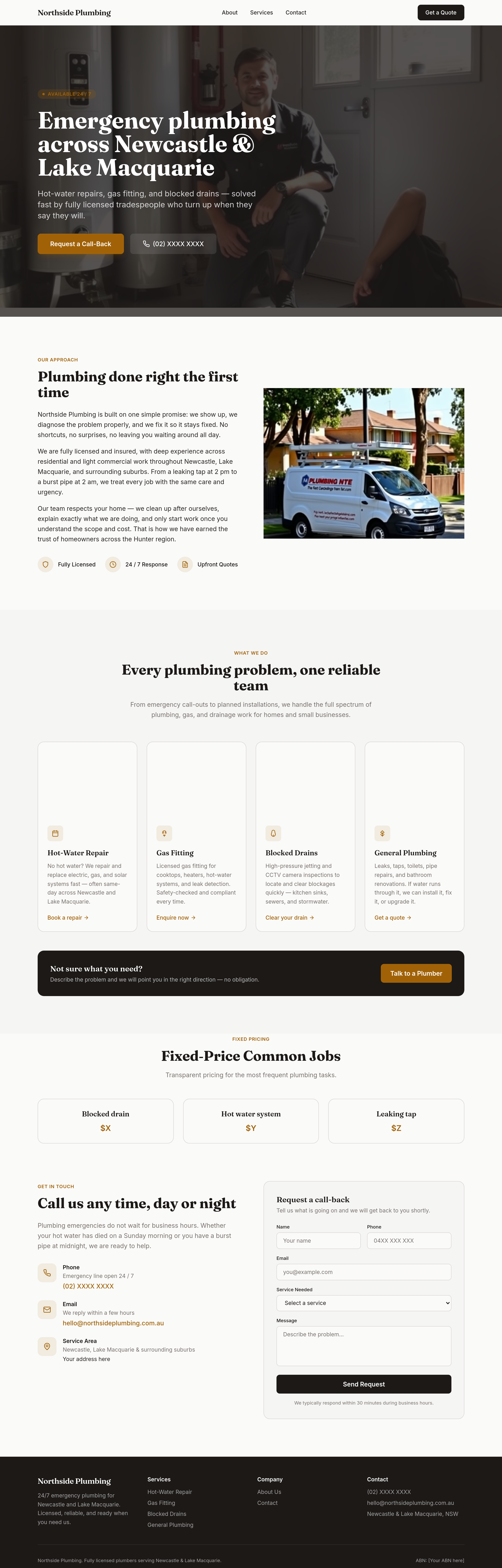
add a 'fixed-price common jobs' section — blocked drain $X, hot water $Y, leaking tap $Z
Before
After
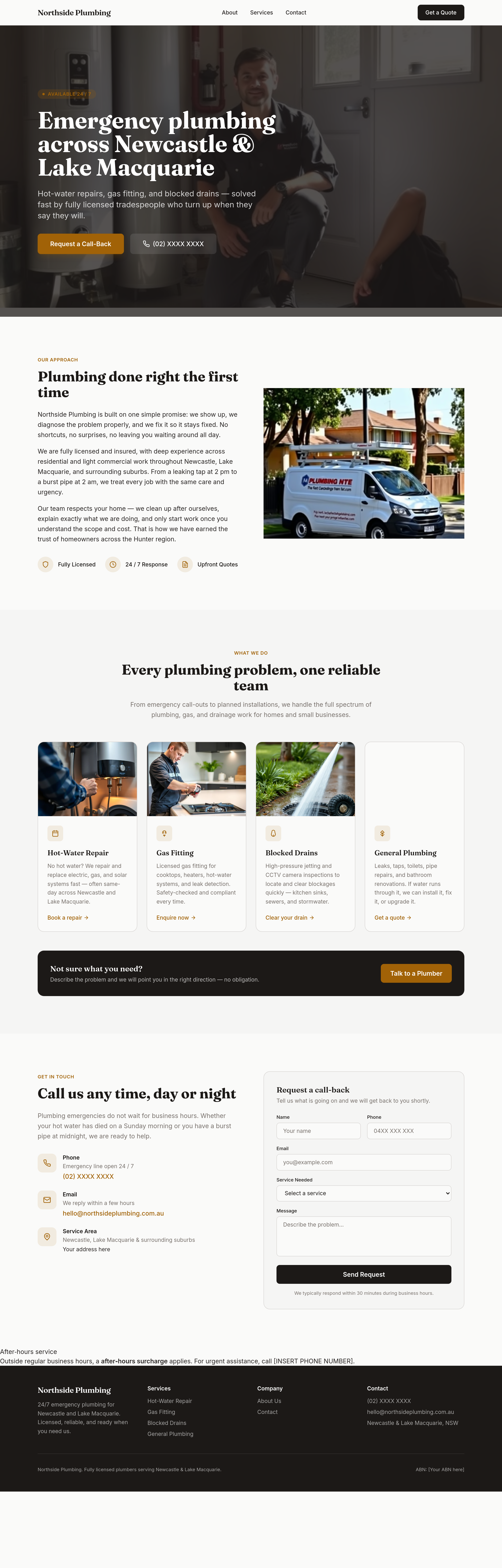
add a 'after-hours' section with the surcharge + the phone number to call
Before
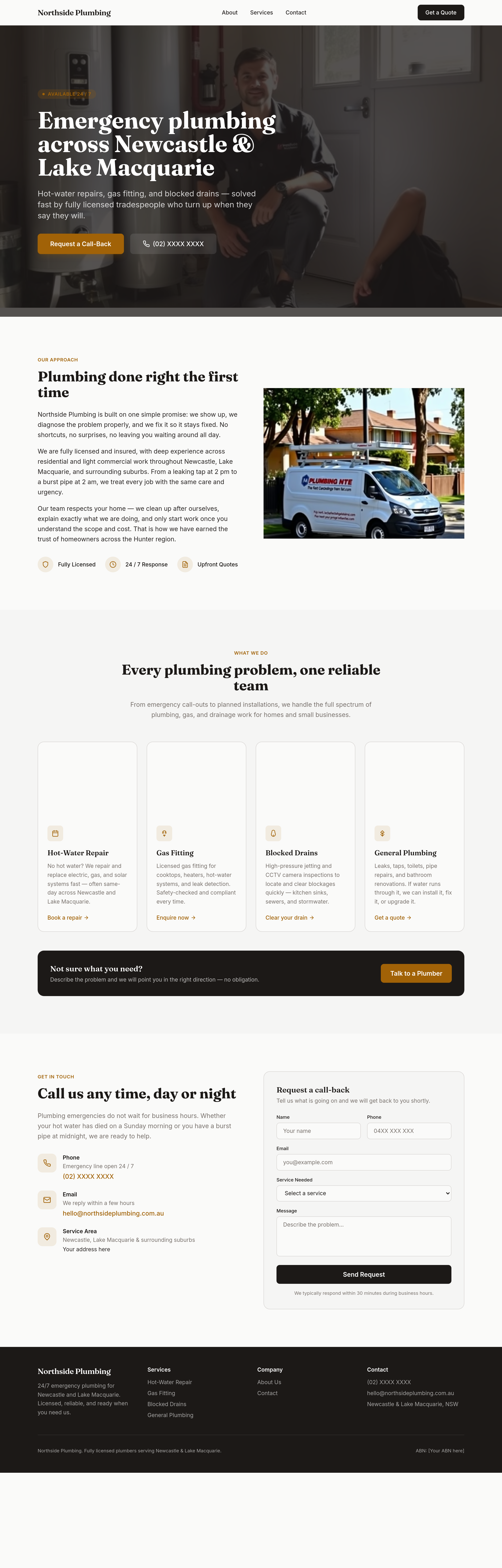
After
add a 'gas + water + sewer' breakdown — what licences cover what
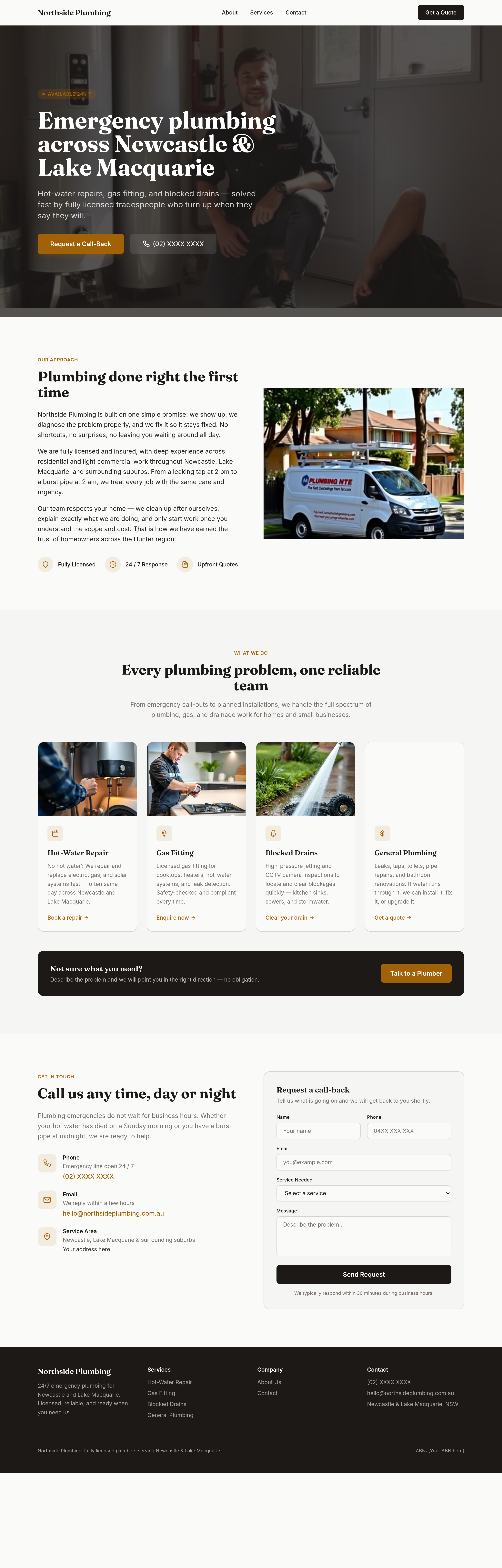
Before
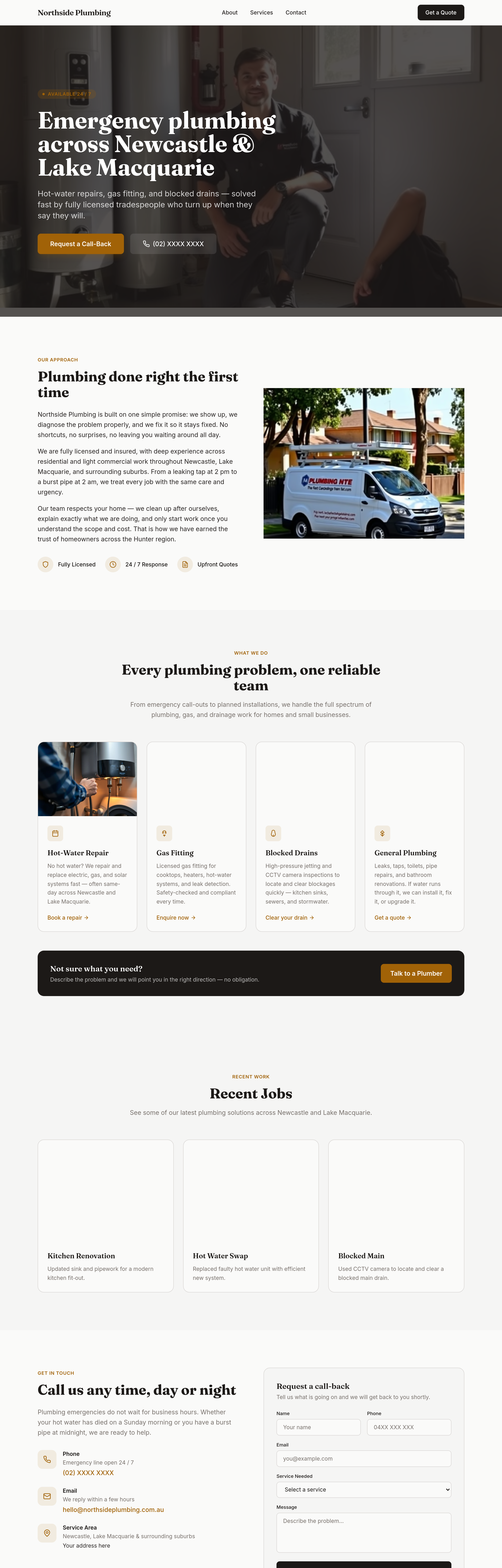
After
add a 'recent jobs' section — 3 placeholder photo + caption (kitchen reno, hot water swap, blocked main)
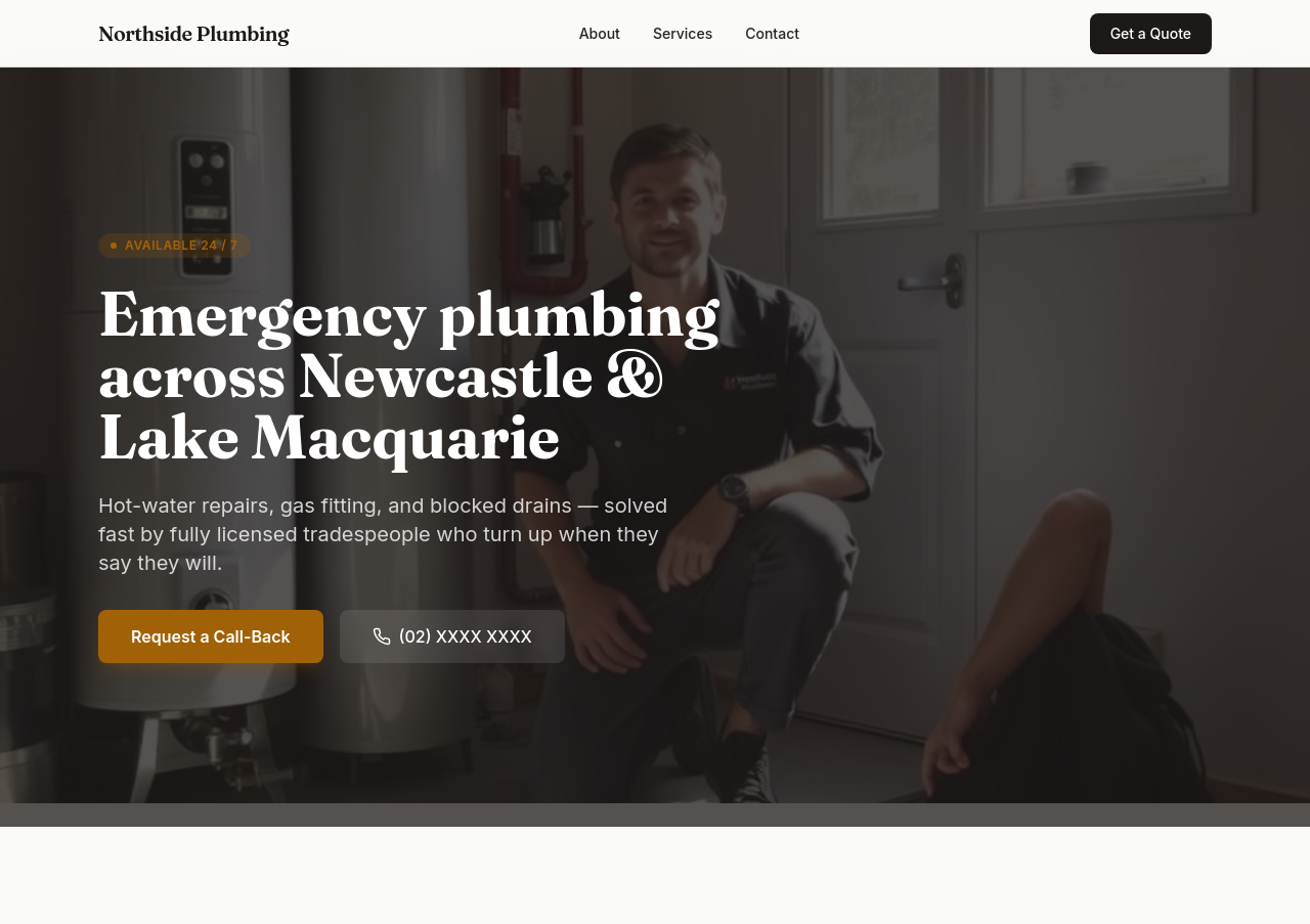
Before
After
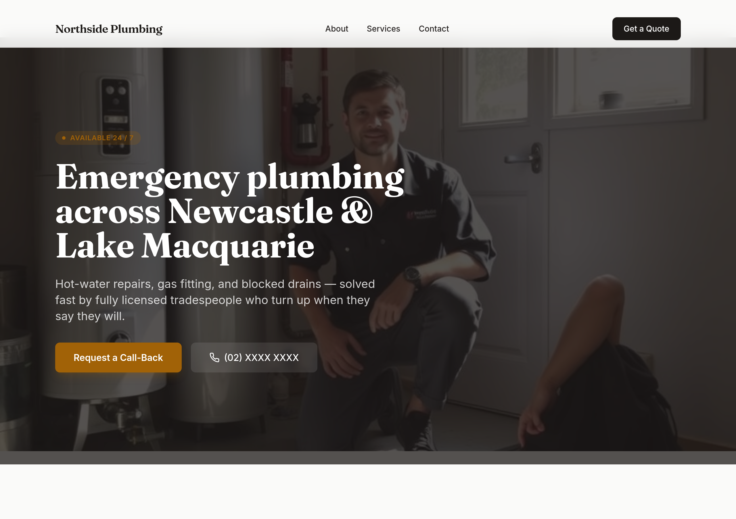
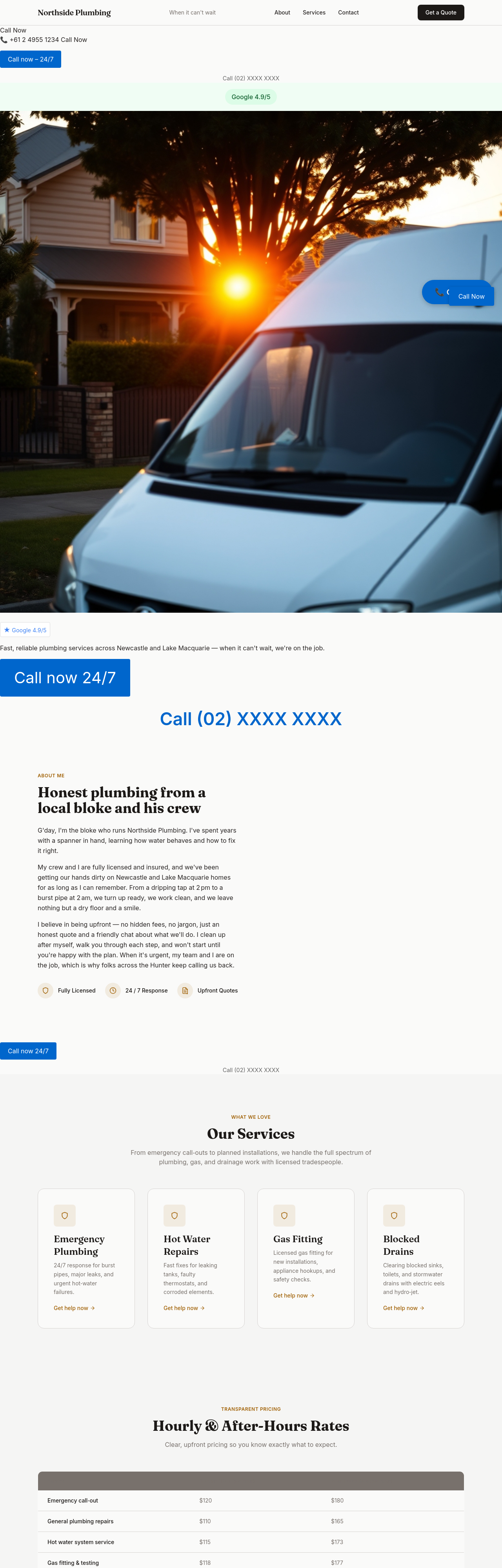
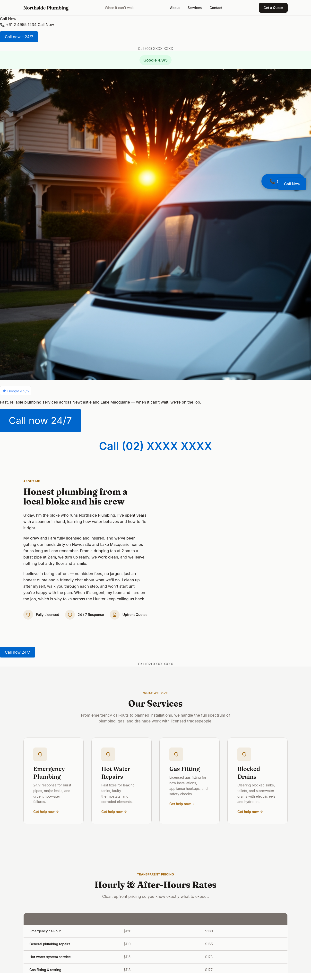
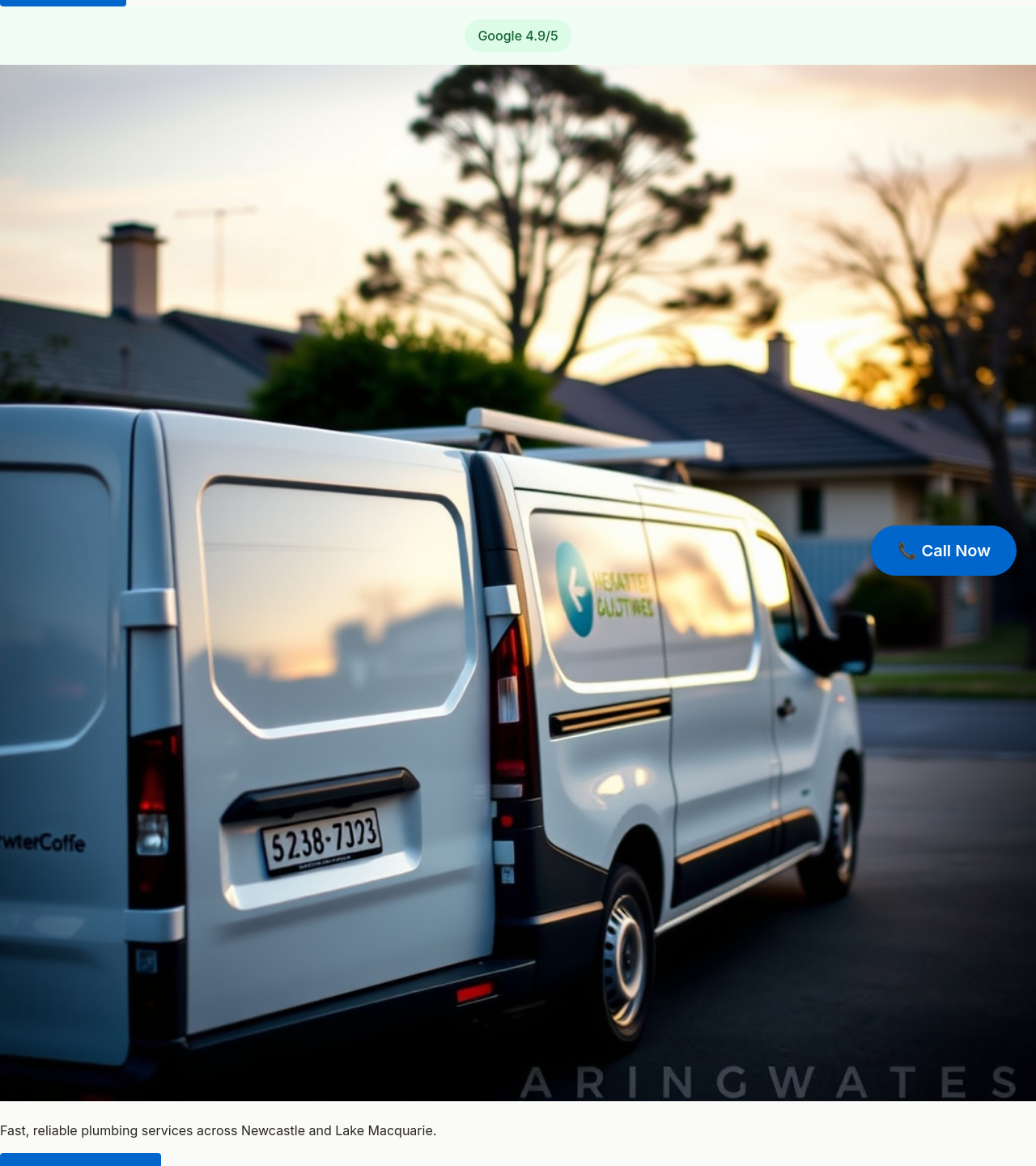
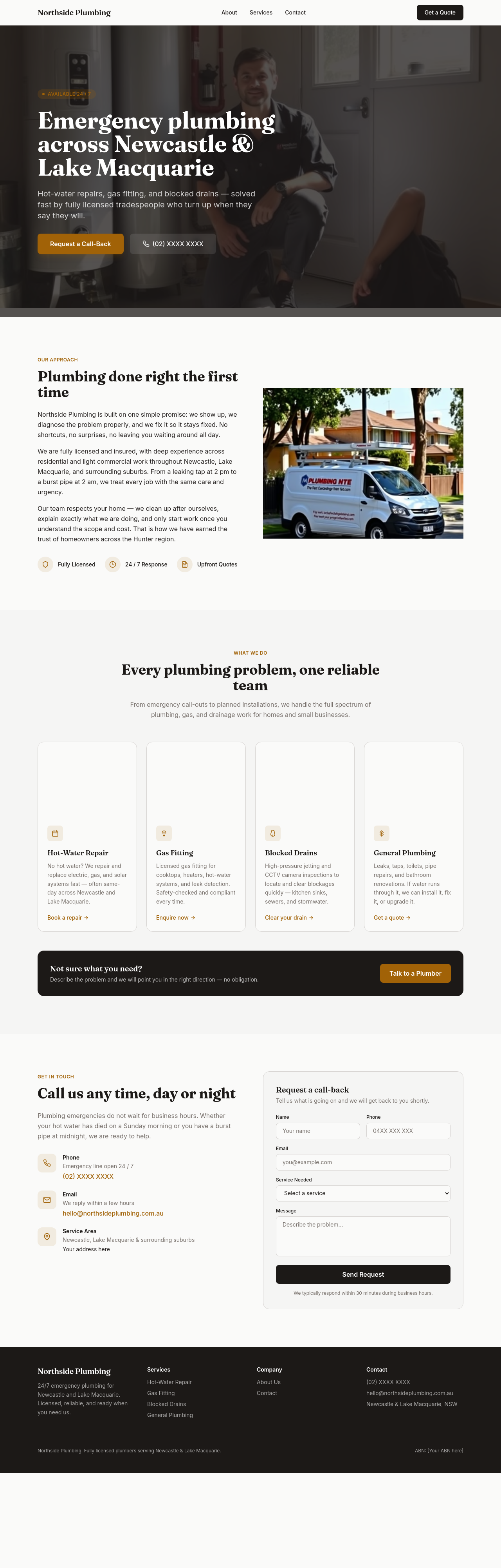
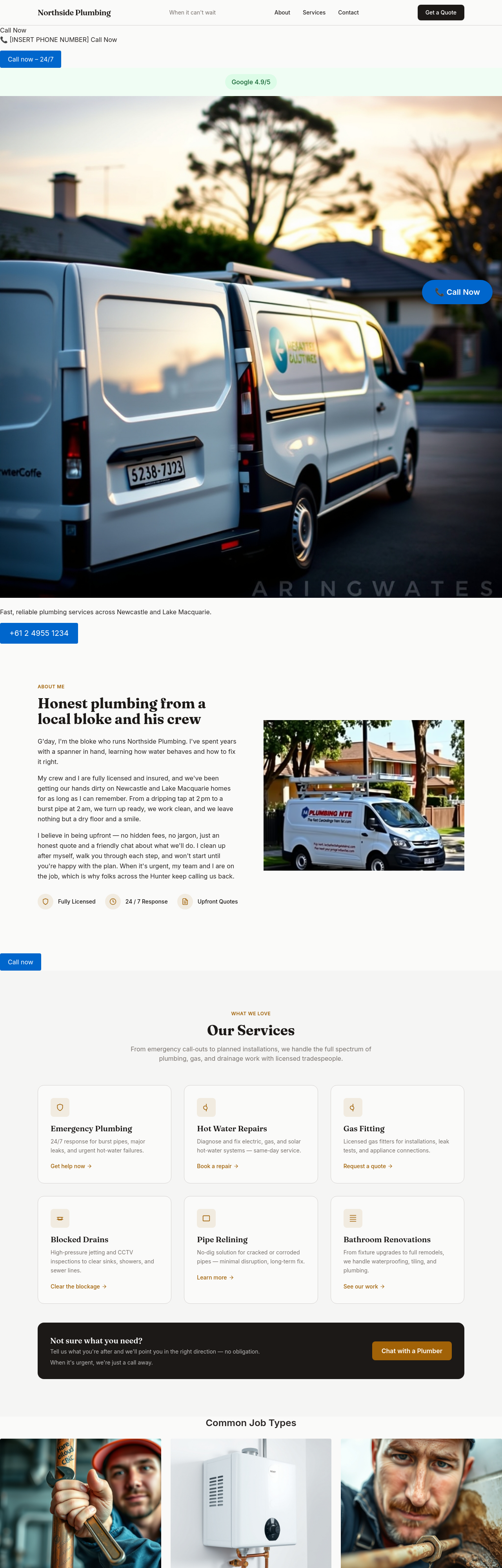
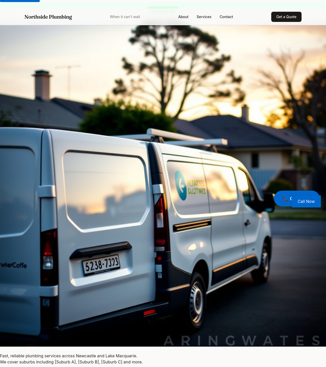
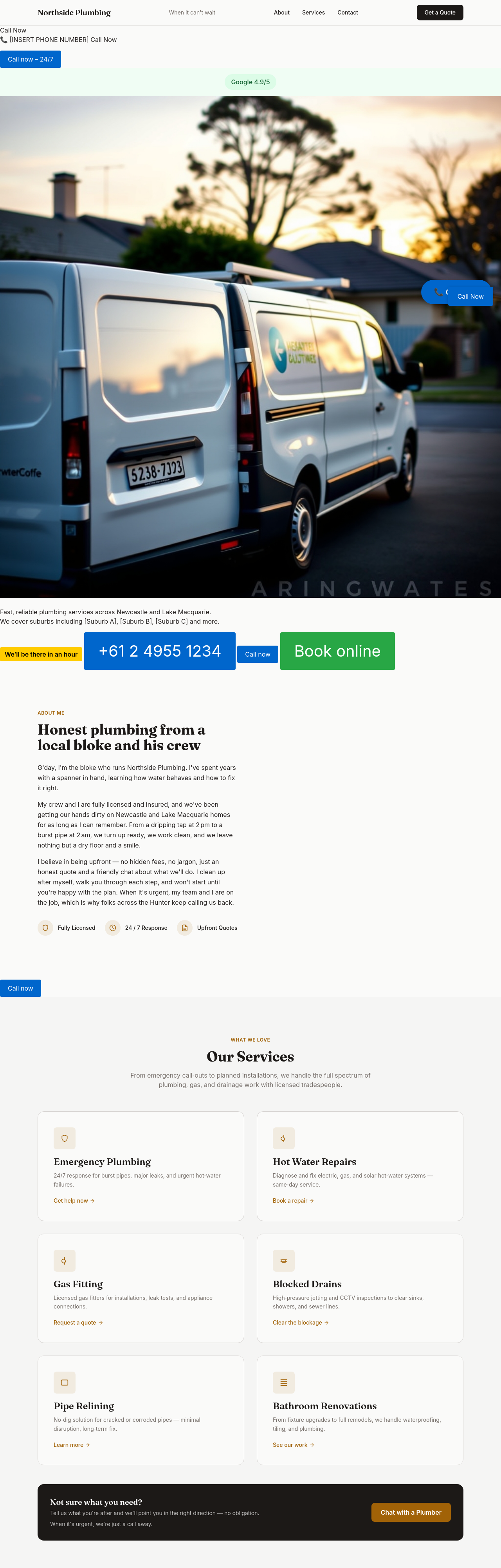
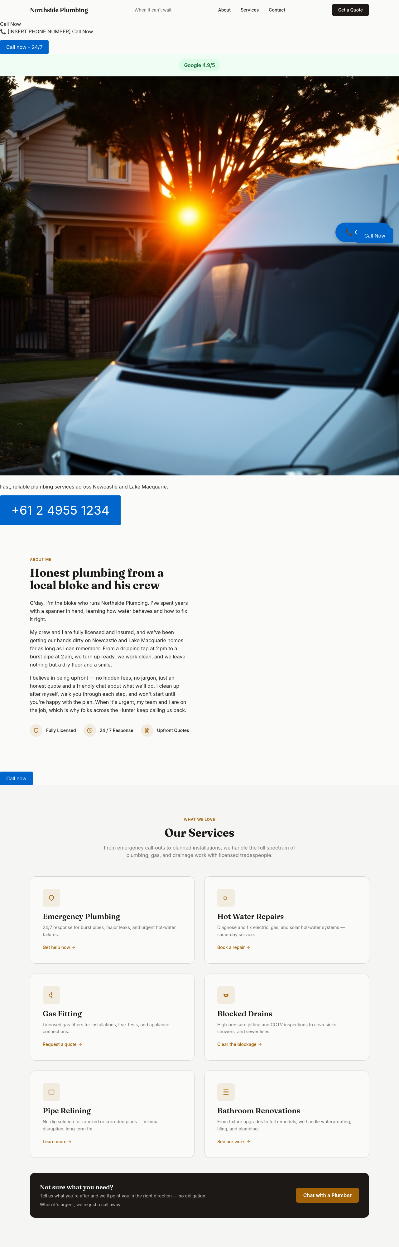
add a hero image of a tradie's van outside a Newcastle suburban home at sunrise
Before
After
add 3 portrait photos of common job types — wrench on pipe, hot-water unit, blocked drain rod
Before
After
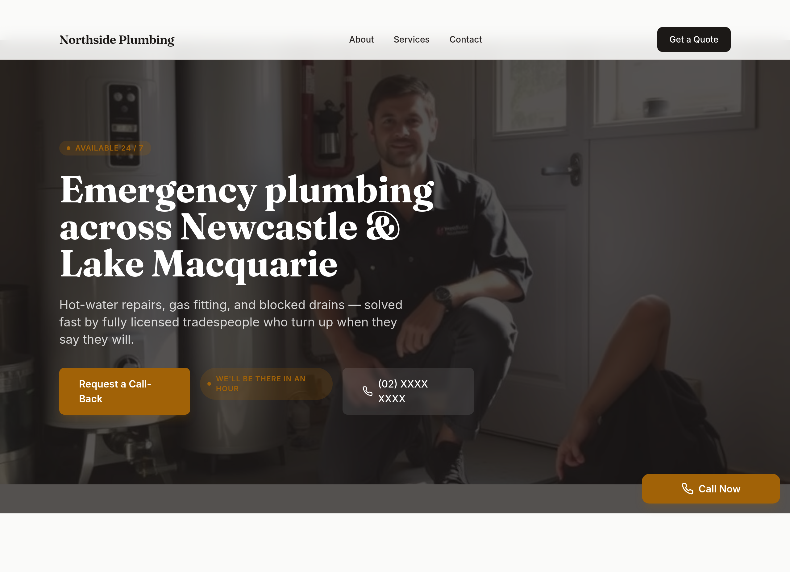
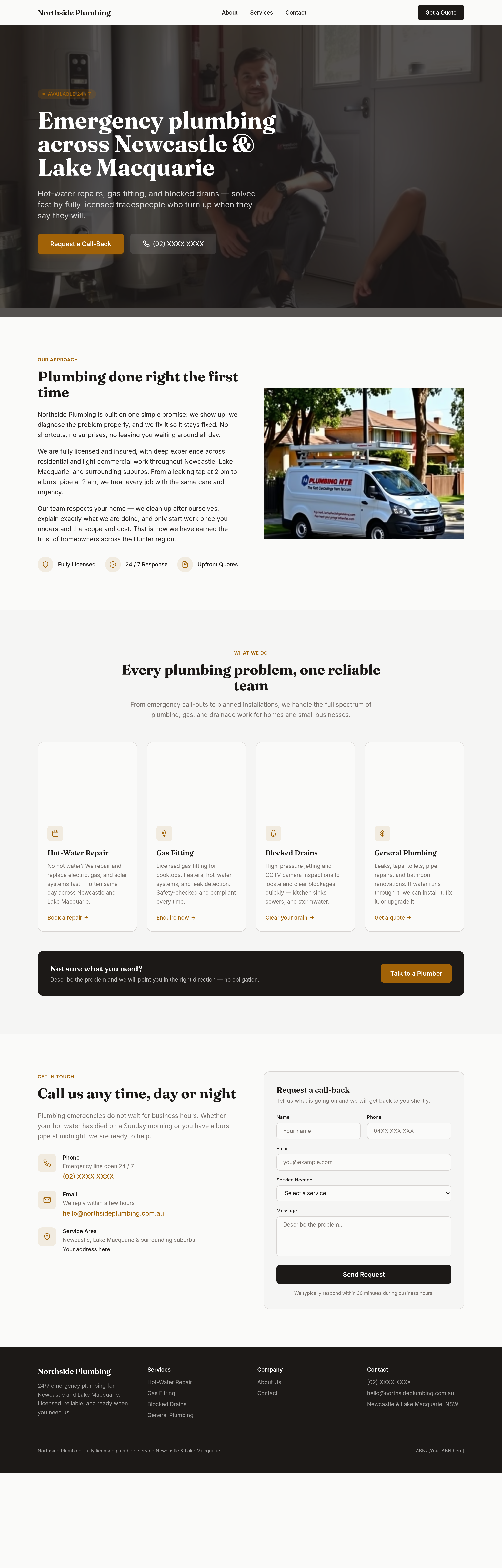
the site should scream 'we'll be there in an hour' — phone in hero, response-time guarantee, sticky phone button
Before
After
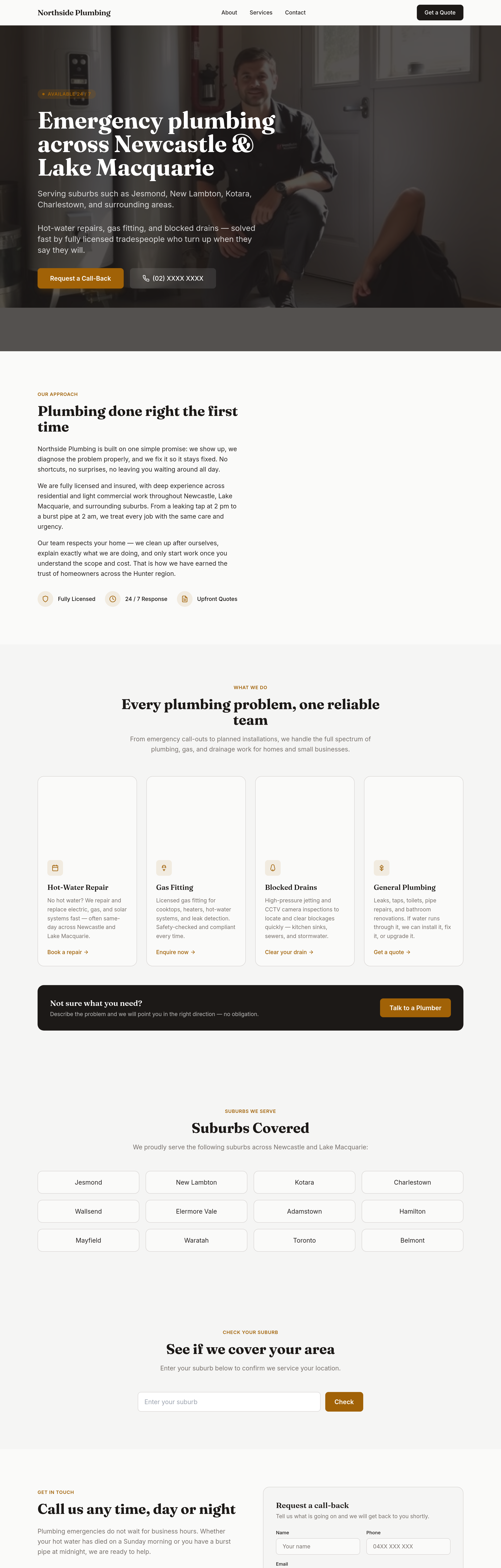
add suburbs covered + a 'check your suburb' interactive list + adjust hero to mention the area
Before
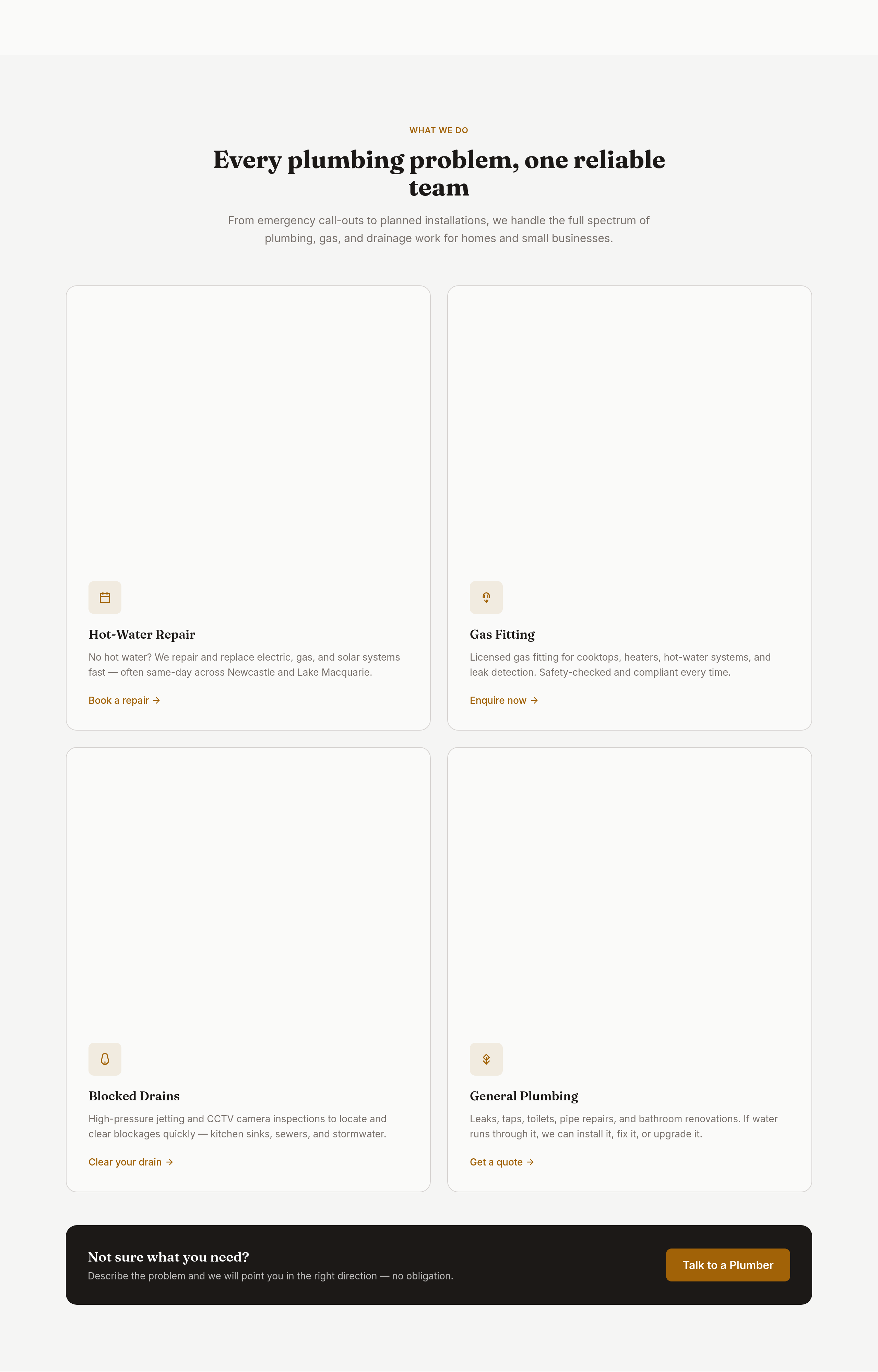
After
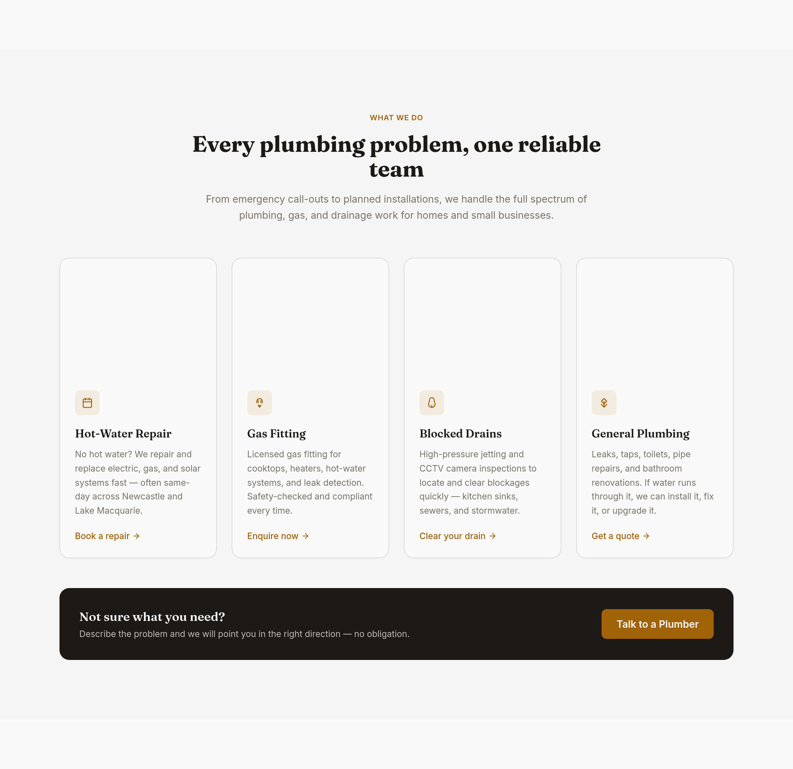
the services grid is 3 columns — too many; make it 2 columns of bigger cards with icons

Before

After
the colours are bland — bold orange + dark navy, high contrast, tradie-confident
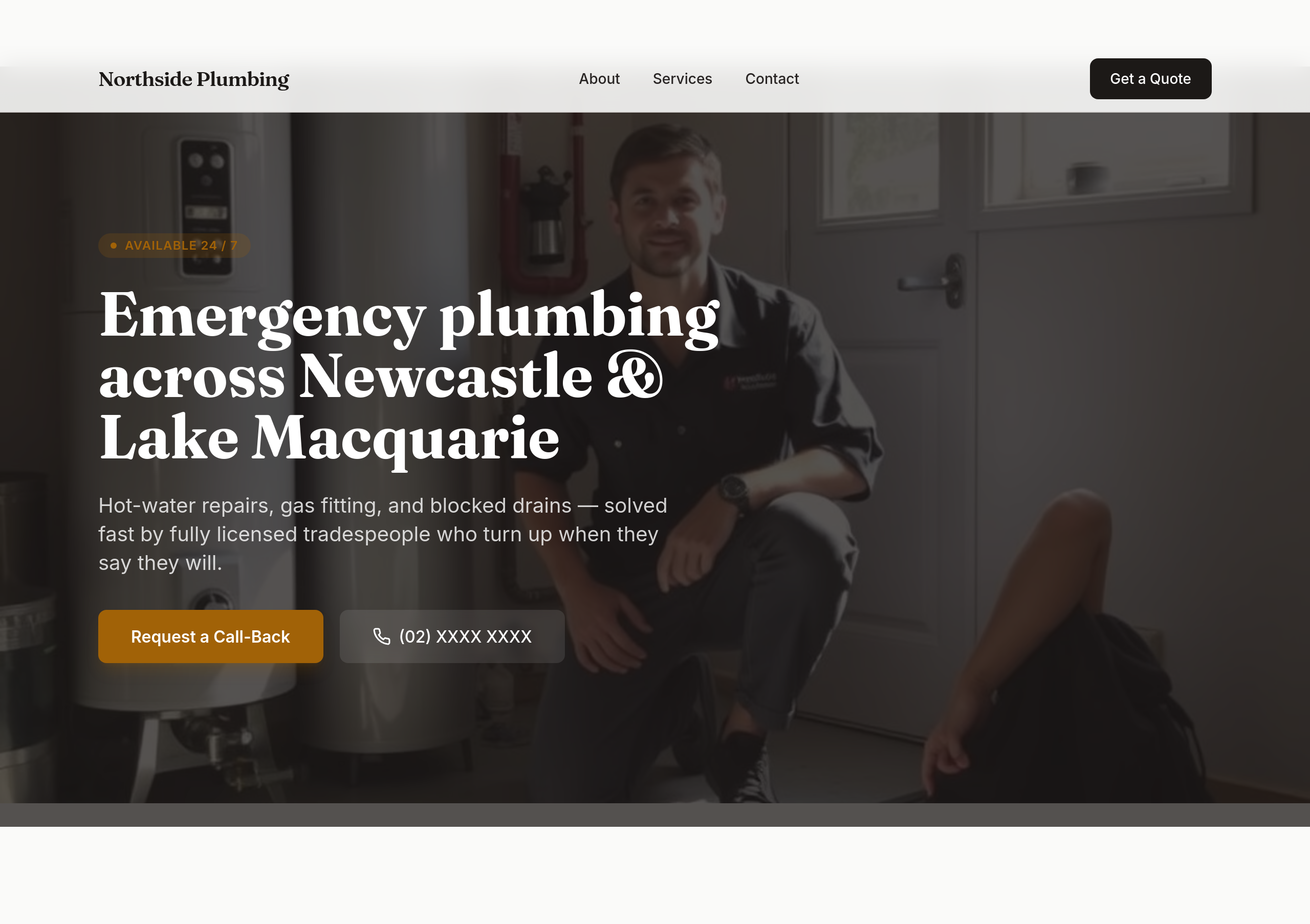
Before
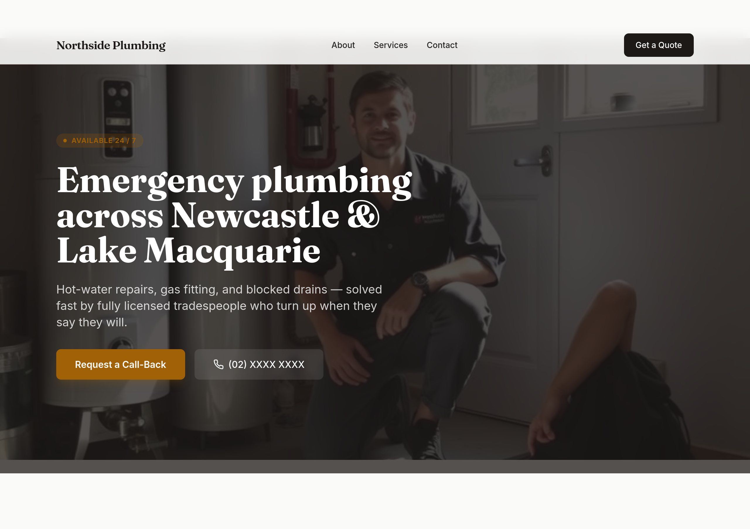
After
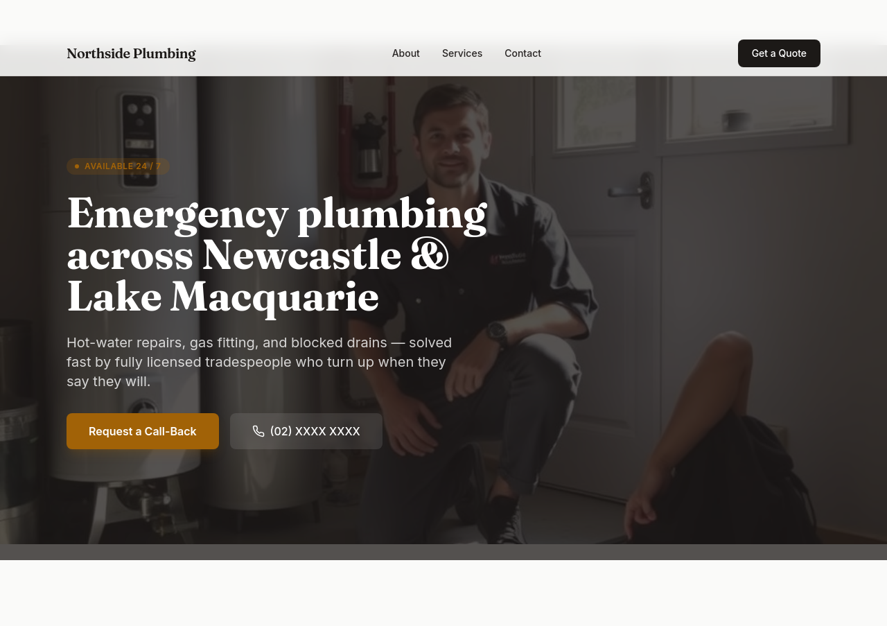
the phone number should be the biggest text on the page in the hero
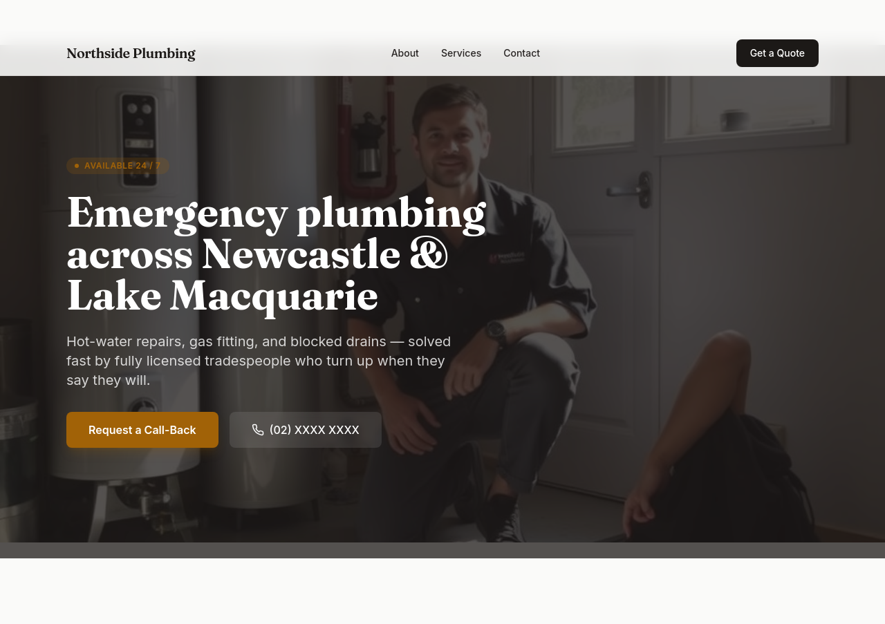
Before
After
every section should end with a 'Call now' link — phone in 5 places minimum
Before
After
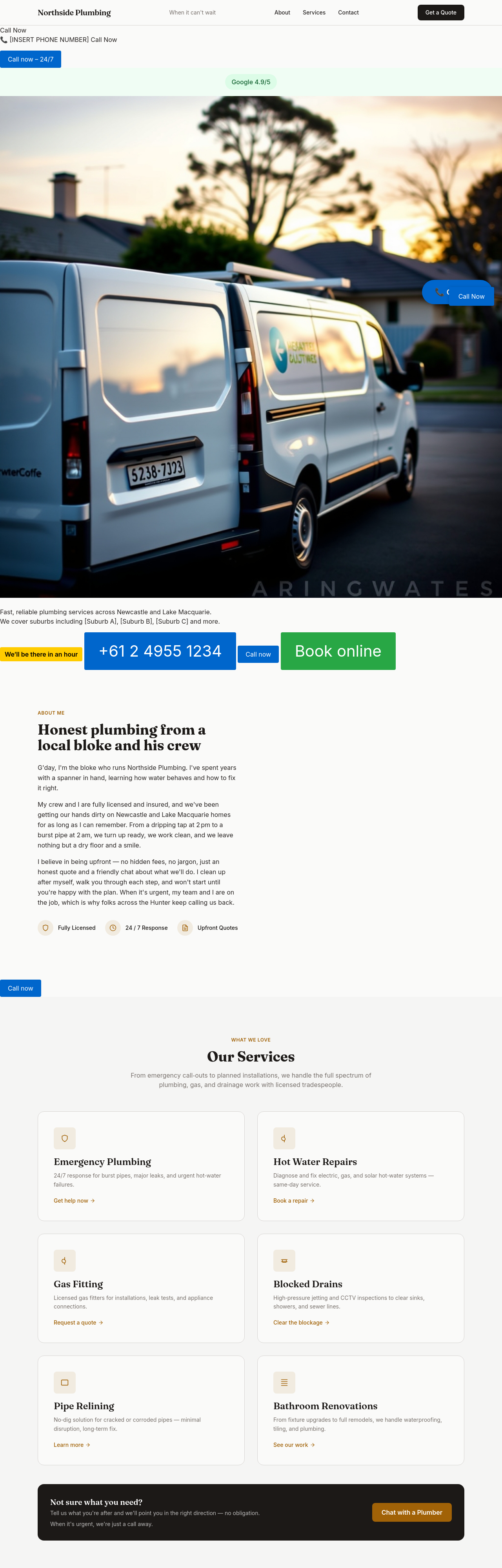
add a 'Book online' button as an alternative for non-emergency jobs
Before
After
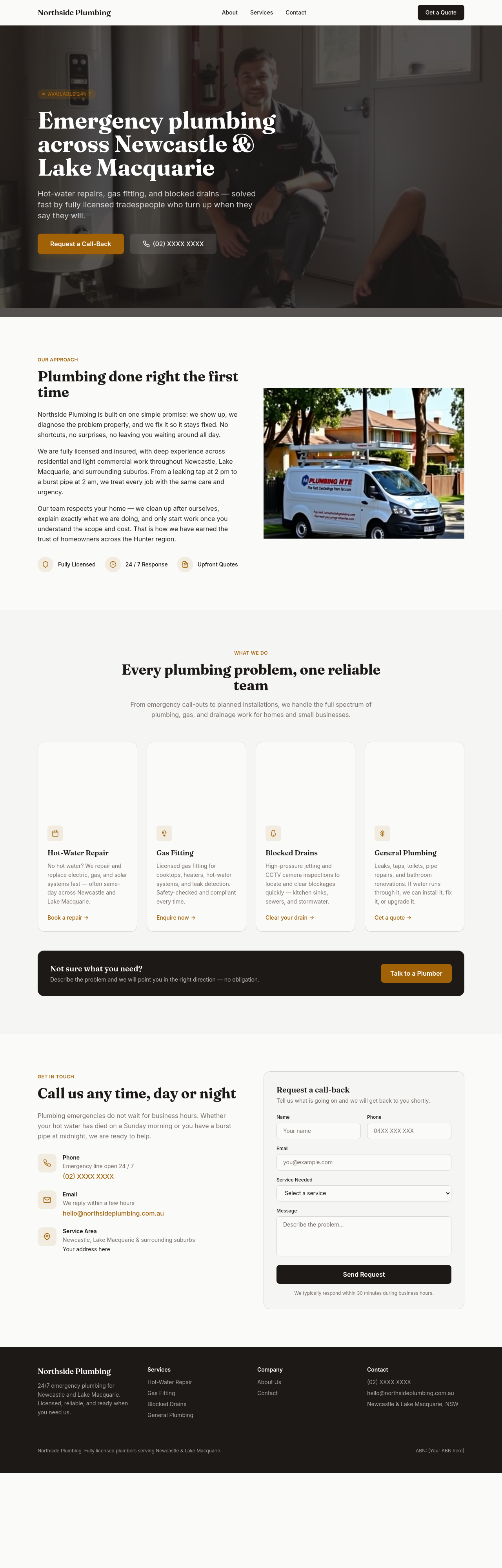
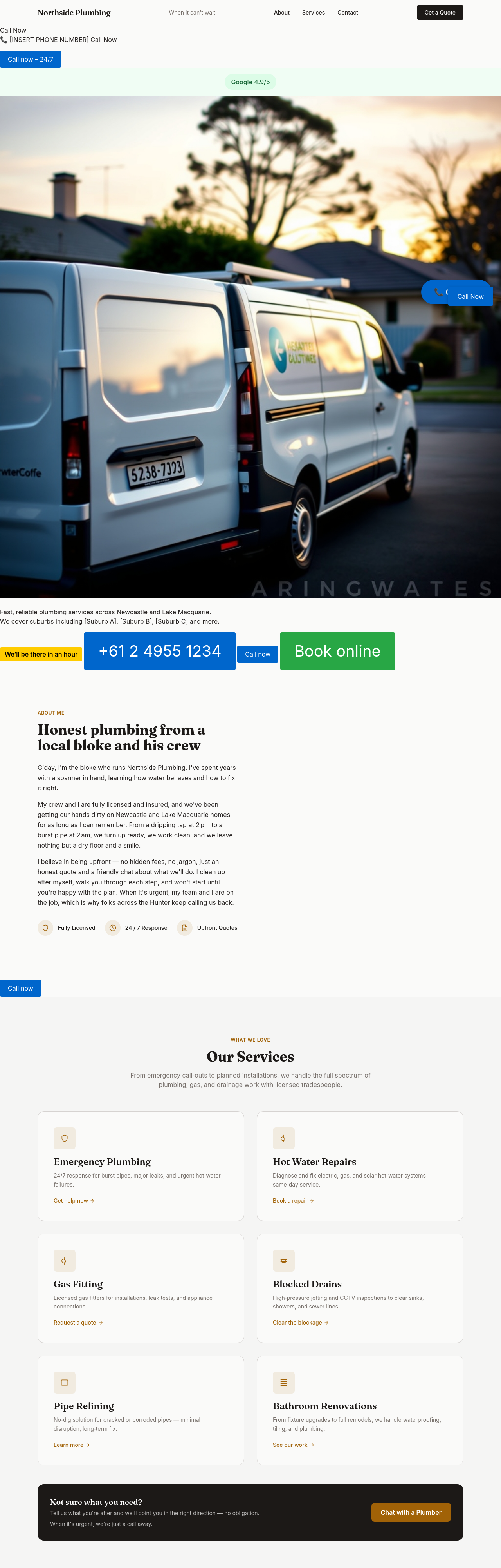
the meta description needs 'emergency plumber Newcastle 24/7 licensed' explicitly
Before
After
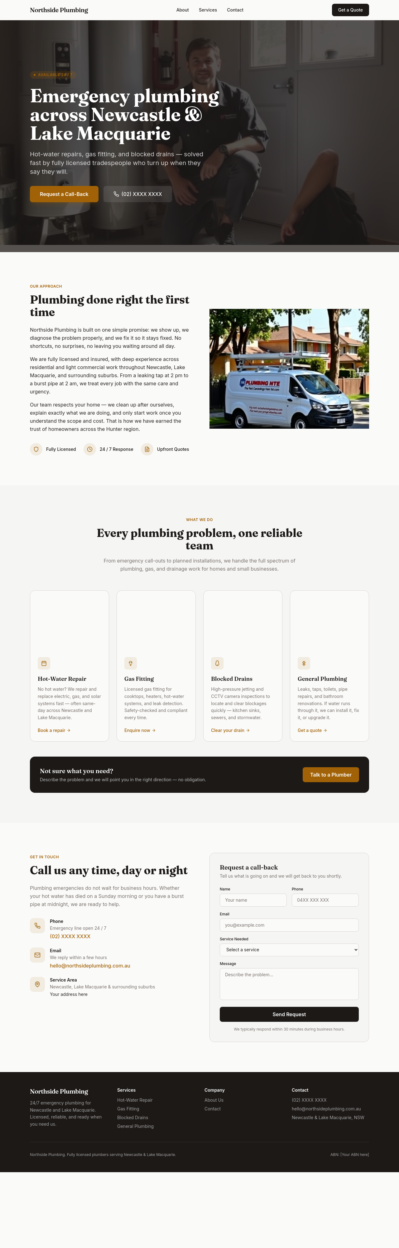
add an upfront-pricing block: hourly $X normal hours, $Y after-hours, no callout fee with the job
Before
After
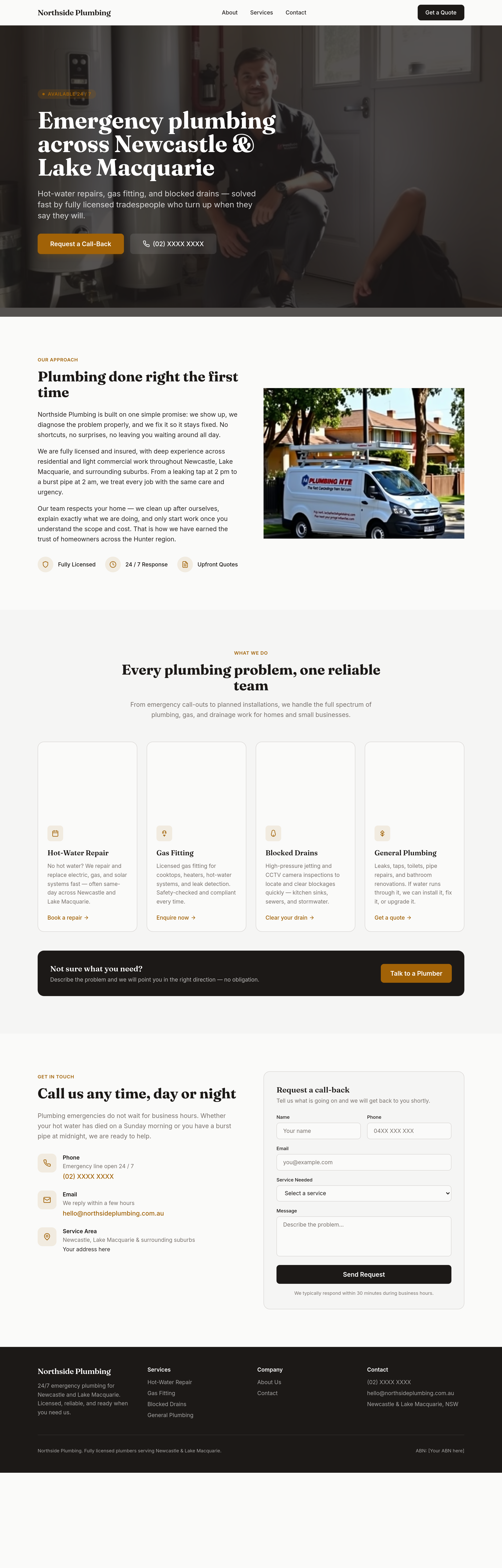
create a /service-areas page listing every suburb covered with response time + a contact map
Before
After
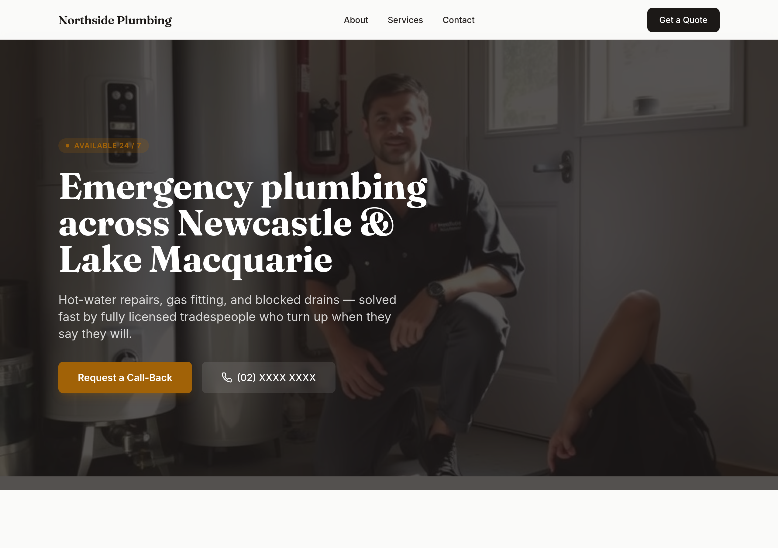
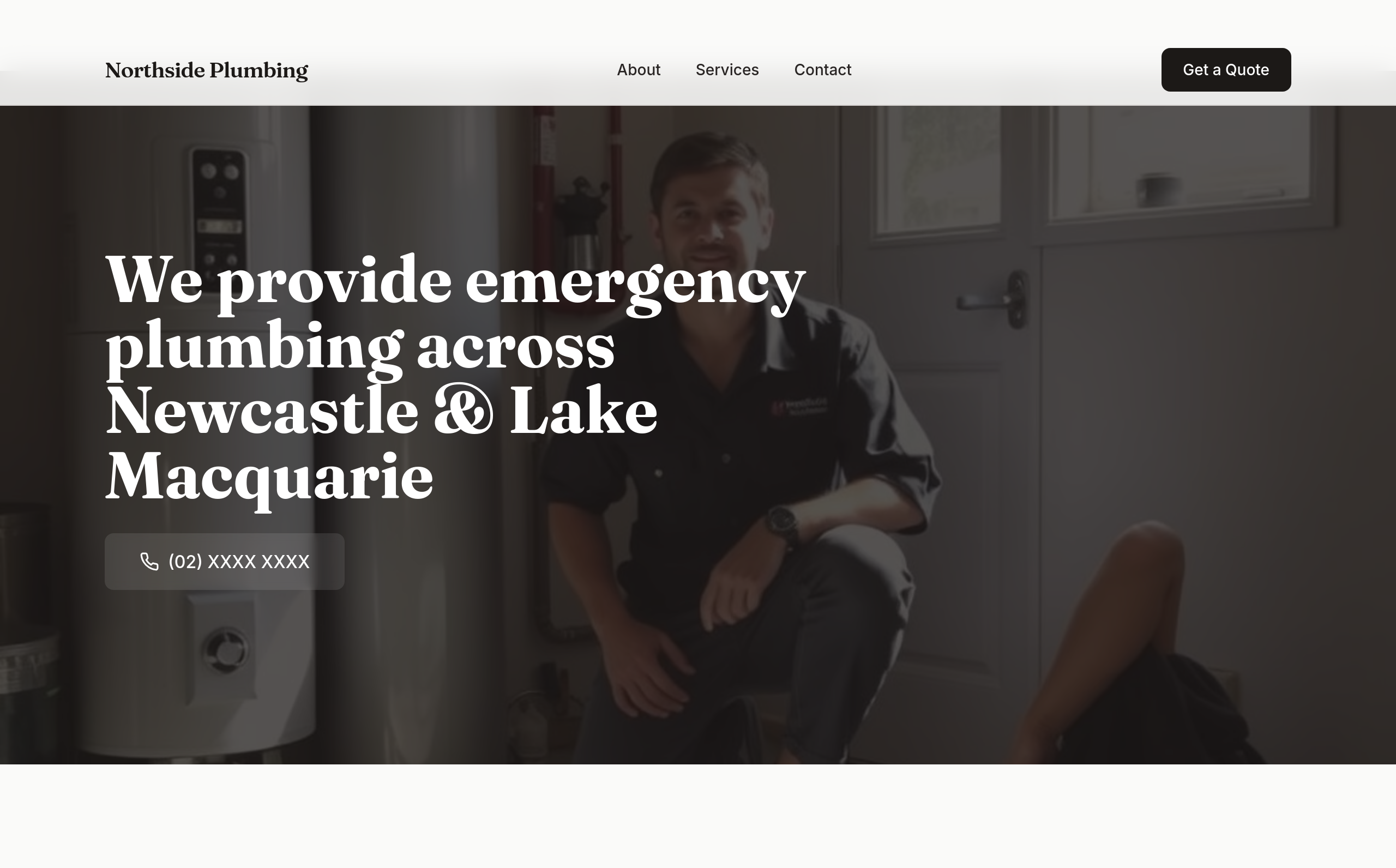
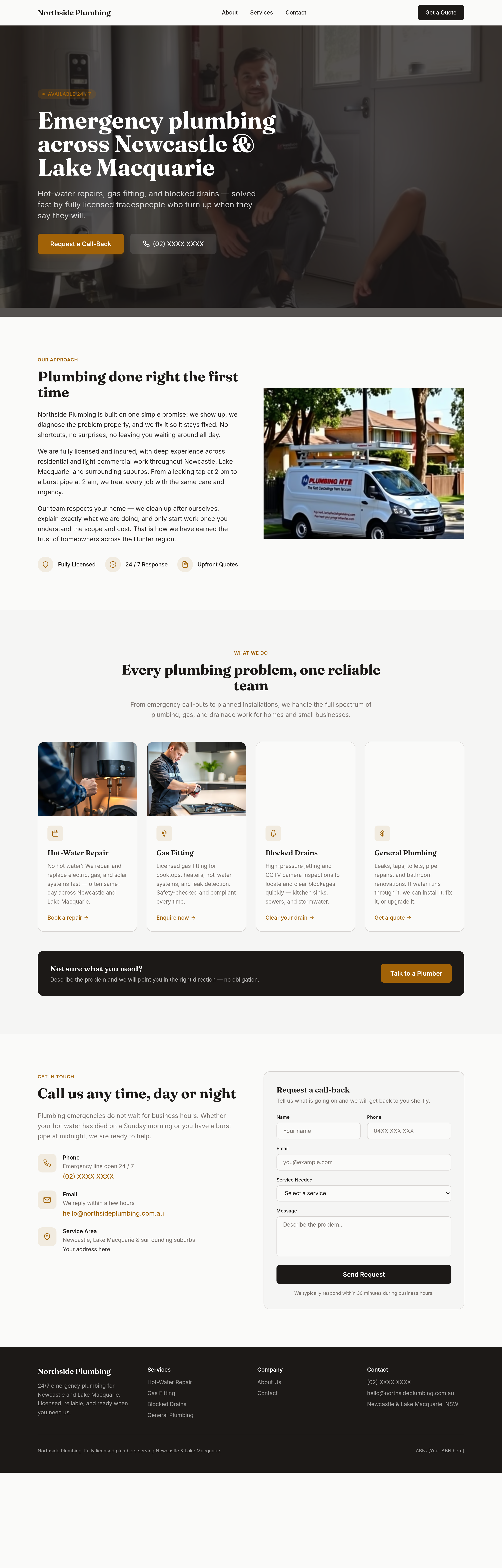
the hero is wordy — strip to a single sentence + the phone number
Before
After
replace every 'we provide' with an action verb that signals urgency
Before
After
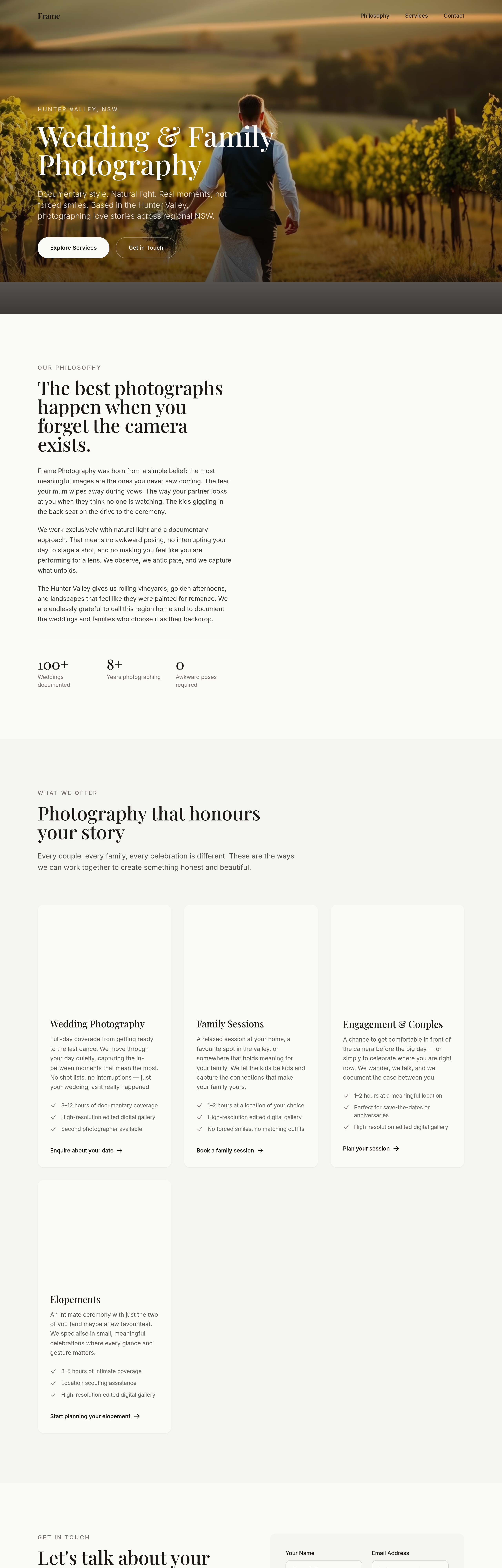
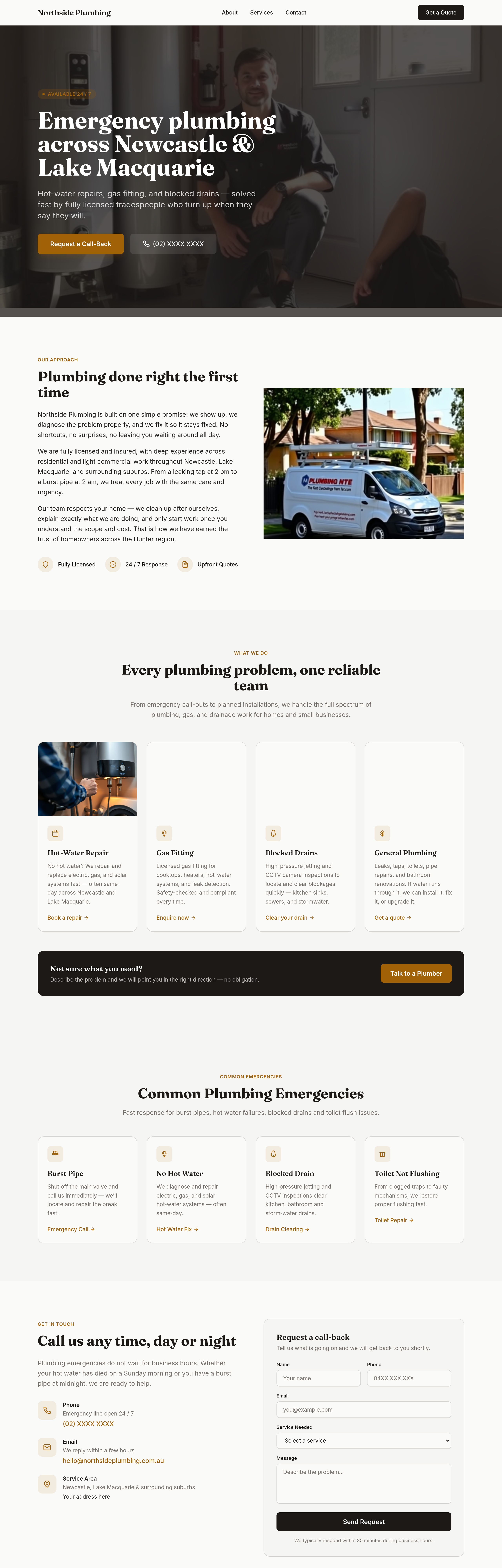
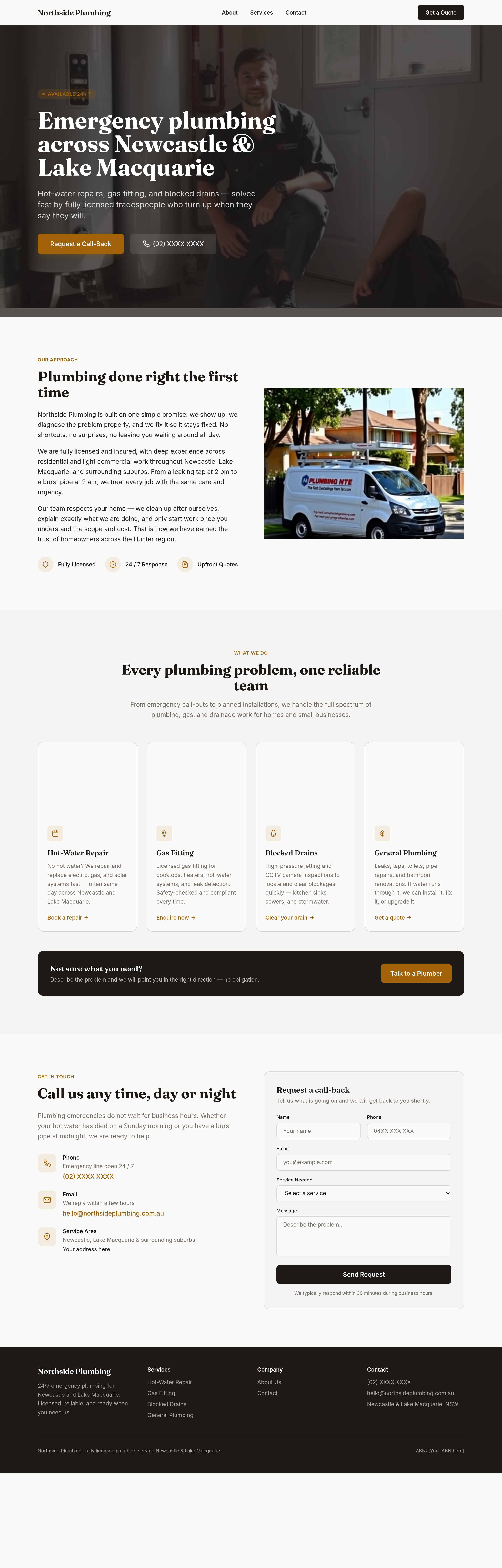
add a 'common emergencies' grid: burst pipe / hot water out / blocked drain / no flush
Before
After
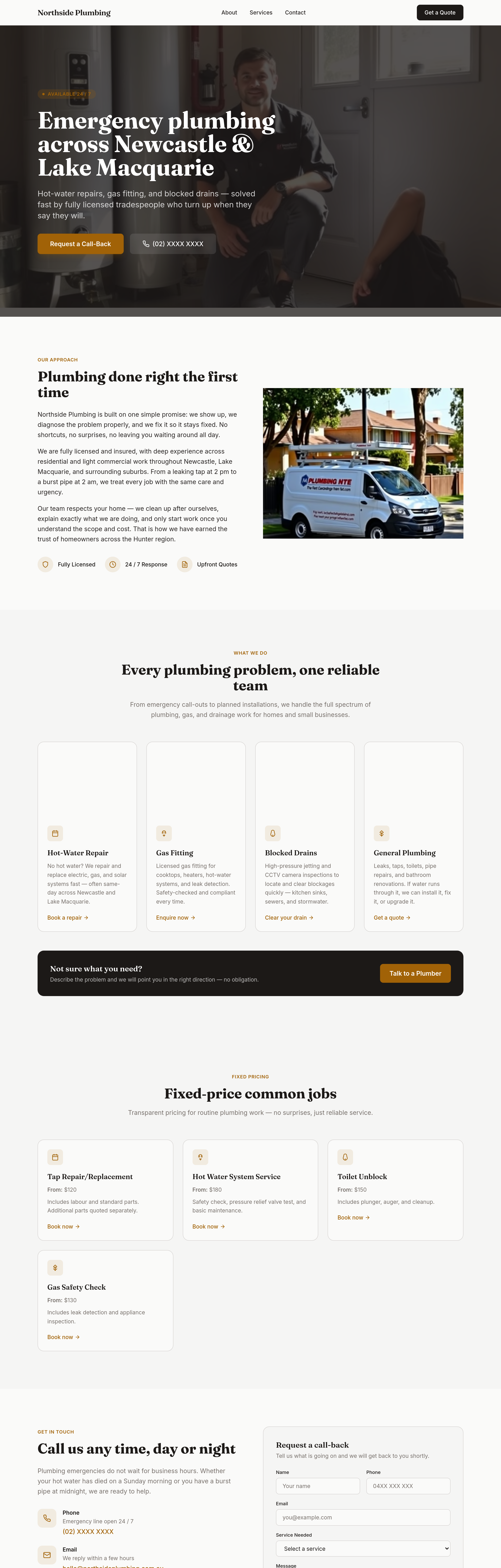
add a 'fixed-price common jobs' section — clear prices for routine work
Before
After
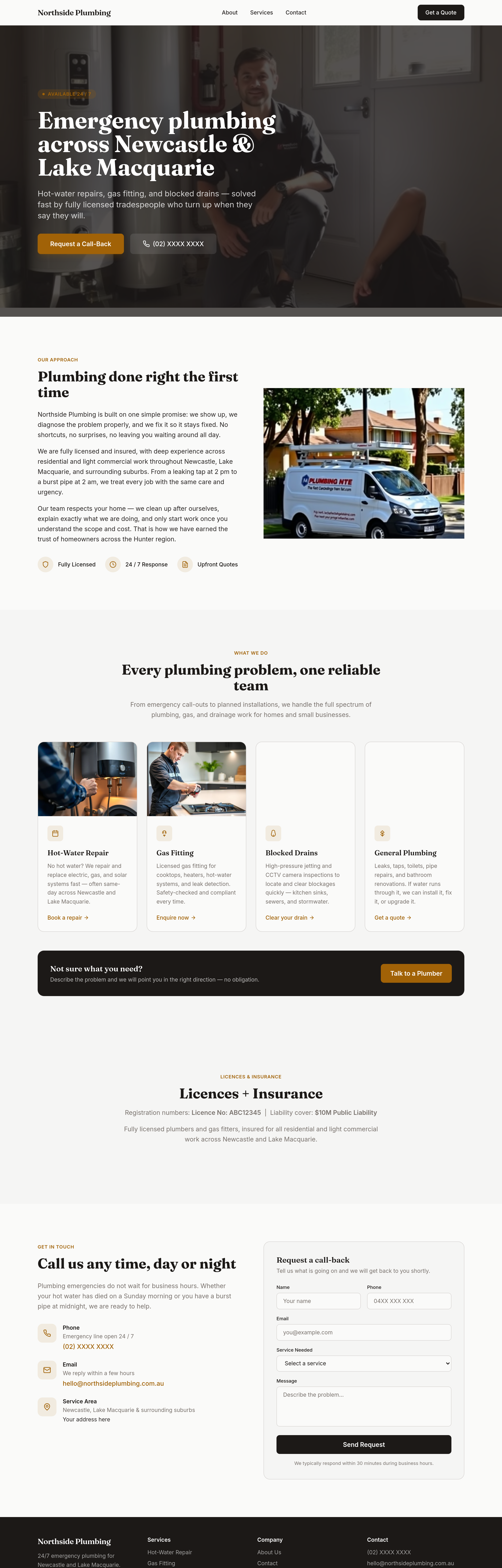
add a 'licences + insurance' section — registration numbers + liability cover
Before
After
add 4 service-area thumbnails — Lake Macquarie, Newcastle, Hunter, Port Stephens

Before

After
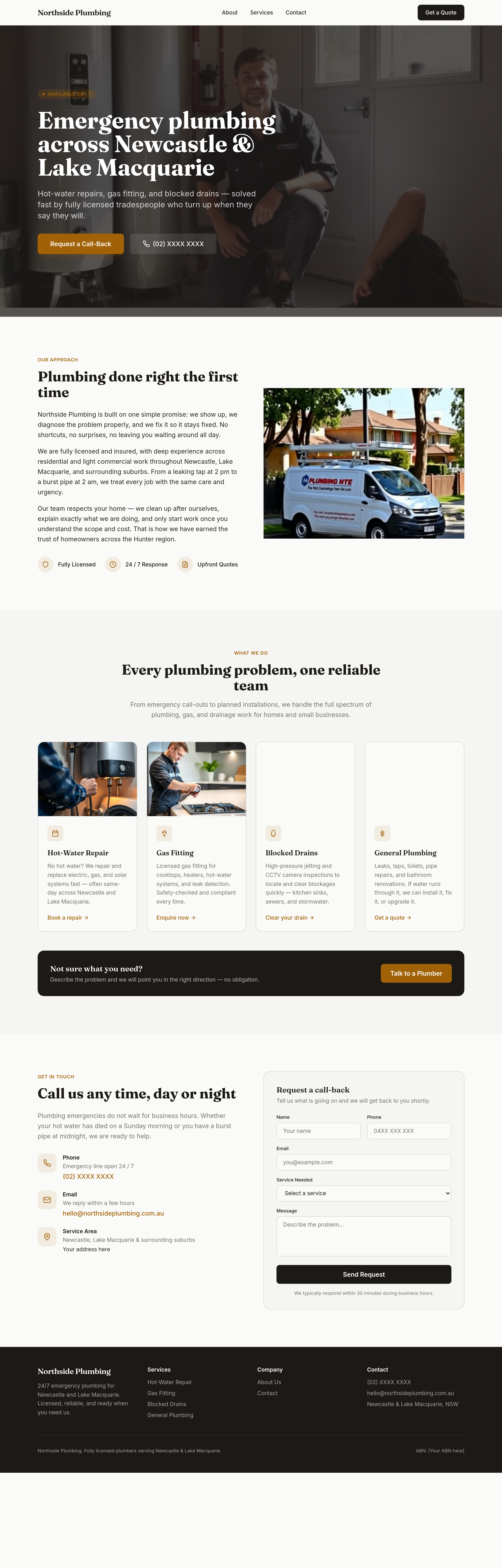
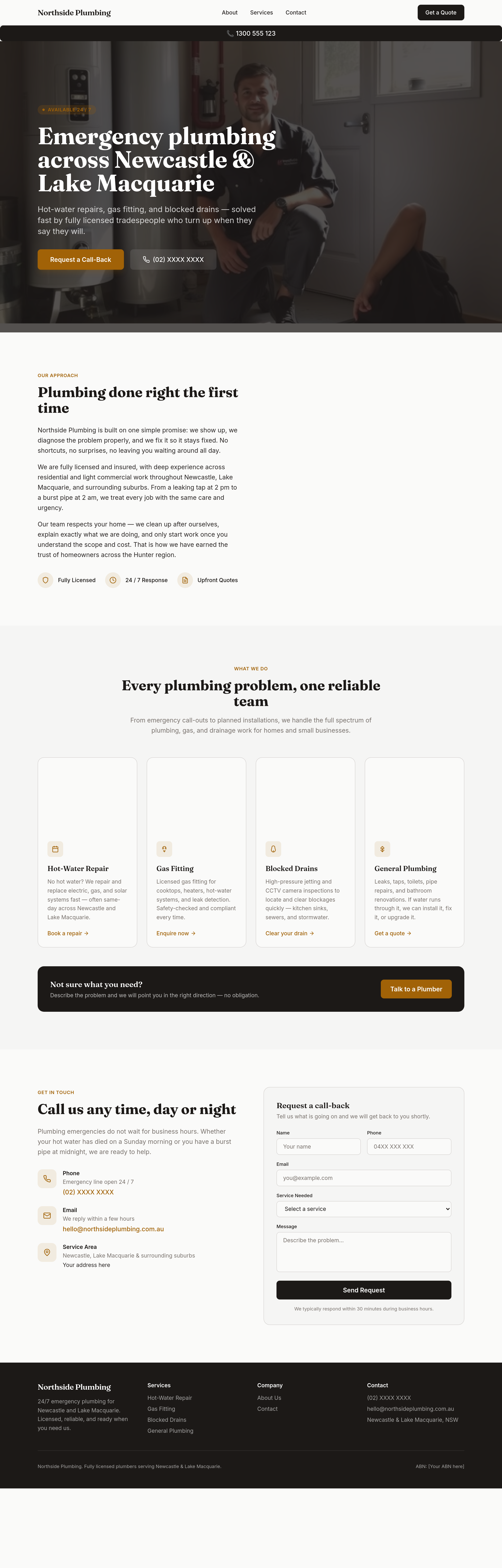
reframe the whole site around 'when it can't wait' — every section emphasises speed + 24/7 phone
Before
After
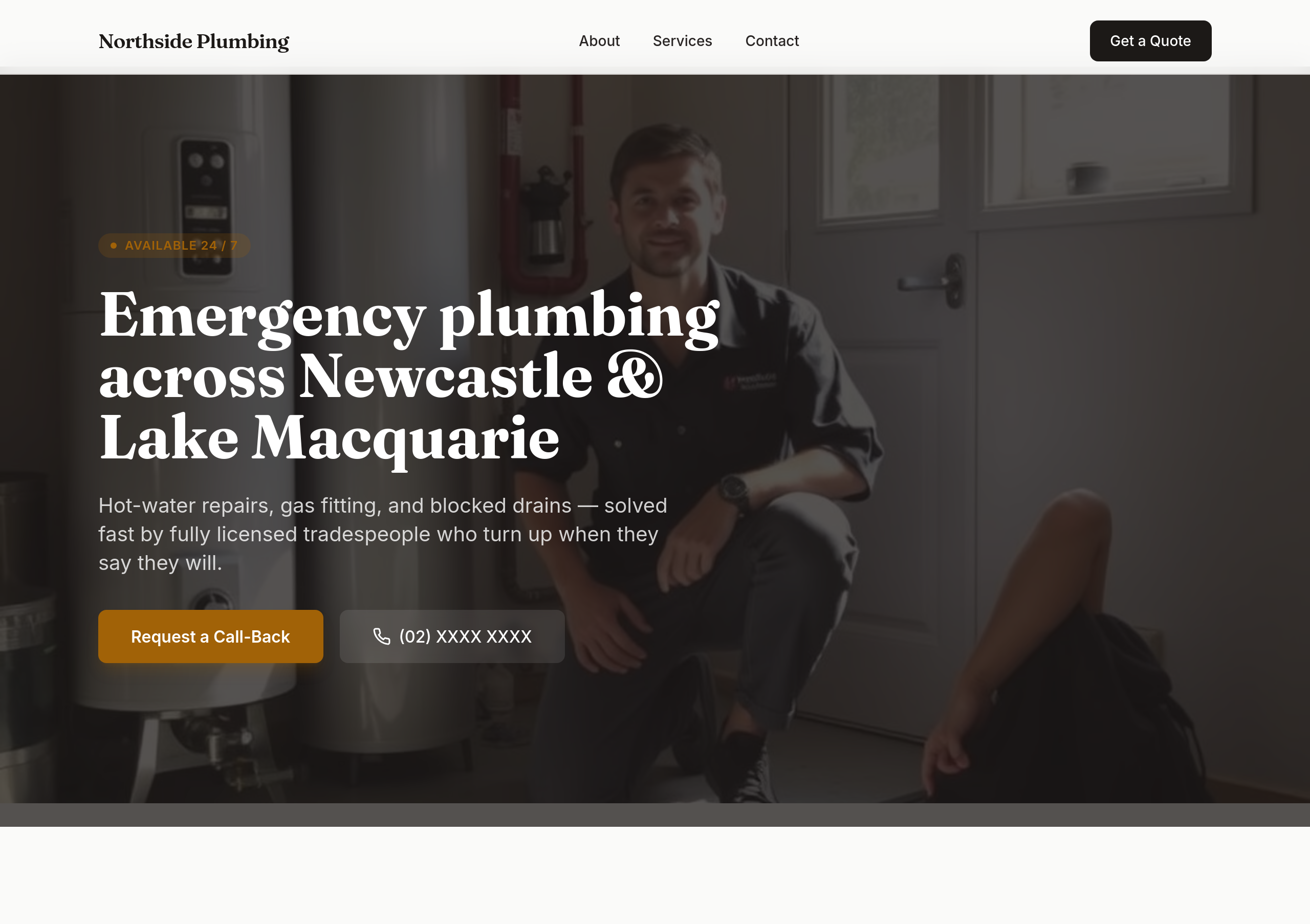
sticky phone button bottom-right on mobile that becomes a header bar on desktop
Before
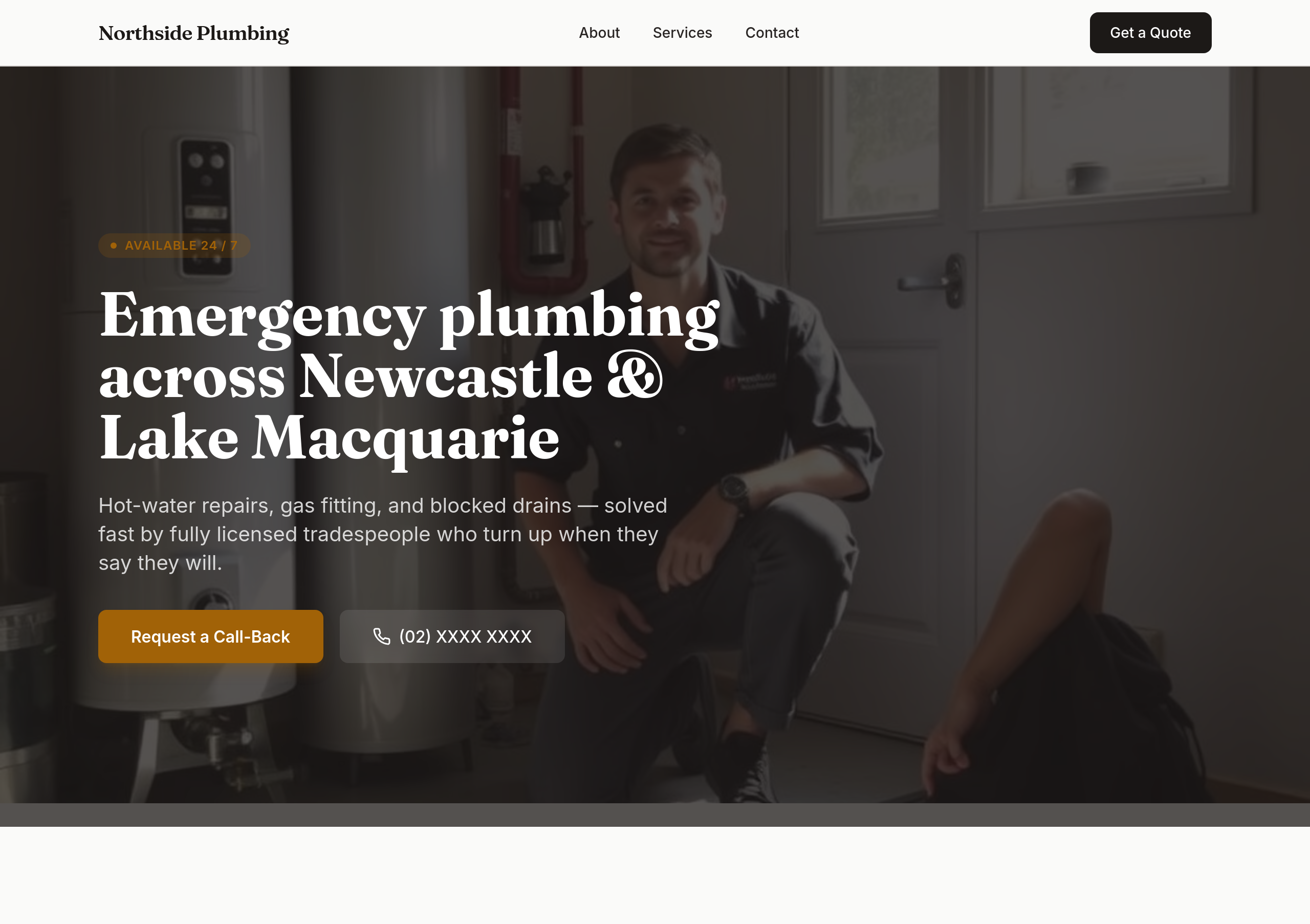
After
the colours are flat — use bold orange + dark navy for tradie confidence

Before

After
every section ends with 'Call (02) XXXX XXXX' as a soft secondary CTA
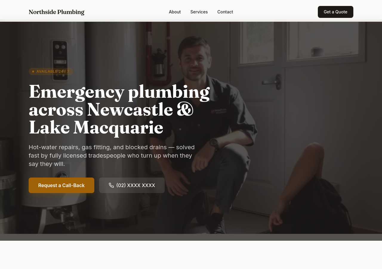
Before
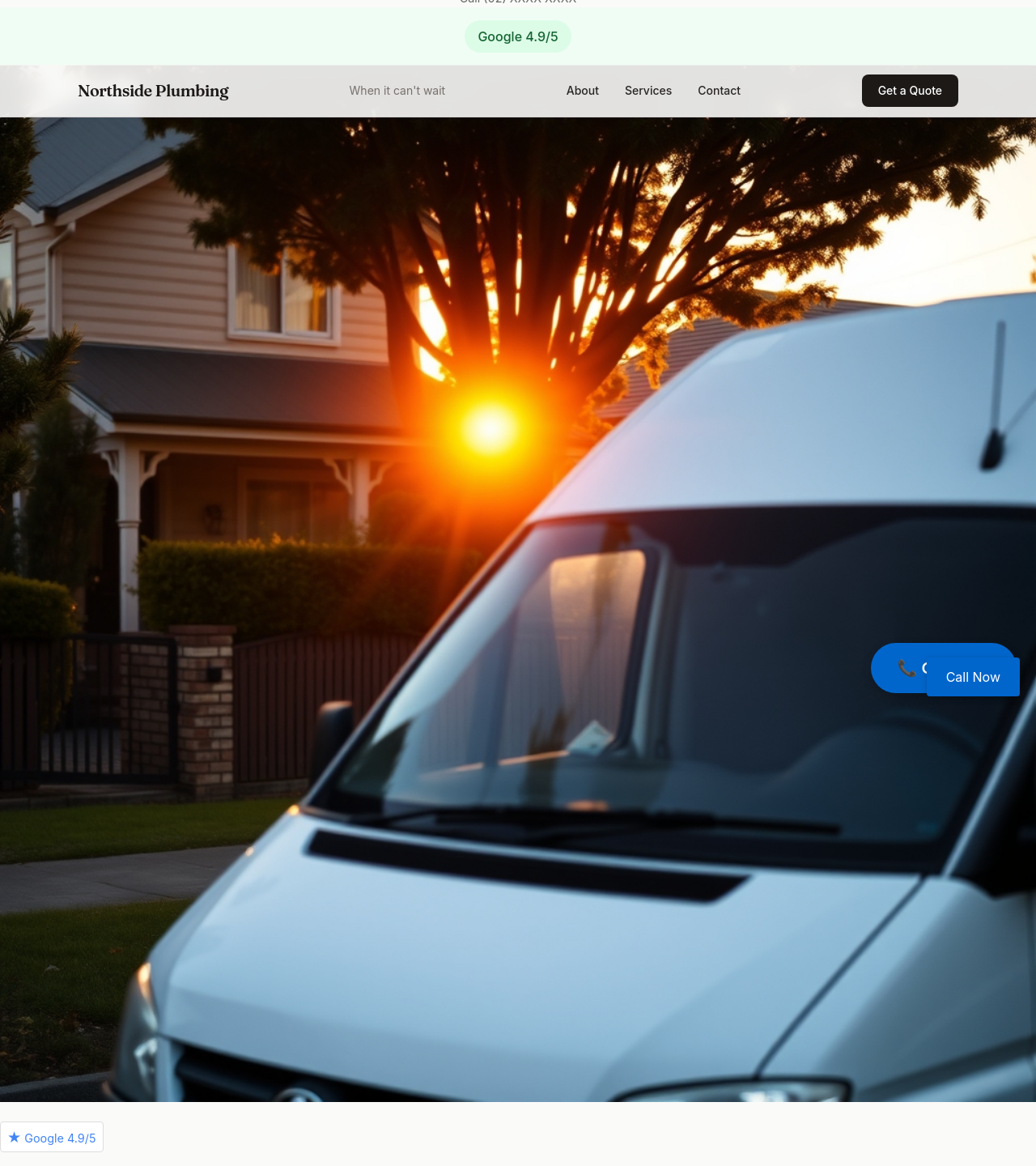
After
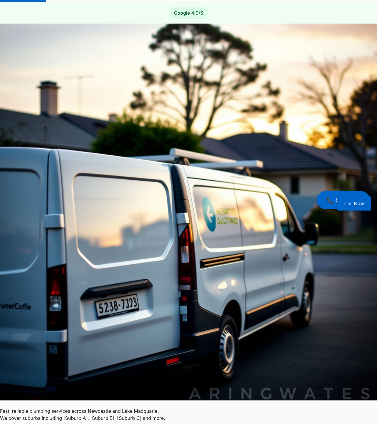
add a 'Google 4.9/5' badge somewhere prominent (placeholder)