accountant
54 examples run against cap-accountant.flarepages.au.
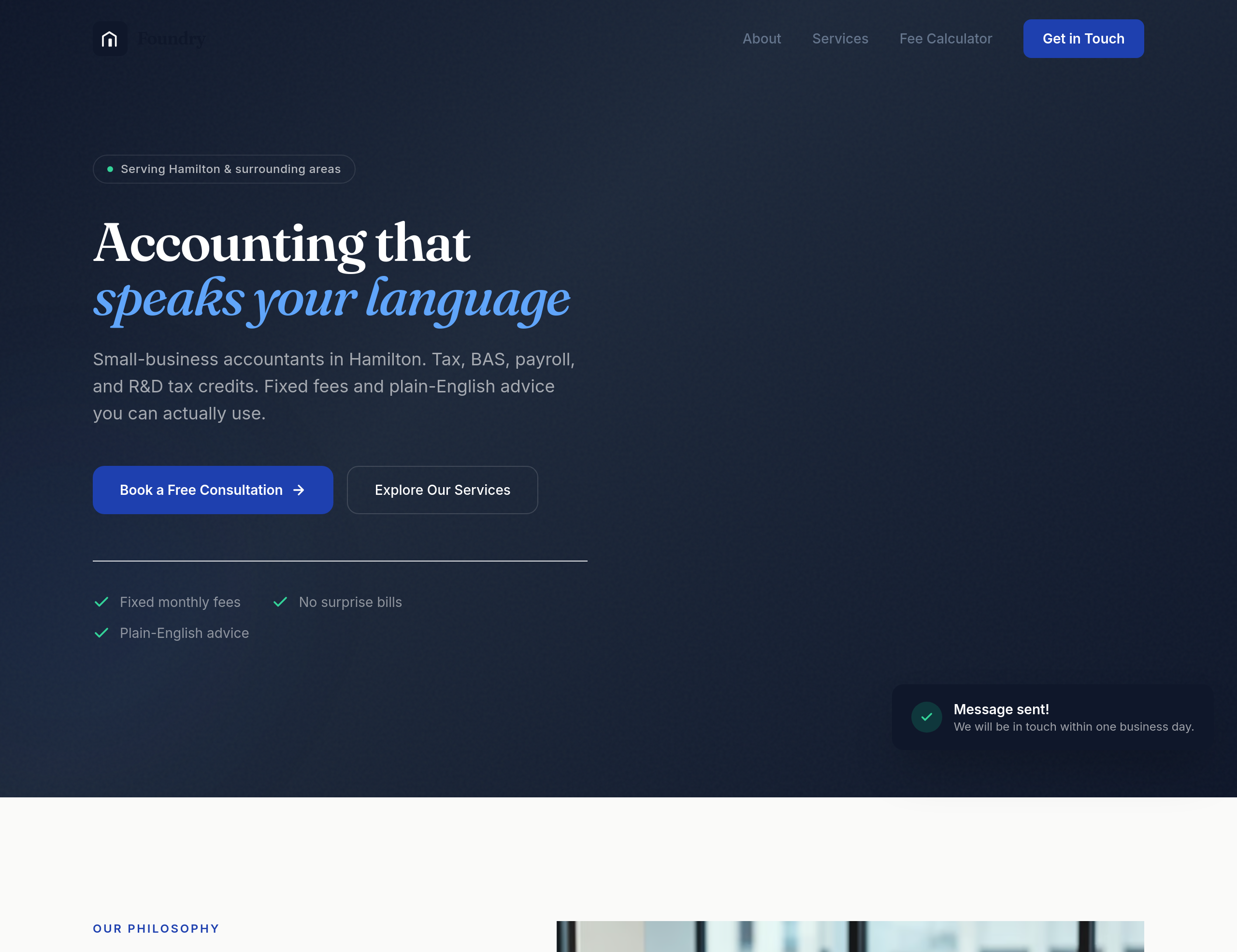
Before
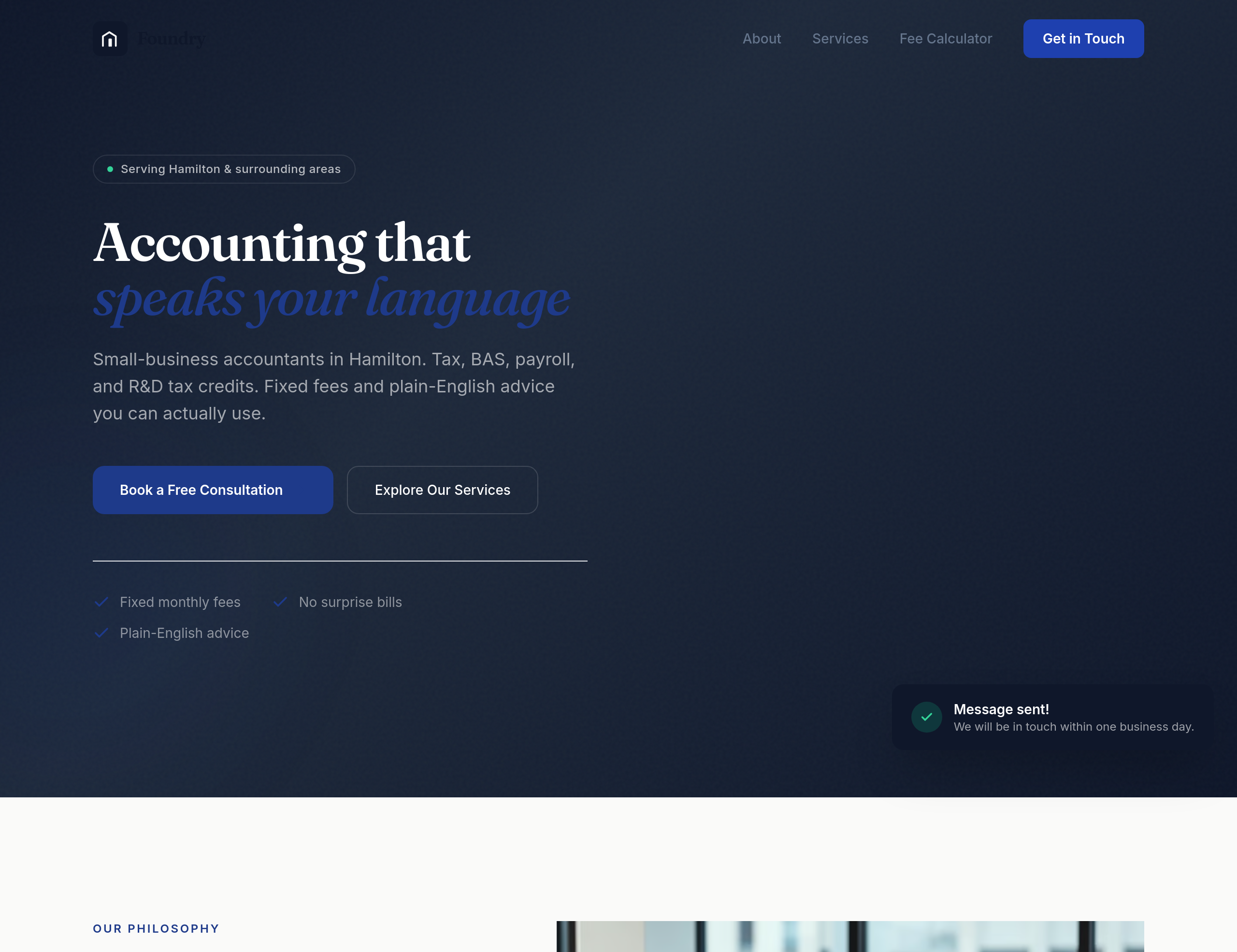
After
the design feels too corporate-blue — use a warmer navy + cream palette
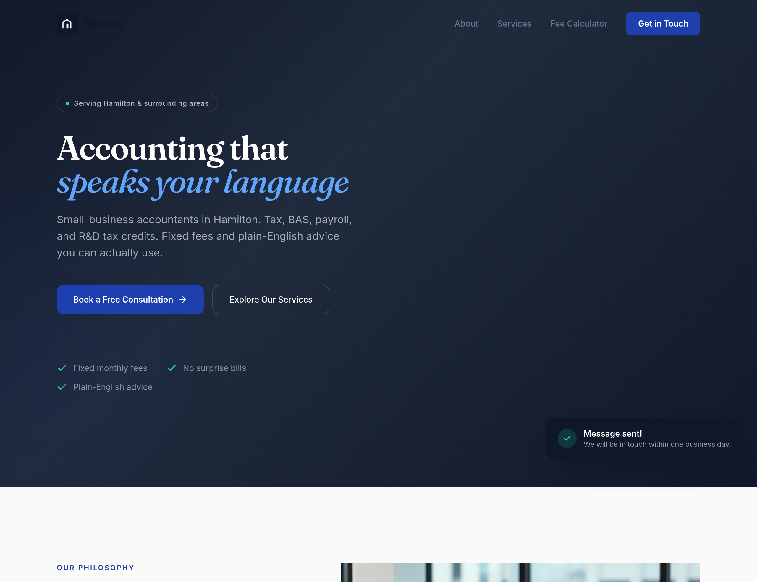
Before
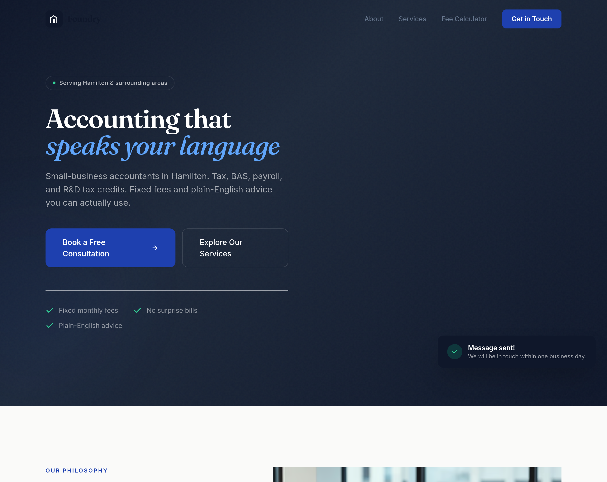
After
the buttons are too small — make them feel substantial without being clunky
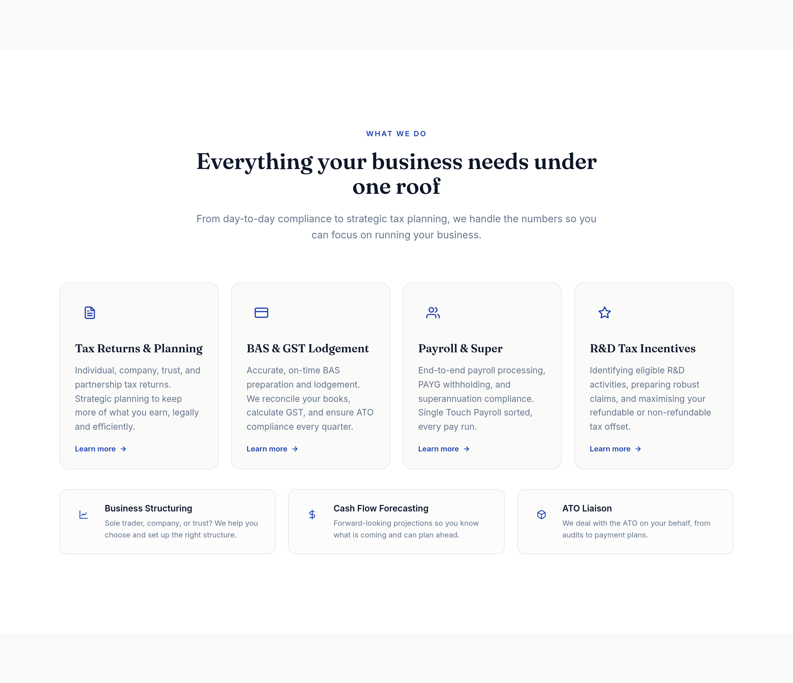
Before
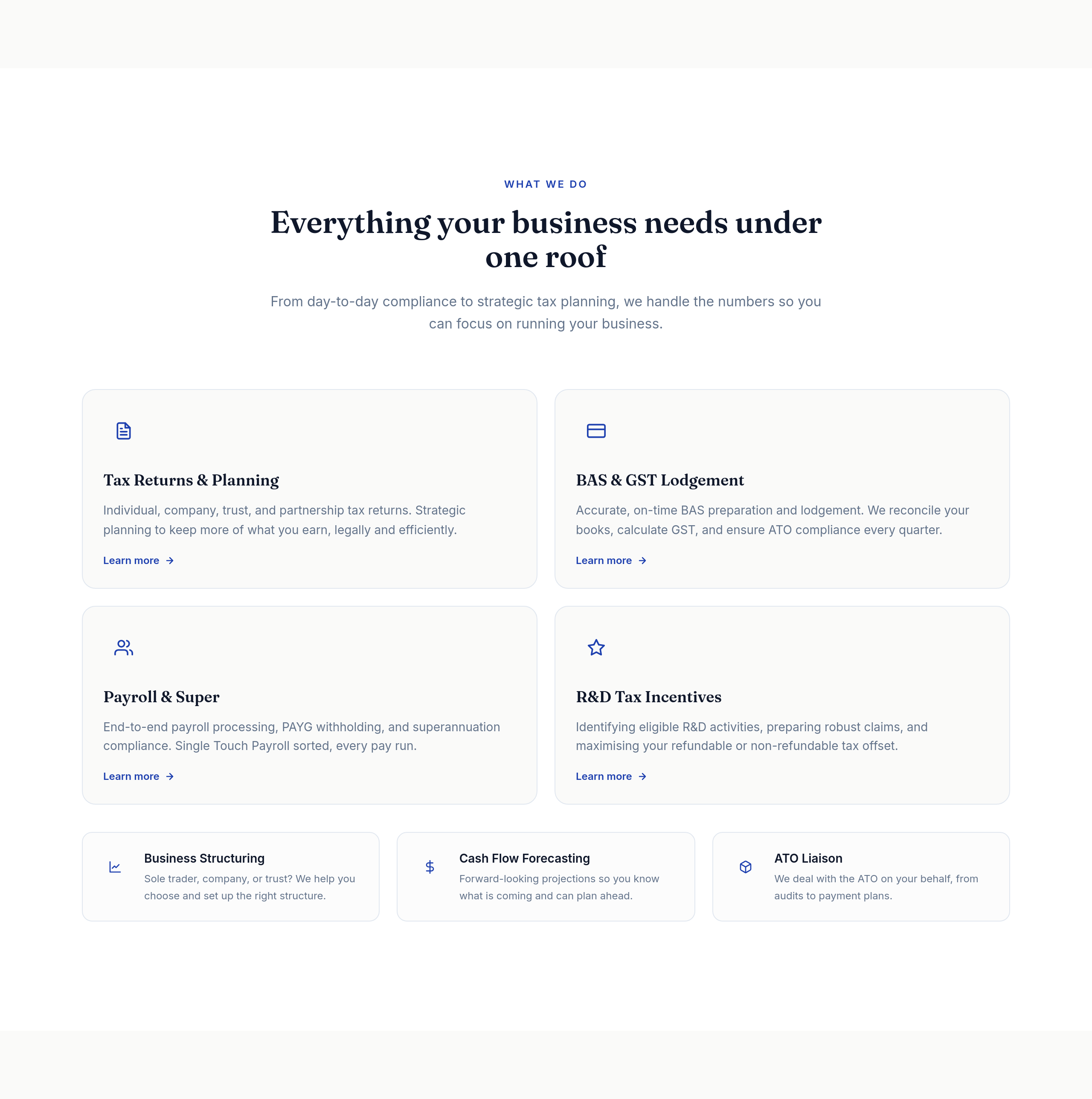
After
the services grid is 4 columns — too cramped, change to 2
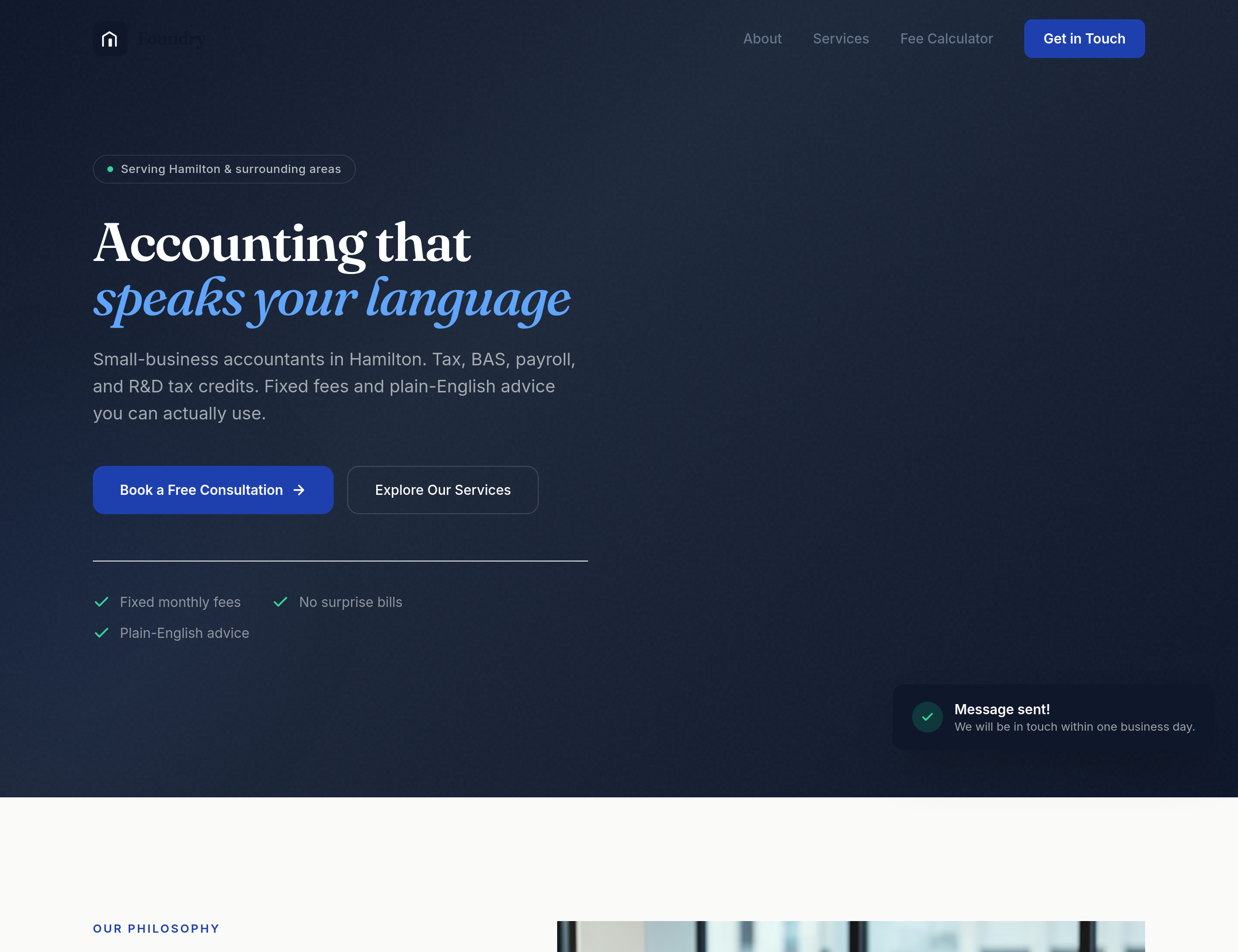
Before
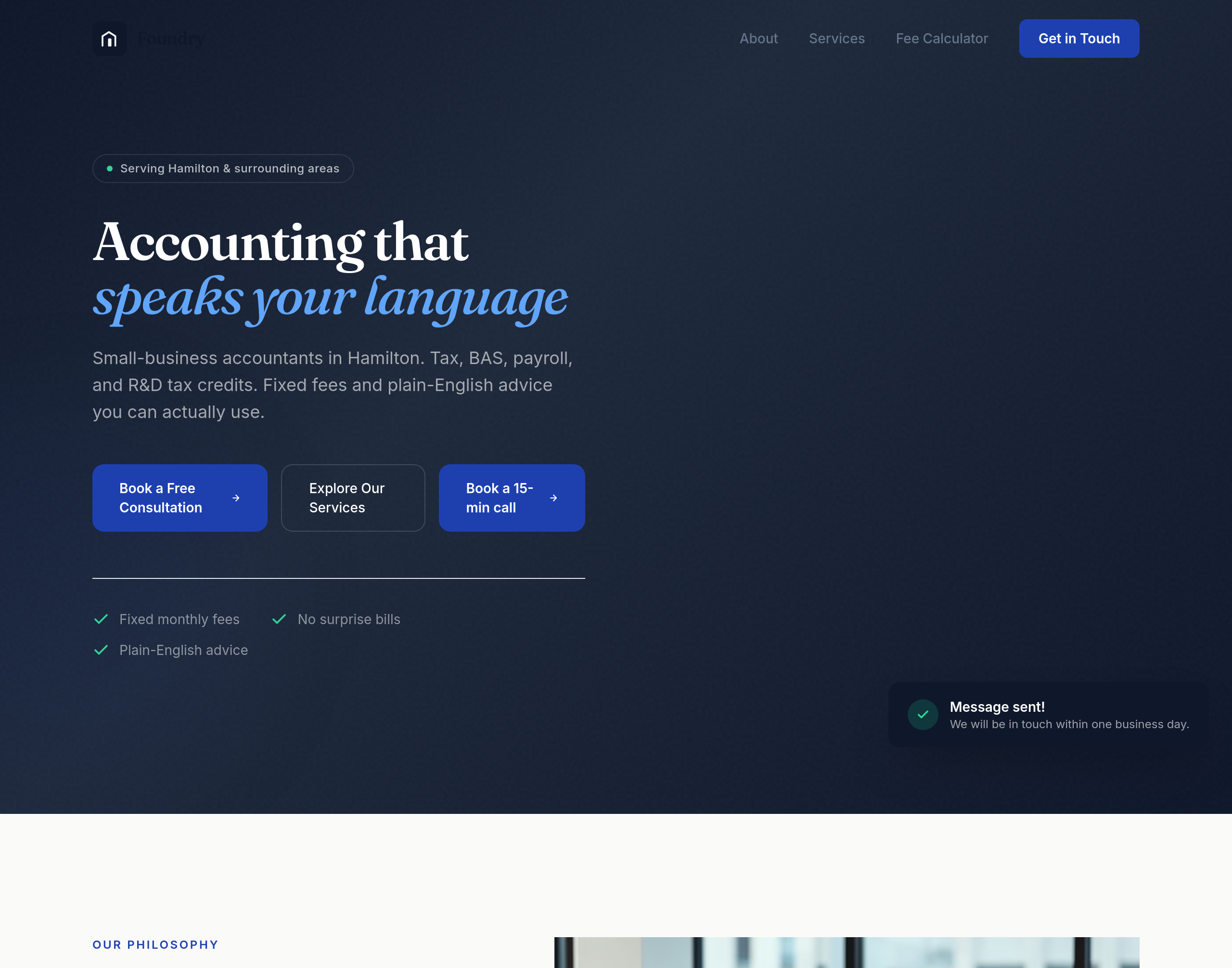
After
add a 'Book a 15-min call' CTA in the hero AND a separate 'Get a quote' below the services
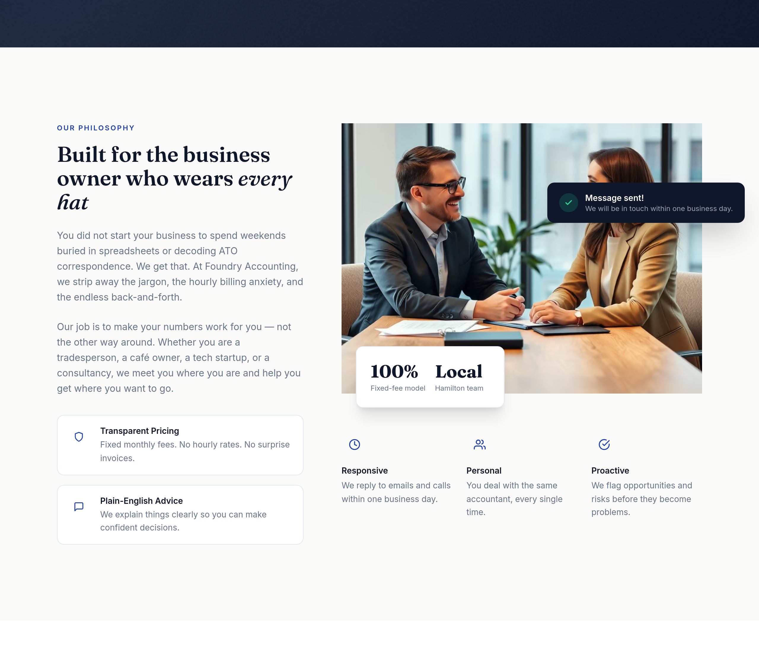
Before
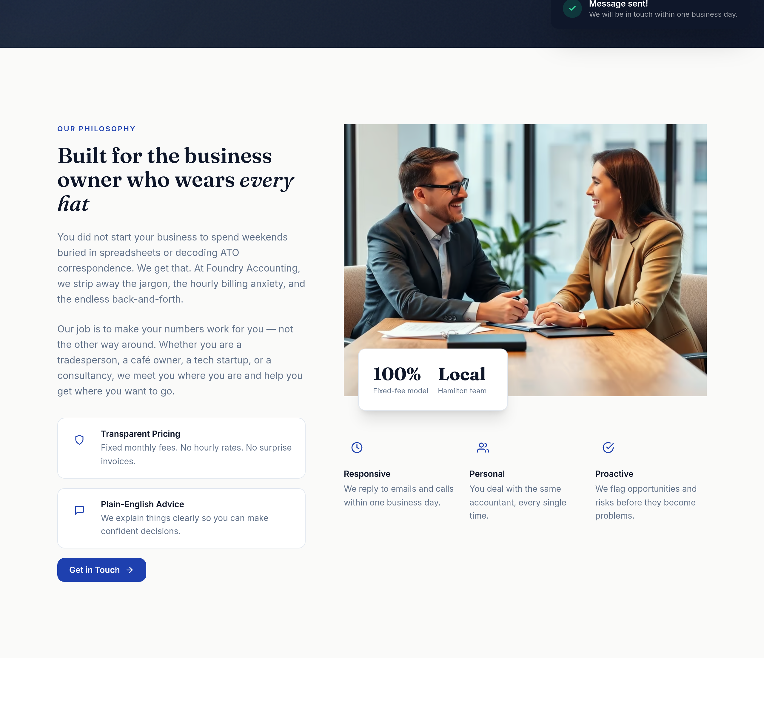
After
add a small contact-form CTA inline within the about section

Before

After
the pricing is hidden — make it the second section after hero, not buried at the bottom
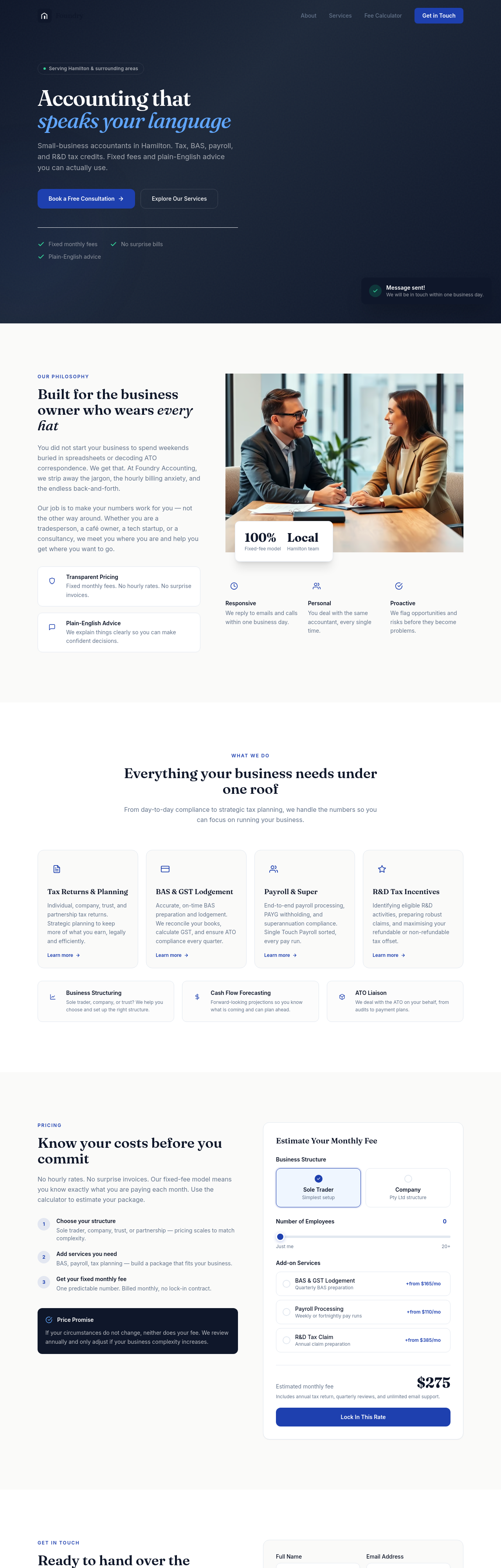
Before
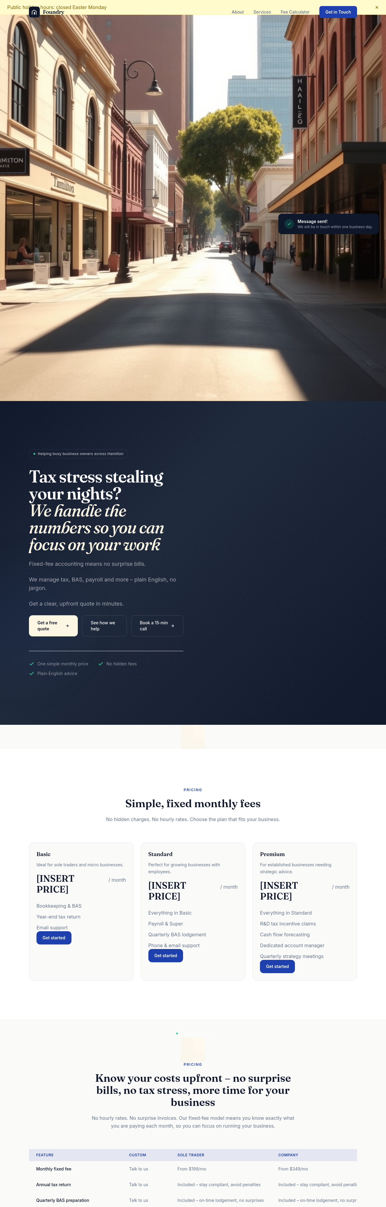
After
rewrite the meta description to mention Newcastle + small business accountant + fixed fees
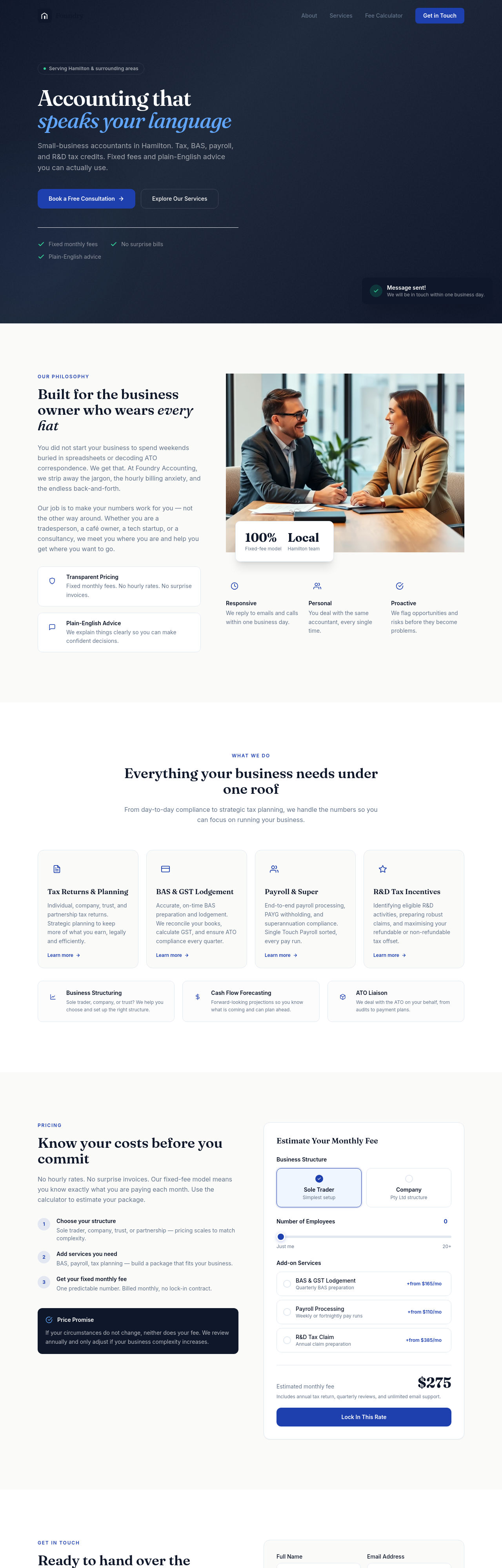
Before
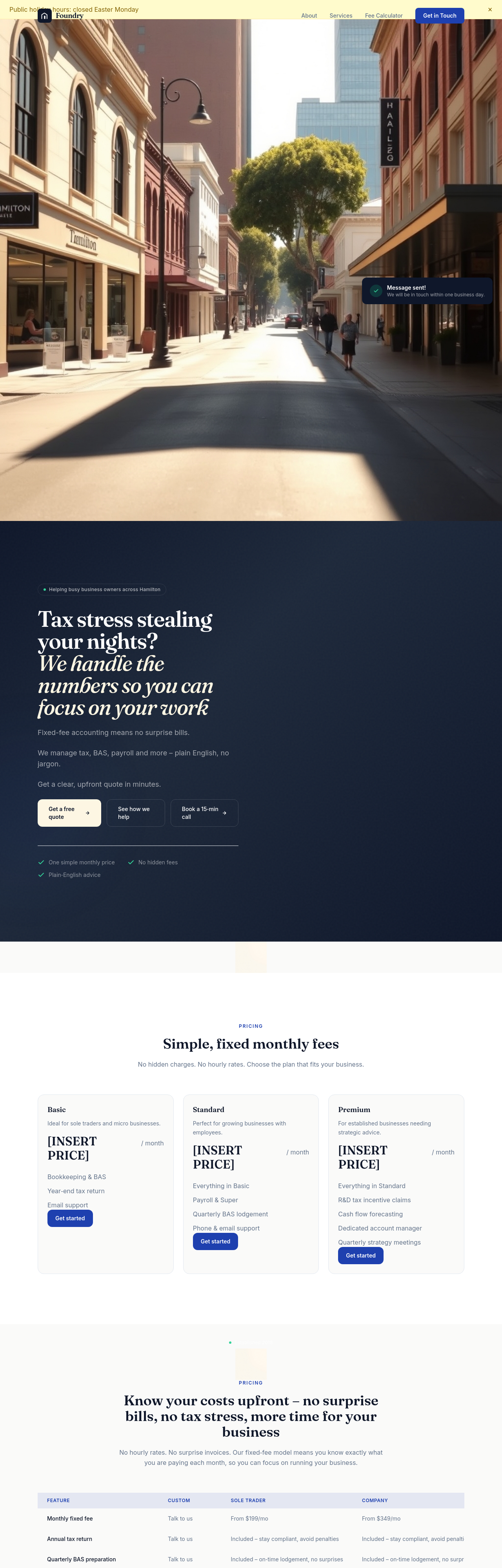
After
create a /tax-deadlines page listing key Aussie business tax dates for the financial year
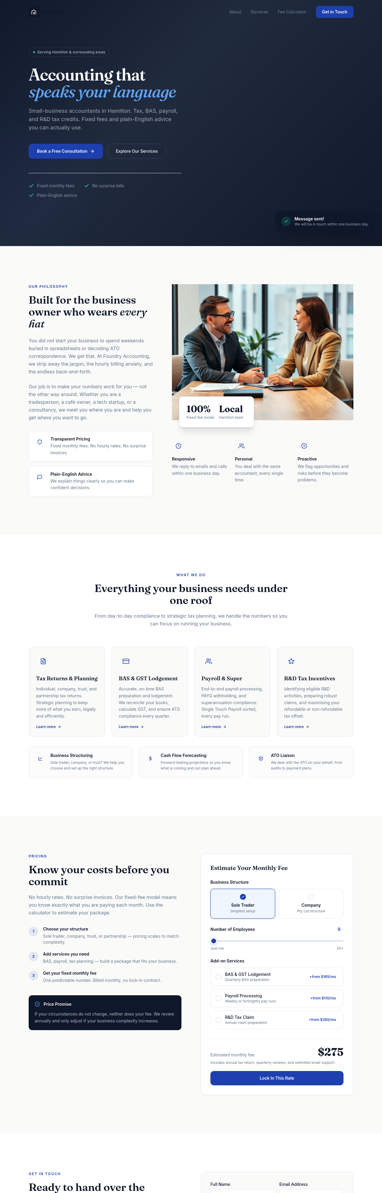
Before
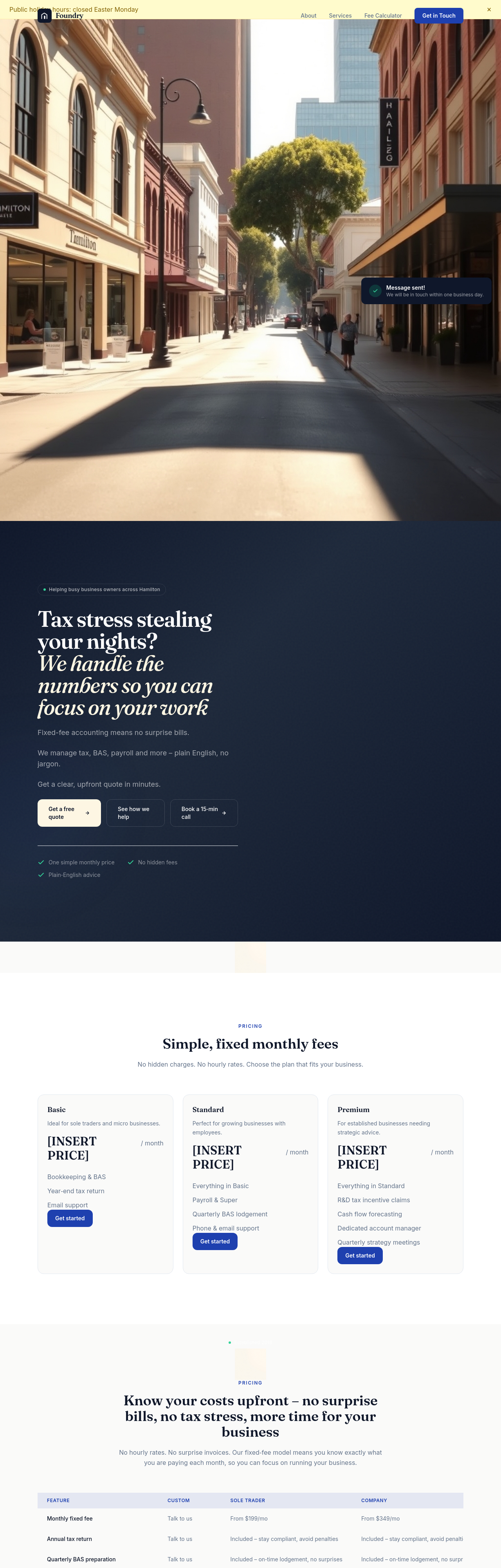
After
add an /about-us page with a 2-3 paragraph history and a placeholder for the team
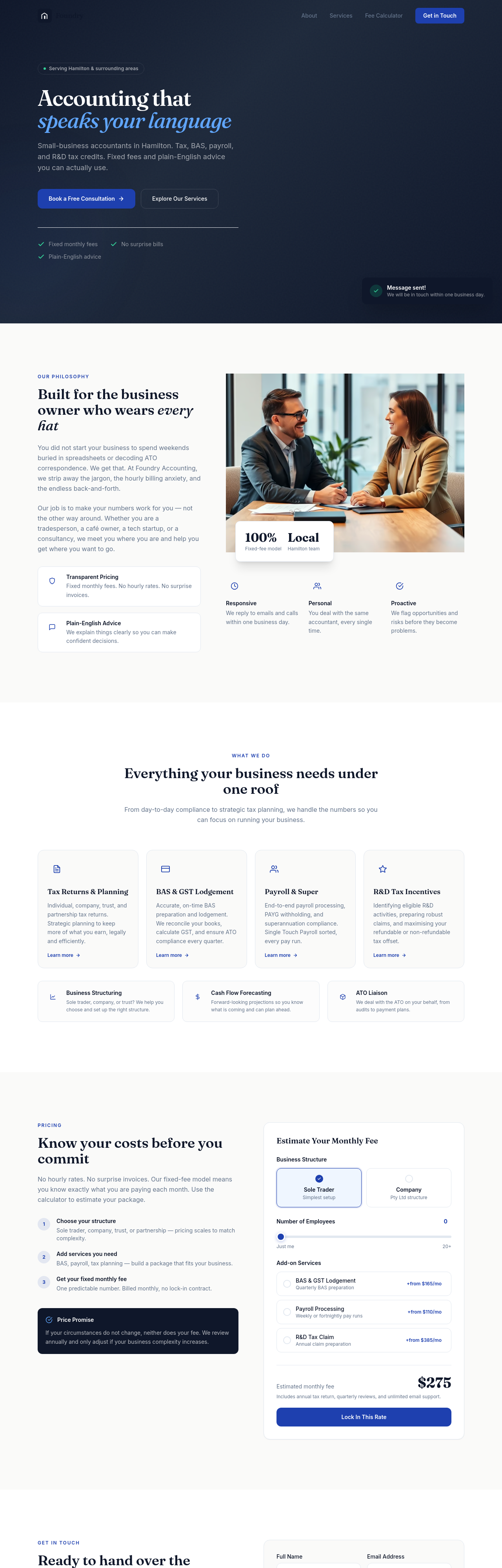
Before
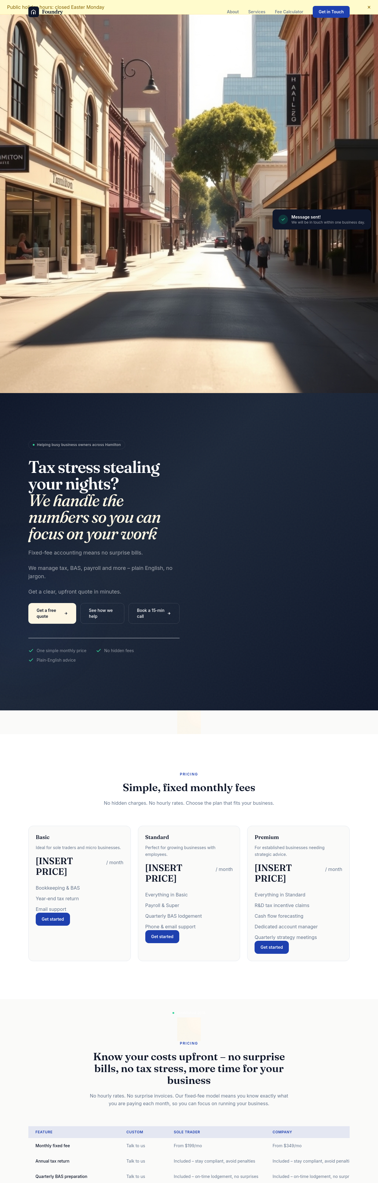
After
add a section about our R&D Tax Credits expertise — short copy, clear who it's for, expected return
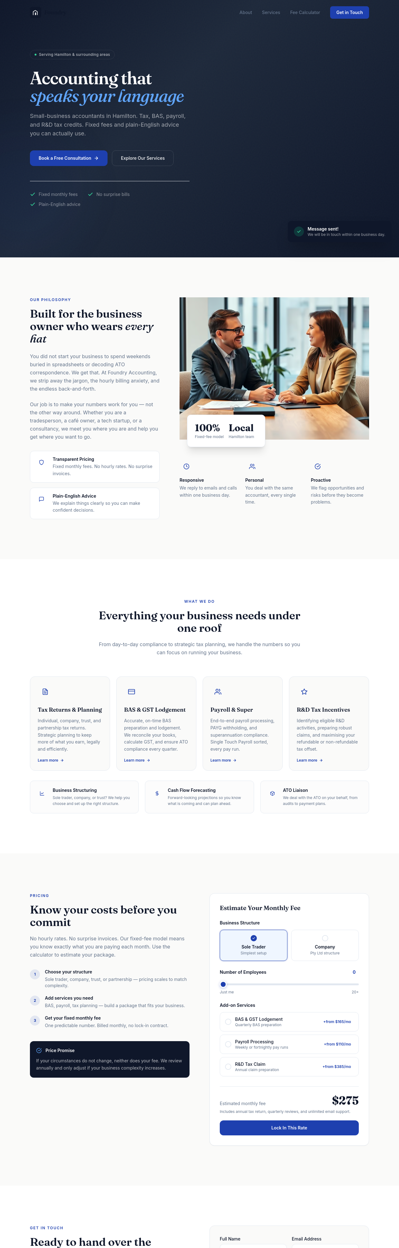
Before
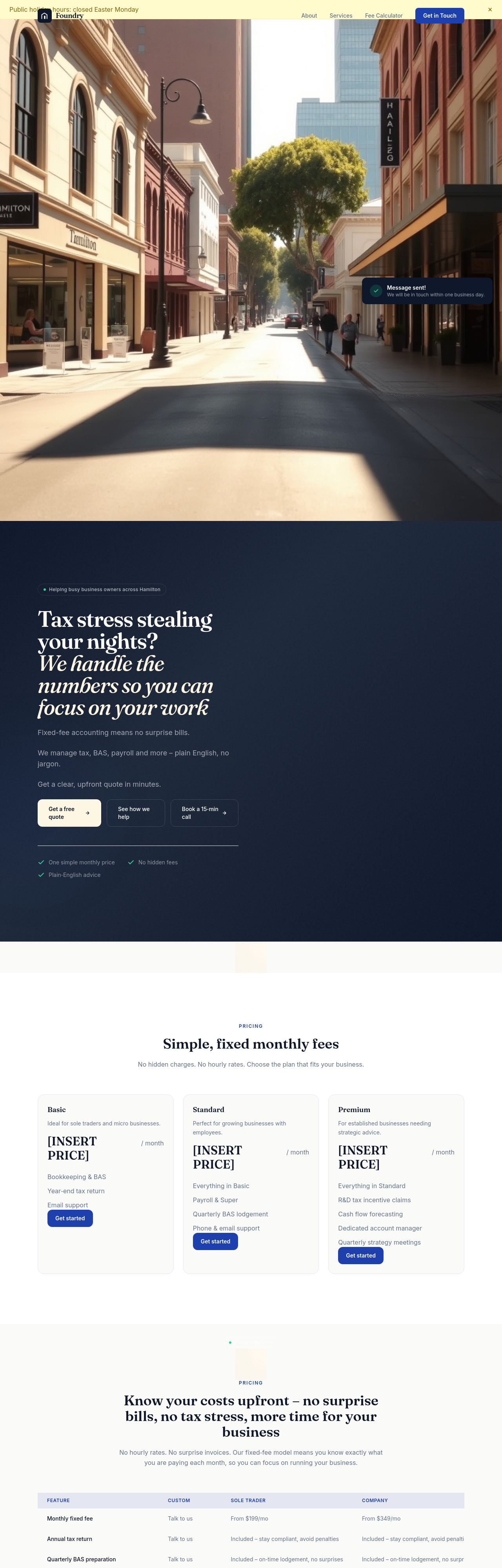
After
add a 'How we work' section with 4 steps: discovery, onboard, ongoing, year-end
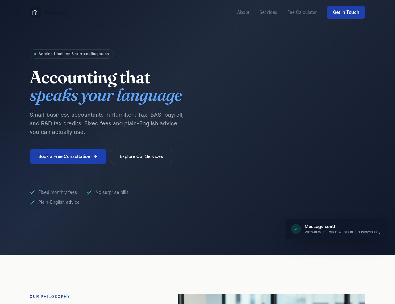
Before
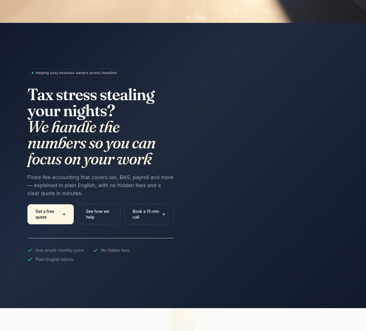
After
the hero subhead is a list of services — rewrite it as a single sentence summary
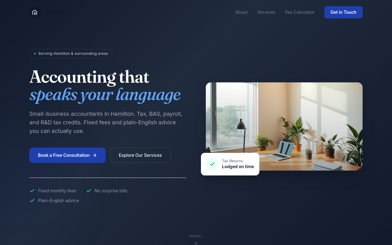
Before
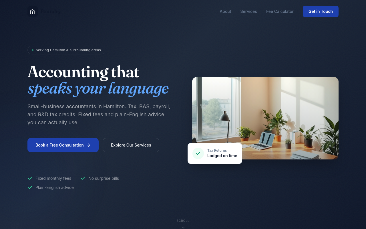
After
every 'CPA' should expand to 'Certified Practising Accountant' on first mention
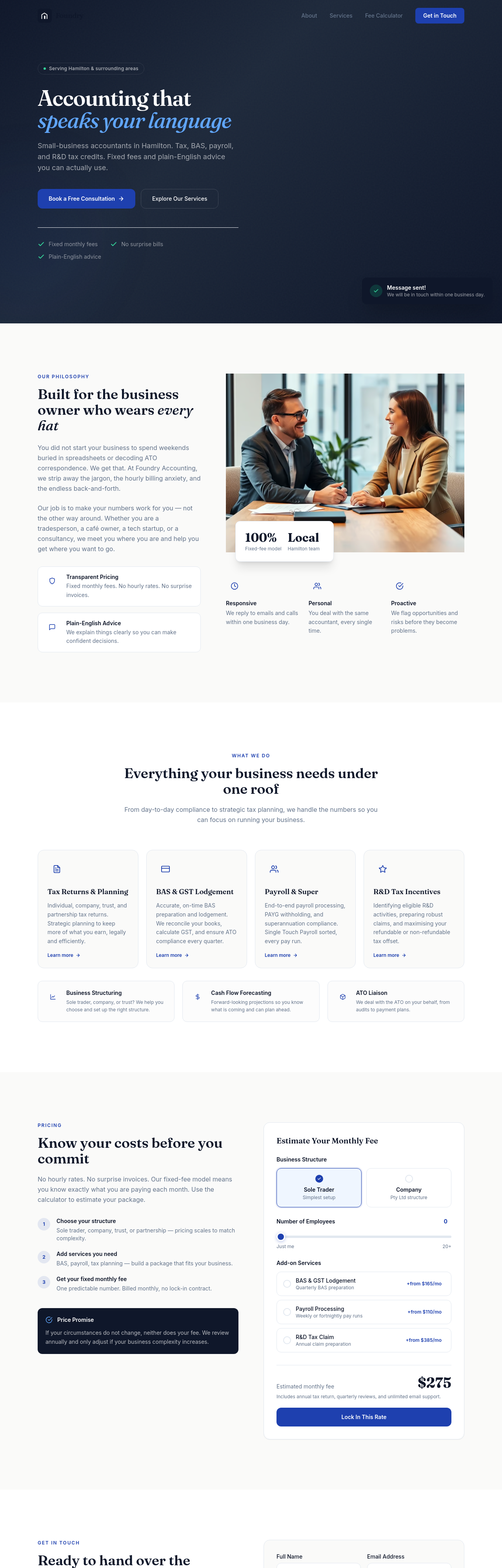
Before
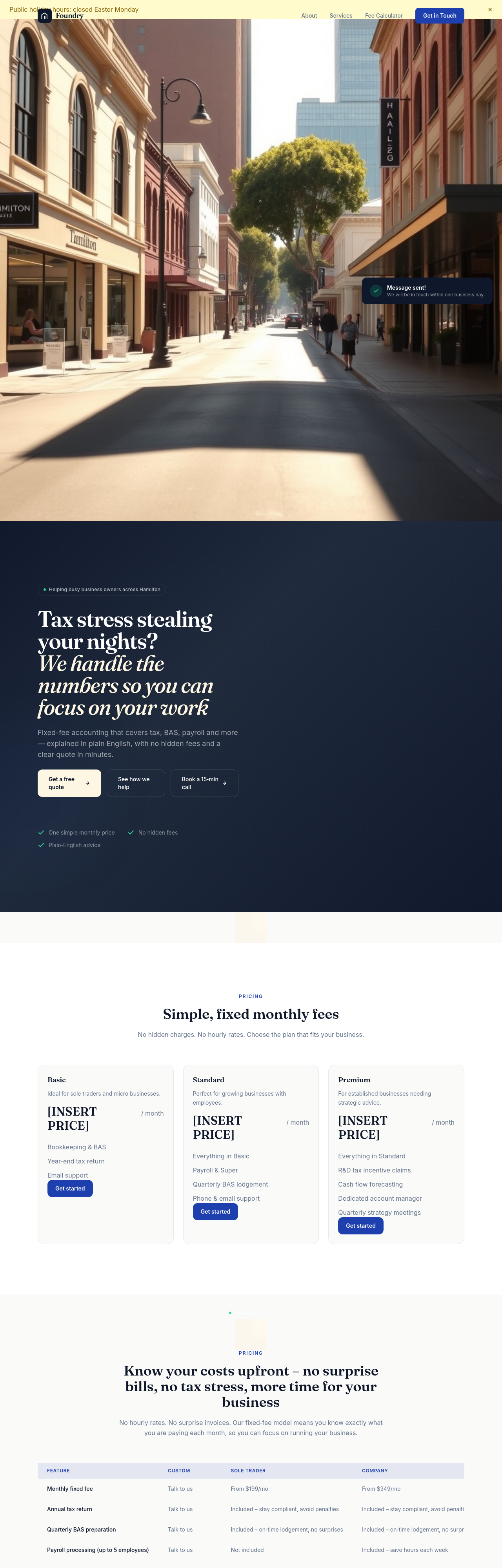
After
add a testimonial that says we save clients $50,000 on average
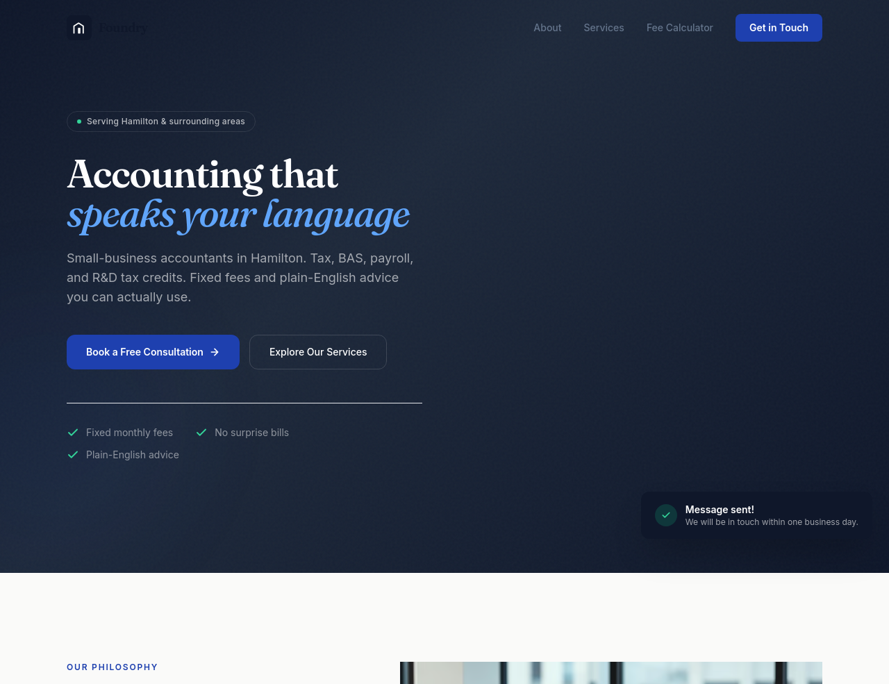
Before
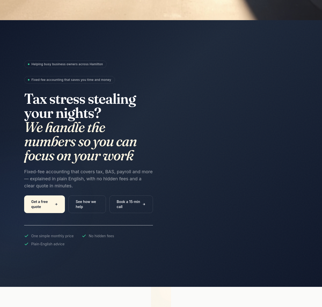
After
add a clear value-prop in the hero + replace generic services with named services + add pricing
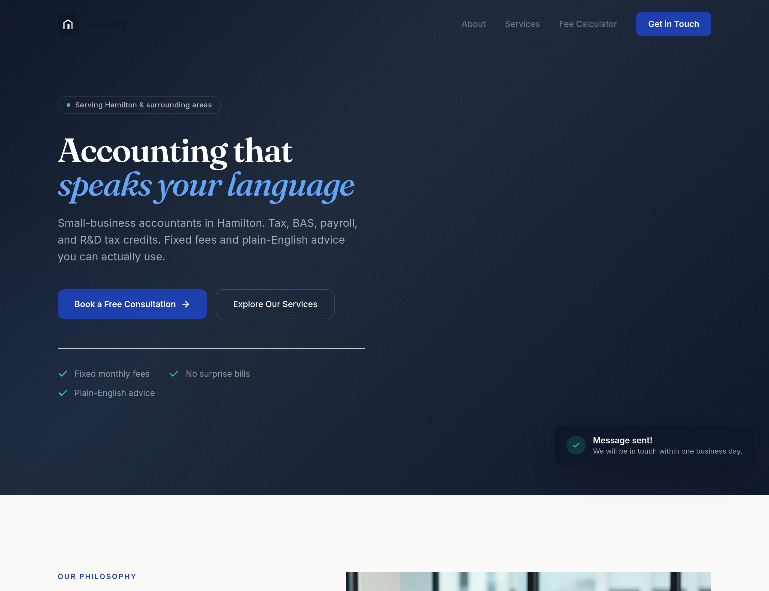
Before
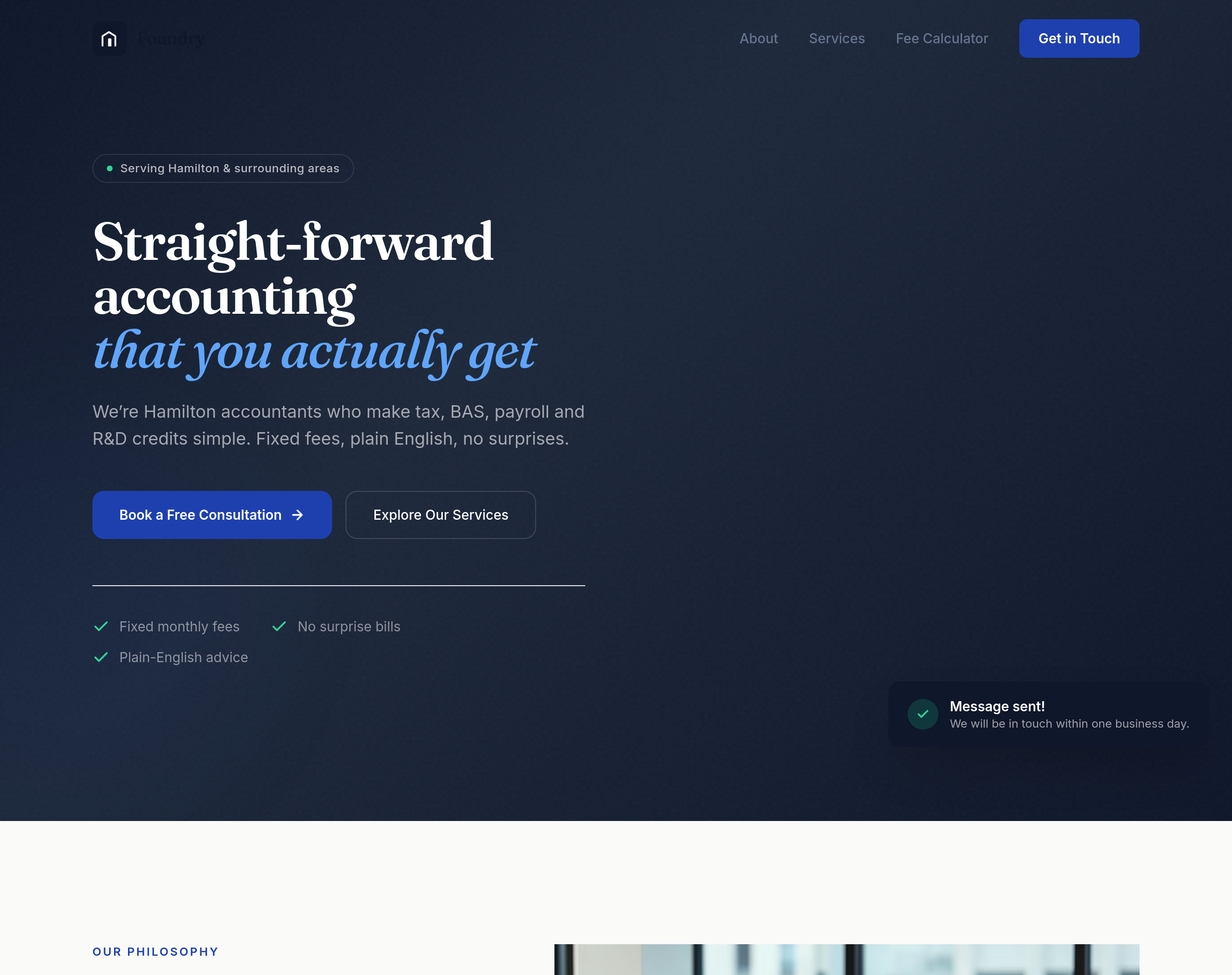
After
the hero is full of accounting jargon — rewrite it so a non-accountant can grasp it in 3 seconds

Before
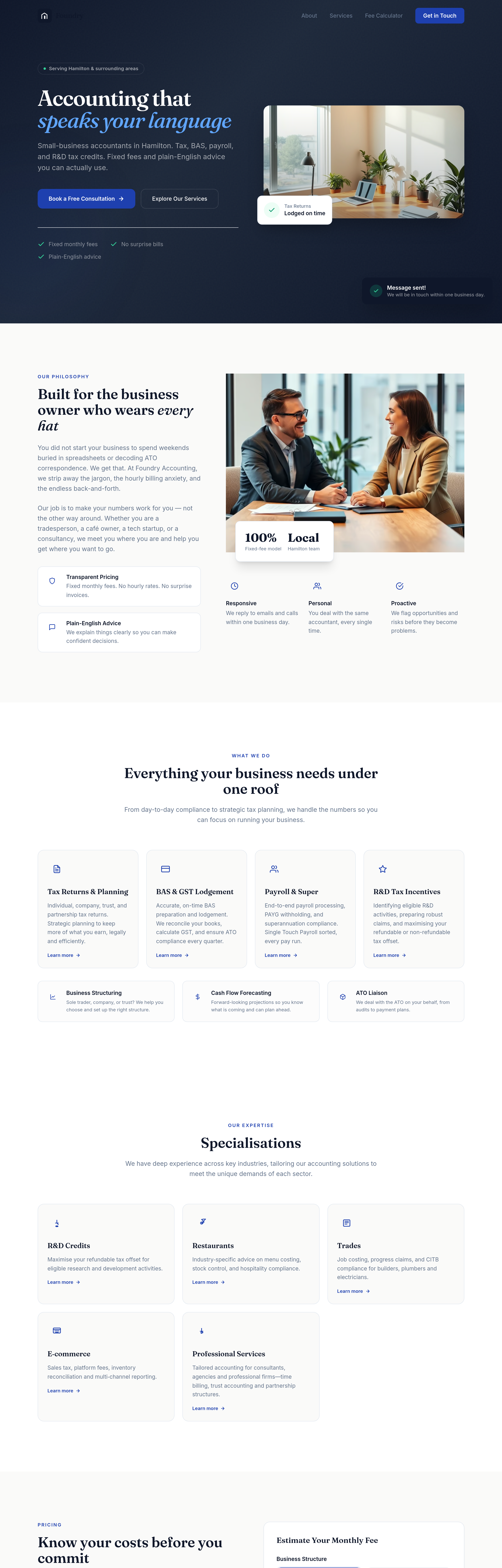
After
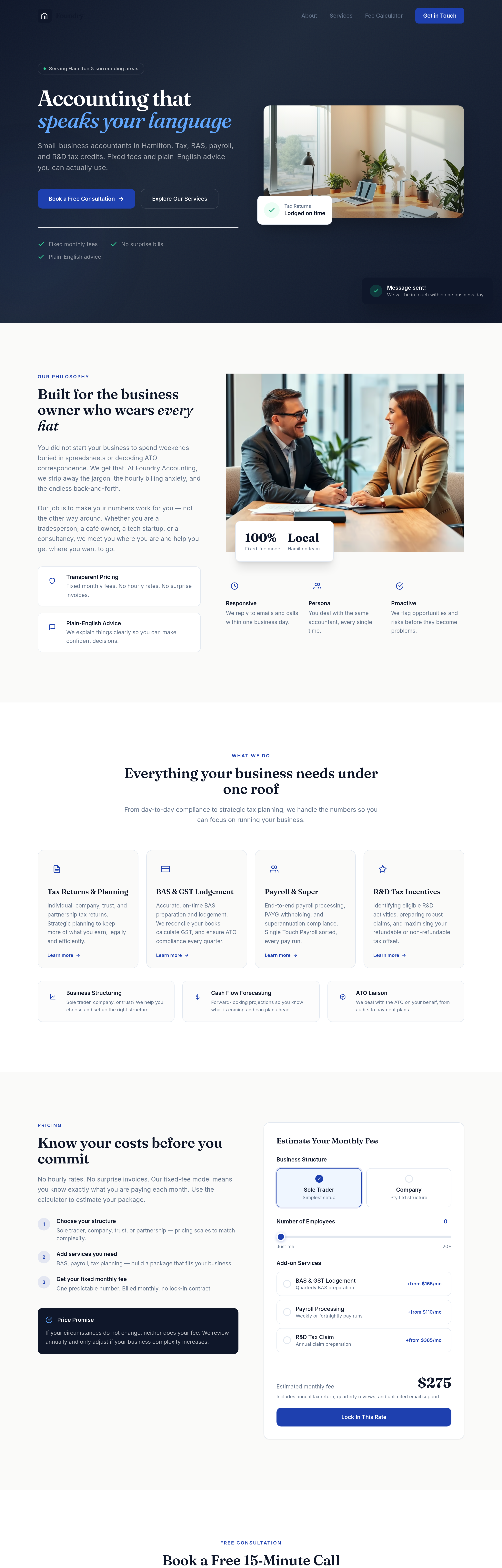
add a 'specialisations' section: R&D credits, restaurants, trades, e-commerce, professional services
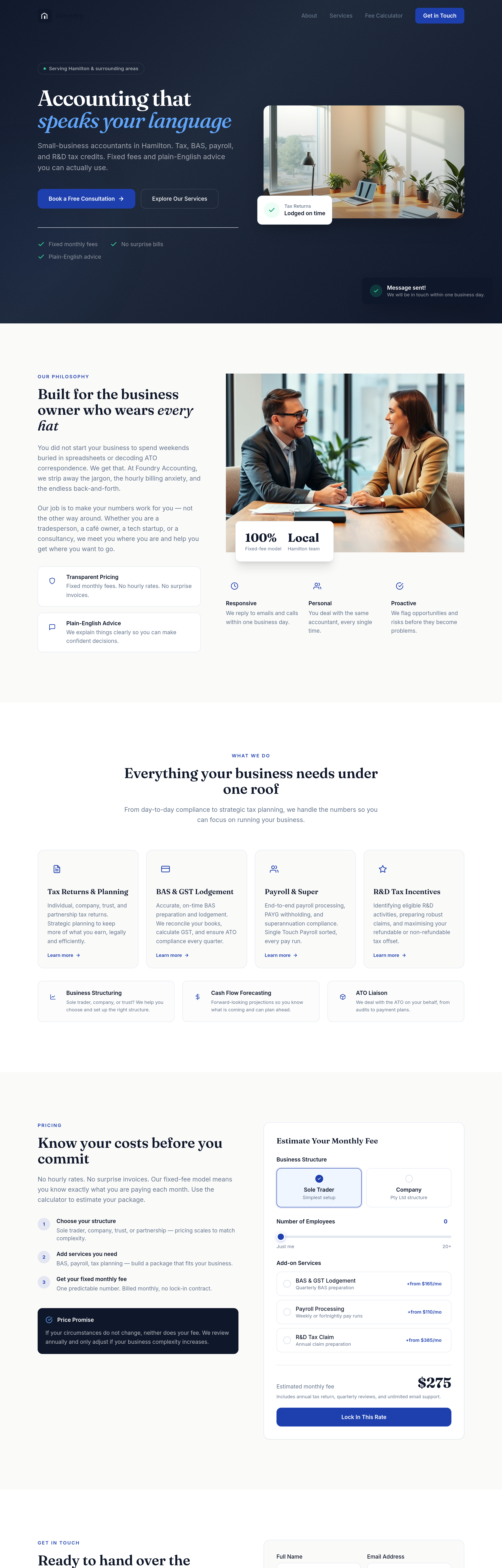
Before
After
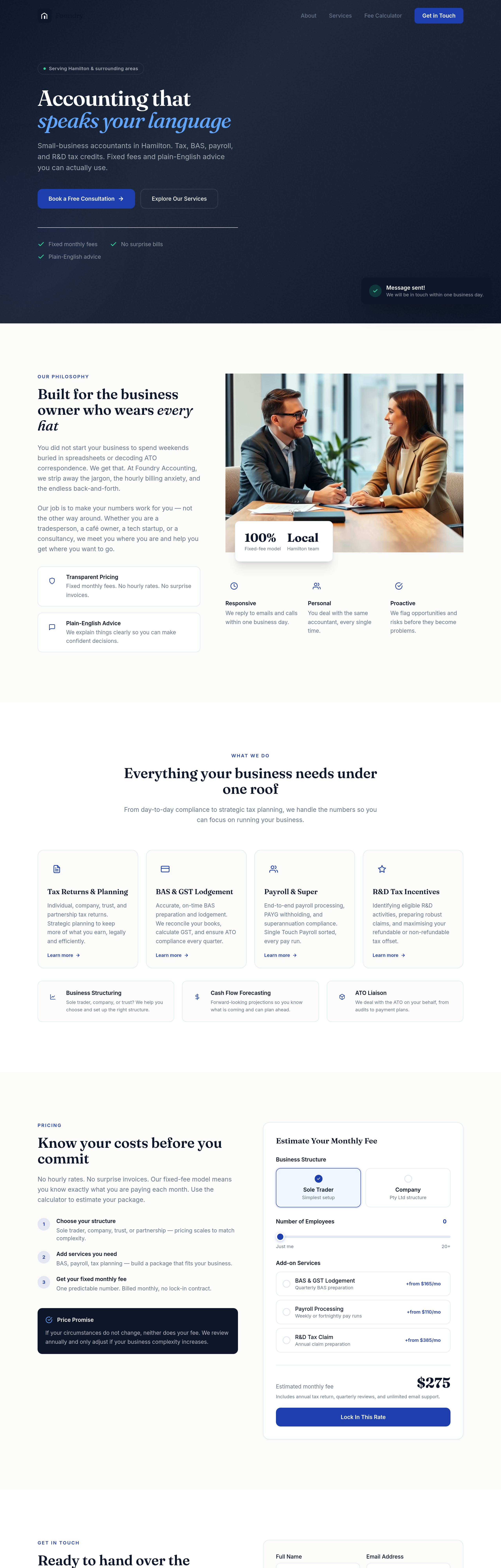
add a 'free 15-minute call' section — clear what to expect, how to book

Before
After
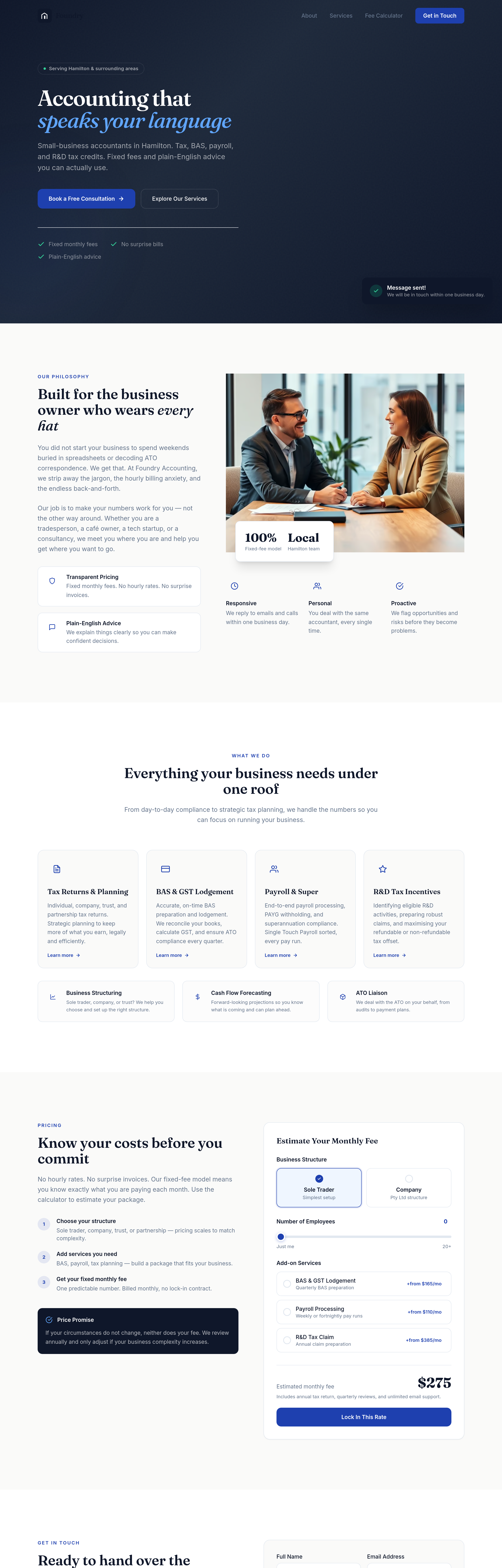
add a 'meet the team' section with 3 placeholder partners and CPA credentials
Before
After
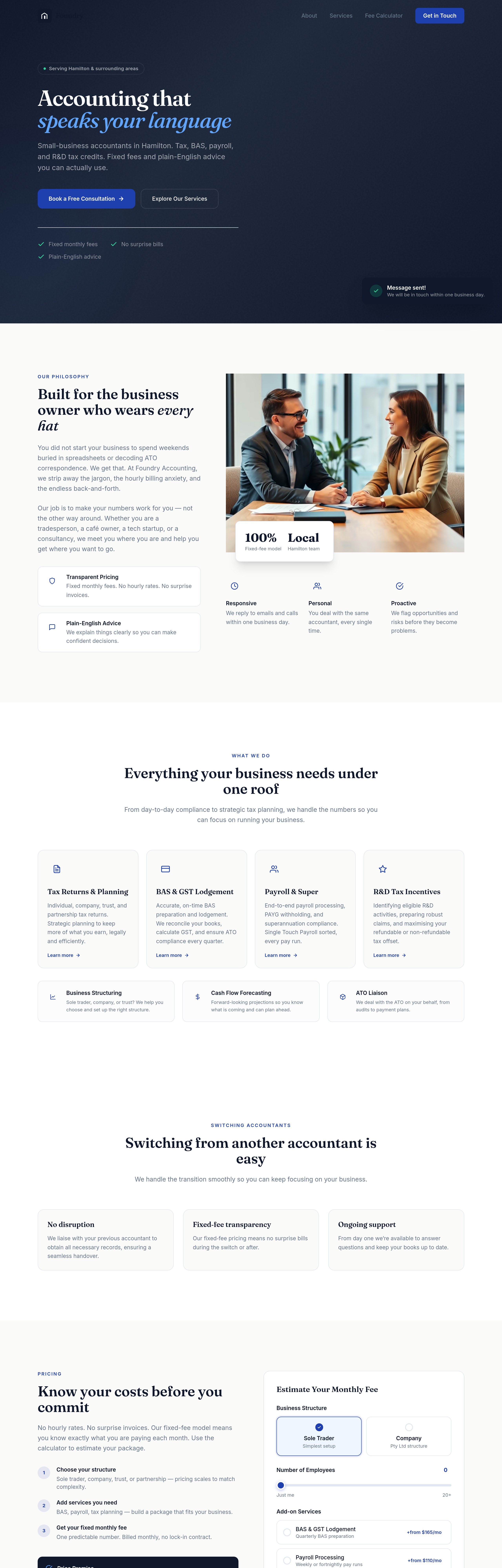
add a 'switching from another accountant' section — explain how easy it is
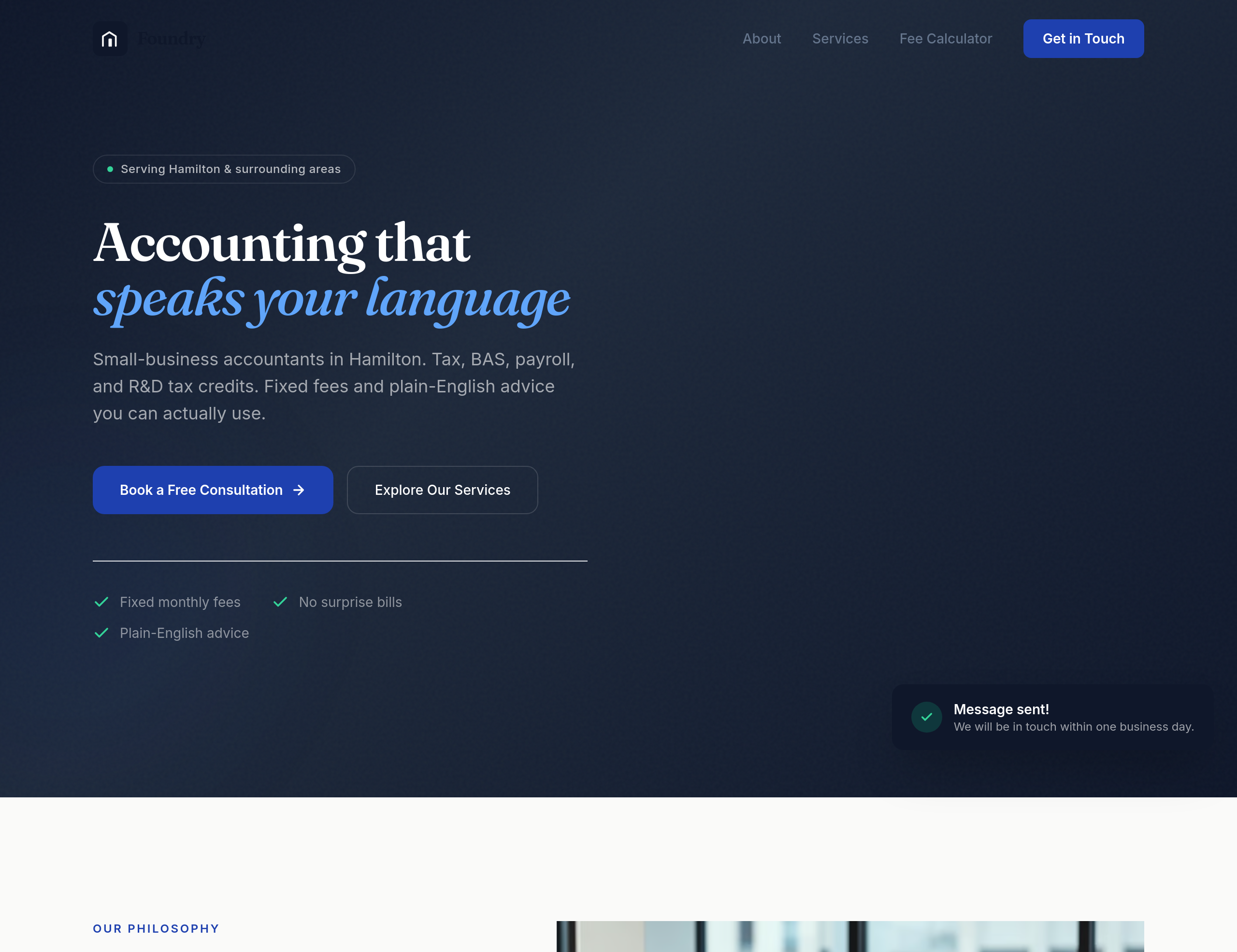
Before
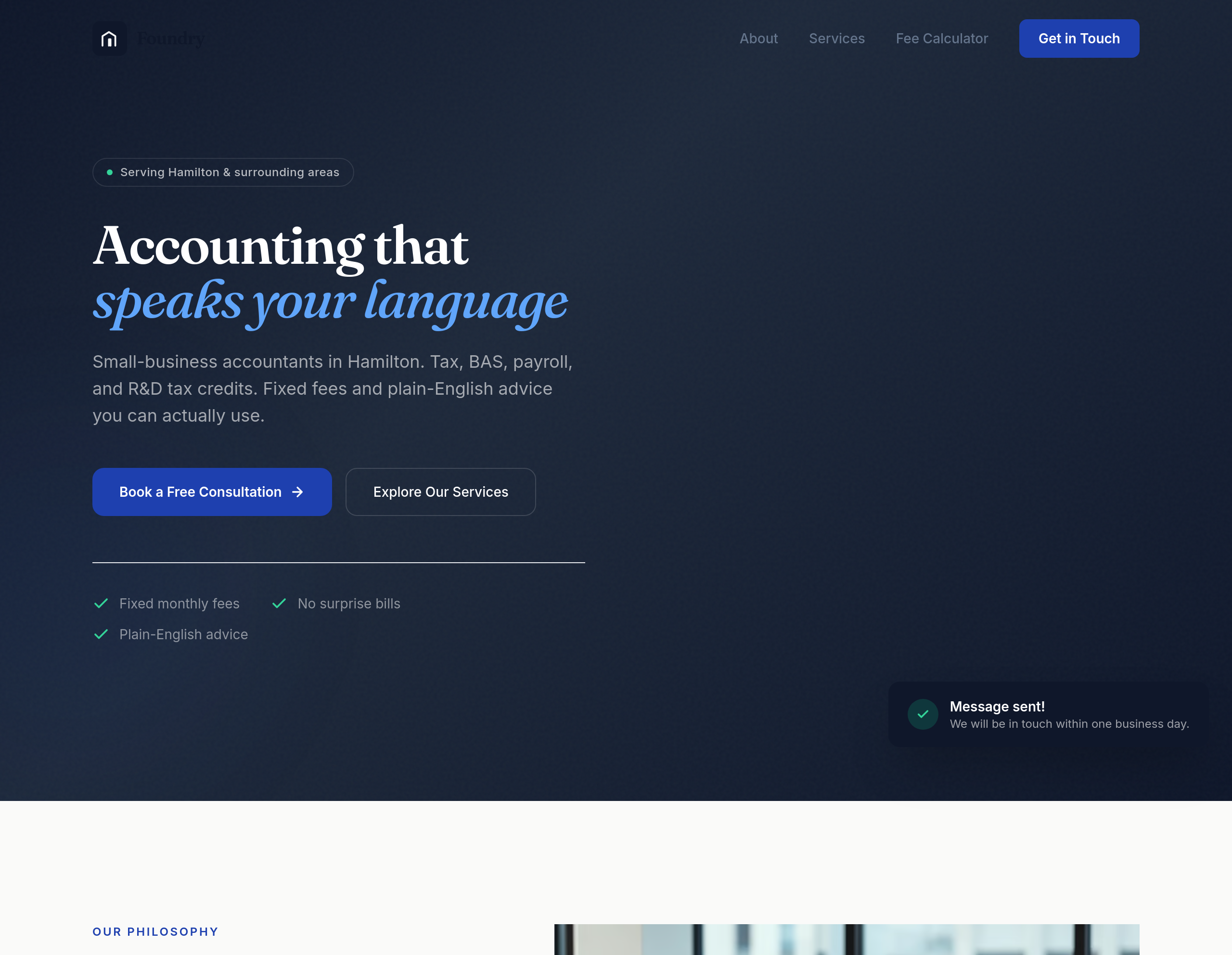
After
add a hero image of a Hamilton-Newcastle streetscape, professional but warm
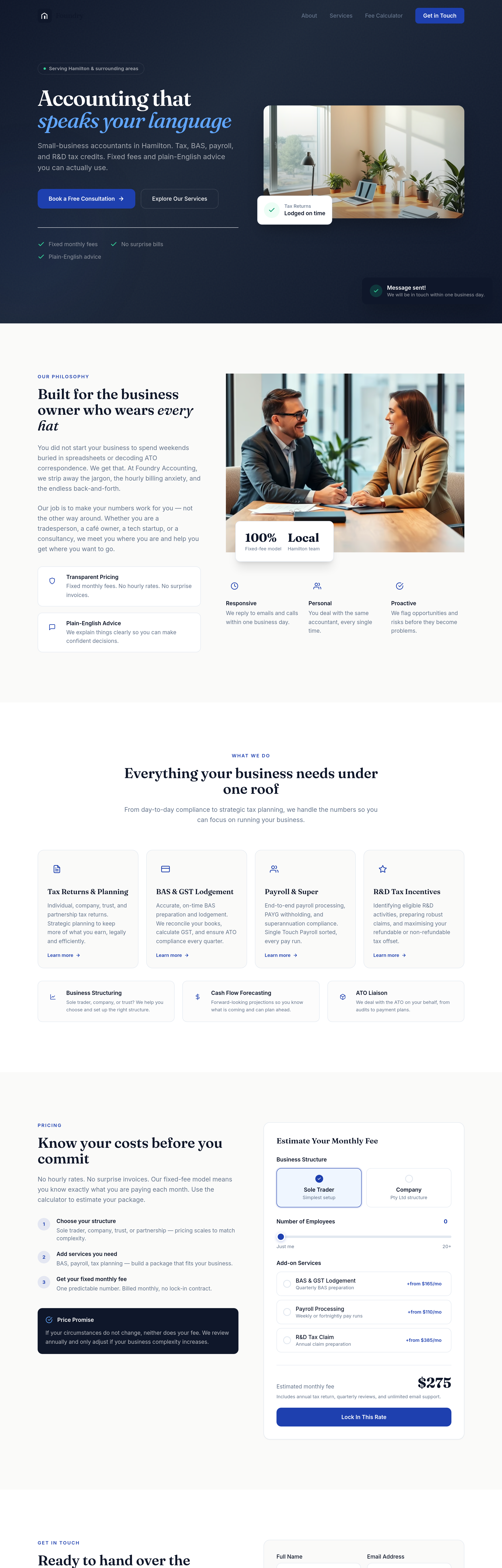
Before
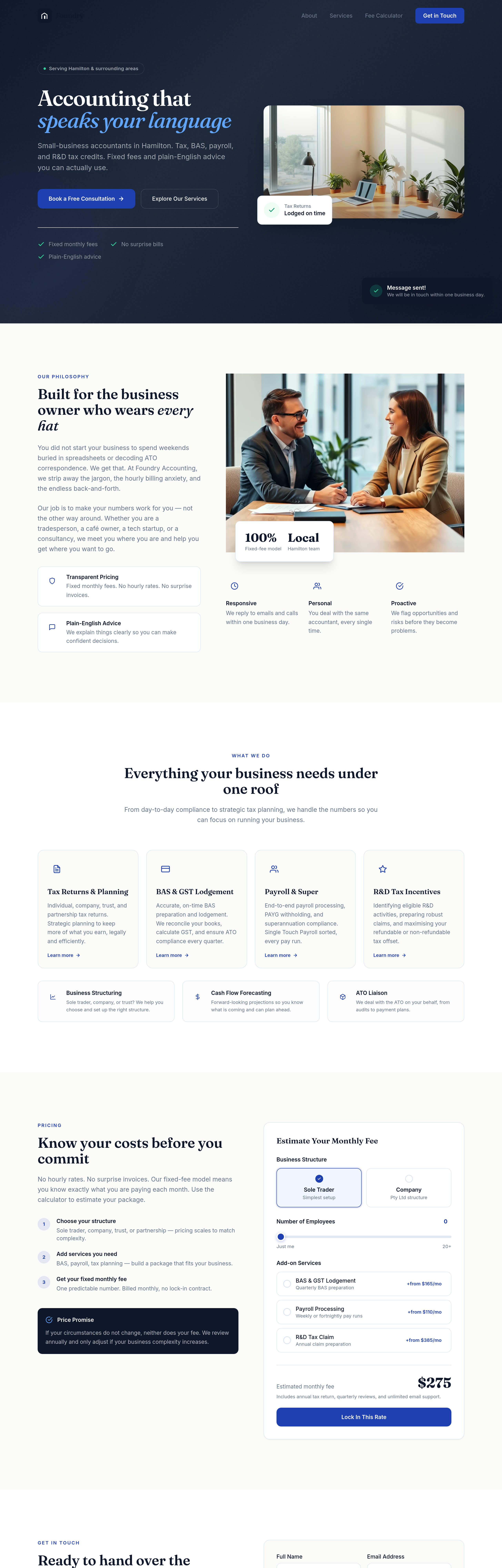
After
add headshots for 3 team members — professional, friendly, not stiff
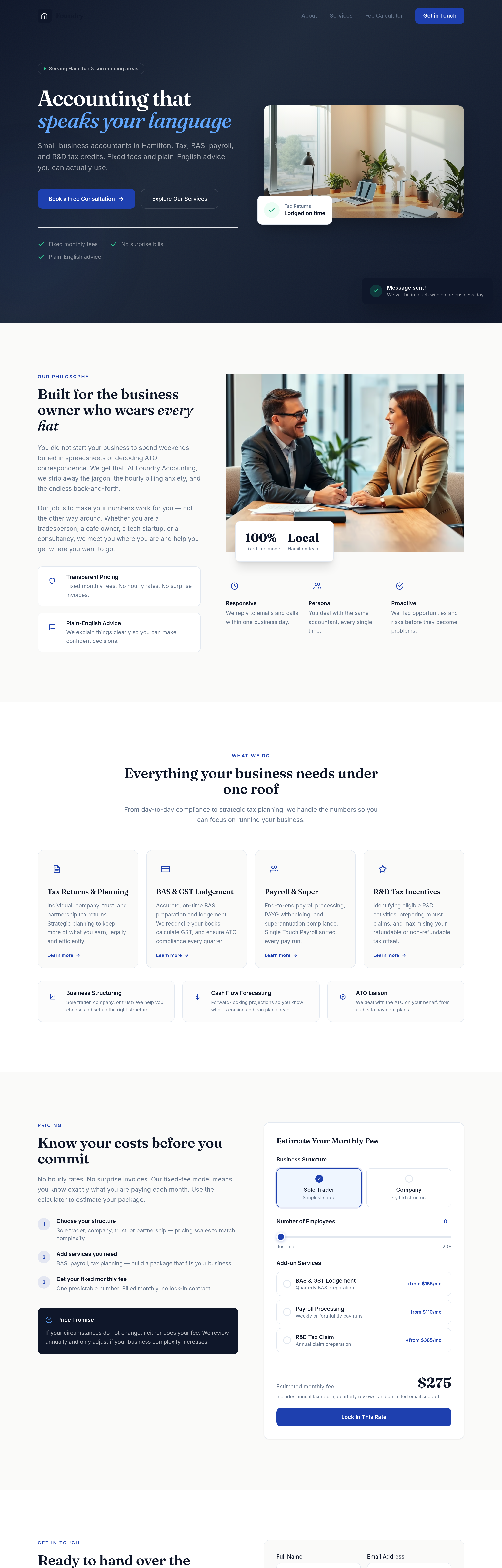
Before
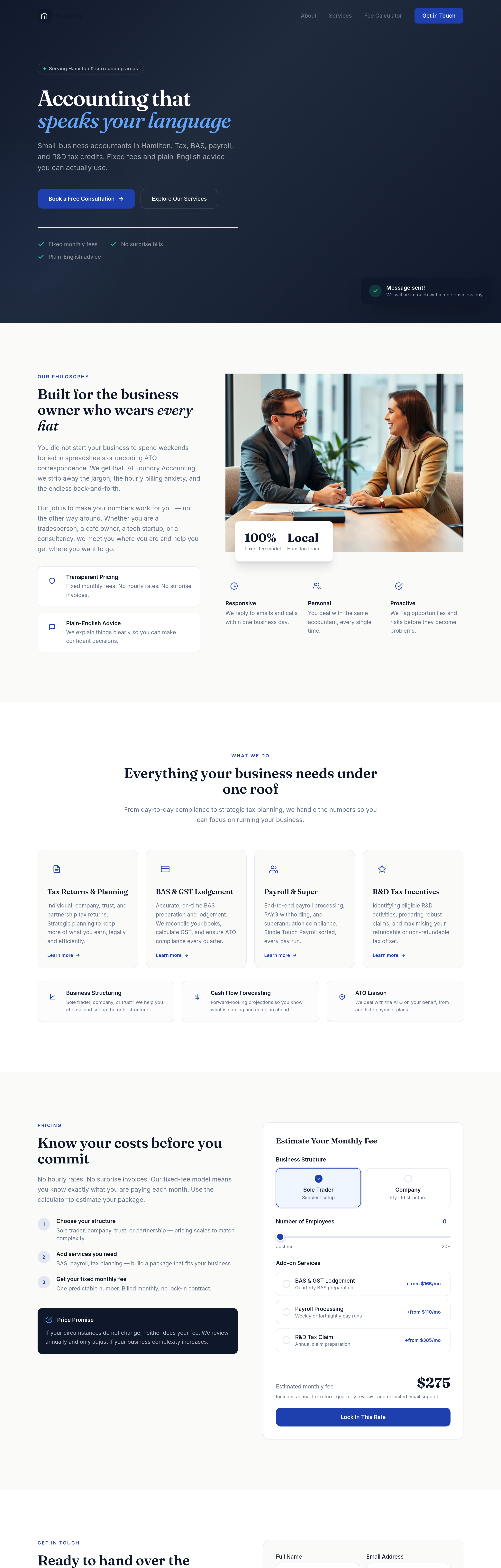
After
the whole site is too formal — soften everything while staying credible
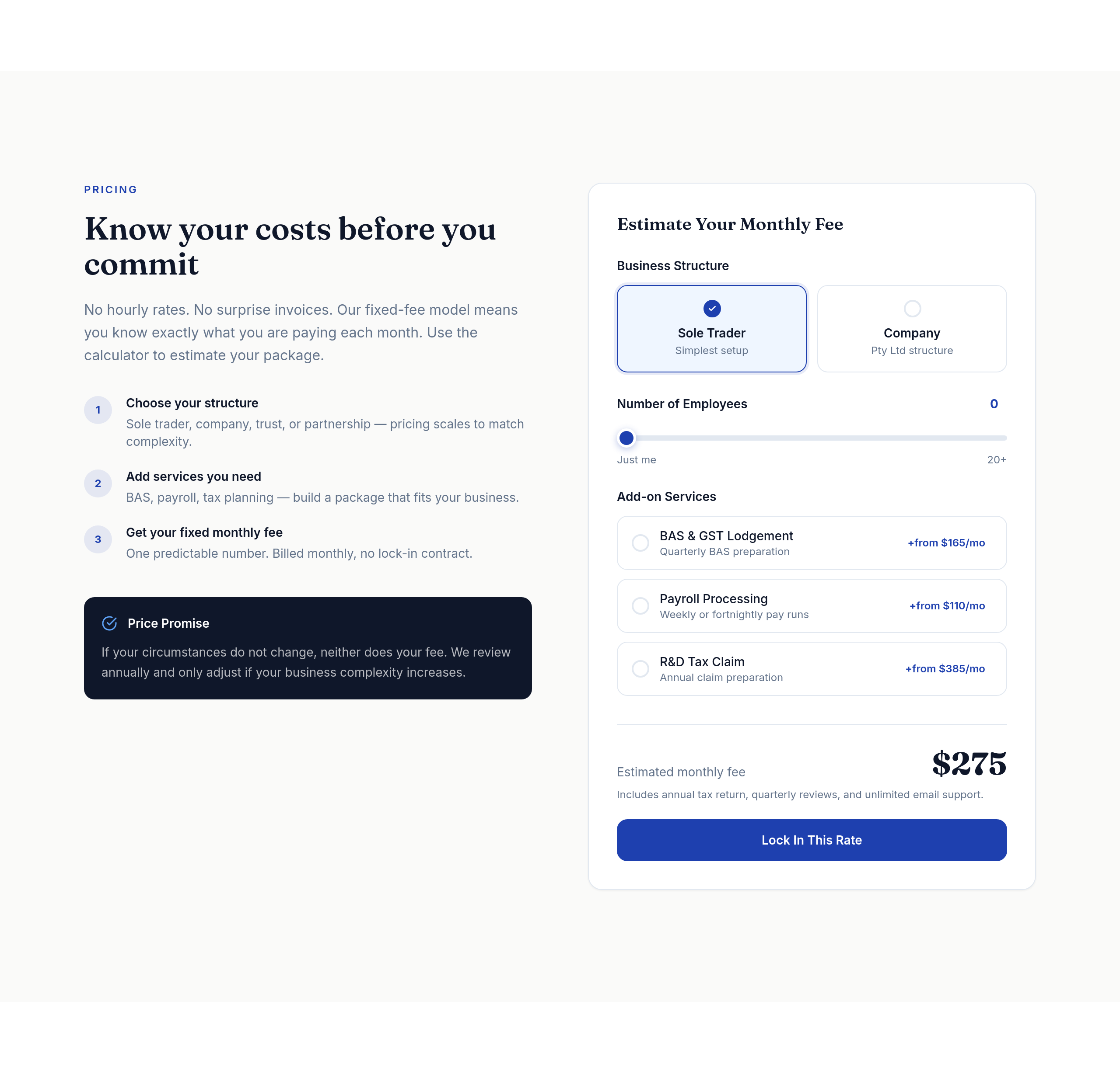
Before
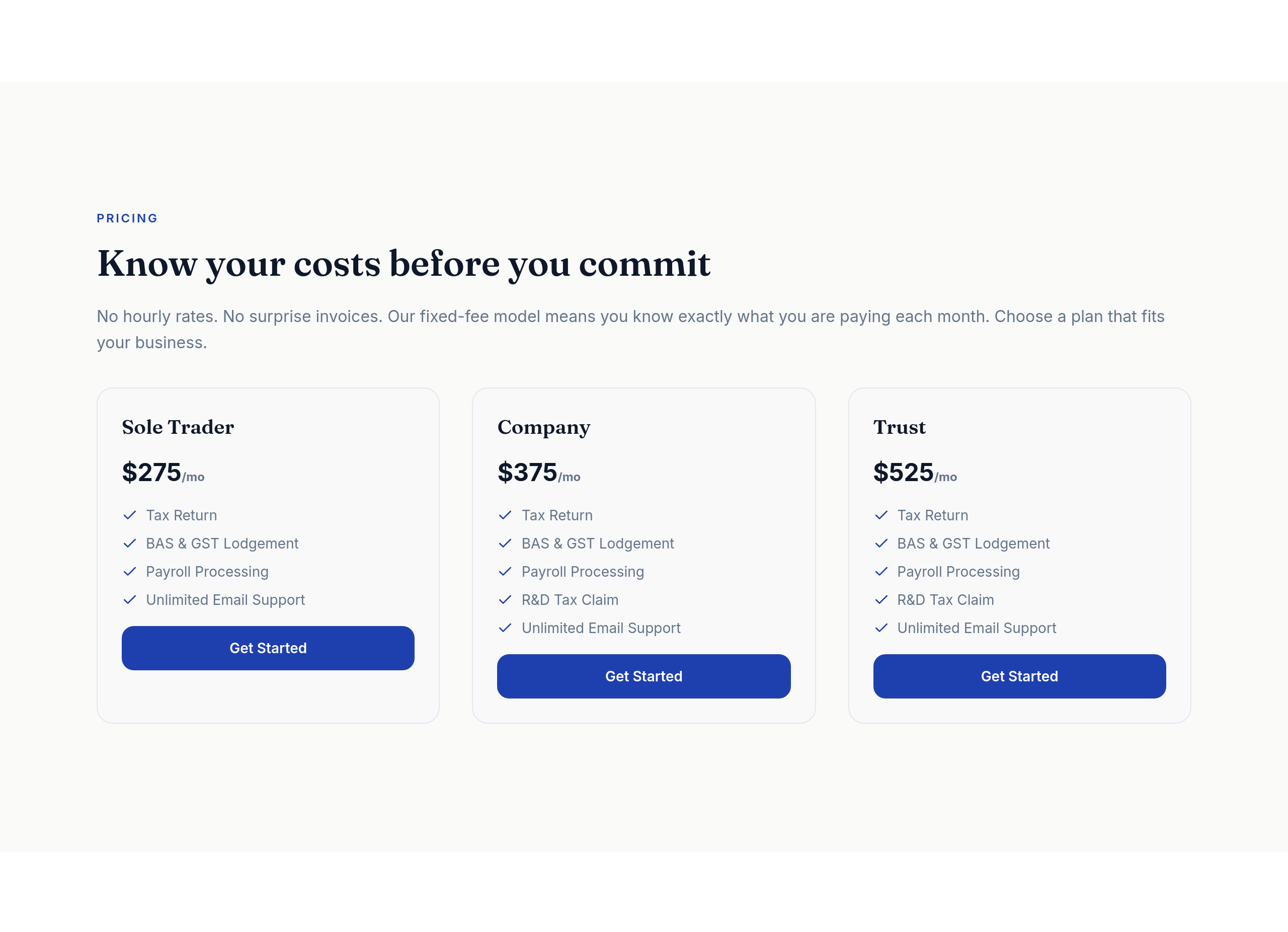
After
the pricing tiers should be a clear 3-column comparison table on desktop
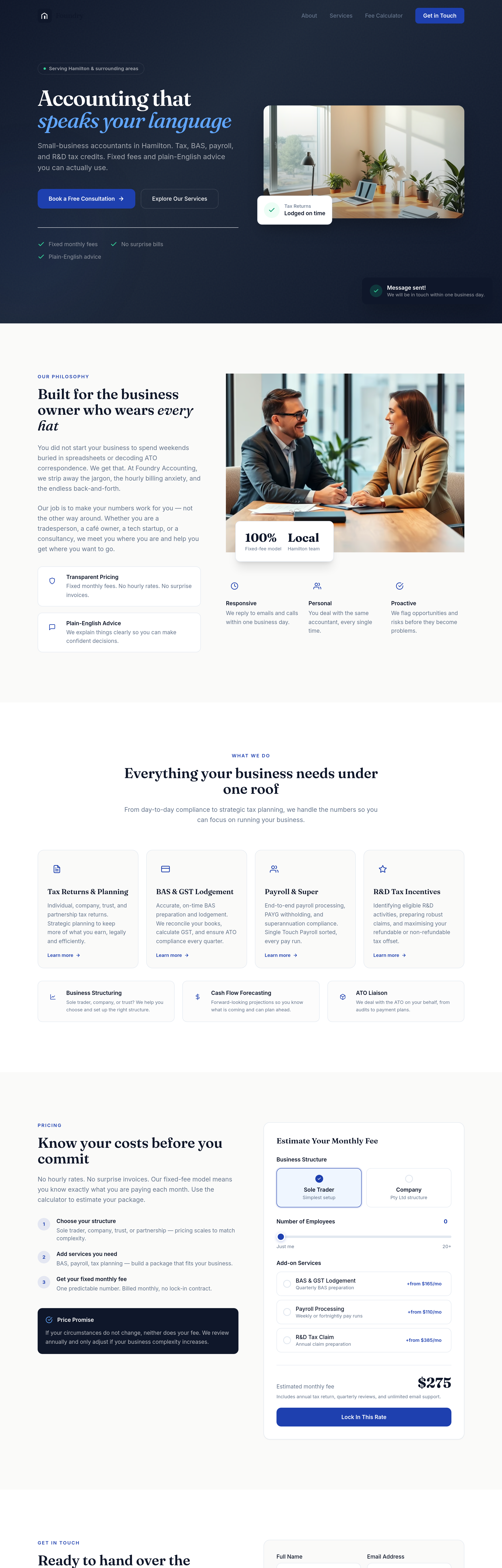
Before
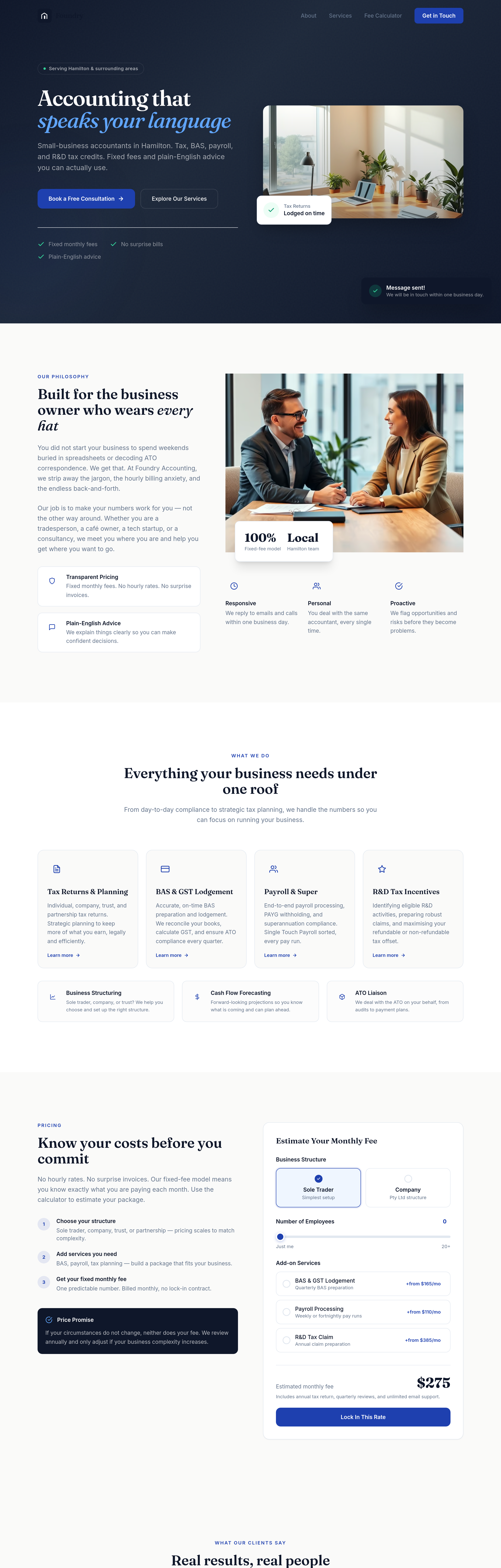
After
add testimonial cards in 3 columns under each pricing tier
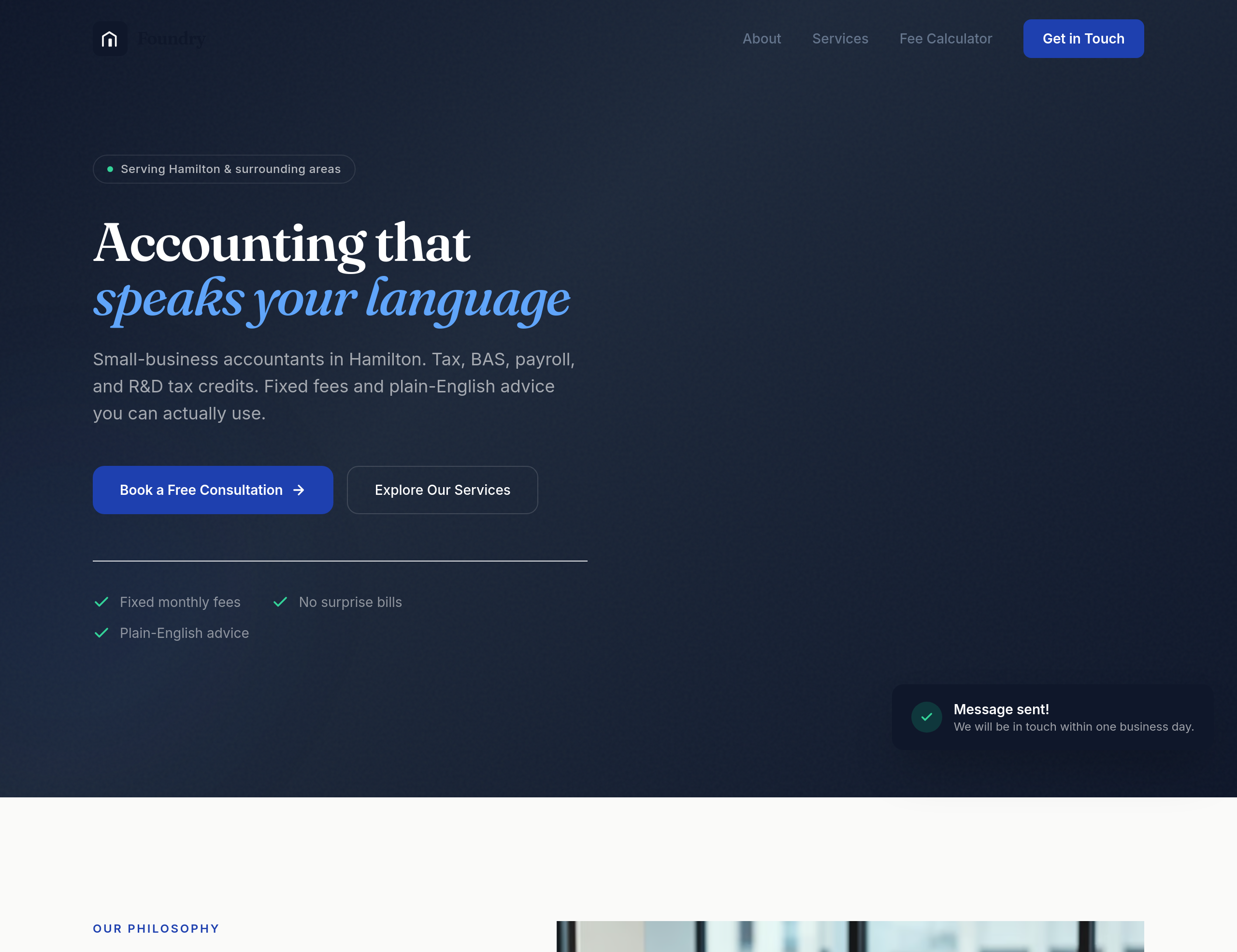
Before
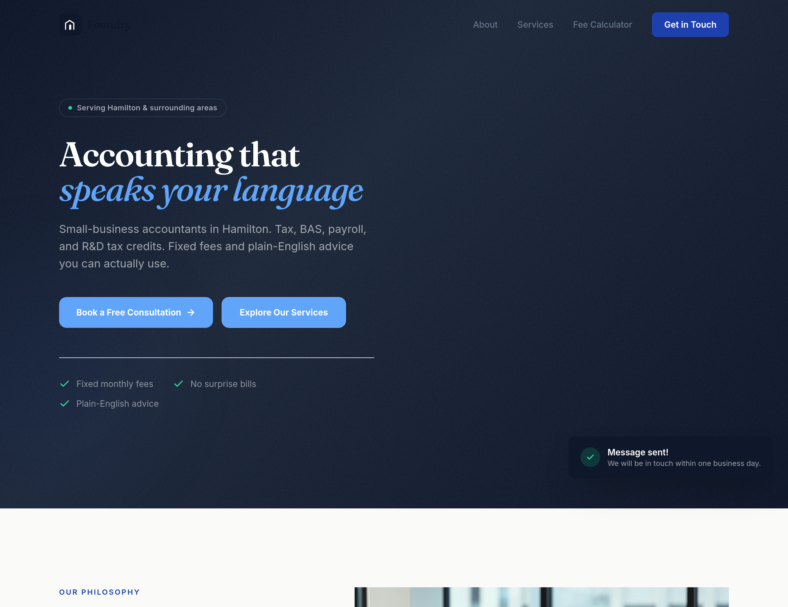
After
the buttons feel generic — give them a subtle accounting-blue with a confident weight
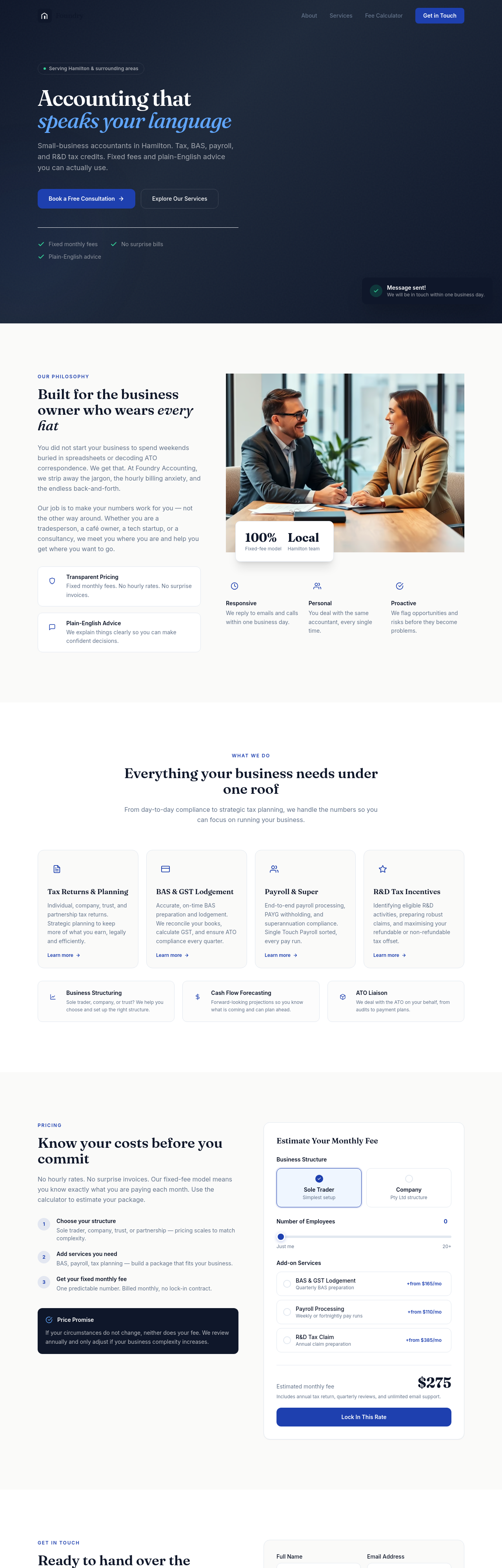
Before
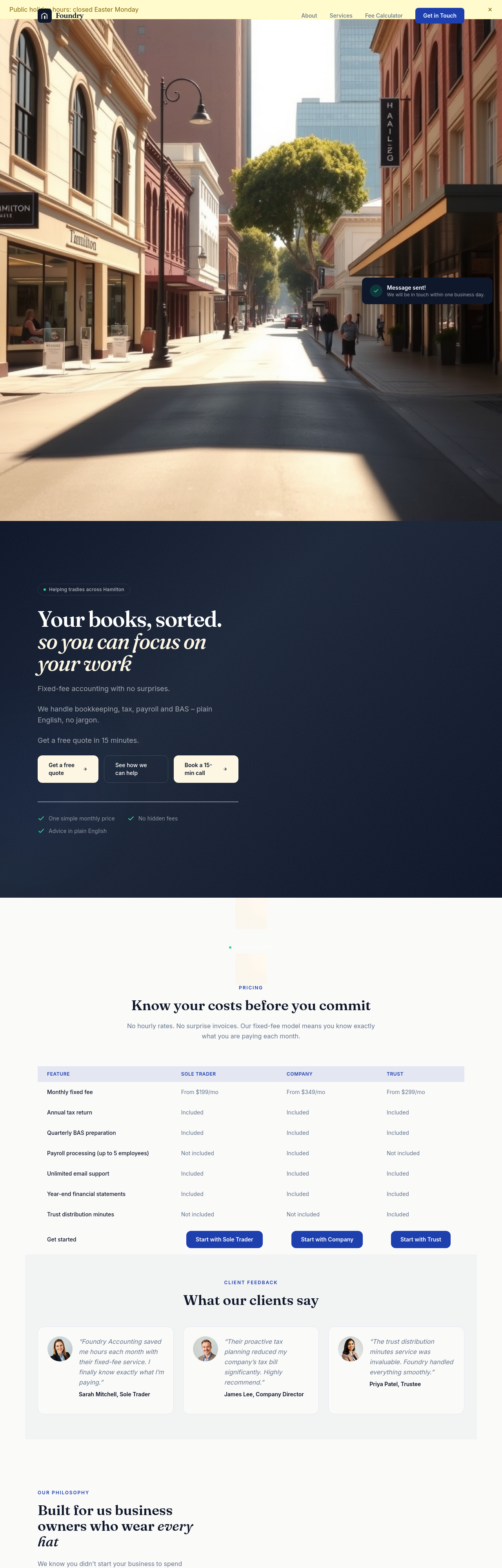
After
add JSON-LD for AccountingService
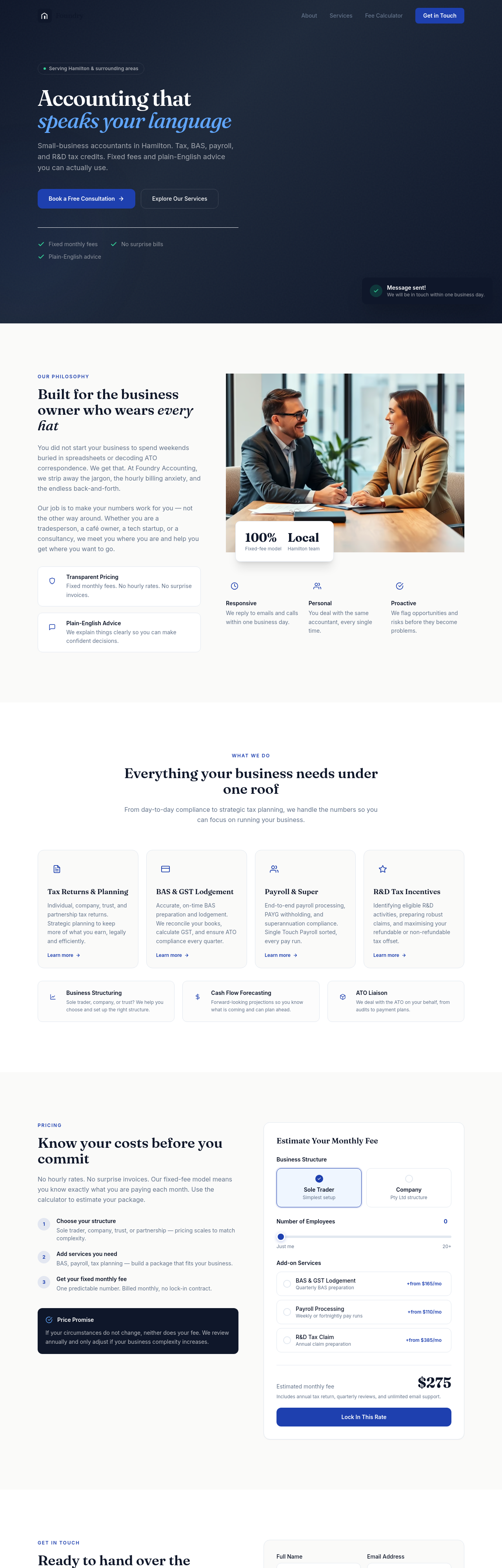
Before
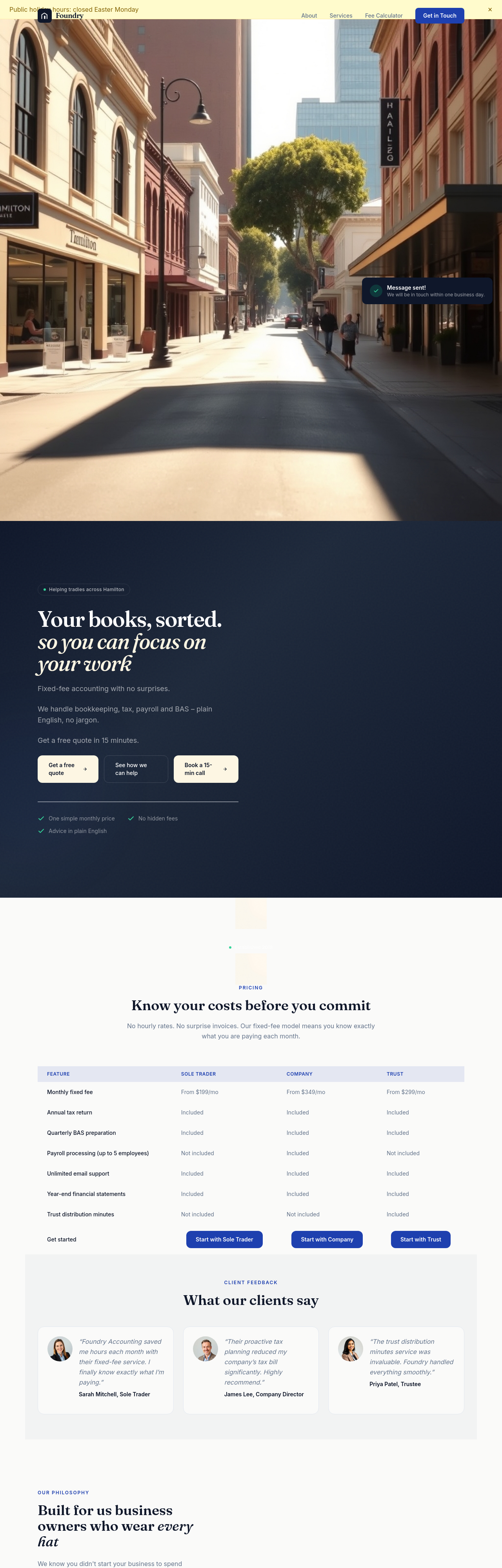
After
the title doesn't include the suburb — add 'Hamilton accountant' explicitly
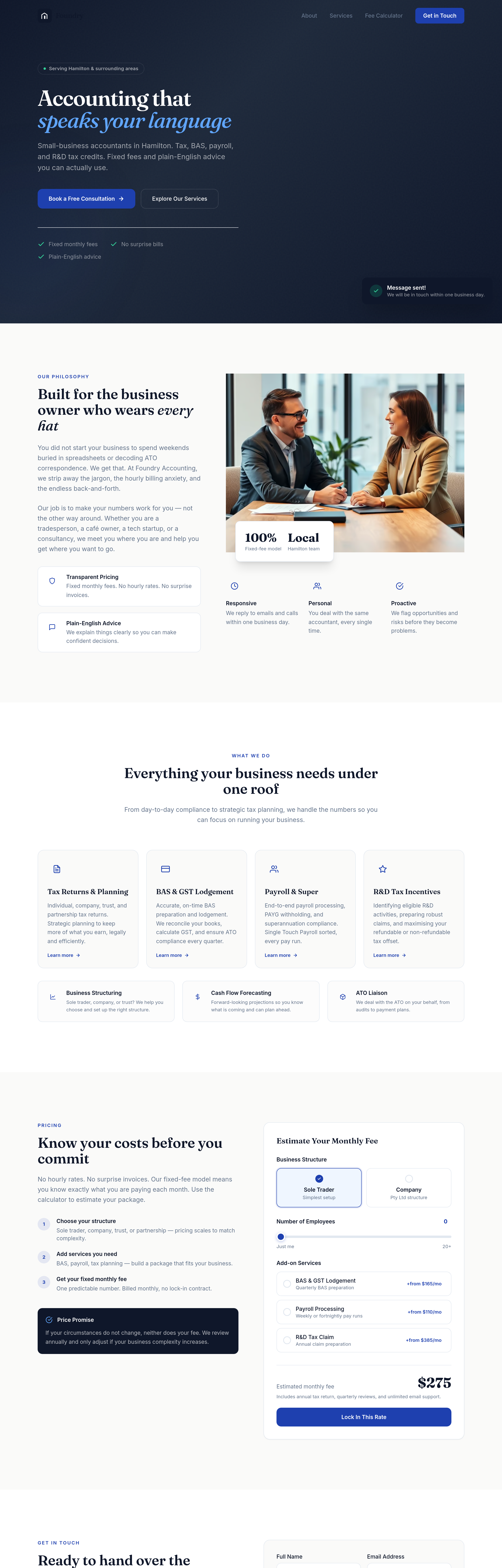
Before
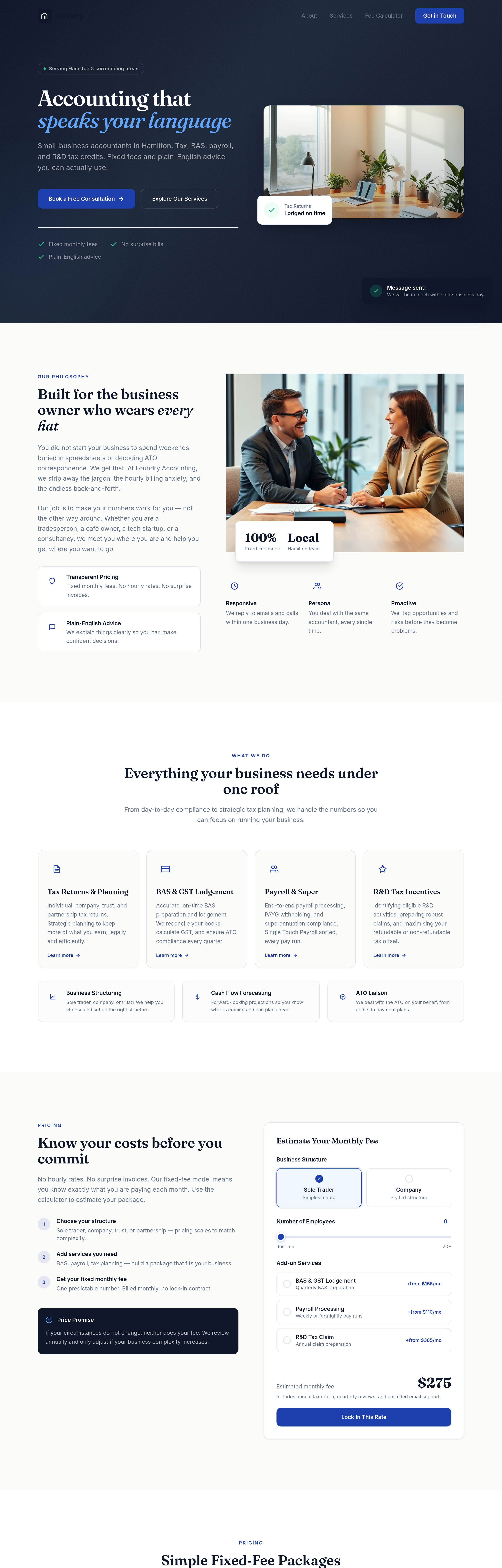
After
every pricing tier needs its own clear CTA button — 'Start with Starter', etc
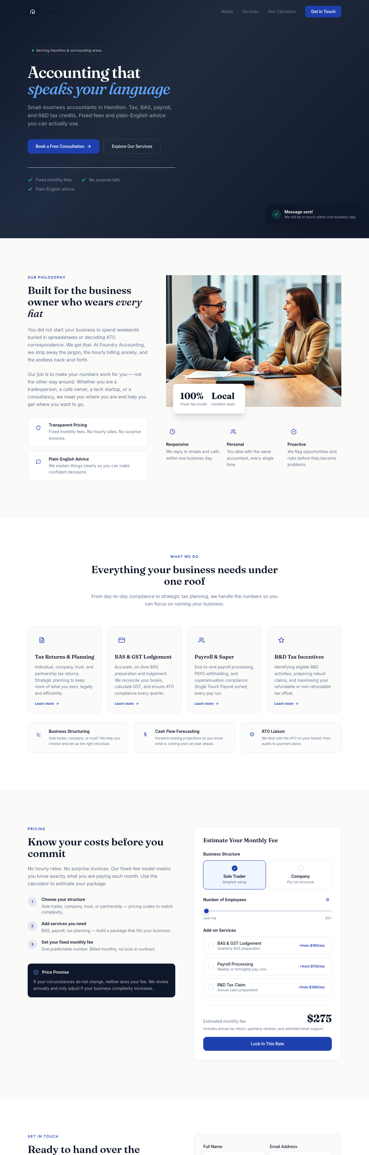
Before
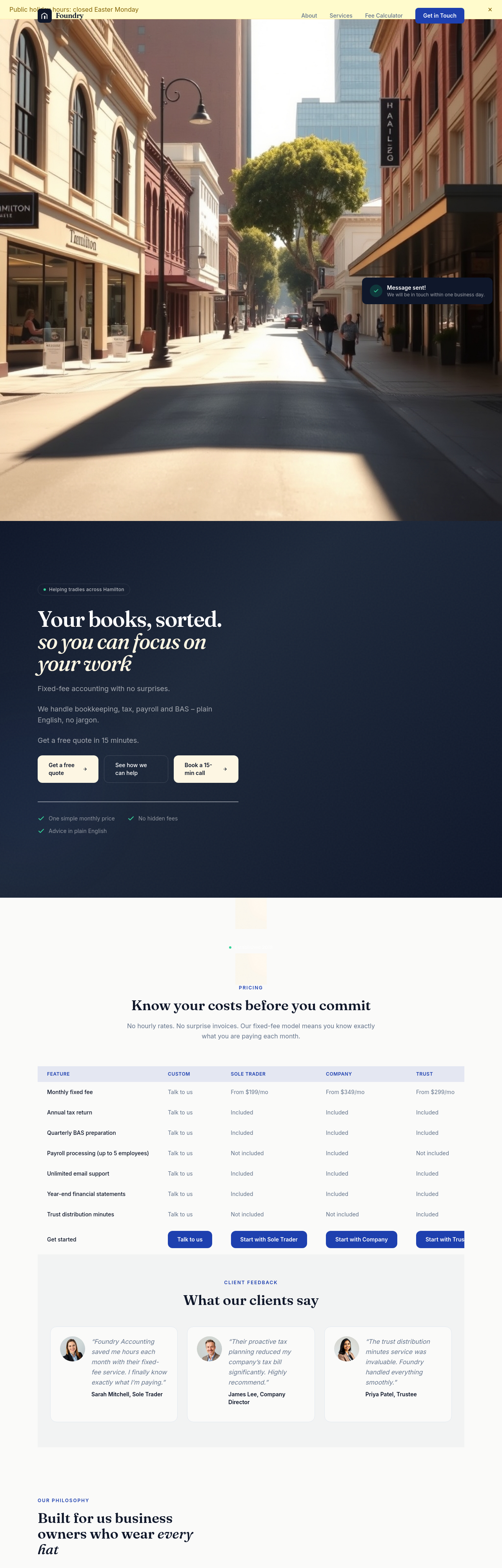
After
create a /eofy page with a checklist for end-of-financial-year prep
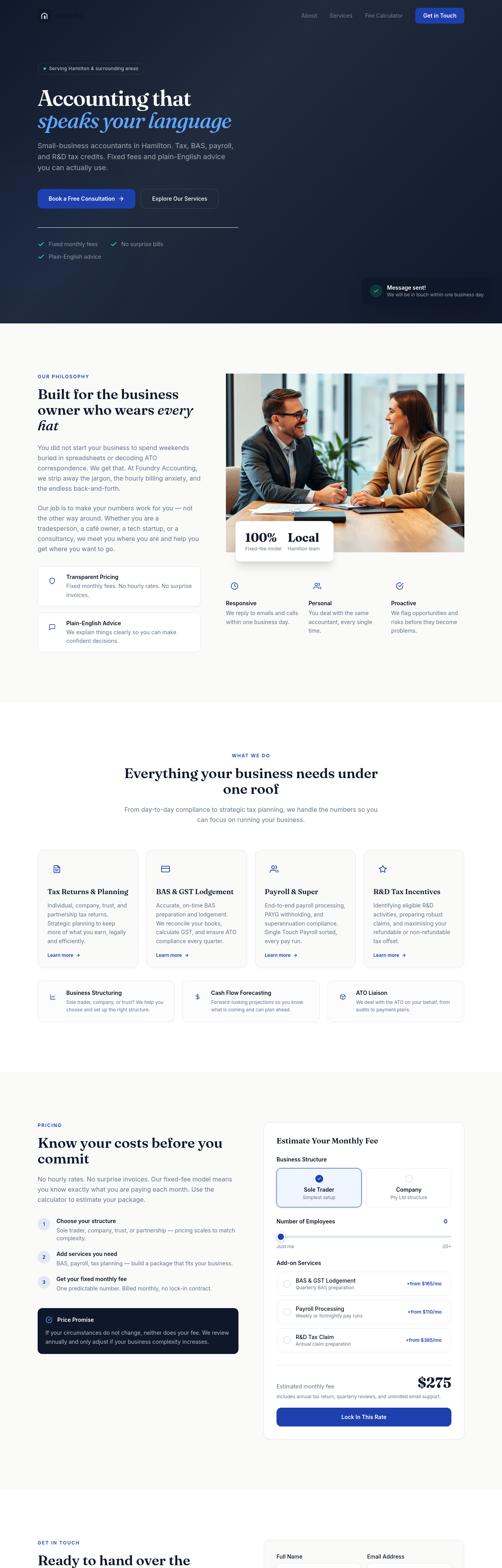
Before
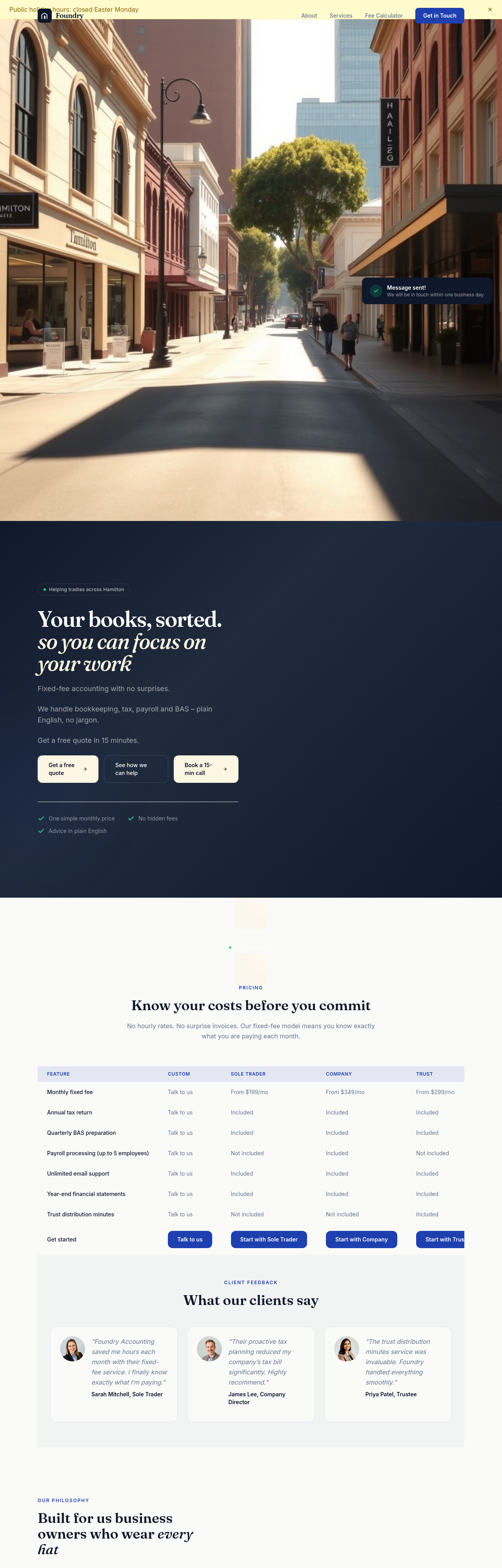
After
create a /bas page explaining BAS lodgement service
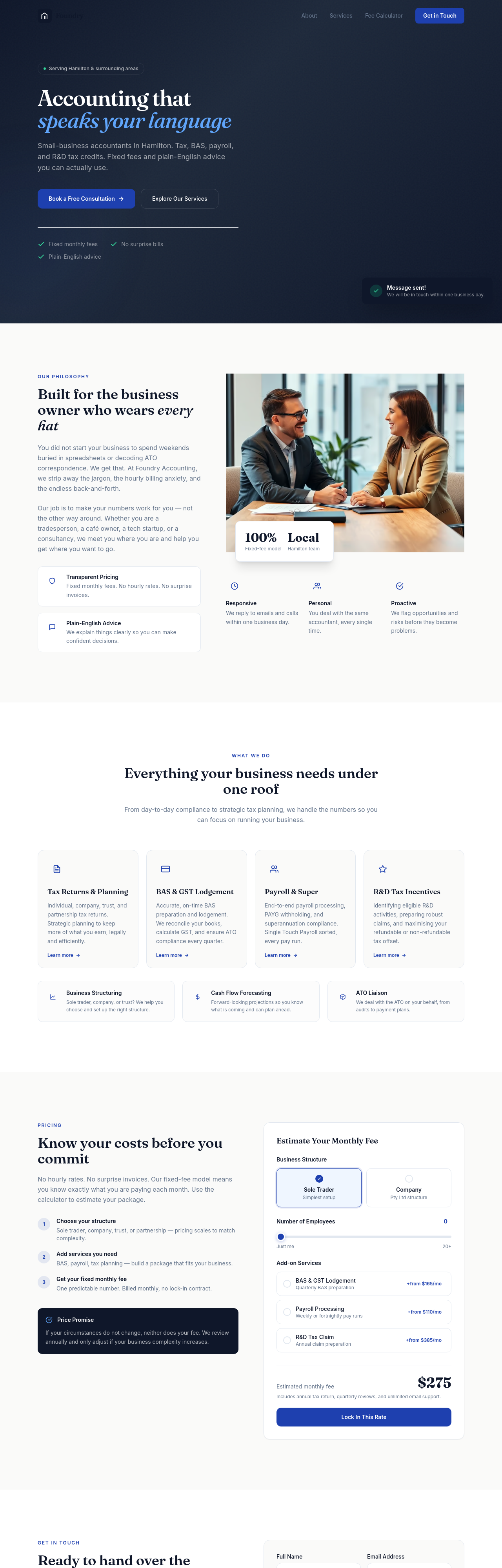
Before
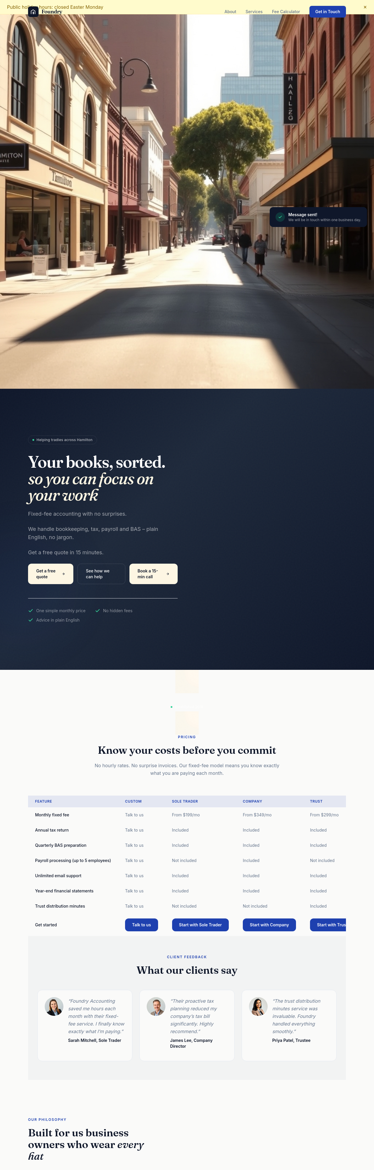
After
create a /payroll page explaining the payroll service tier
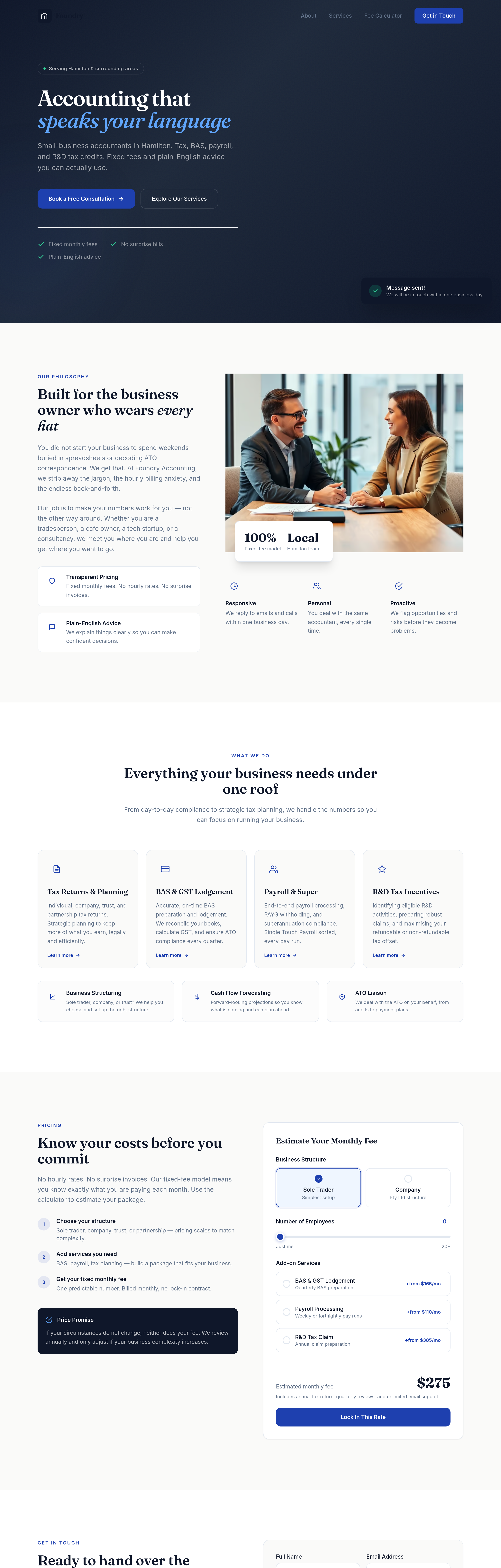
Before
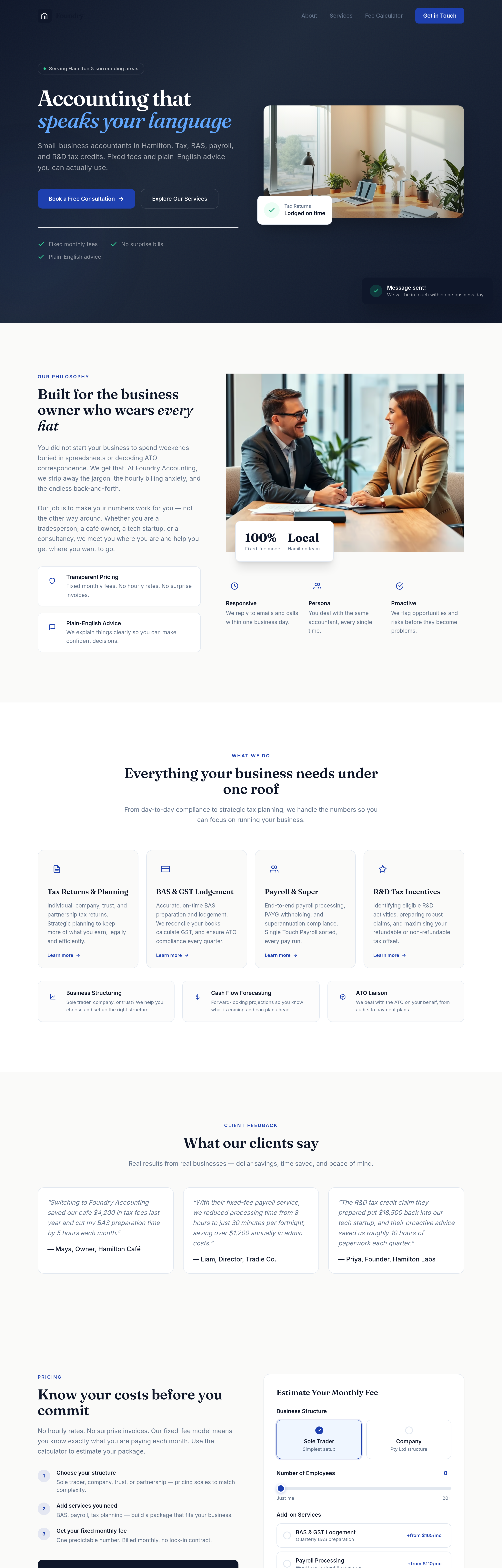
After
the testimonials section feels generic — write 3 specific quotes that mention dollar savings or hours saved
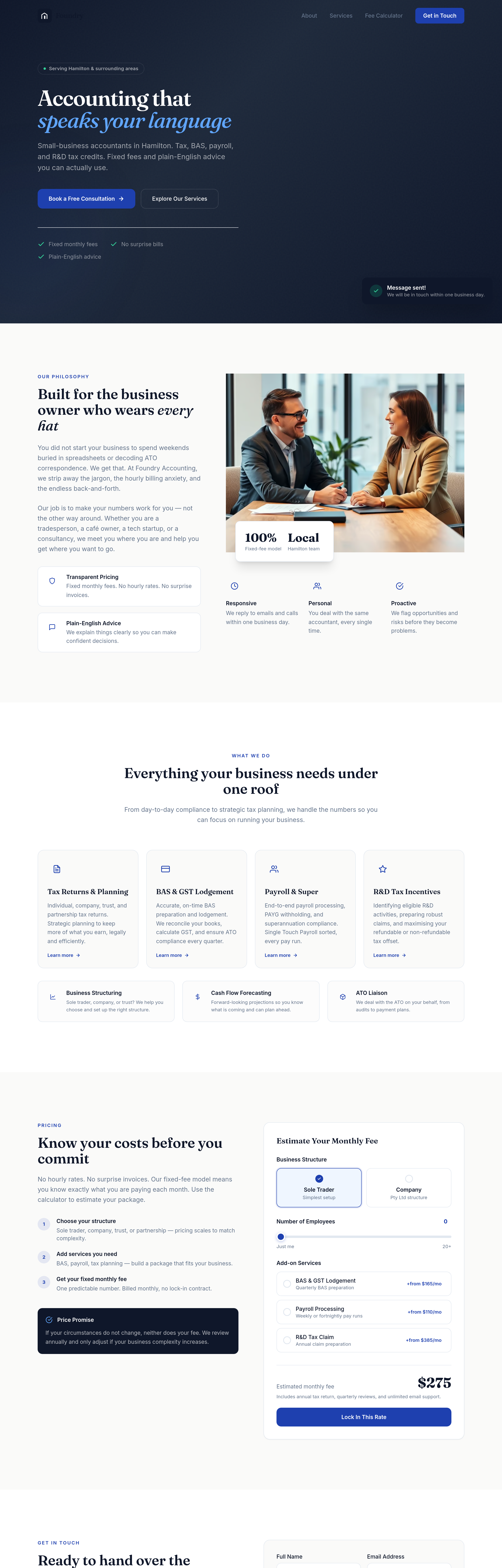
Before
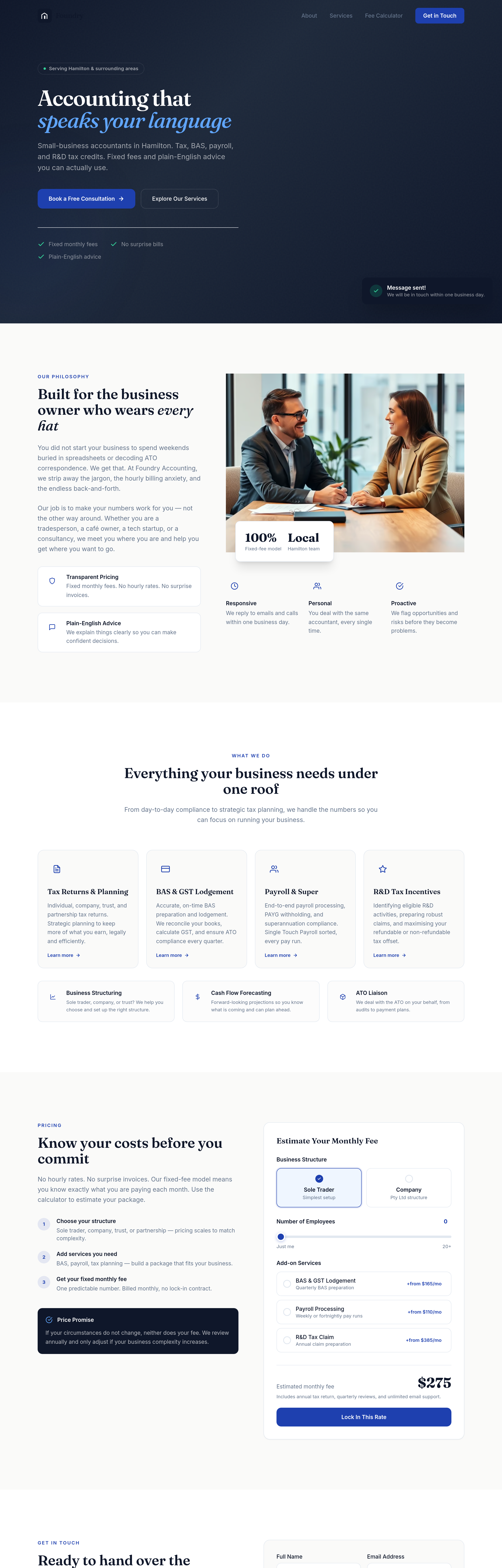
After
every paragraph is the same length — vary it: one-liner, medium, longer for emphasis
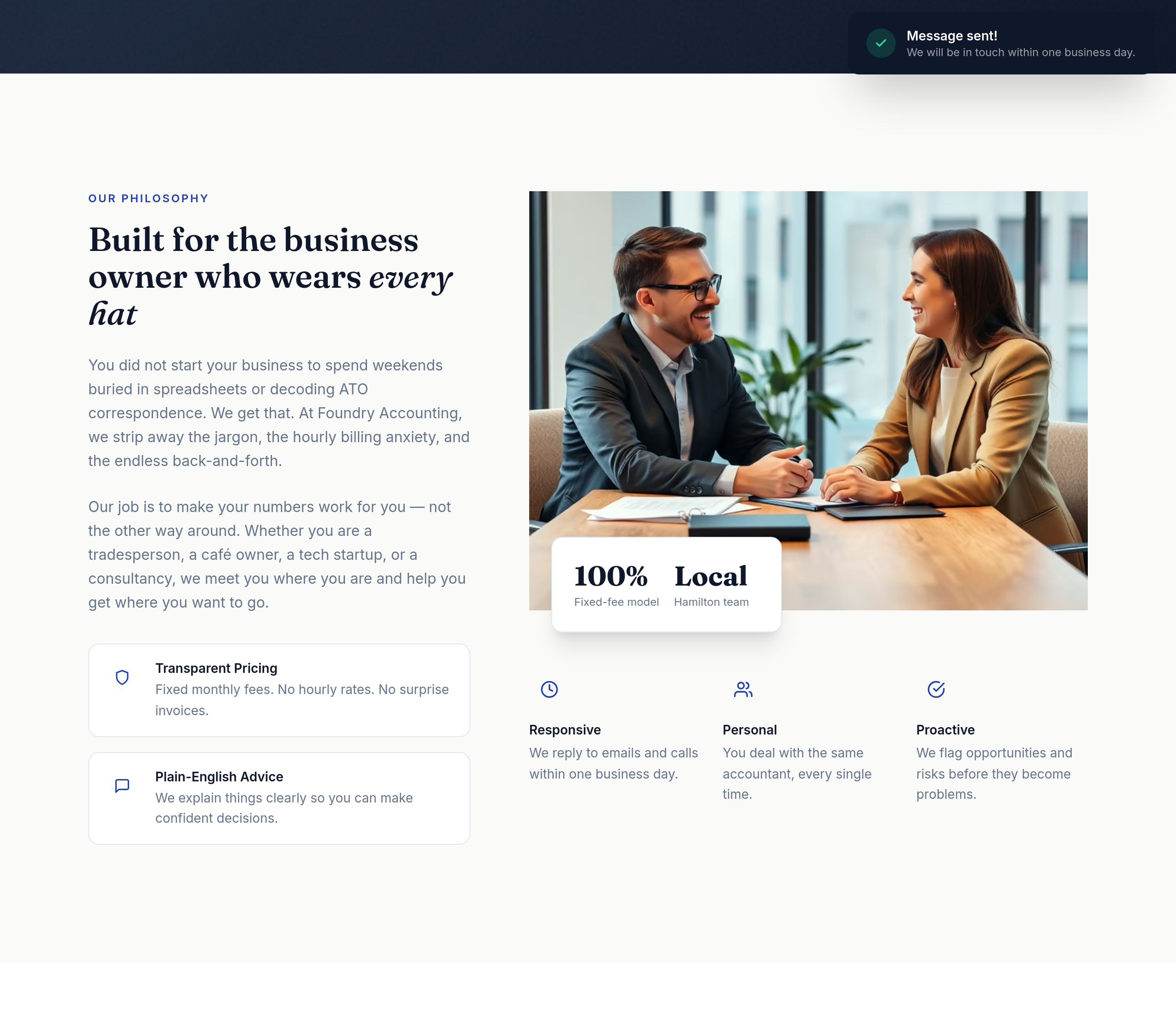
Before
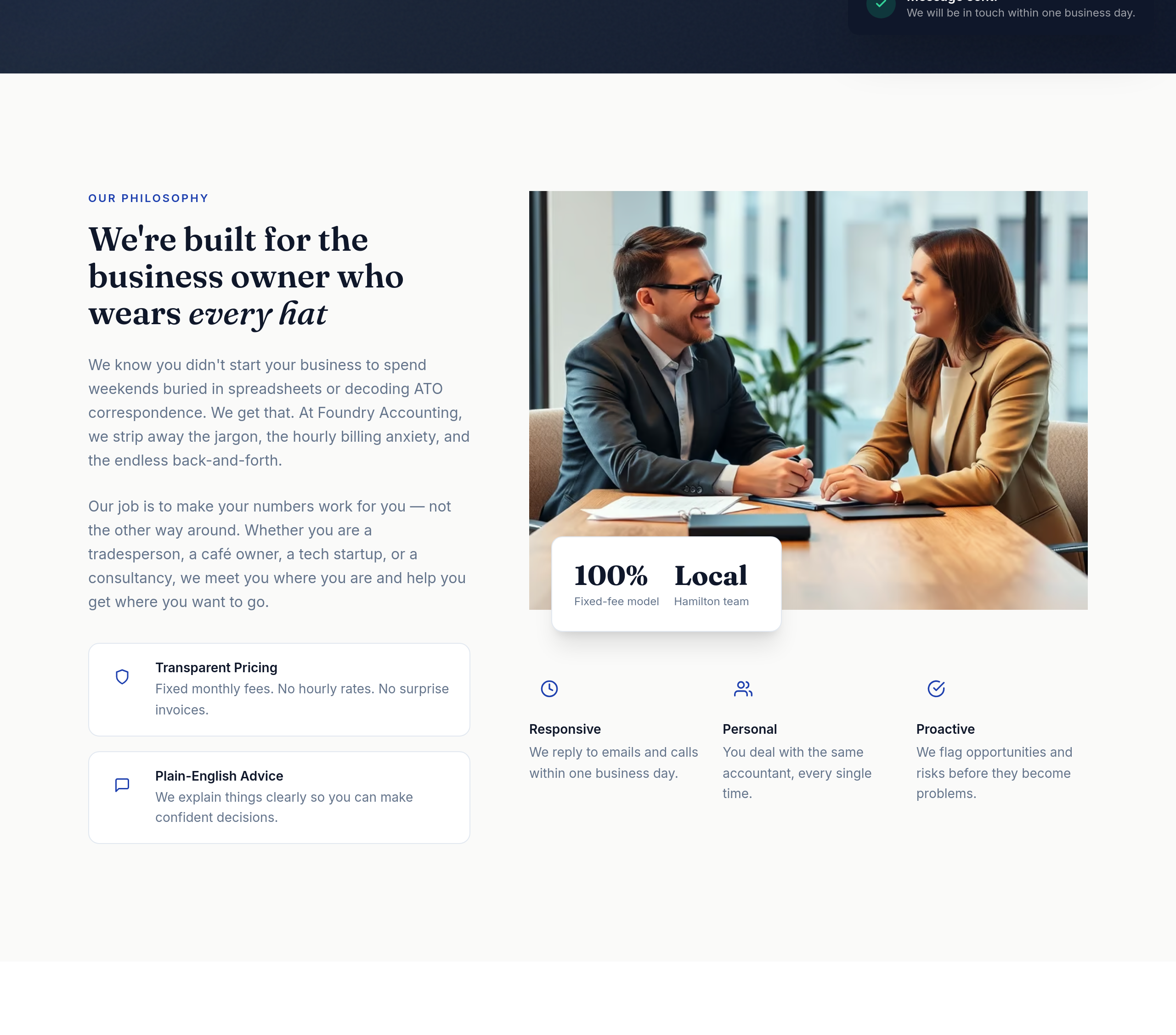
After
the about section is third-person — switch to first-person plural for warmth
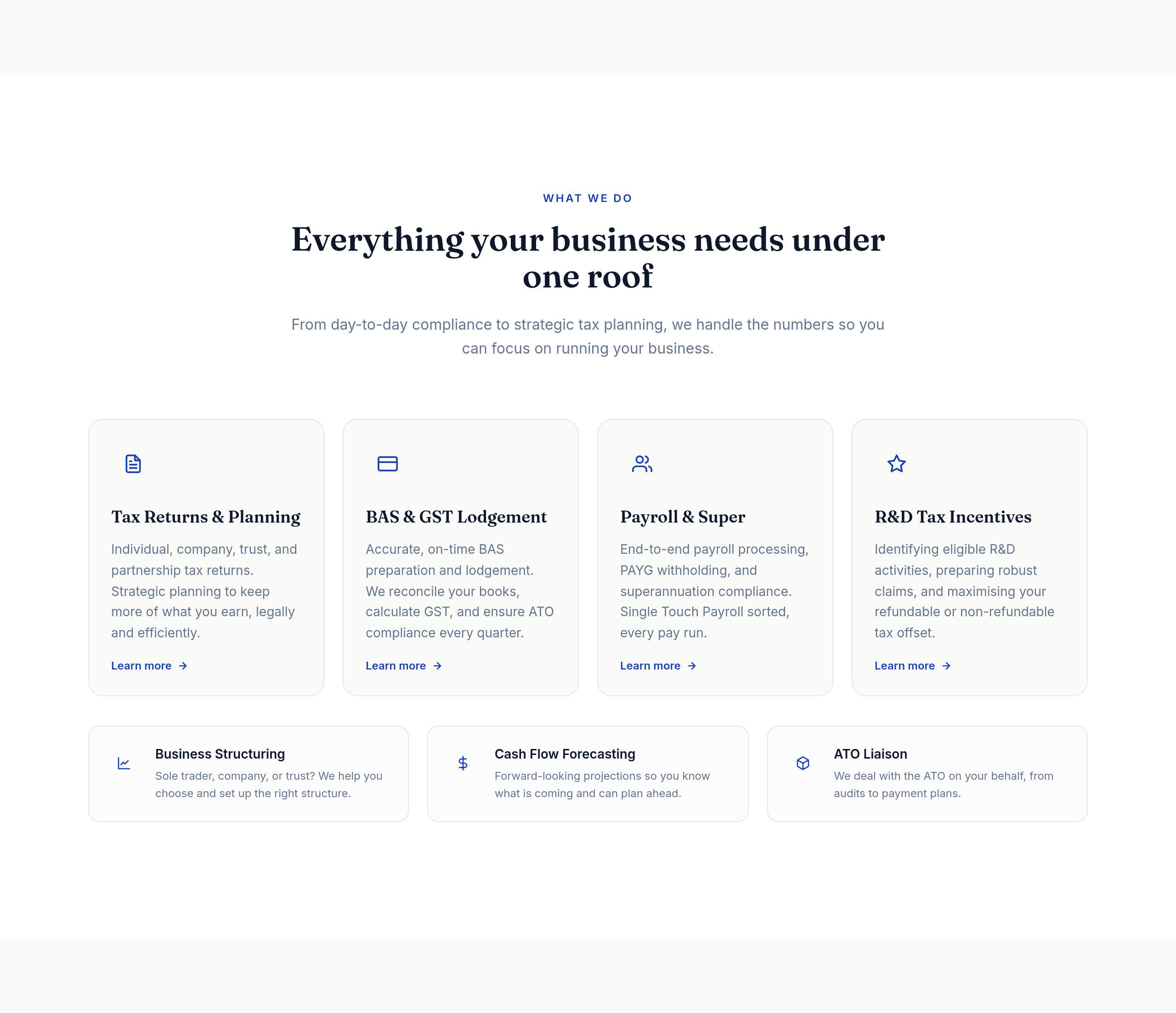
Before
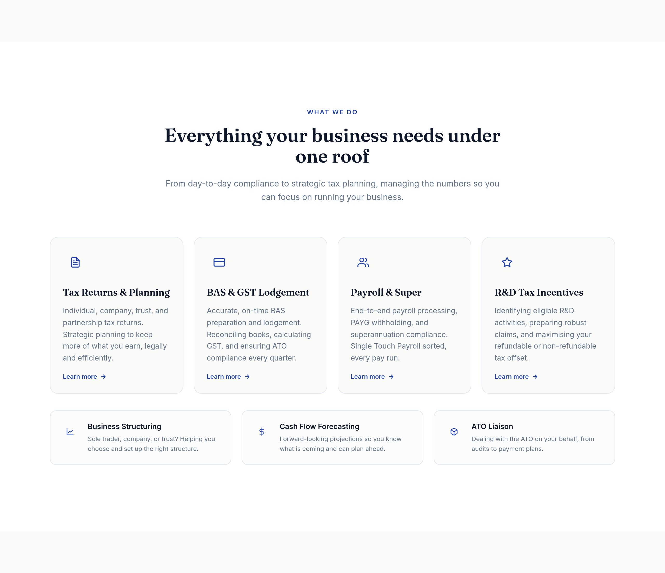
After
the services list uses 'we' too often — vary openings, use action verbs
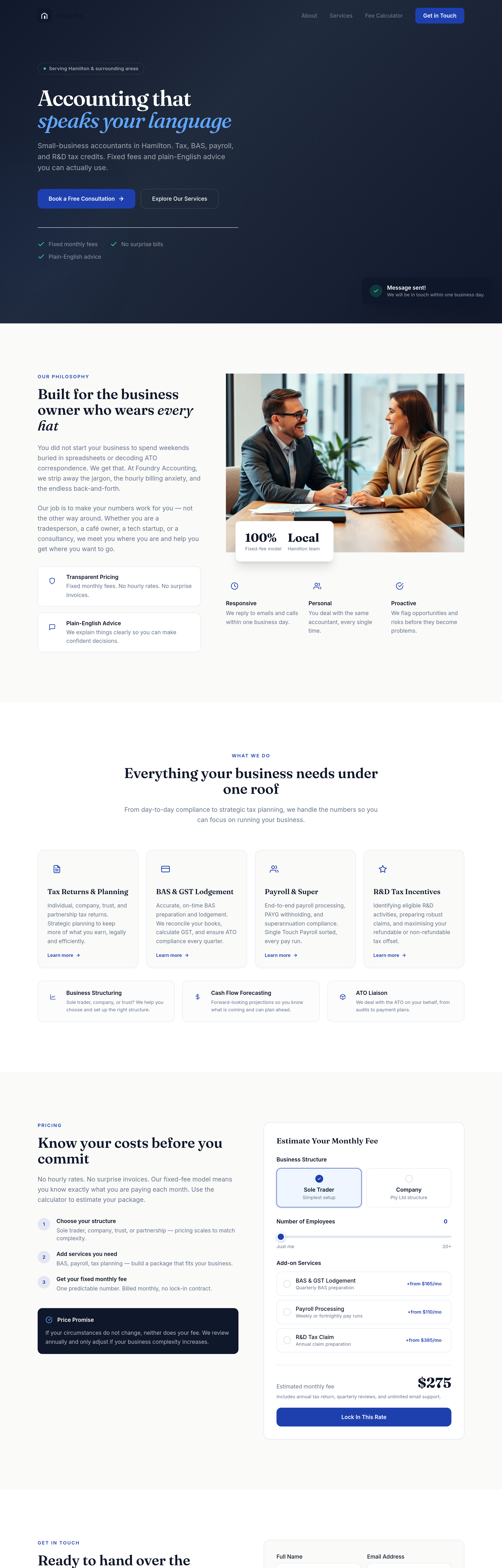
Before
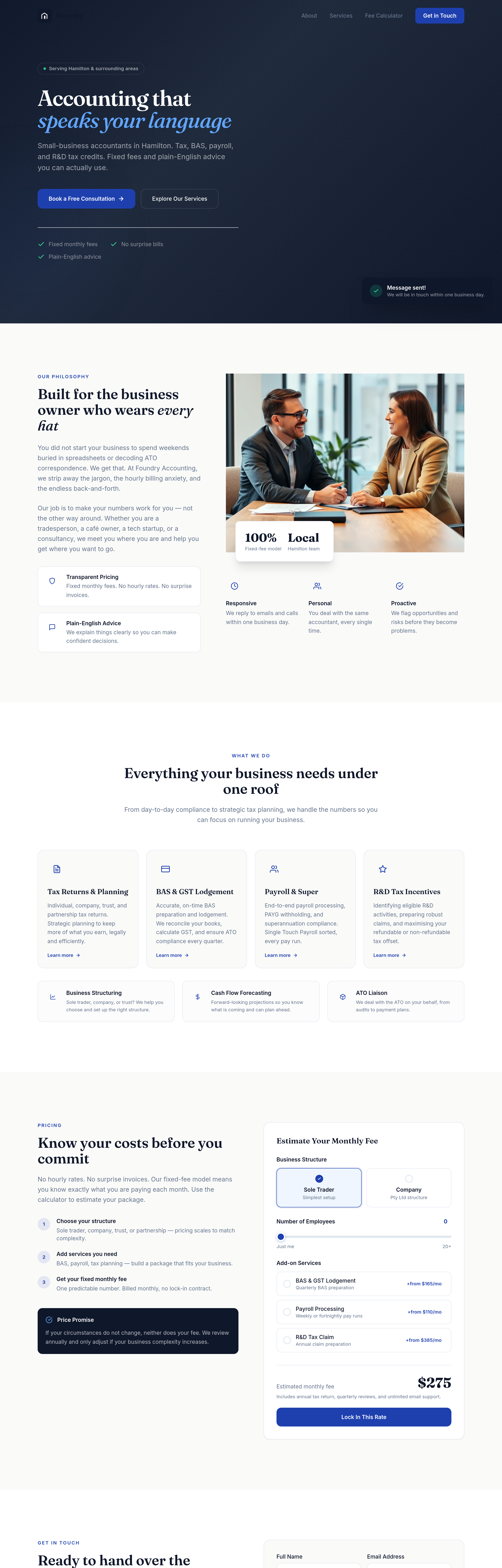
After
add a 'who we work with' section: SME owners, freelancers, professional services, e-commerce
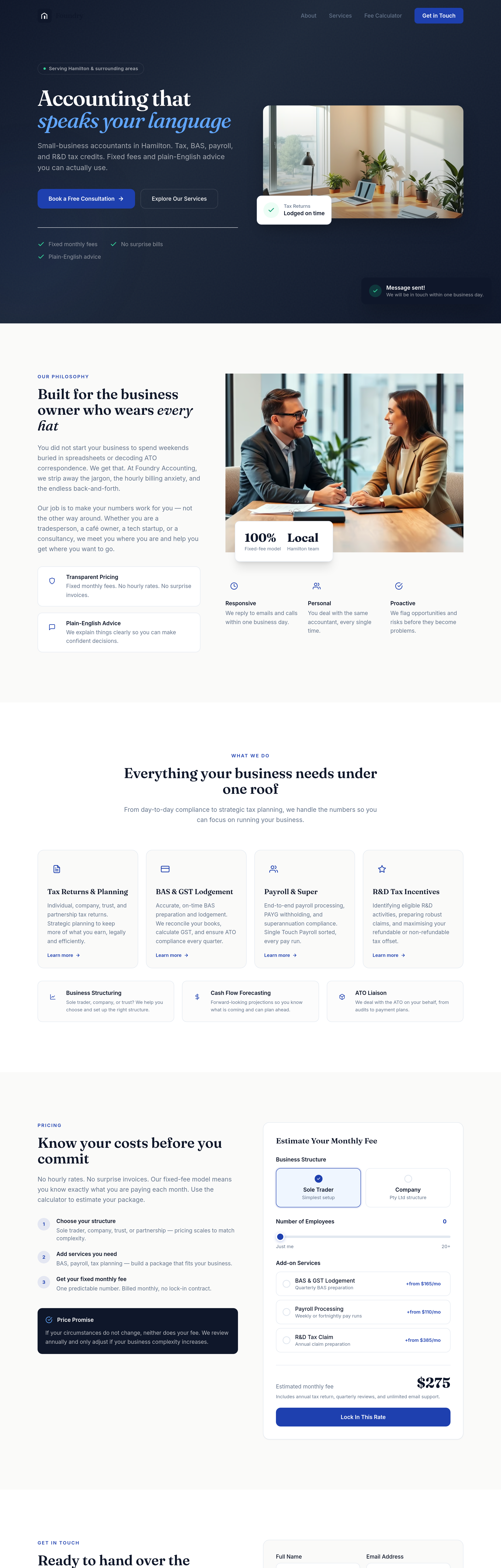
Before
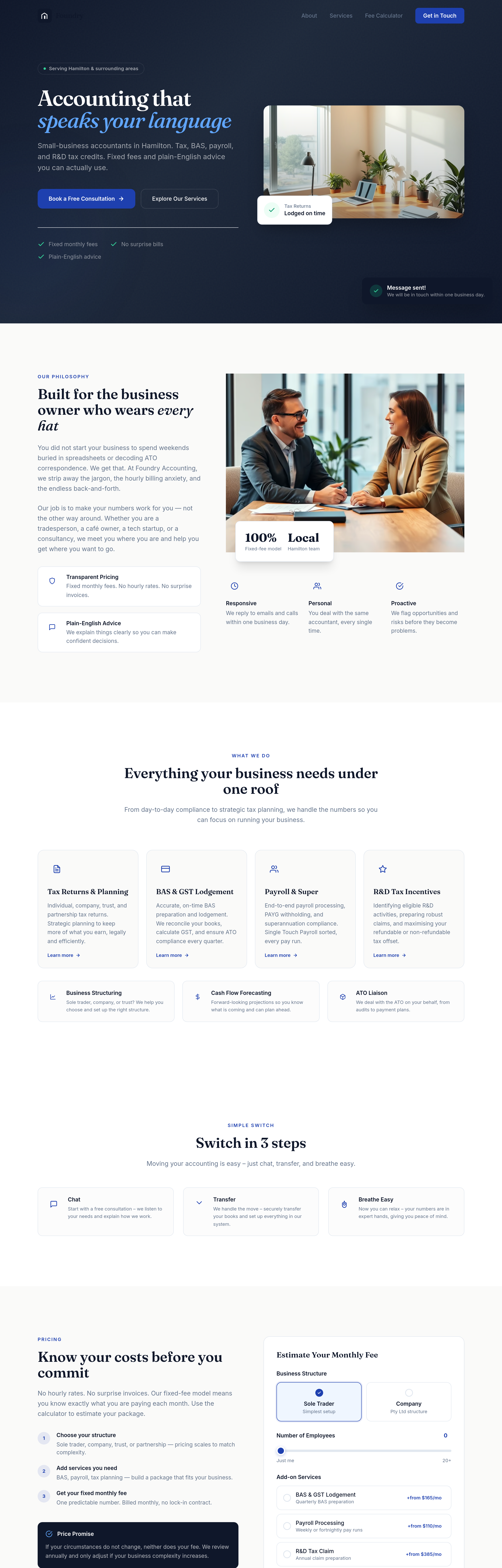
After
add a 'switch in 3 steps' section: chat, transfer, breathe easy
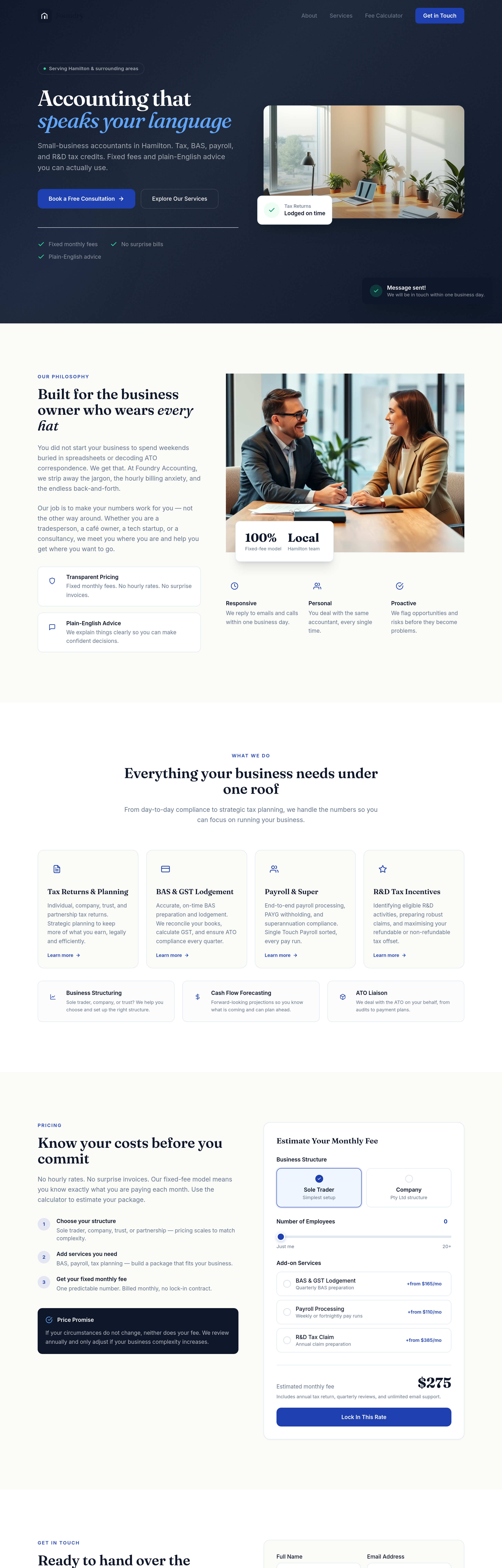
Before
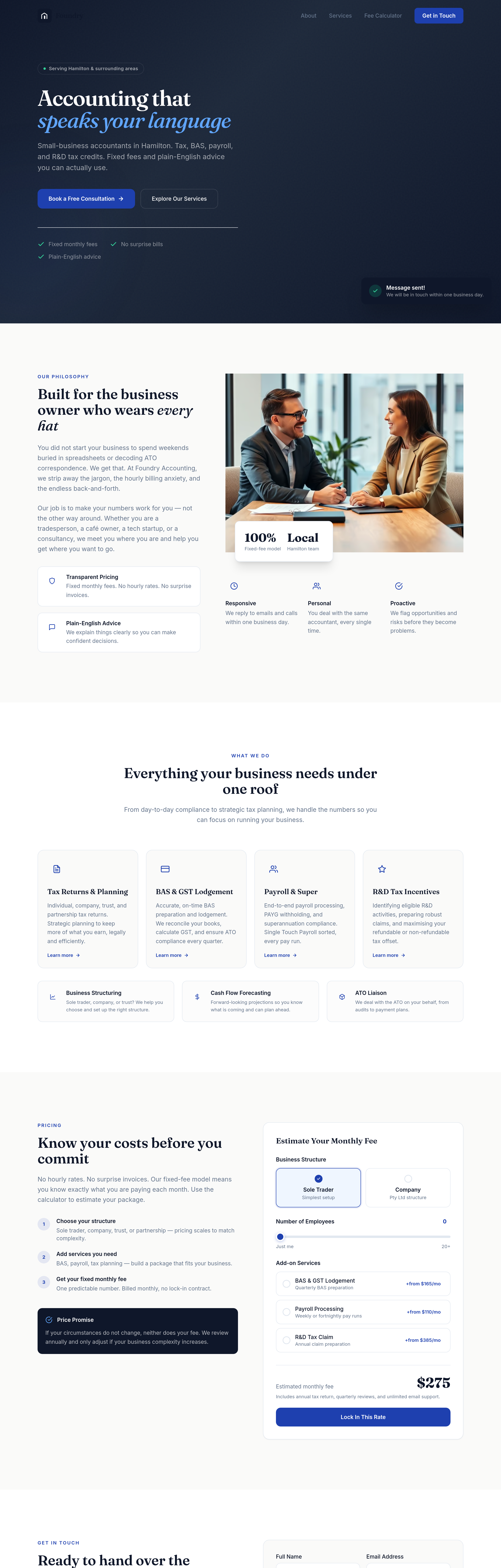
After
add a 'tools we use' section: Xero, MYOB, QuickBooks — we work with what you have
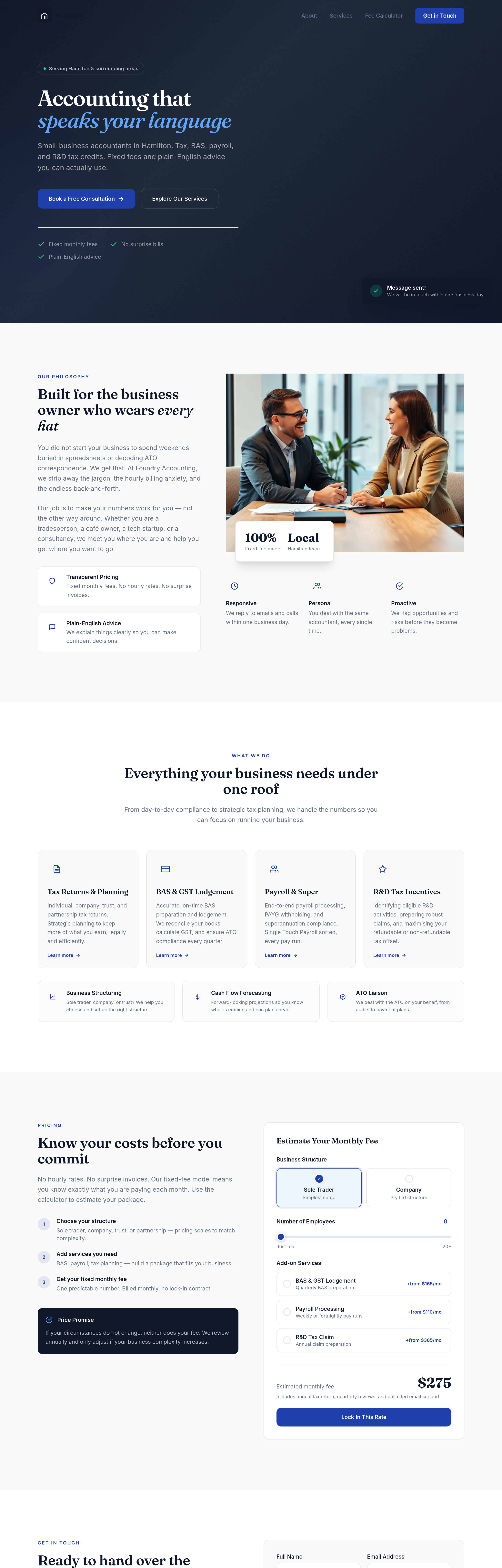
Before
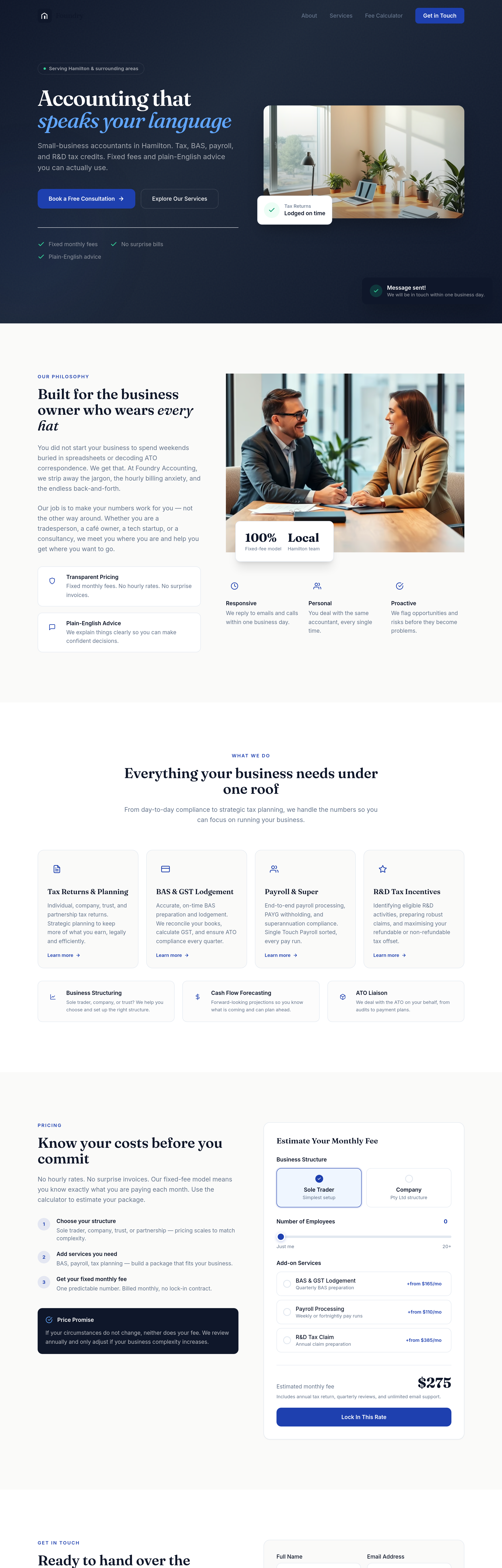
After
add a 'security & compliance' section — TPB registered, MFA on portals, encrypted file uploads
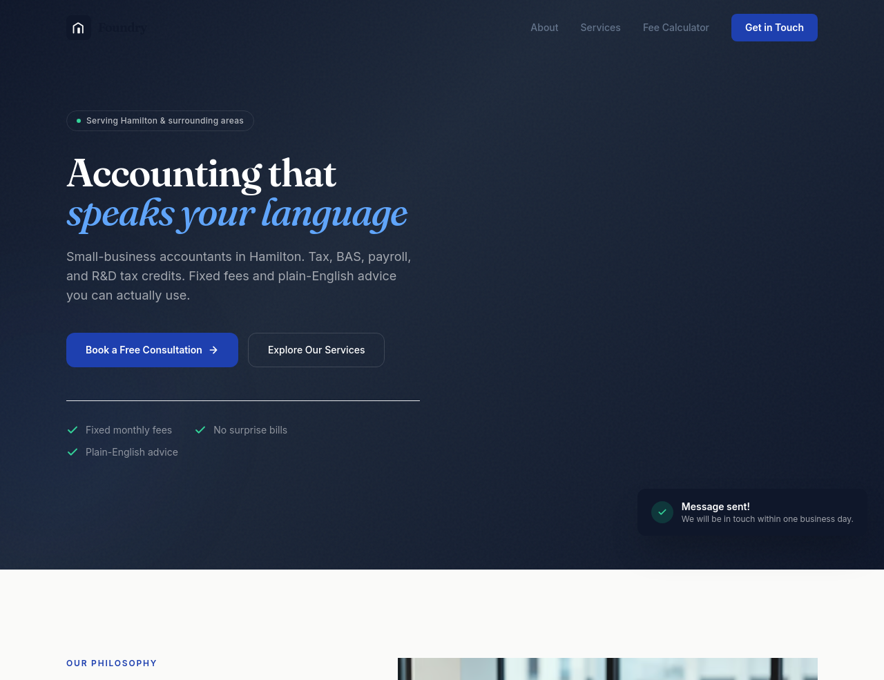
Before
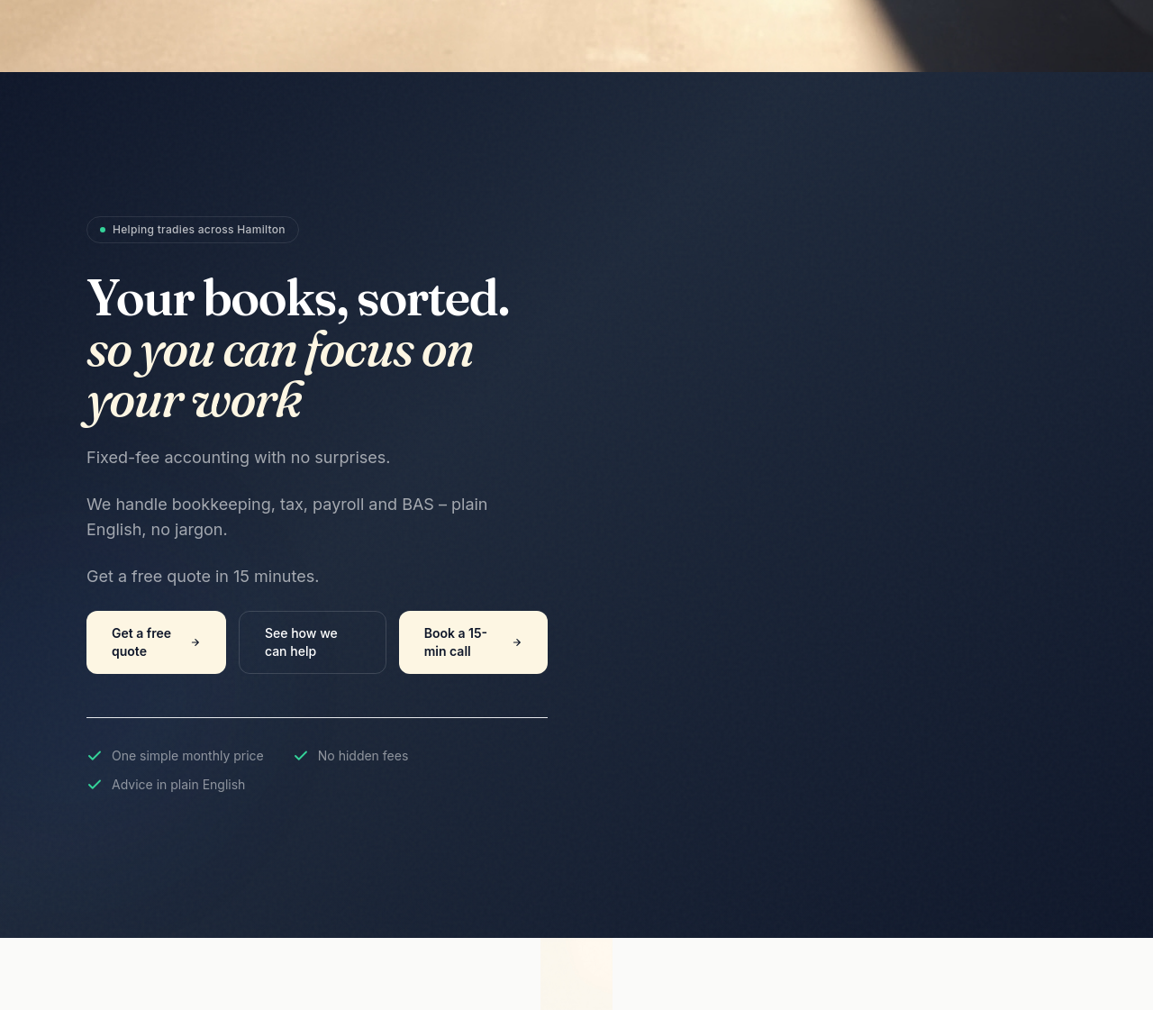
After
add a hero image of the Hamilton-Newcastle skyline at dawn, conveying calm and capability
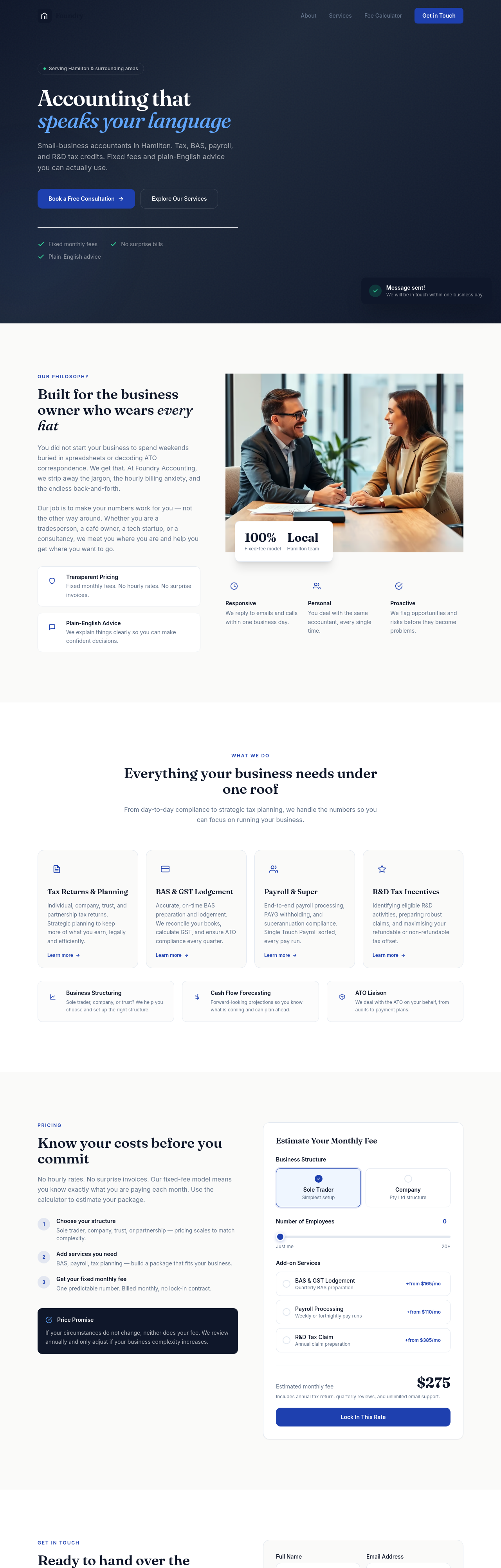
Before
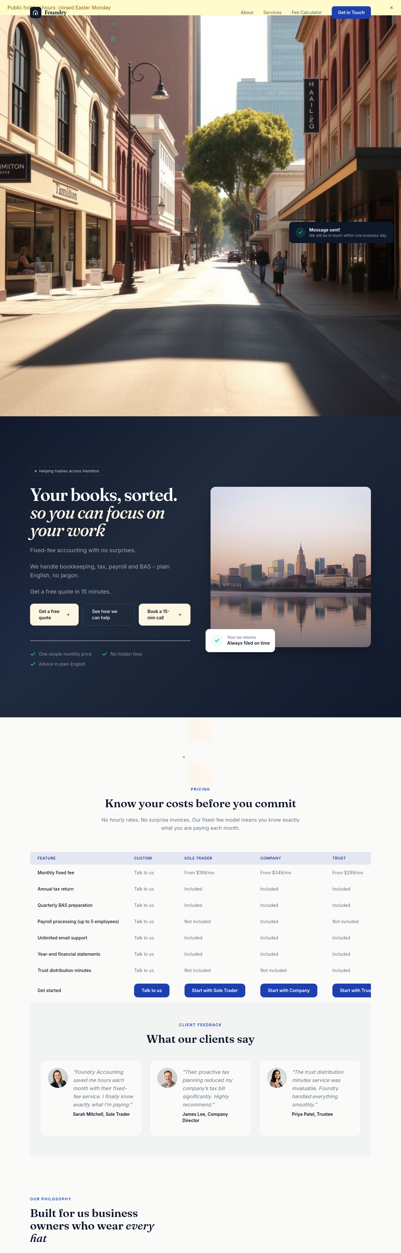
After
add team-style headshot placeholders for 3 partners — friendly, accessible, not boardroom-stiff
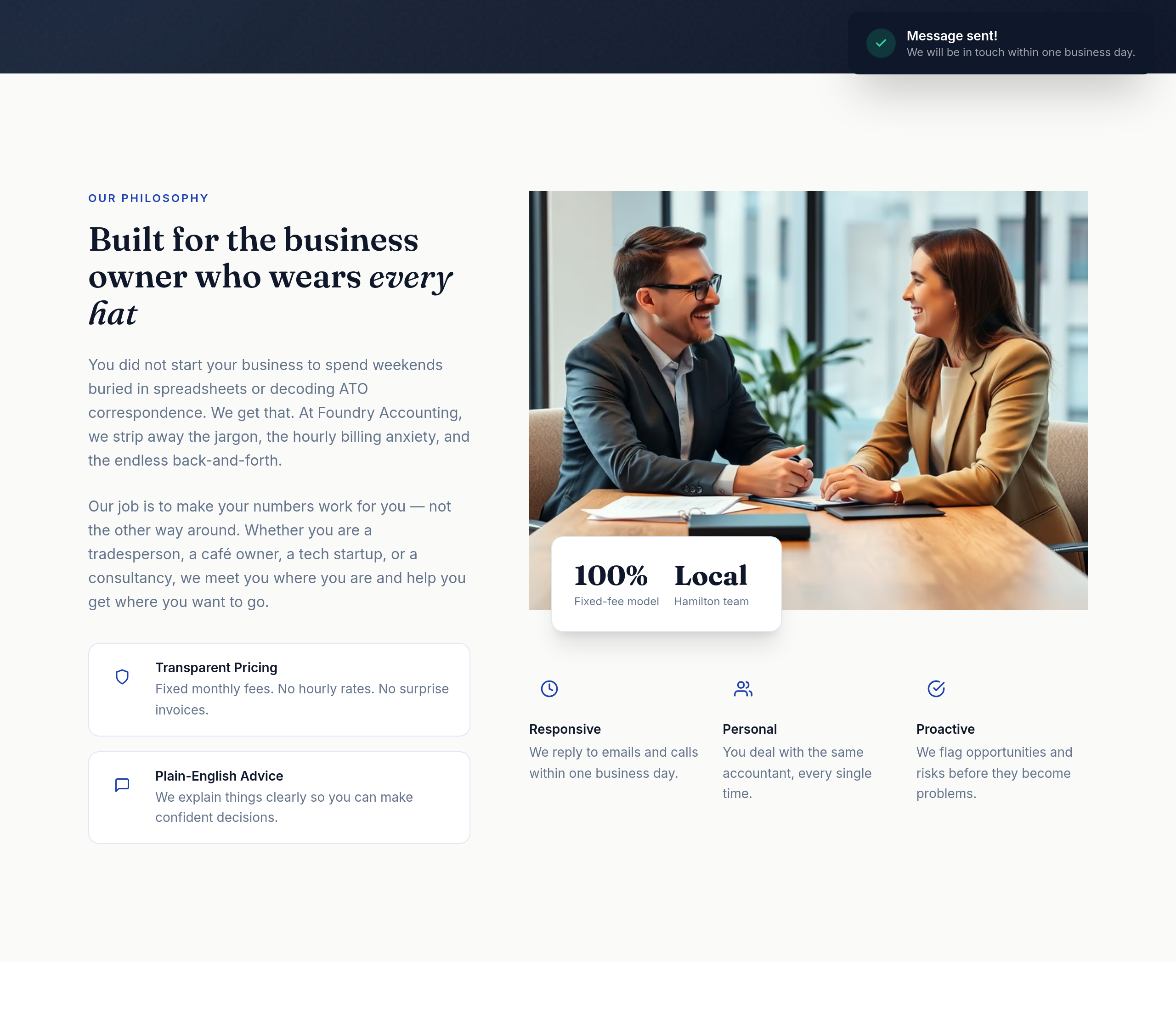
Before
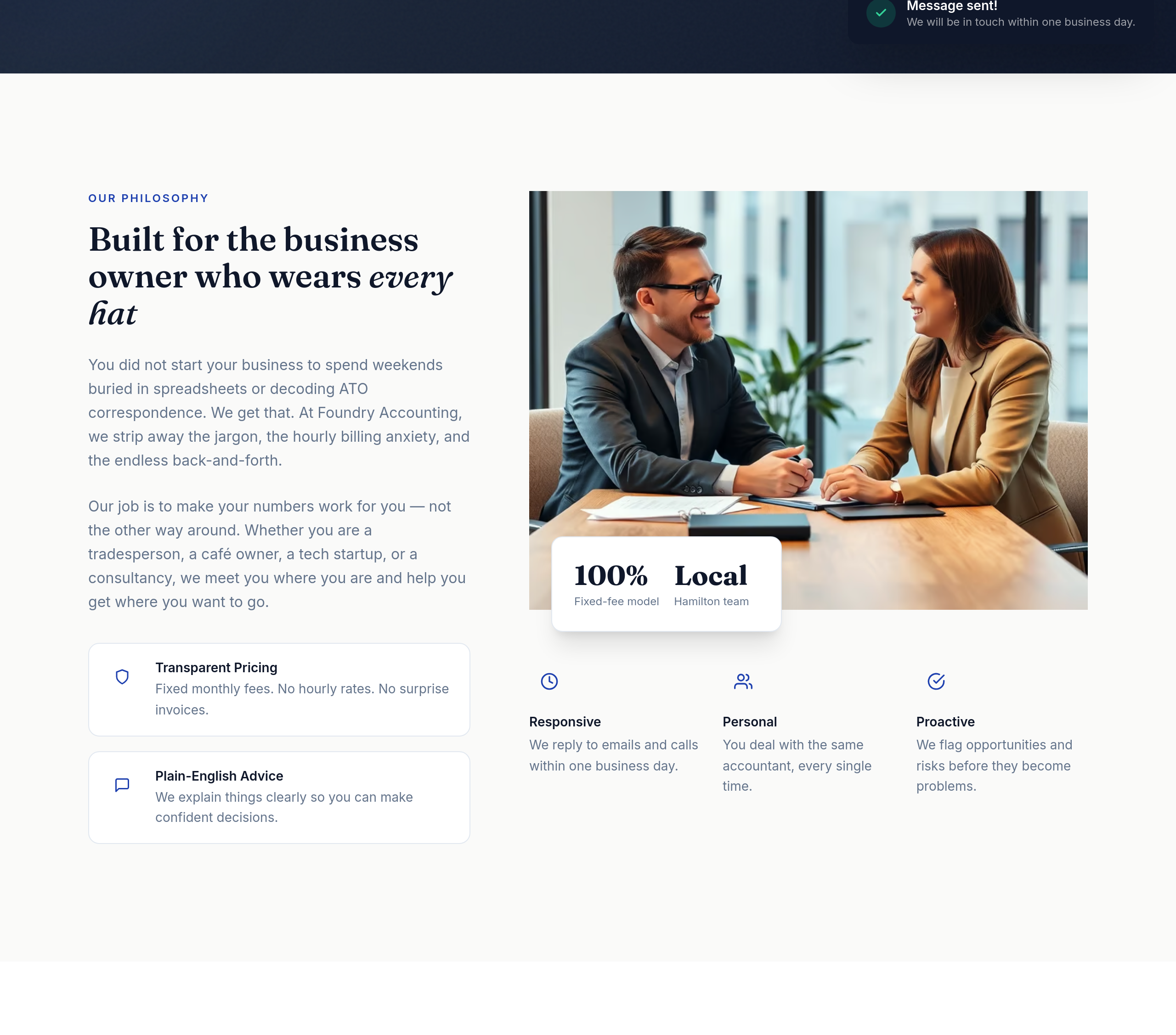
After
the value props read as a wall of text — split into 3 columns with icon + headline + 1-liner
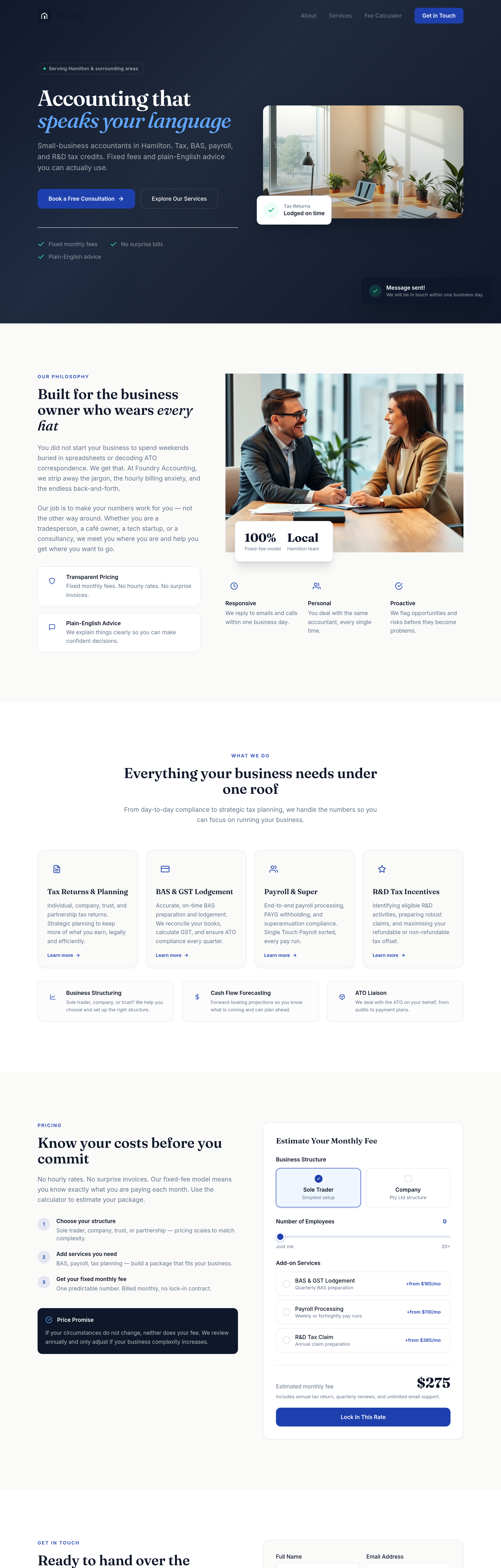
Before
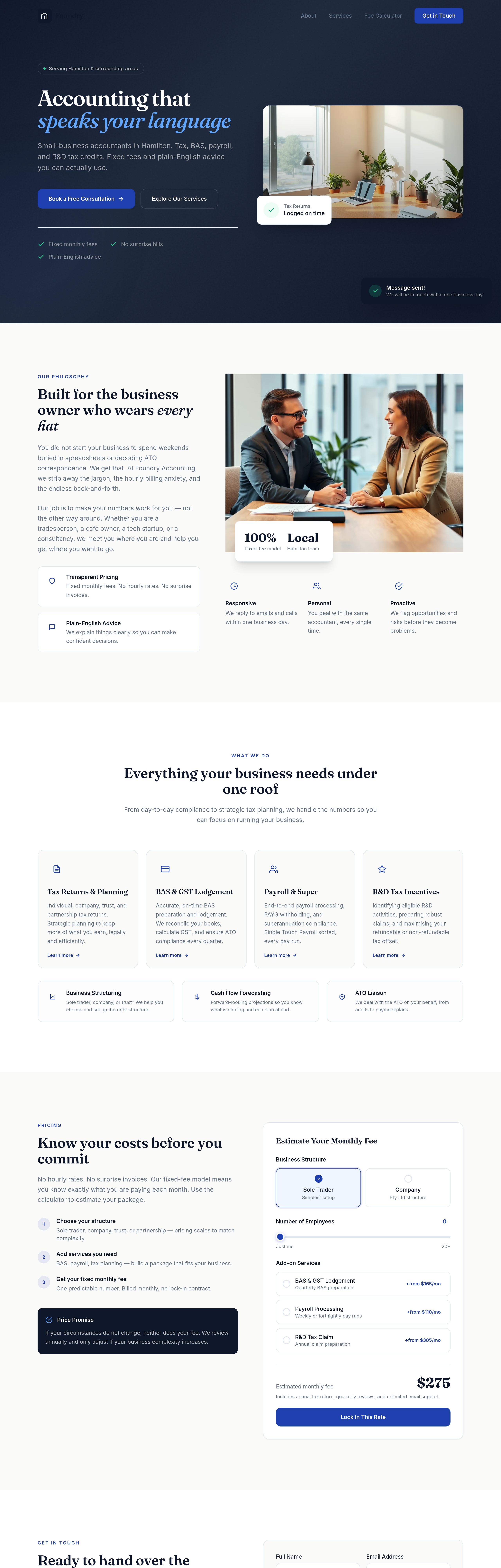
After
the buttons need more weight — bigger padding, confident typography, no shadow
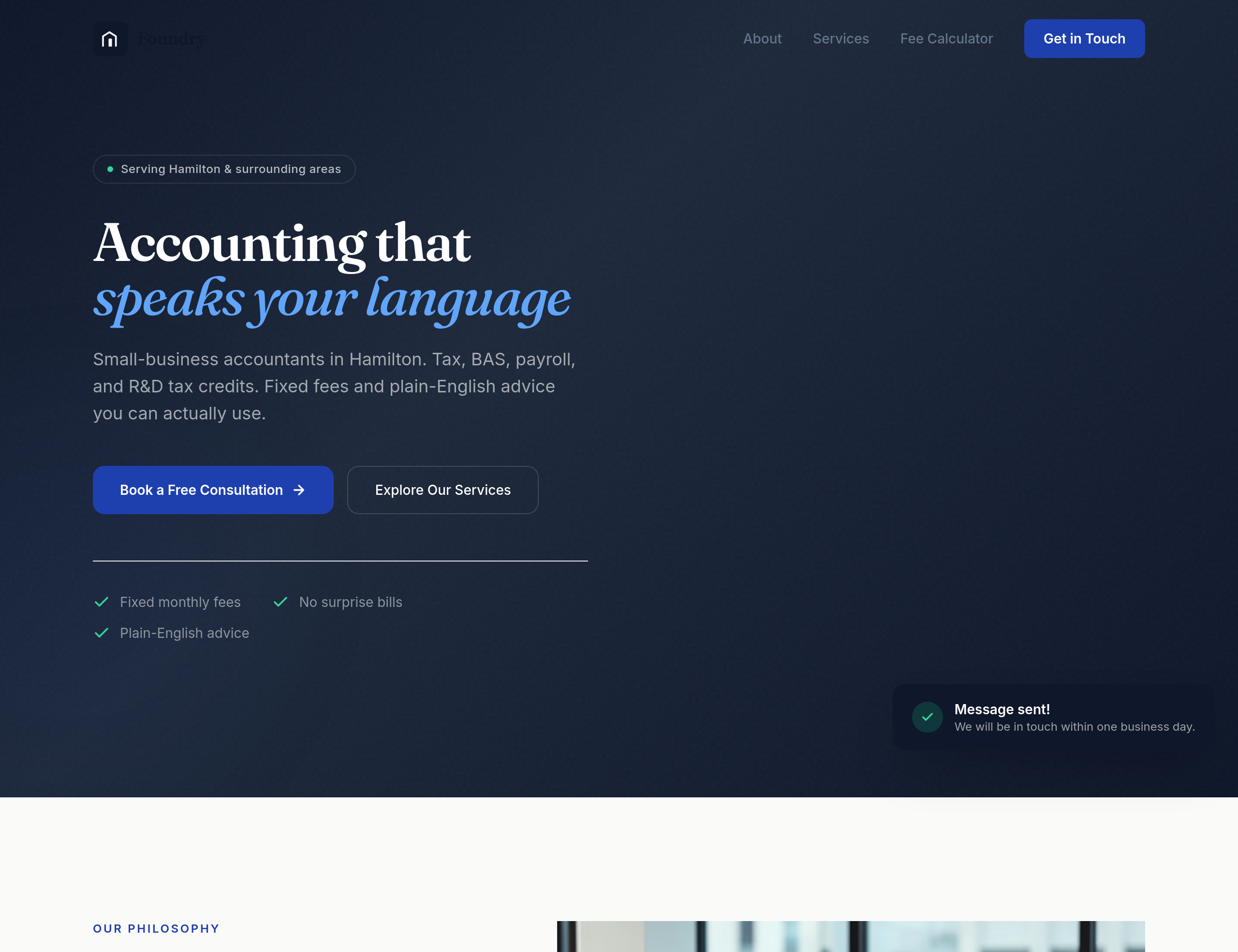
Before
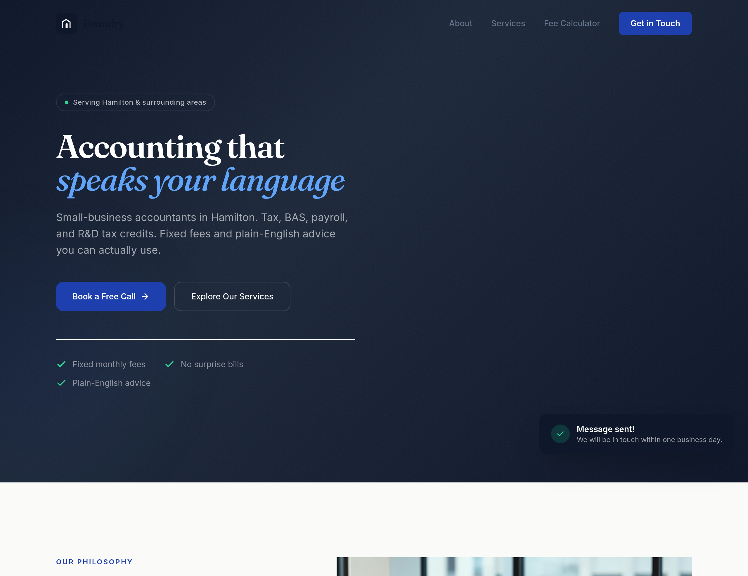
After
every section needs a clear next step — primary CTA in hero, secondary 'See pricing' in services, 'Book a call' in contact
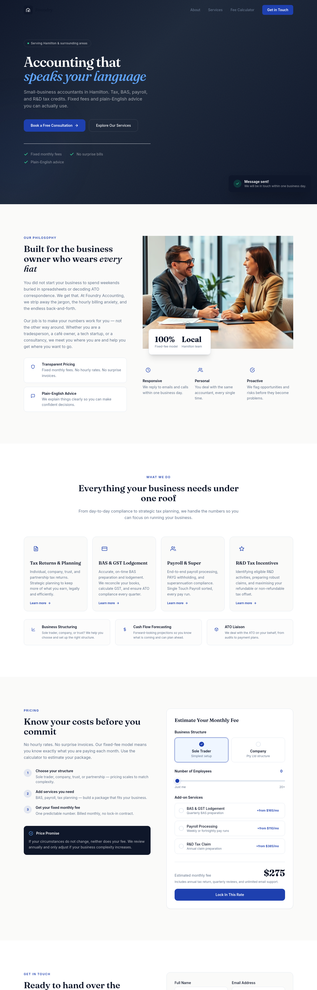
Before
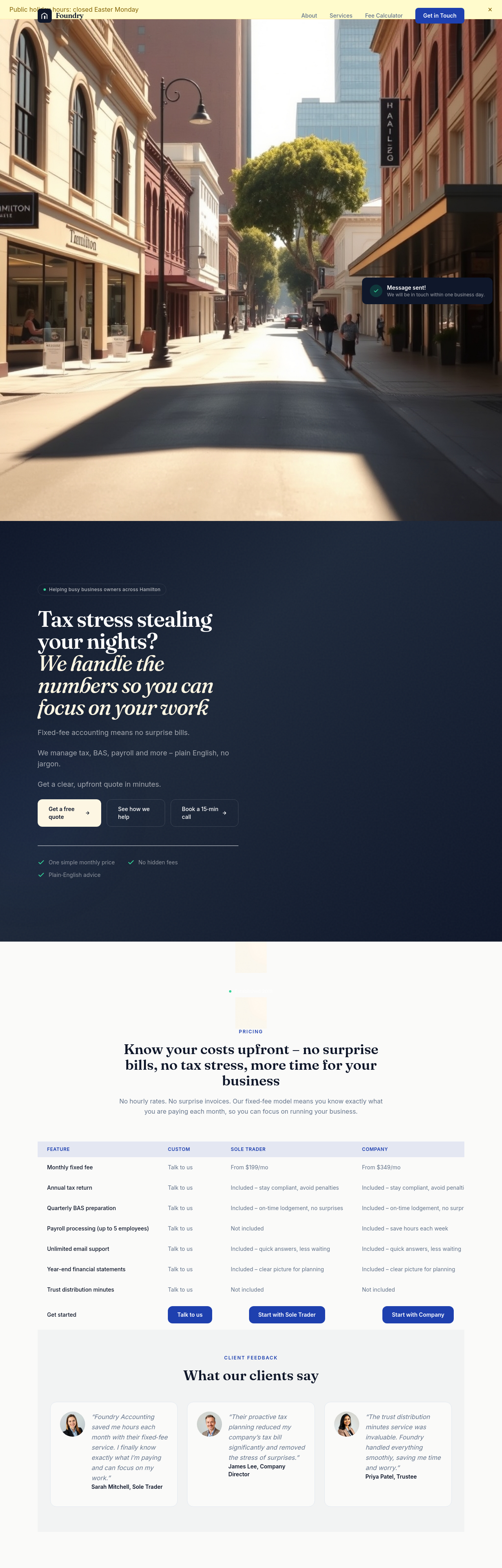
After
the pricing tiers compare across the same dimensions — restructure into a clean 3-column comparison with checkmarks
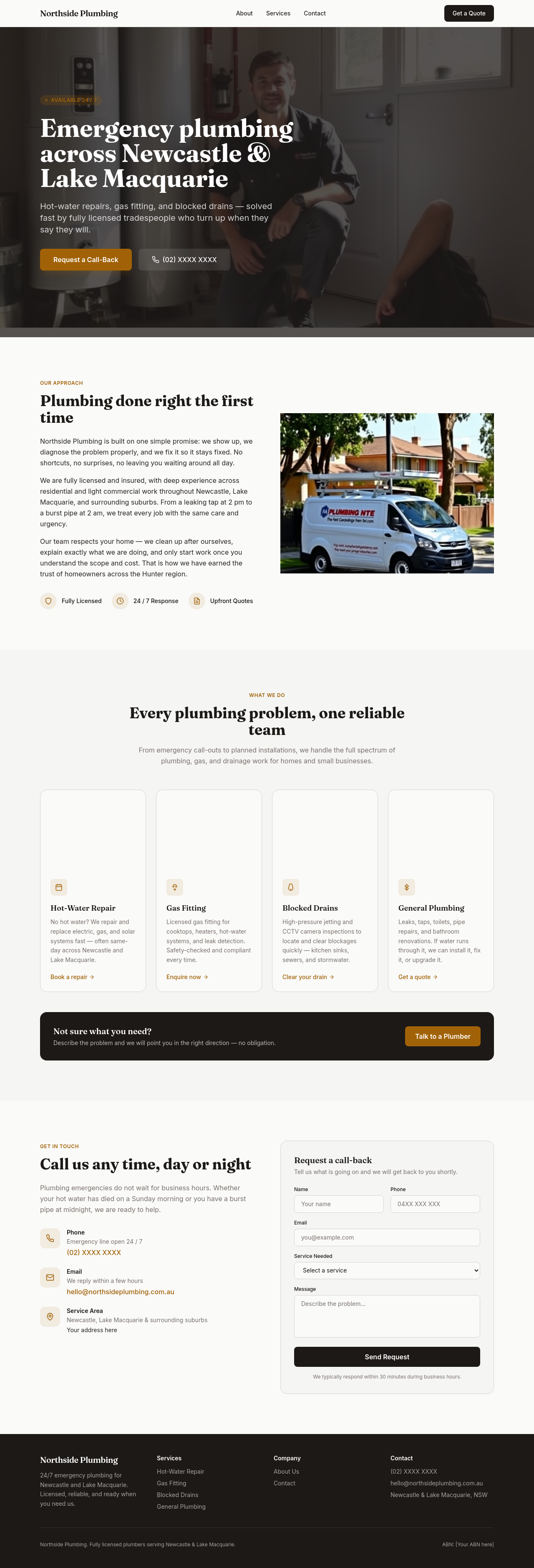
Before

After
add a contact form section with name, email, message
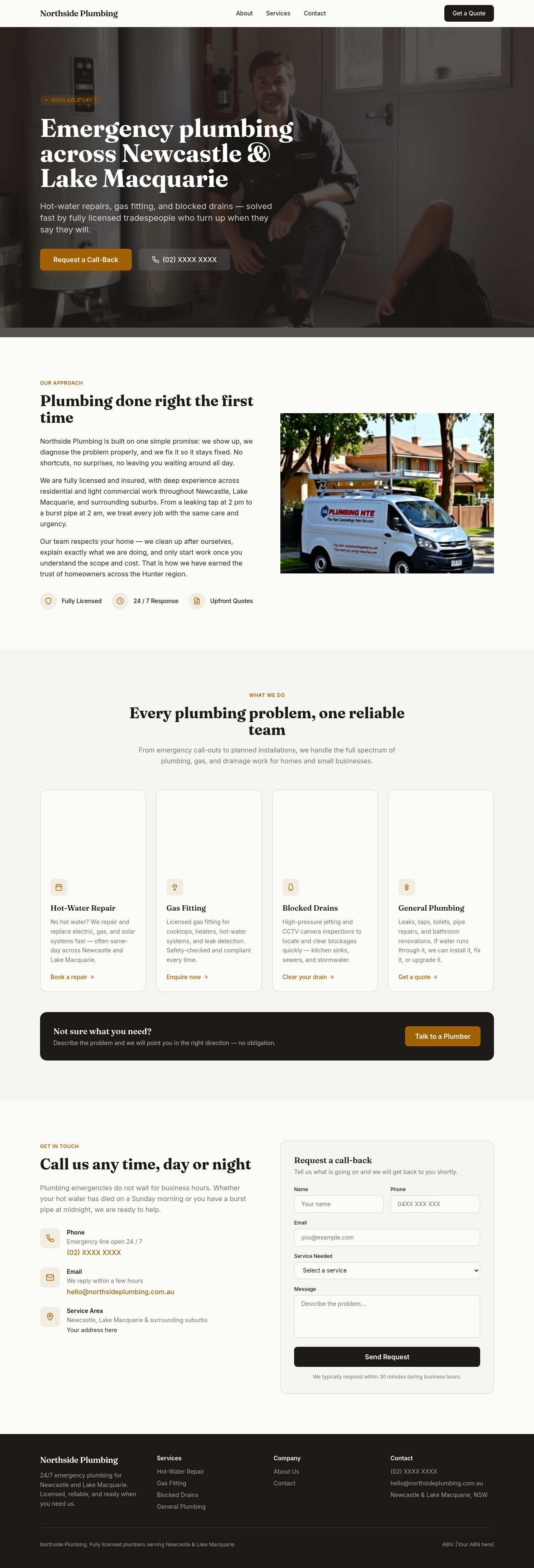
Before

After
add a newsletter signup section — just email field + subscribe button

Before

After
add a booking-enquiry form: name, email, phone, preferred date, message
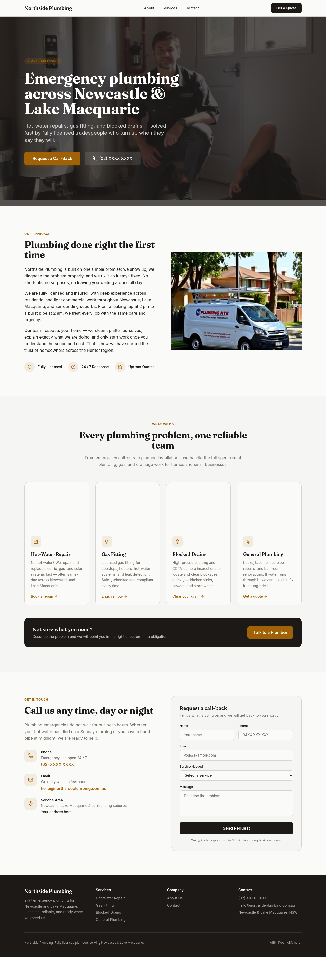
Before

After
add a 'Get a quote' form — name, email, project type dropdown, budget range, message
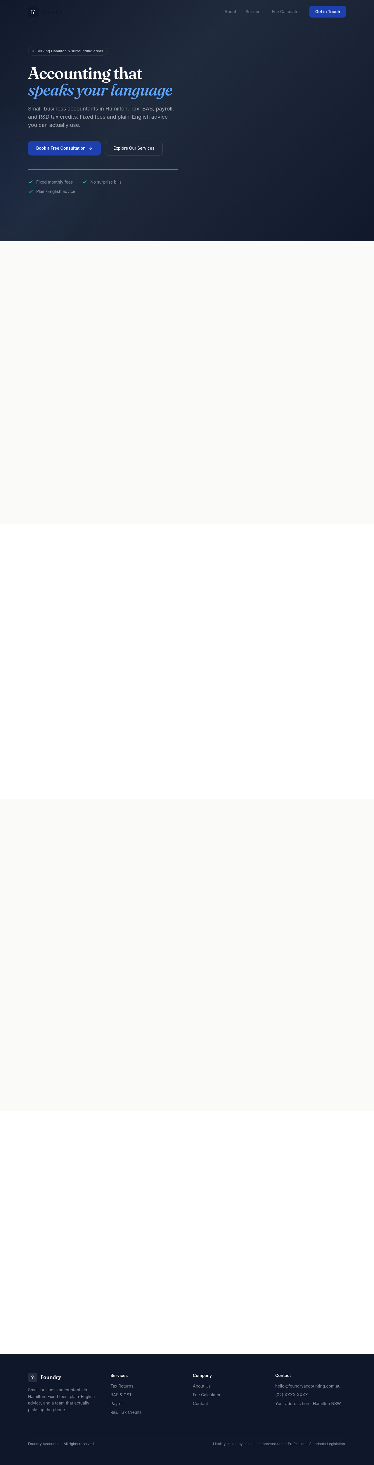
Before

After
the contact form needs an ABN field for business clients

Before

After
add validation hints — phone format, email required, message minimum 30 chars

Before

After
add a small disclaimer below the contact form about response times

Before

After
add a checkbox for marketing consent that defaults unchecked