Tool: update_section
52 examples where the agent called this tool.
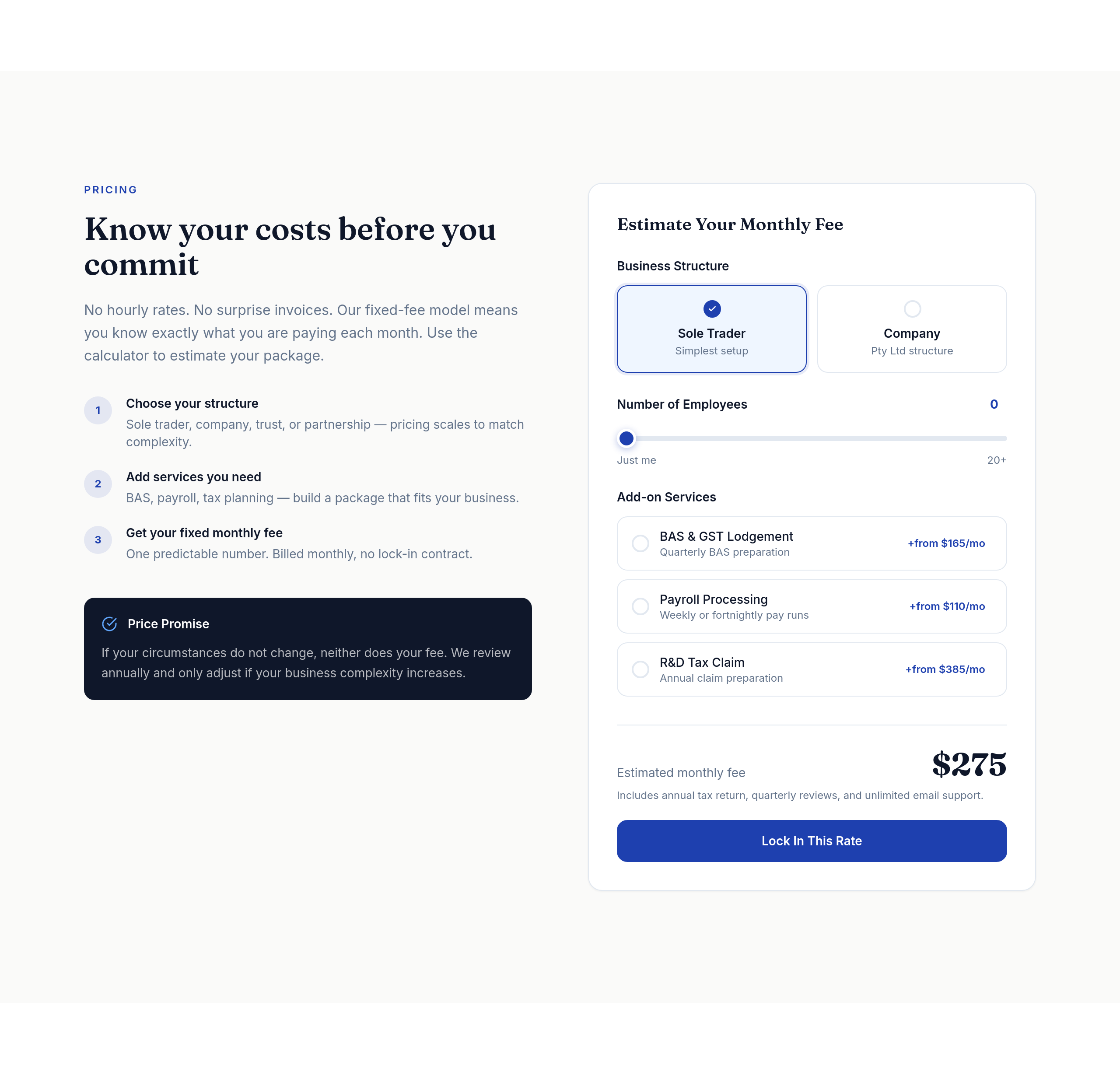
Before
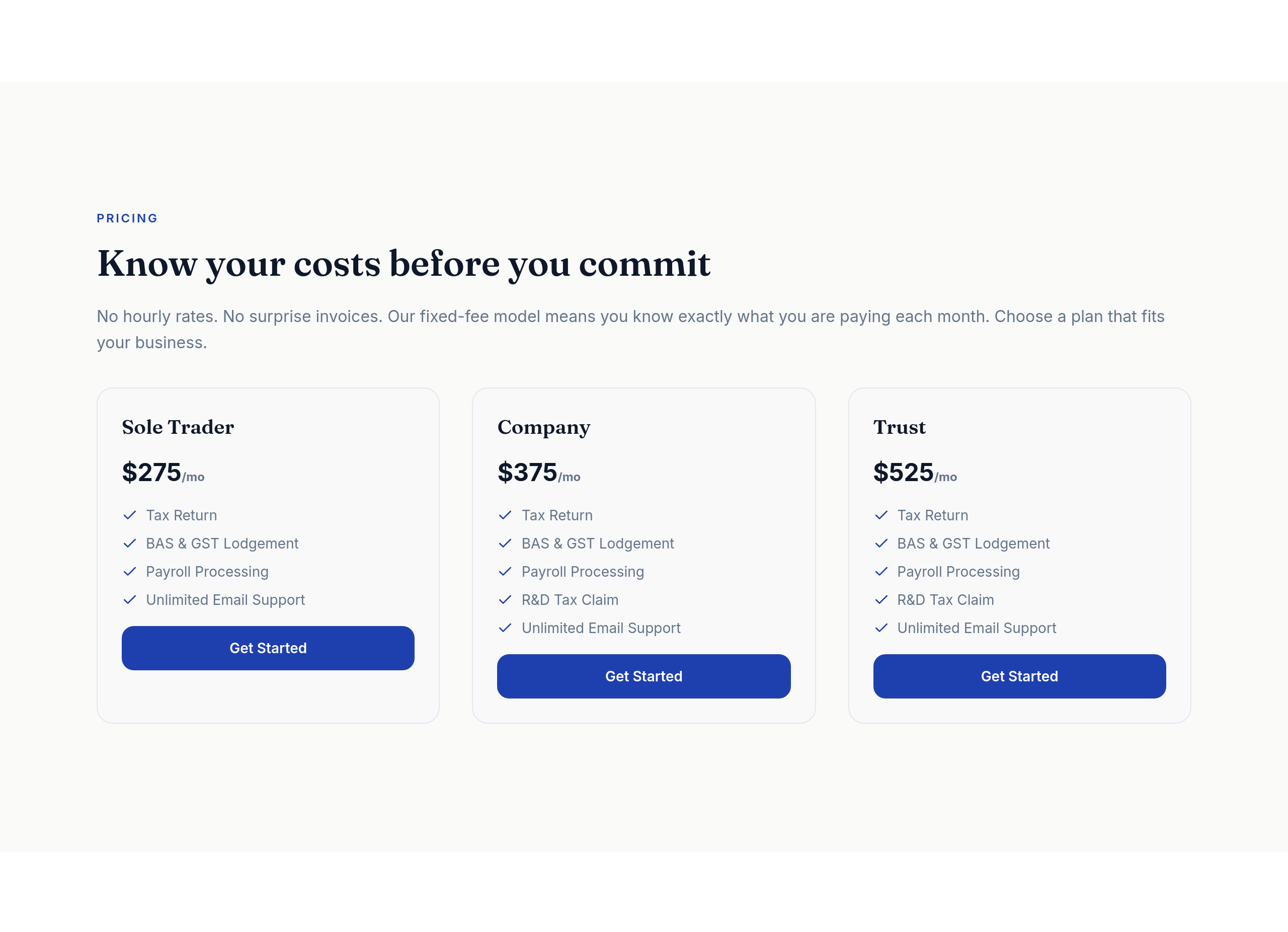
After
the pricing tiers should be a clear 3-column comparison table on desktop

Before

After
add a Google Maps embed showing our location
Before
After
add a Google Maps embed showing our location
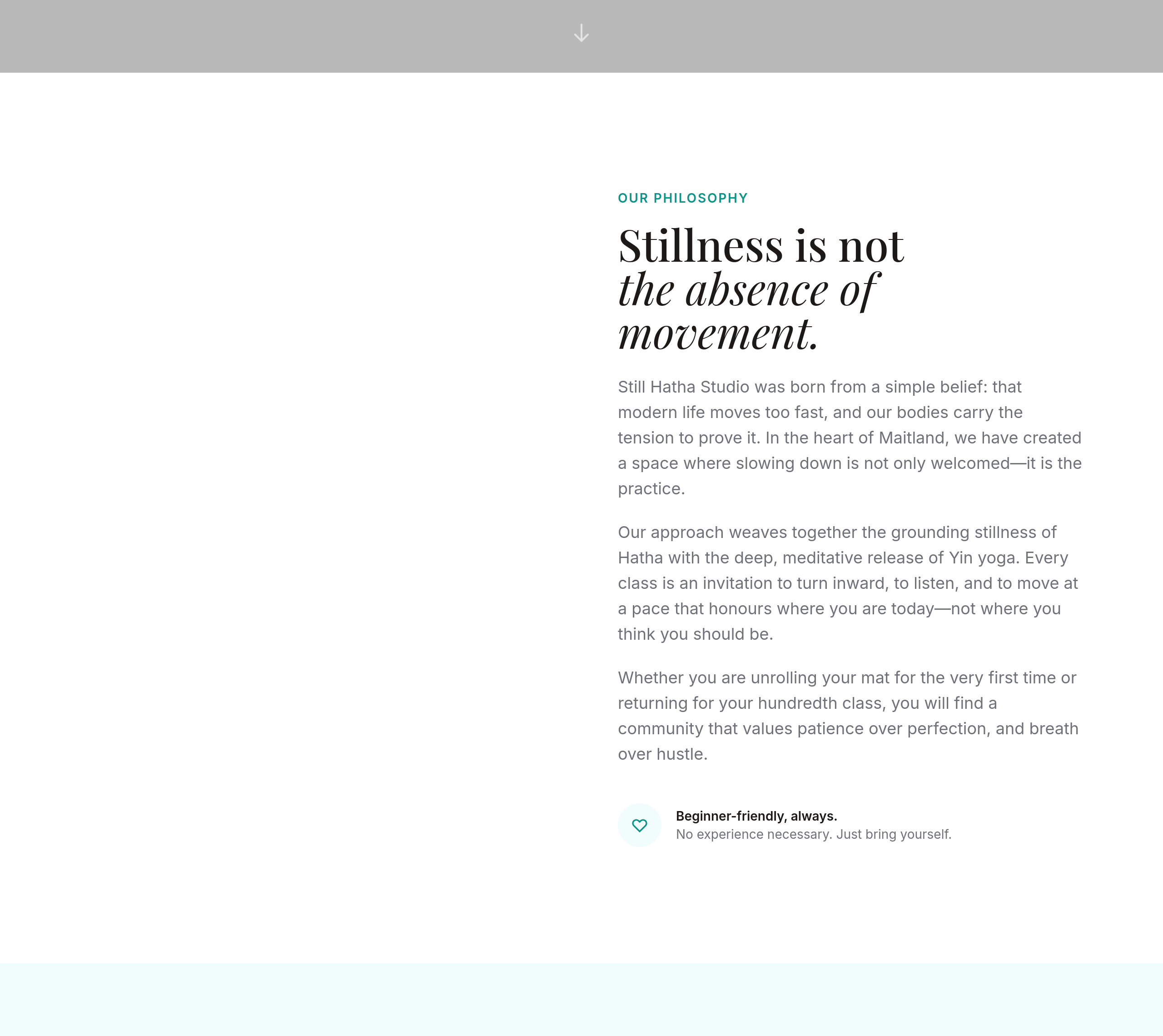
Before
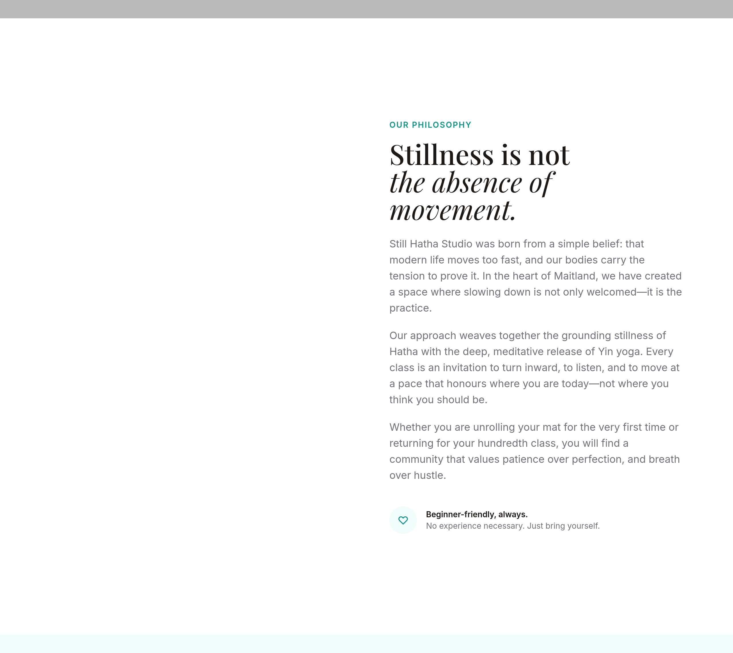
After
add more space between sections — feels too cramped
Before
After
add more space between sections — feels too cramped
Before
After
add more space between sections — feels too cramped
Before
After
add more space between sections — feels too cramped
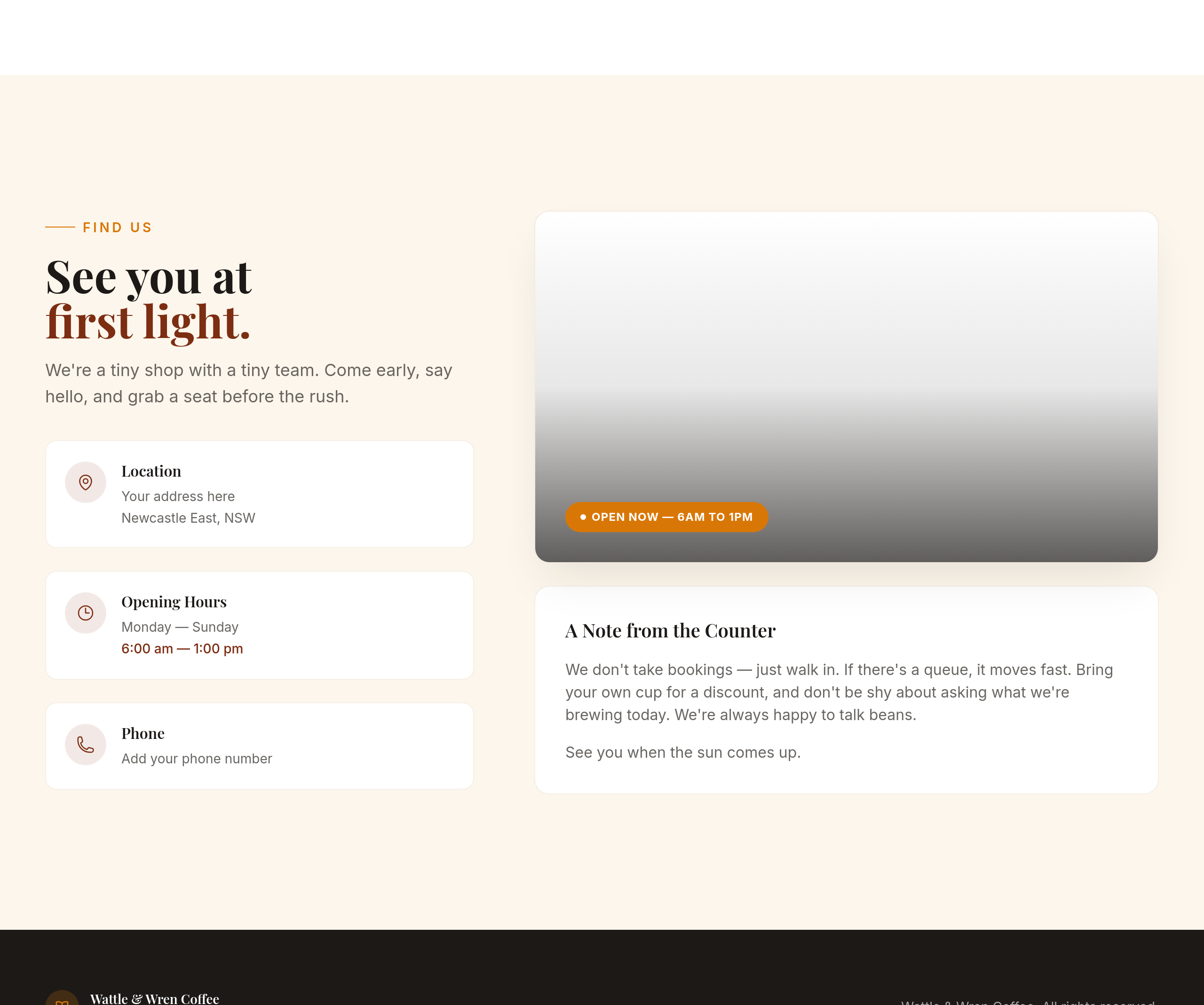
Before
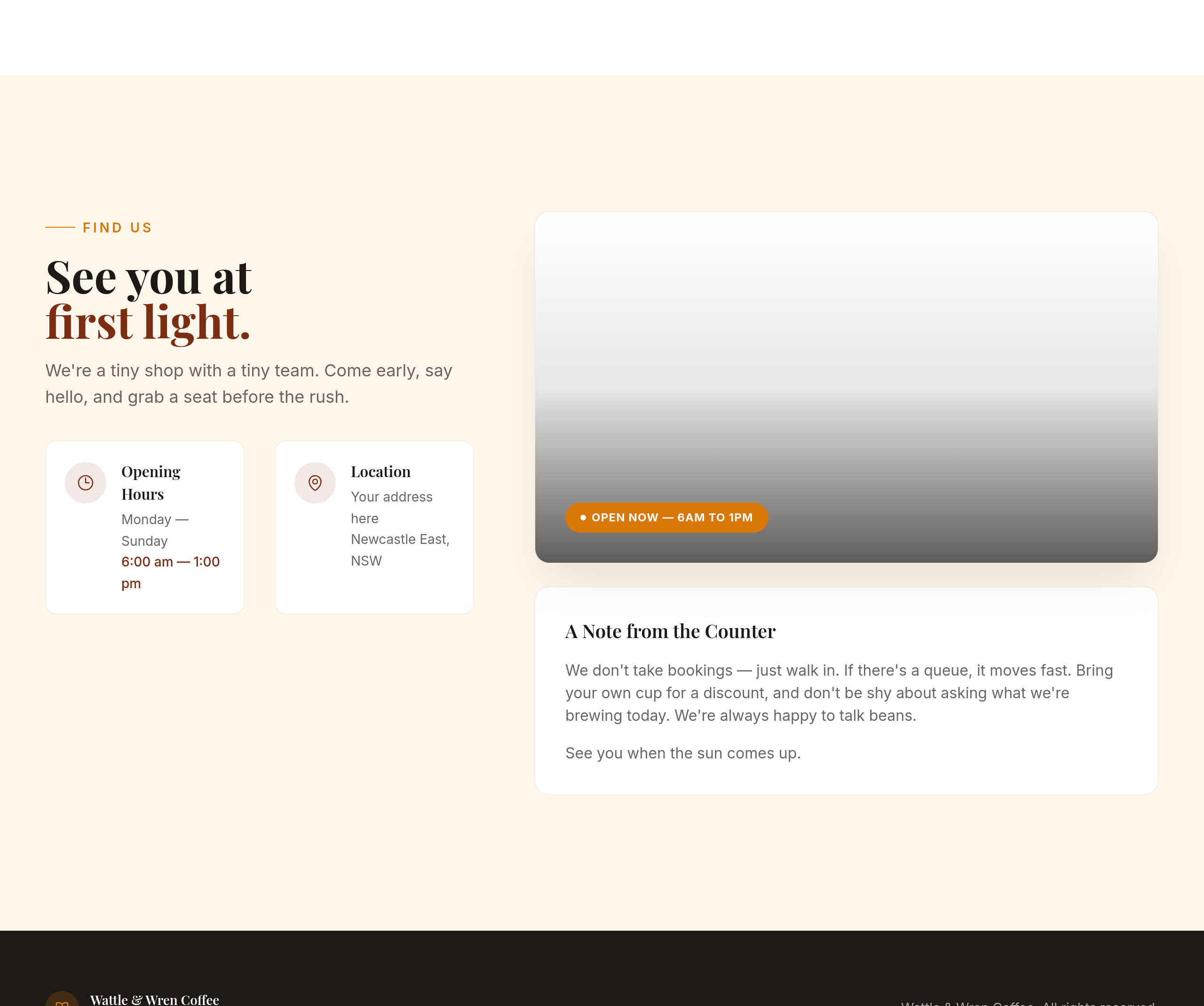
After
the contact section is text-only — add a 2-column layout with hours on the left, address on the right
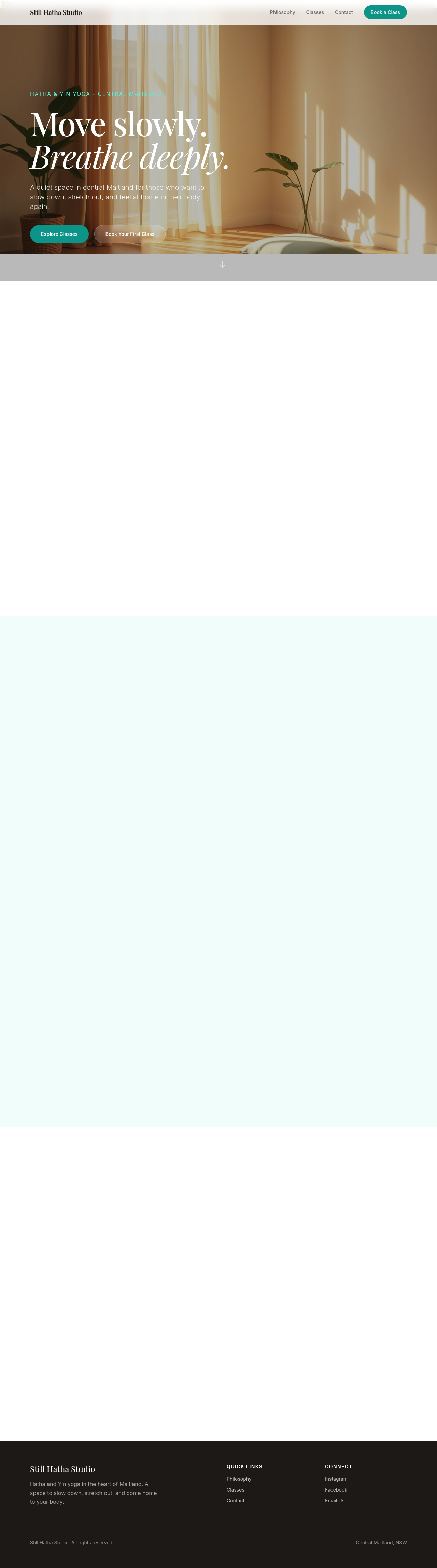
Before

After
add a sticky header that's transparent at top, solid white when scrolled
Before
After
add a sticky header that's transparent at top, solid white when scrolled
Before
After
add a sticky header that's transparent at top, solid white when scrolled
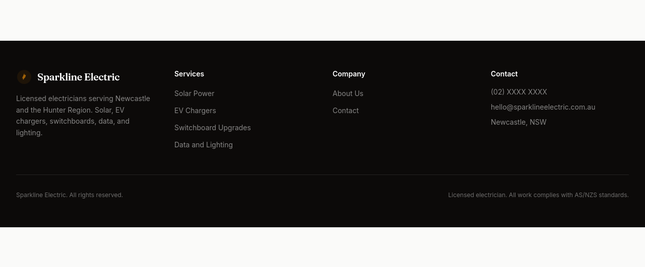
Before
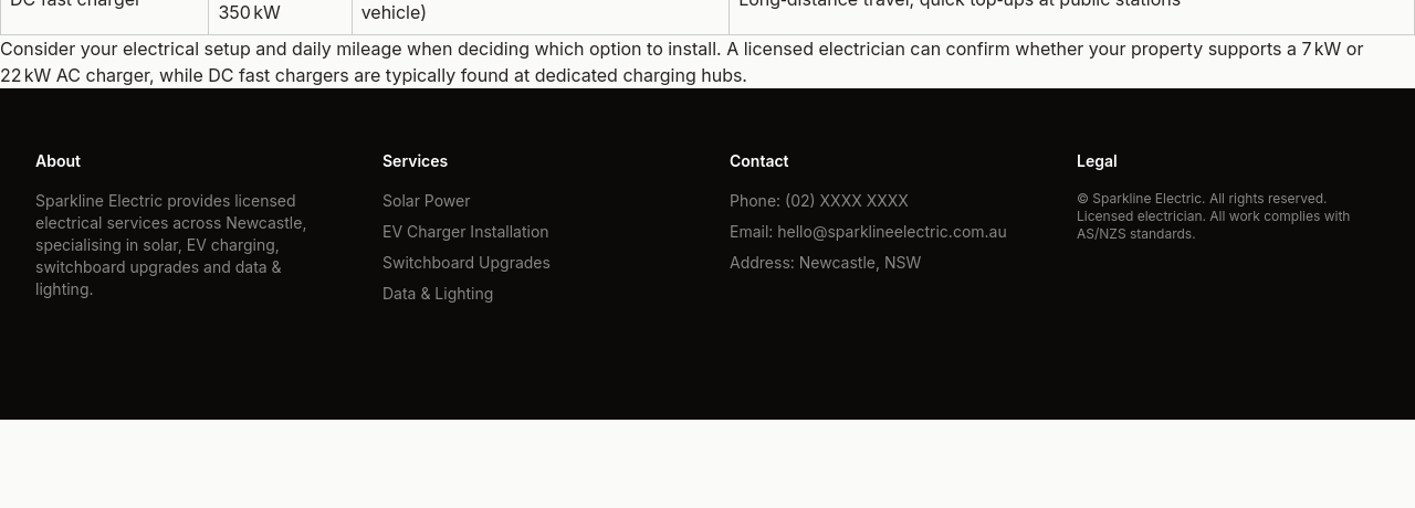
After
the footer is sparse — add 4 columns: about, services, contact, legal
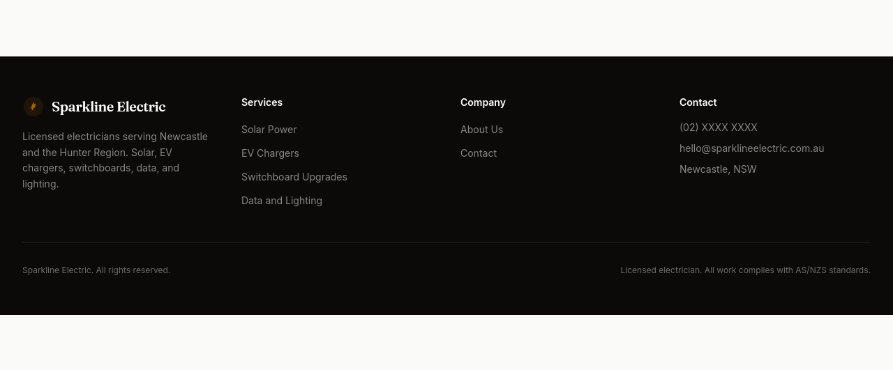
Before
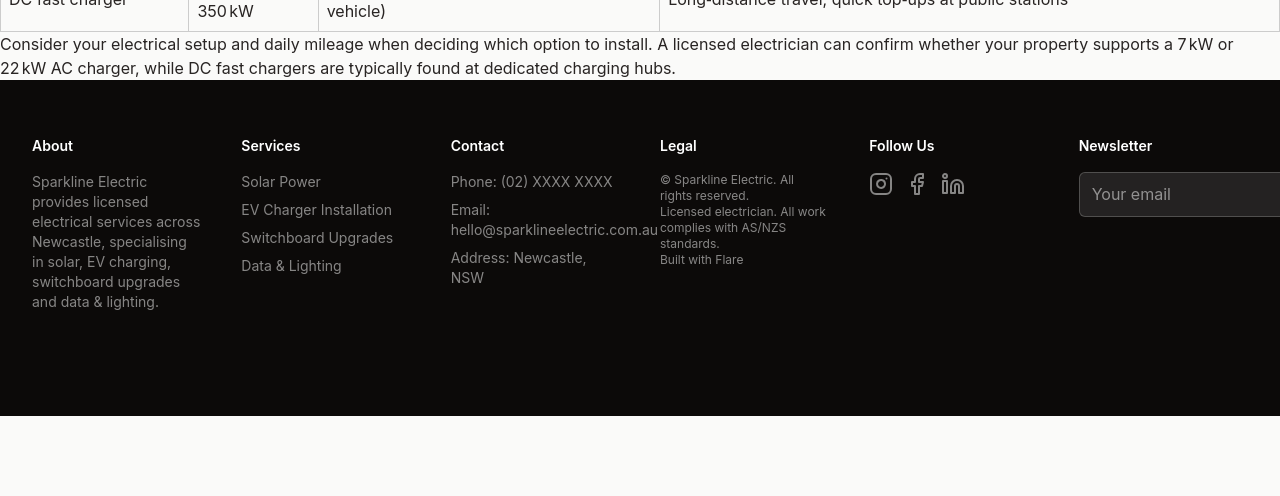
After
add a newsletter signup field in the footer
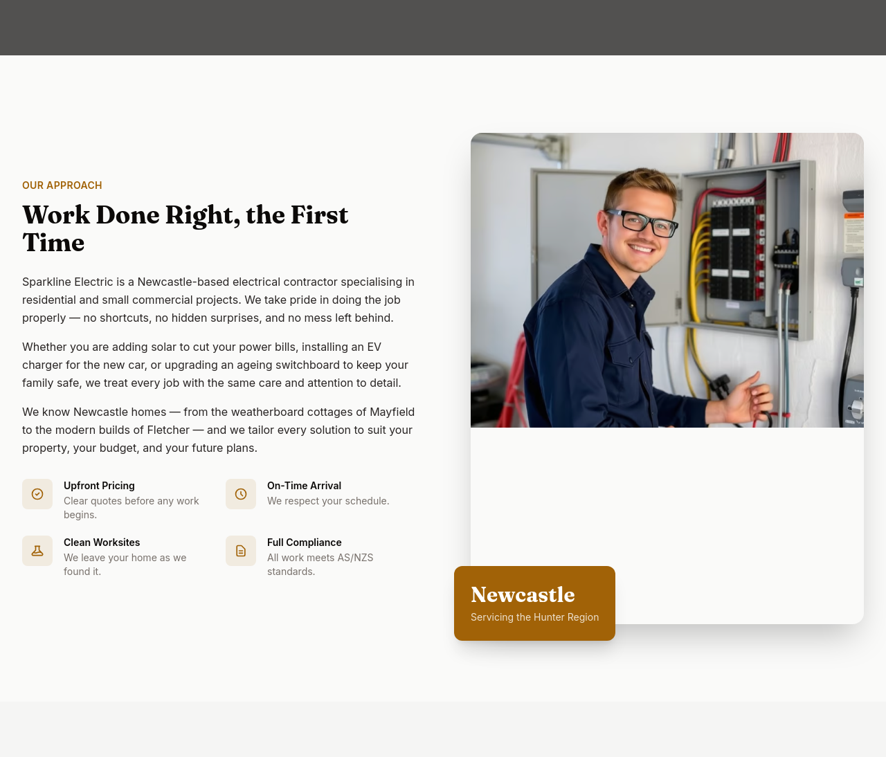
Before
After
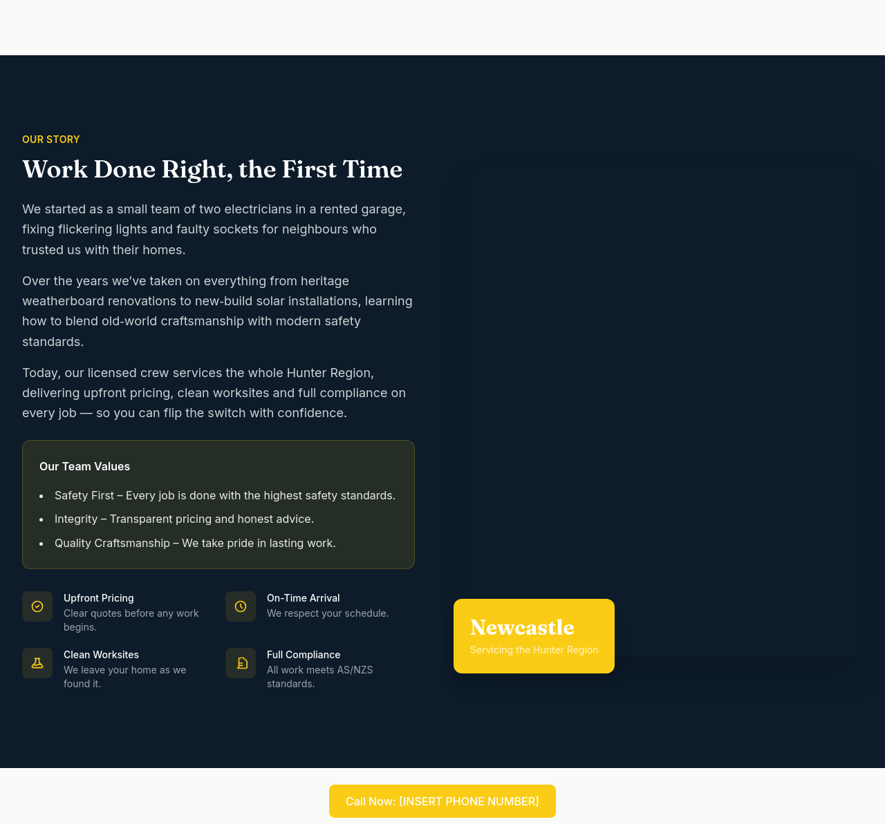
the about needs a 'team values' callout with 3 short principles

Before

After
add a Google reviews badge showing 4.8/5 stars (placeholder)
Before
After
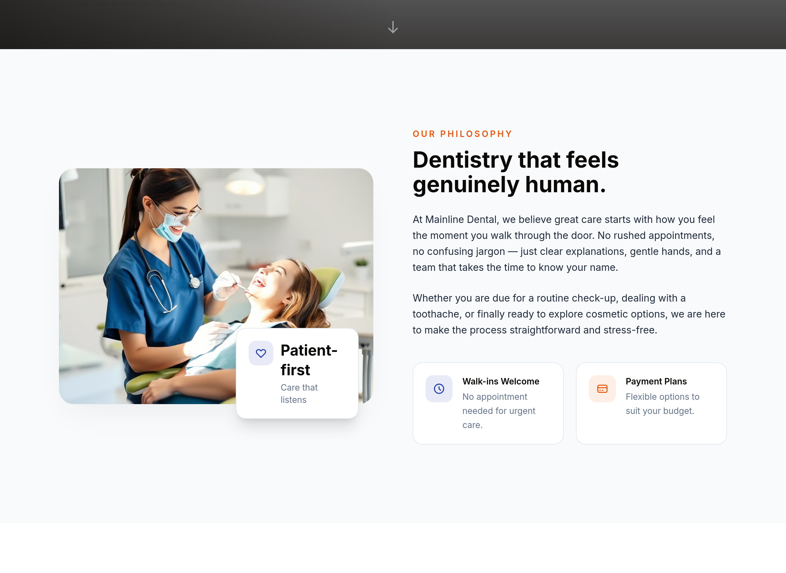
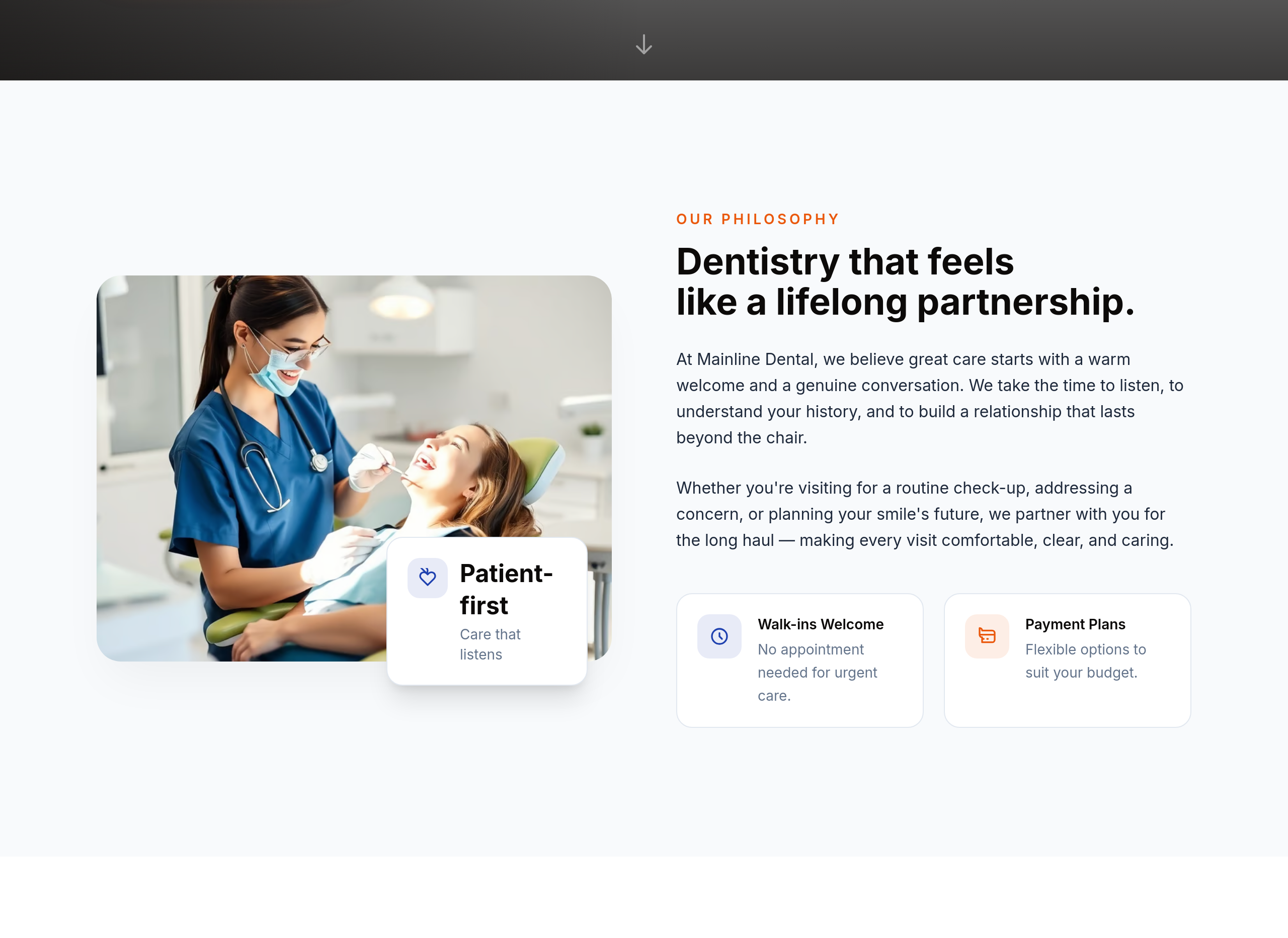
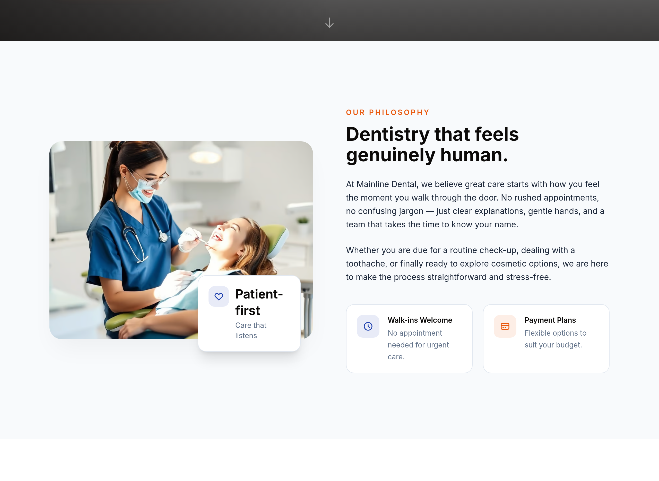
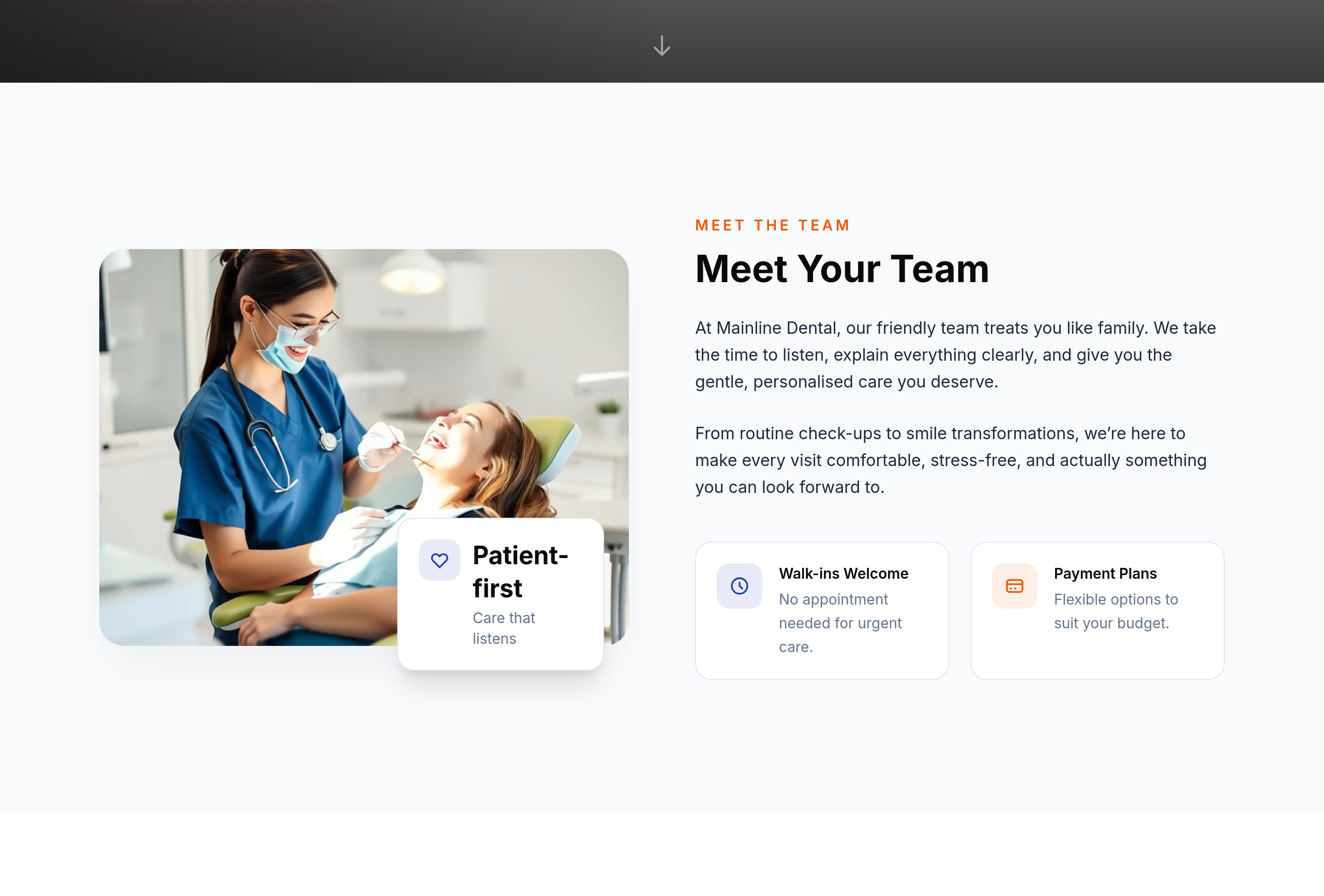
the about section is cold — make it warmer and emphasise our long-term patient relationships
Before
After
the about section is doctor-bio style — soften into 'meet your team' warmer voice

Before

After
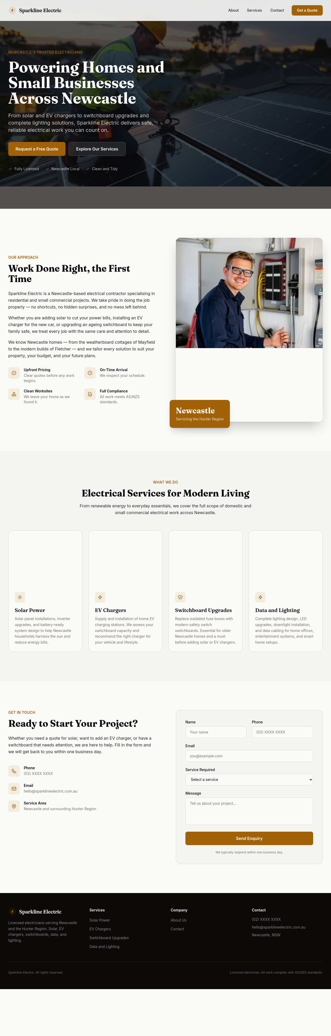
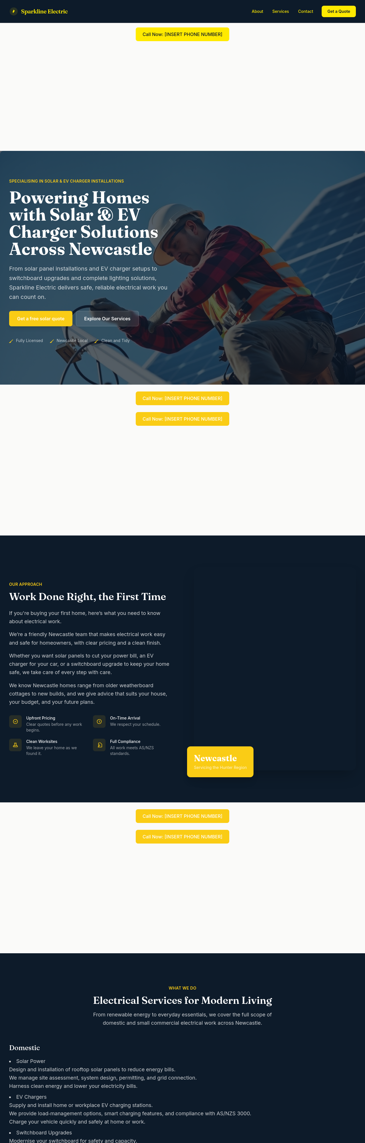
add a 'Get a free solar quote' CTA in the hero
Before
After
the meta description should mention licensed Newcastle electrician + solar + EV charger

Before

After
add a checkbox for marketing consent that defaults unchecked

Before

After
between every text section add a small full-width decorative image — divider photos
Before
After
between every text section add a small full-width decorative image — divider photos
Before
After
between every text section add a small full-width decorative image — divider photos
Before
After
between every text section add a small full-width decorative image — divider photos
Before
After
between every text section add a small full-width decorative image — divider photos
Before
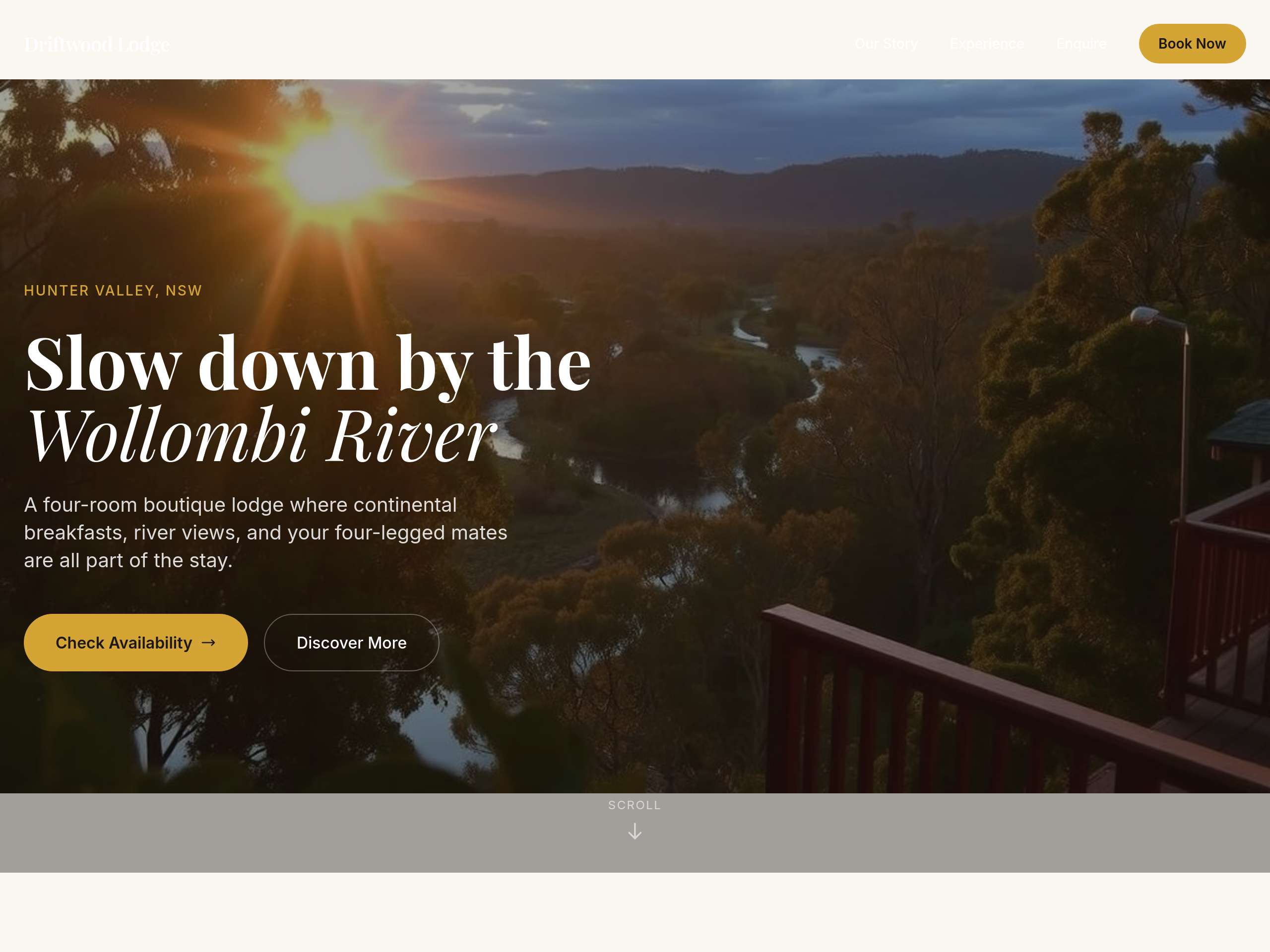
After
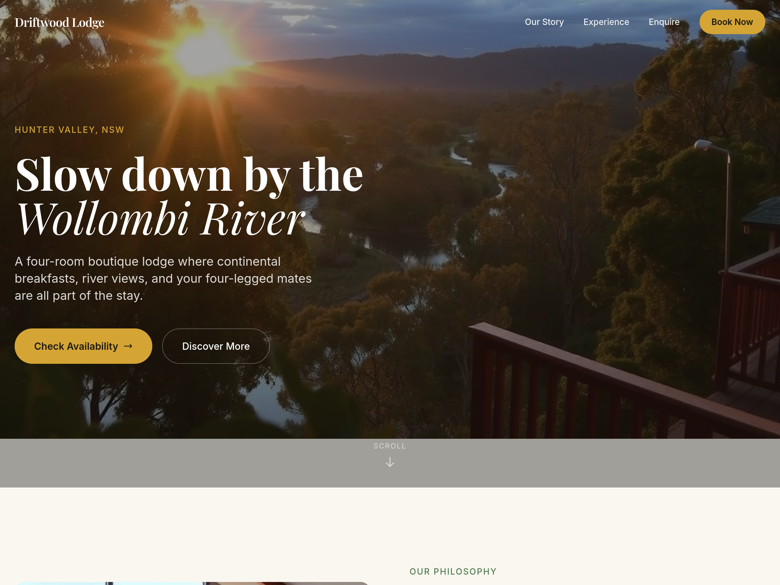
add 80px more space above and below the hero
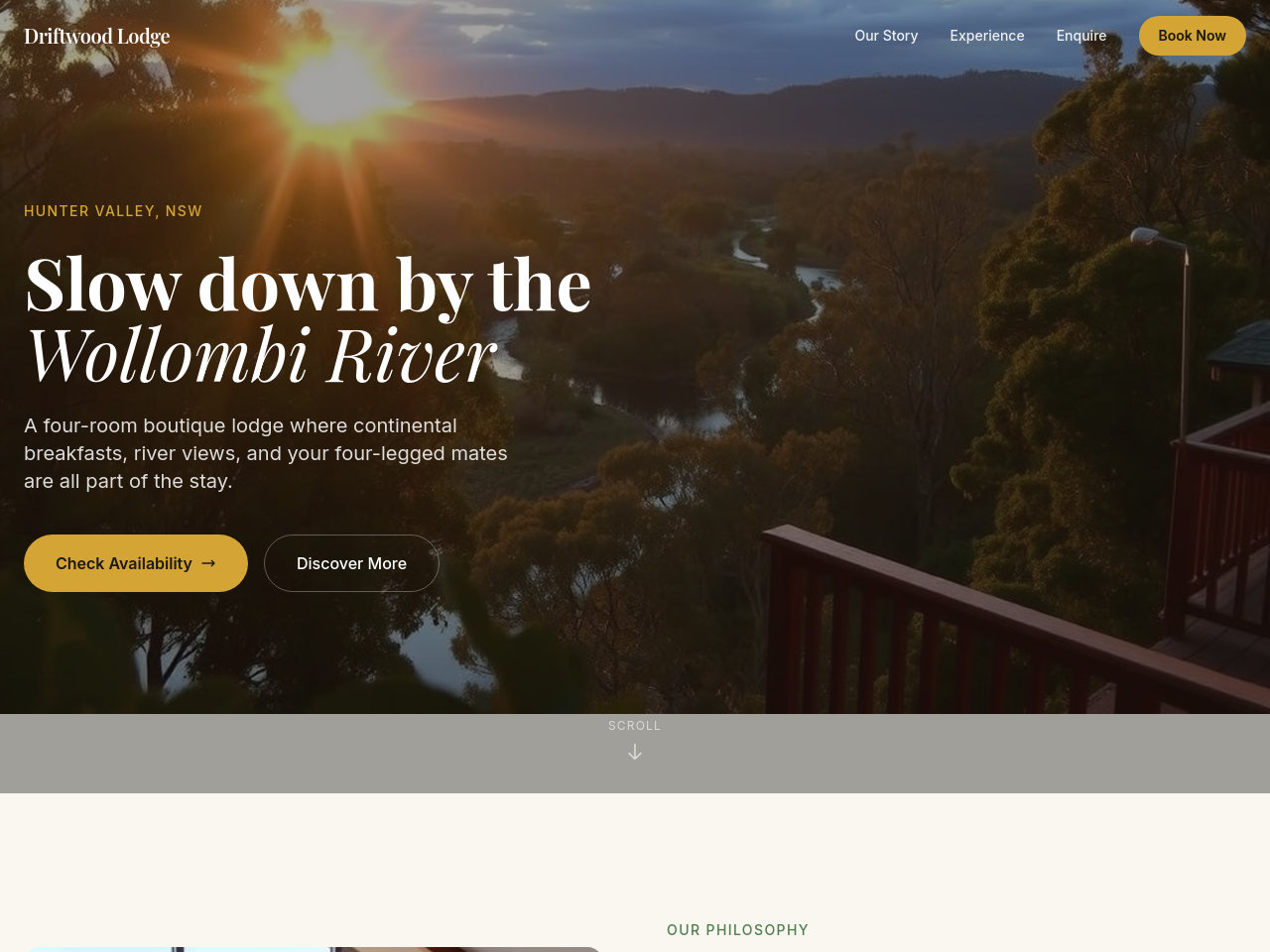
Before
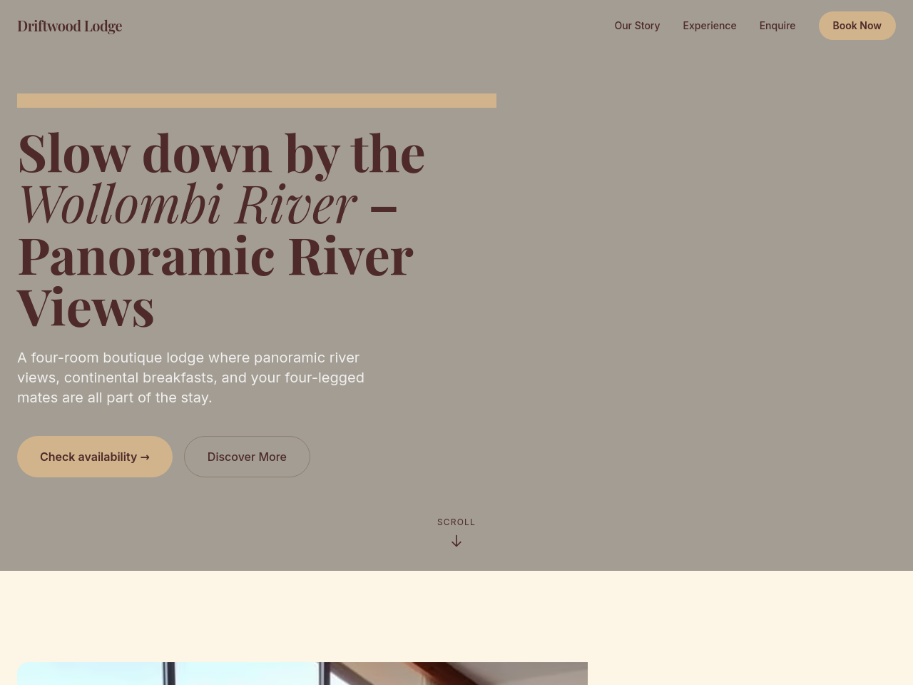
After
add a hero gallery of 4 images rotating: river view dawn, breakfast plate, room interior, deck at sunset
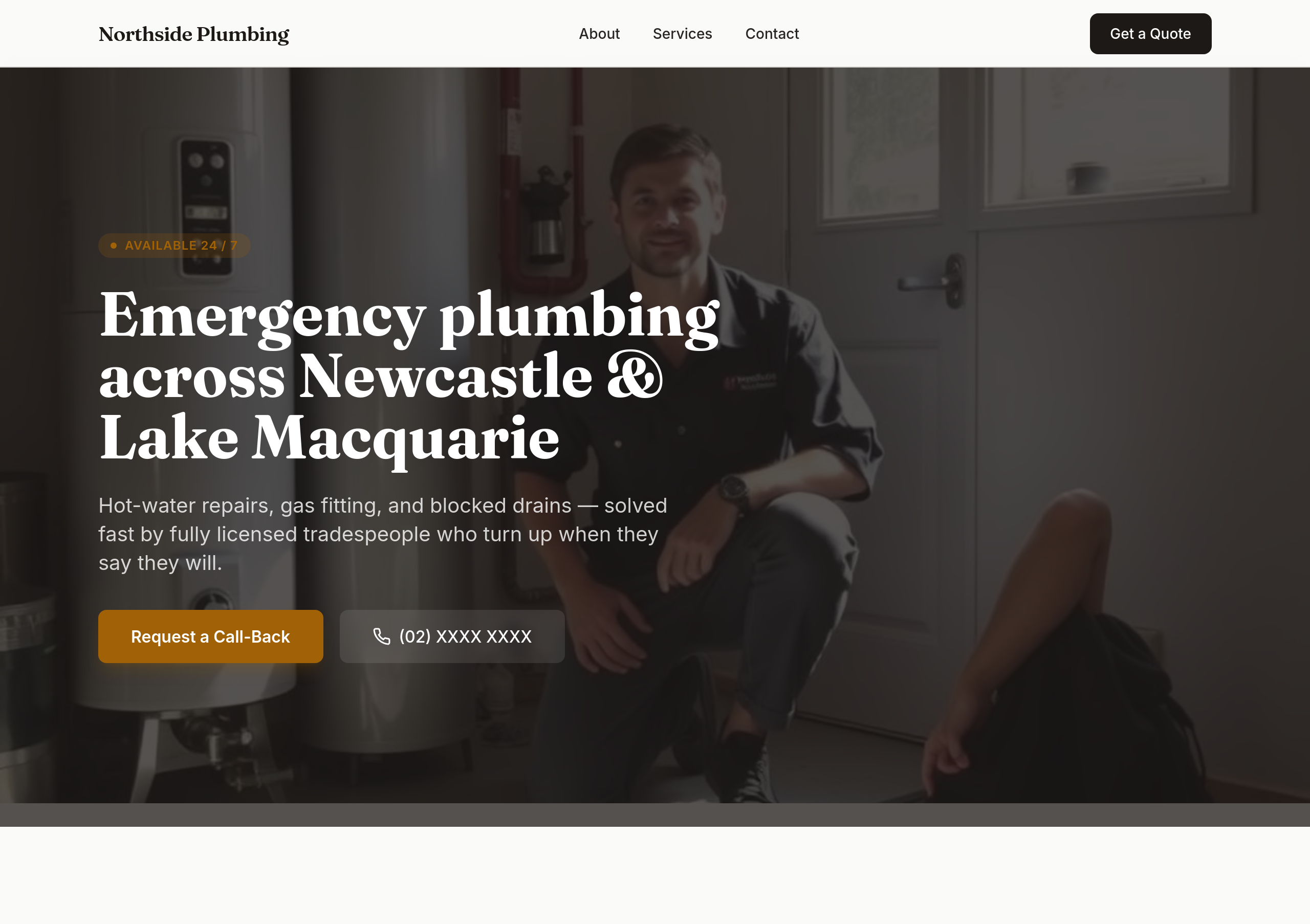
Before
After
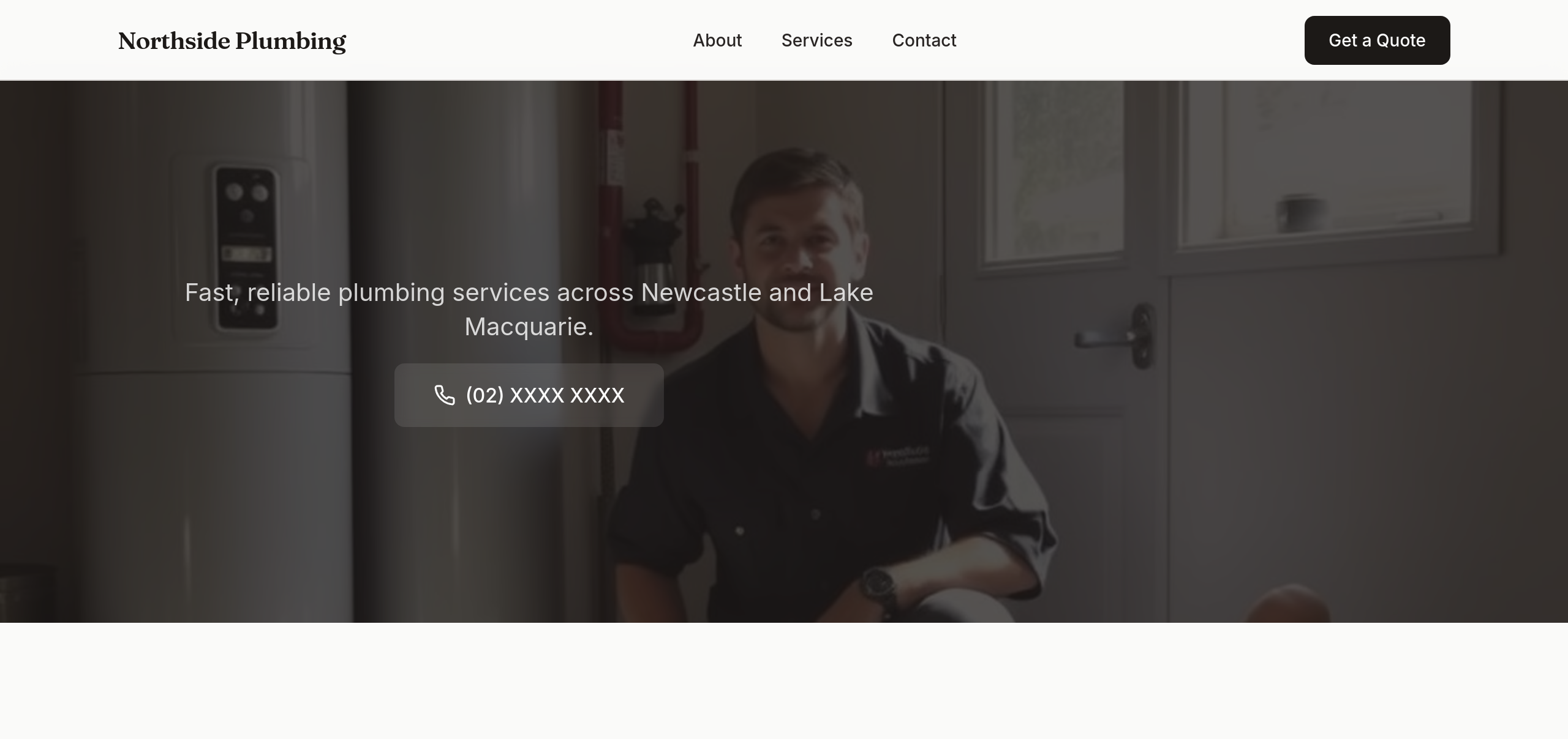
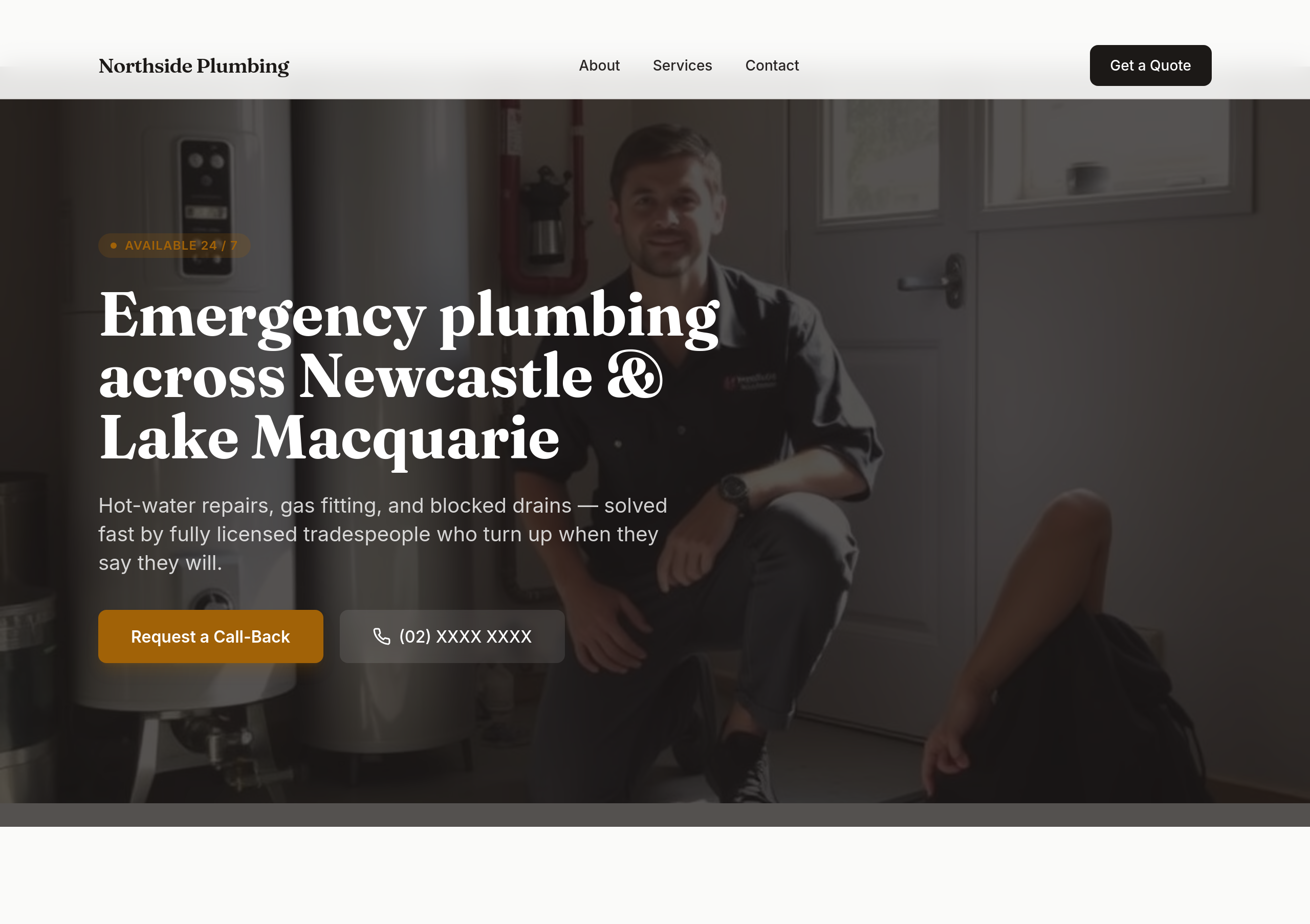
rewrite the hero as a single short sentence + a phone number — that's it
Before
After
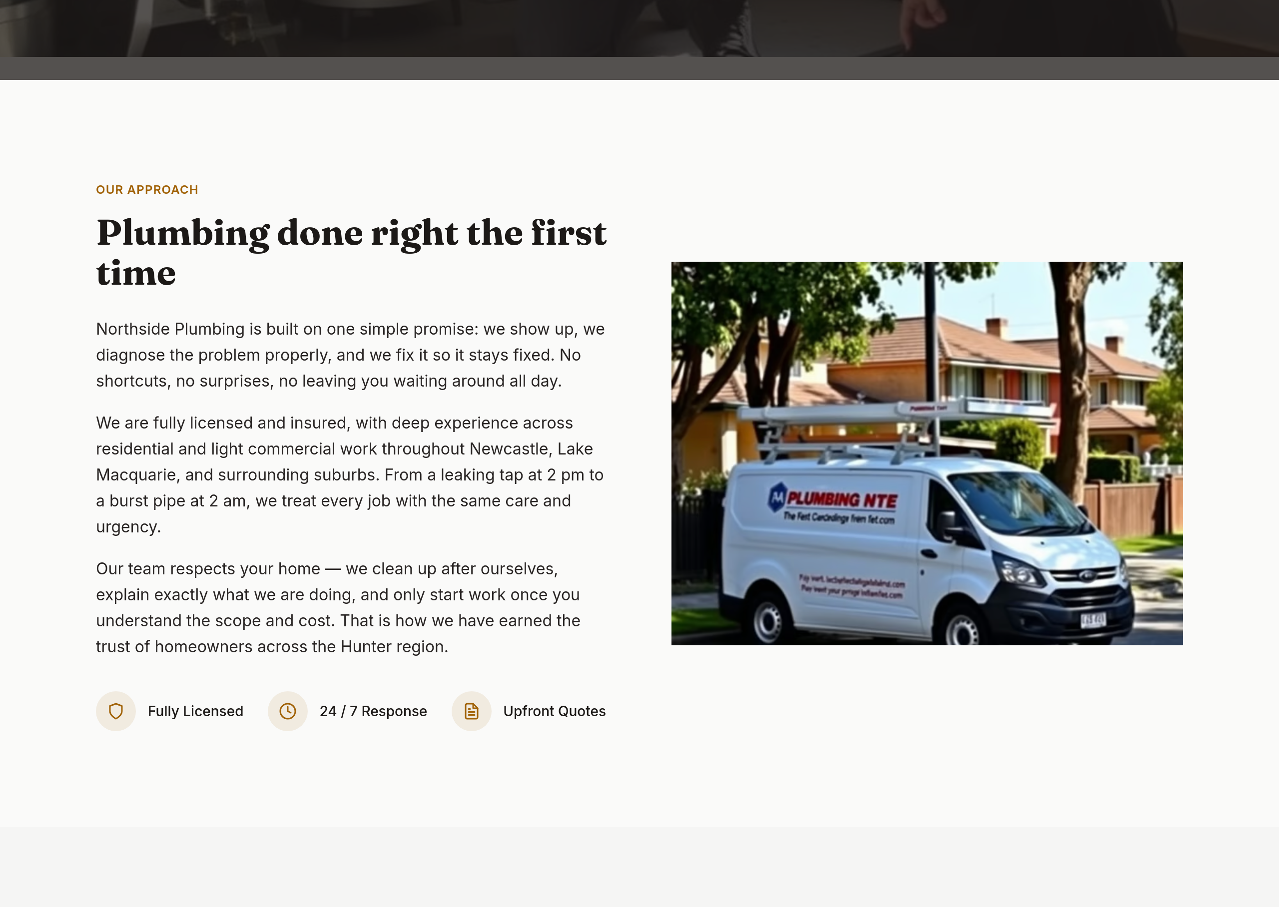
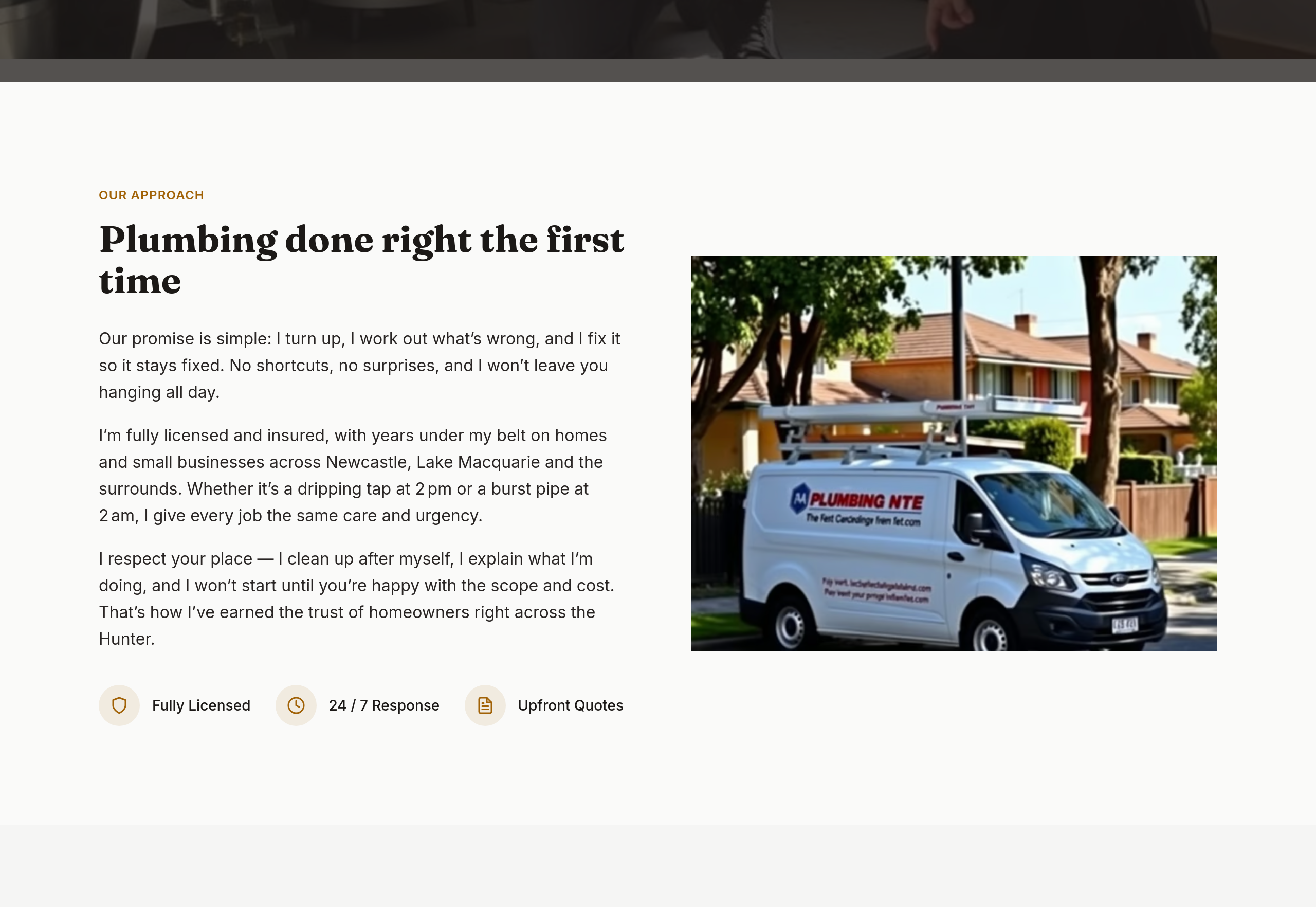
the about section is stiff — make it sound like one tradie introducing his crew
Before
After
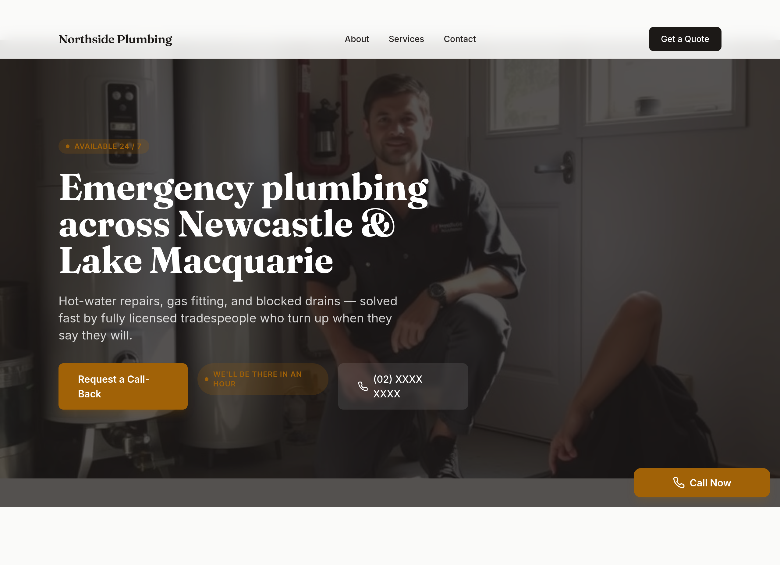
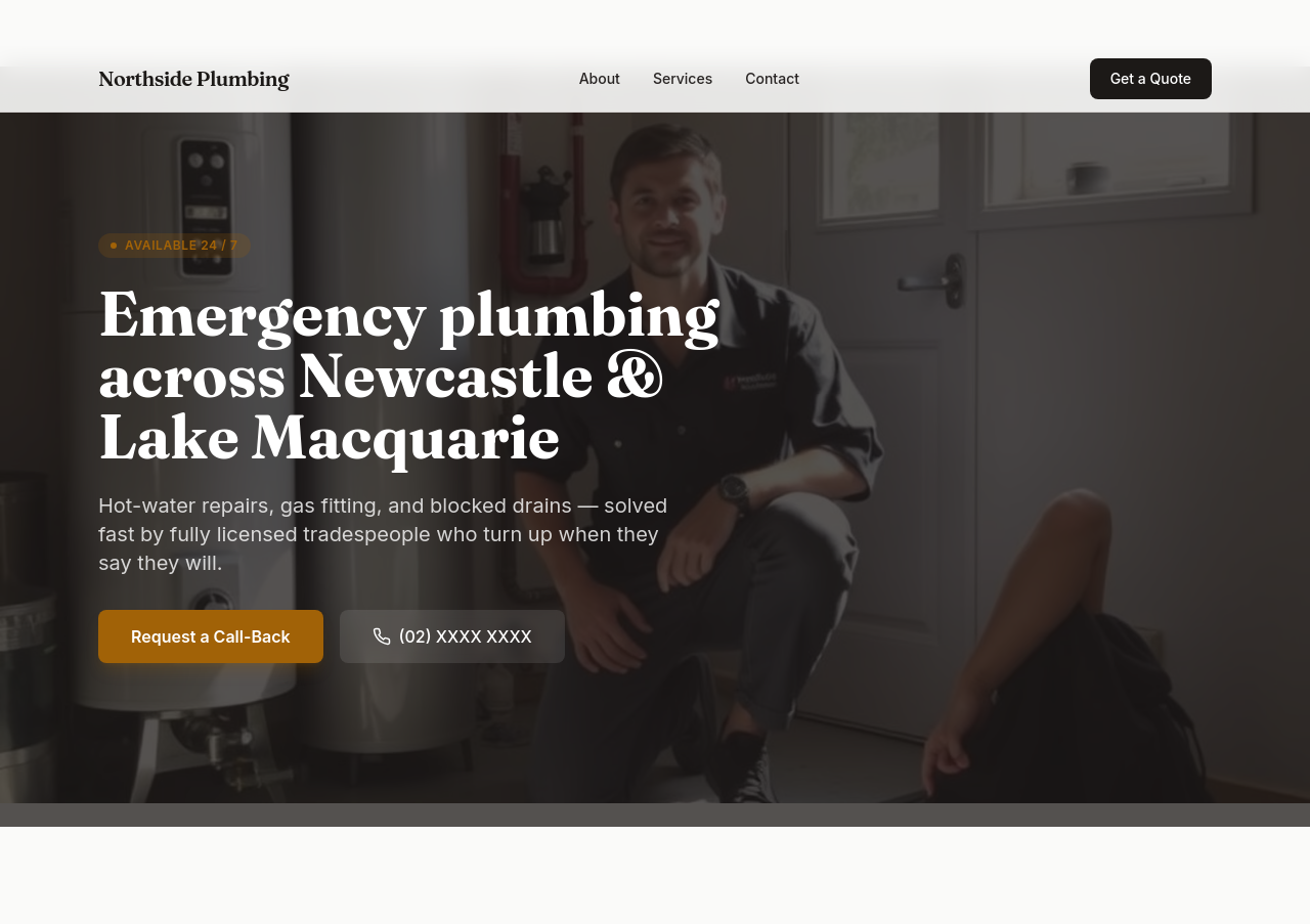
the site should scream 'we'll be there in an hour' — phone in hero, response-time guarantee, sticky phone button
Before
After
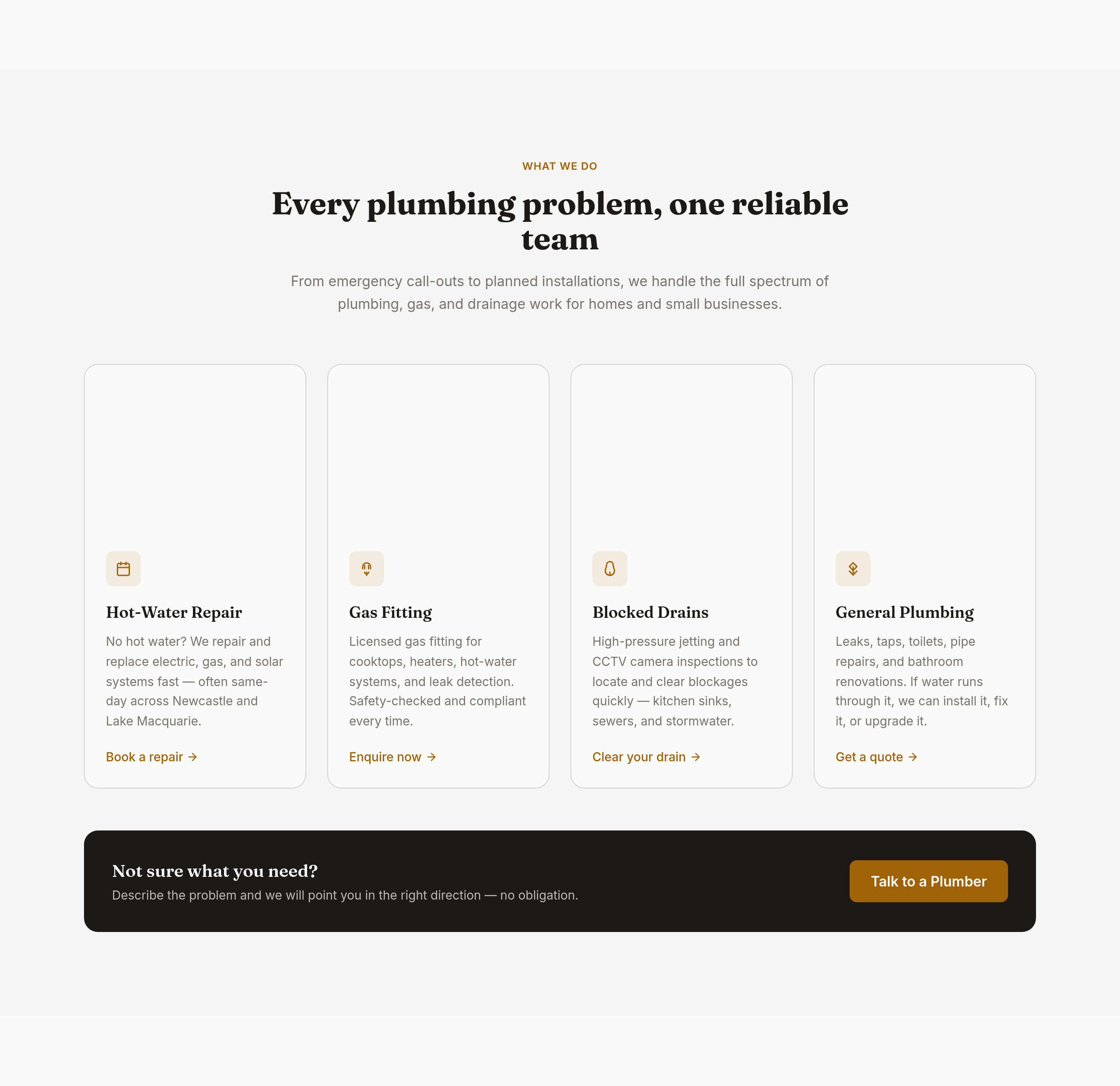
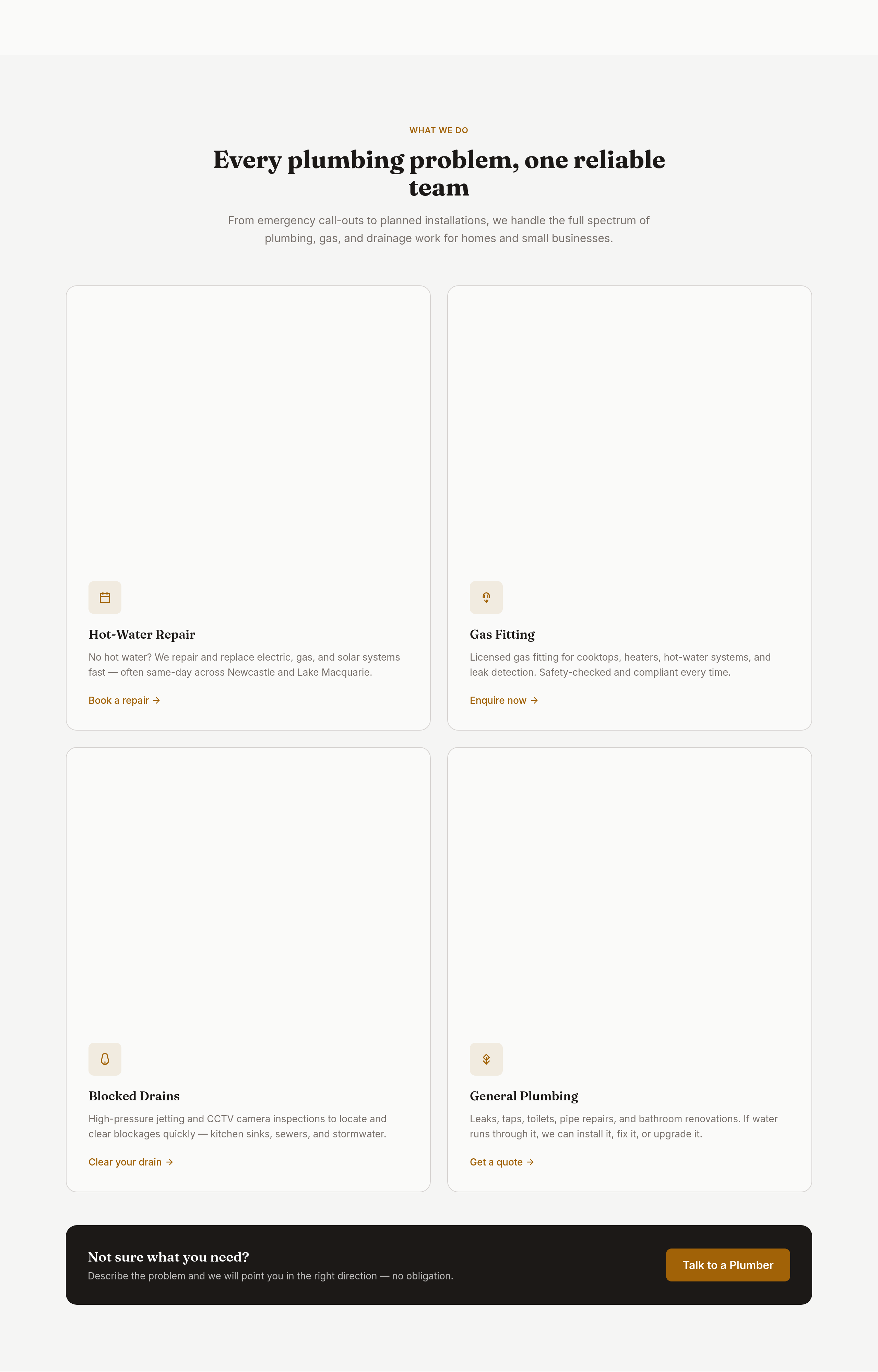
the services grid is 3 columns — too many; make it 2 columns of bigger cards with icons
Before
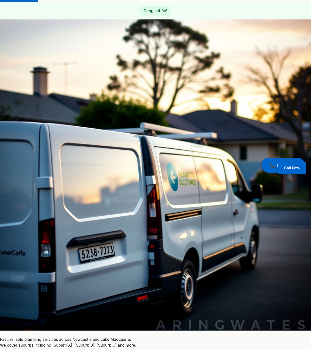
After
add a 'Book online' button as an alternative for non-emergency jobs
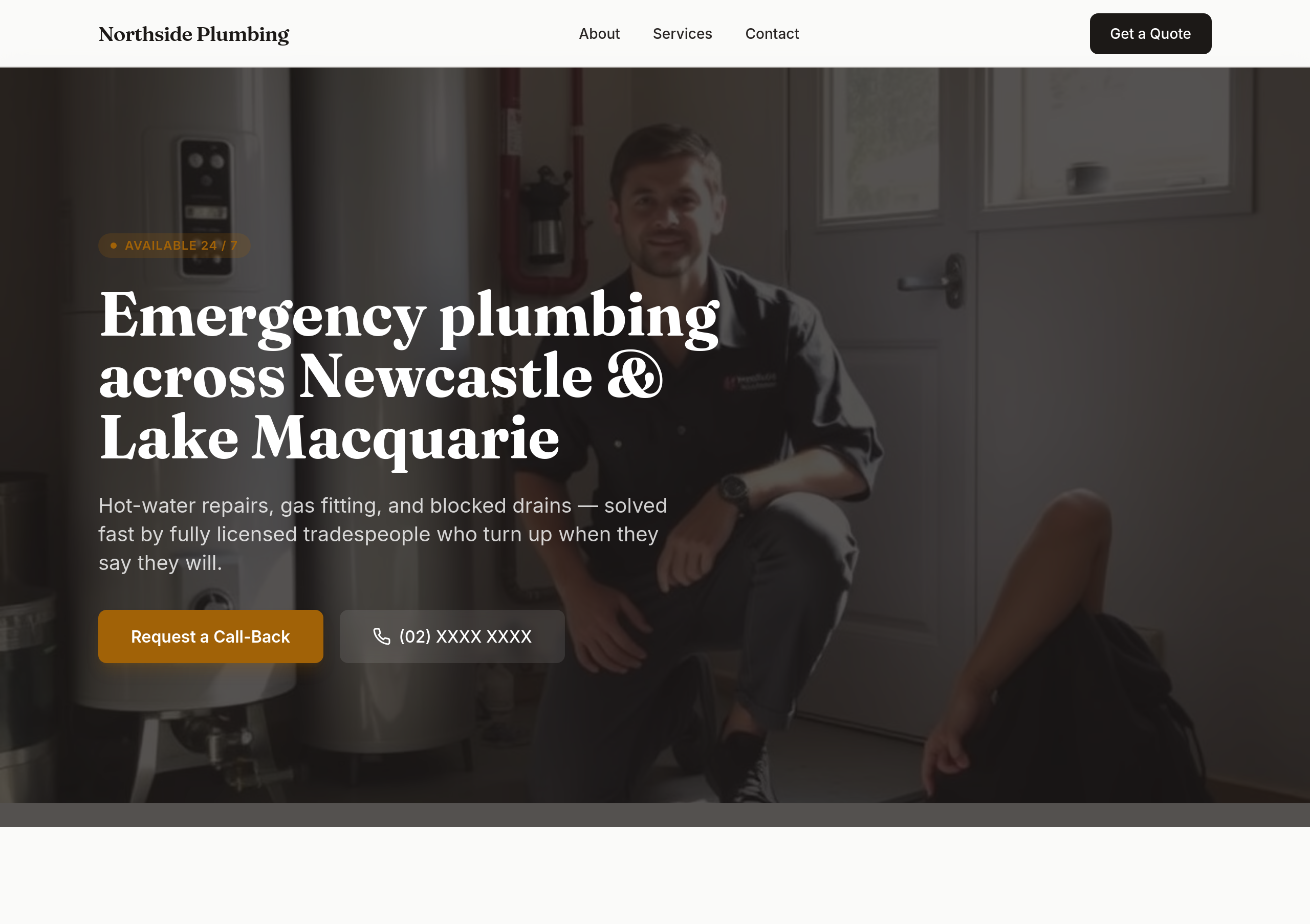
Before
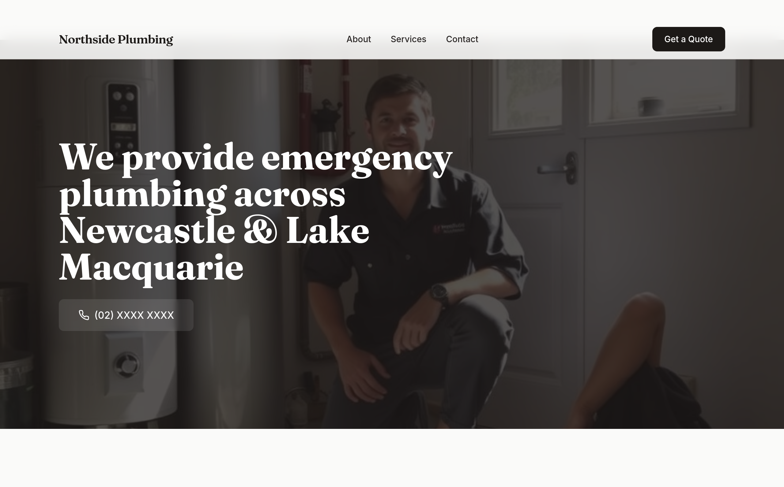
After
the hero is wordy — strip to a single sentence + the phone number
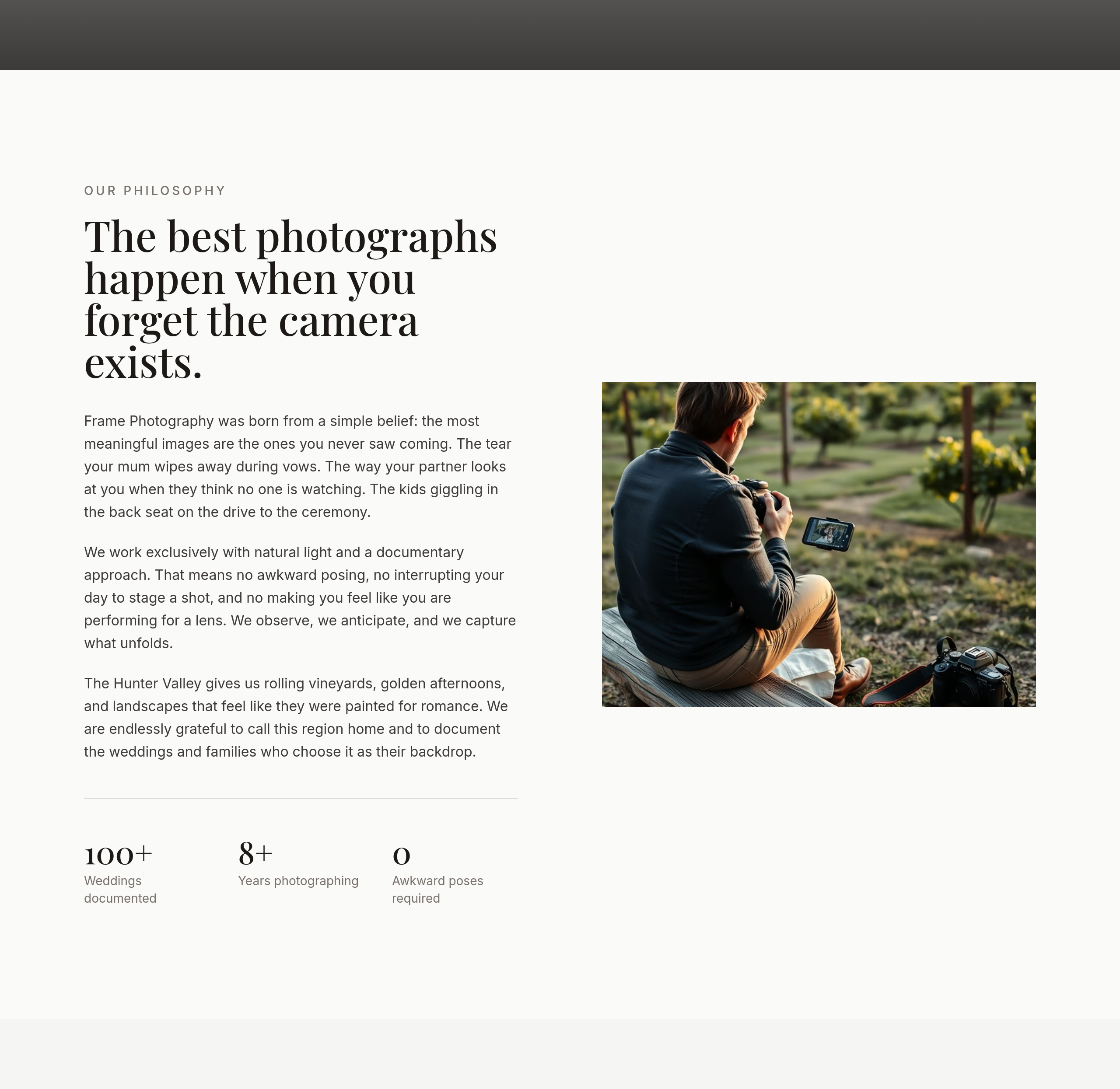
Before
After
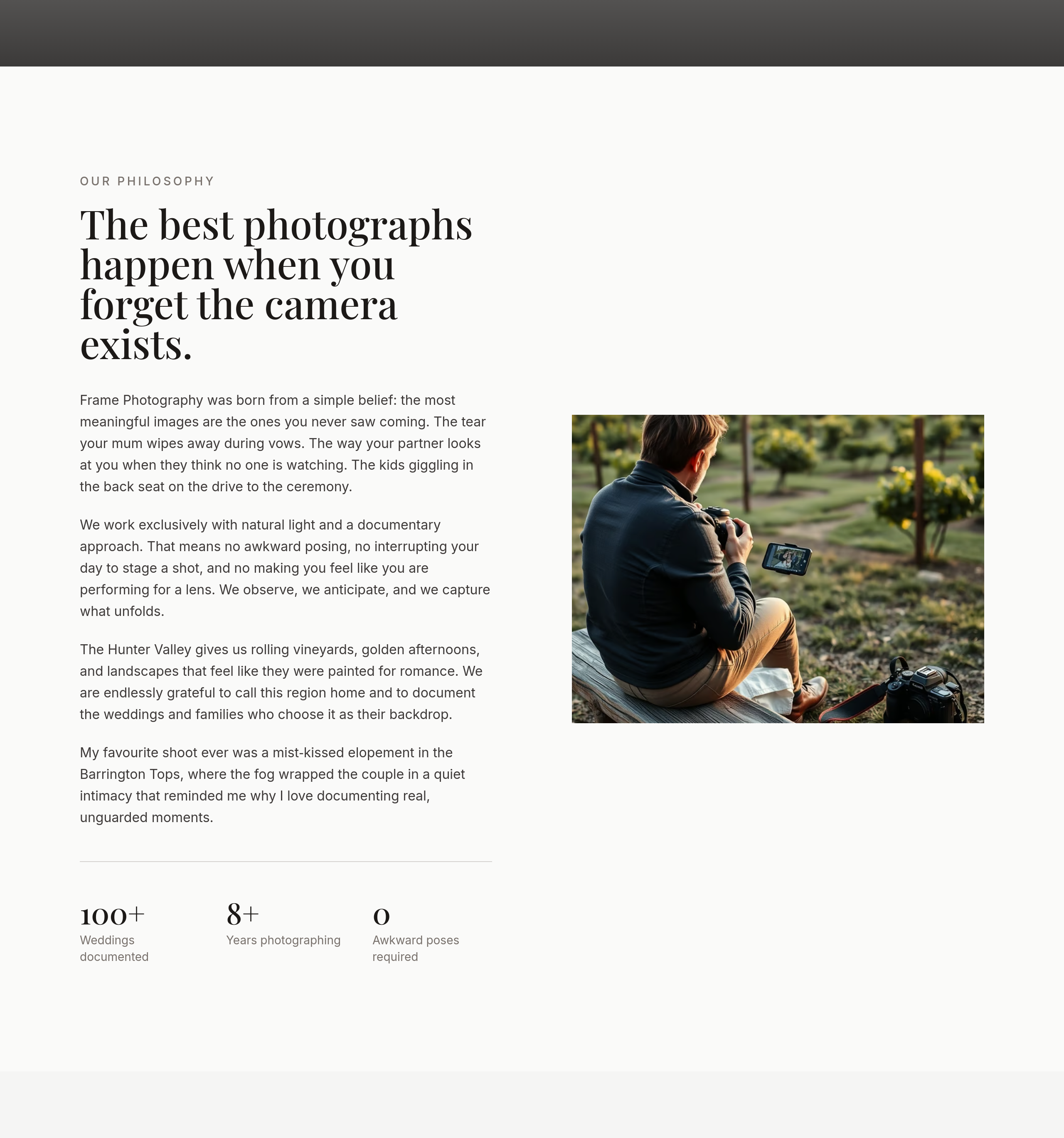
the about section is professional bio — add 1 personal sentence (favourite shoot ever, why this work matters)

Before

After
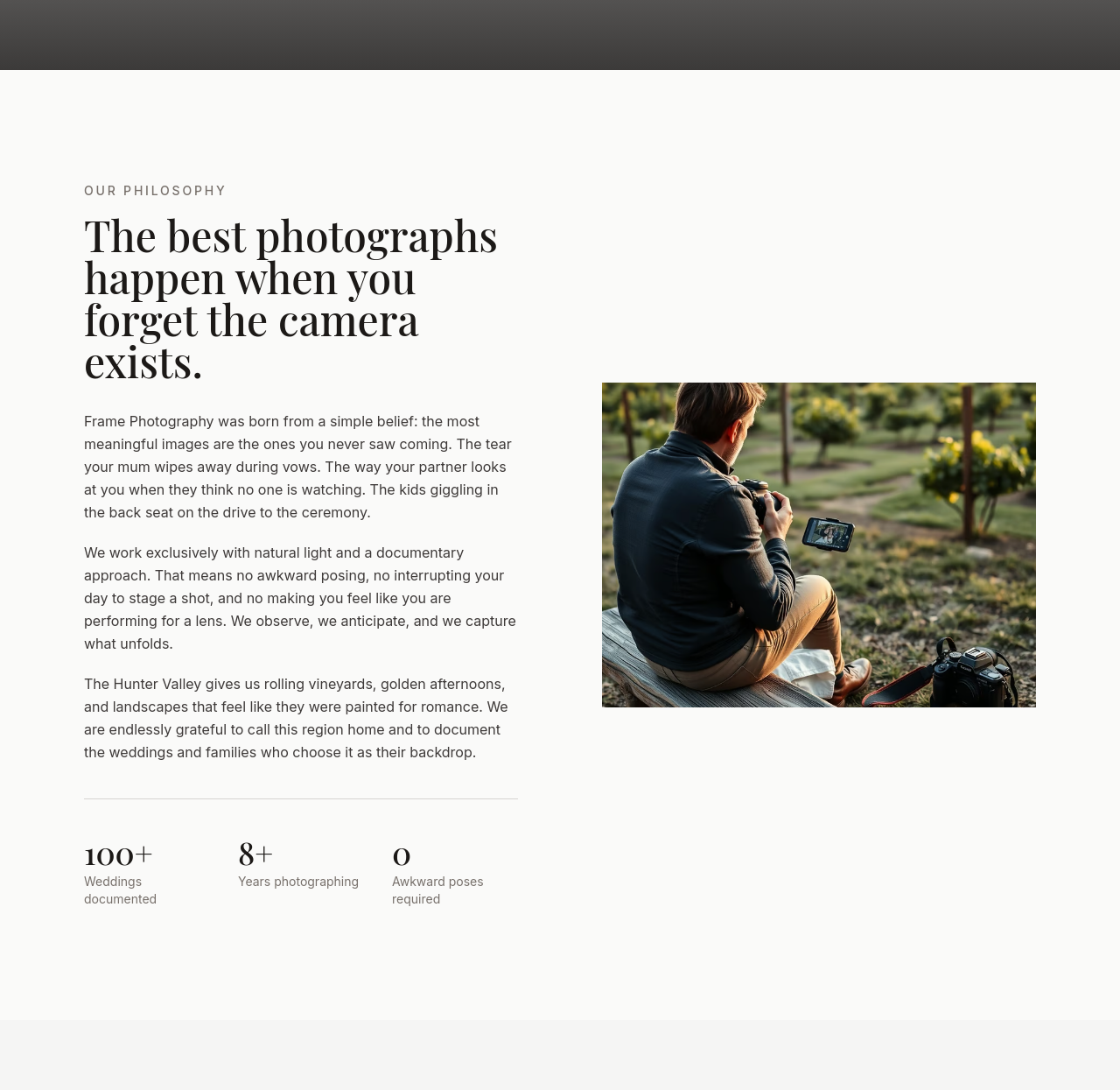
every section ends with 'Call (02) XXXX XXXX' as a soft secondary CTA
Before
After
every section ends with 'Call (02) XXXX XXXX' as a soft secondary CTA
Before
After
every section ends with 'Call (02) XXXX XXXX' as a soft secondary CTA
Before
After
every section ends with 'Call (02) XXXX XXXX' as a soft secondary CTA
Before
After
every section ends with 'Call (02) XXXX XXXX' as a soft secondary CTA
Before
After
every section ends with 'Call (02) XXXX XXXX' as a soft secondary CTA
Before
After
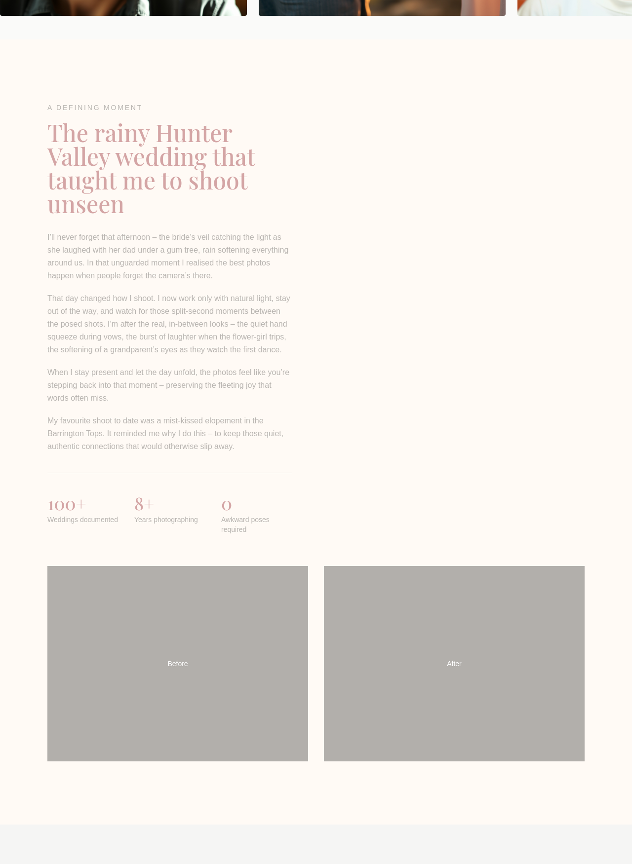
the about section is too detached — make it sound like the photographer's own voice

Before

After
add a contact CTA to the hero AND make the whole tone warmer + less corporate
Before
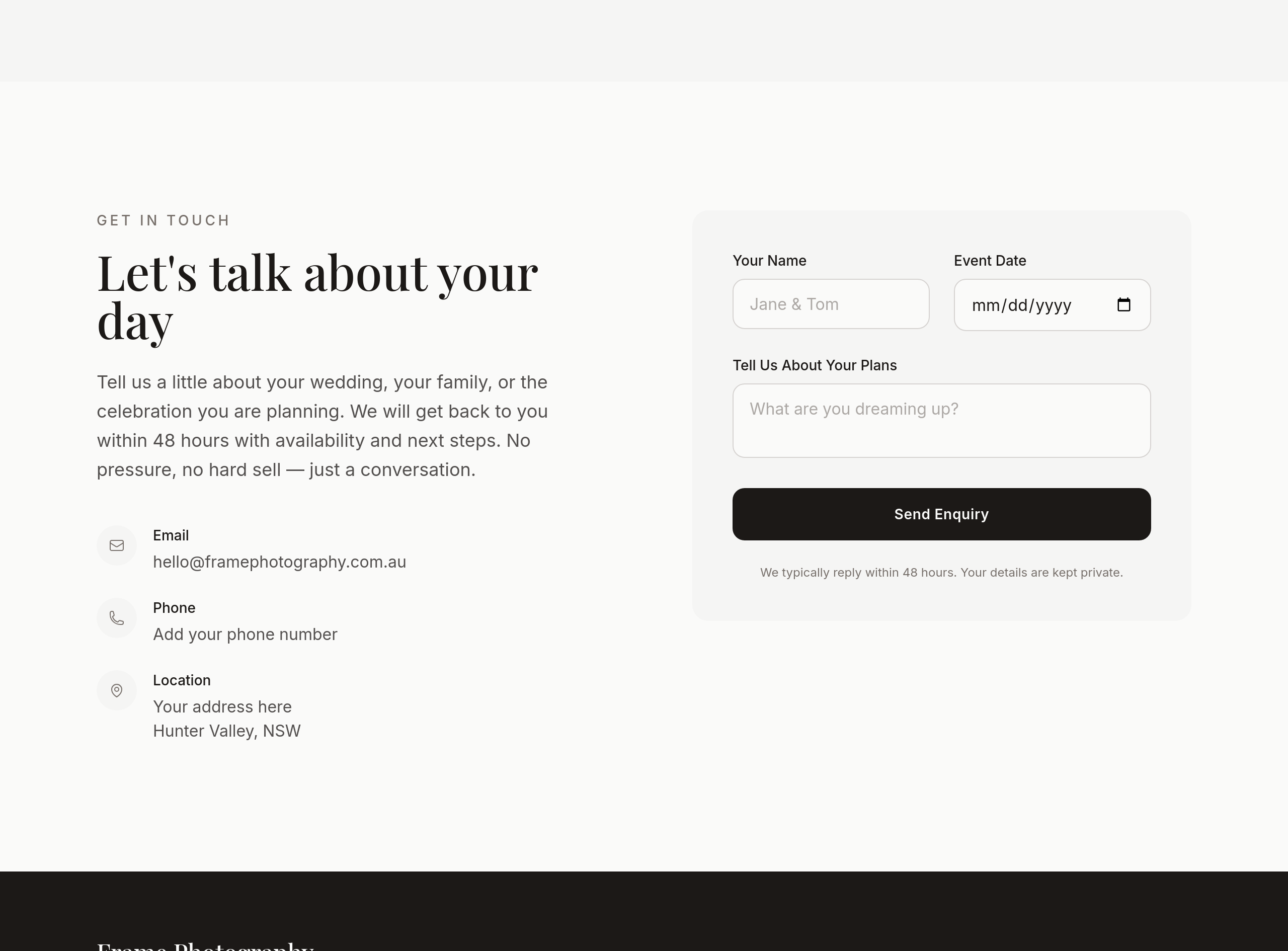
After
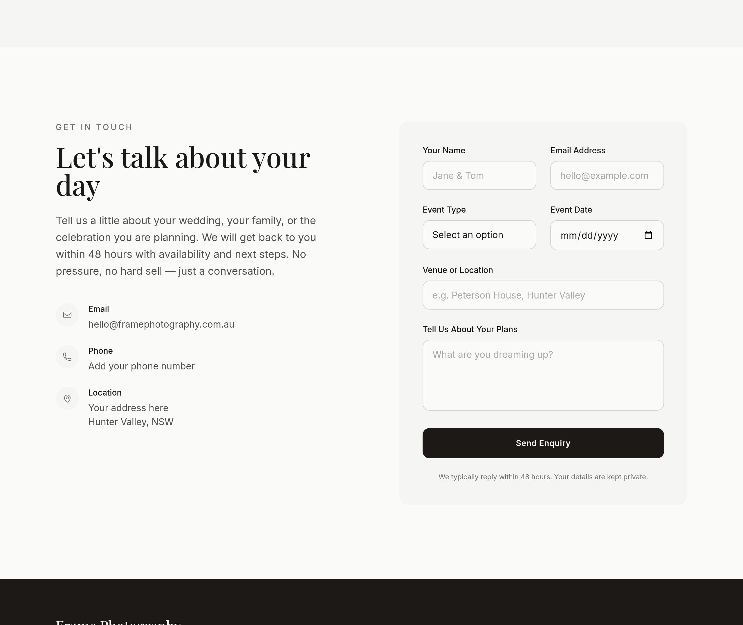
the contact section asks for too much info upfront — pare to name + date + 1 line
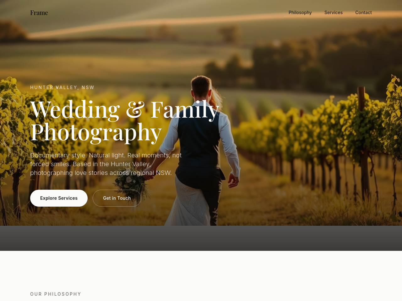
Before
After
add a soft black-and-white film-style hero image of an embrace

Before

After
add a stacked image collage — 3 vertical portraits side by side at the top of the about
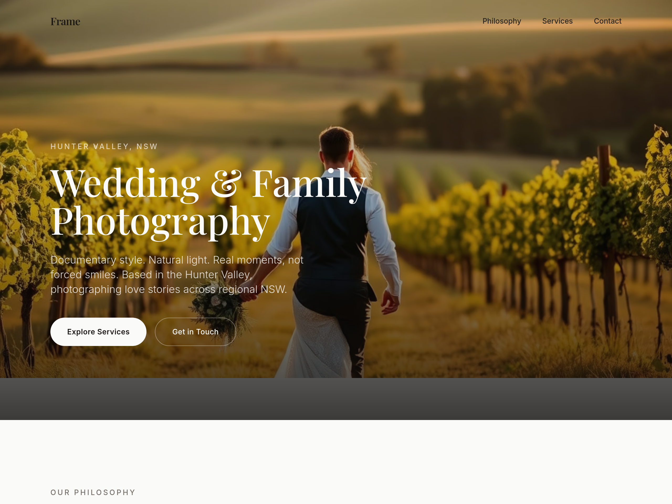
Before
After
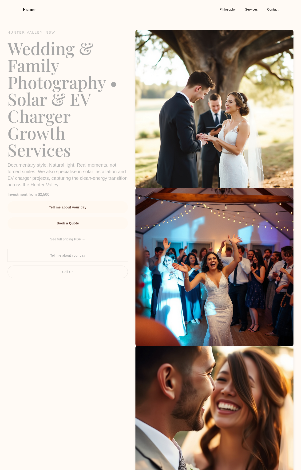
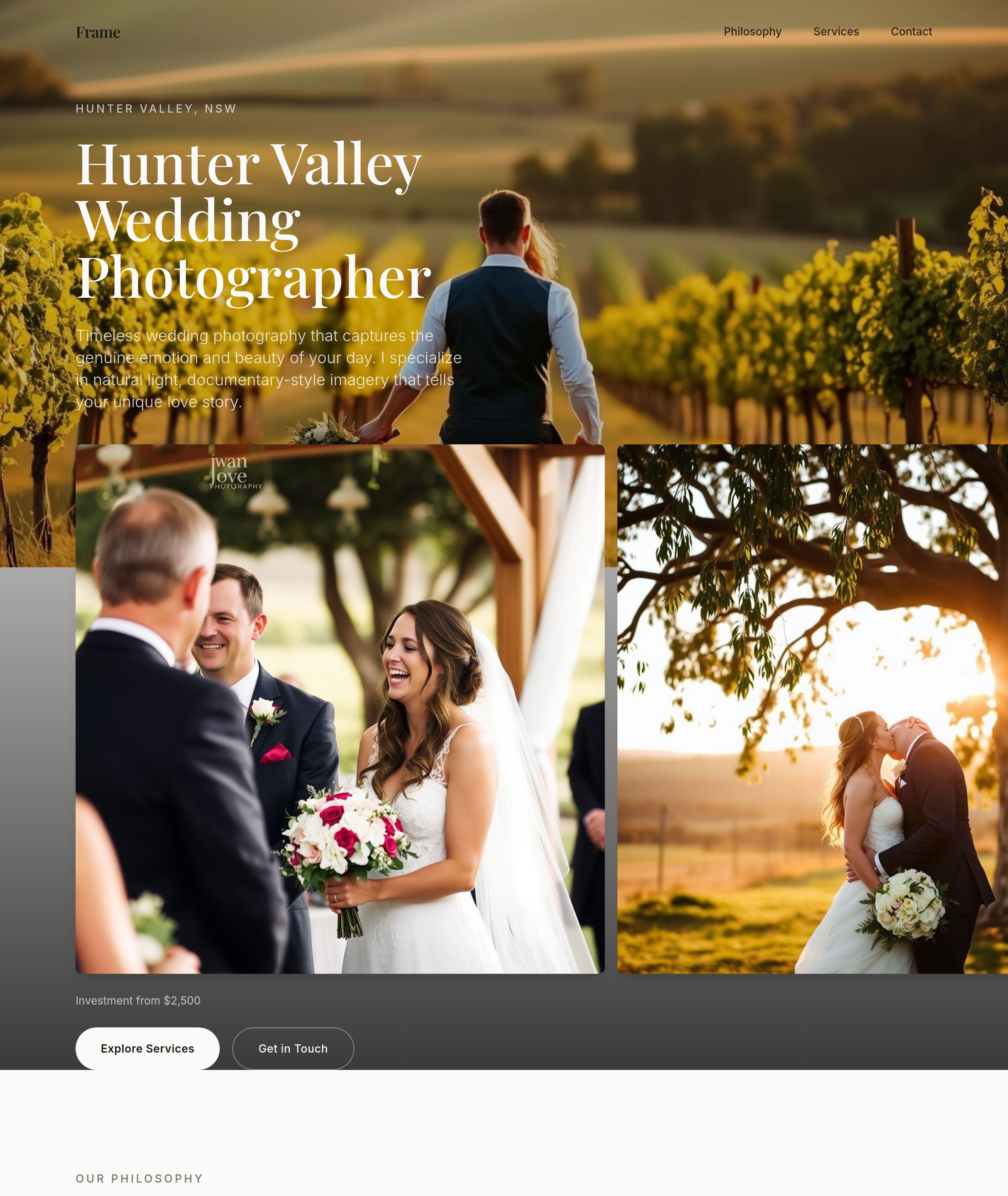
the wedding section needs love — rewrite copy + add 3 images + a 'investment from' line
Before
After
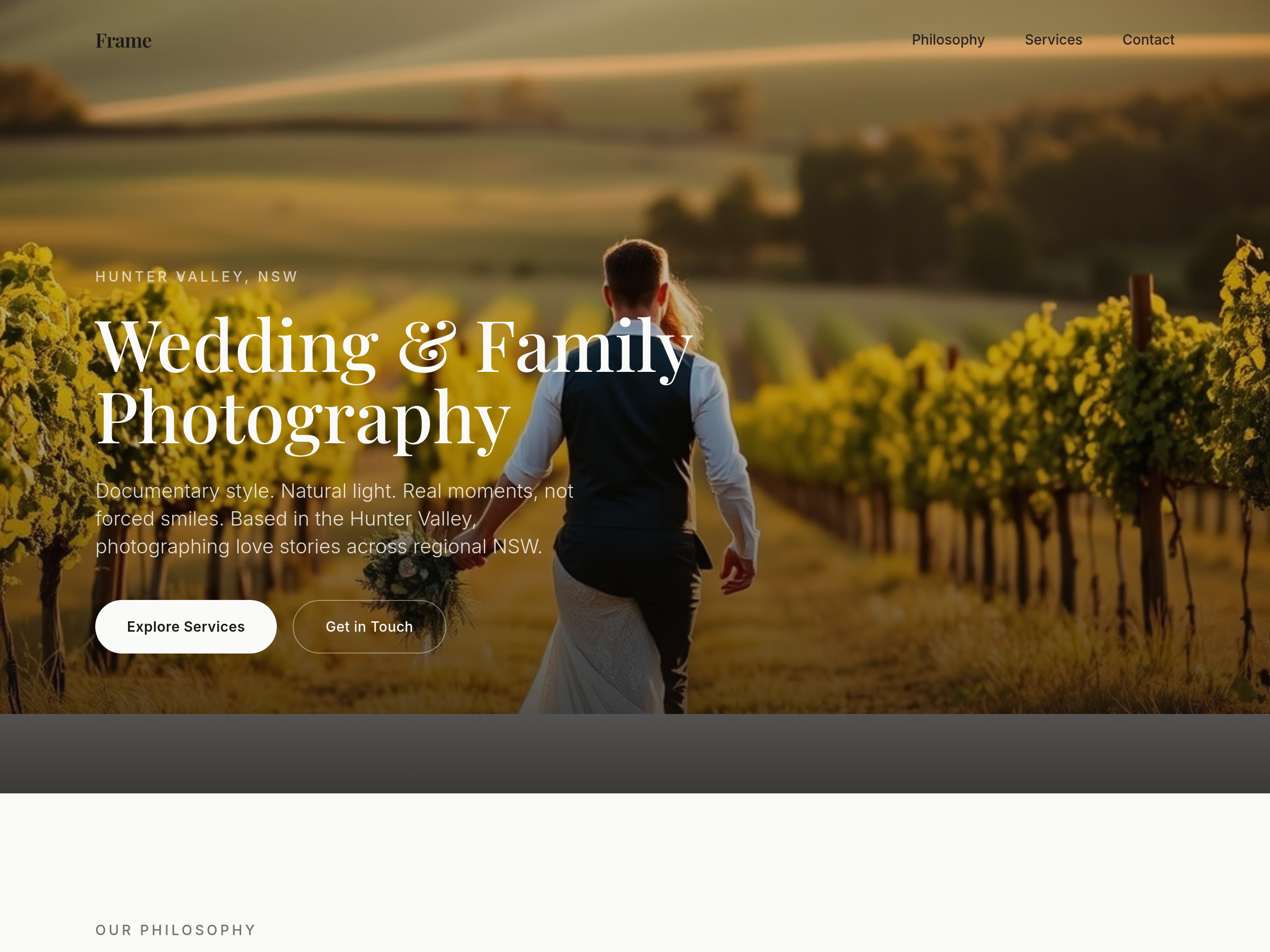
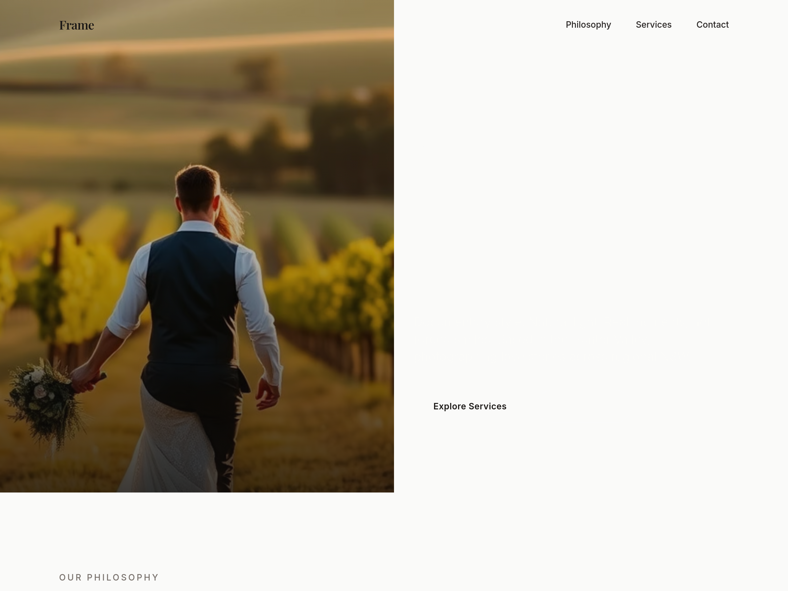
the hero is centered — make it a 2-column layout with copy left, image right

Before

After
focus rings are invisible — add a clear 2px accent-coloured ring with 2px offset
Before
After
focus rings are invisible — add a clear 2px accent-coloured ring with 2px offset
Before
After
focus rings are invisible — add a clear 2px accent-coloured ring with 2px offset
Before
After
focus rings are invisible — add a clear 2px accent-coloured ring with 2px offset
Before
After
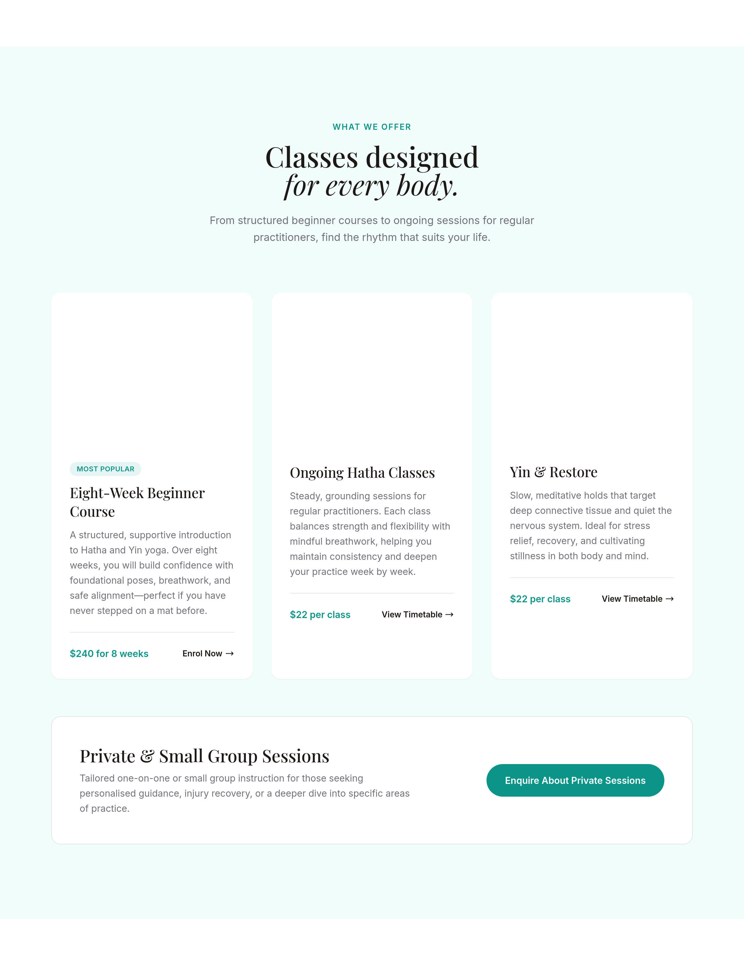
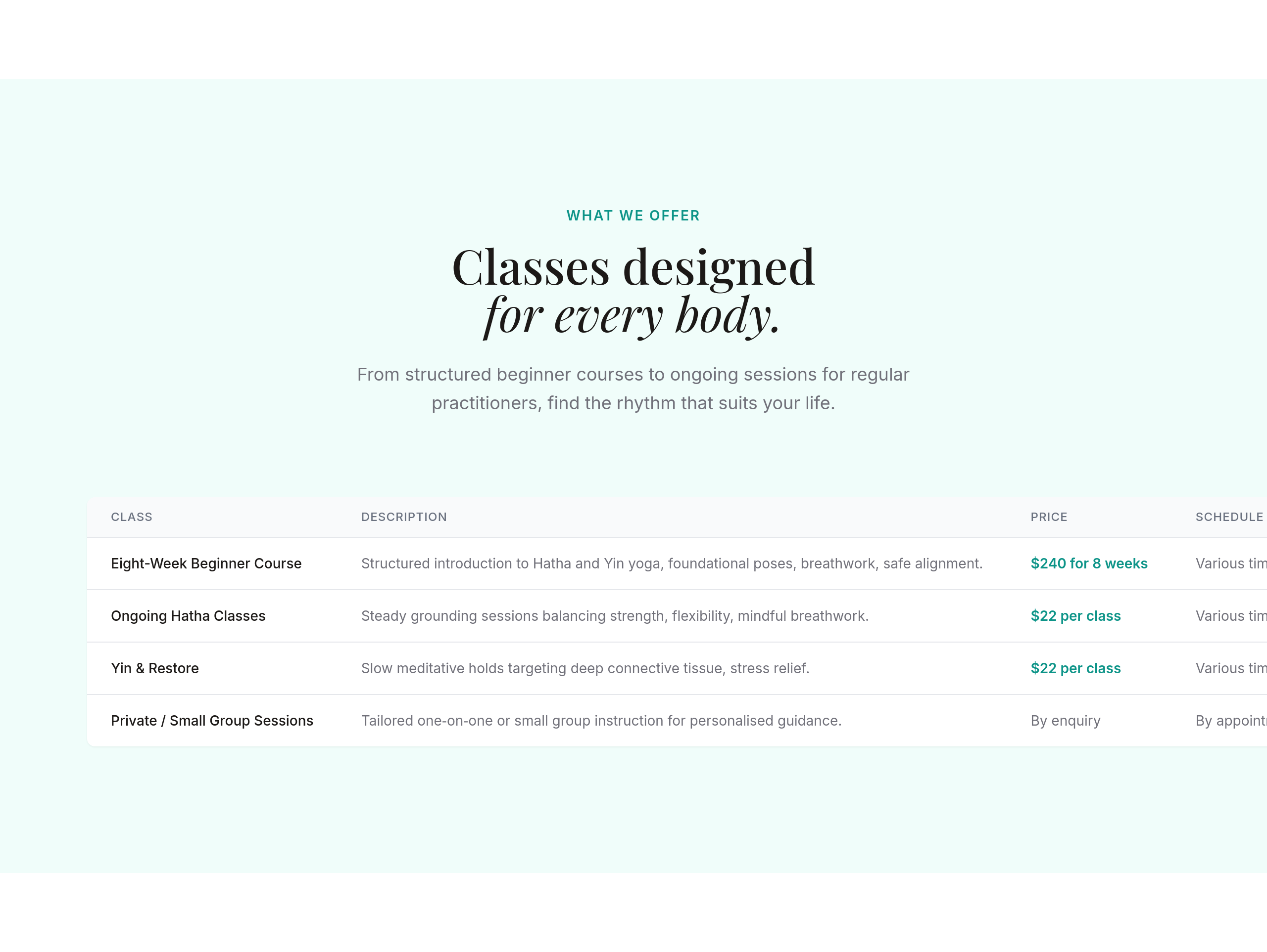
the class schedule should be a clean table, not paragraphs