brand-style
40 examples.
Showing all 40
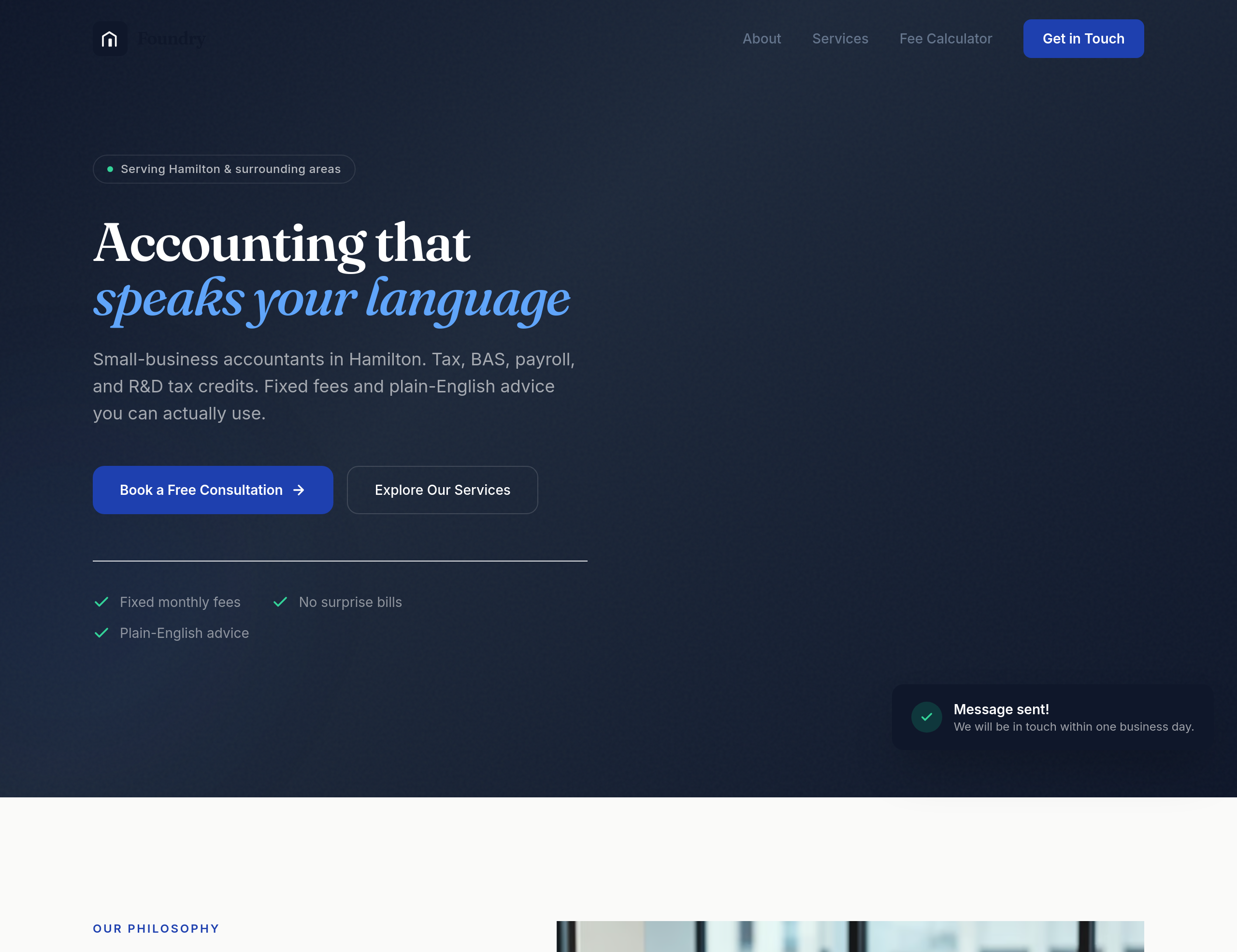
Before
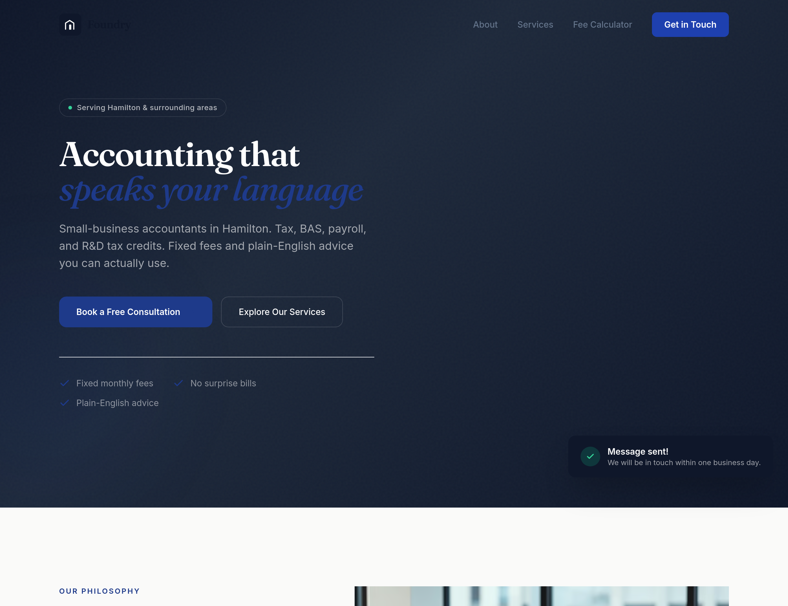
After
the design feels too corporate-blue — use a warmer navy + cream palette
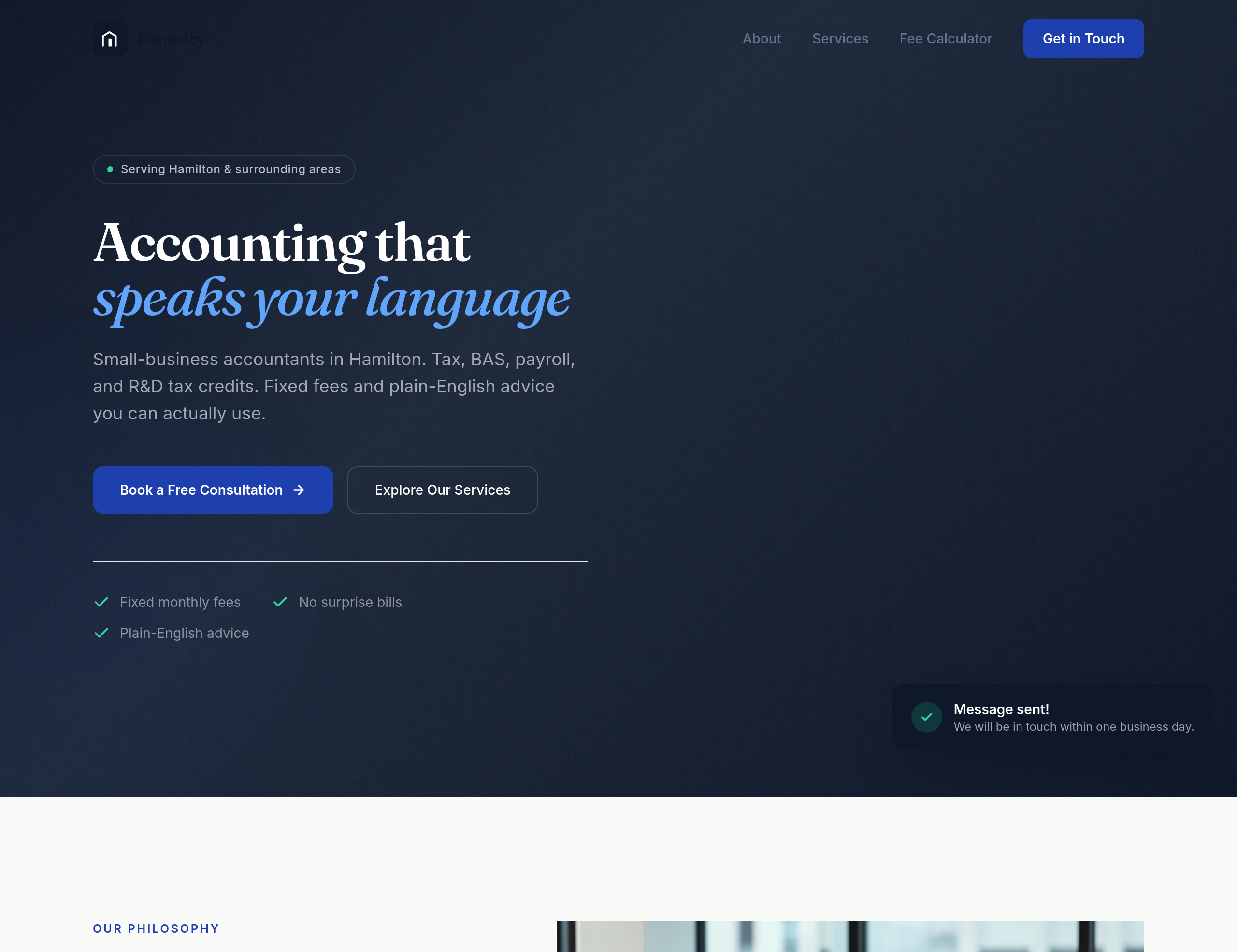
Before
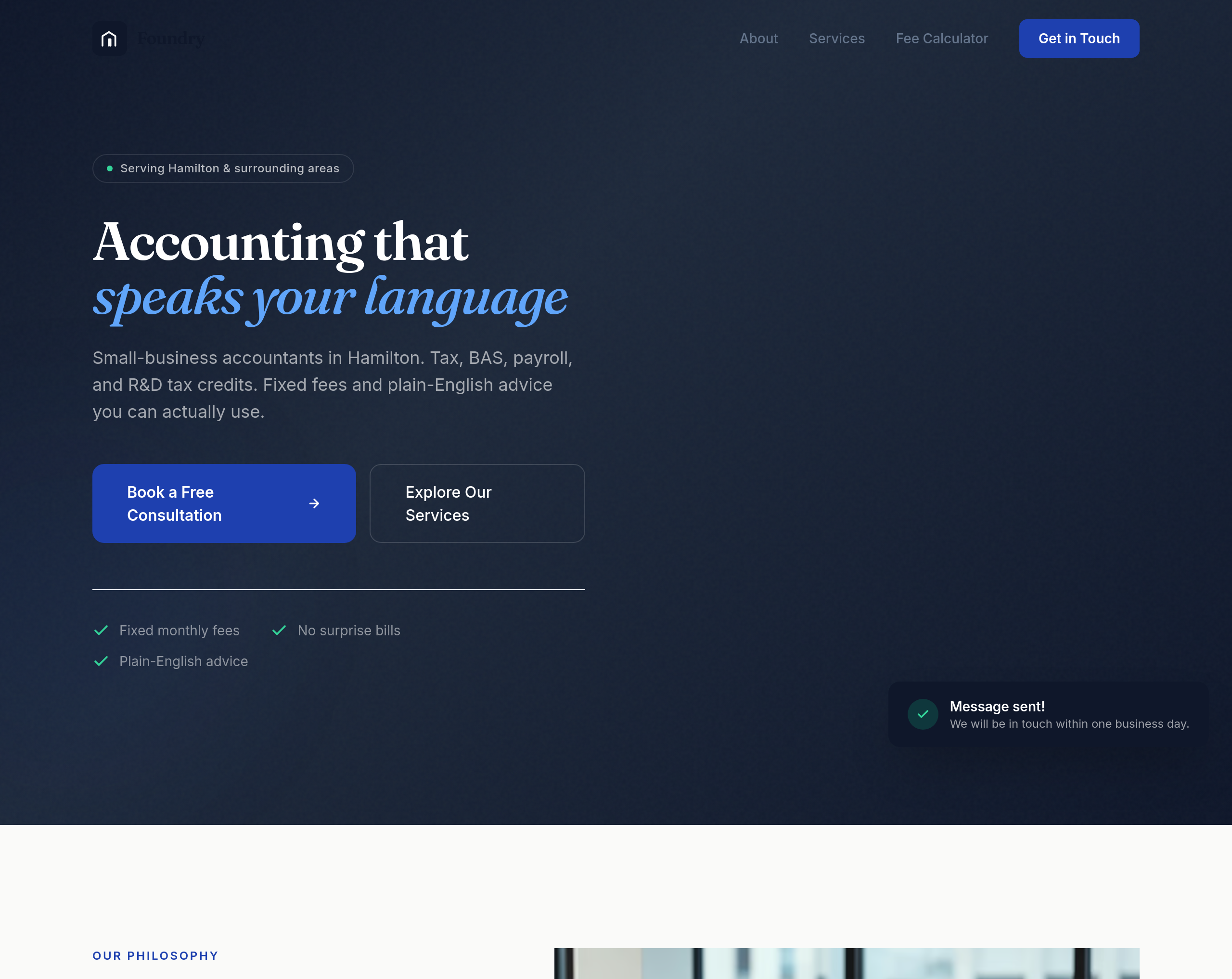
After
the buttons are too small — make them feel substantial without being clunky
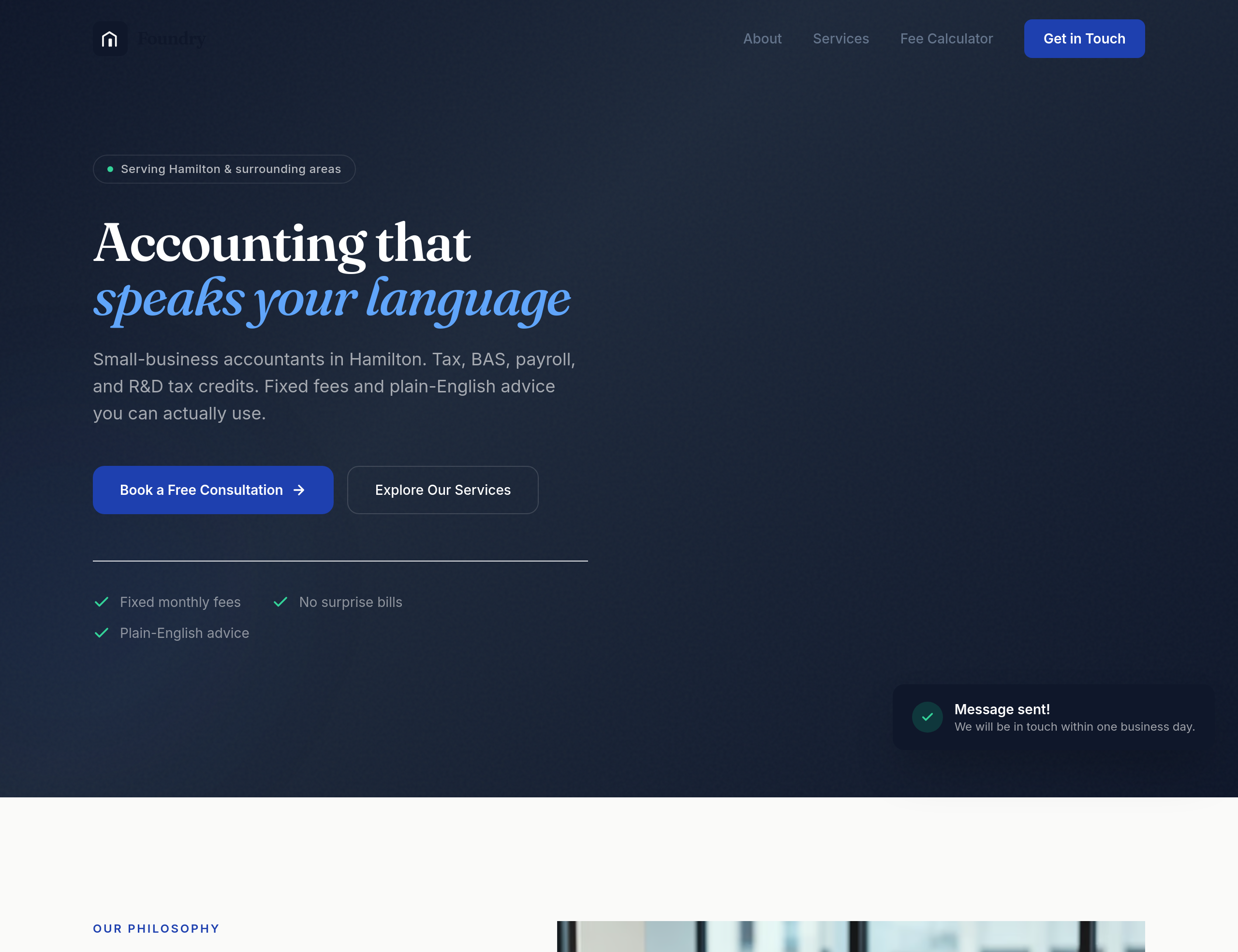
Before
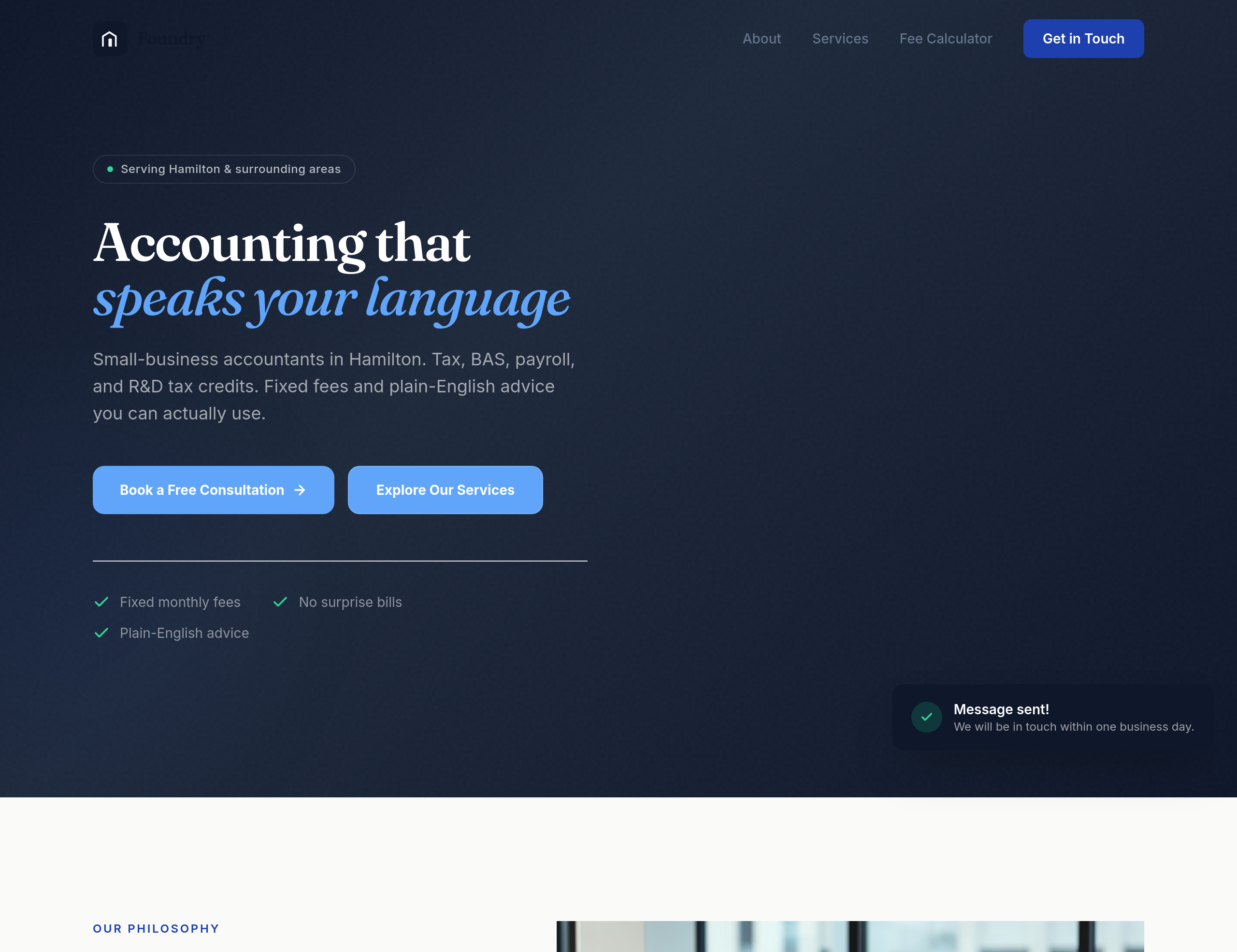
After
the buttons feel generic — give them a subtle accounting-blue with a confident weight
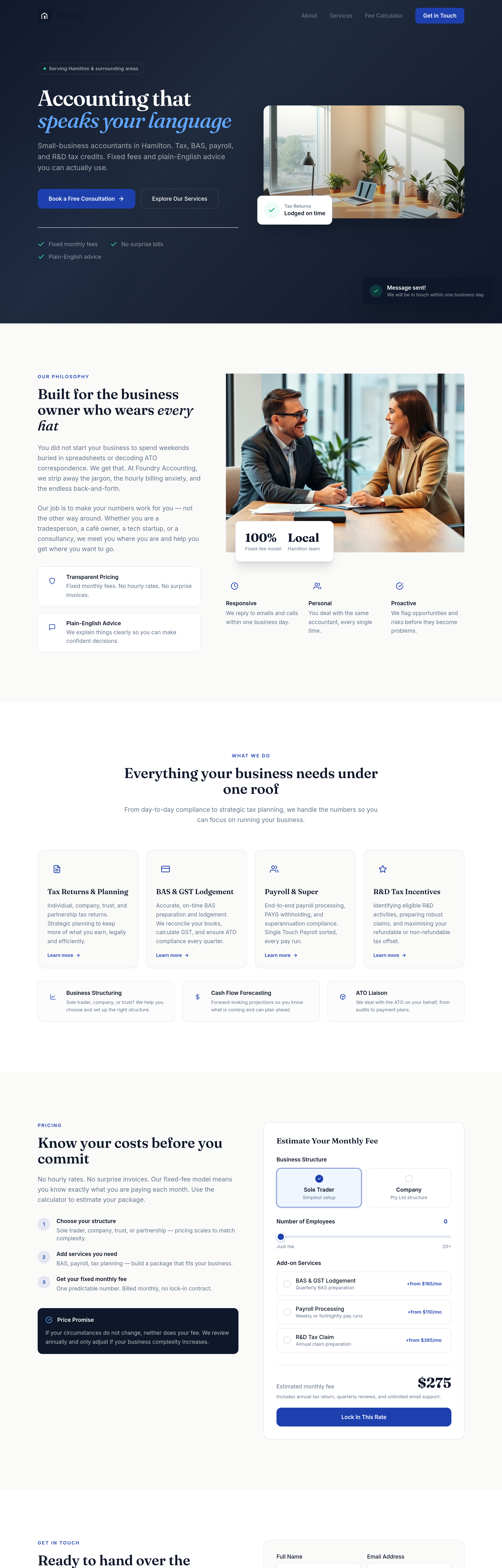
Before
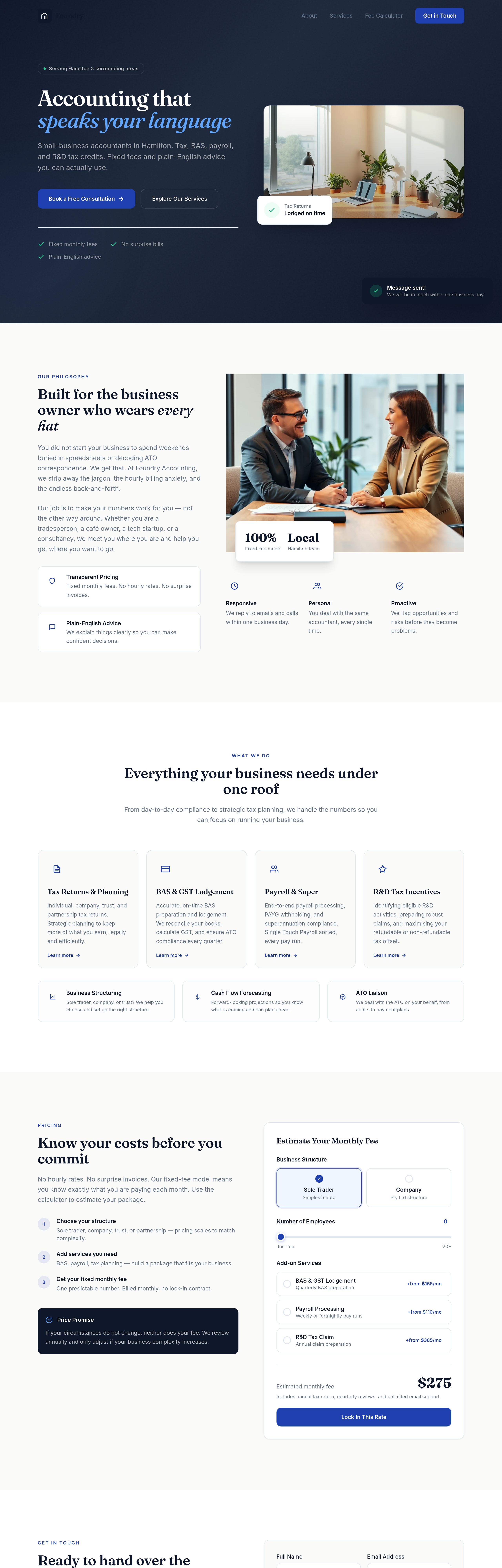
After
the buttons need more weight — bigger padding, confident typography, no shadow
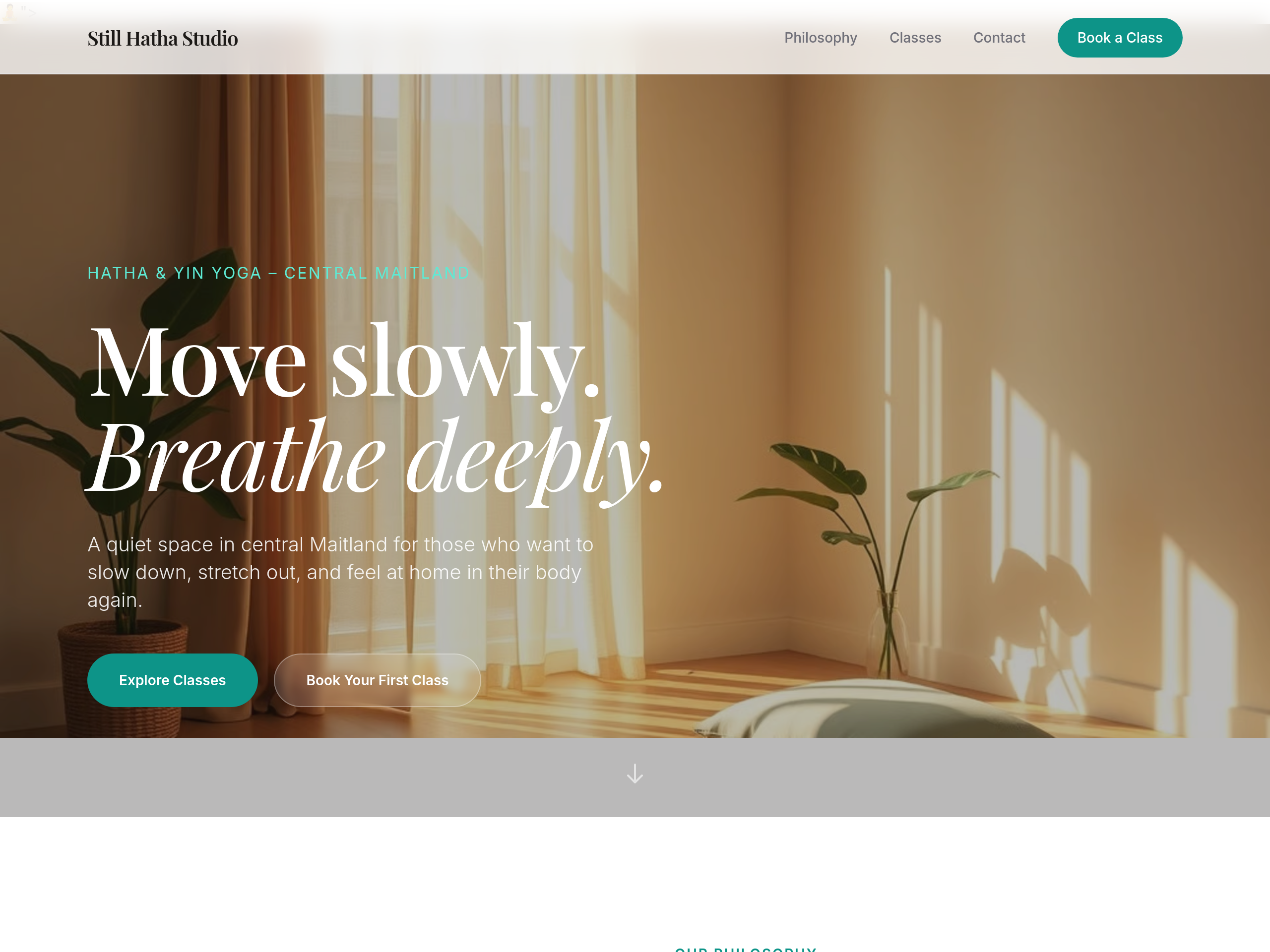
Before
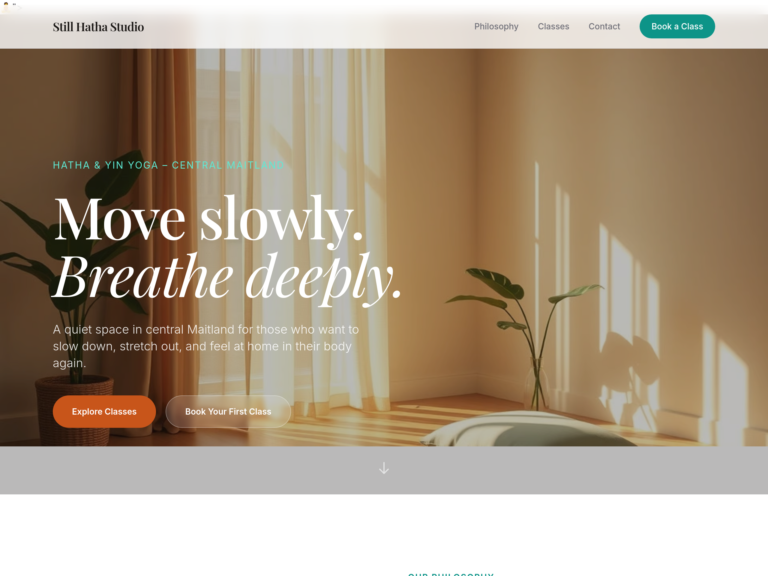
After
change the primary button colour from green to a warm terracotta
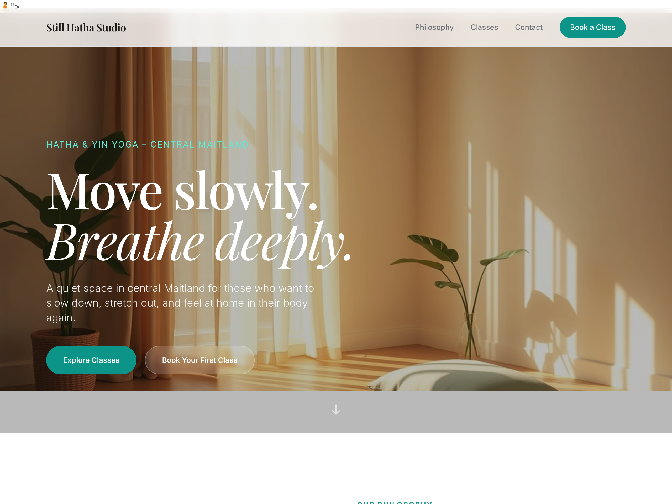
Before
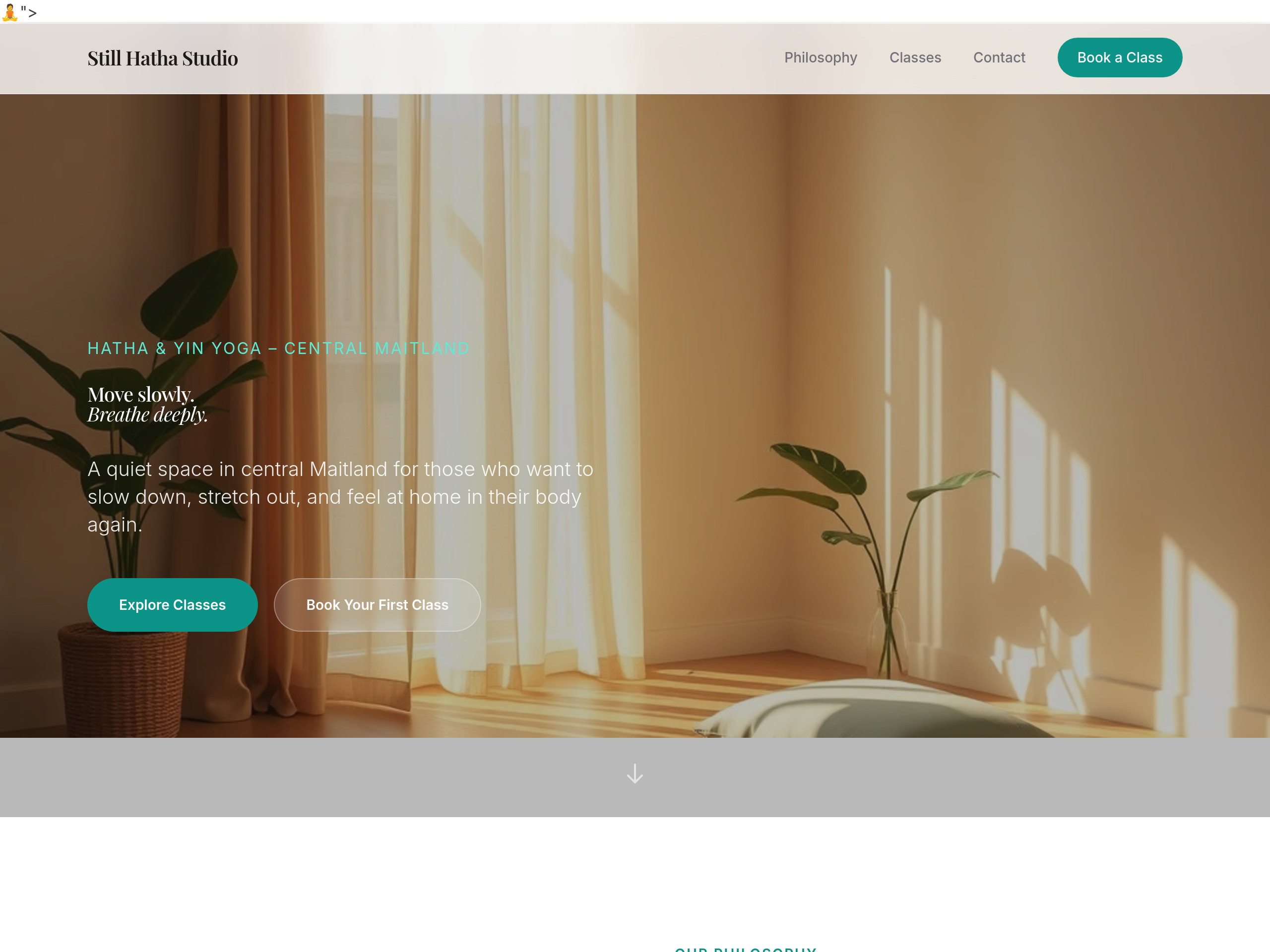
After
make the headings 25% bigger throughout
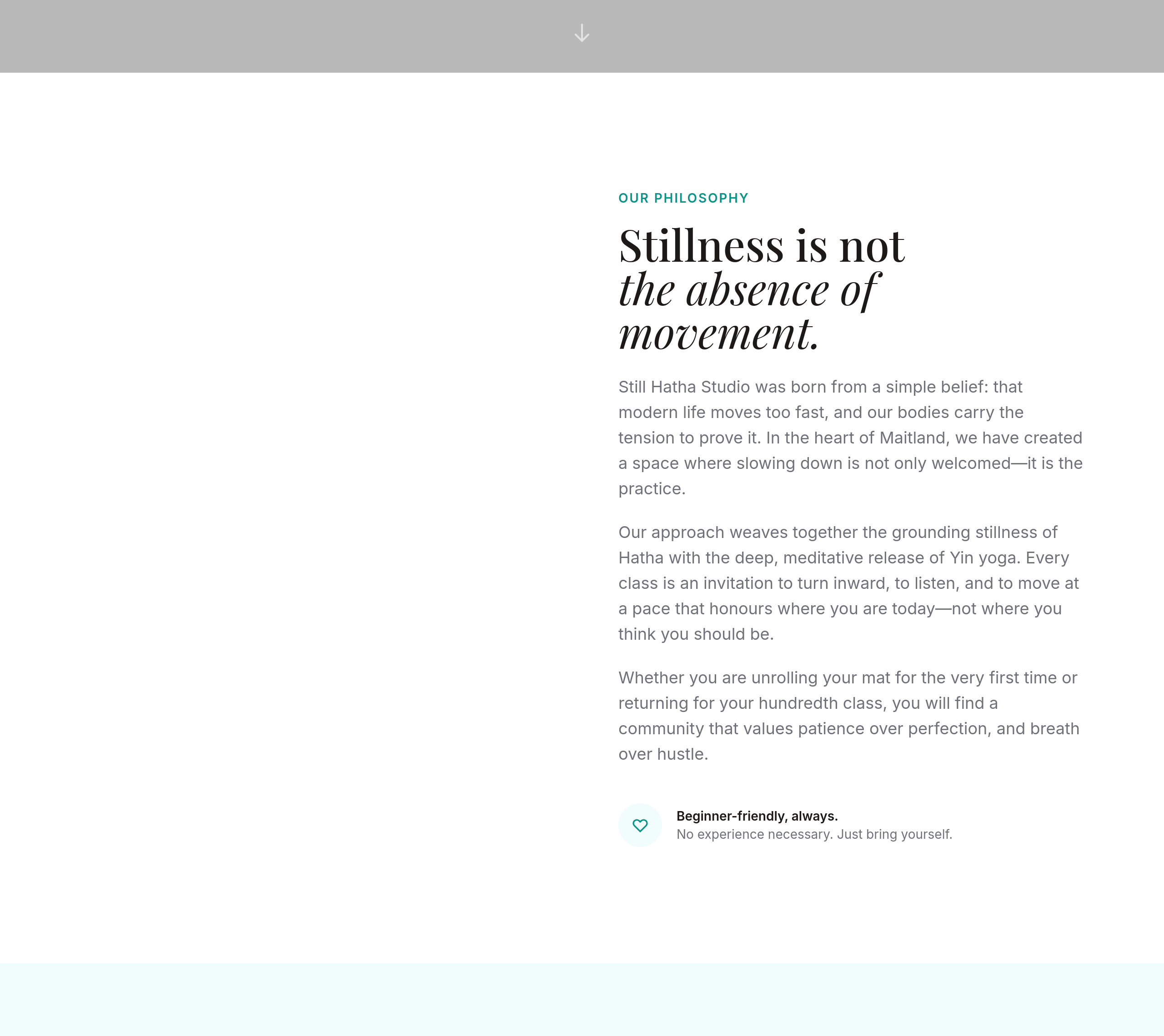
Before
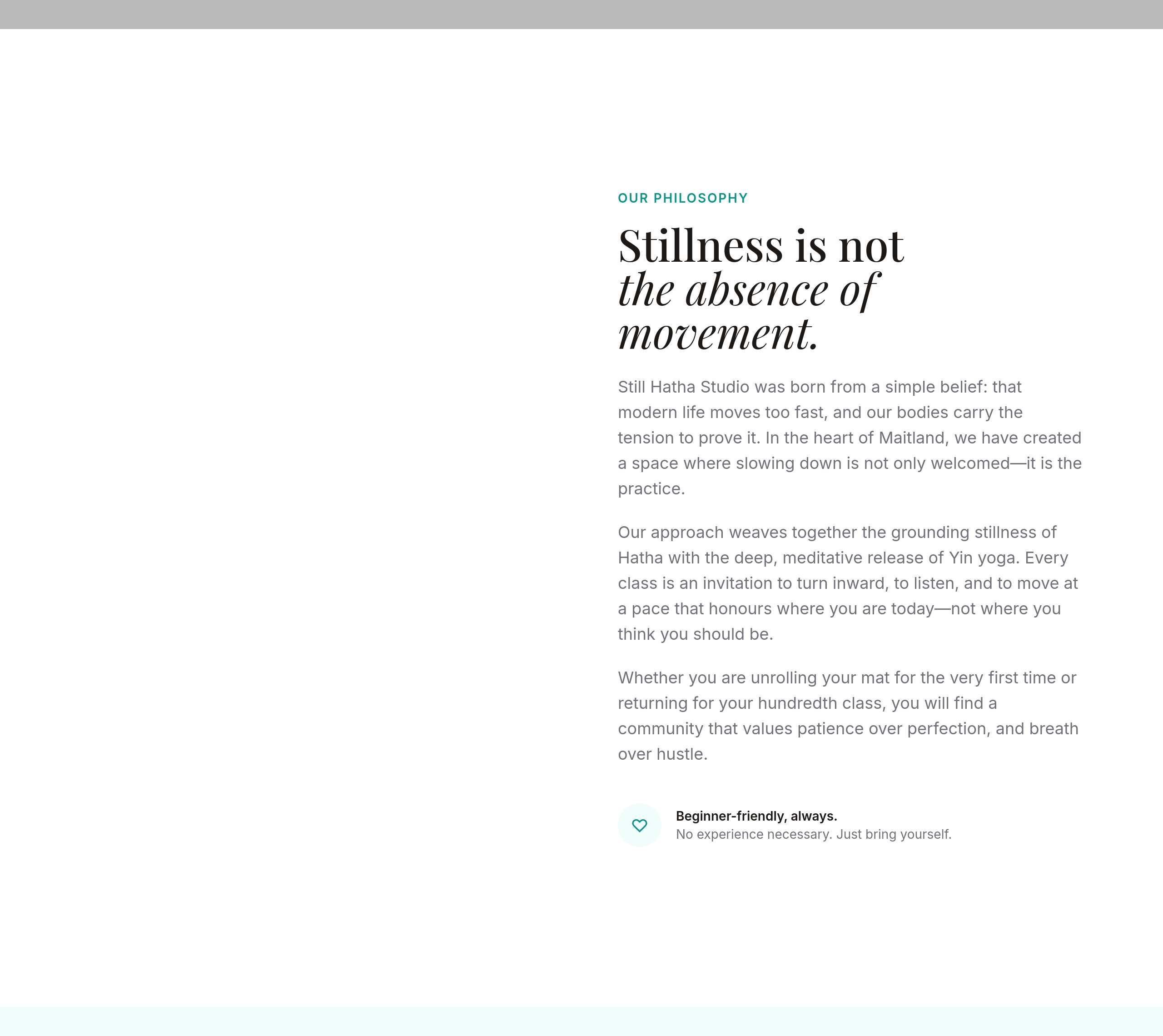
After
add more space between sections — feels too cramped
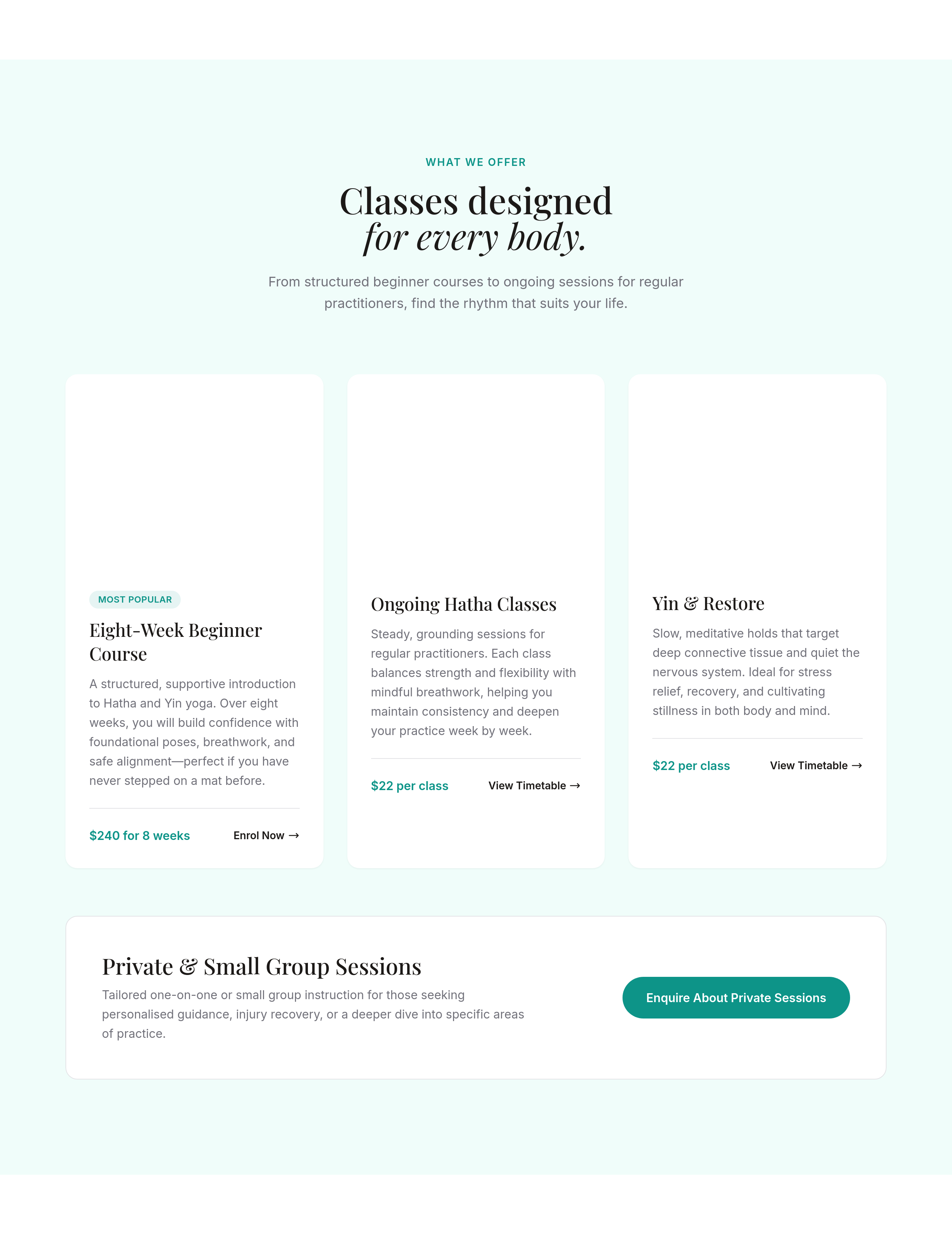
Before
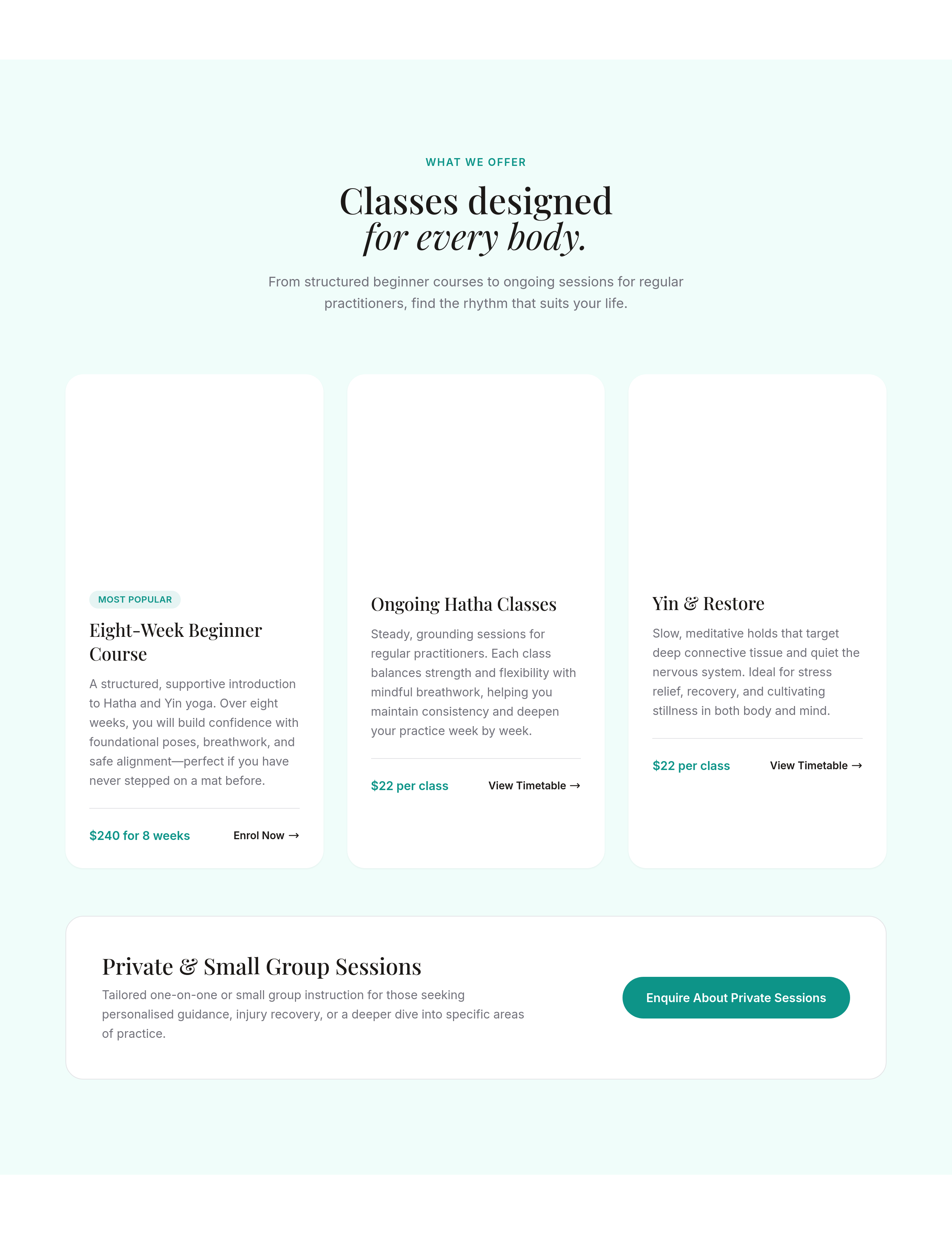
After
the cards have sharp corners — round them off slightly
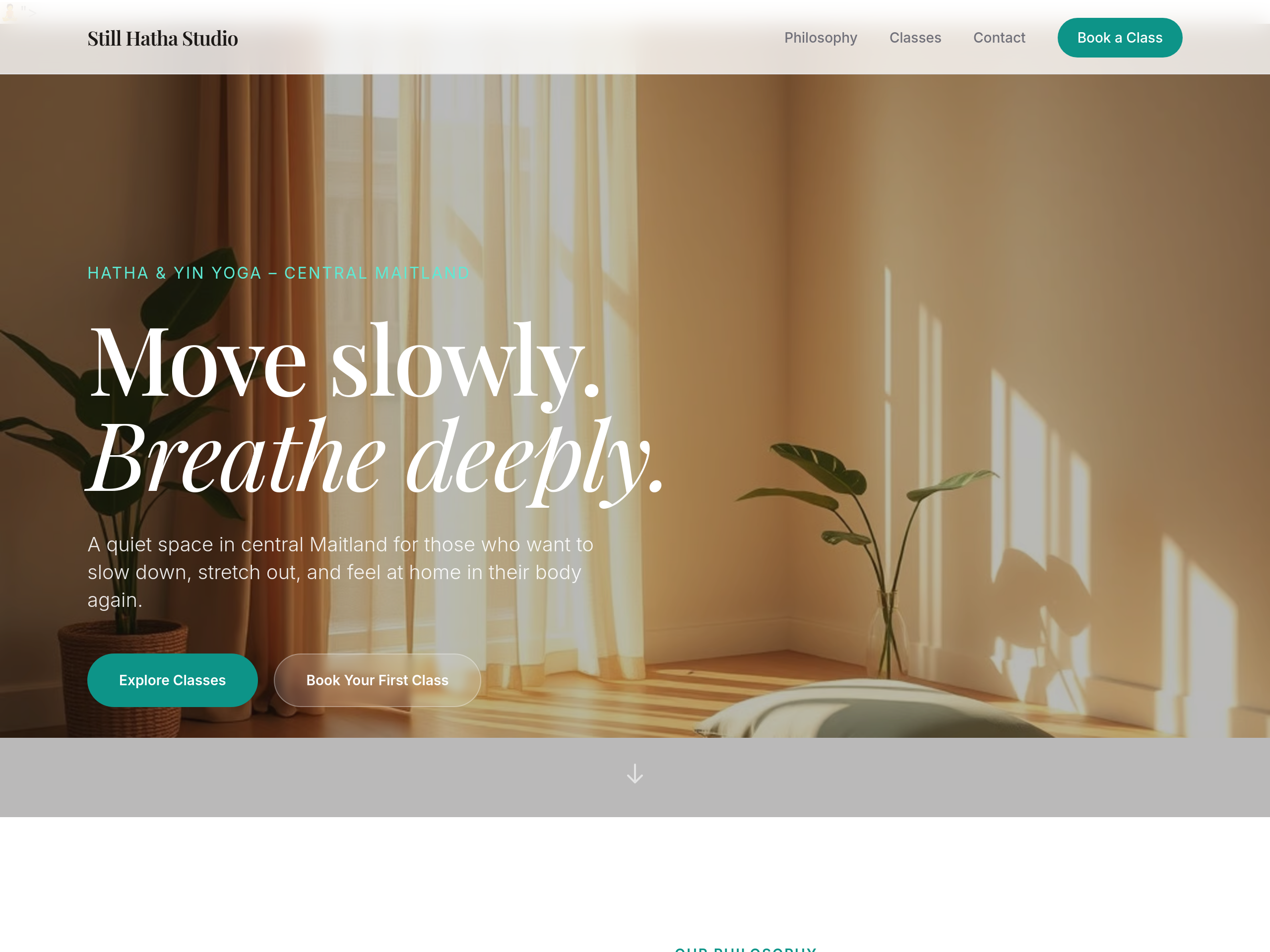
Before
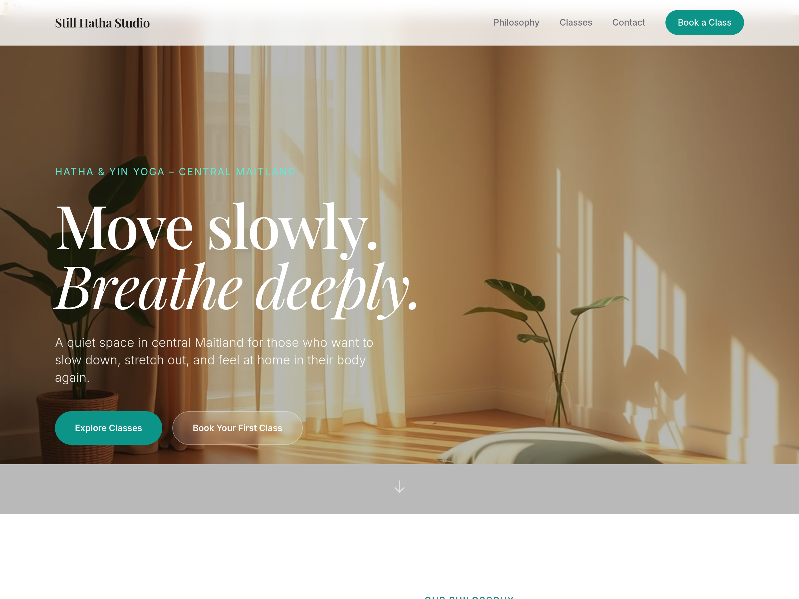
After
the body text colour is too light — bump contrast for accessibility
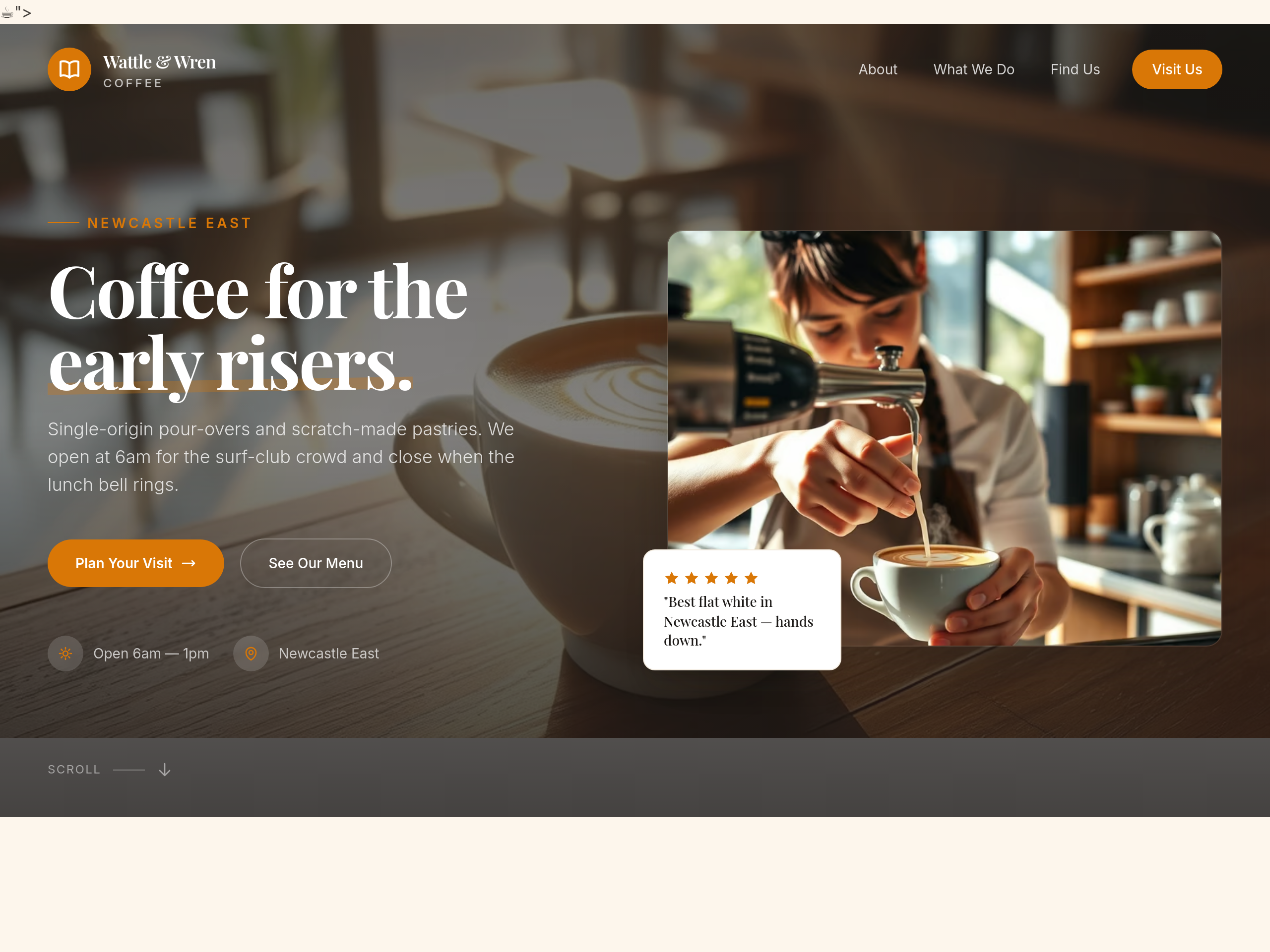
Before
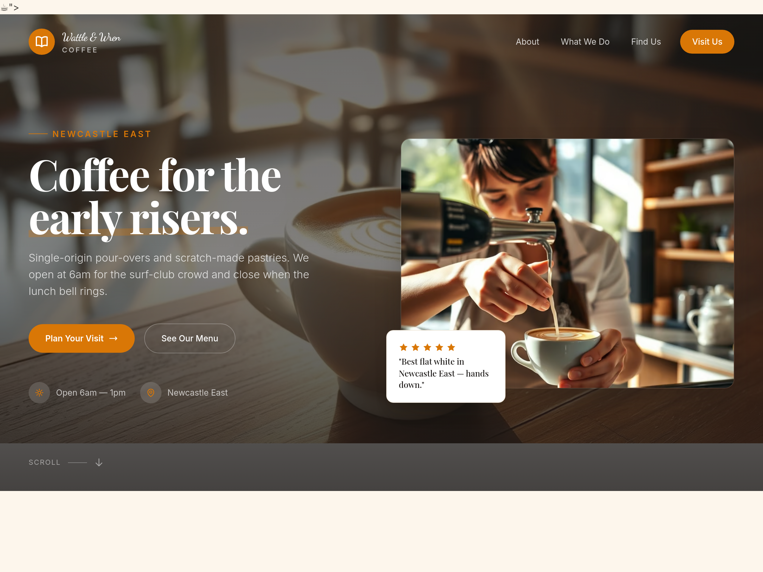
After
use a hand-written script font for the cafe name in the hero
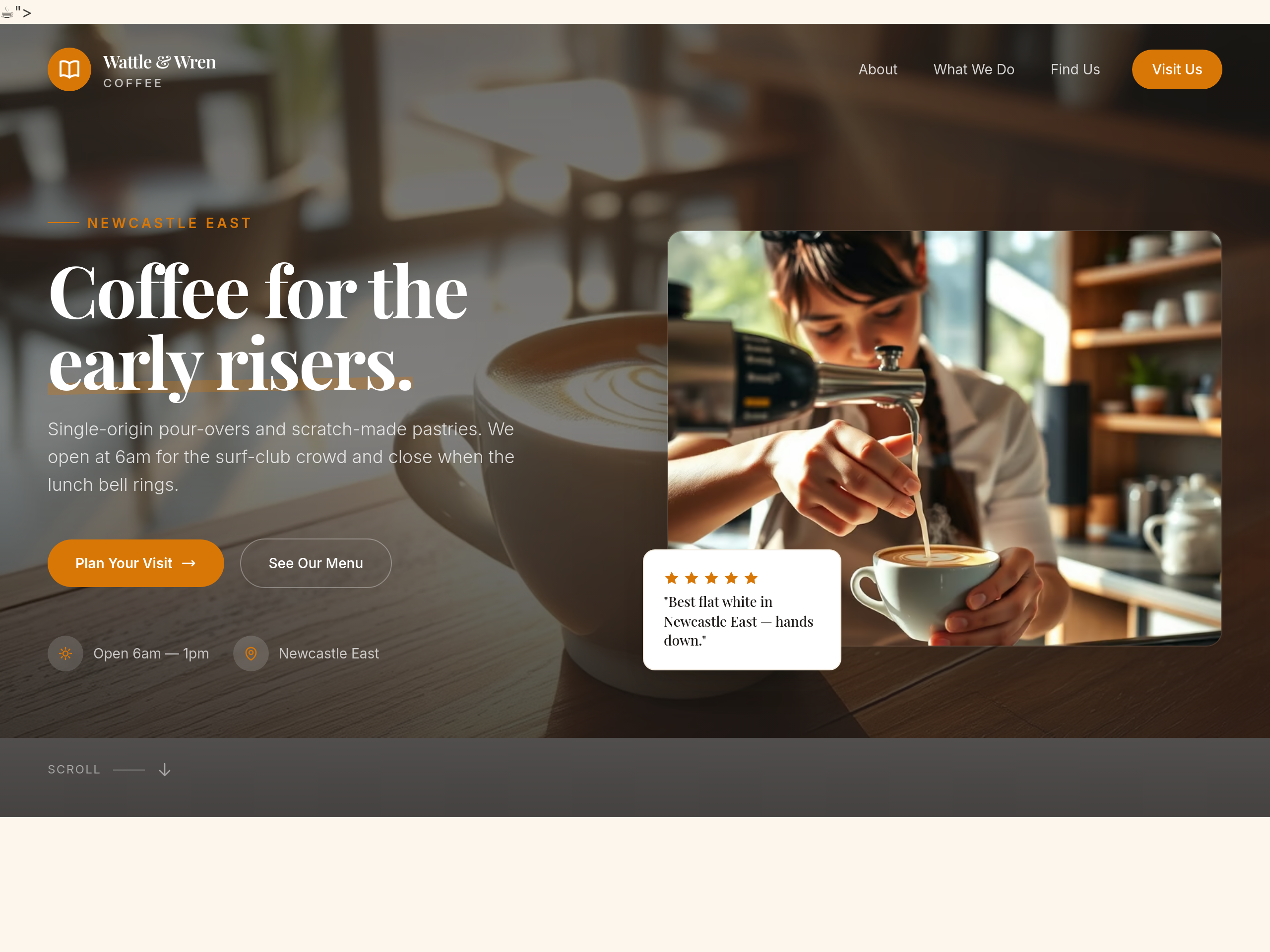
Before
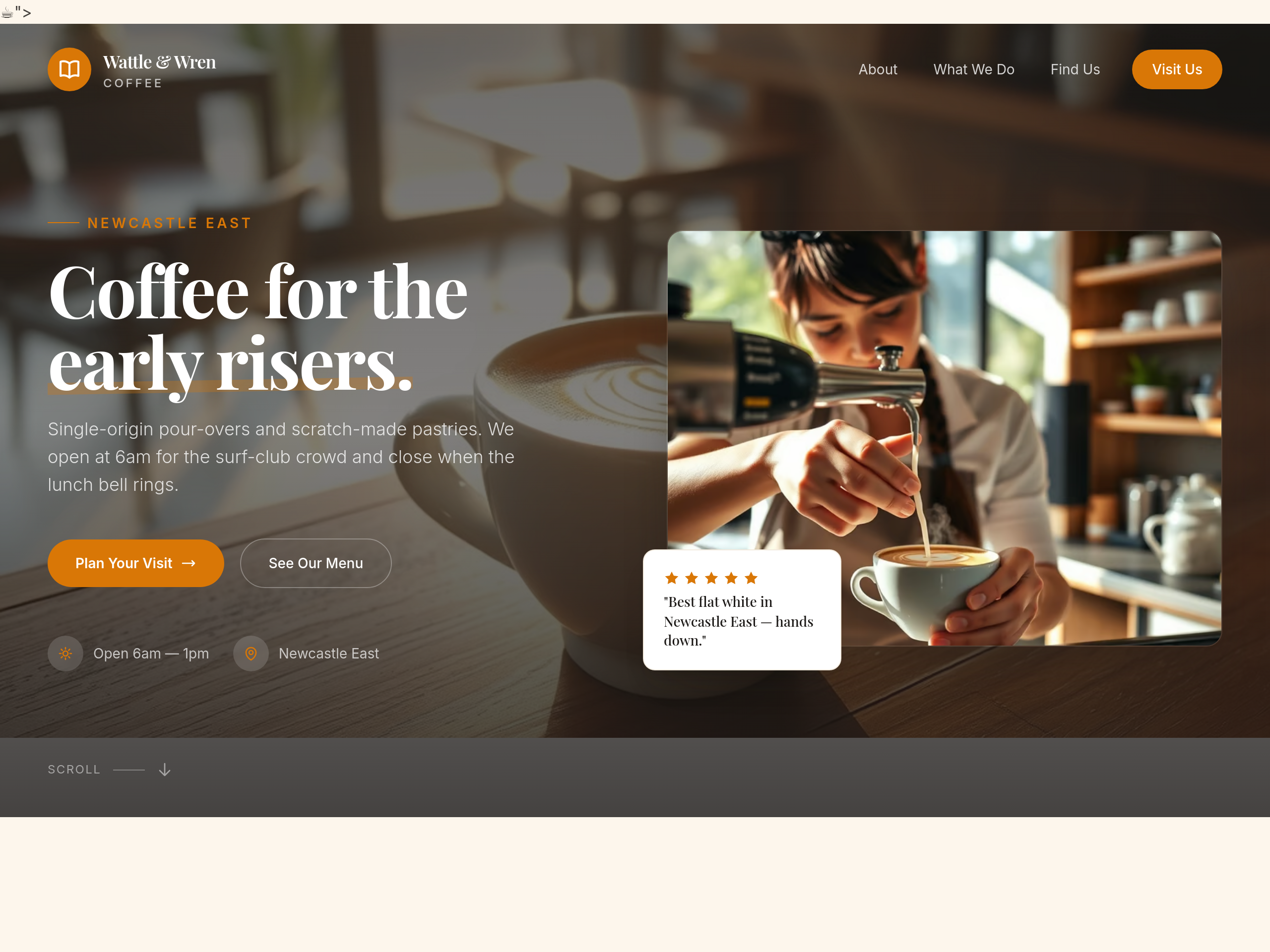
After
all the buttons have shadows — remove the shadows for a flatter look
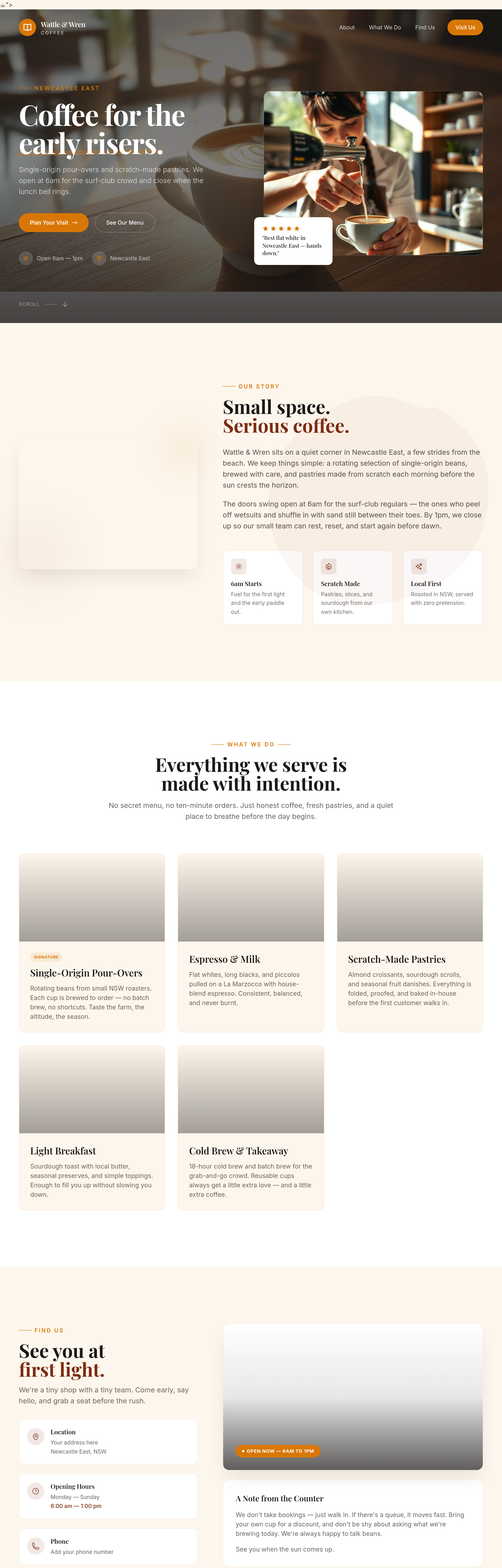
Before
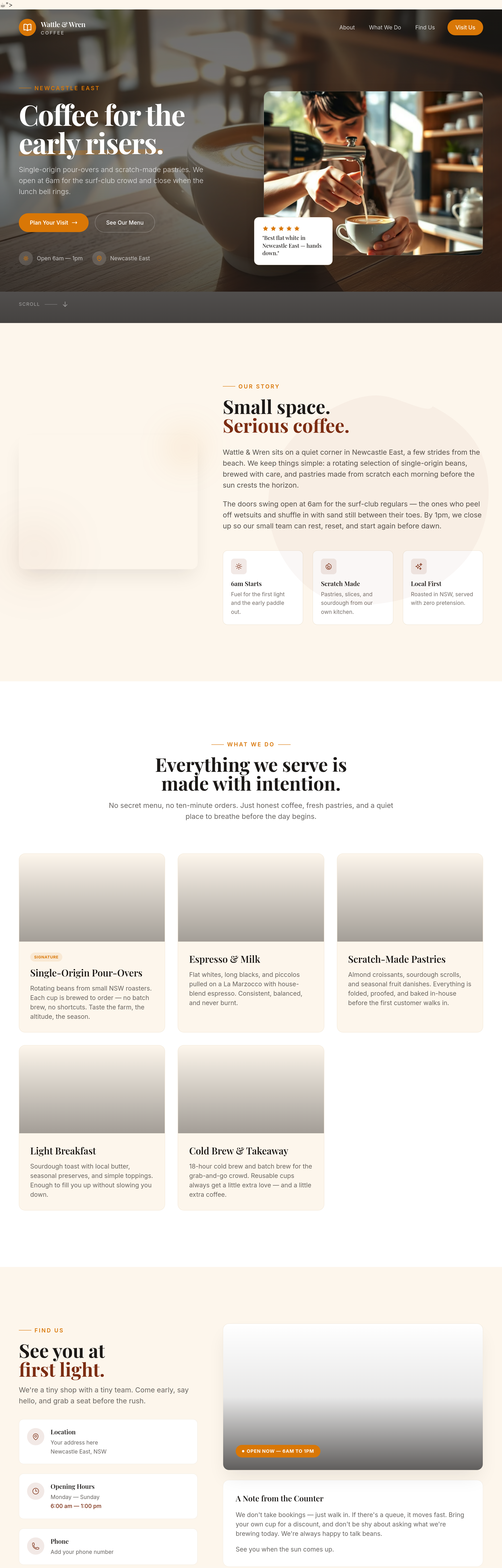
After
add subtle textures to the background — kraft paper feel
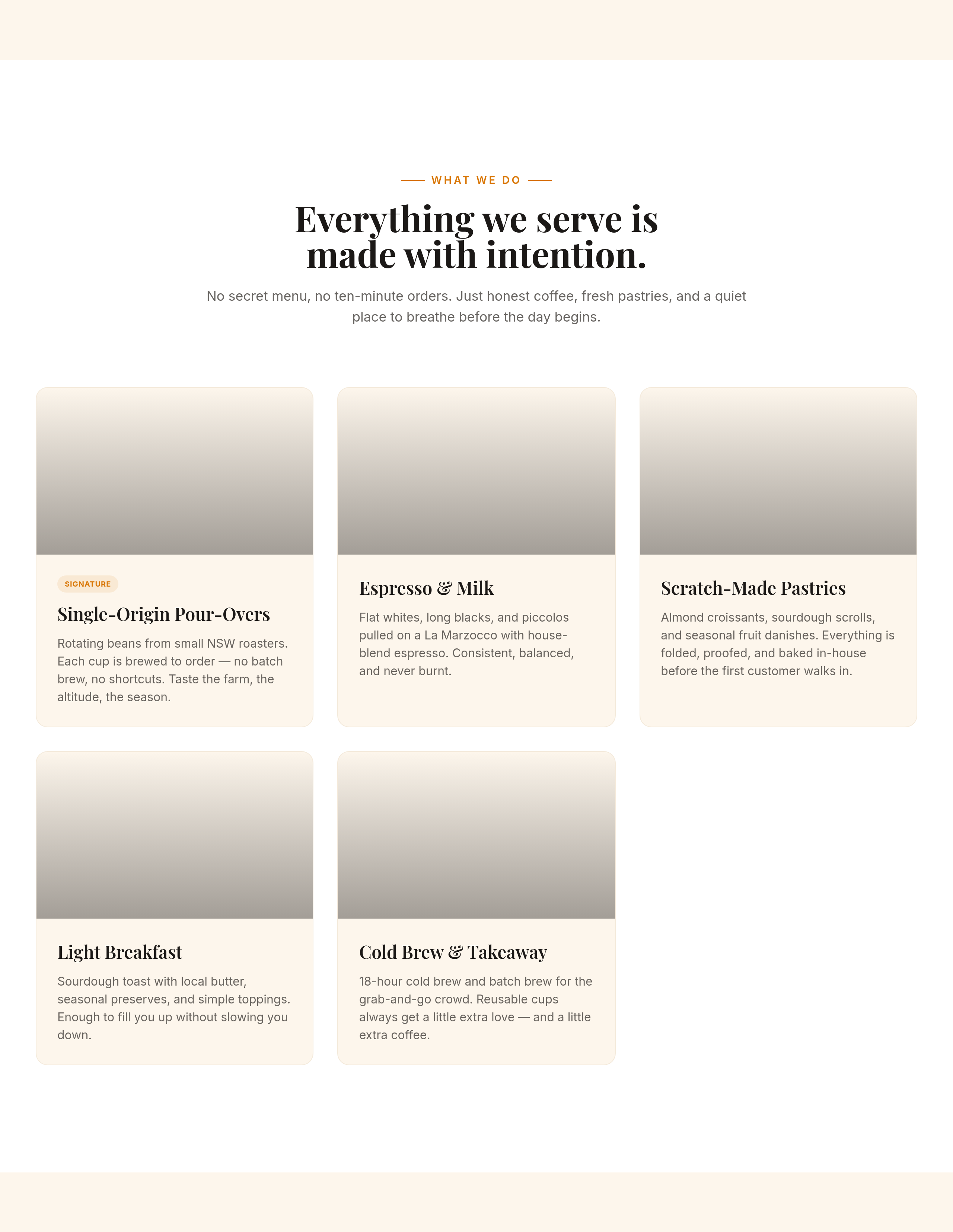
Before
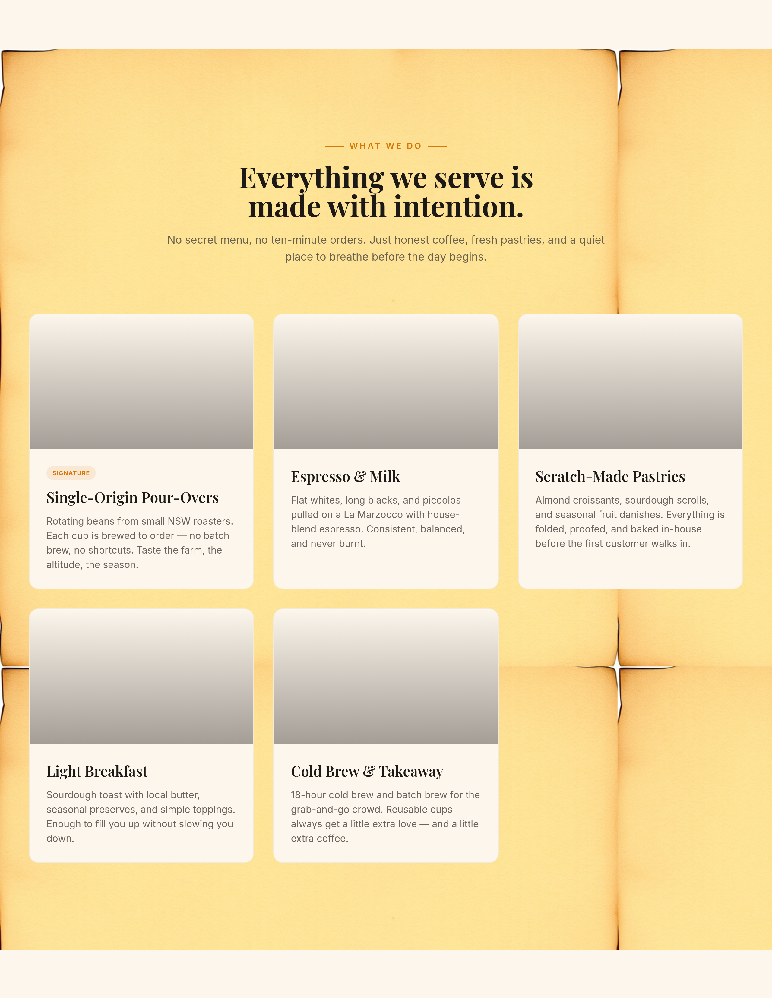
After
add a soft kraft-paper background texture to the menu section

Before

After
the colours feel sterile — soften with warm beige + sage
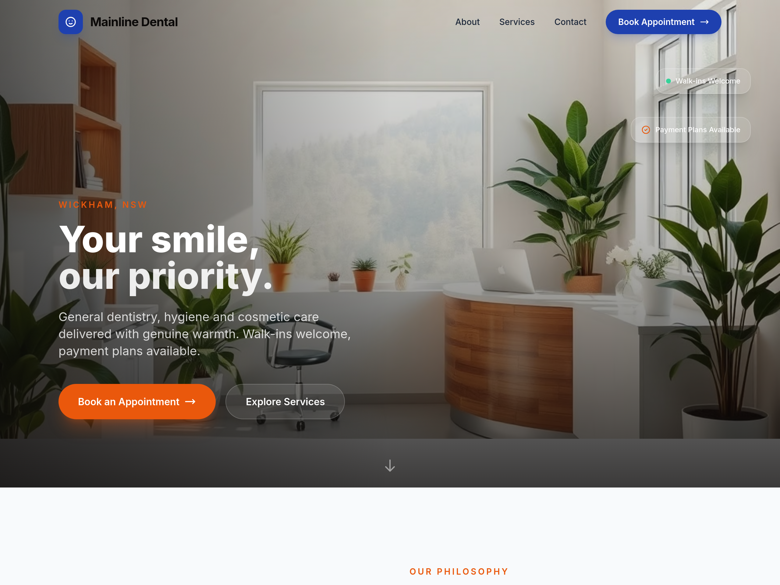
Before
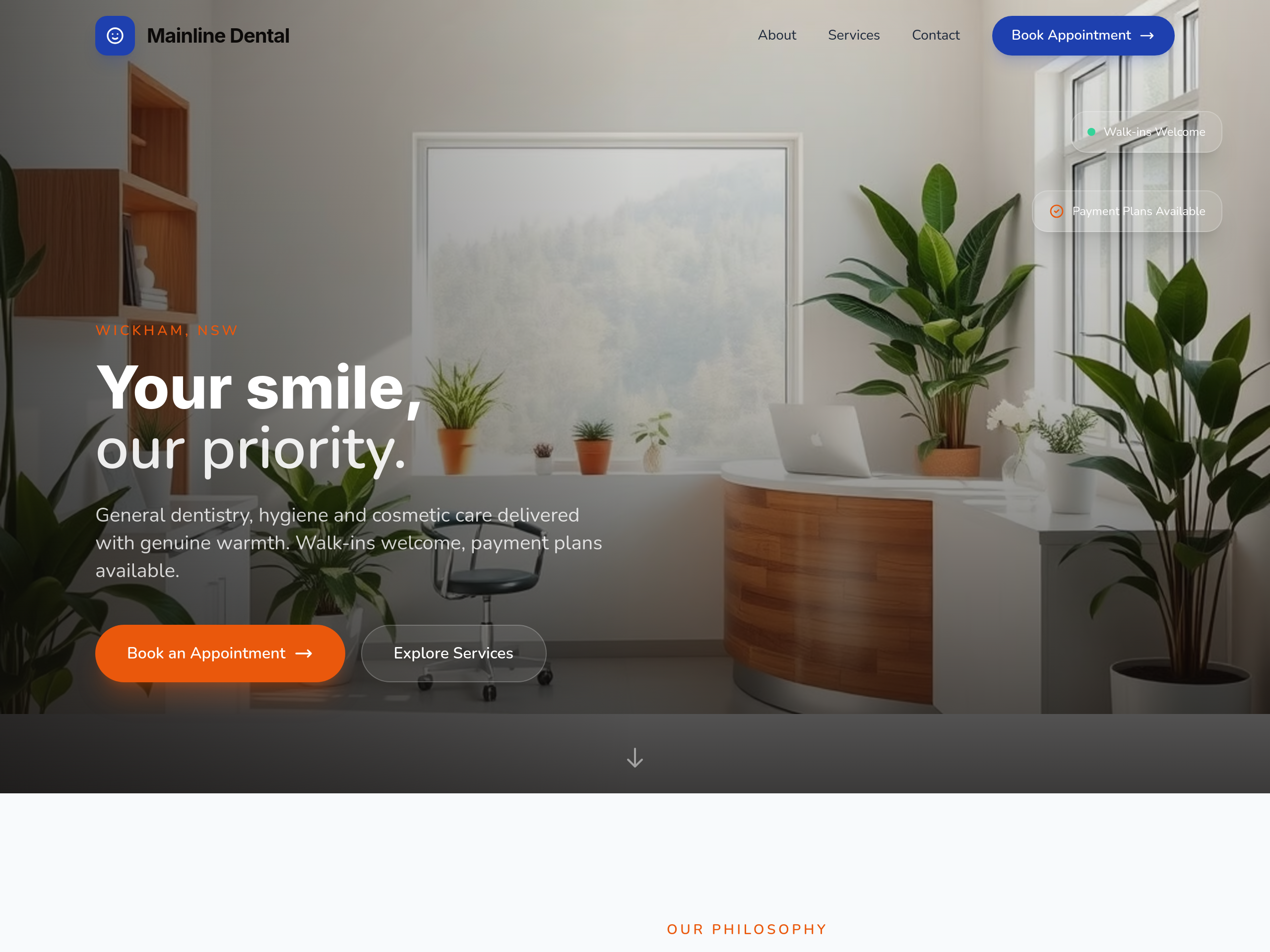
After
make the typography feel friendlier — rounded sans serif
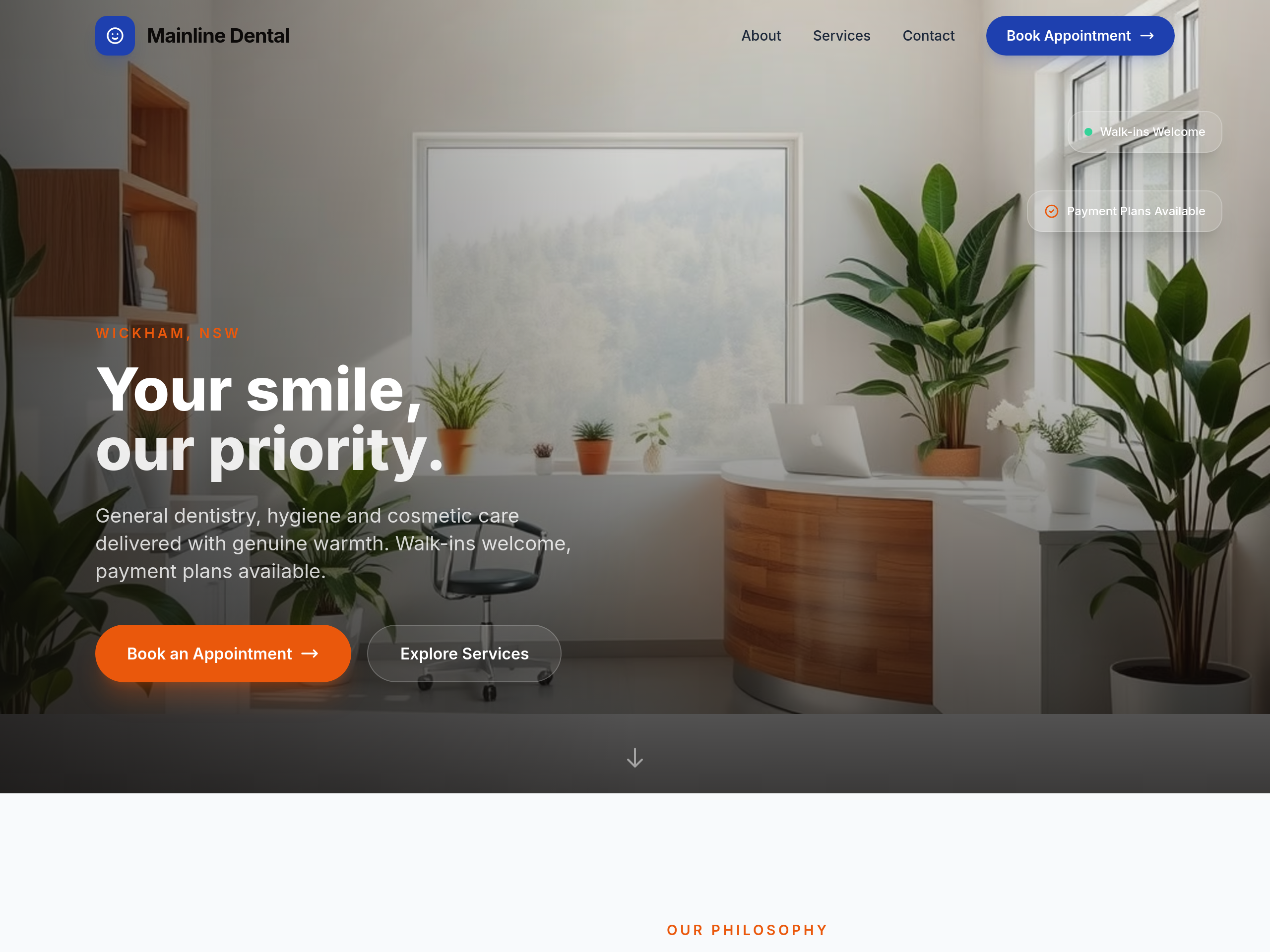
Before
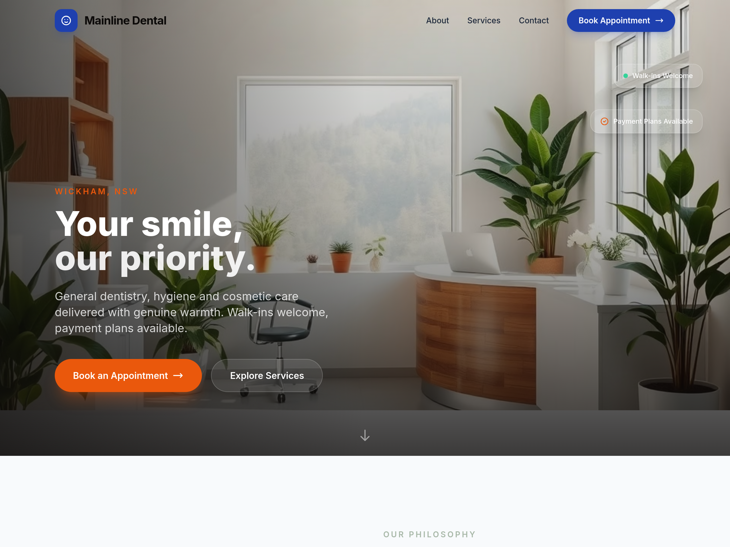
After
the colours are too clinical — soften with warm beige + sage green accents
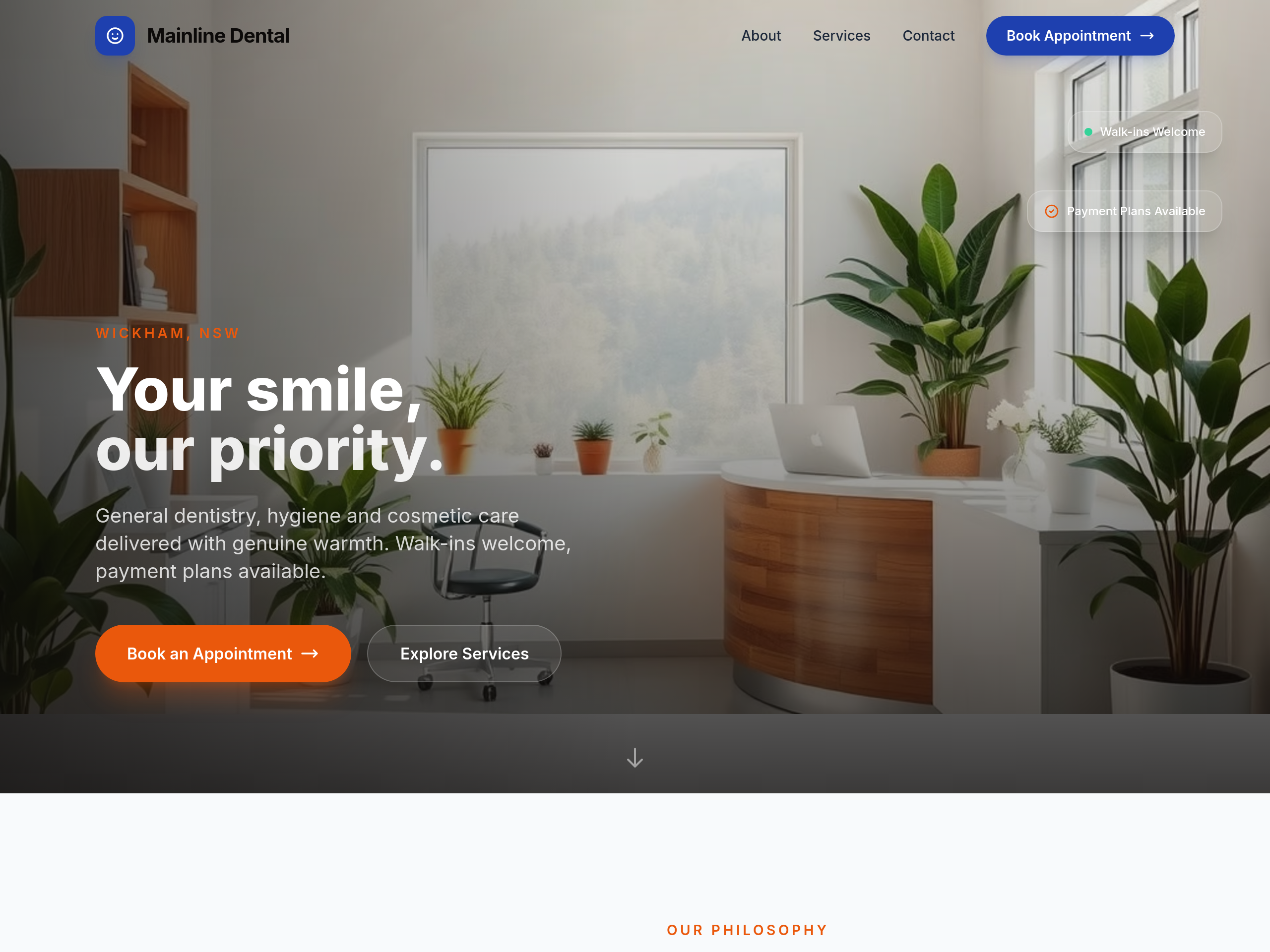
Before
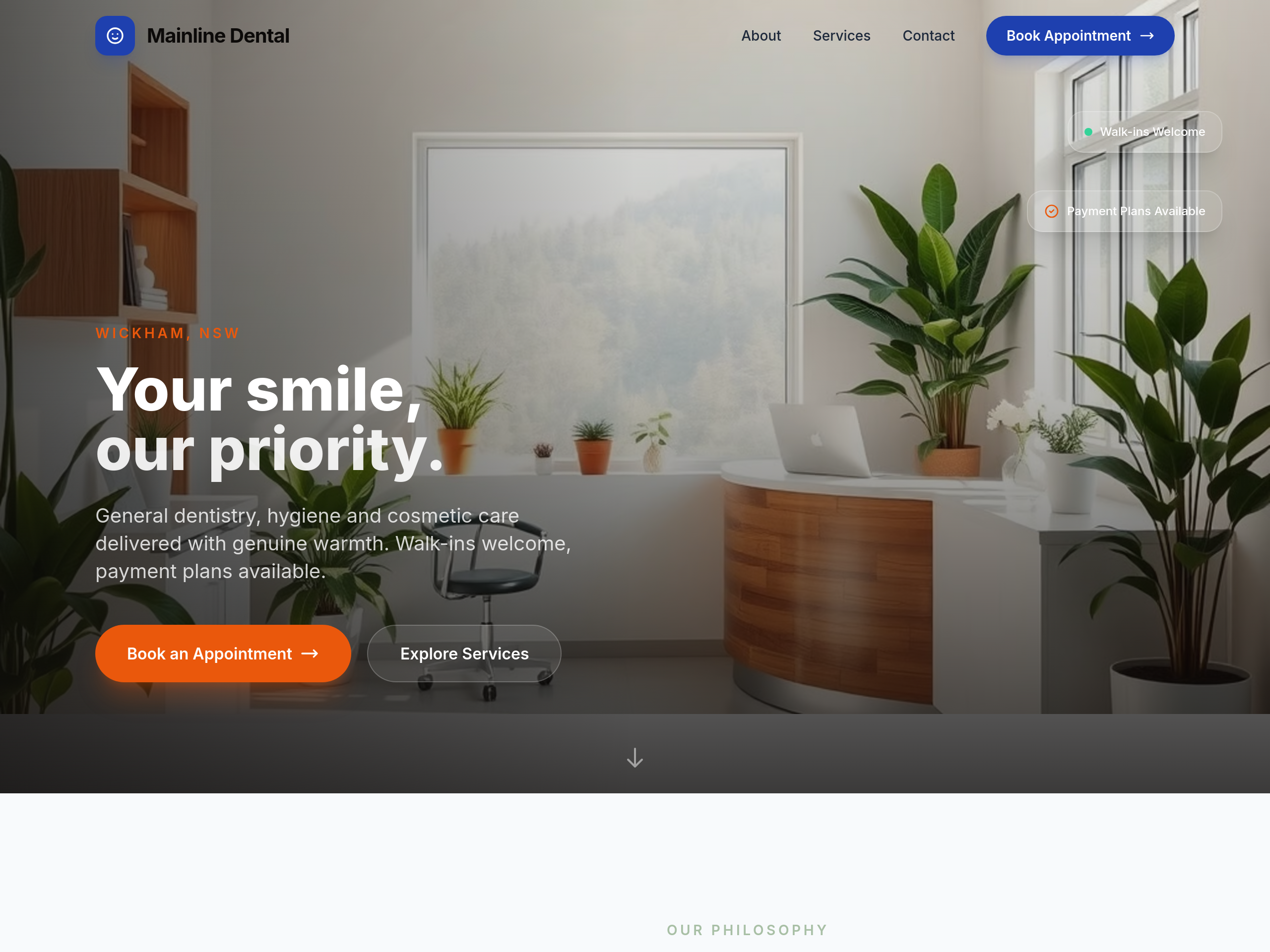
After
too clinical-blue — soften with sage + cream for calmer feel

Before

After
the colours feel too utility — try a more premium dark navy + electric-yellow accent
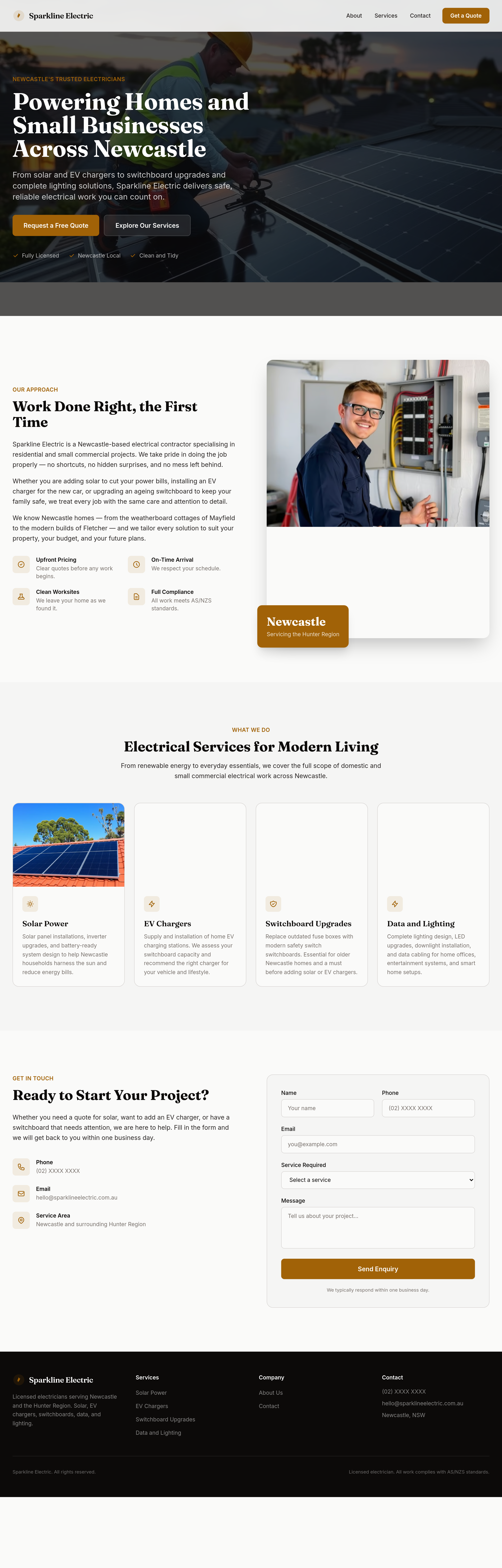
Before
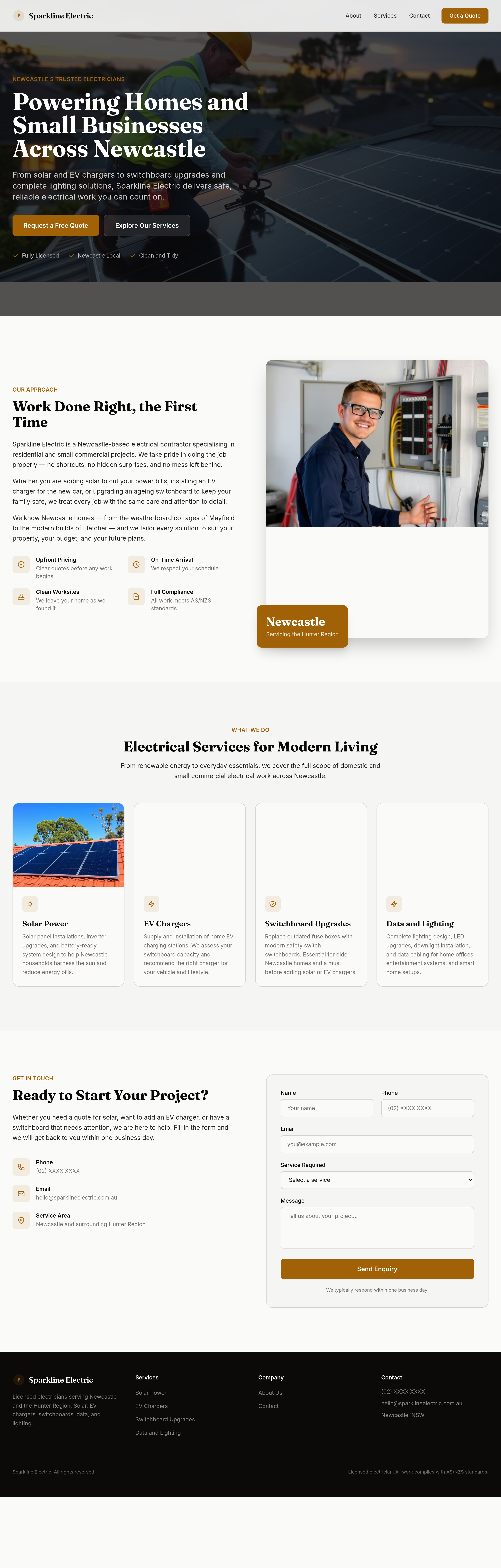
After
make the headings feel confident and capable
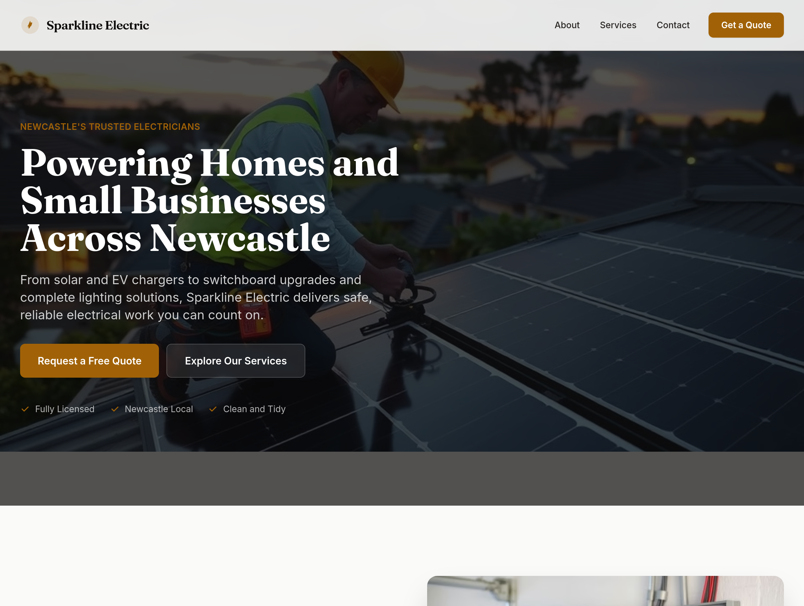
Before
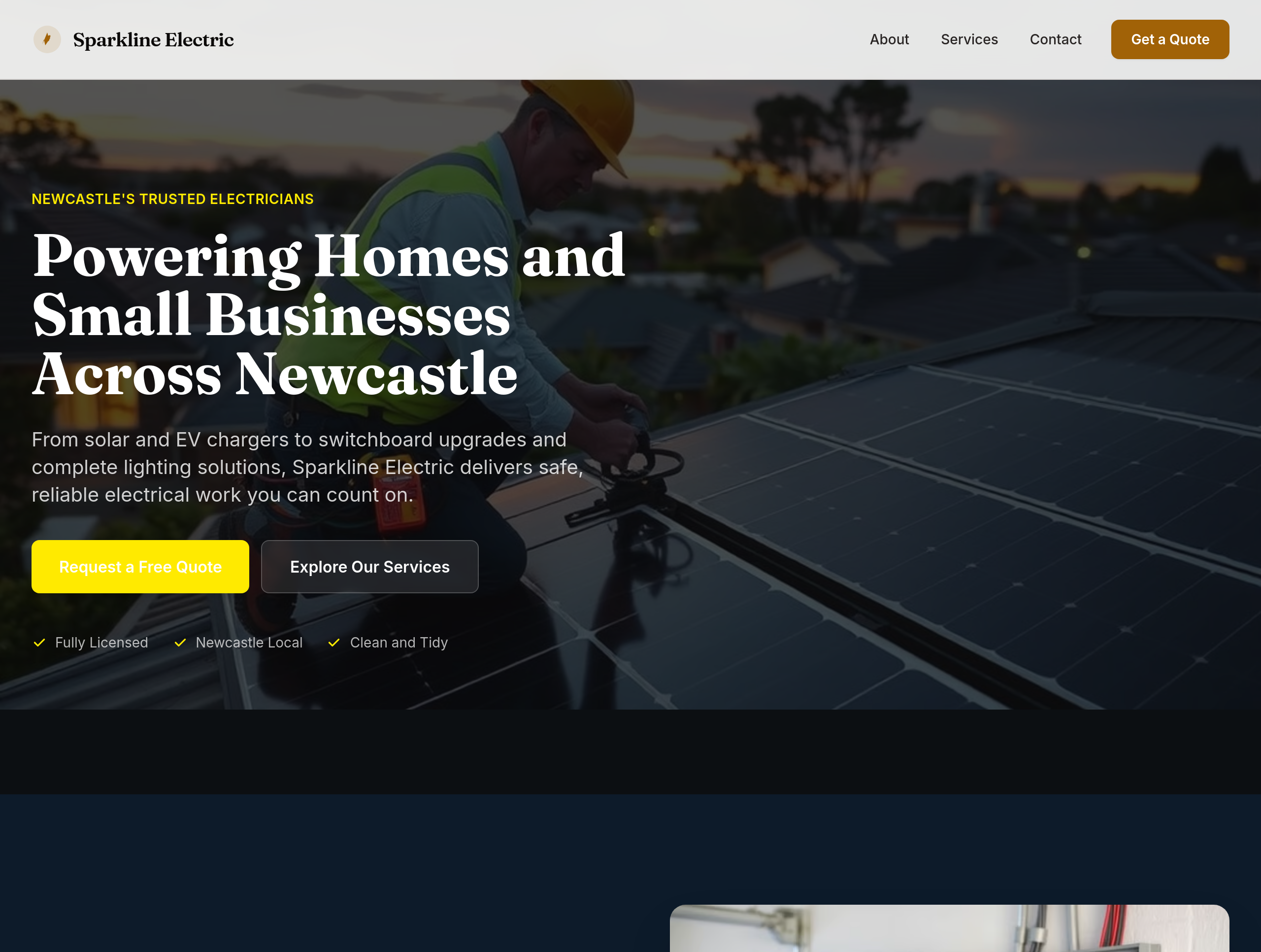
After
the colours feel utility — use deep navy + electric yellow accents for premium feel
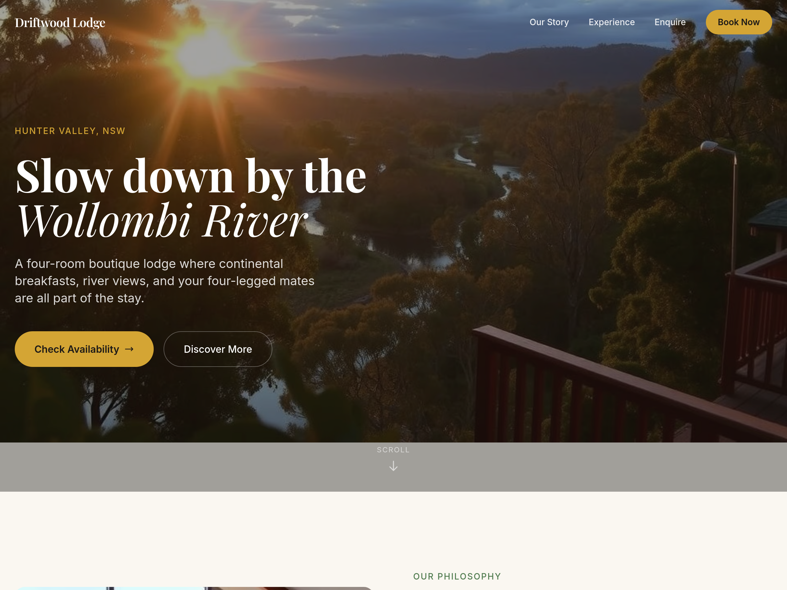
Before
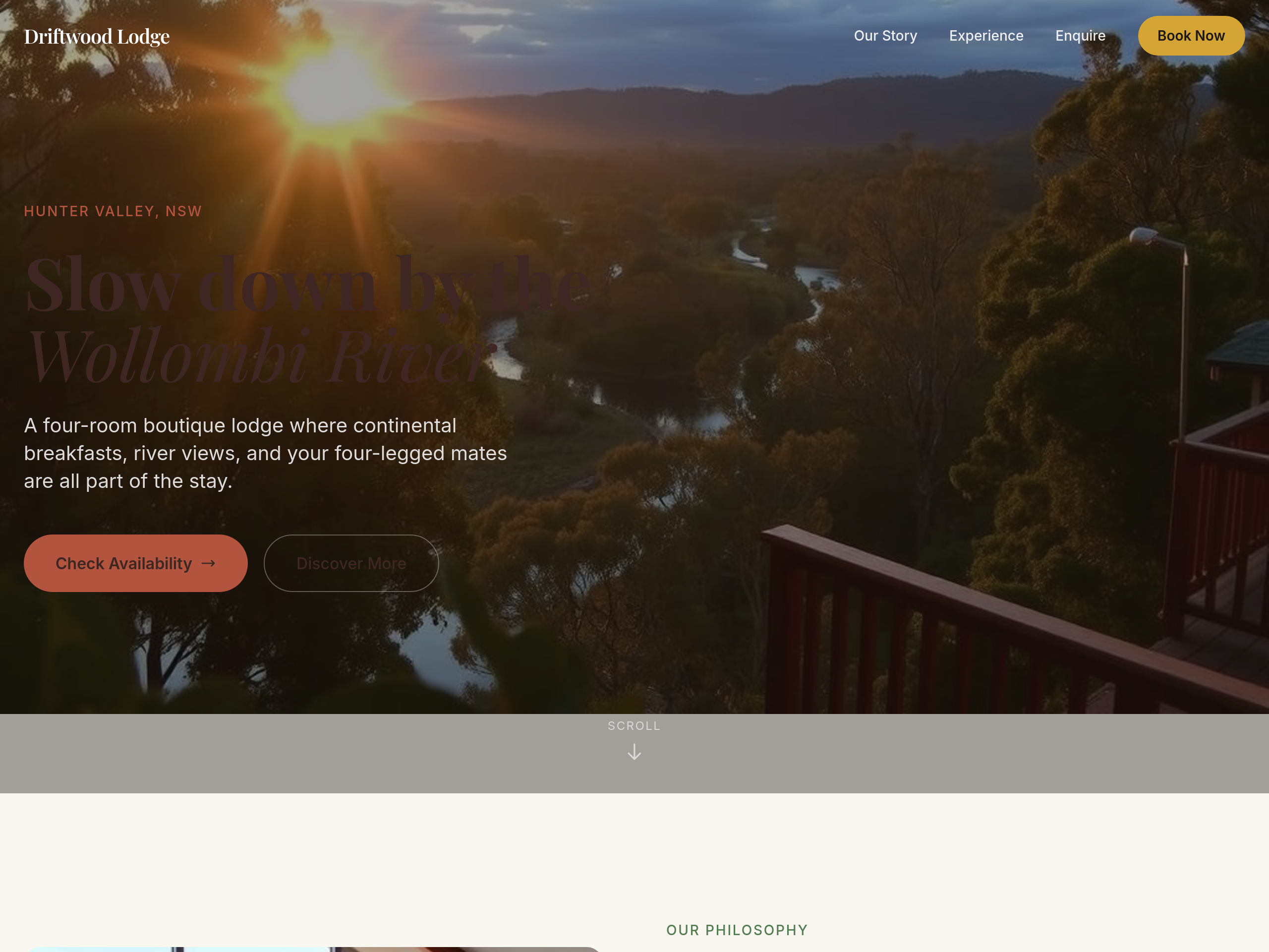
After
the colours are too cool — warm everything up with sandstone + clay tones
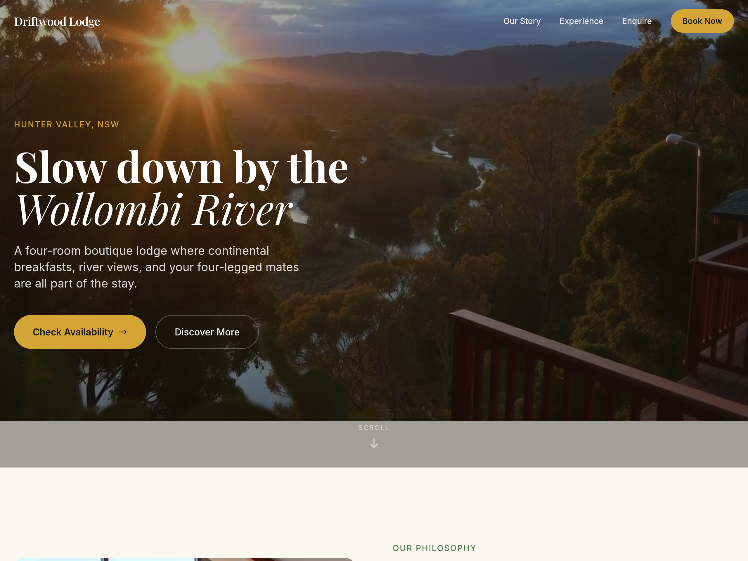
Before
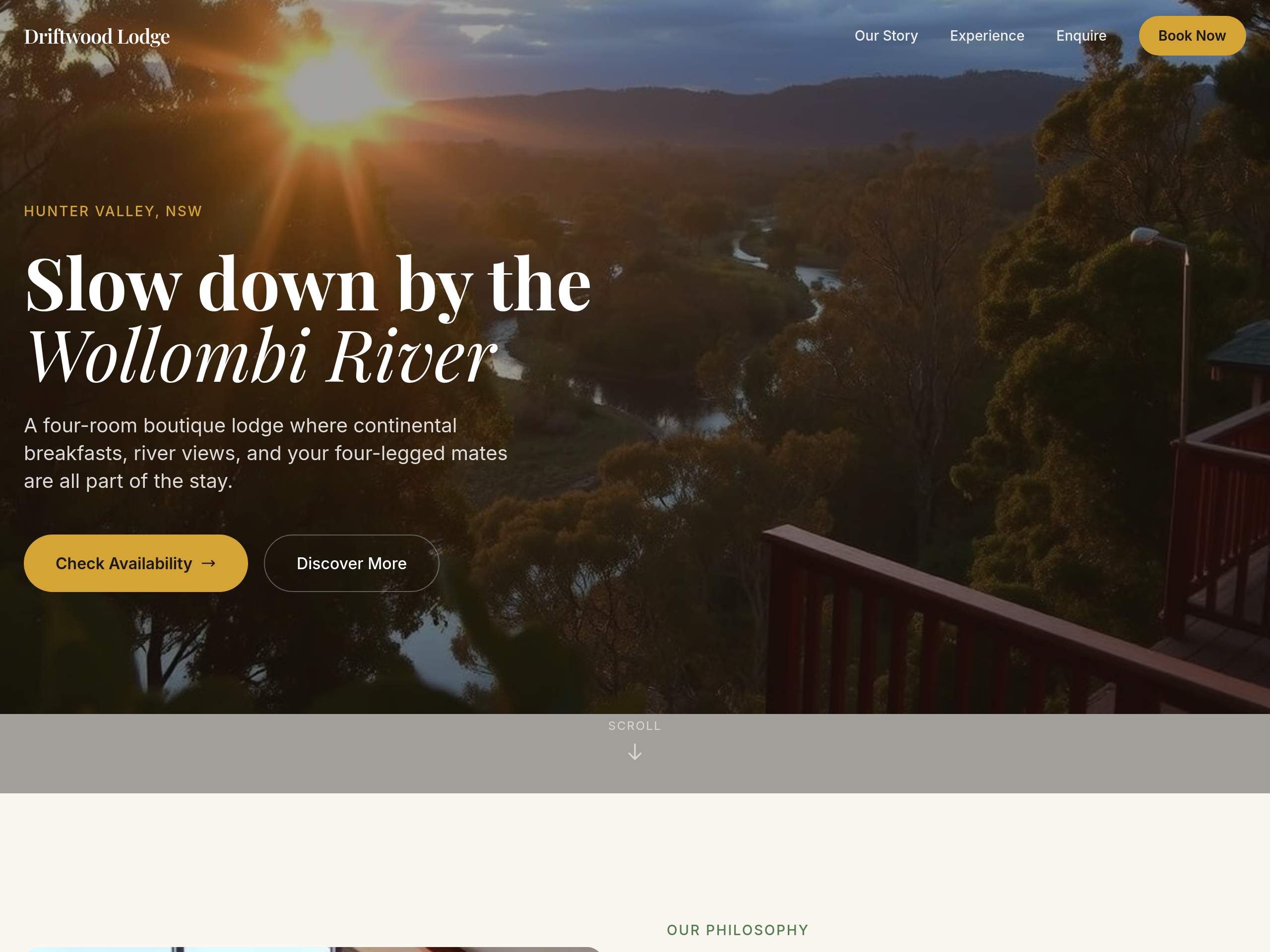
After
use a serif font for the headings — feels more boutique
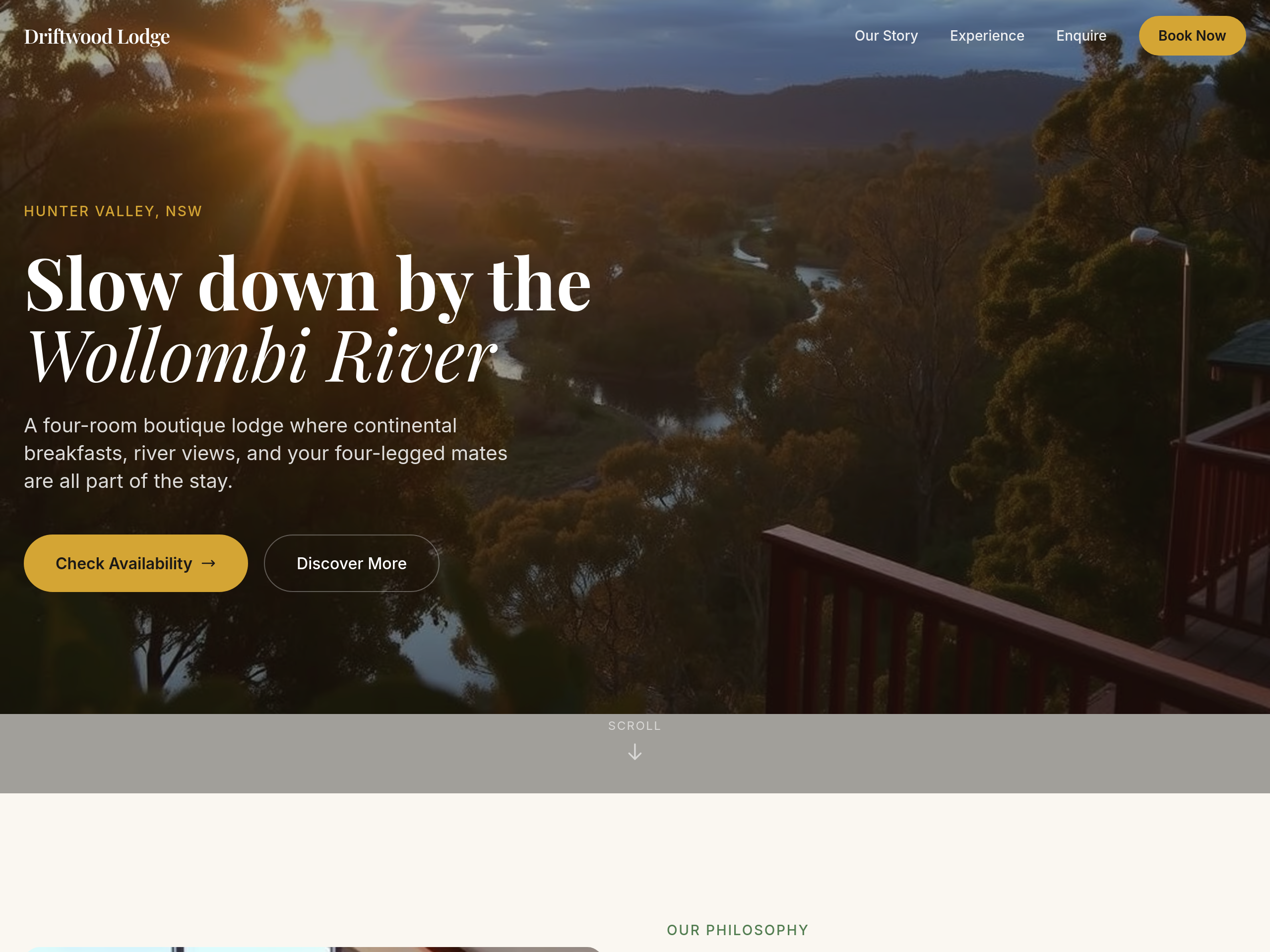
Before
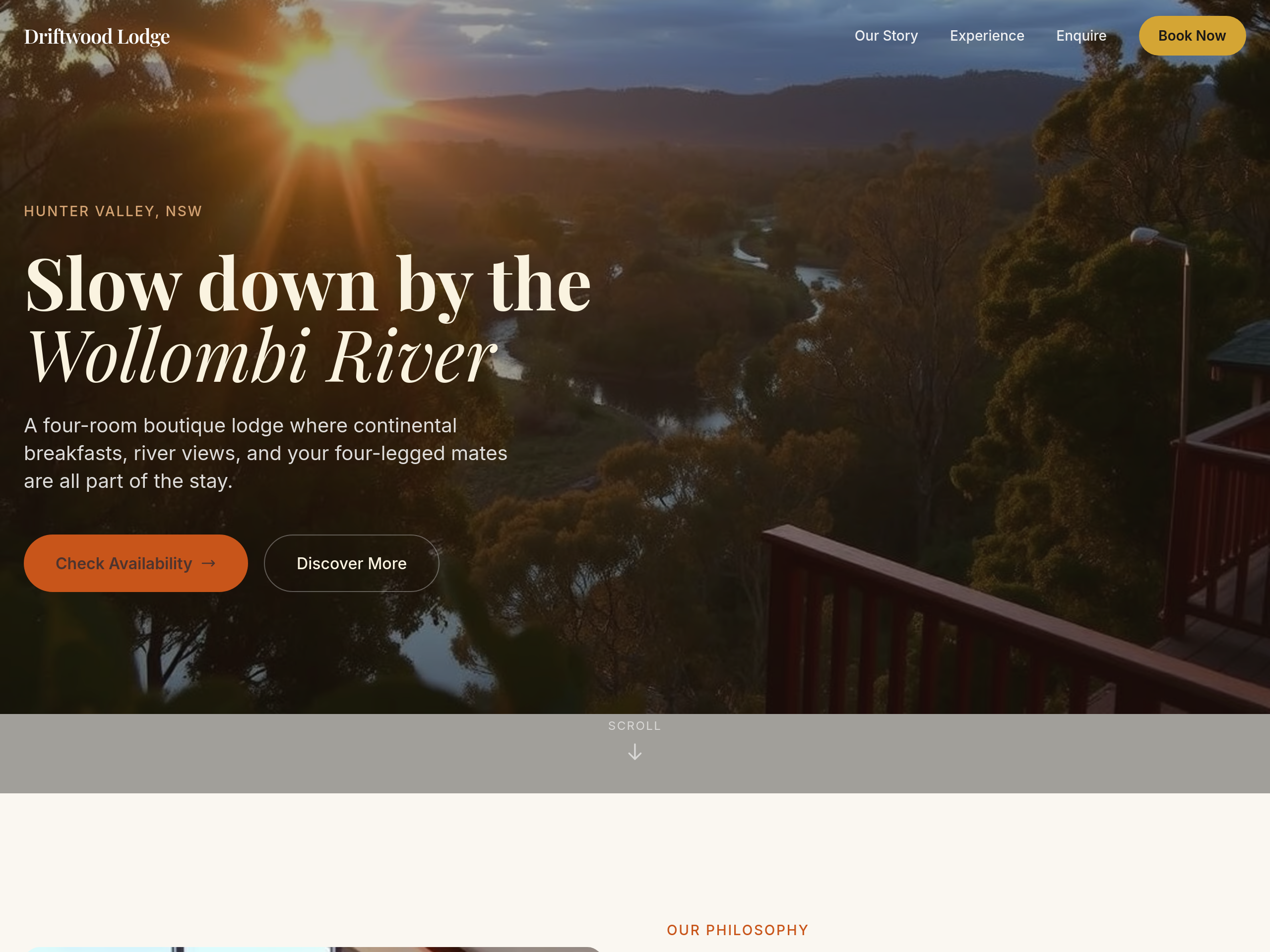
After
the colour palette is too cold — warm everything to earthy tones
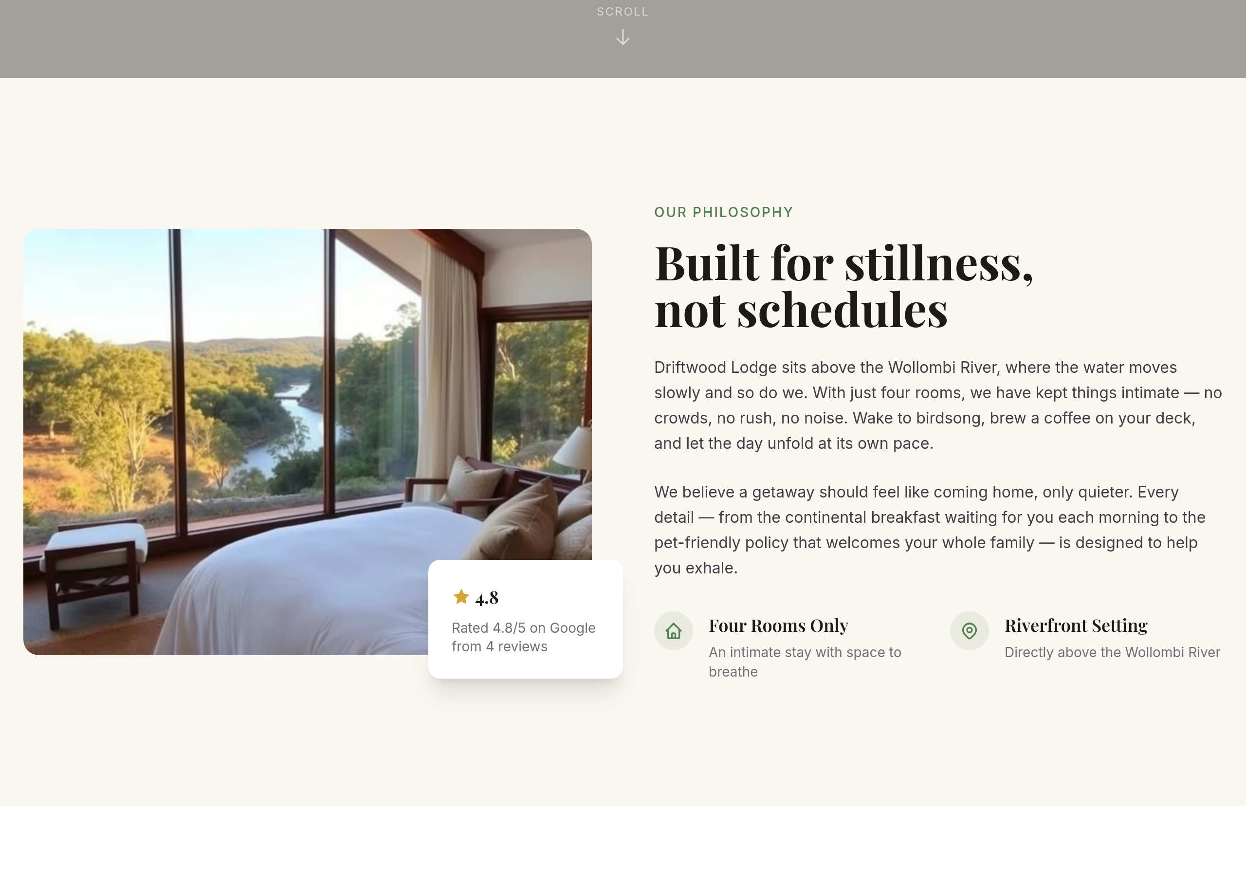
Before
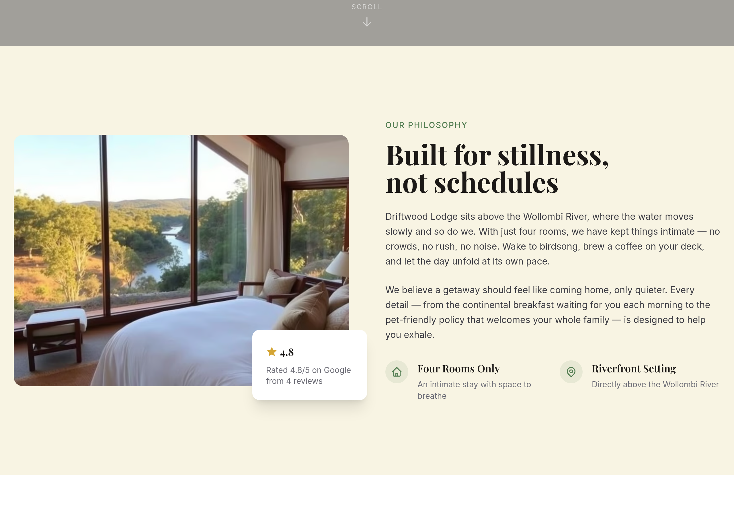
After
add a subtle parchment-style background to the about section
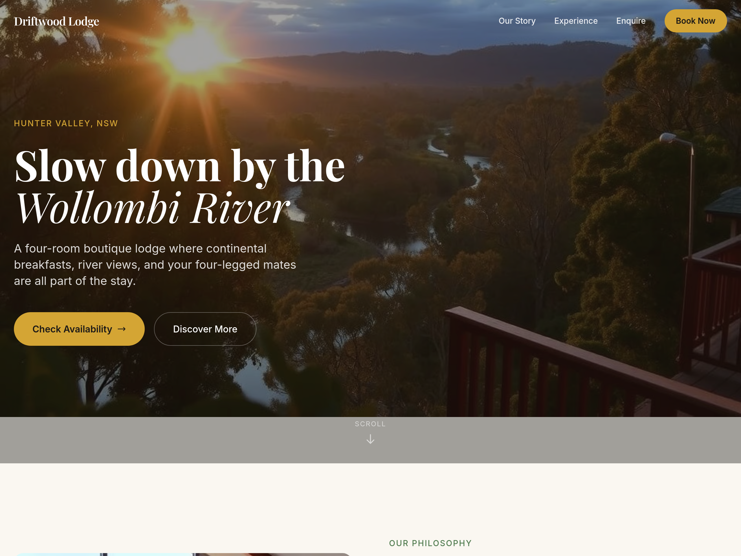
Before
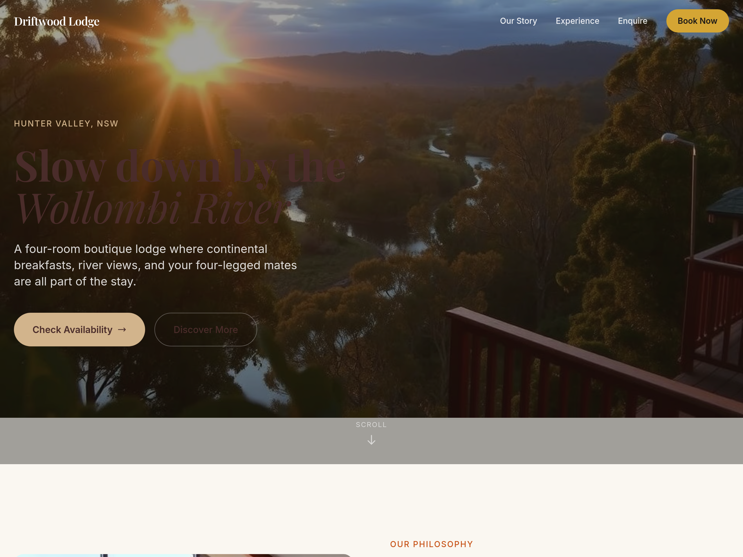
After
the colour palette is too cool — warm everything with sandstone + clay tones
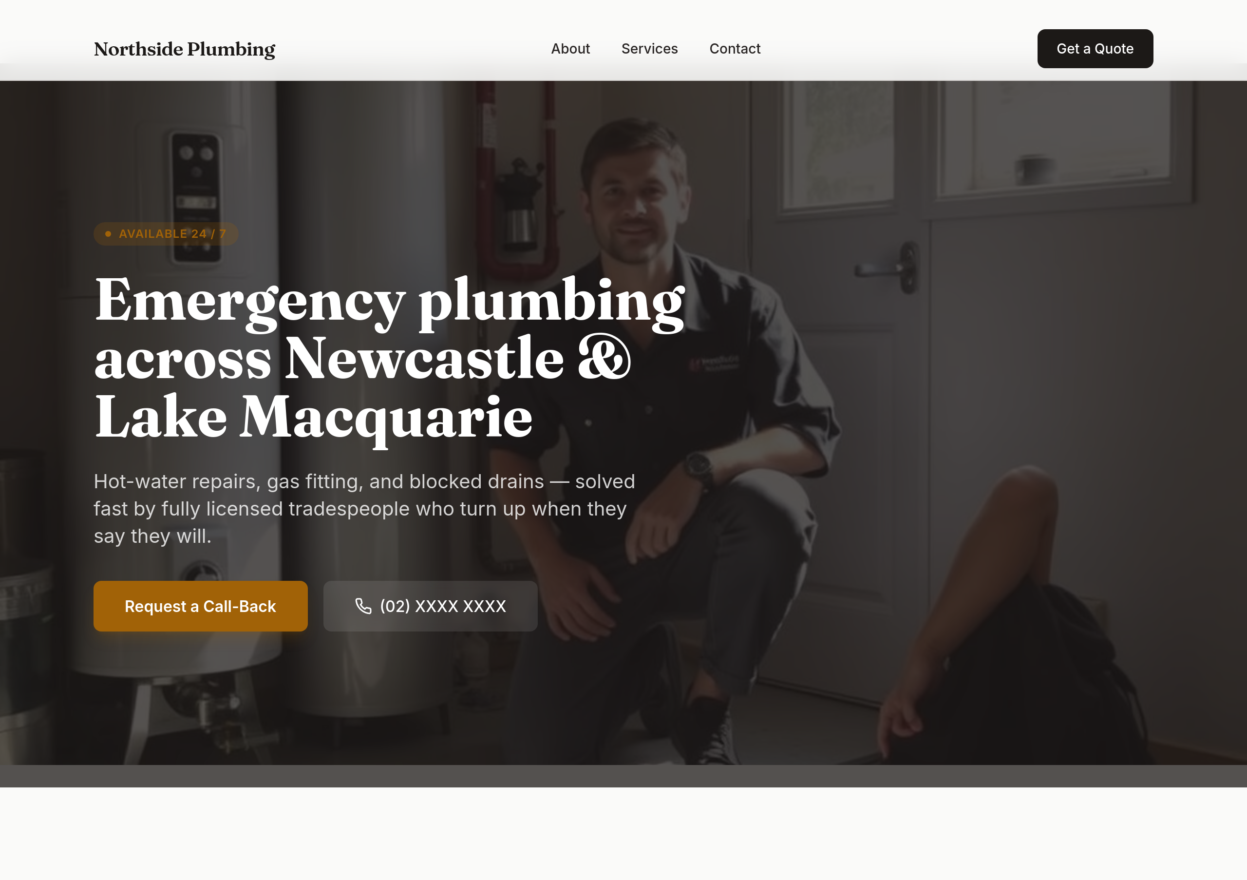
Before
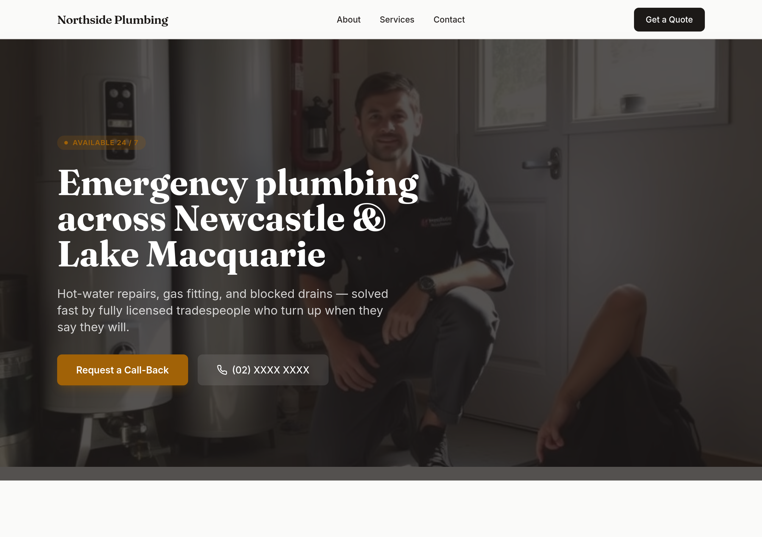
After
the colours are too soft — use bold orange + dark navy
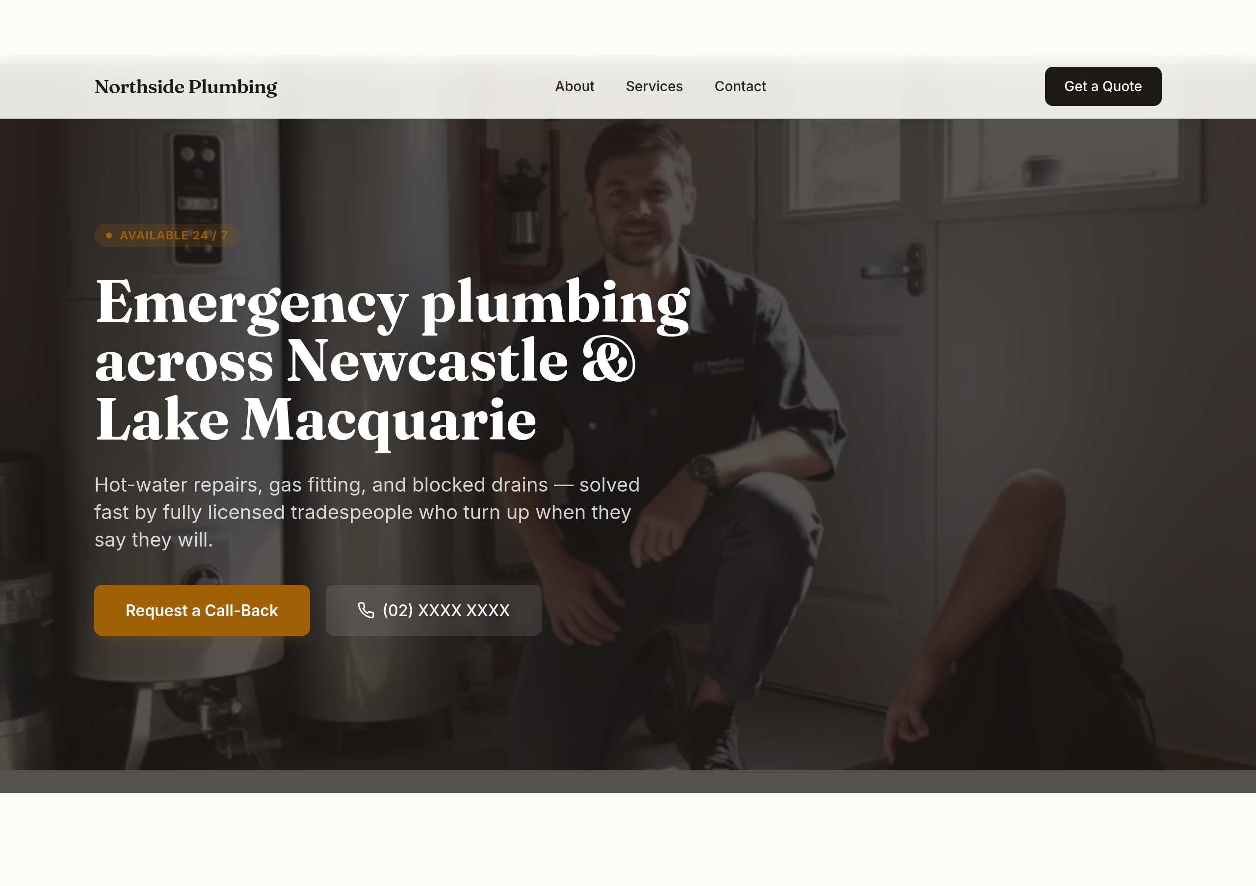
Before
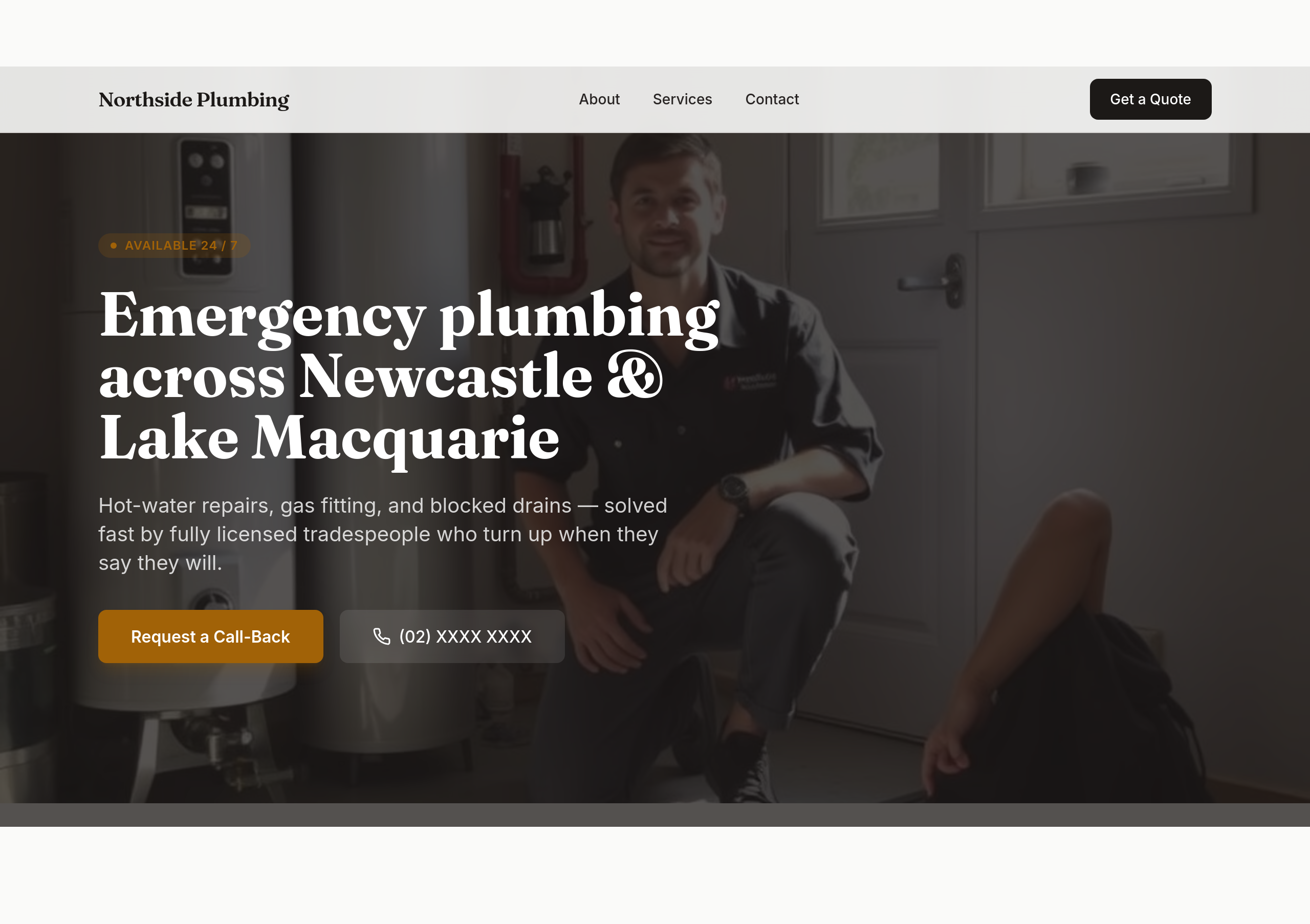
After
make the phone number BIG in the hero — it should be the most prominent thing

Before

After
the colours are bland — bold orange + dark navy, high contrast, tradie-confident
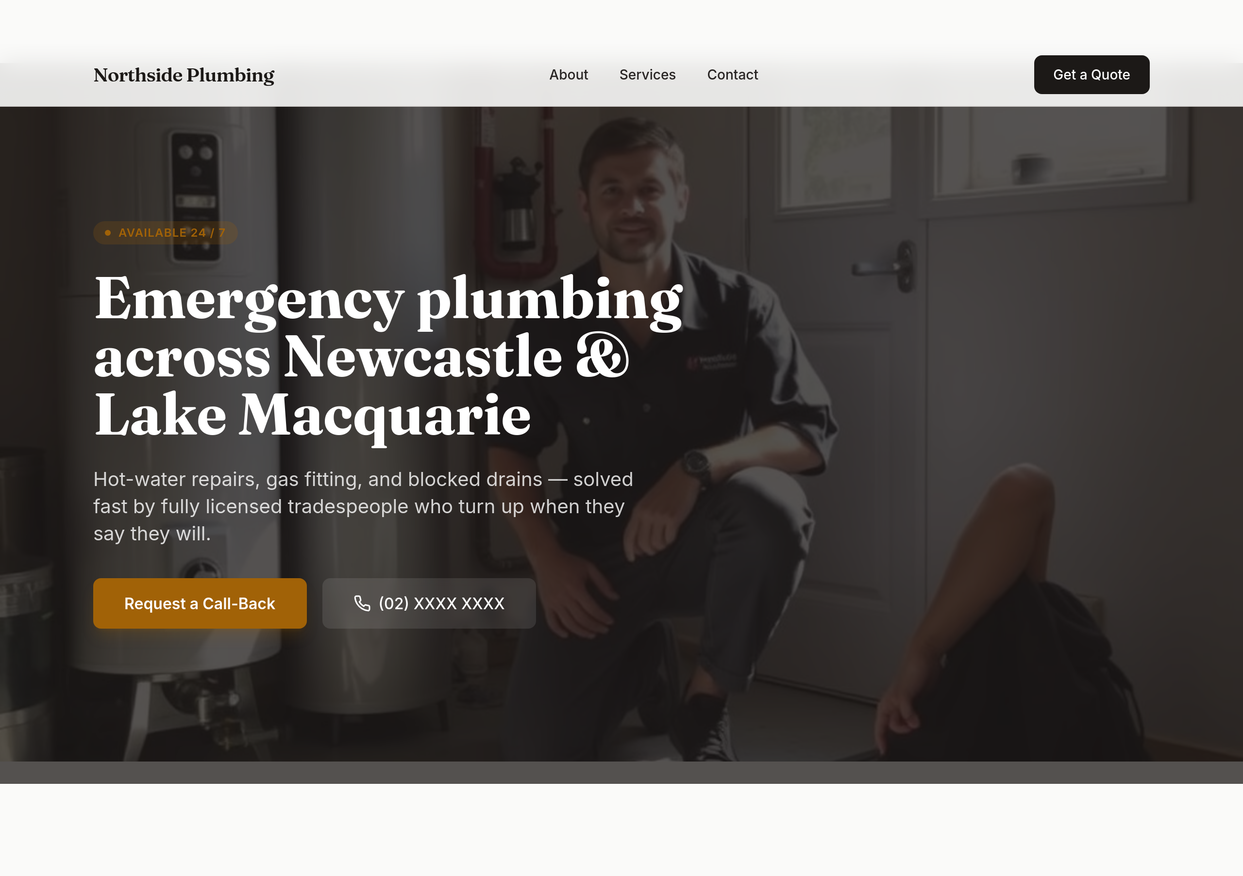
Before
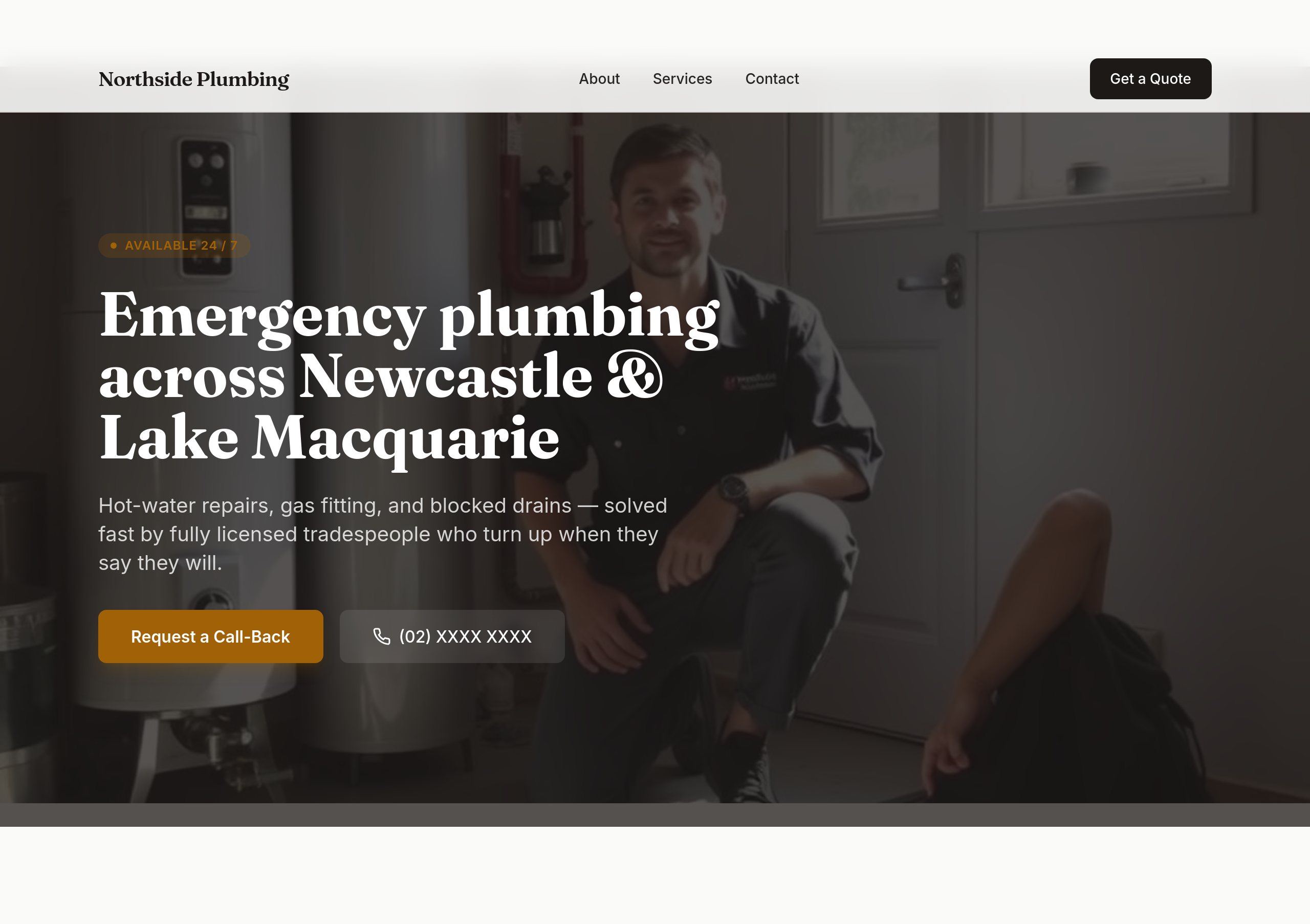
After
the phone number should be the biggest text on the page in the hero
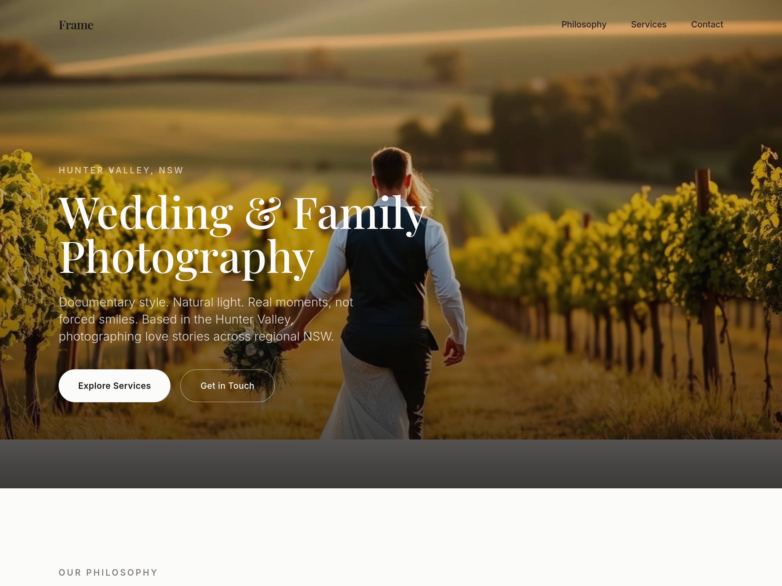
Before
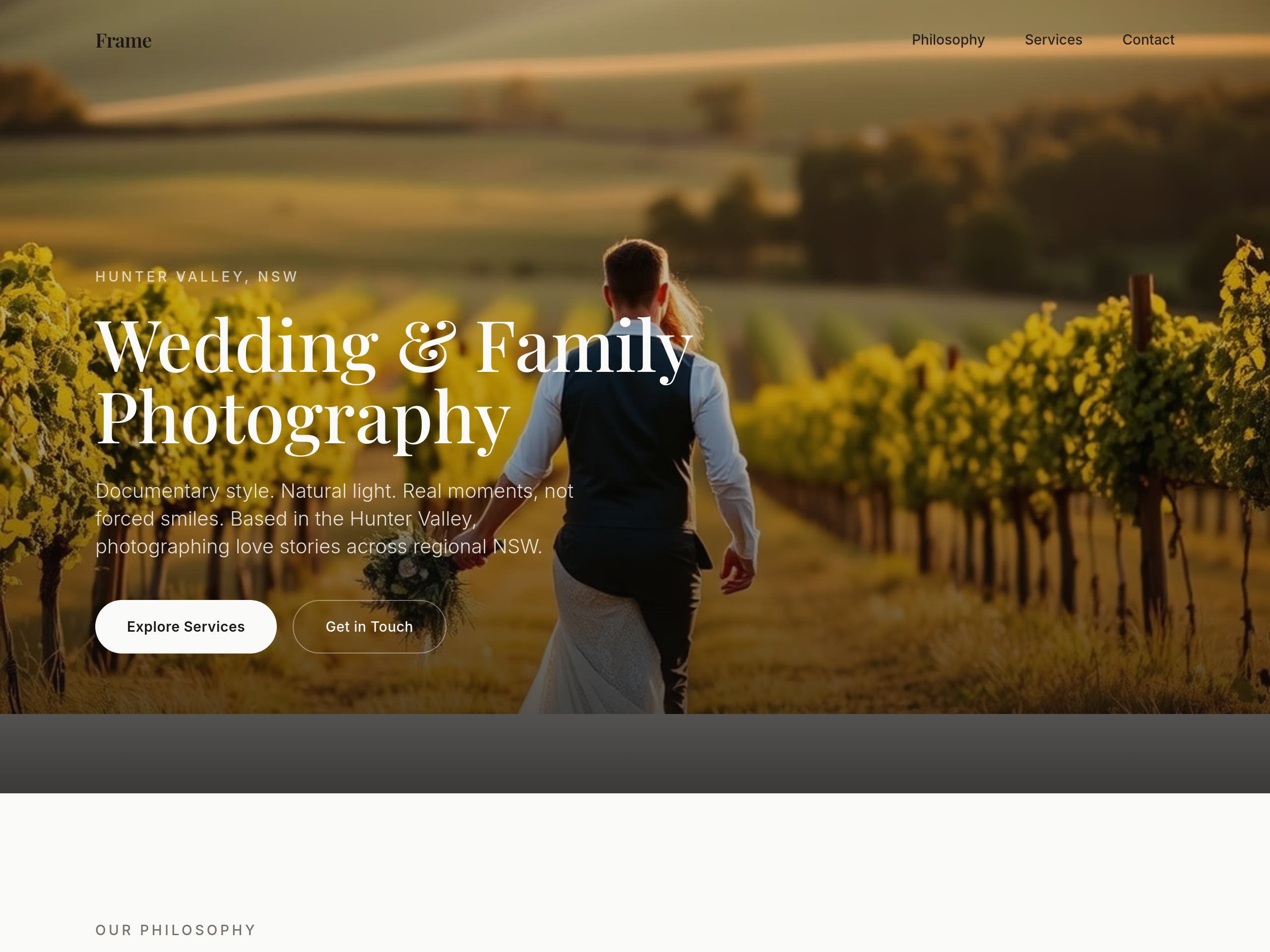
After
the type is too modern — switch to a classic serif headline + clean sans body
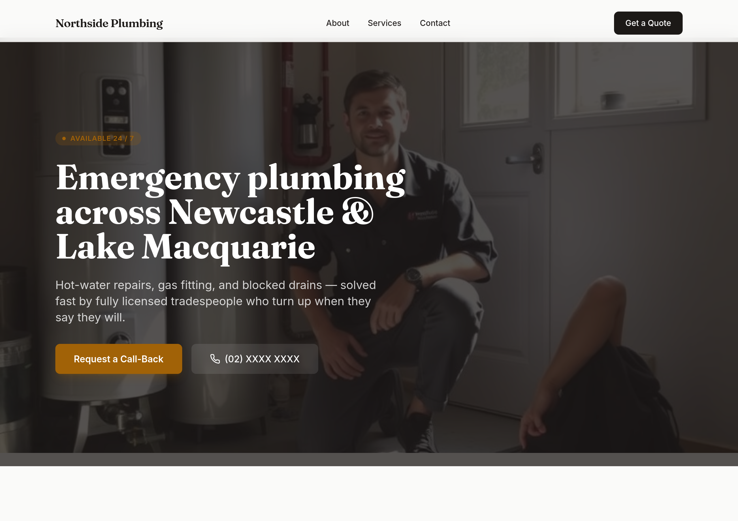
Before
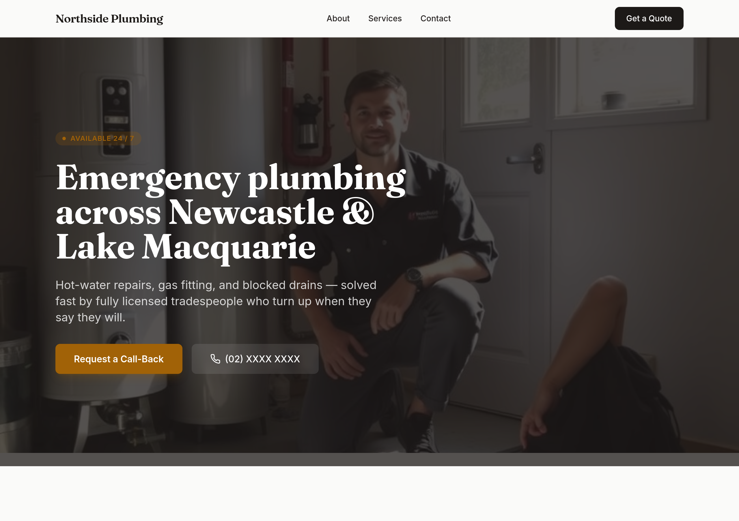
After
the colours are flat — use bold orange + dark navy for tradie confidence

Before

After
the colours are too saturated — soften to cream + dusty rose
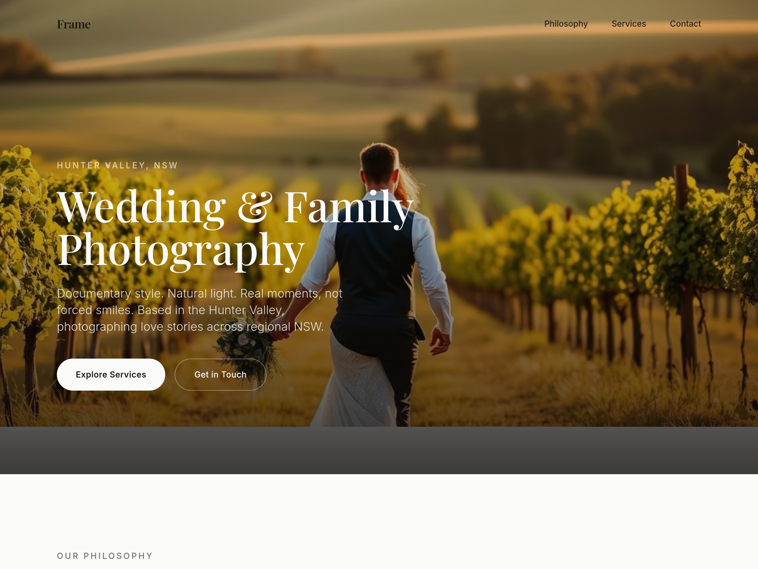
Before
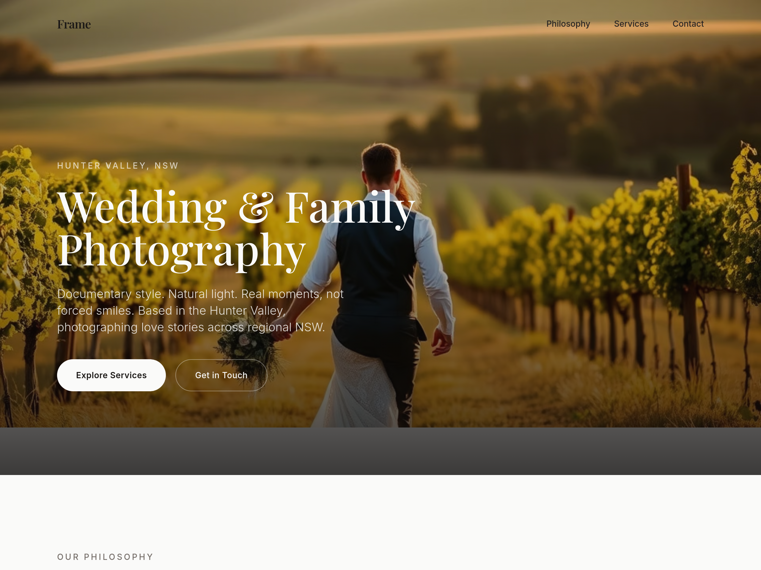
After
use a serif heading font — feels more editorial
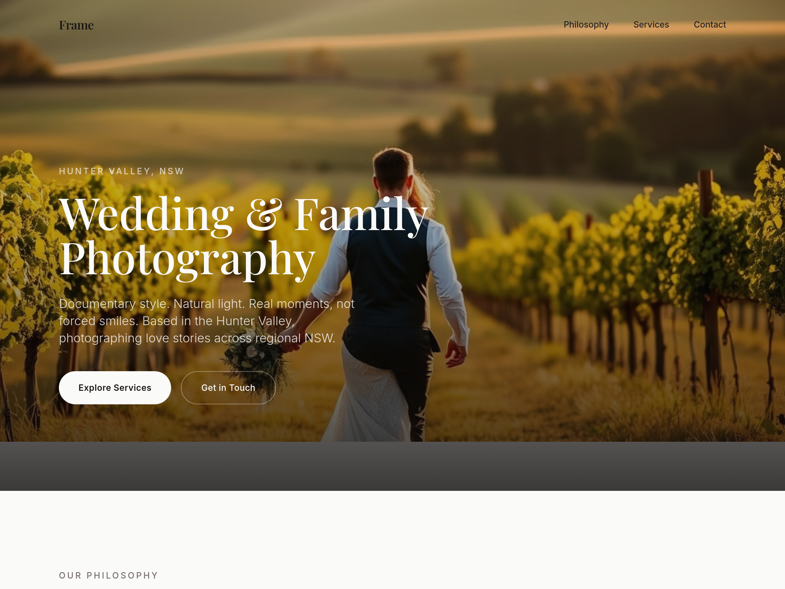
Before
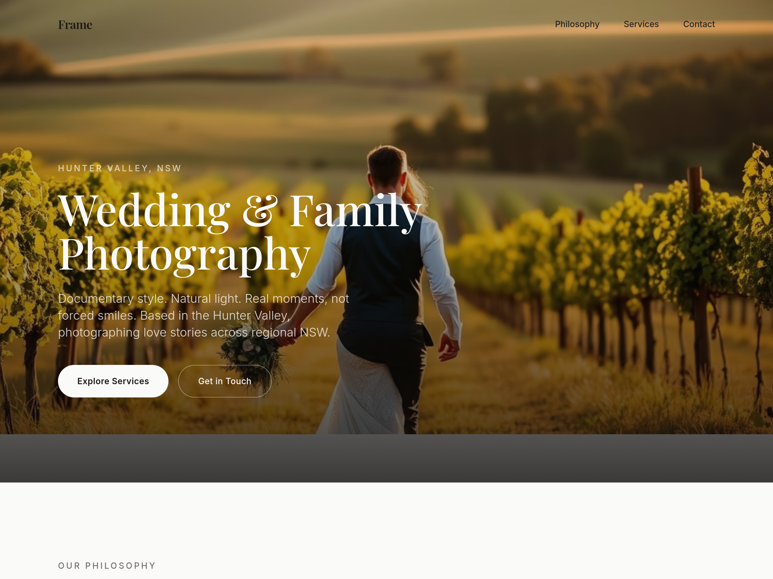
After
the type is too modern — switch headings to a classic serif (think editorial wedding magazine)
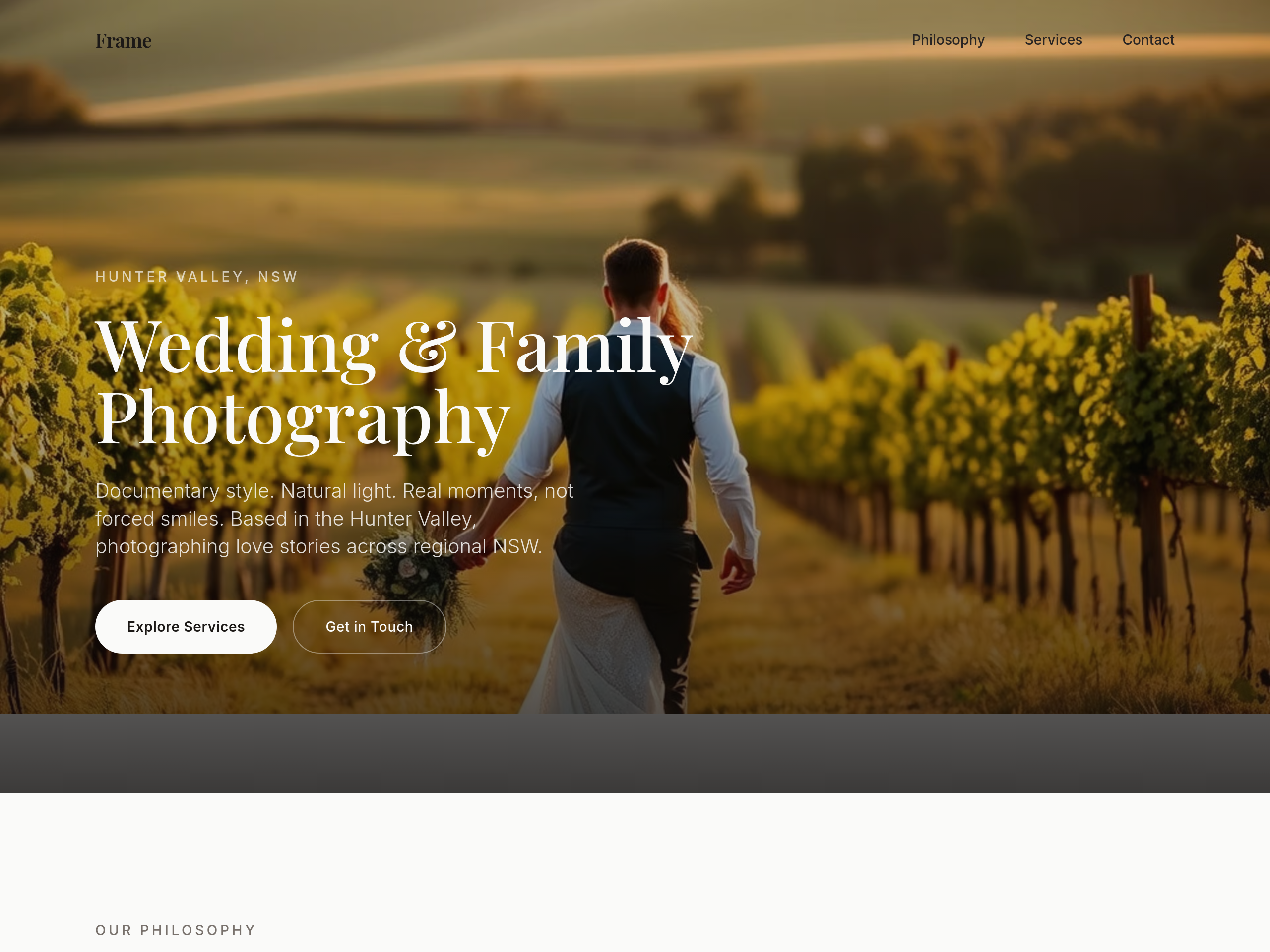
Before
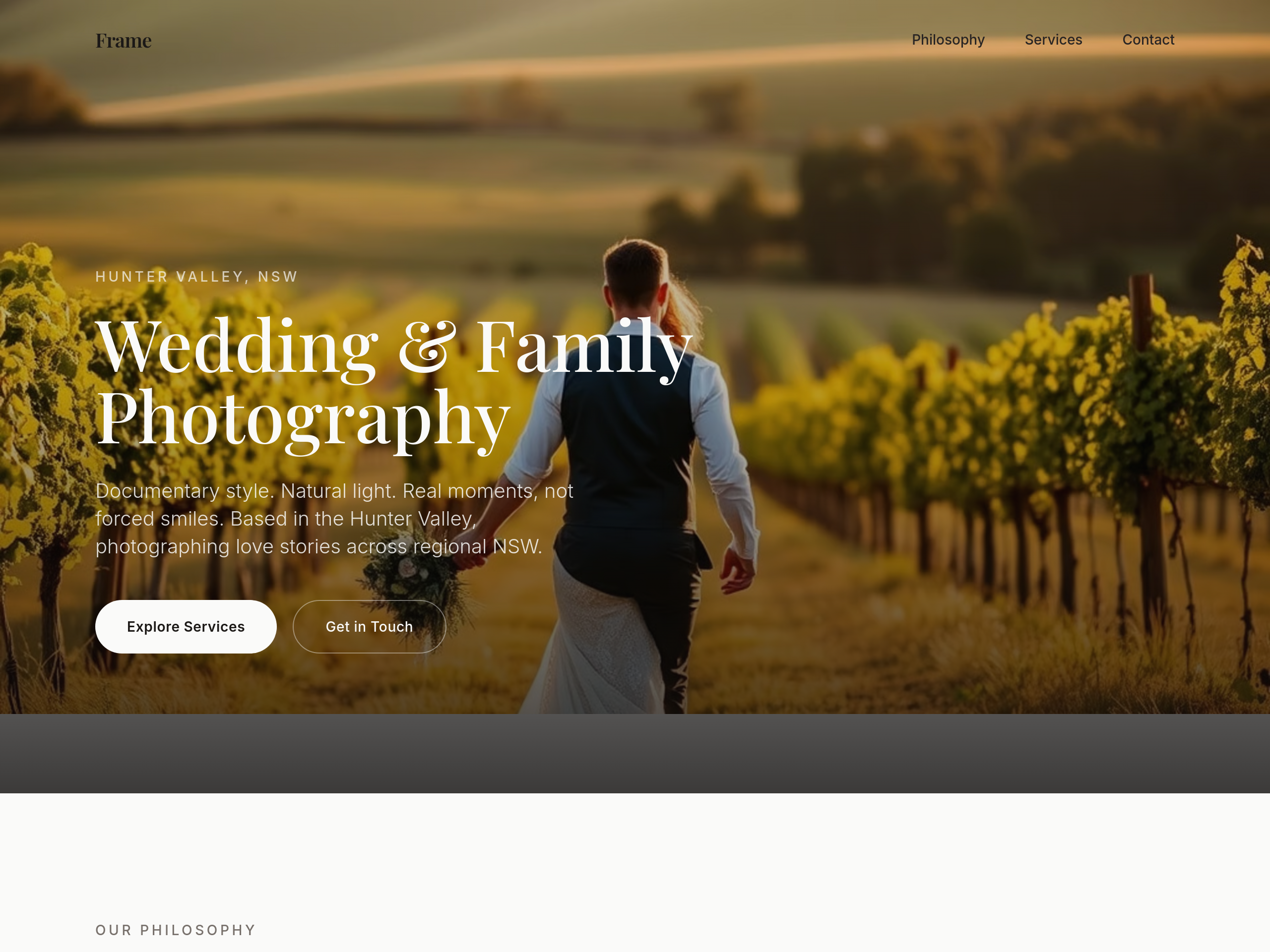
After
add subtle film grain texture as a CSS overlay on every image

Before

After
the colour palette is too cool — soften to ivory, dusty rose, warm grey
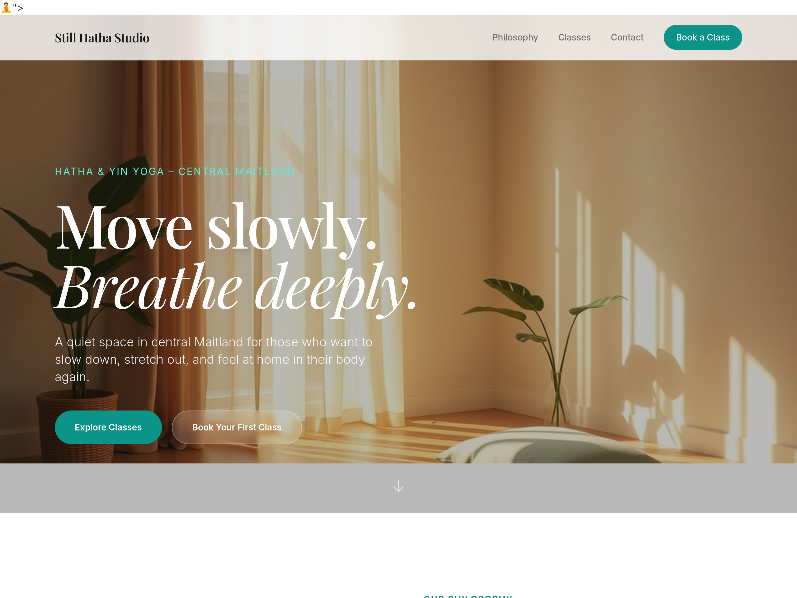
Before
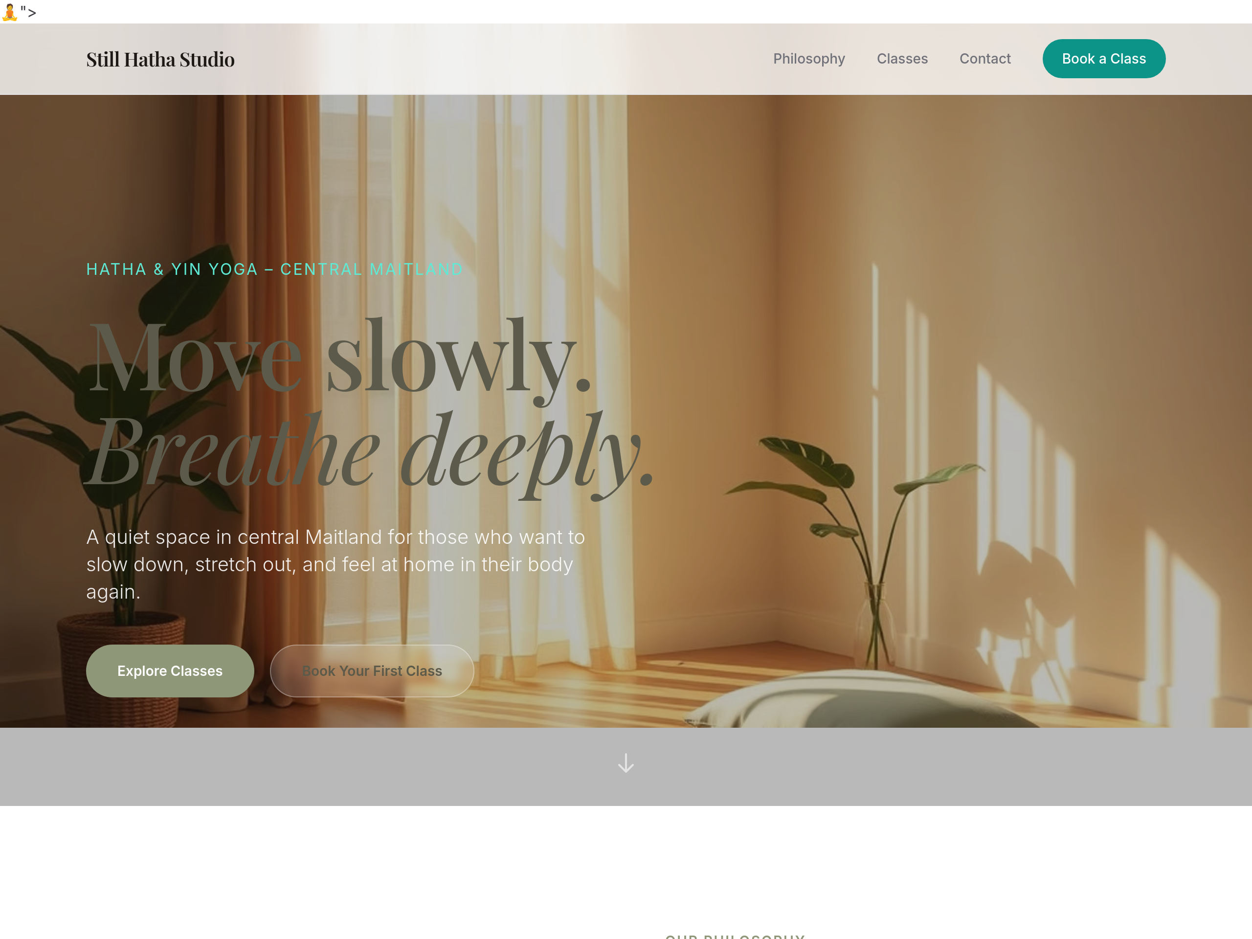
After
the palette is too pink — use earthy sage + warm linen tones
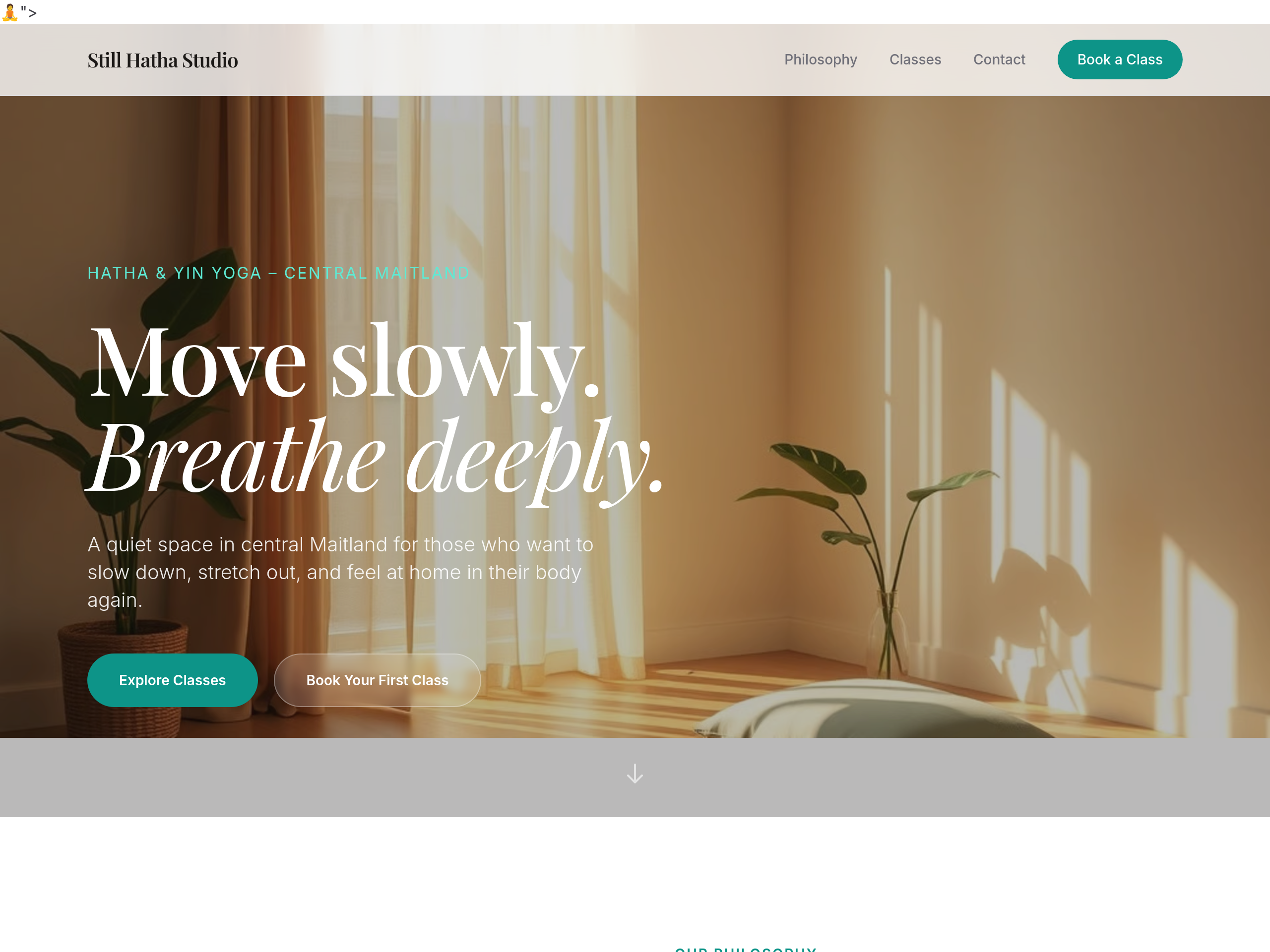
Before
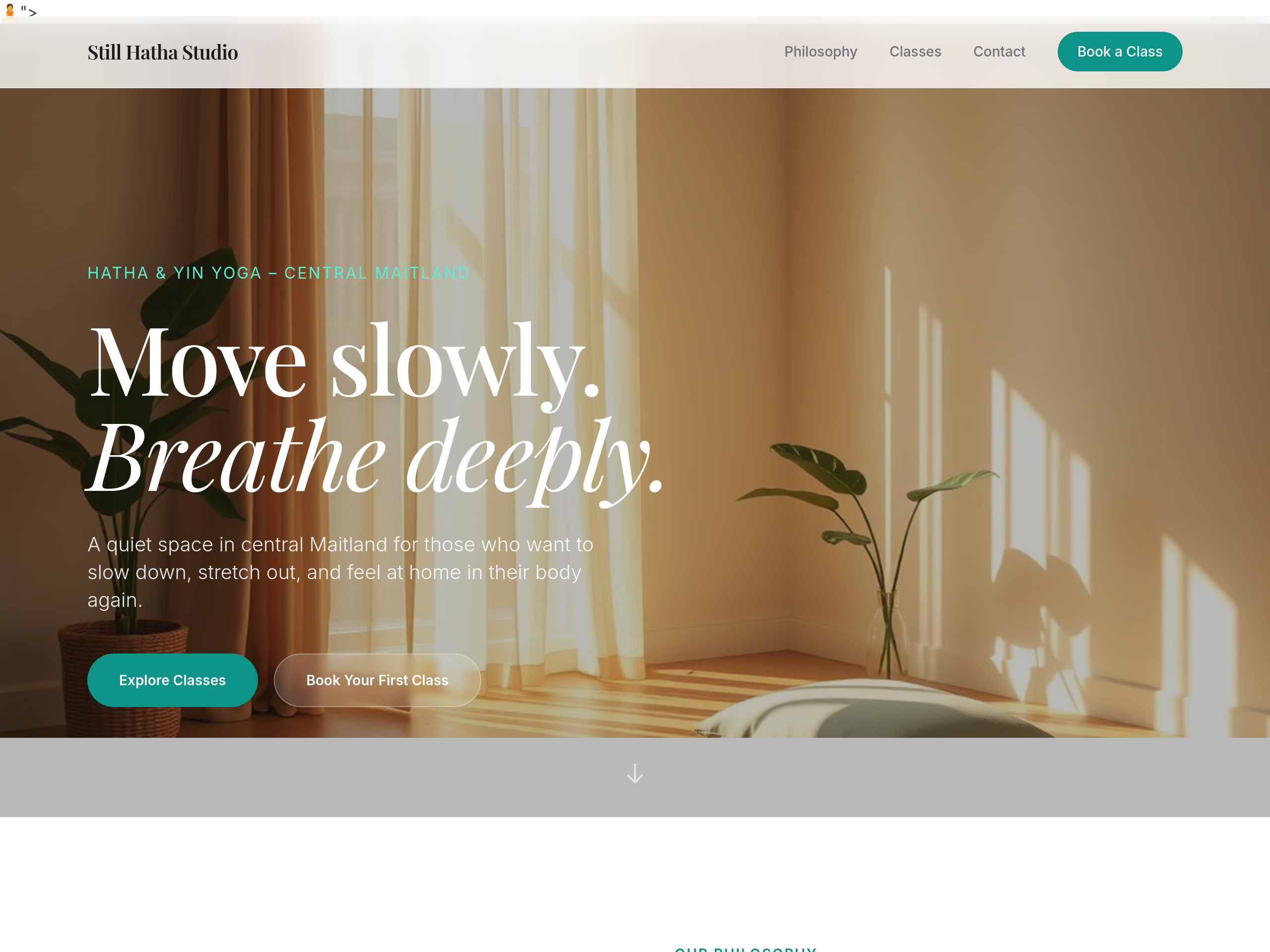
After
use a soft serif for headings — feels more grounded
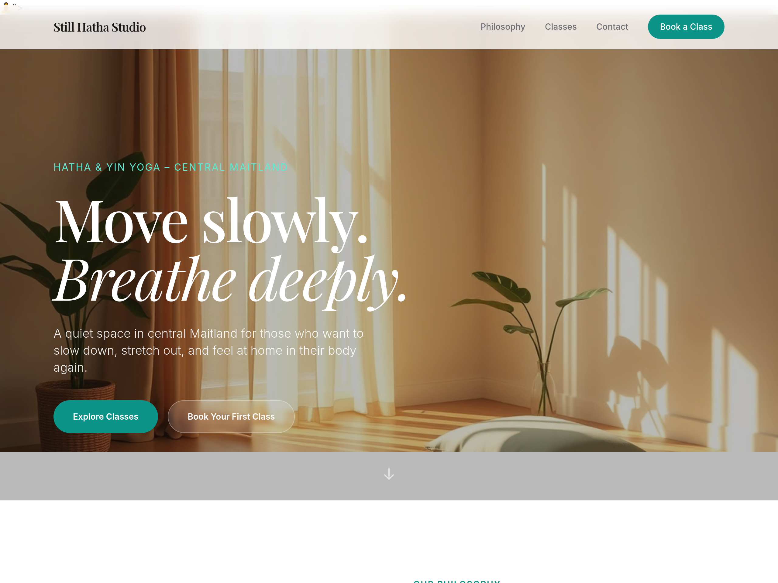
Before
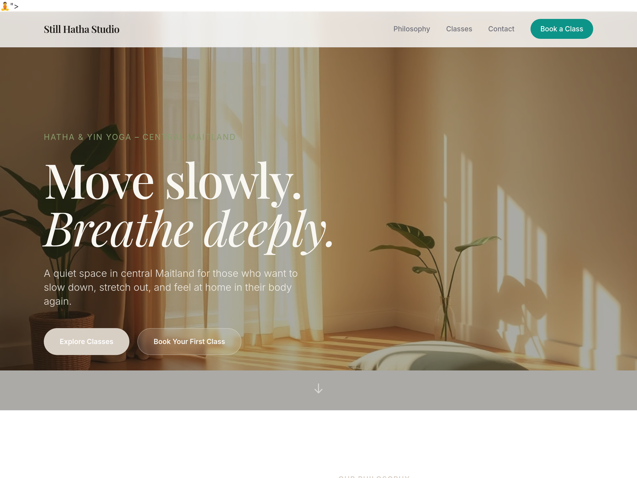
After
the colour palette is too pink — warm earthy sage + dusty linen tones
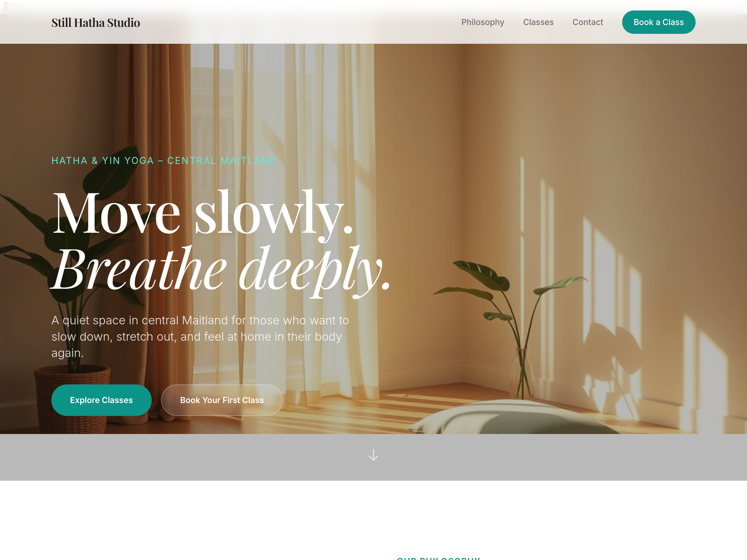
Before
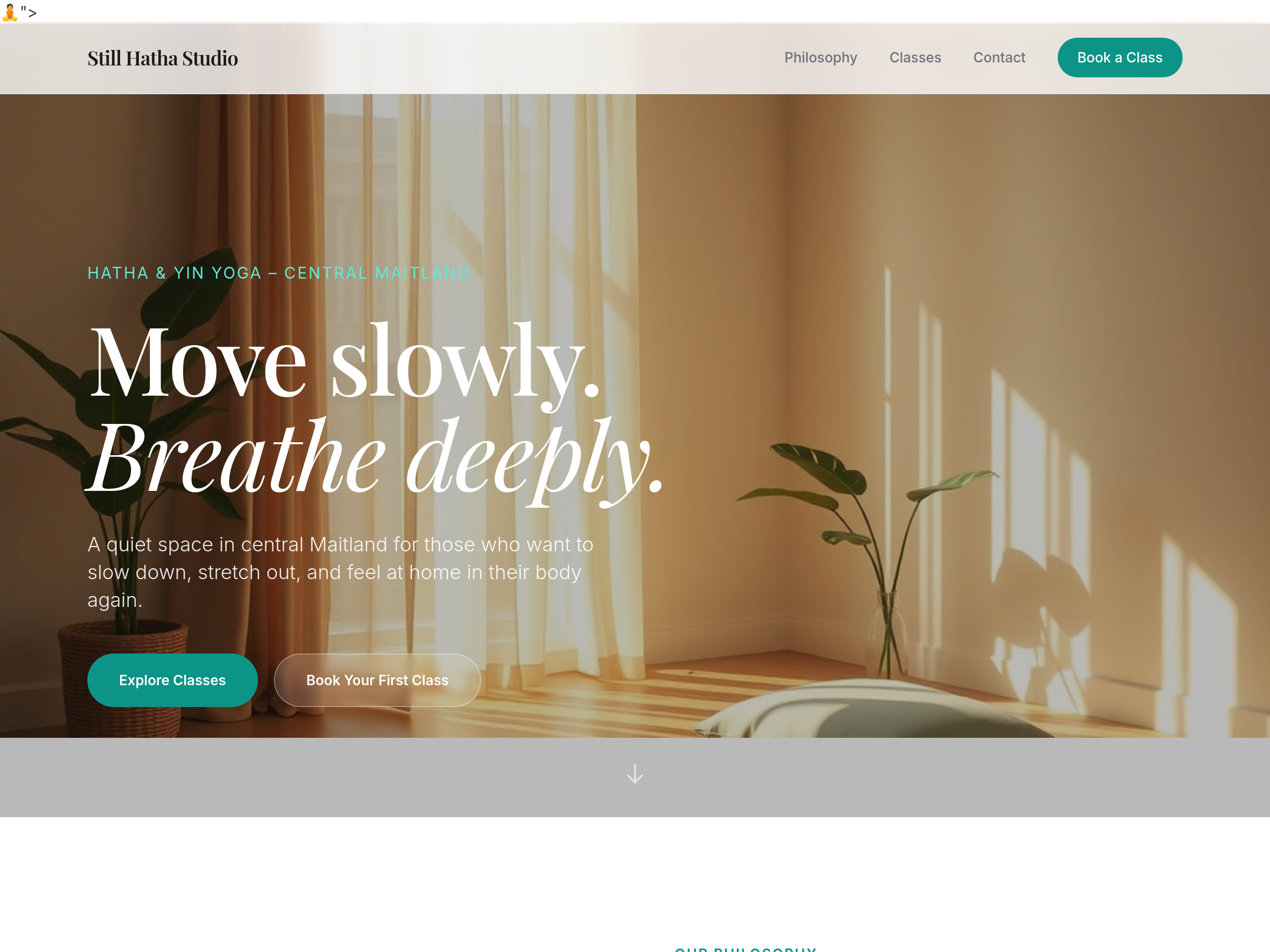
After
the headings feel commercial — use a soft humanist serif