yoga
67 examples run against cap-yoga.flarepages.au.
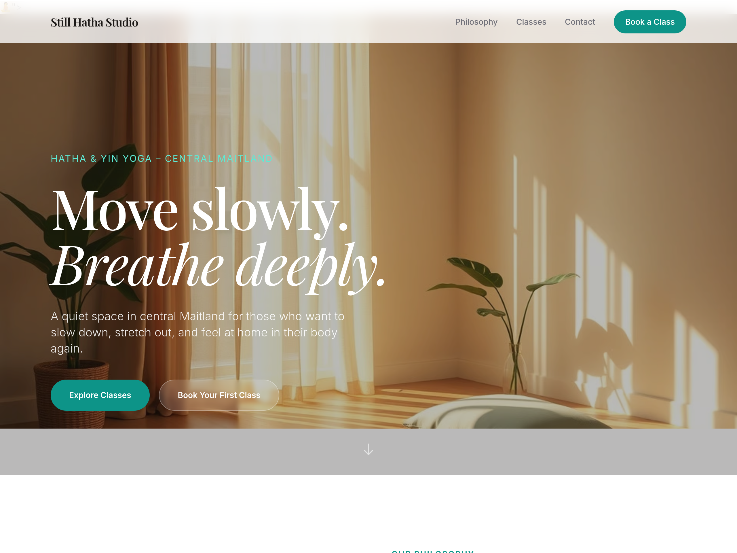
Before
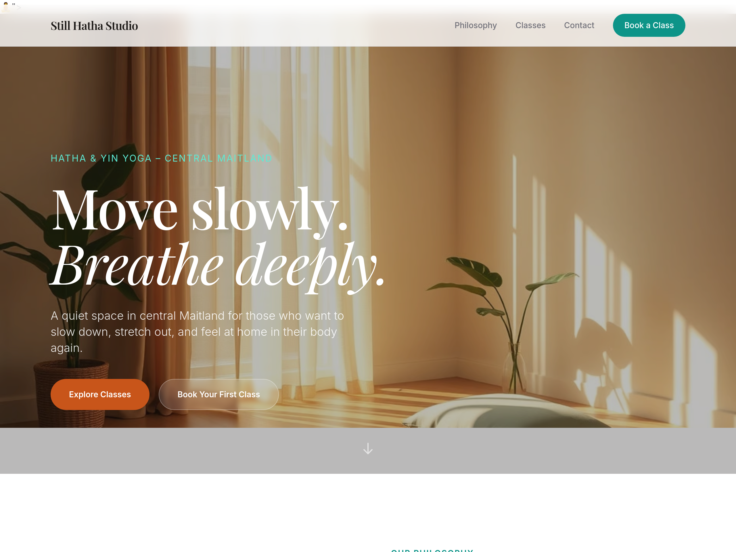
After
change the primary button colour from green to a warm terracotta
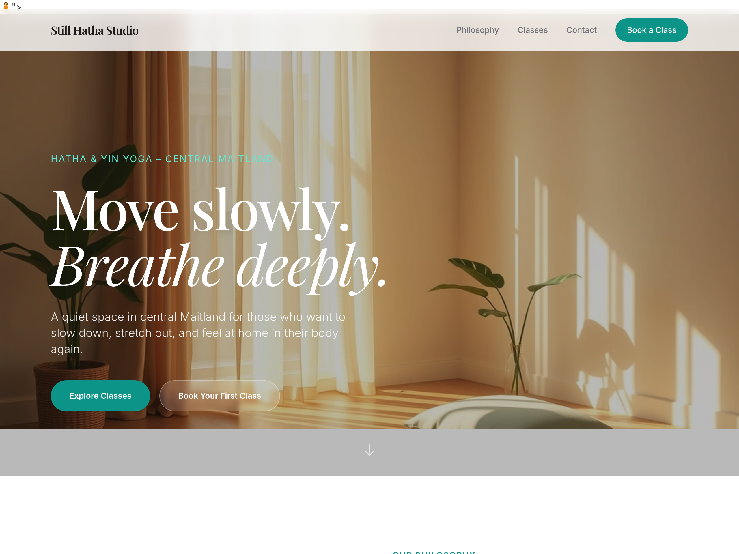
Before
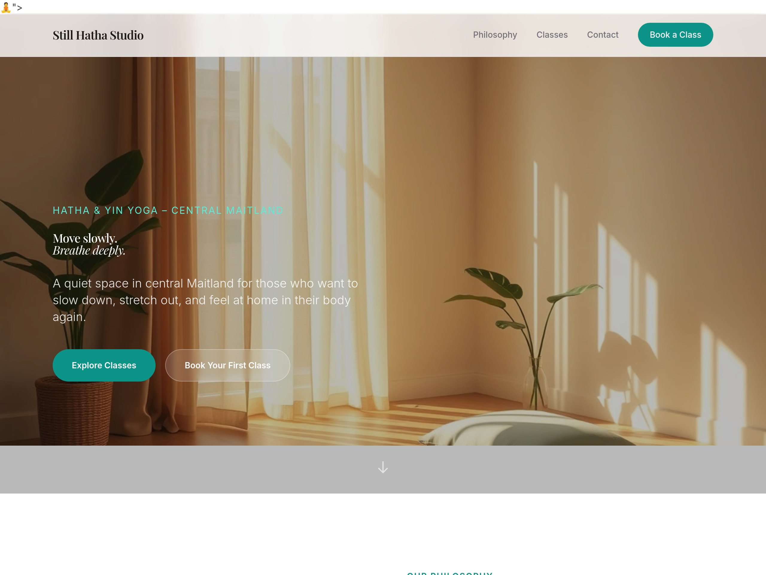
After
make the headings 25% bigger throughout
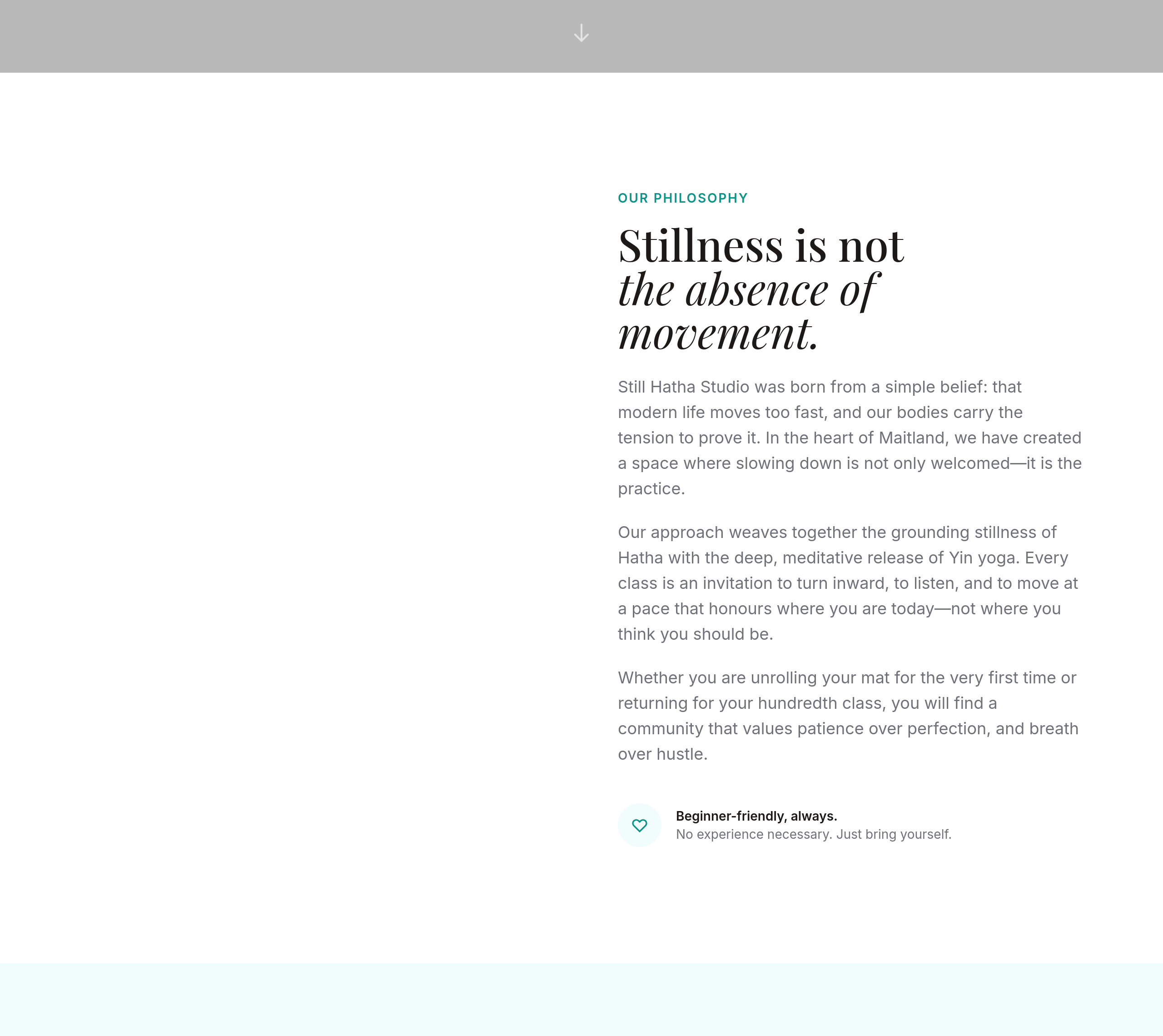
Before
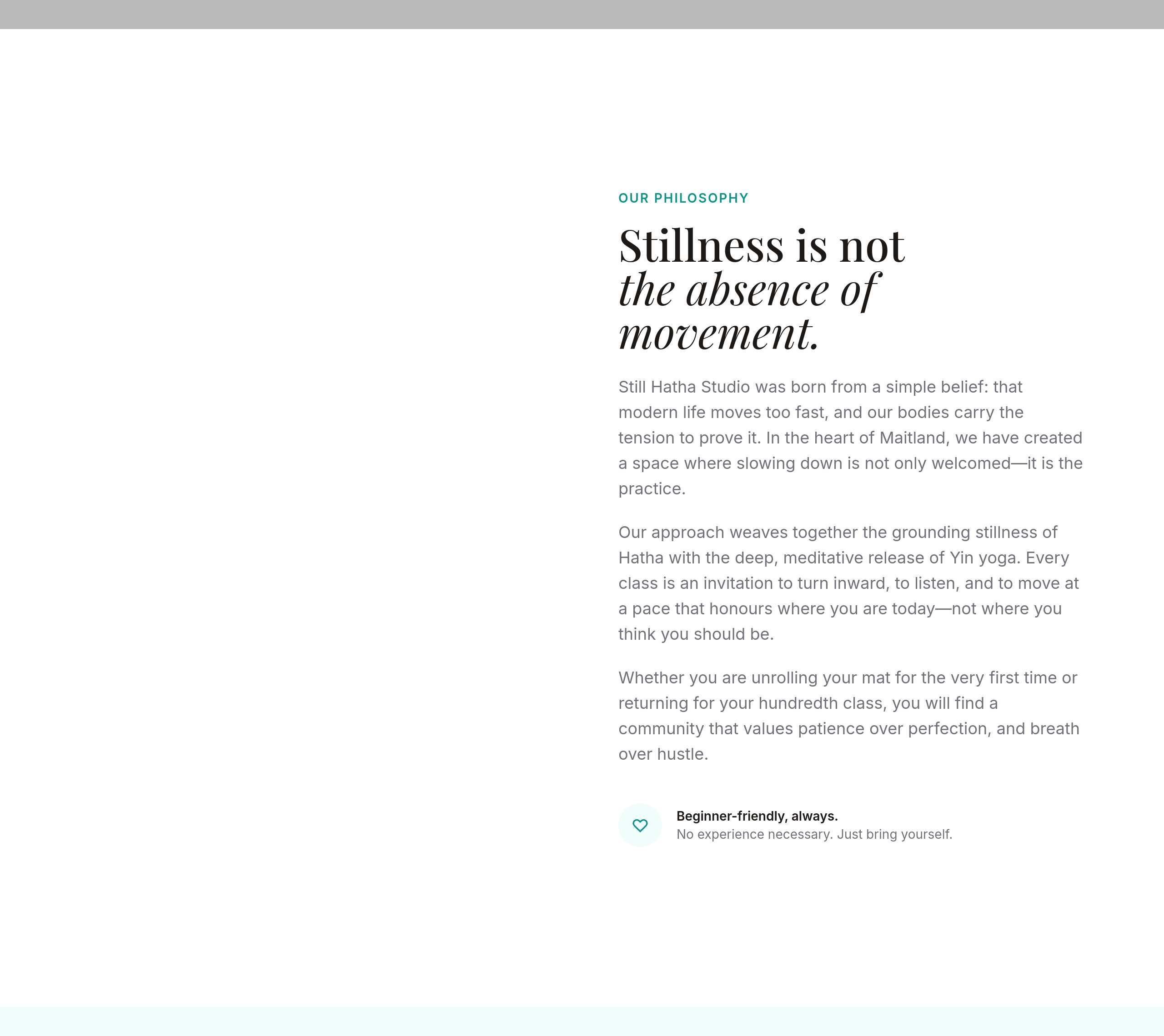
After
add more space between sections — feels too cramped
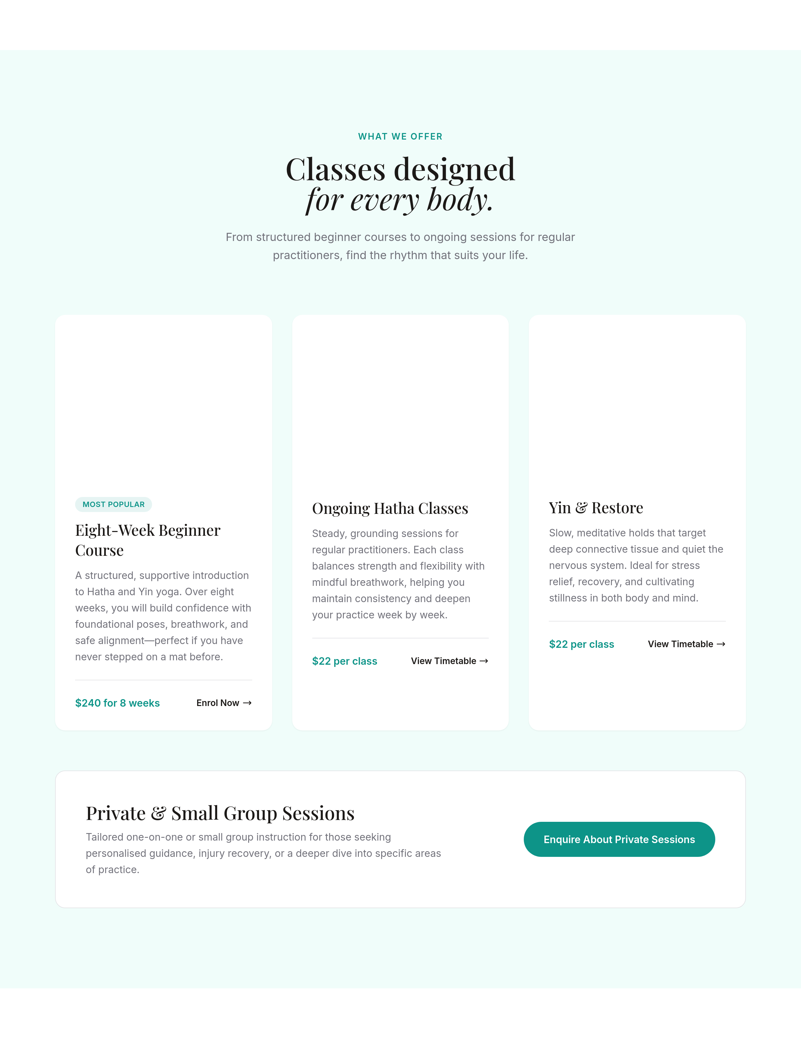
Before
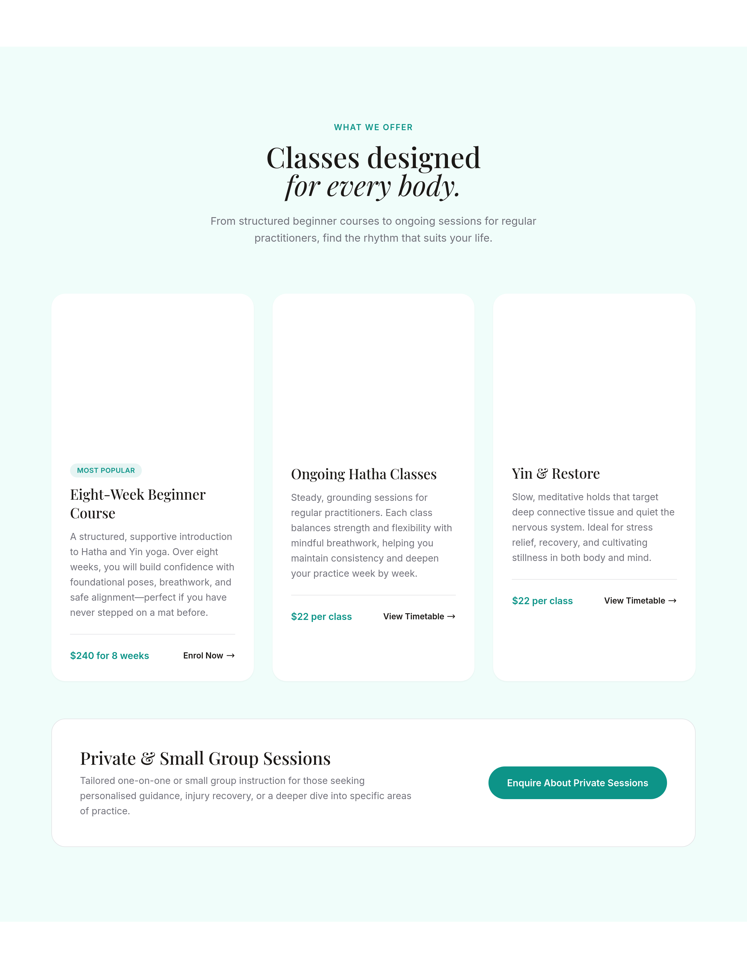
After
the cards have sharp corners — round them off slightly
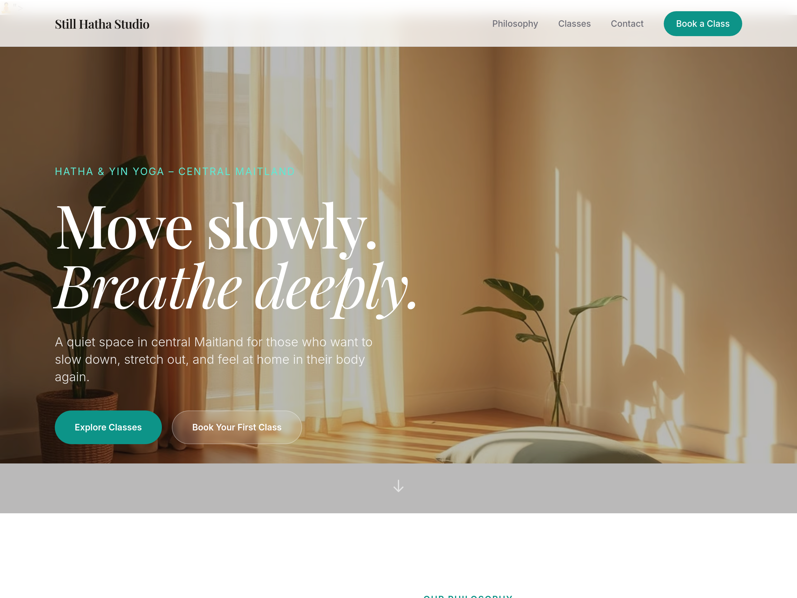
Before
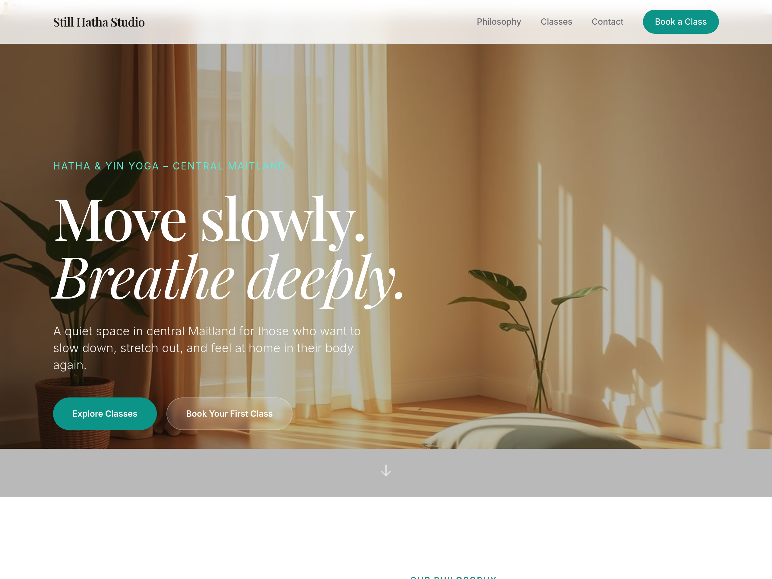
After
the body text colour is too light — bump contrast for accessibility
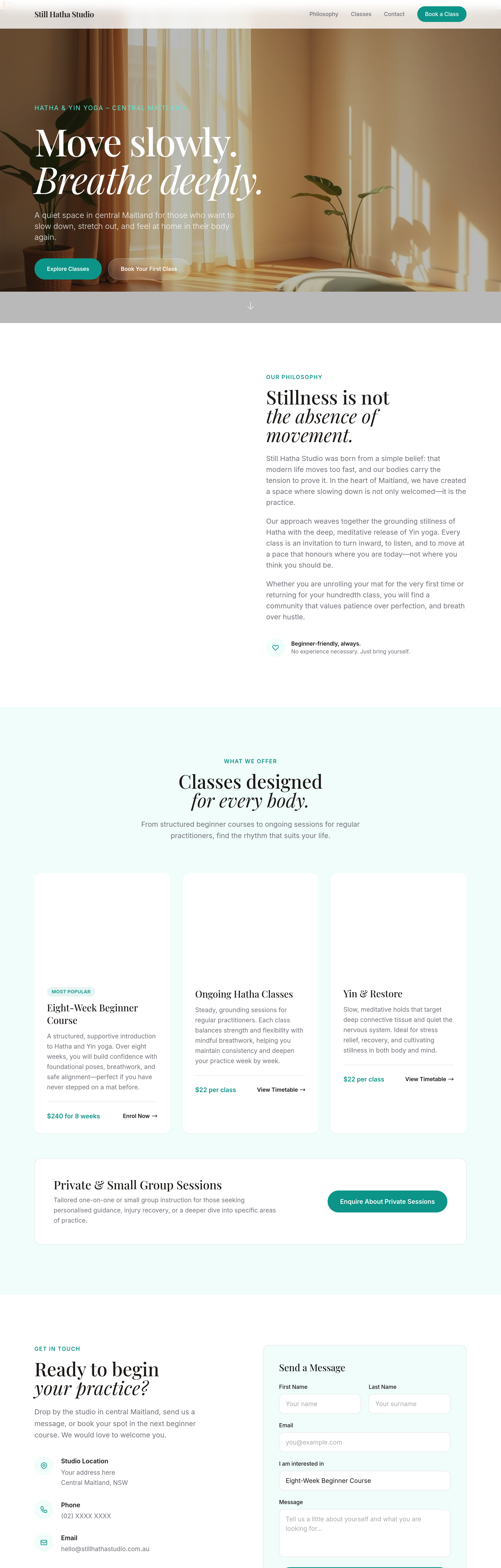
Before
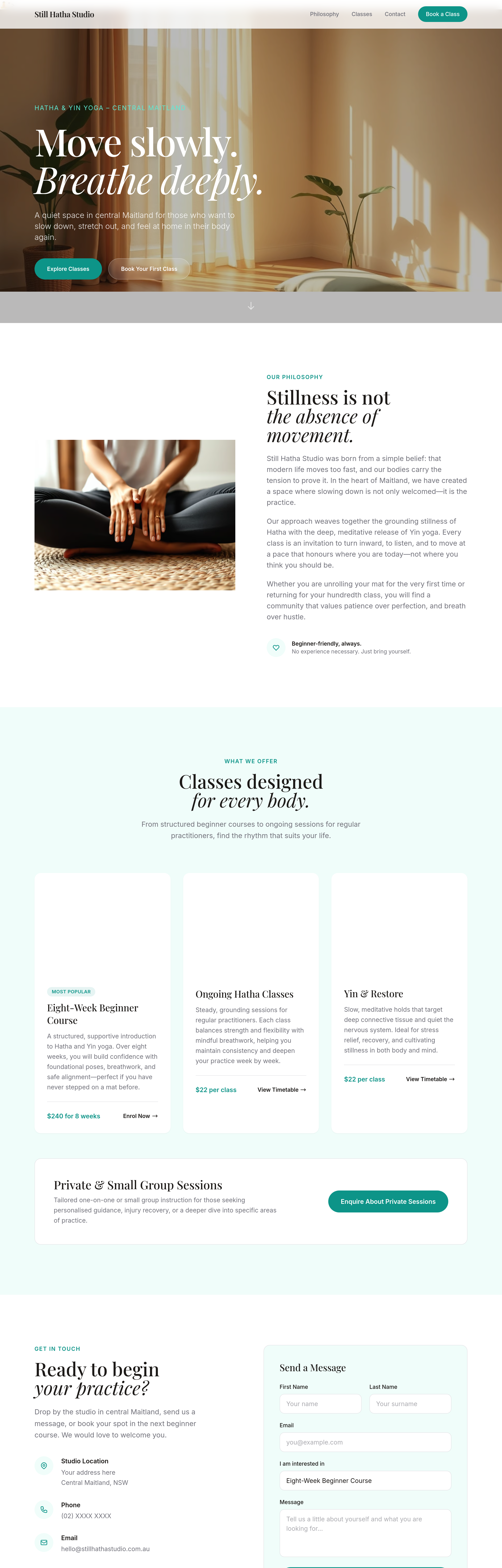
After
add a 'Find us on Instagram' link in the footer
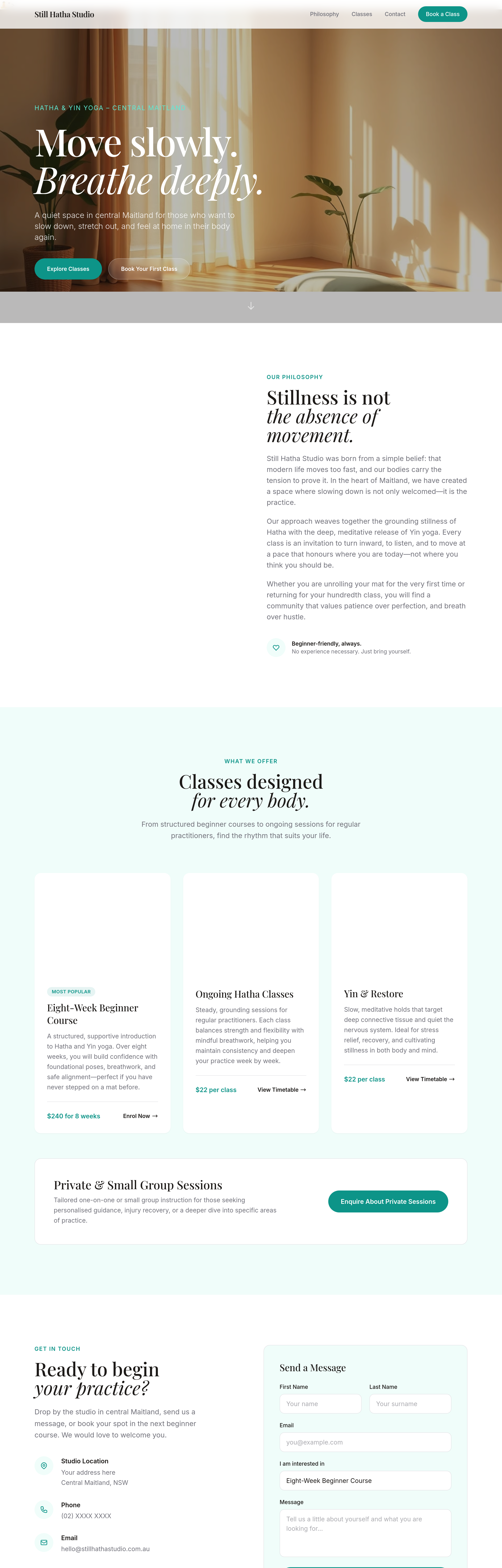
Before
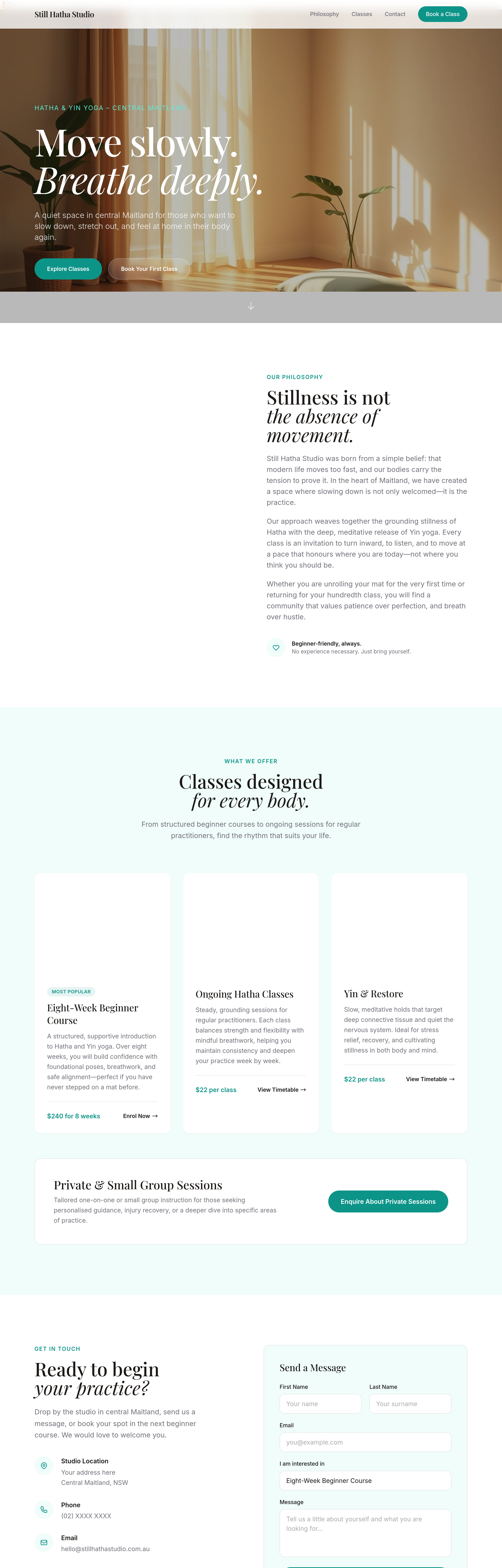
After
the CTA button is buried — move it up so it's visible above the fold
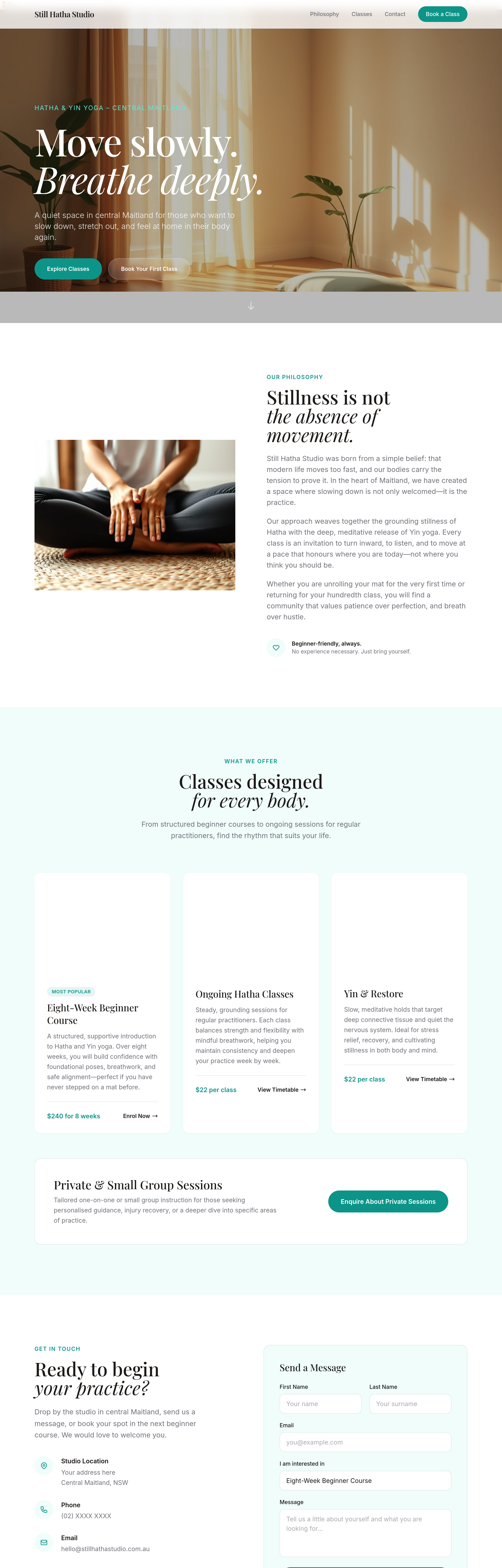
Before
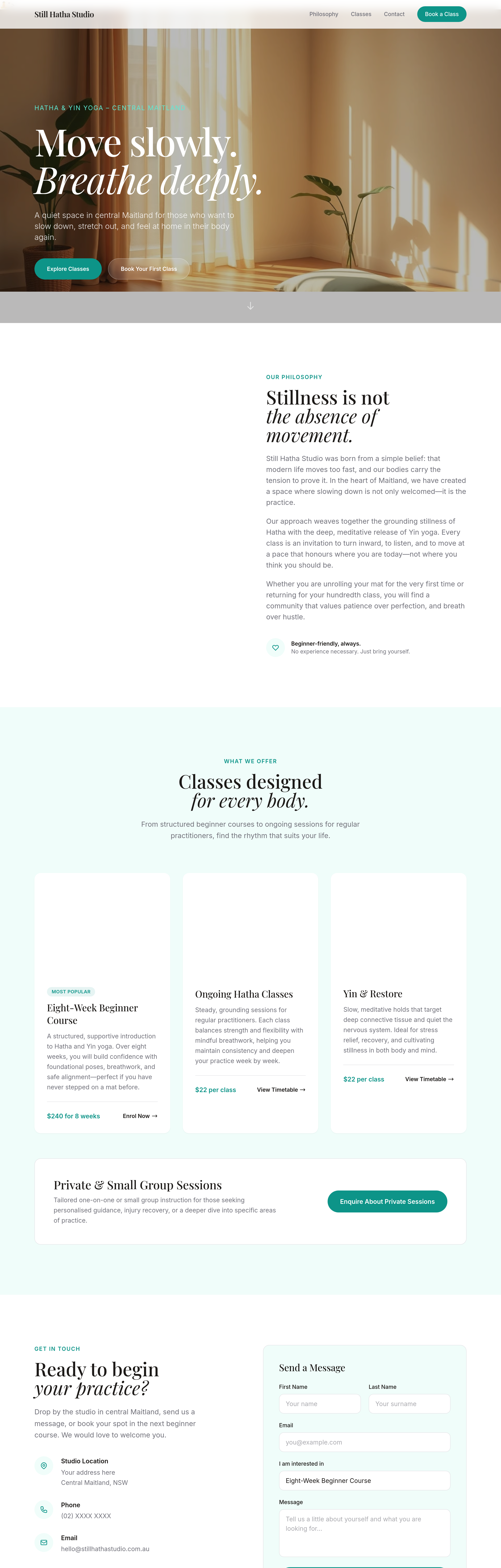
After
add a secondary CTA next to the primary — 'View the menu' alongside 'Visit us'
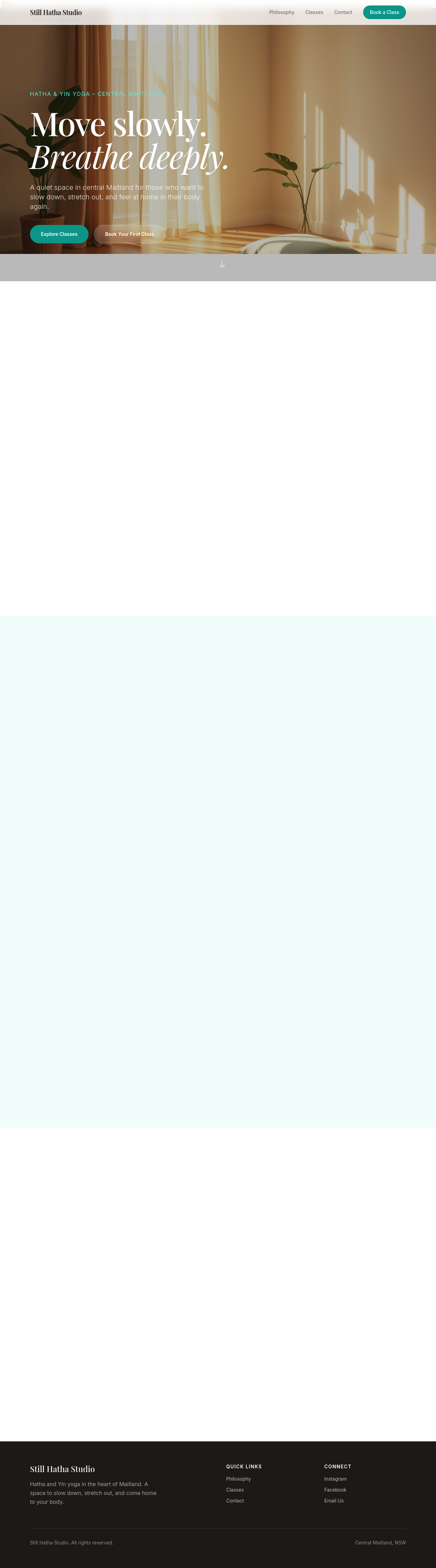
Before

After
add a small menu pricing card — coffees $4.50-$6, pastries $4-$8, lunch $14-$20
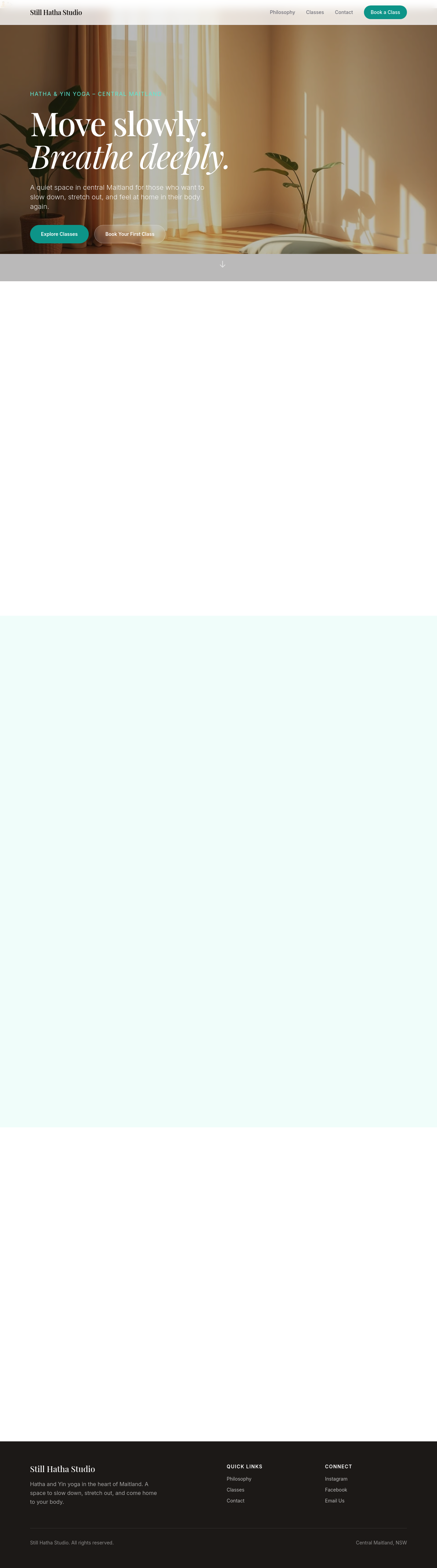
Before

After
the meta description is missing — write one that mentions Newcastle East + slow-pour coffee
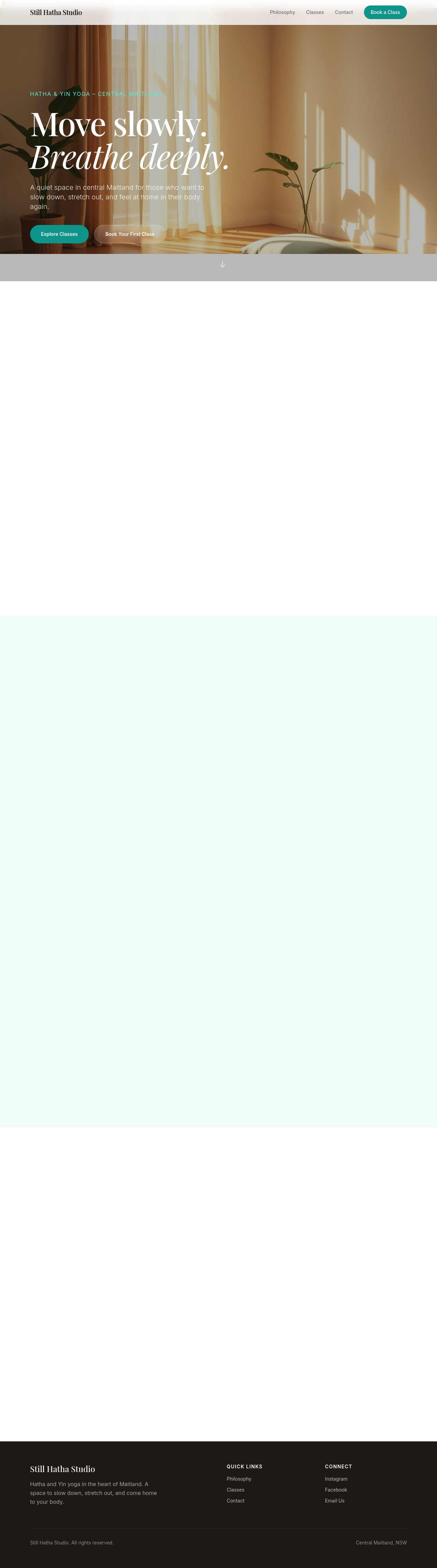
Before

After
every 'cafe' should be 'café' with the accent
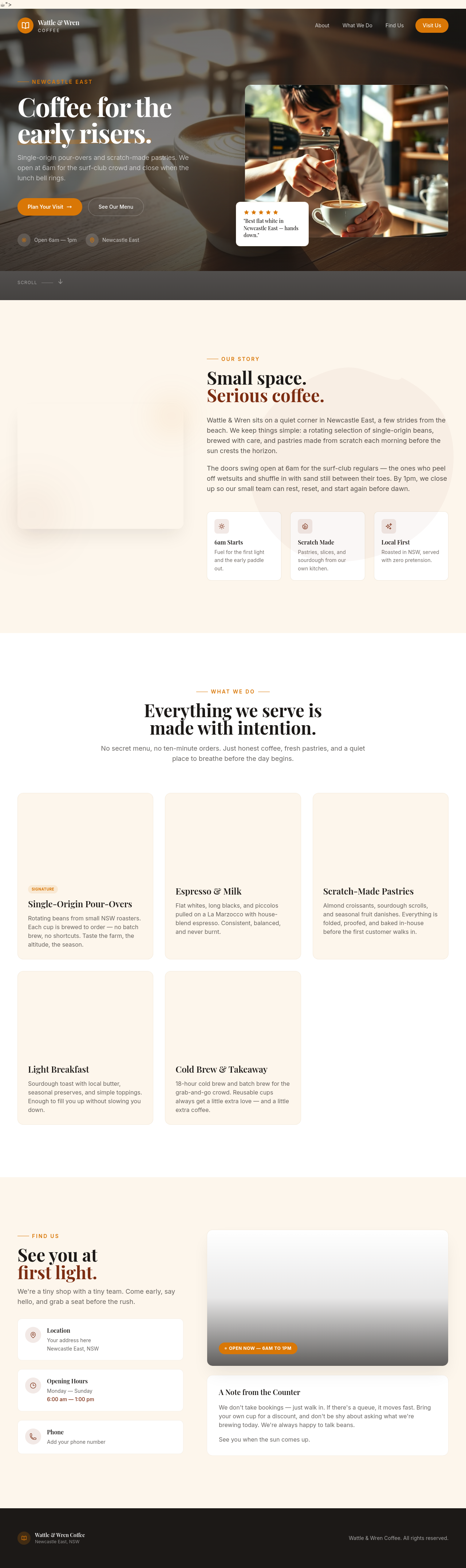
Before
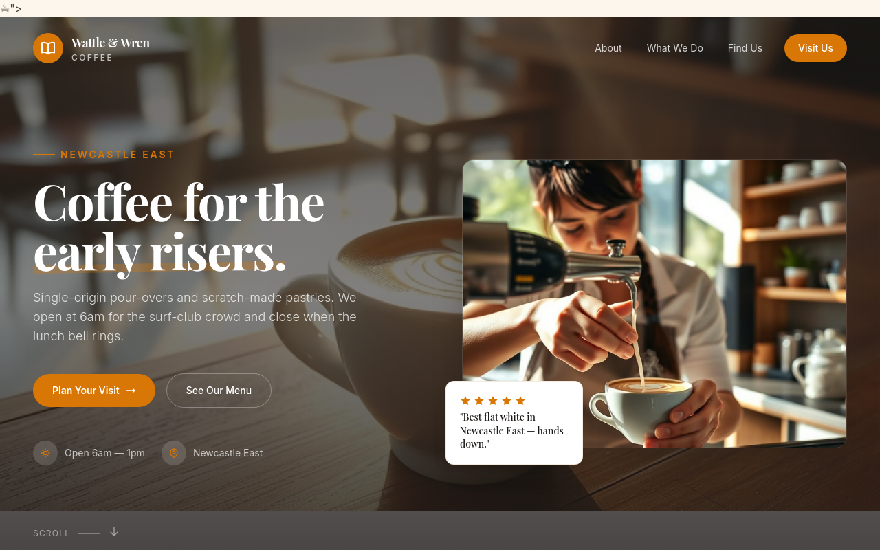
After
create a new page at /menu listing all our coffees + pastries with descriptions
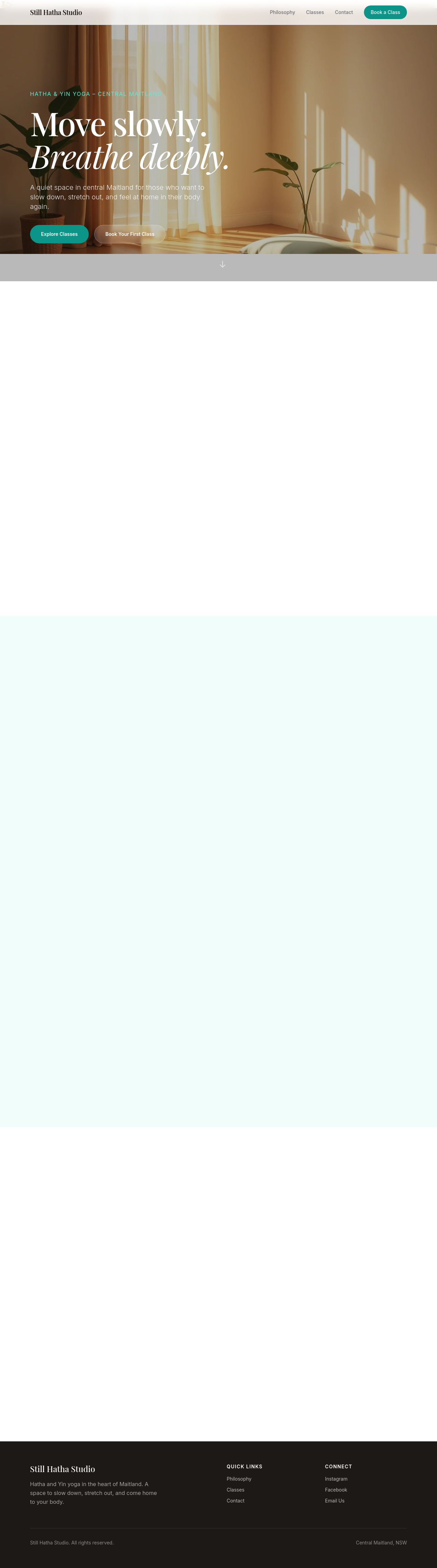
Before

After
add a /privacy page with a basic Australian Privacy Principles compliance statement
Before
After
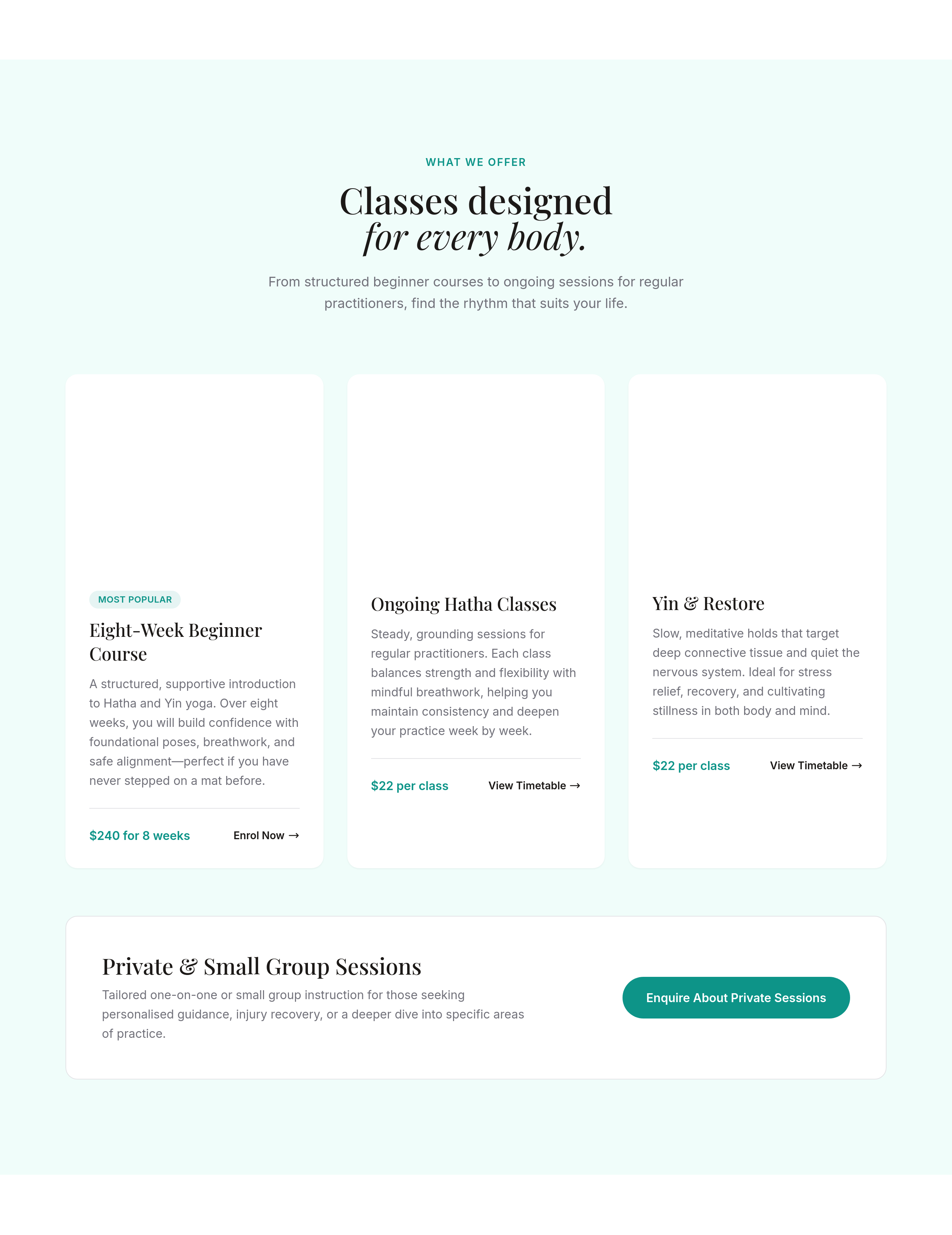
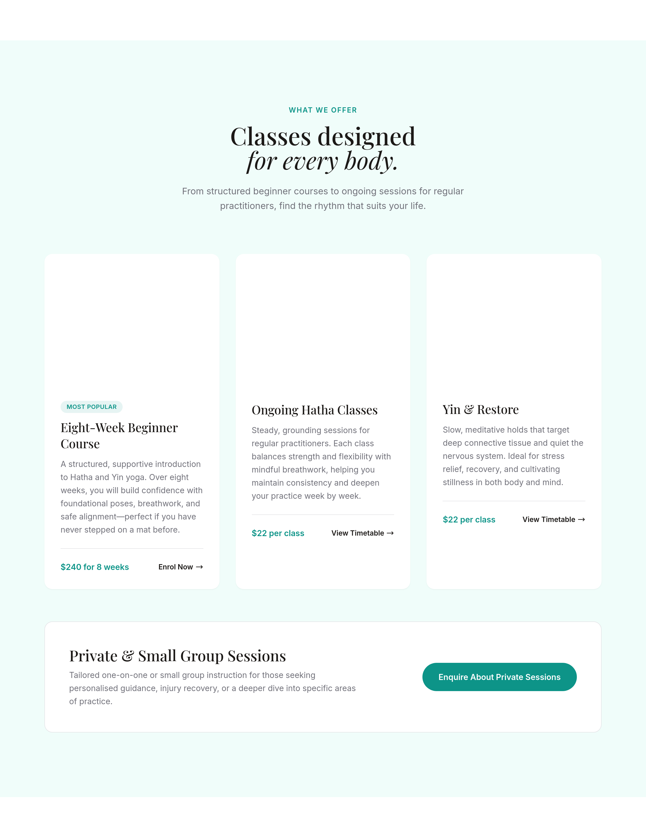
the services section is 1 column — make it 3 columns on desktop, stays 1 on mobile
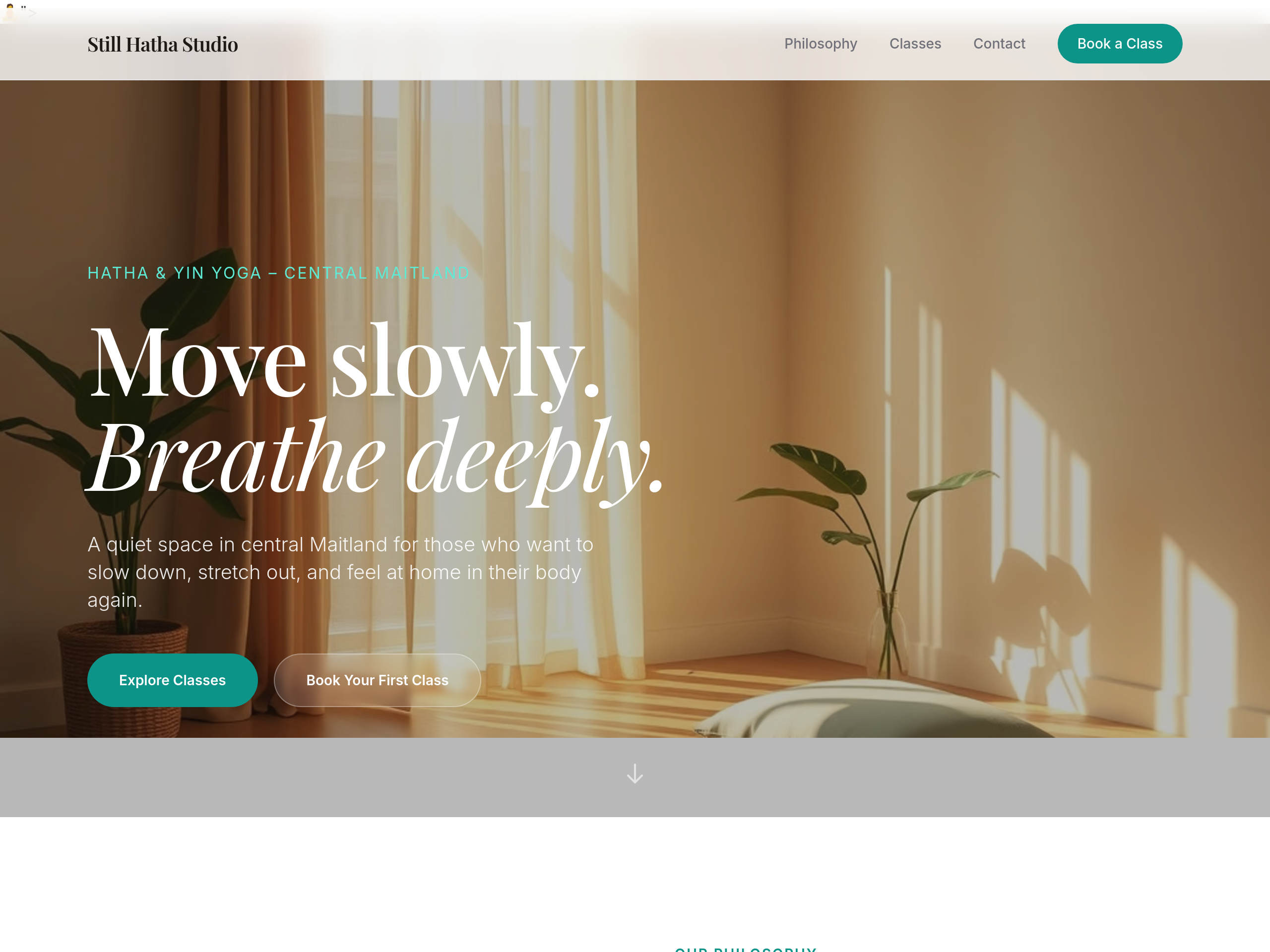
Before
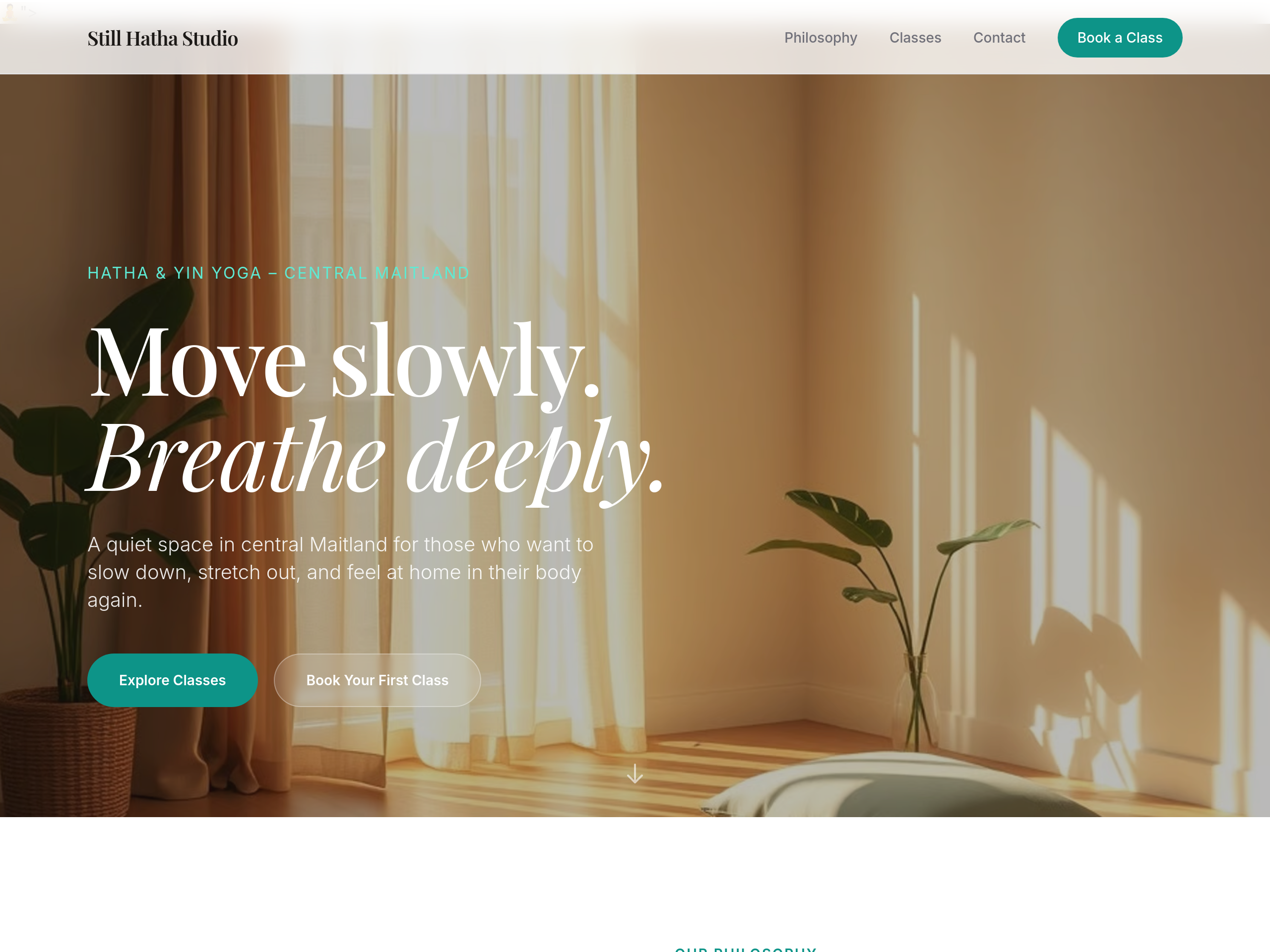
After
the hero image is too small — make it full-width edge-to-edge
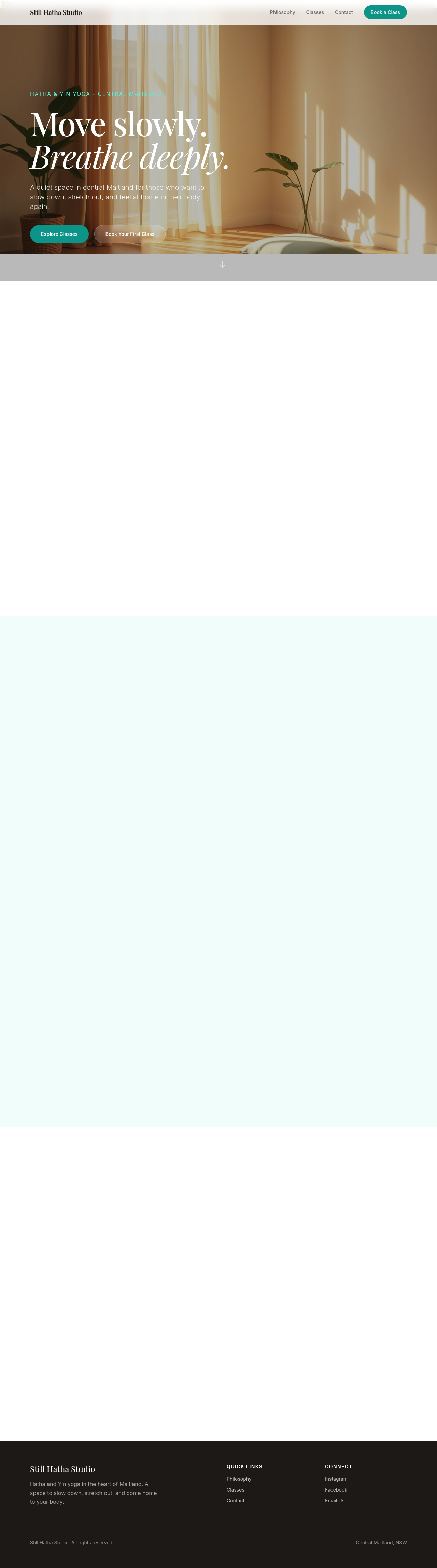
Before

After
add a sticky header that's transparent at top, solid white when scrolled

Before

After
the nav links are spread out — group them into Sections / Pages with subtle separator
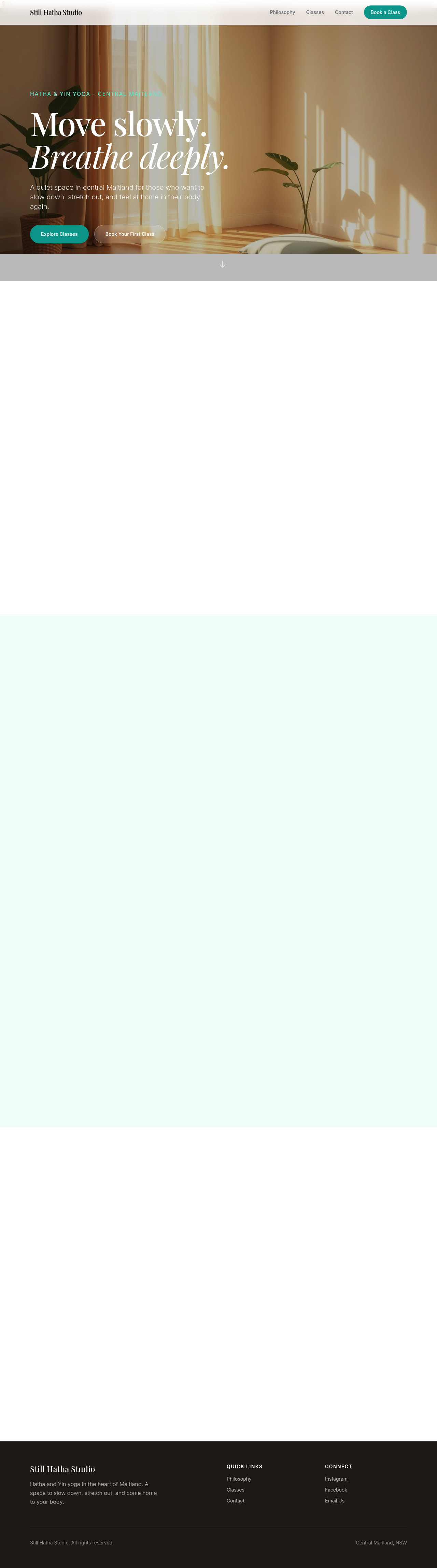
Before

After
add a search box in the header that filters page content
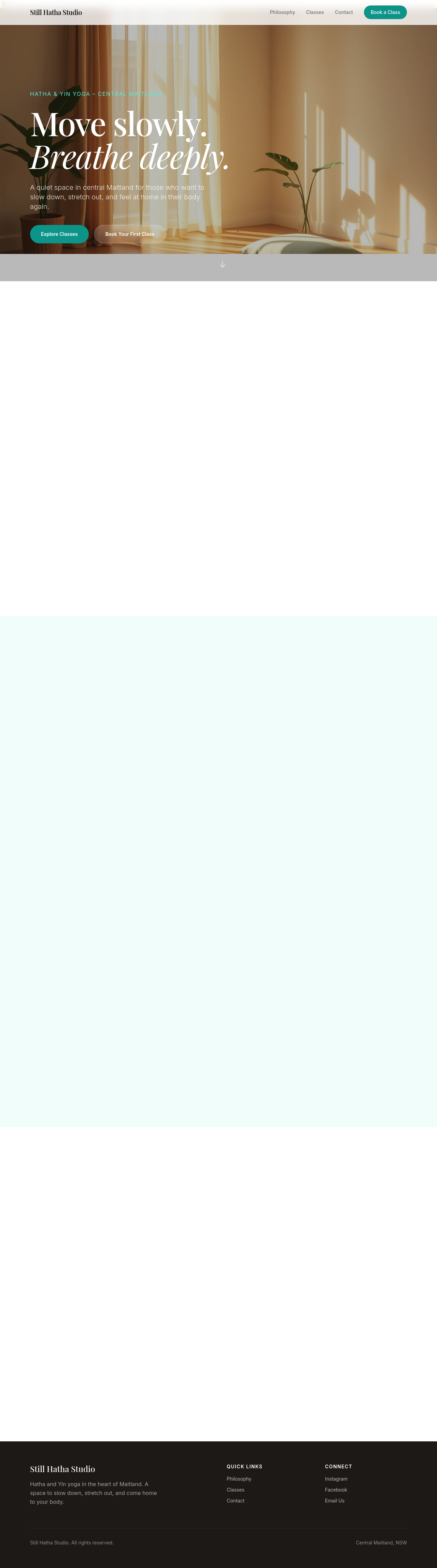
Before

After
add a 'back to top' floating button that appears after scrolling 400px
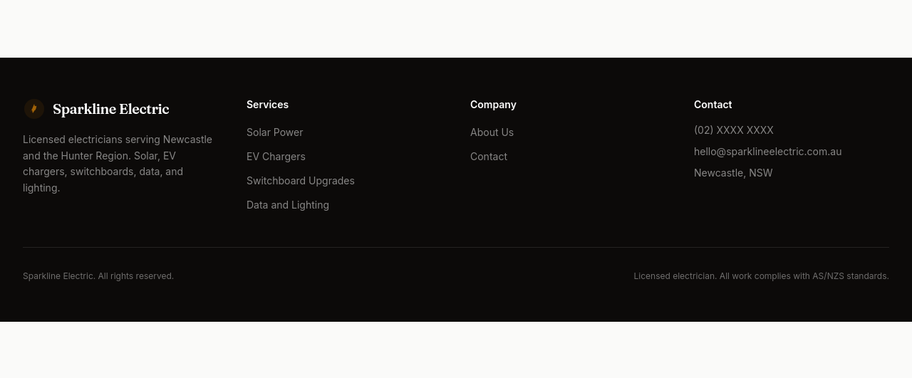
Before
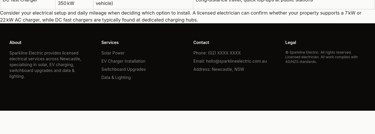
After
the footer is sparse — add 4 columns: about, services, contact, legal
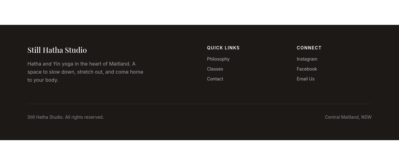
Before
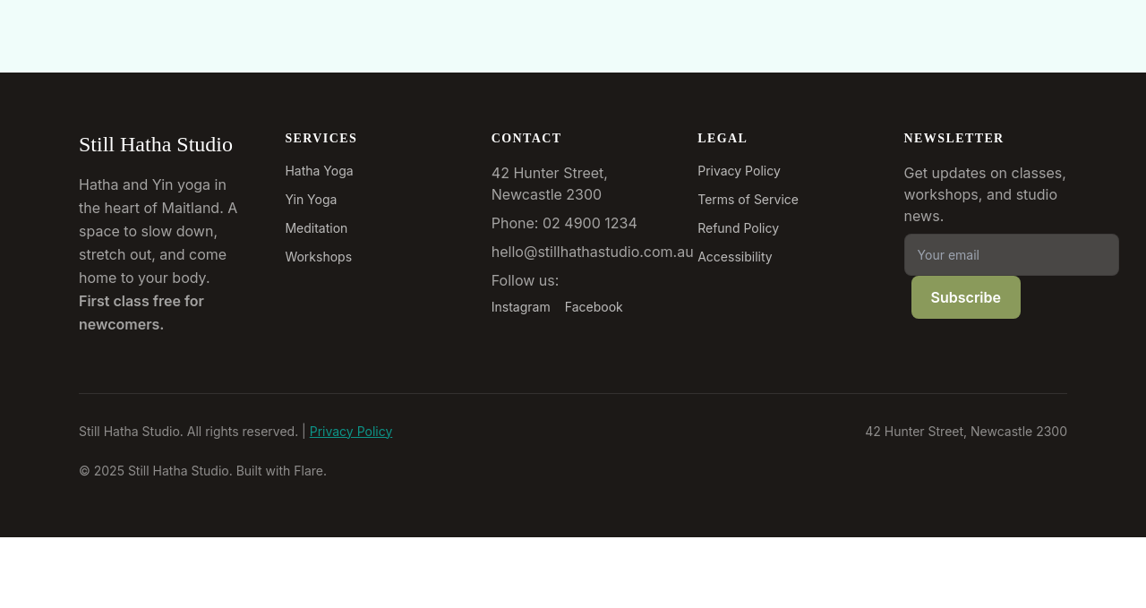
After
add a copyright + 'Built with Flare' line at the very bottom
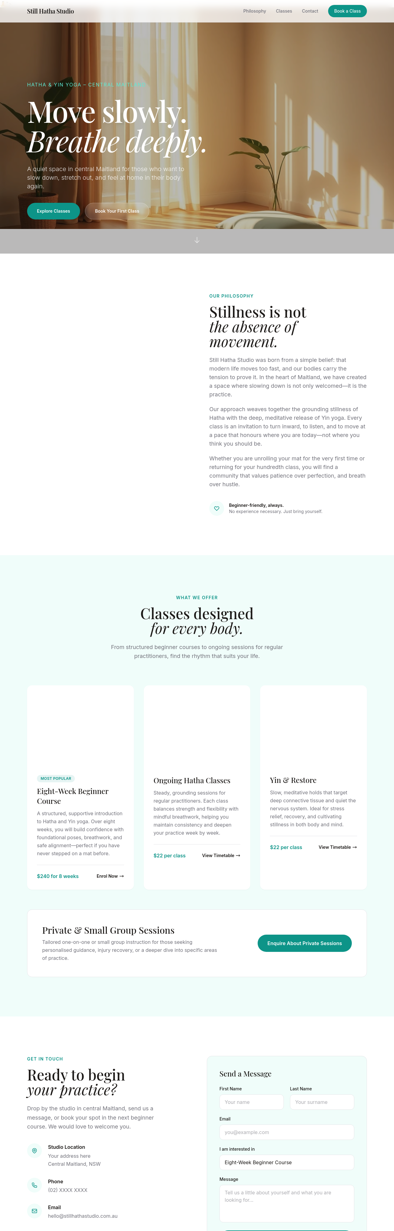
Before
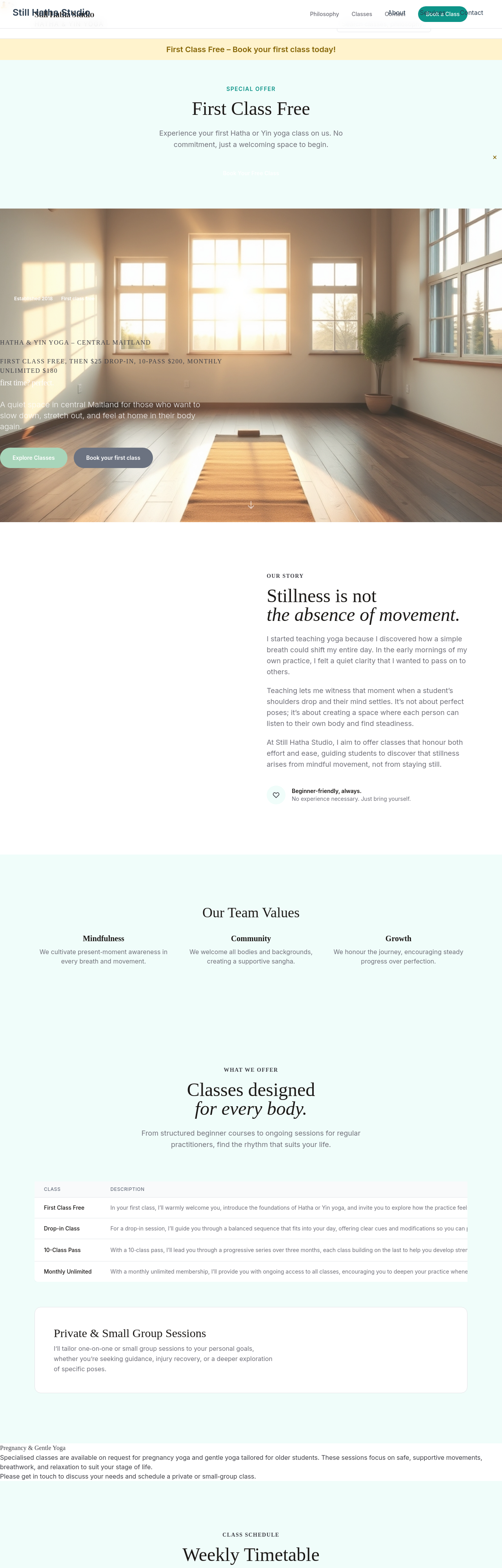
After
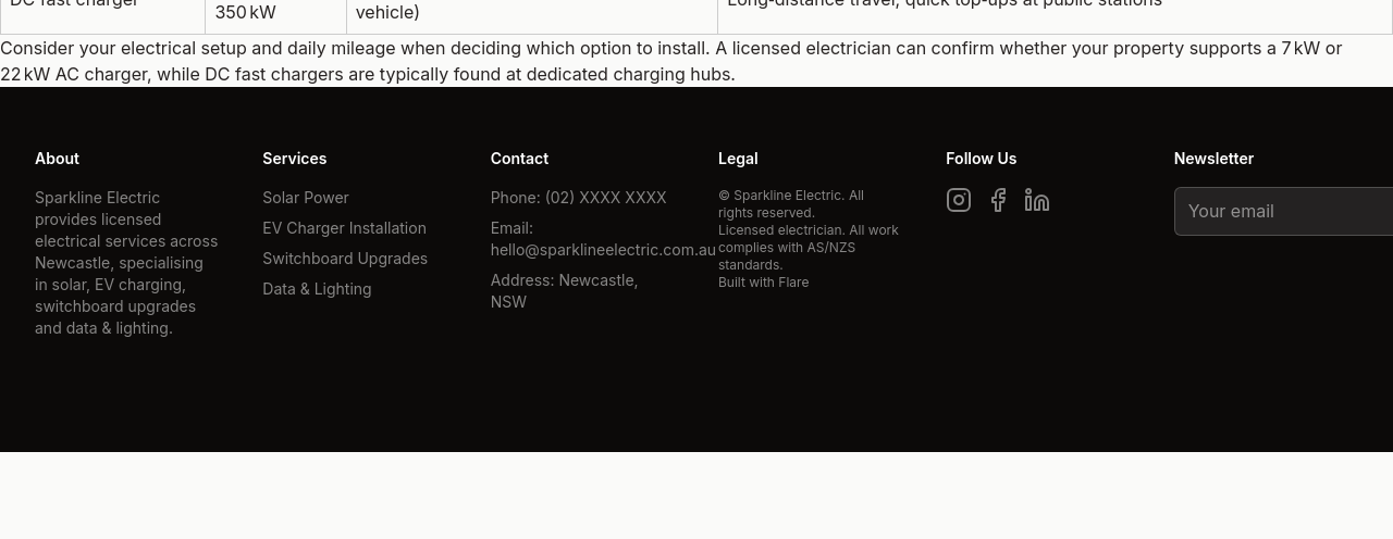
add social media icons in the footer — Instagram, Facebook, LinkedIn
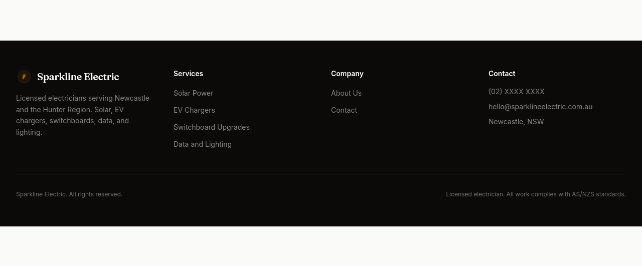
Before
After
add a newsletter signup field in the footer
Before
After
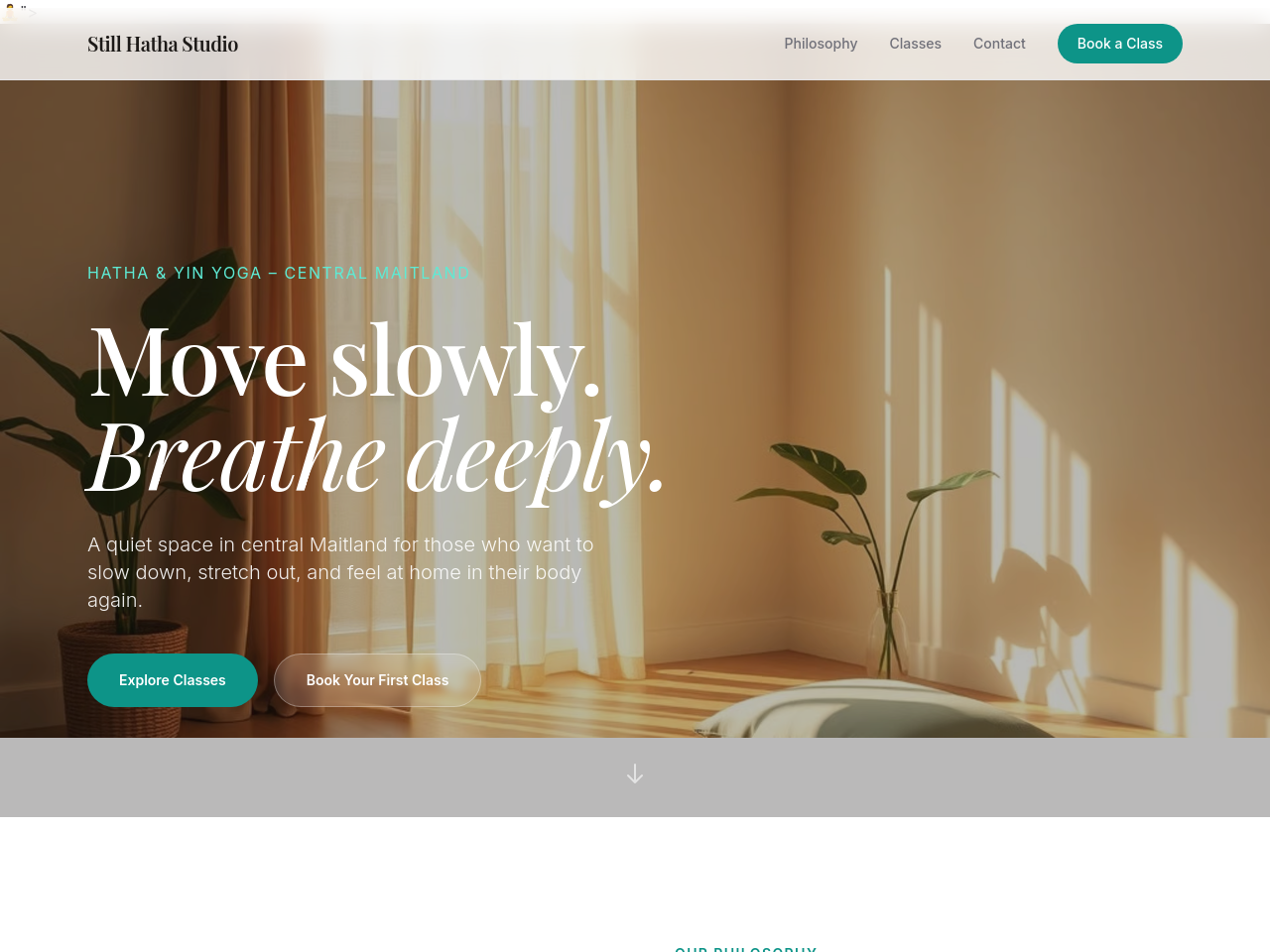
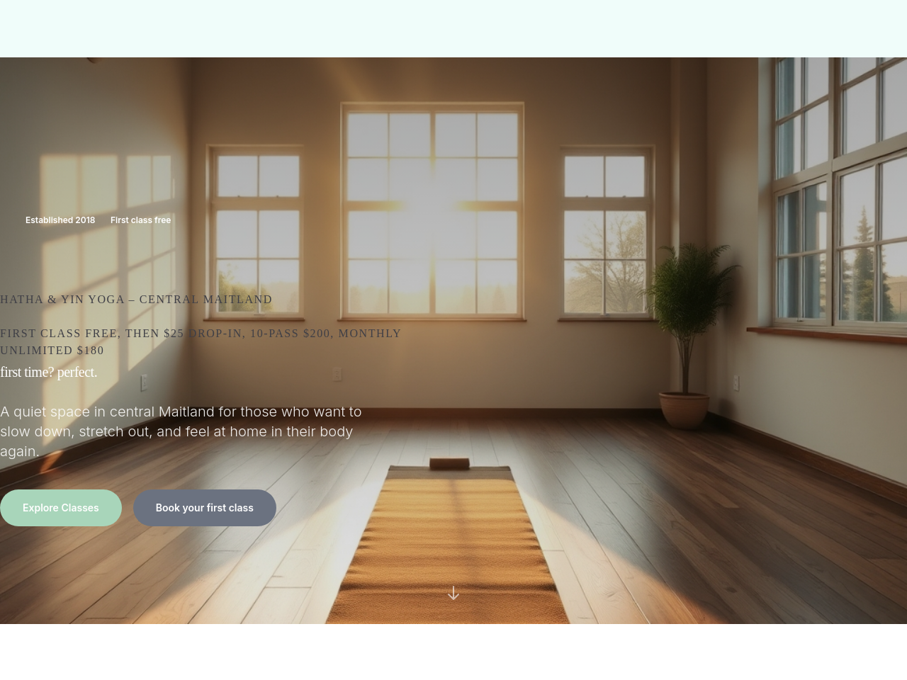
the hero has no image — add a hero background with a subtle gradient overlay
Before
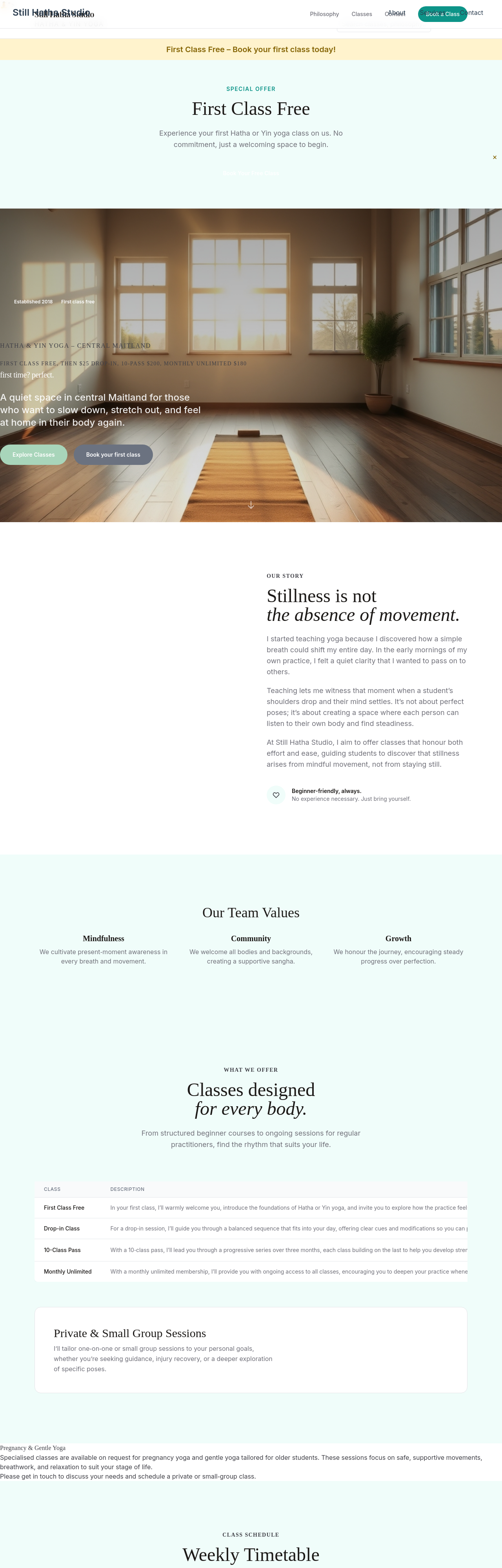
After
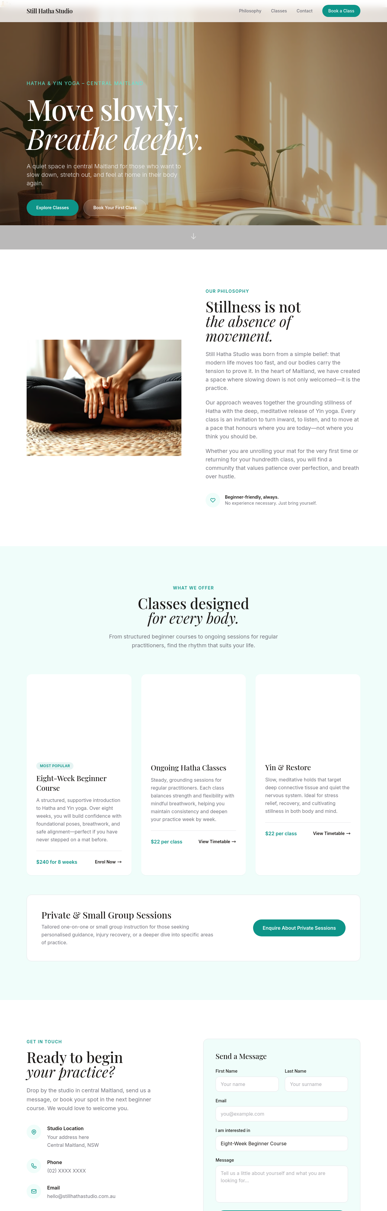
the hero is too text-heavy — promote one key value prop, demote rest
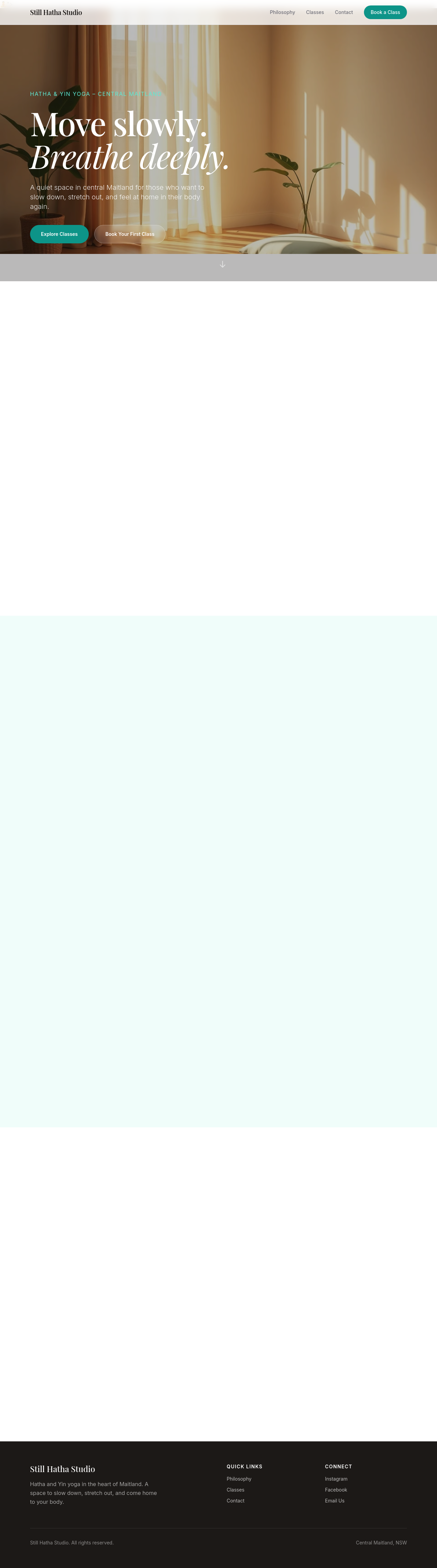
Before

After
add a video background to the hero (with poster fallback)
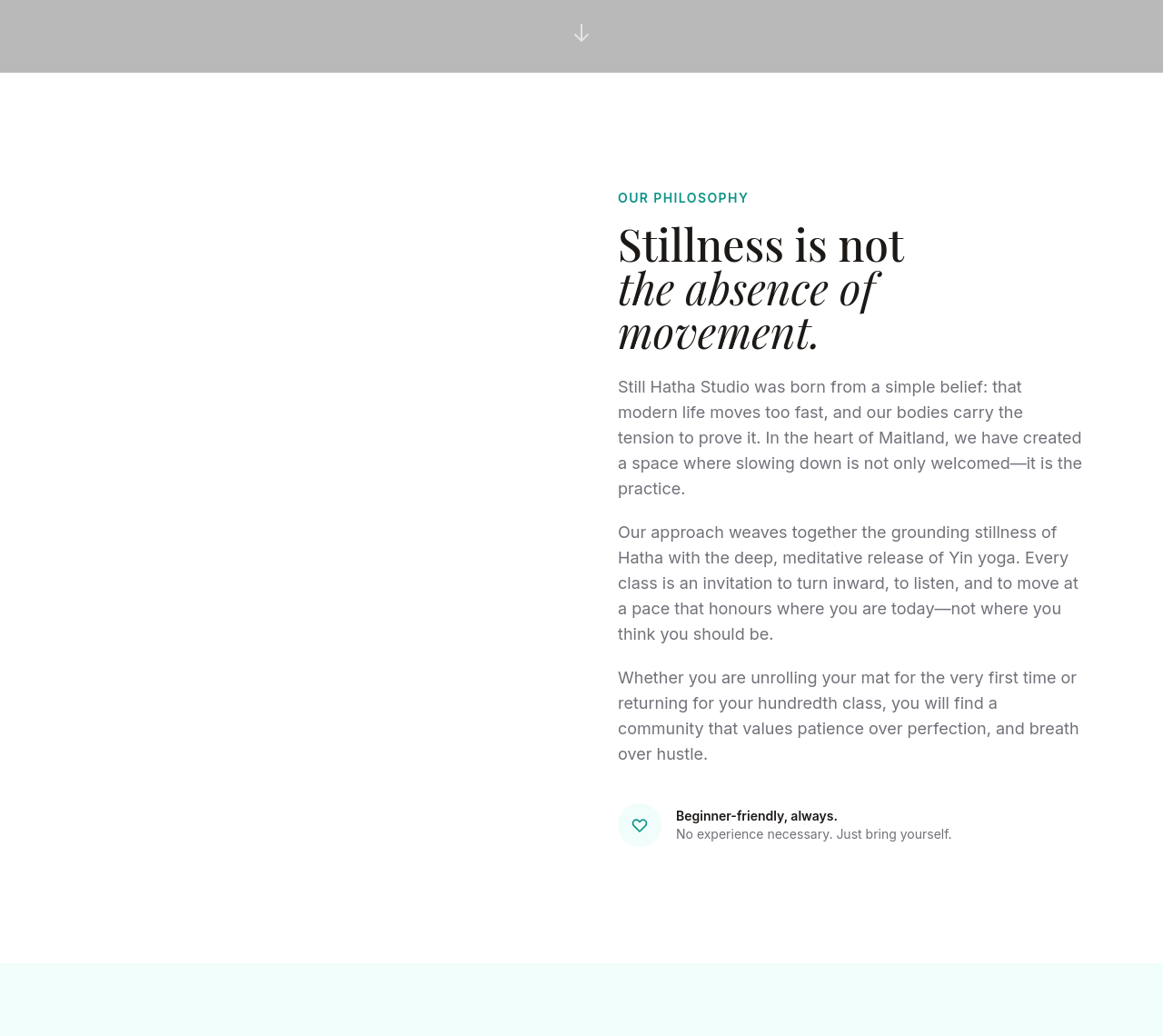
Before
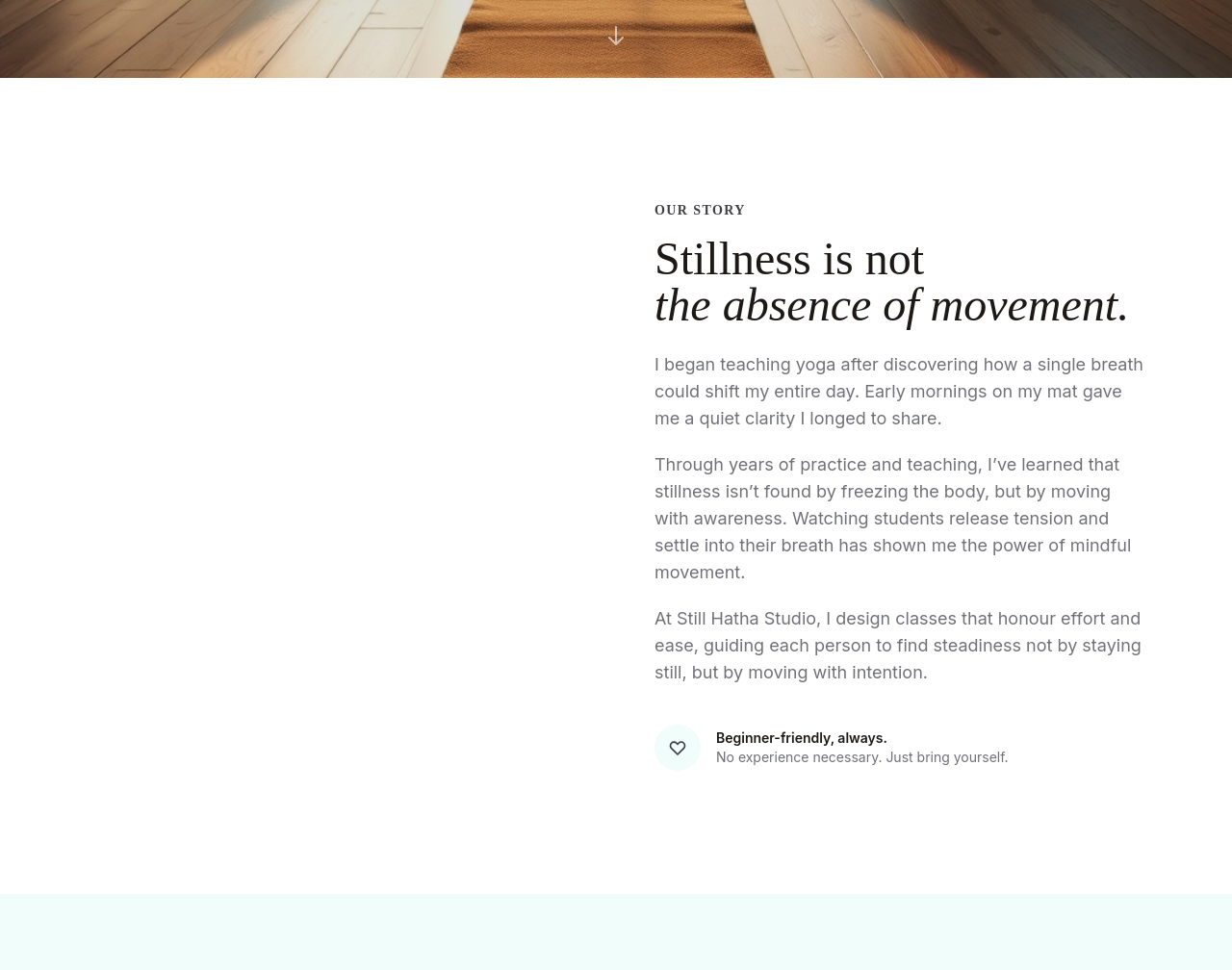
After
the about section reads like a CV — turn into a story arc (start / middle / now)
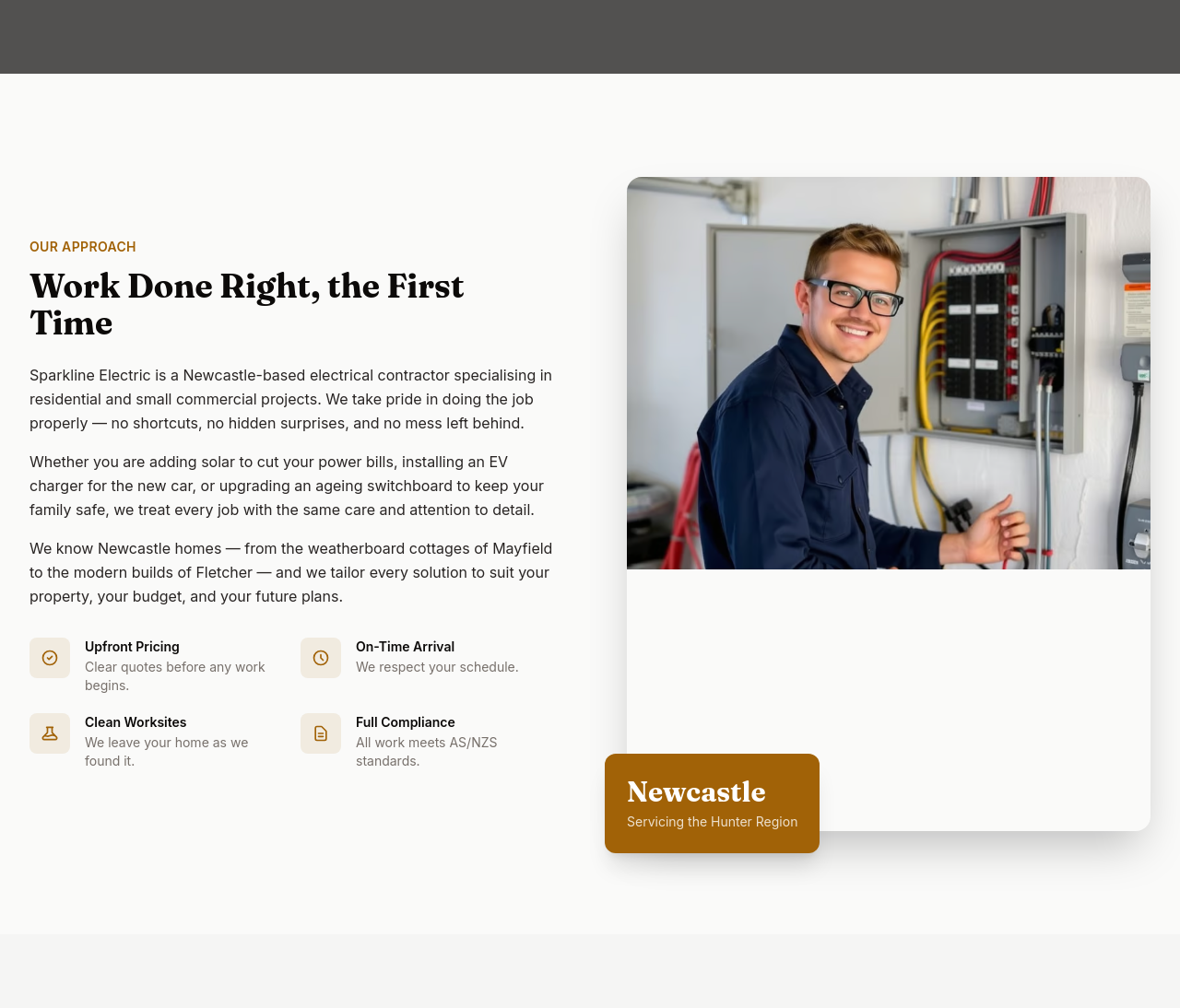
Before
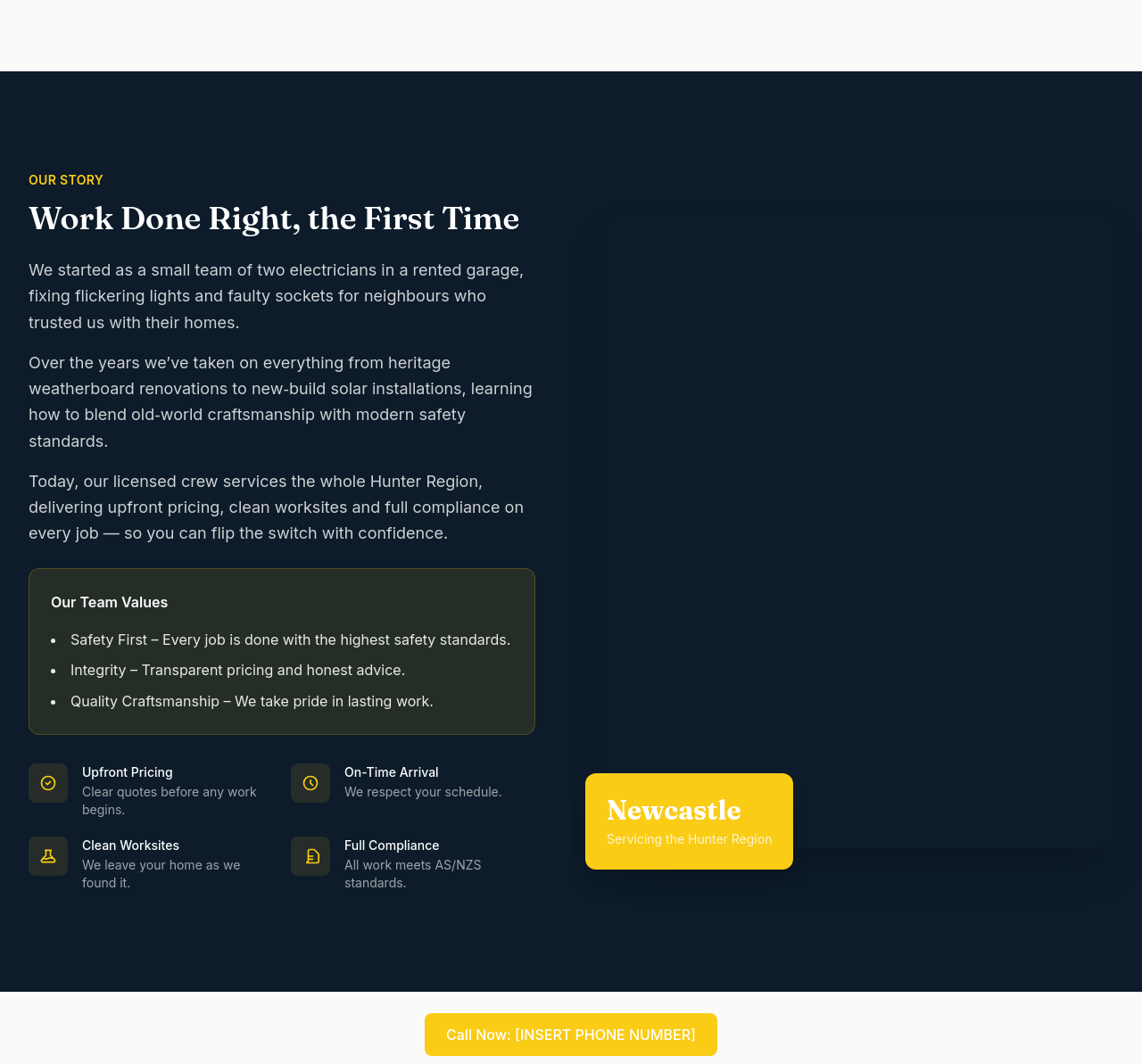
After
the about needs a 'team values' callout with 3 short principles

Before

After
add a Google reviews badge showing 4.8/5 stars (placeholder)

Before

After
add 3 testimonial cards with name + photo placeholder + quote
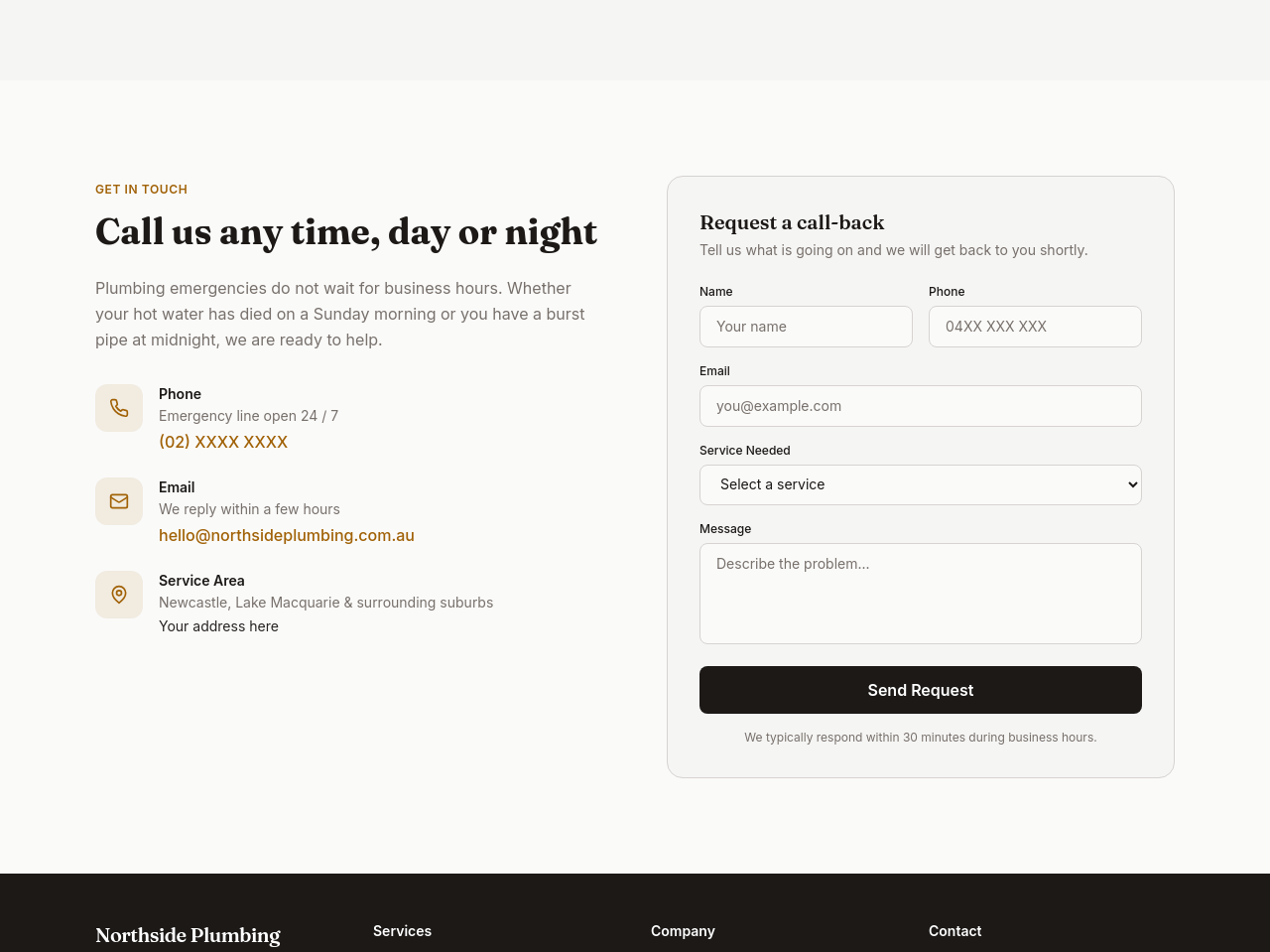
Before
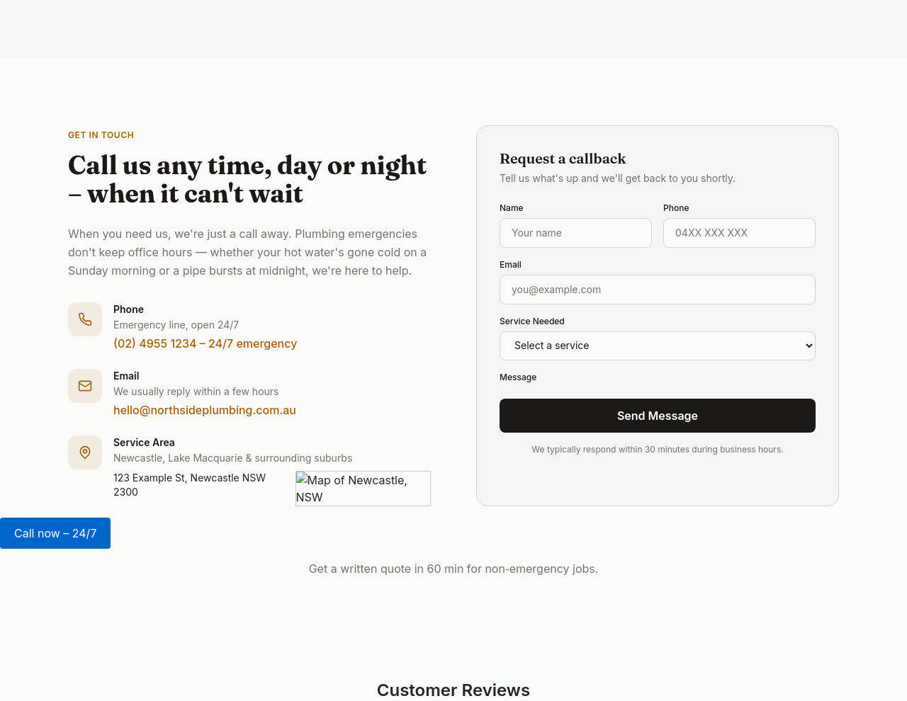
After
the contact section needs a map embed beside the address

Before

After
add quick-action buttons in contact: 'Call now', 'Email', 'Get directions'
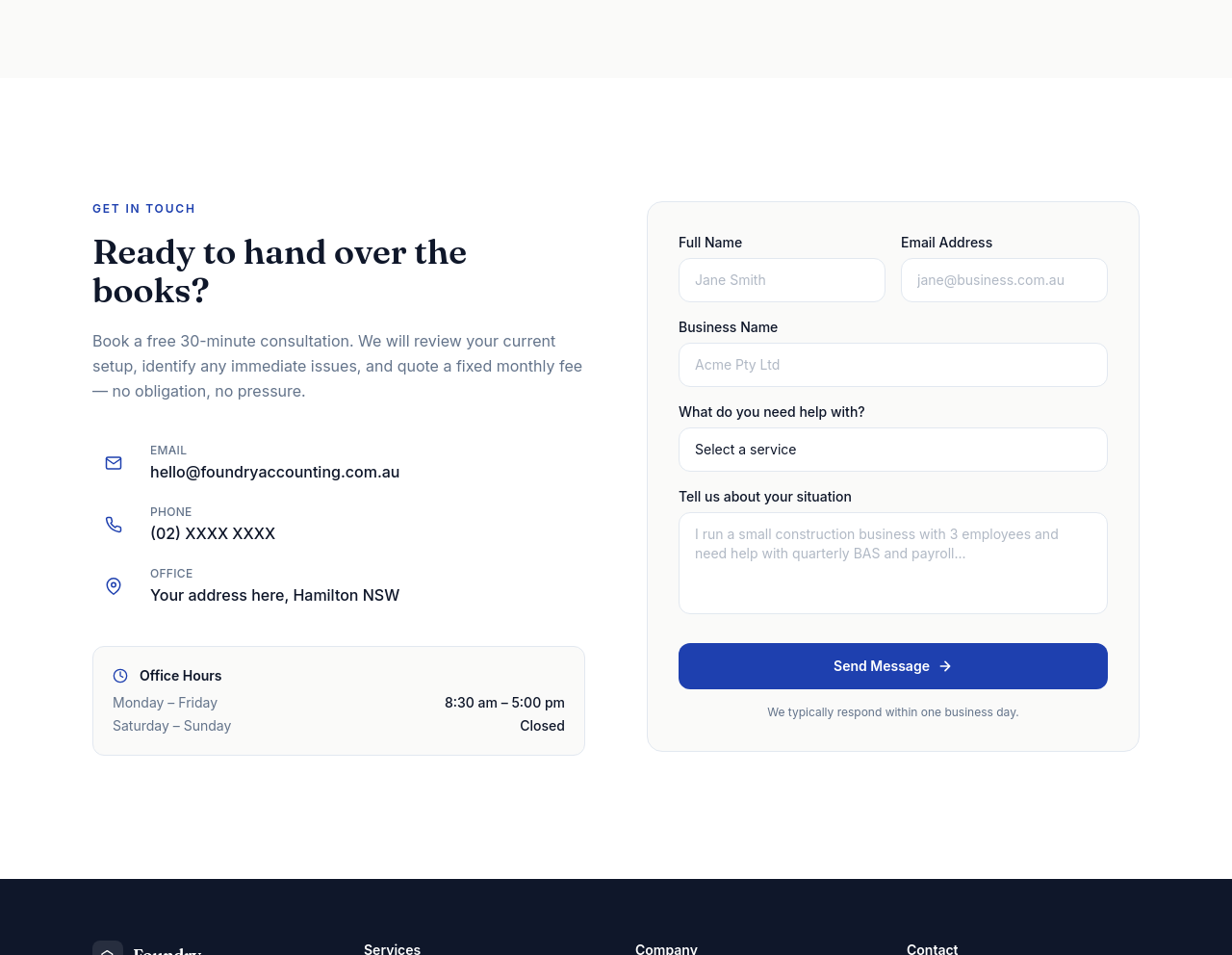
Before
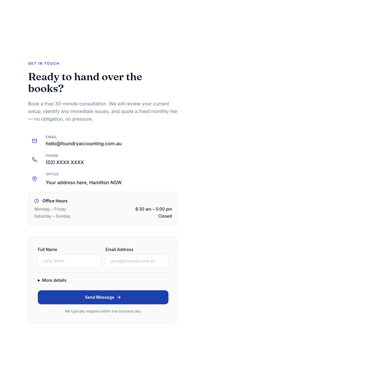
After
the contact form is huge — collapse non-essential fields behind 'More details'

Before

After
add an 'Established 2018' badge somewhere on the page
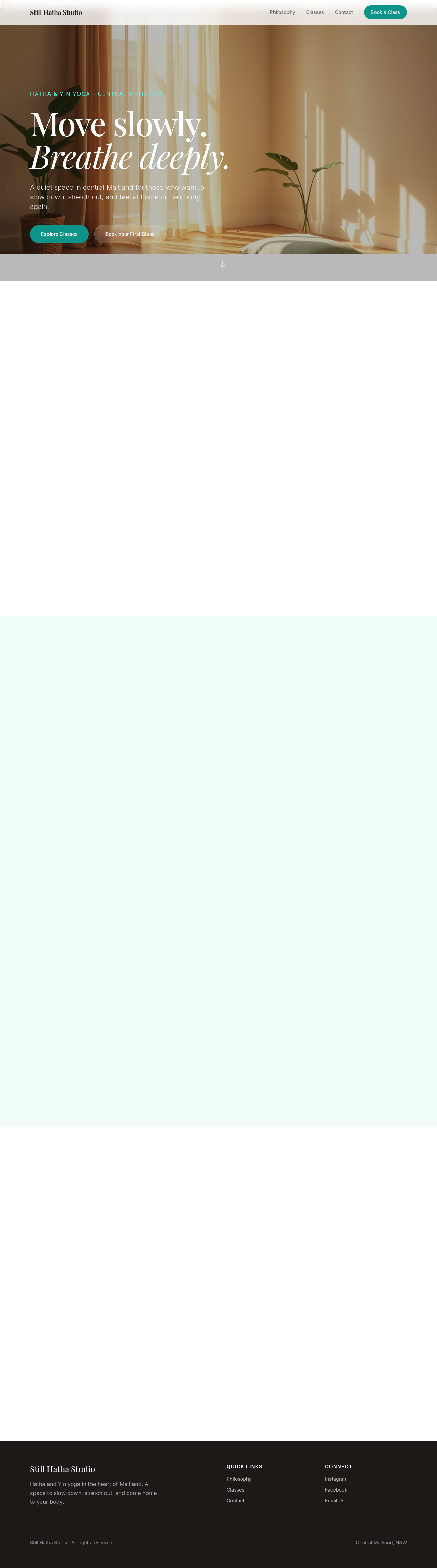
Before

After
add a 'Members of ___ Industry Association' line with logos placeholder

Before

After
do a full content refresh — rewrite hero, about, services, contact in one pass
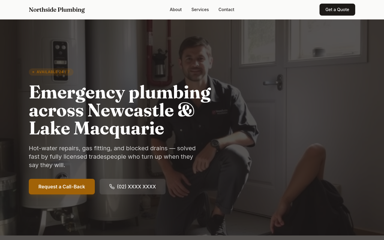
Before
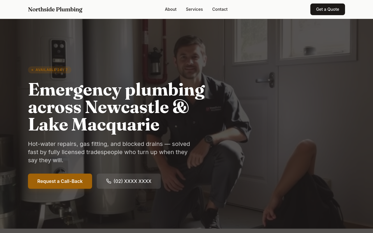
After
add a pricing section, link to it from the hero, AND mention pricing in the FAQ
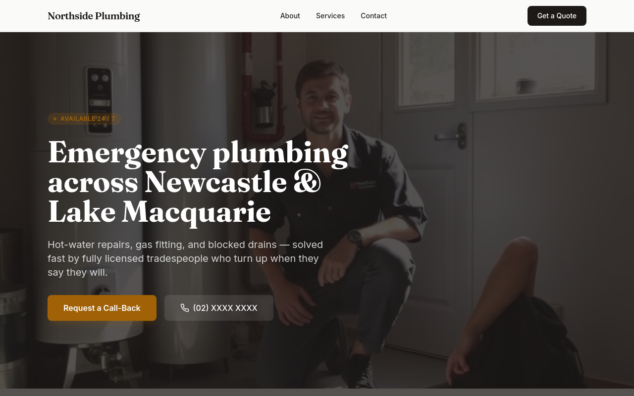
Before
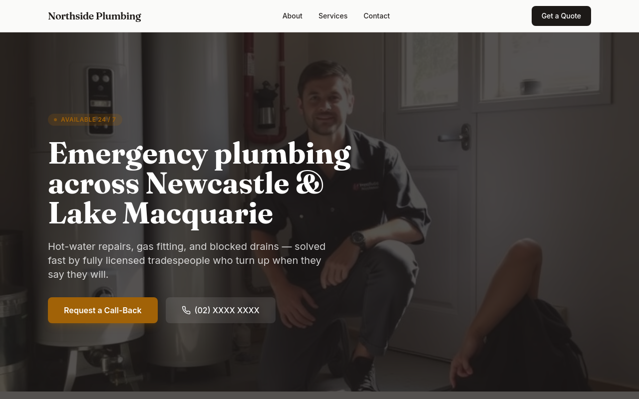
After
remove all images, then add a single hero image, then update all copy to reference that image

Before

After
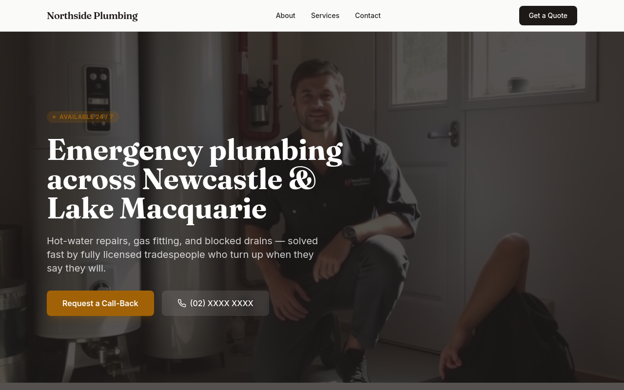
the whole site needs to feel more premium — typography, colours, spacing, copy
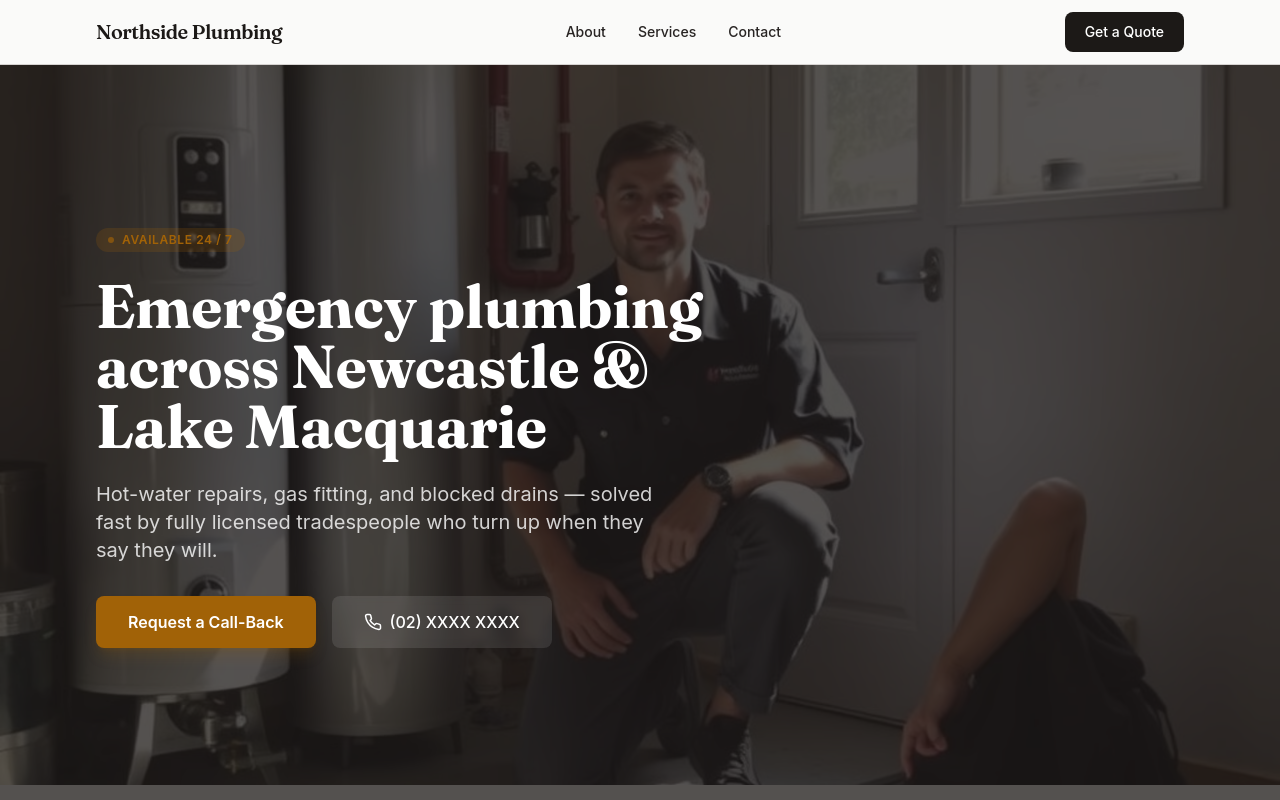
Before
After
rebrand — change the business name throughout, update meta tags, regenerate the hero

Before

After
add 3 new sections (testimonials, FAQ, contact form) and link them all from the hero

Before

After
audit the whole page — flag every weakness and propose specific fixes, then apply your top 3
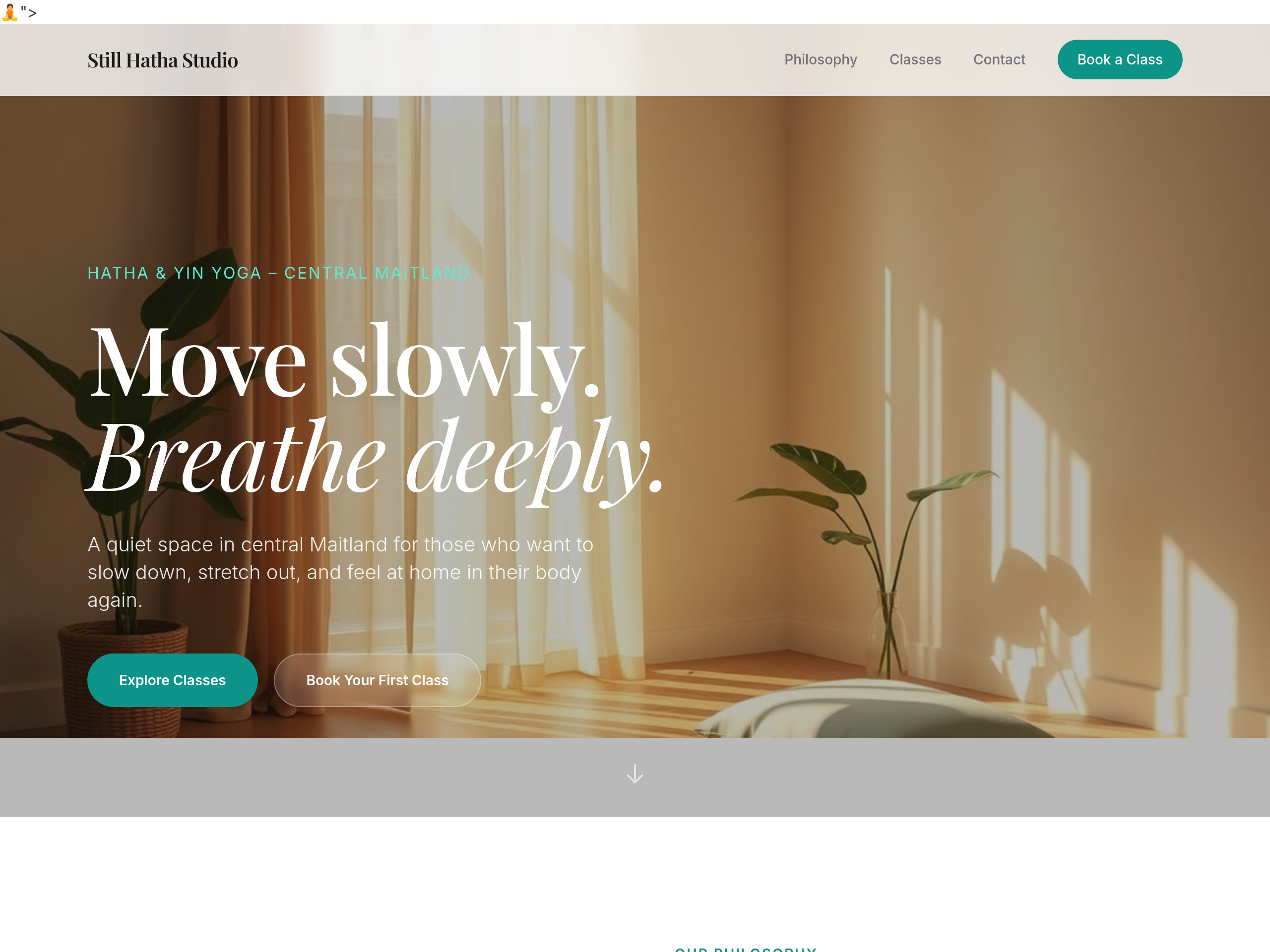
Before
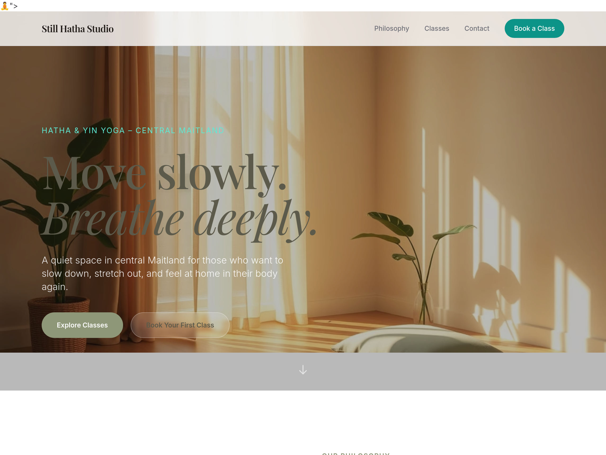
After
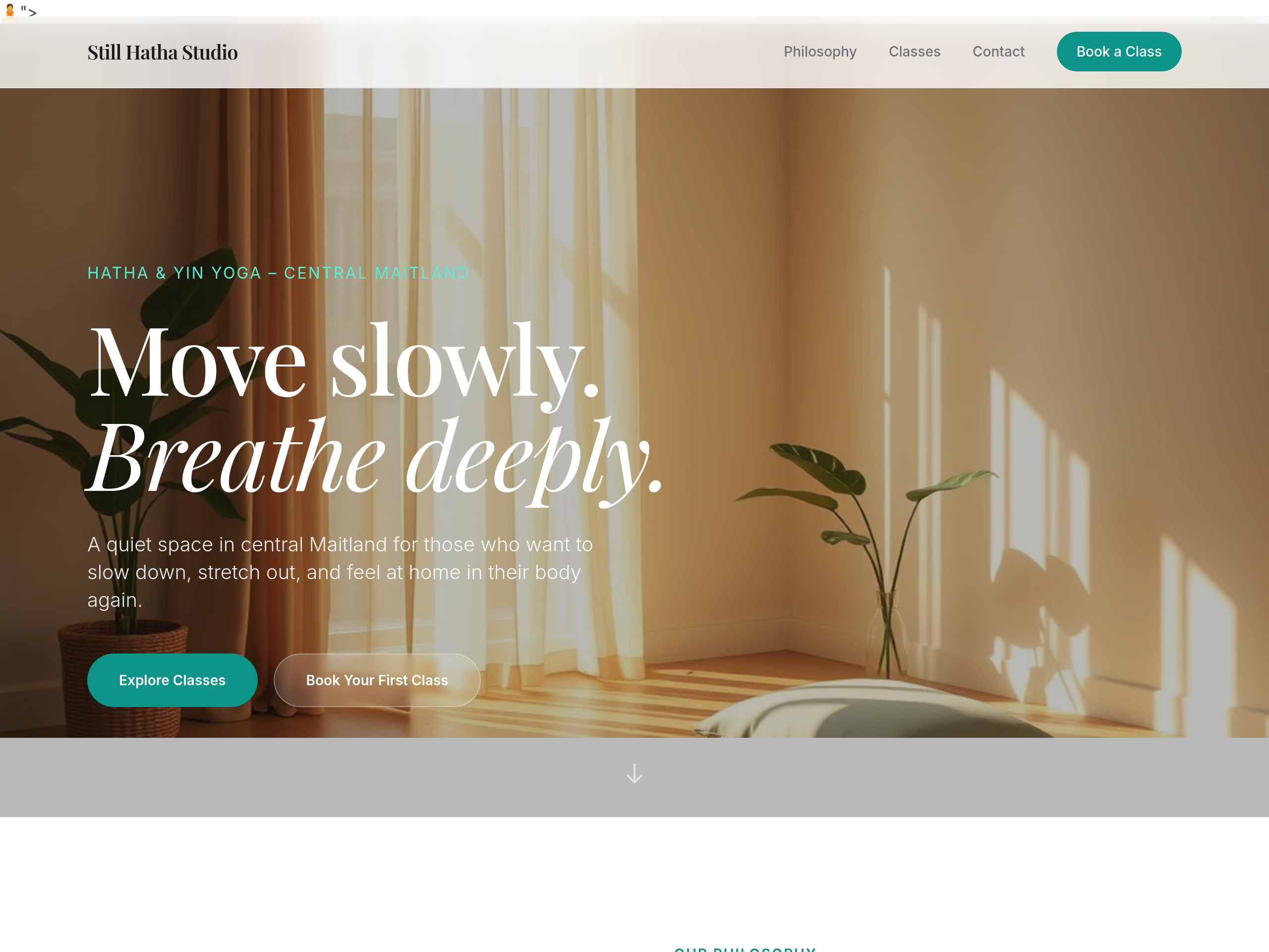
the palette is too pink — use earthy sage + warm linen tones
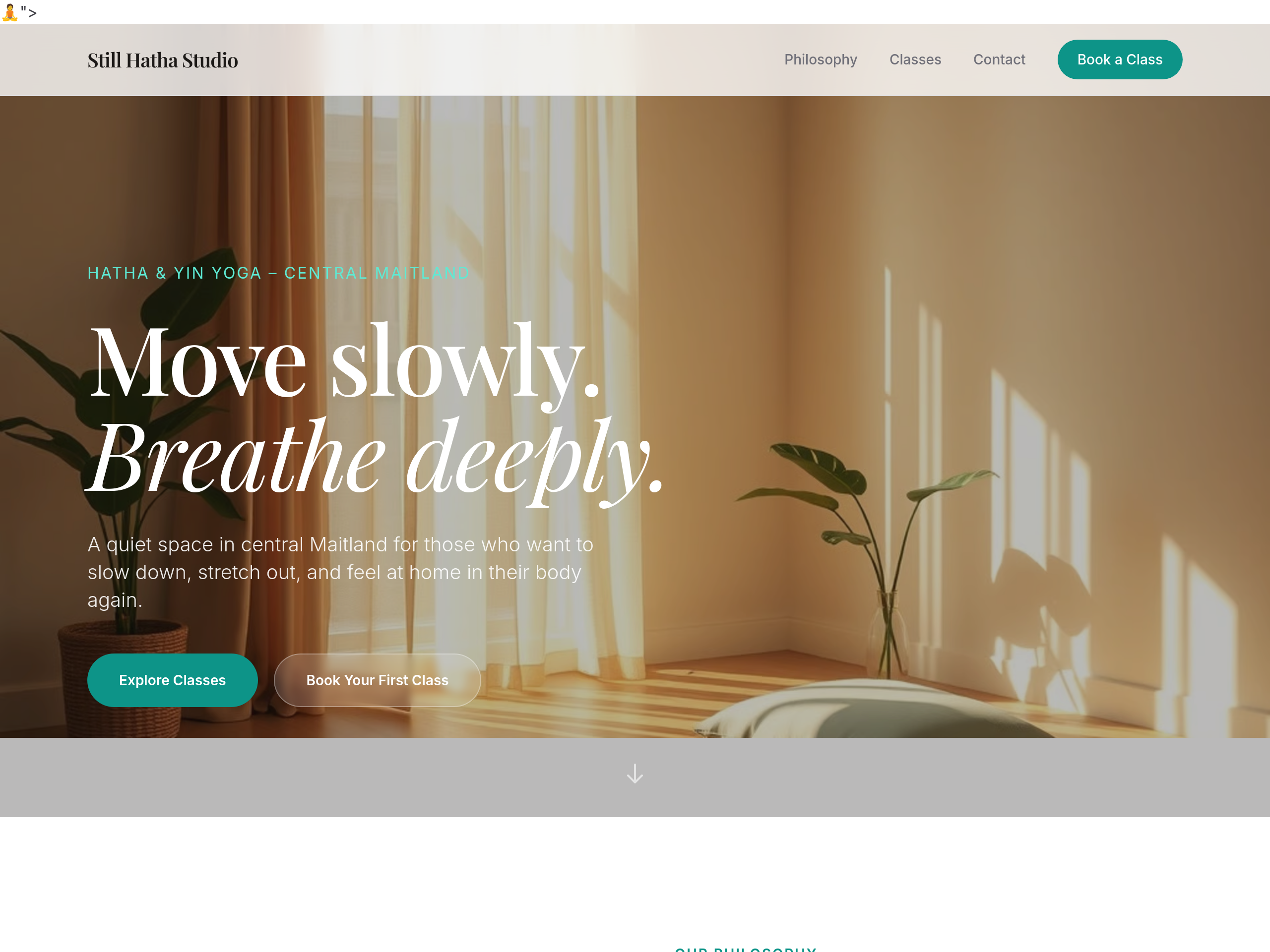
Before
After
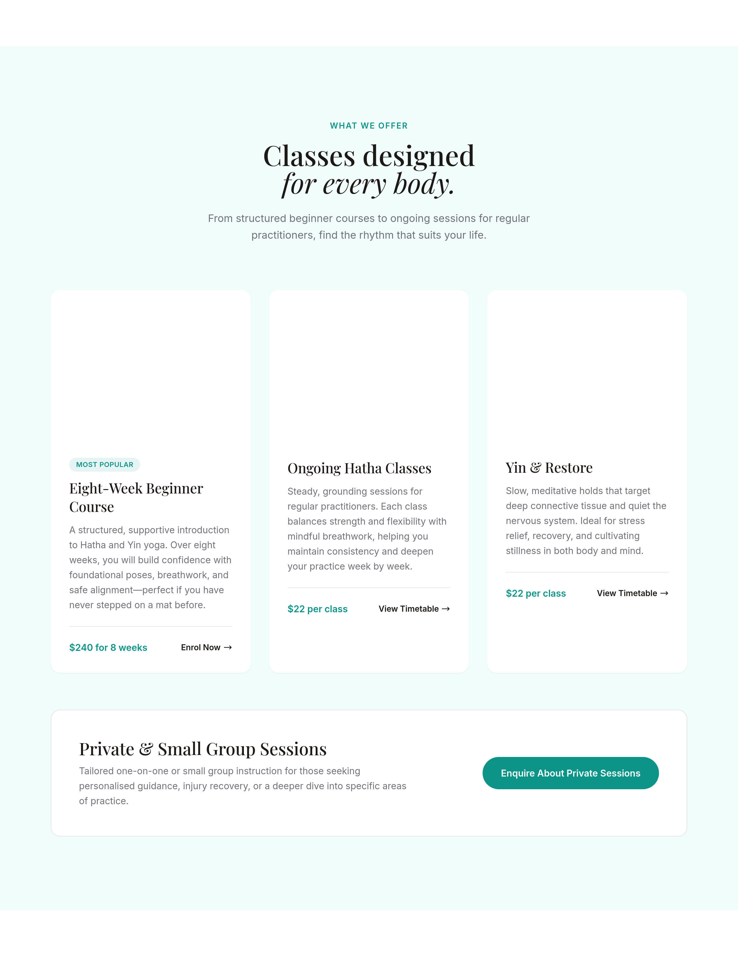
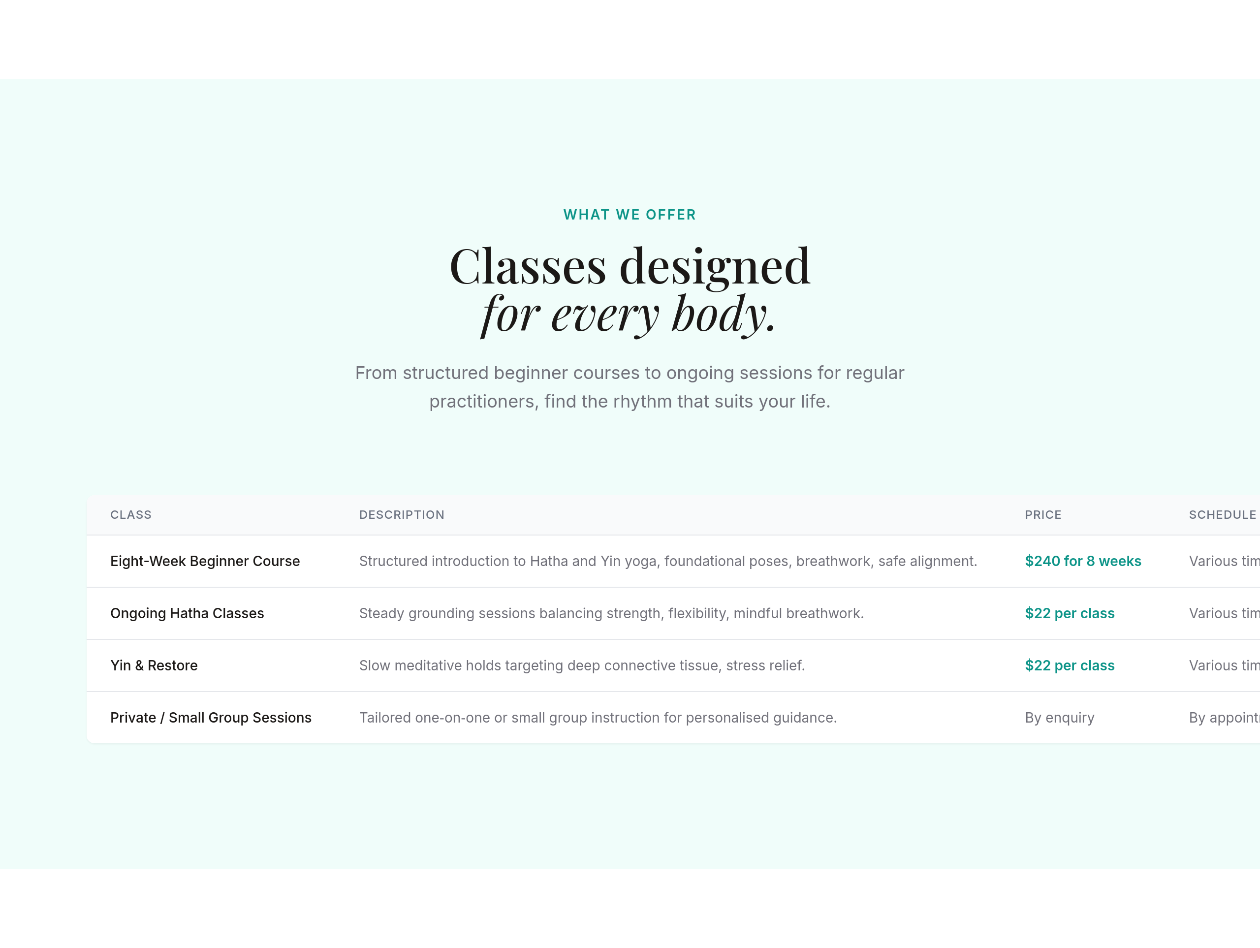
use a soft serif for headings — feels more grounded
Before
After
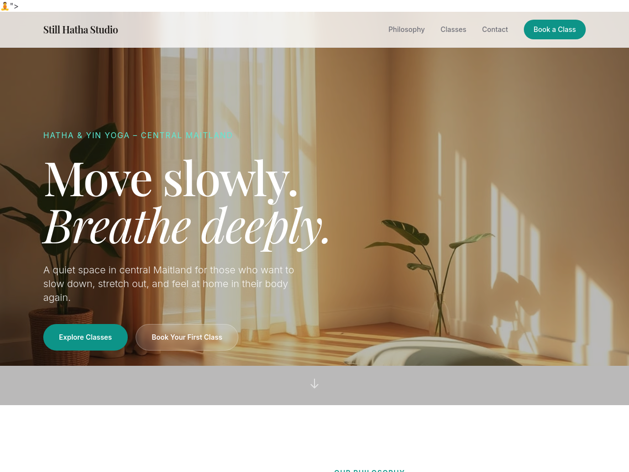
the class schedule should be a clean table, not paragraphs
Before
After
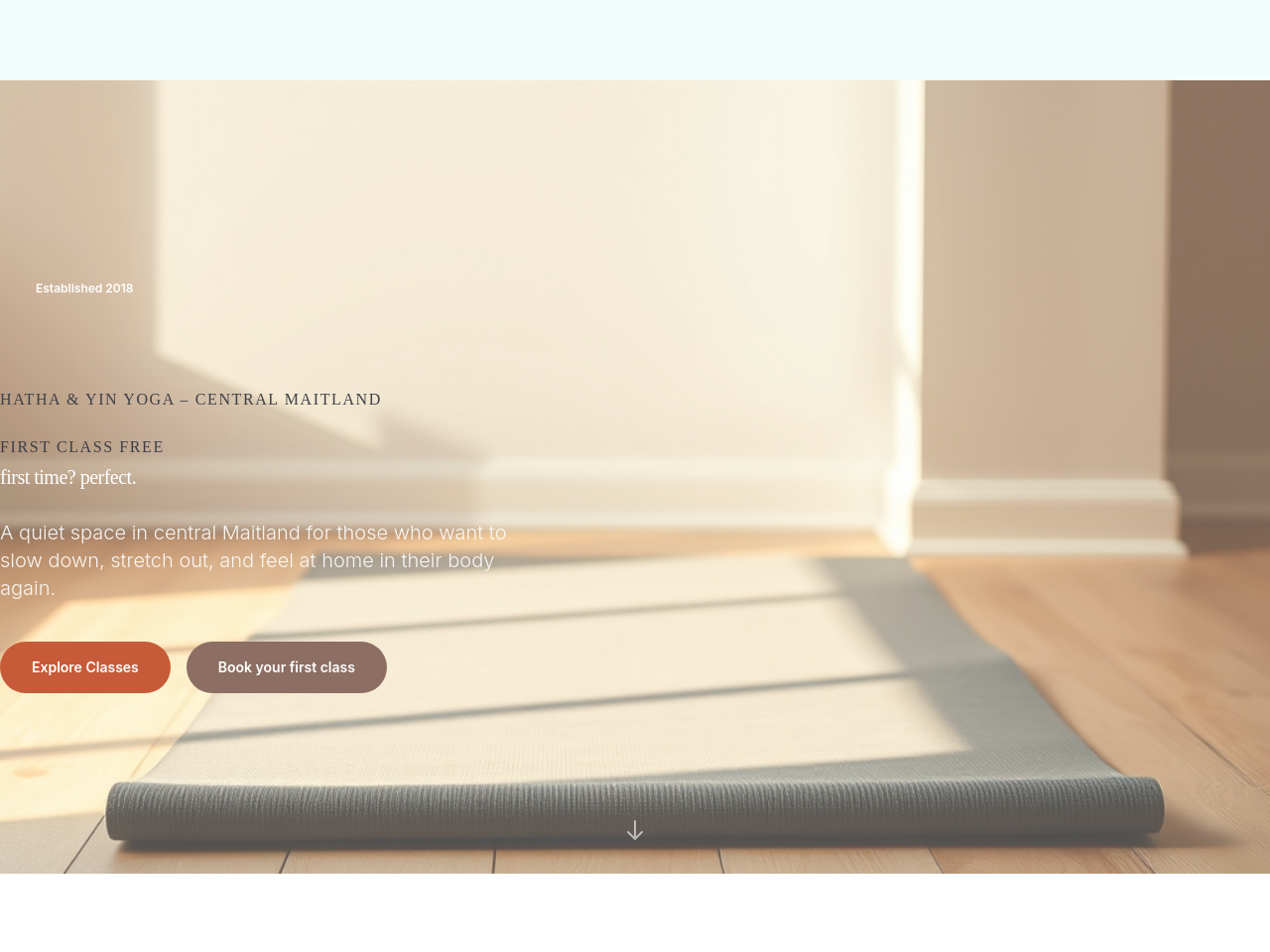
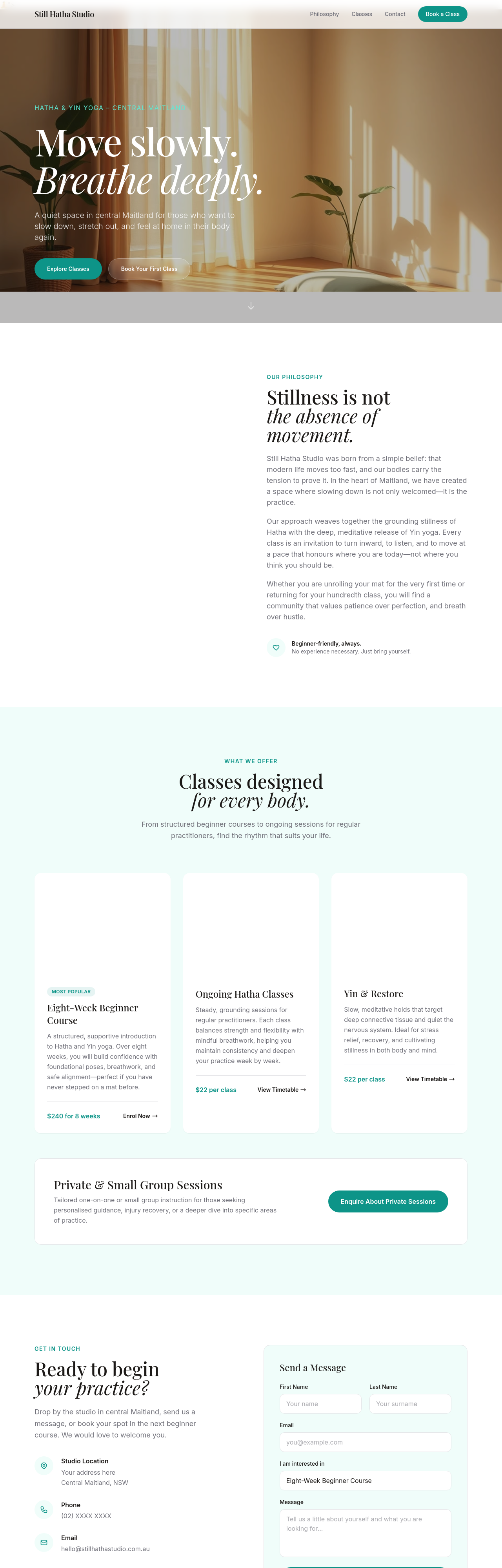
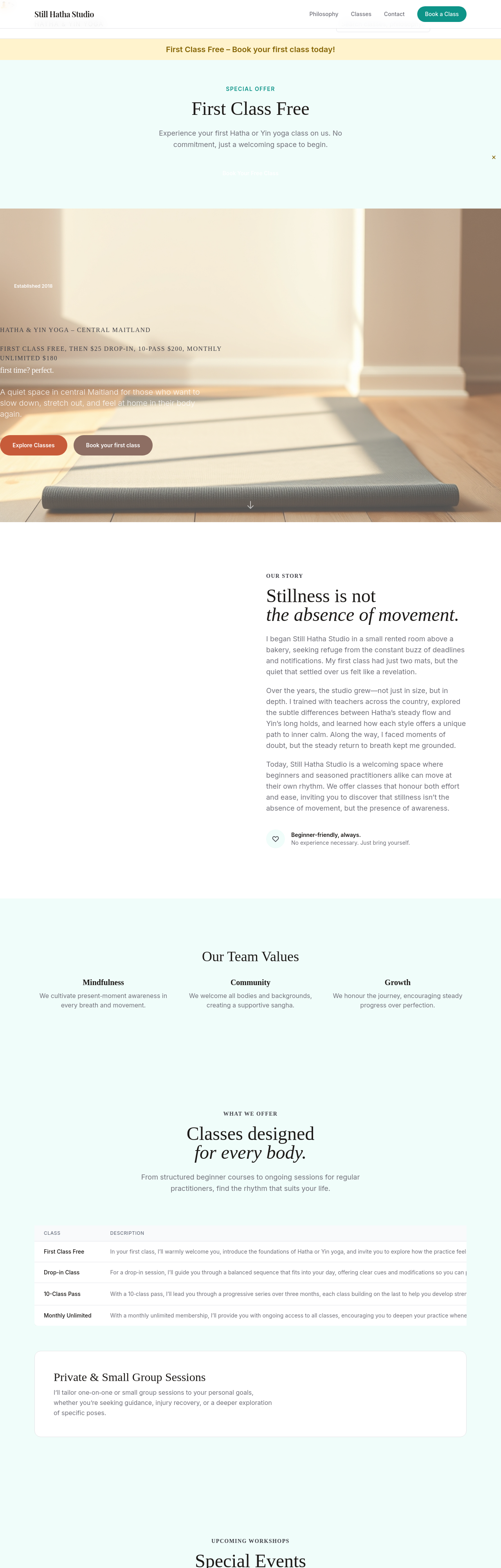
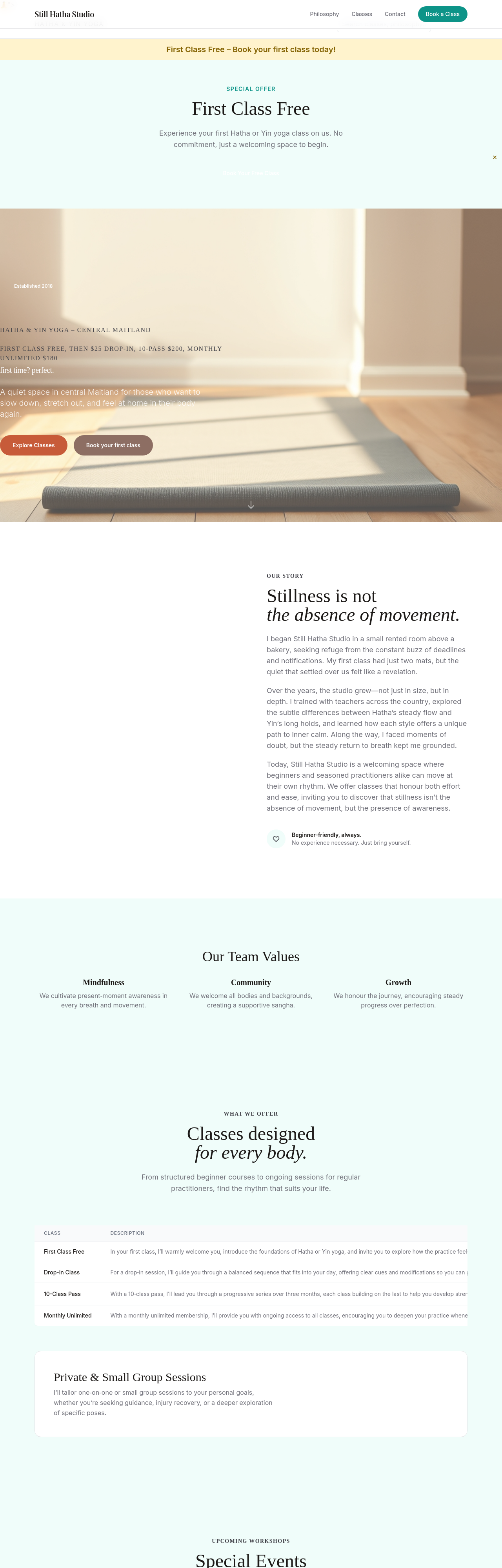
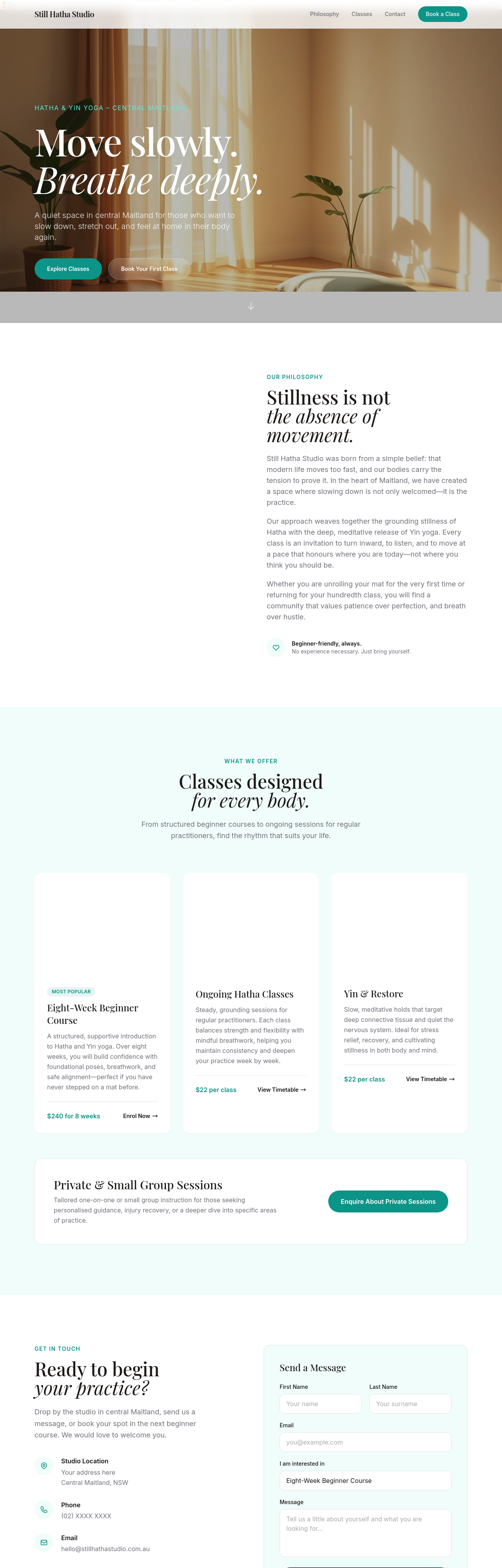
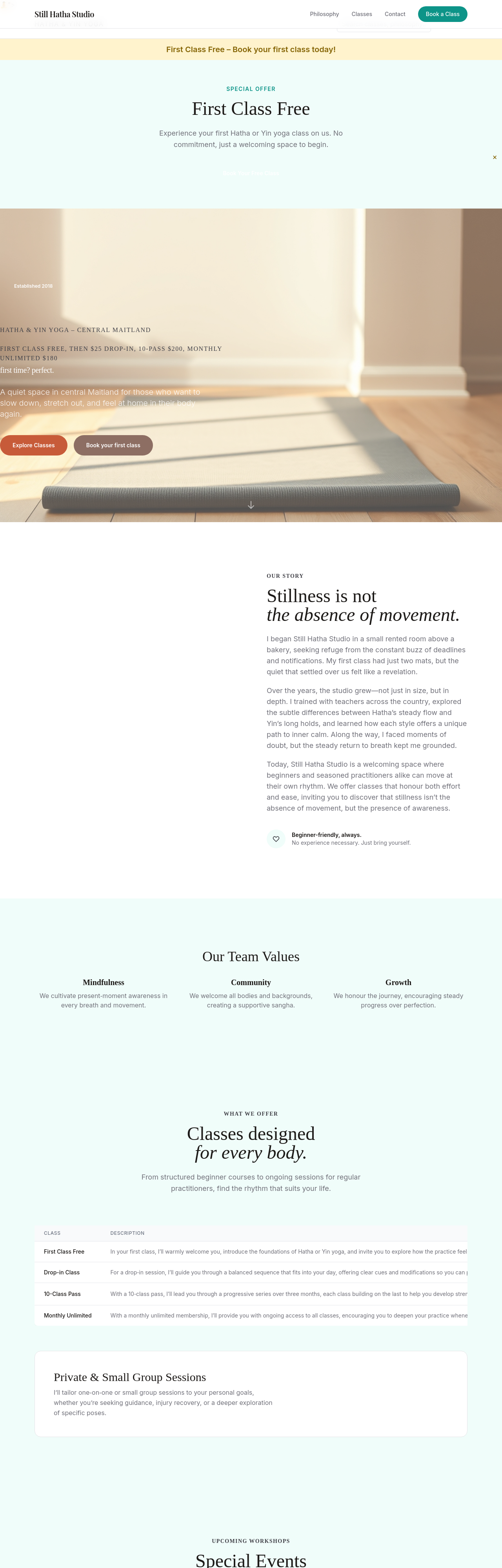
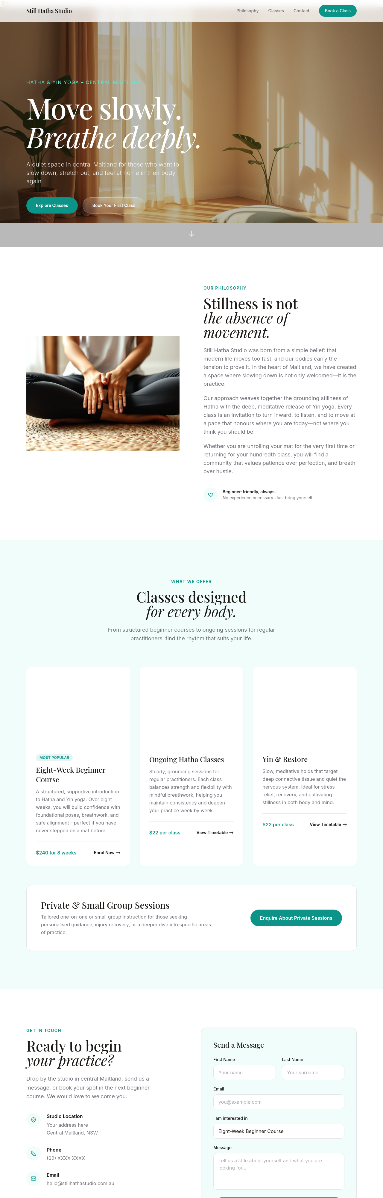
add 'Book your first class' CTA in the hero — make it warm not urgent
Before
After
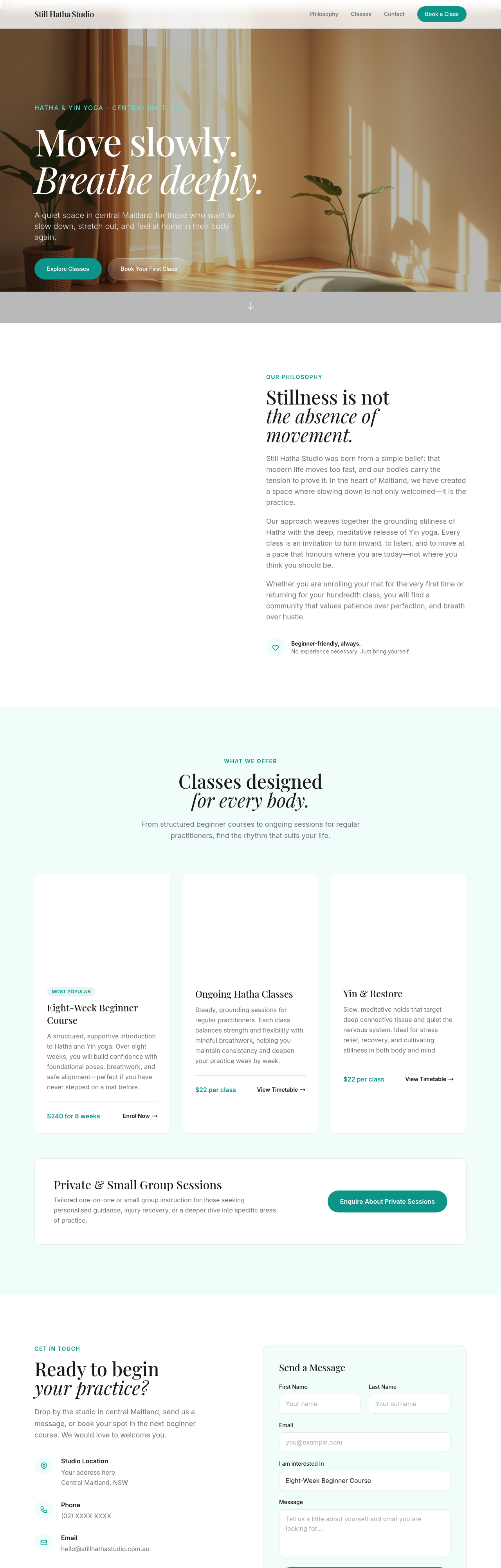
clarify the pricing — first class free, then $25 drop-in, 10-pass $200, monthly unlimited $180
Before
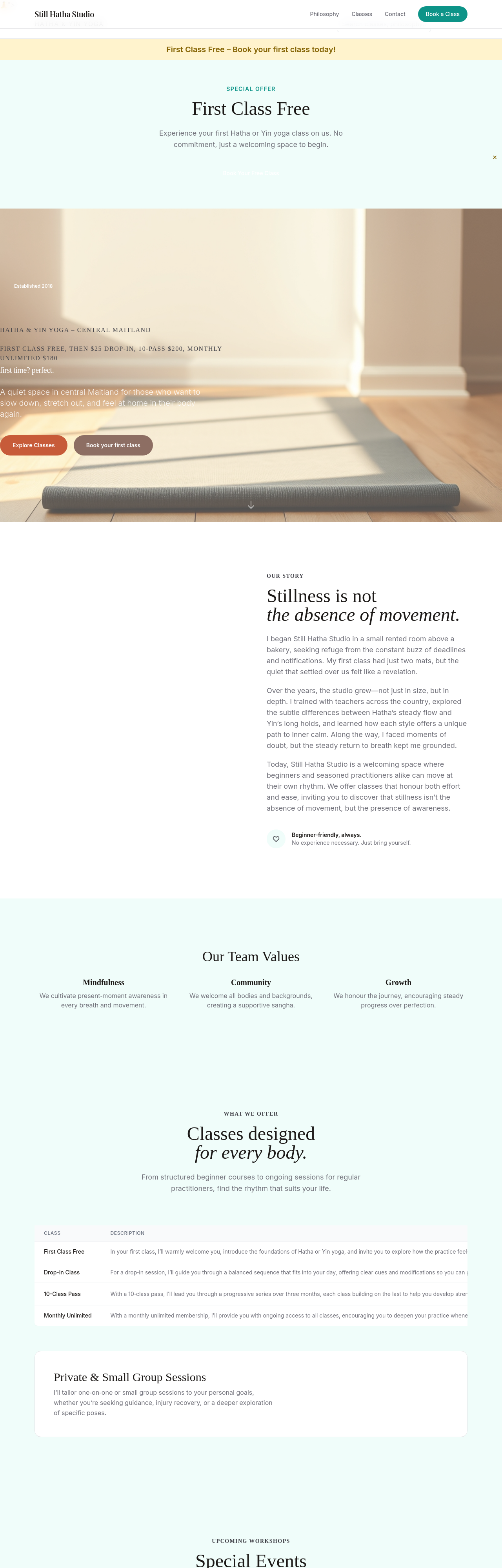
After
meta description should mention Maitland + Hatha + Yin + beginners welcome
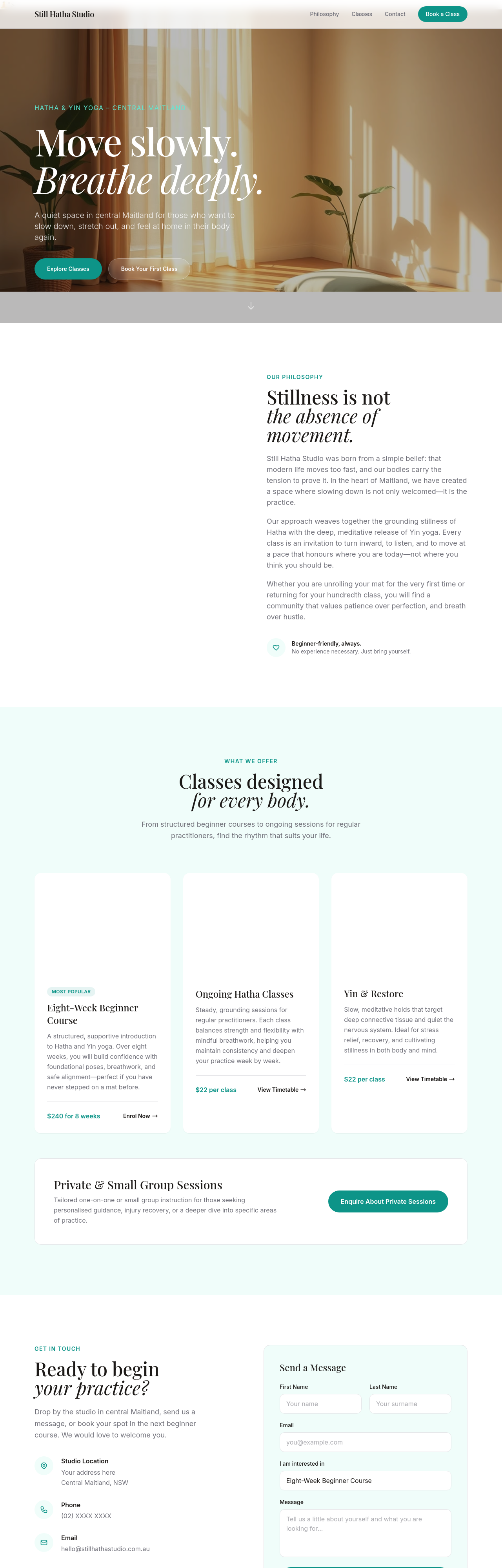
Before
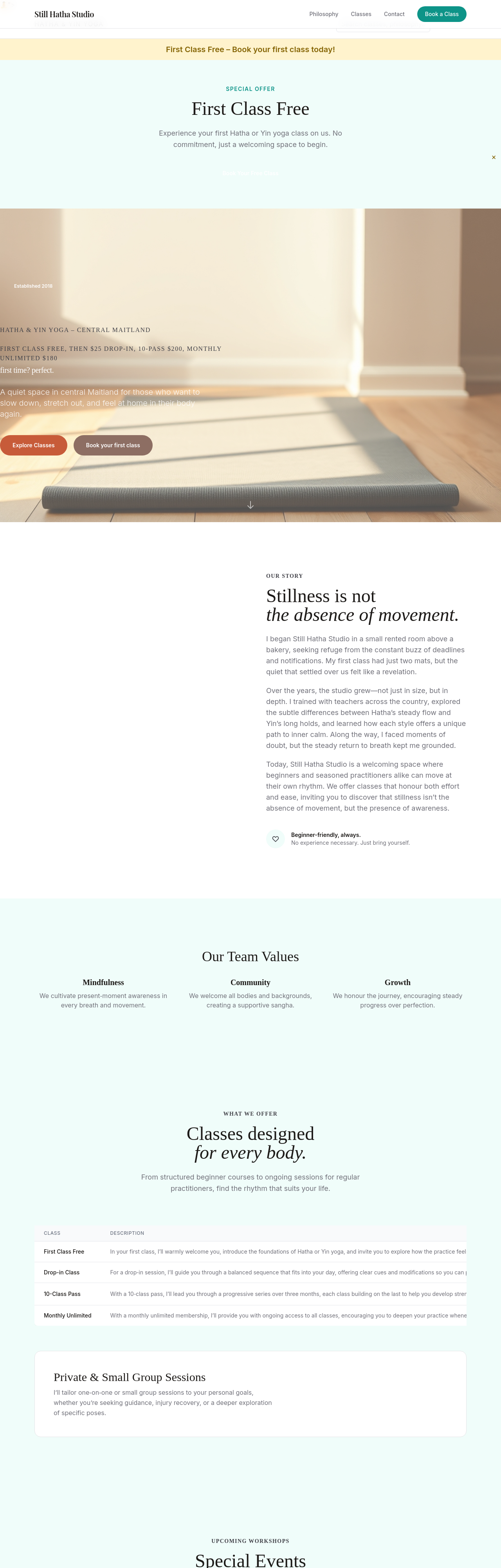
After
add a /teachers page with placeholders for 3 instructor bios
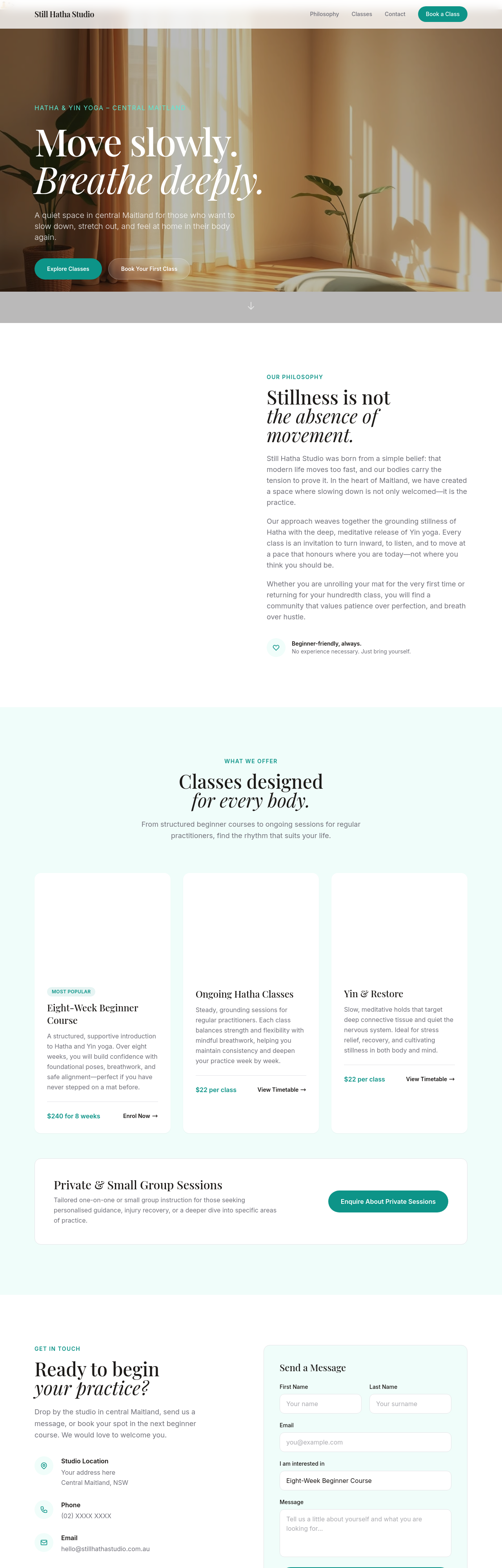
Before
After
add a /workshops page describing seasonal special-event classes
Before
After
add a section explaining yoga styles — what's Hatha, what's Yin, what's Vinyasa
Before
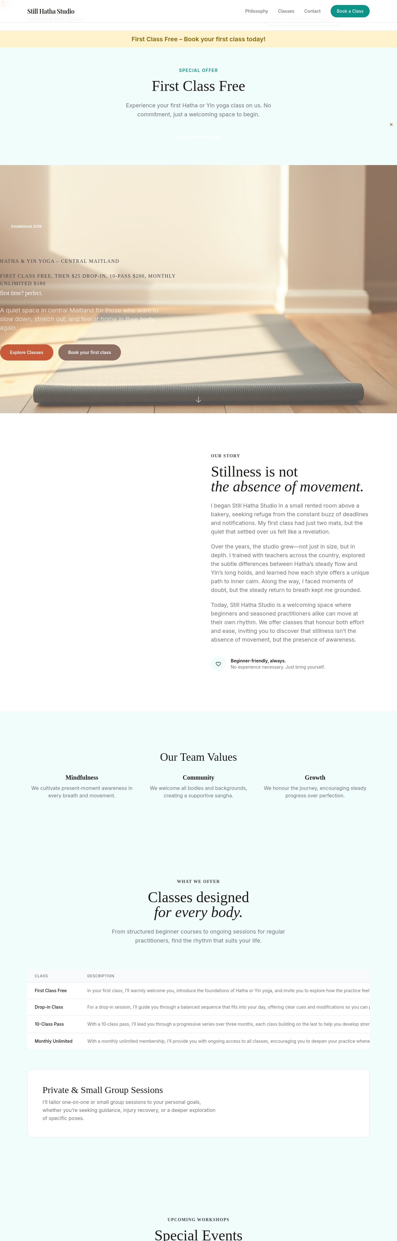
After
add a section about our small-class policy — max 8 students, why it matters
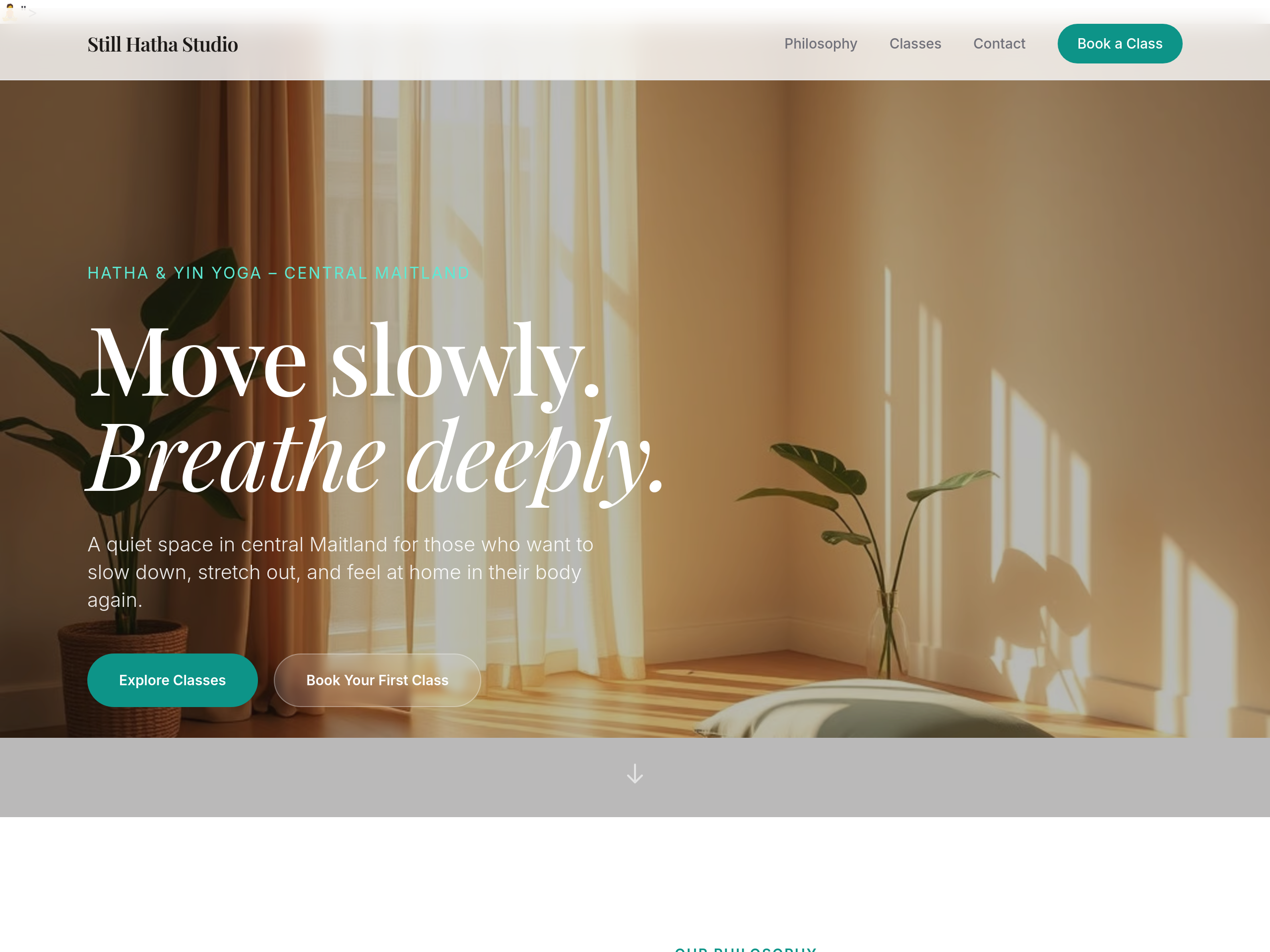
Before
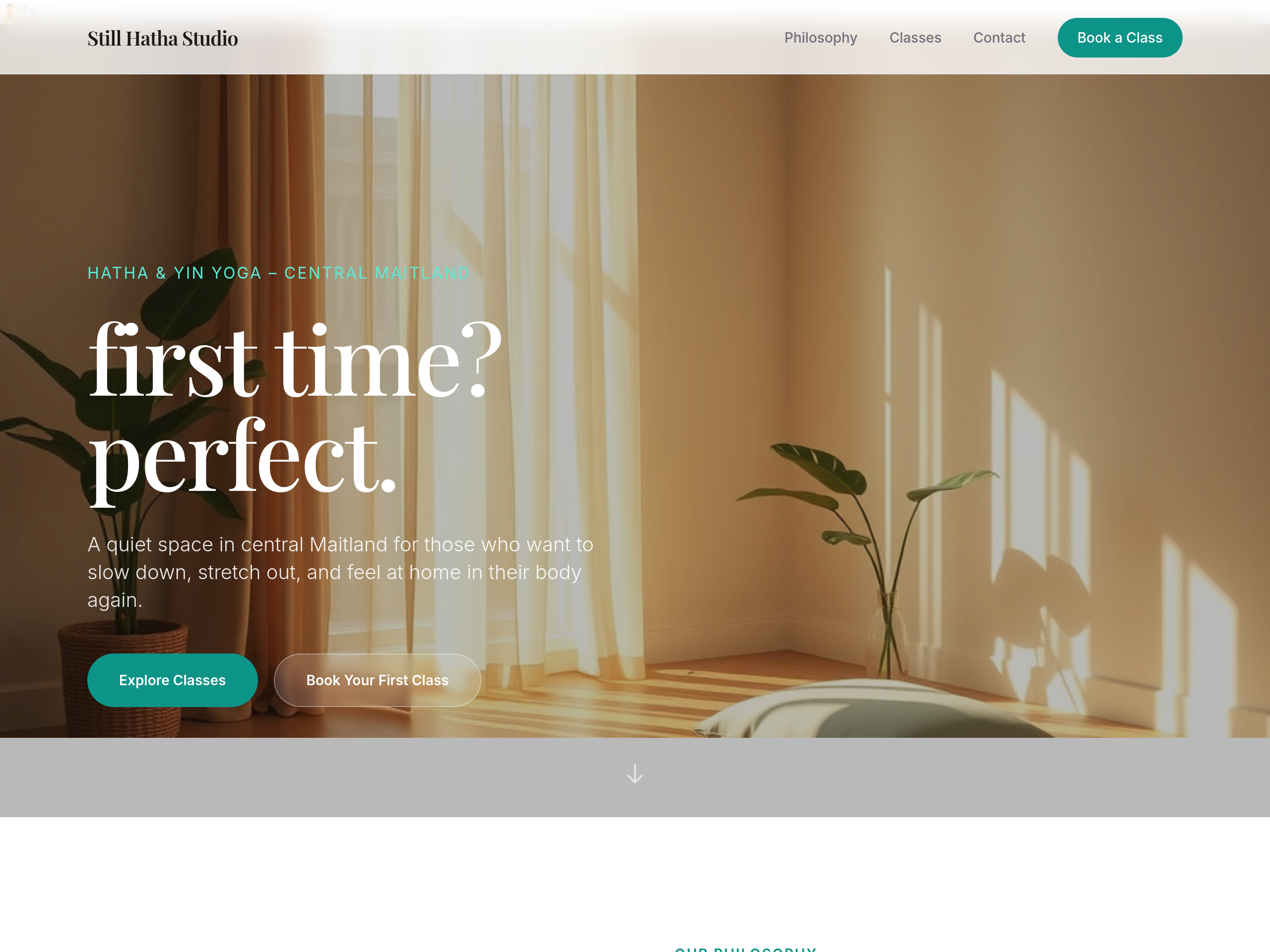
After
the hero is intimidating for beginners — soften to 'first time? perfect.'
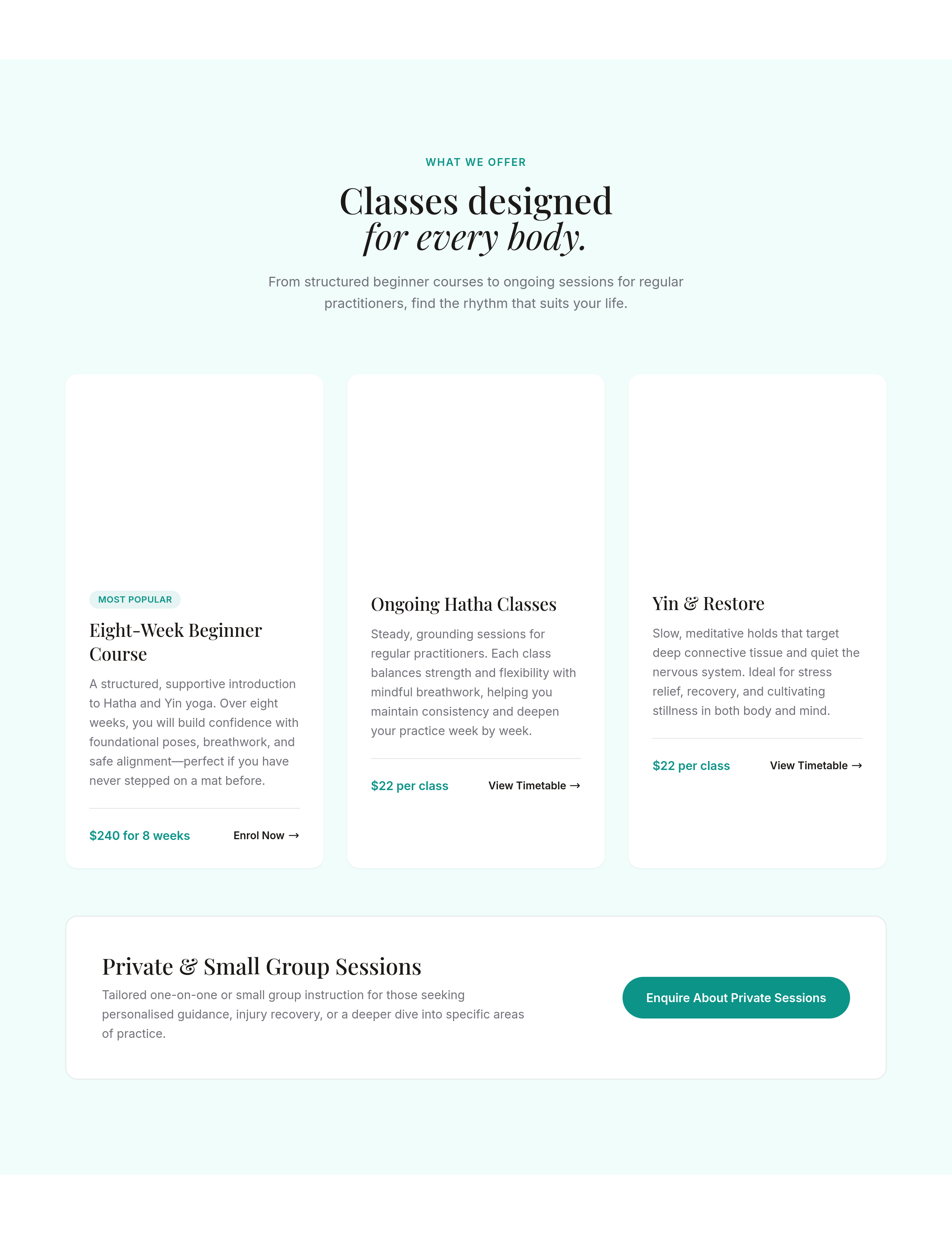
Before
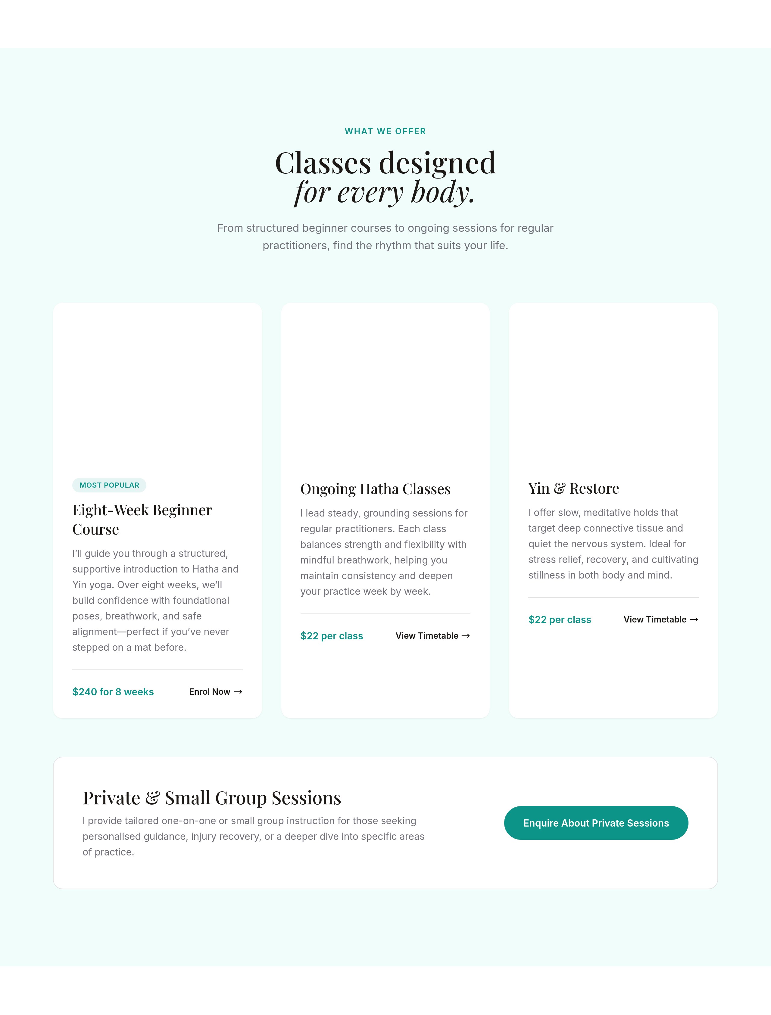
After
rewrite each class description in the teacher's voice — first-person, what to expect
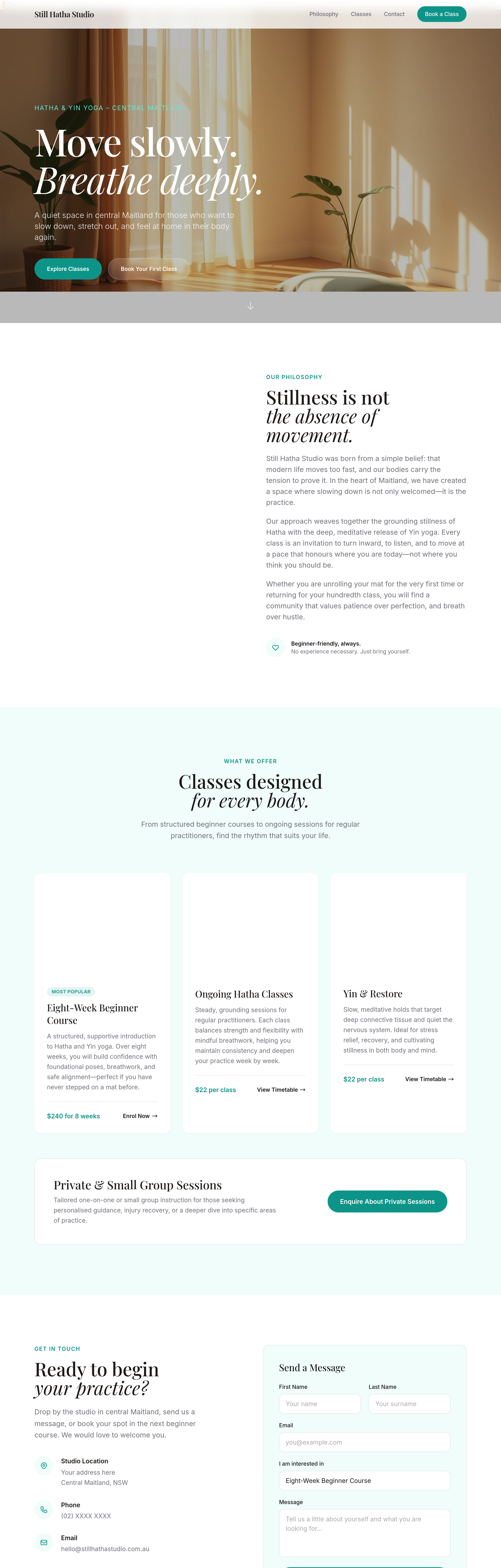
Before
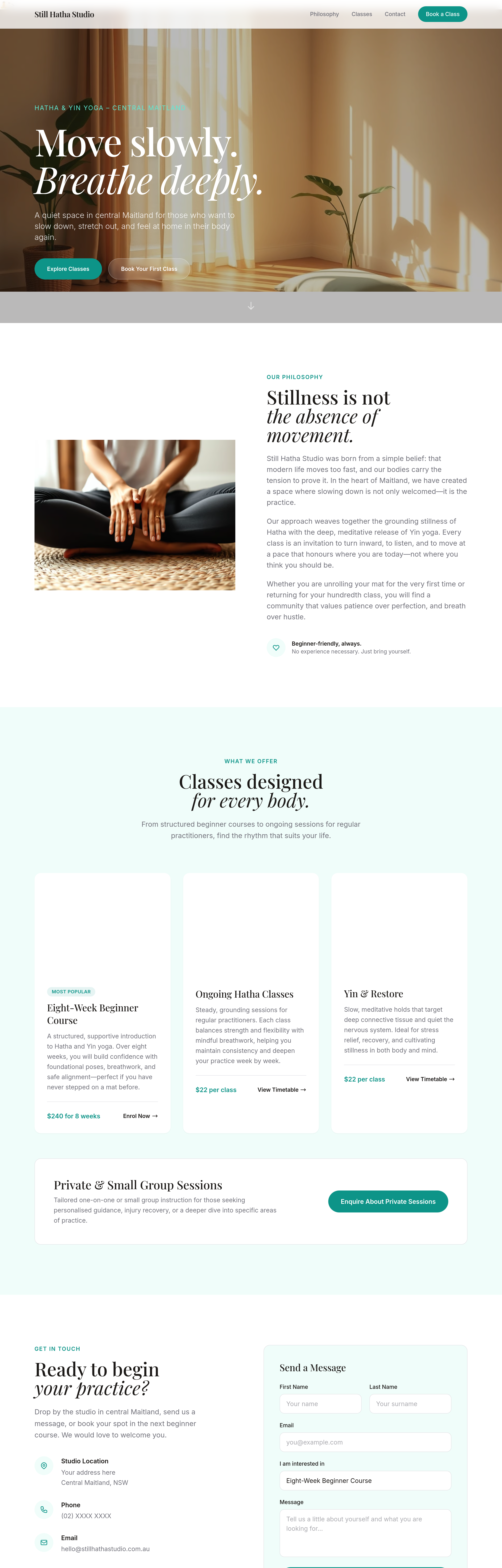
After
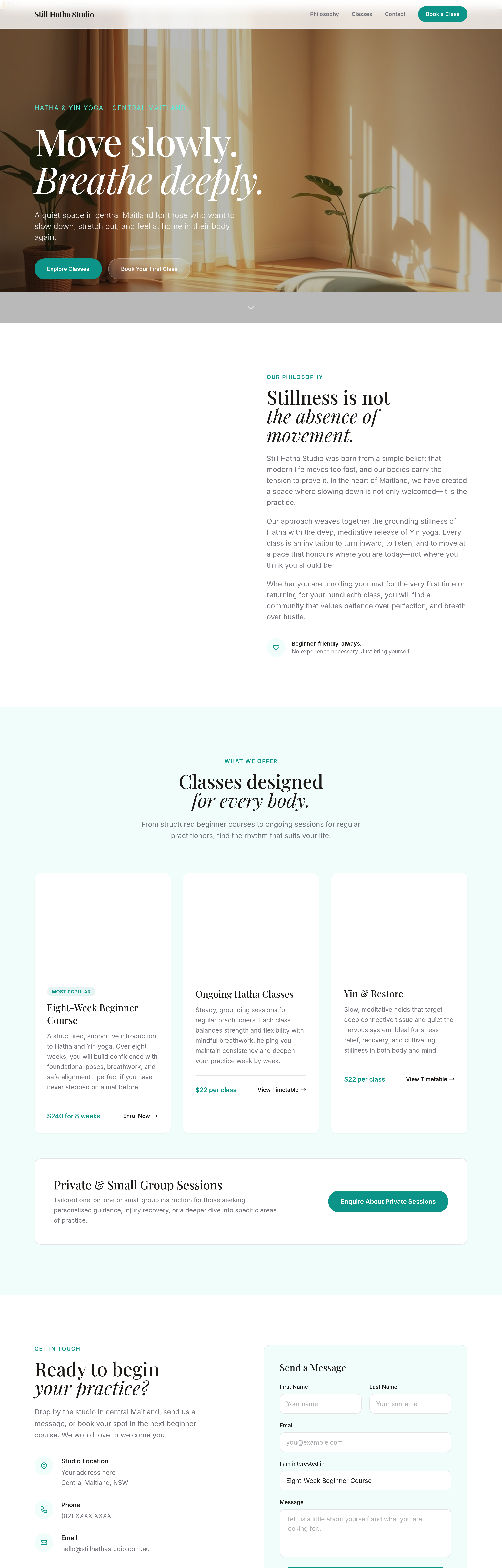
add a 'studio etiquette' section — phones off, arrive 5 min early, bring own mat or rent one
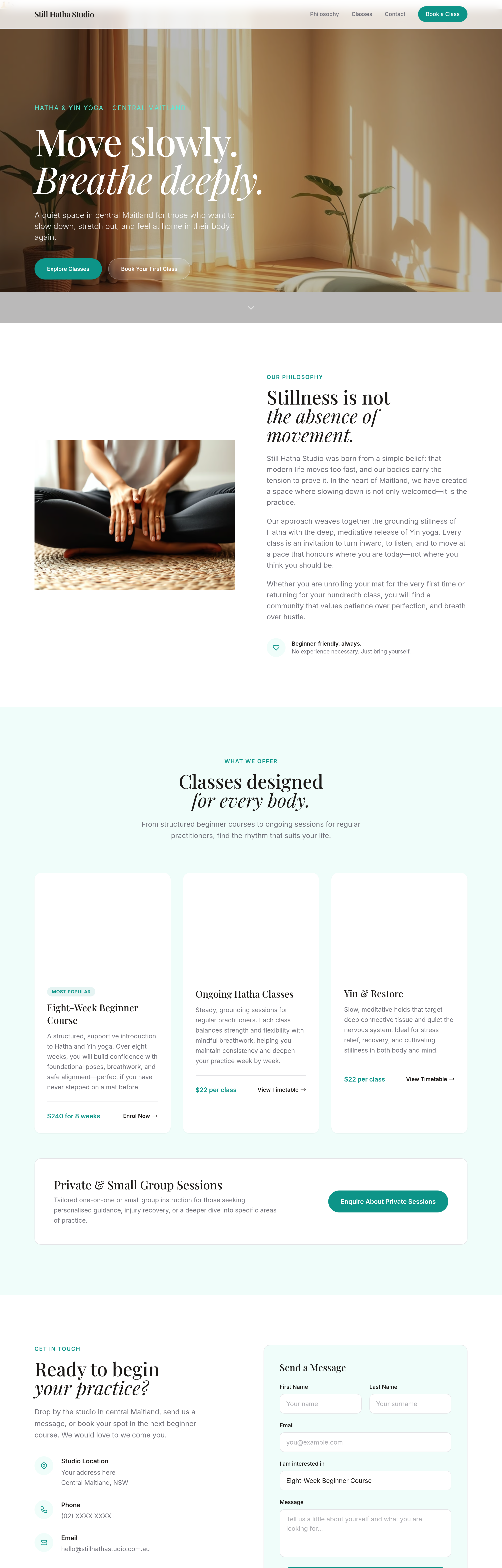
Before
After
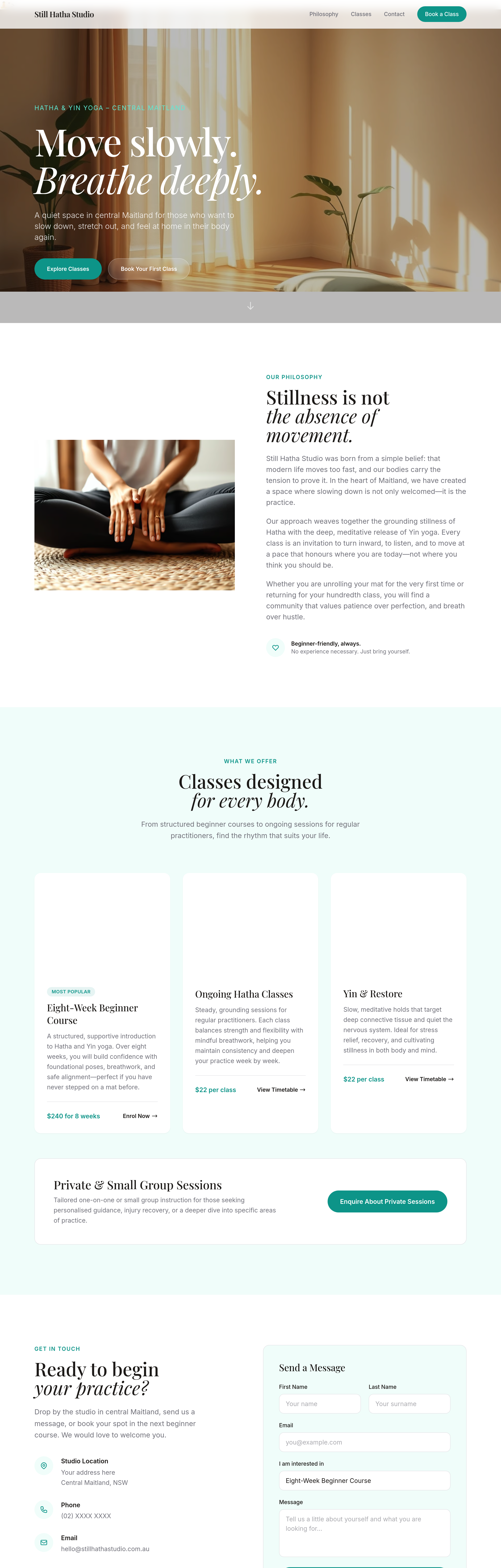
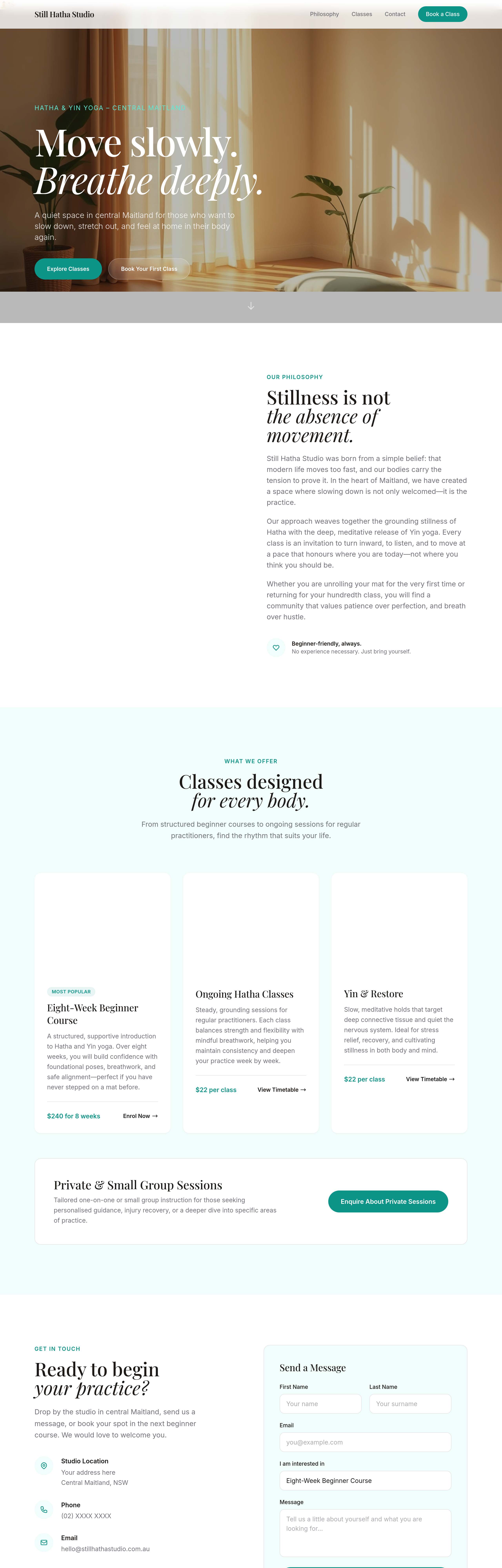
add a 'private sessions' section — 1:1 with a teacher, $120/hr, by appointment
Before
After
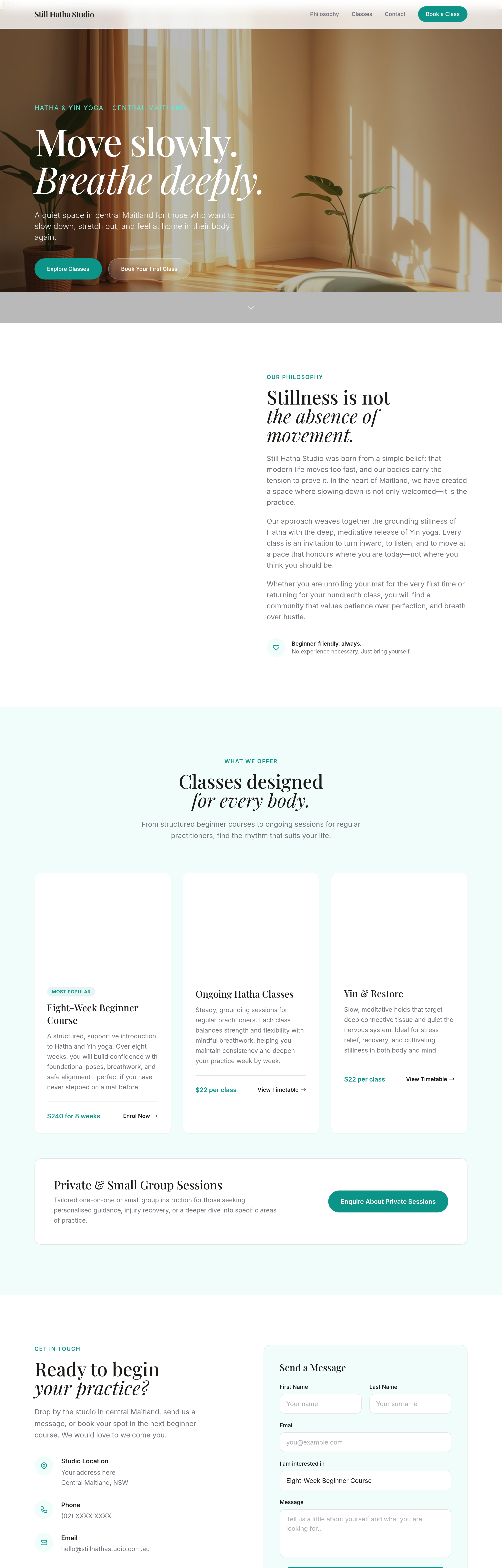
add a 'workshops' section listing upcoming special events (placeholder dates)
Before
After
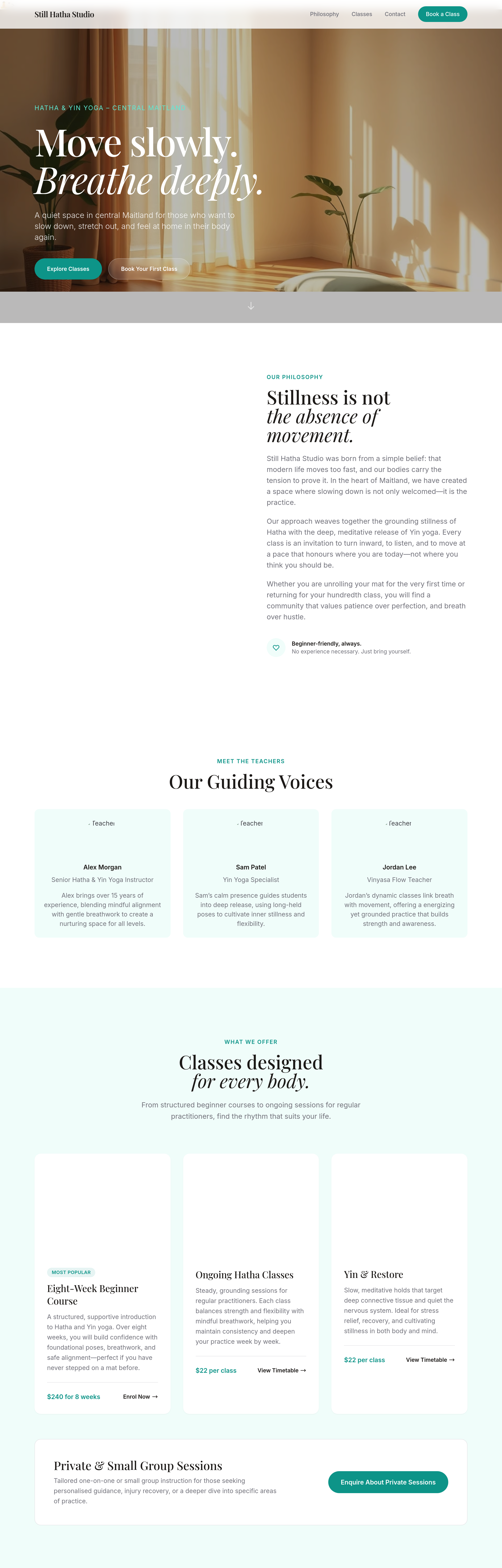
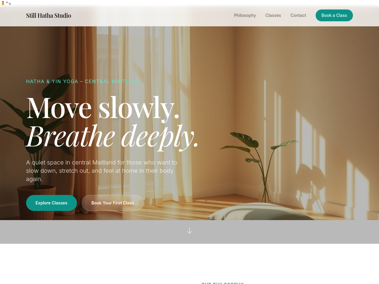
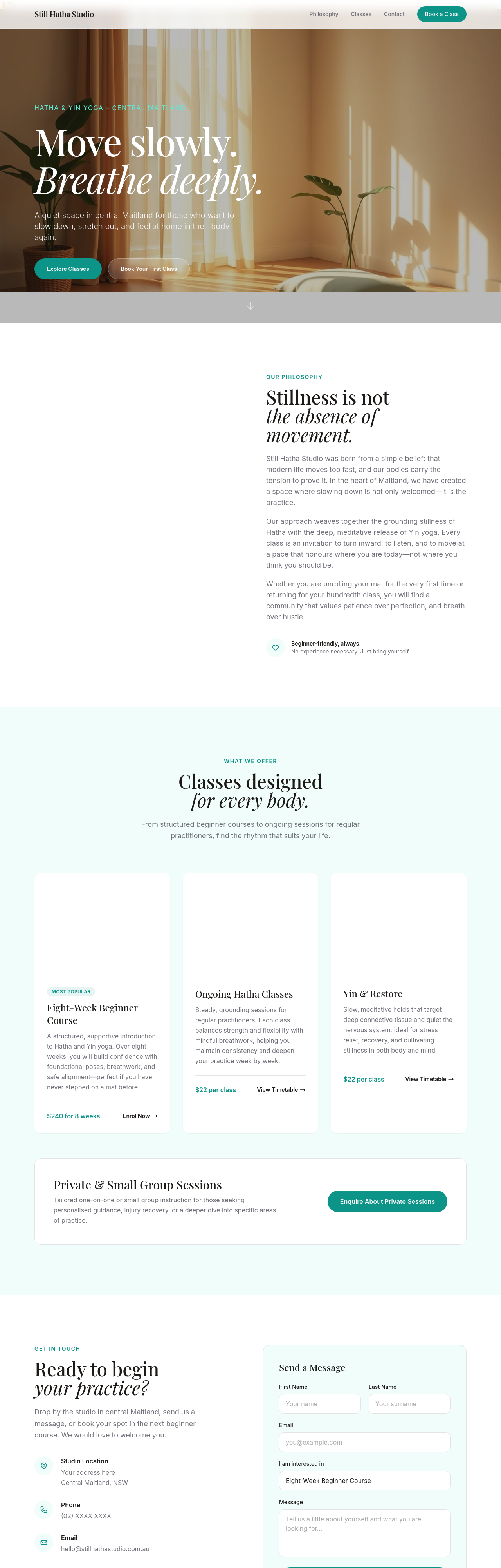
add a 'meet the teachers' section with 3 placeholder bios in soft tone
Before
After
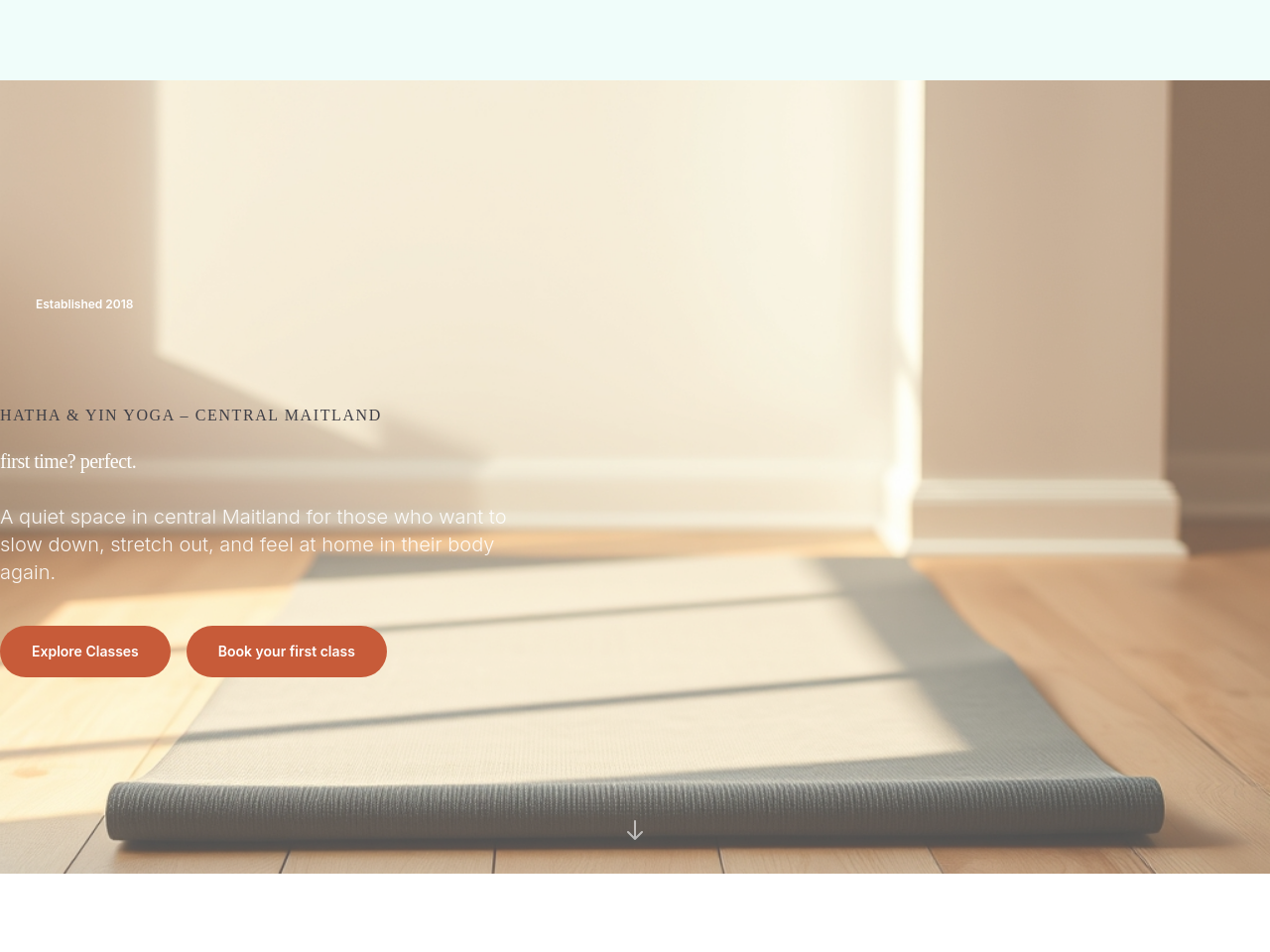
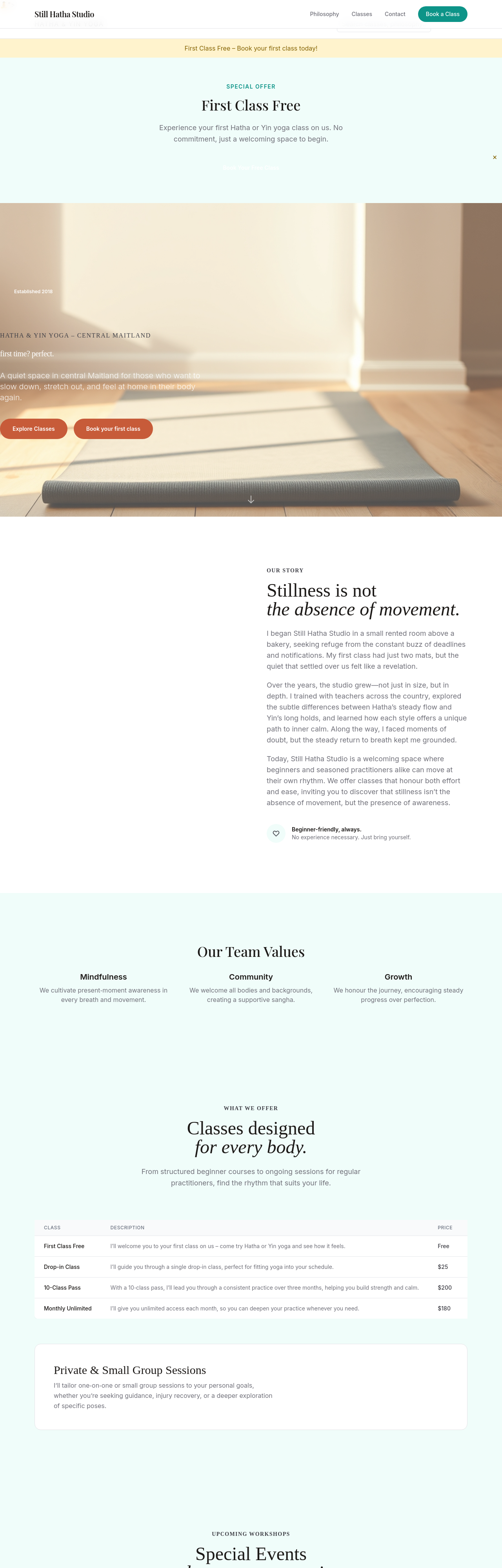
add a serene hero image of an empty mat in soft morning light, wooden floor
Before
After
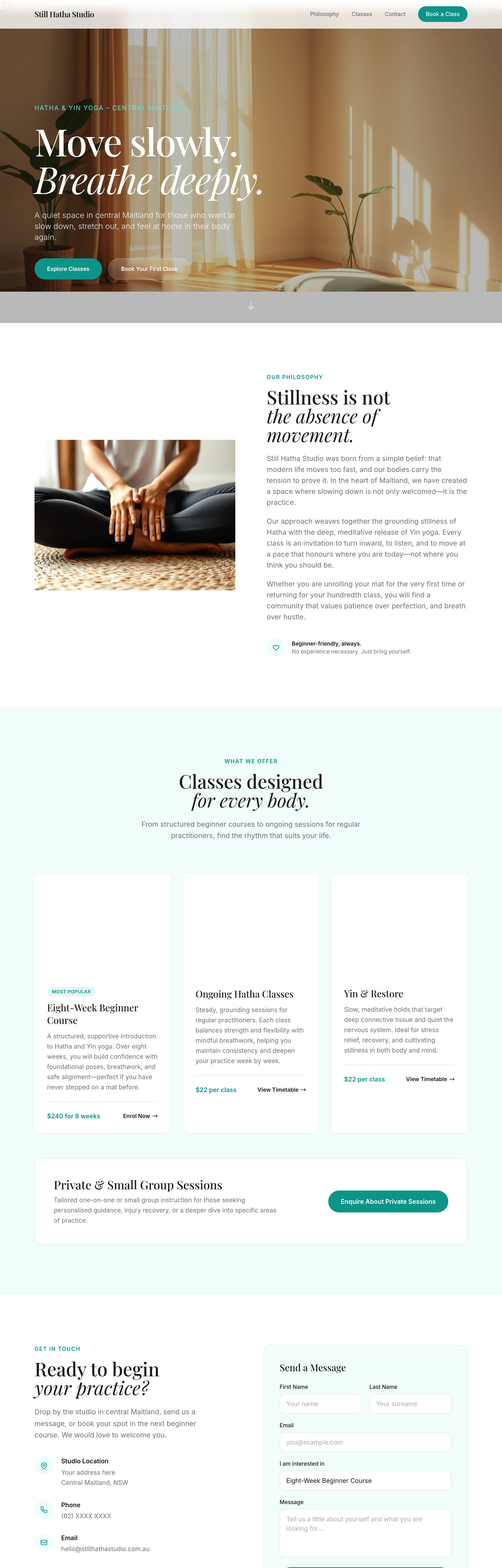
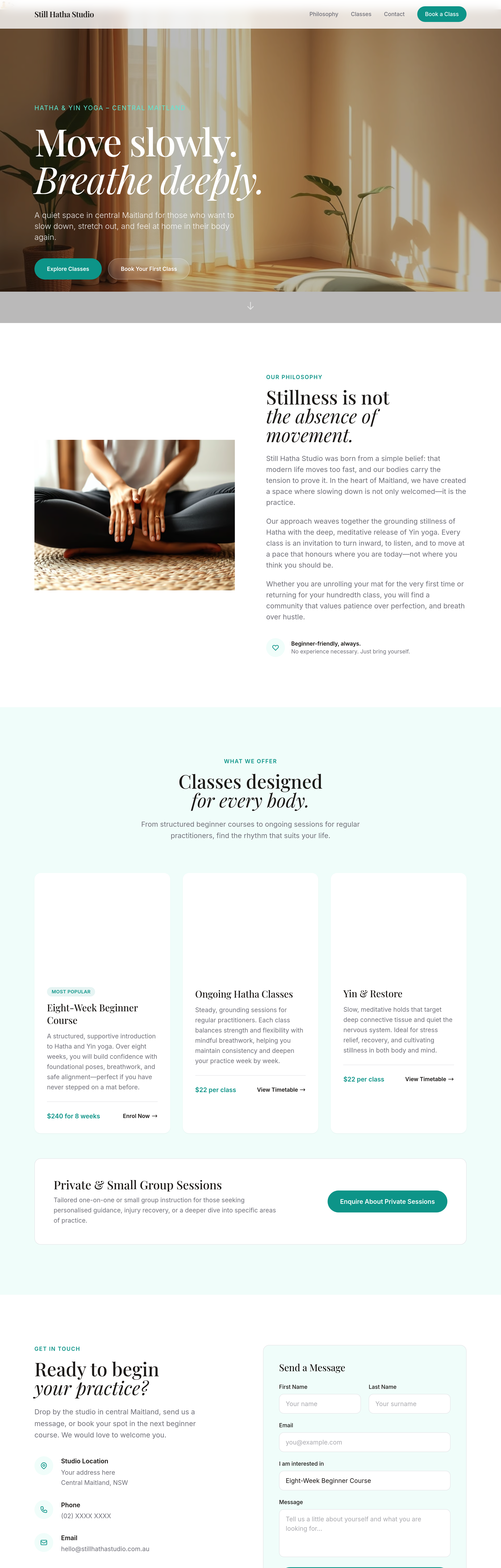
add 4 image cards of different class styles — each capturing the mood
Before
After
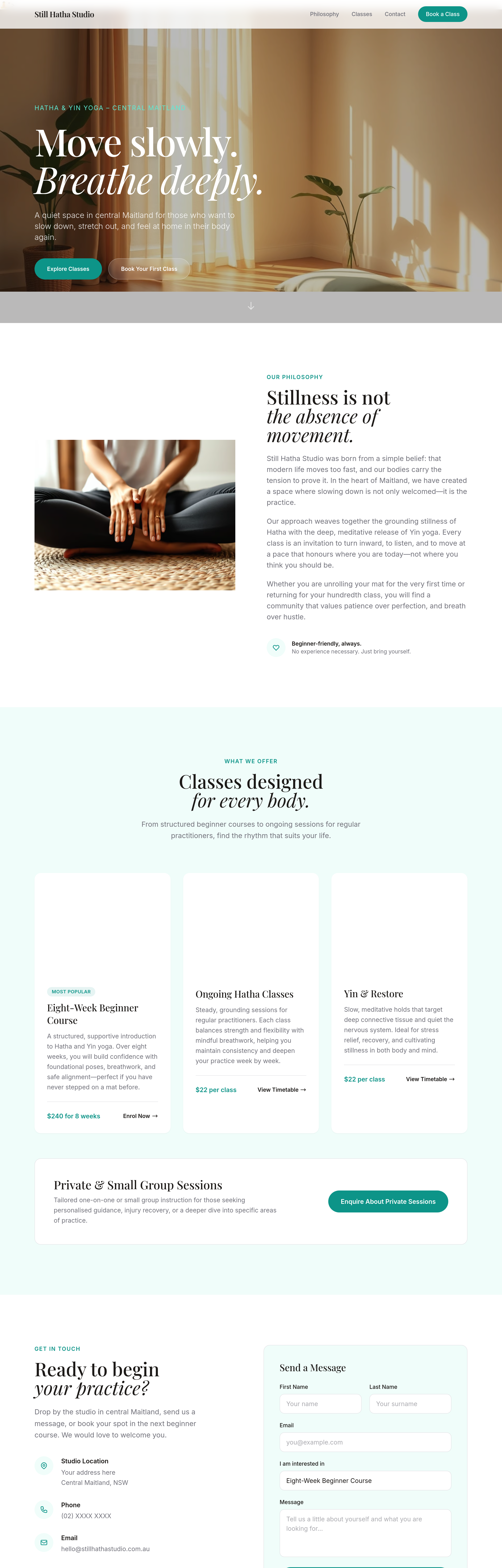
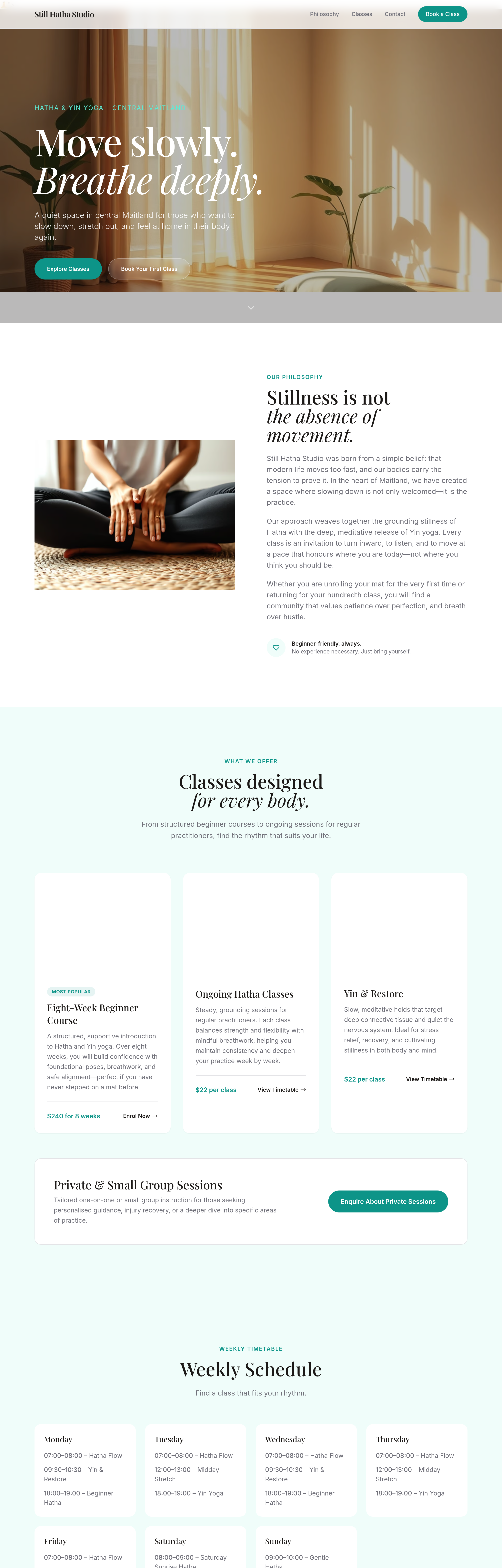
emphasise 'first class free' across hero + sticky bar + footer + a dedicated section
Before
After
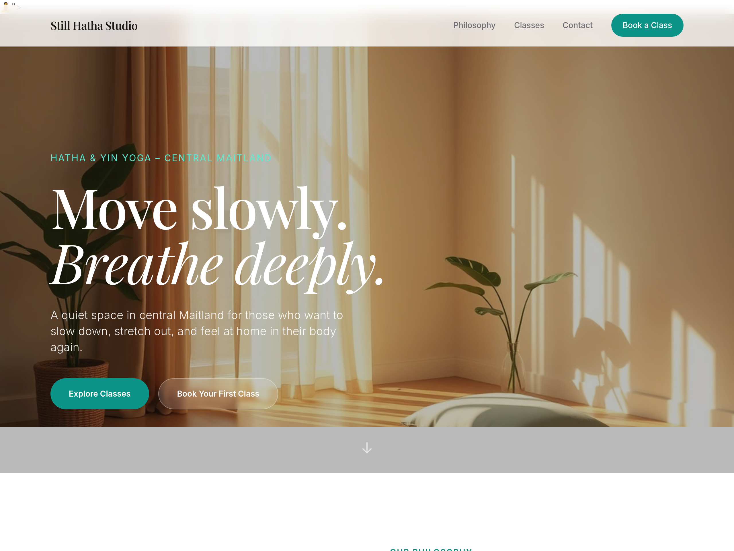
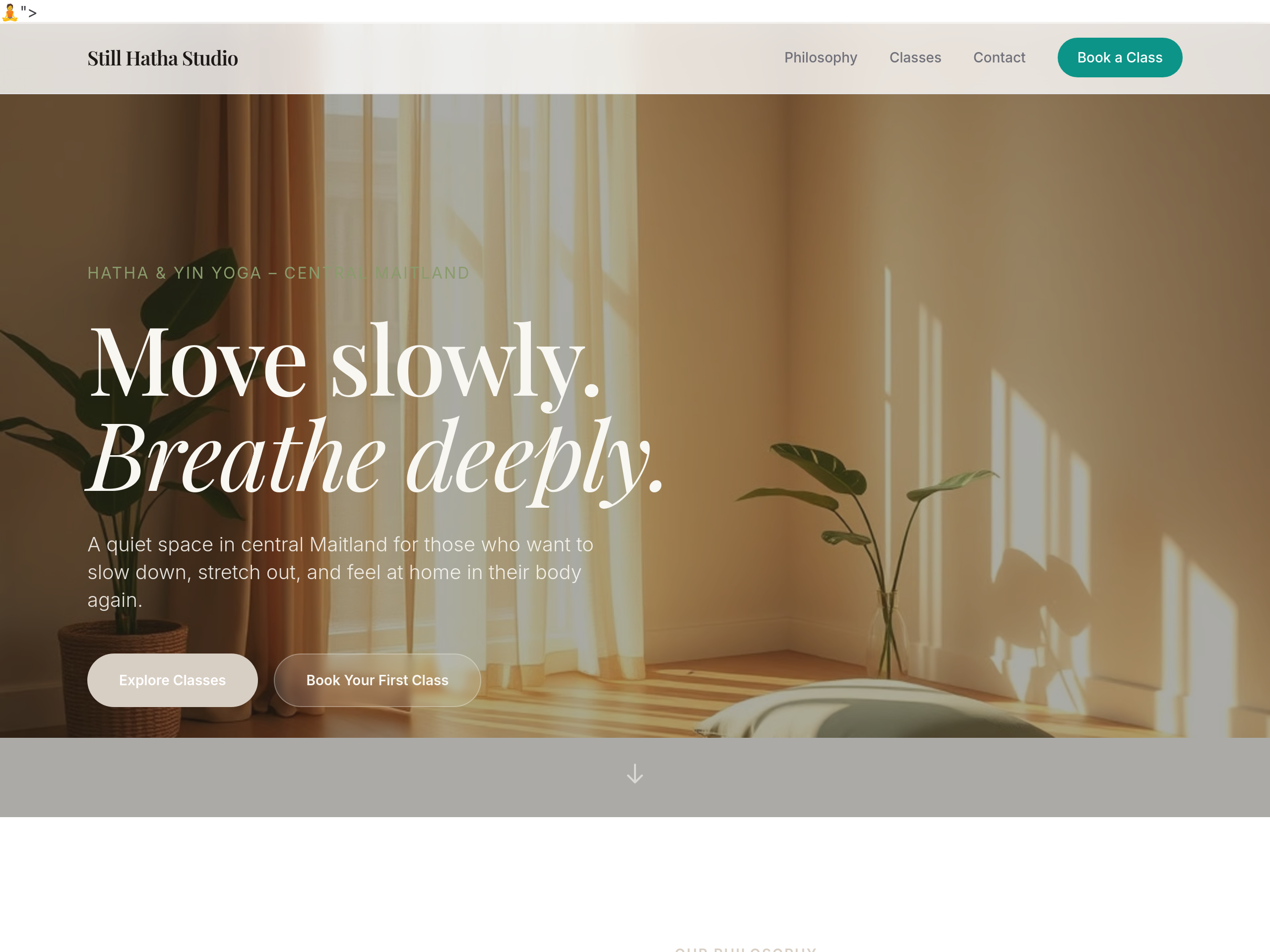
the schedule should be a clean week-grid layout, not paragraphs
Before
After
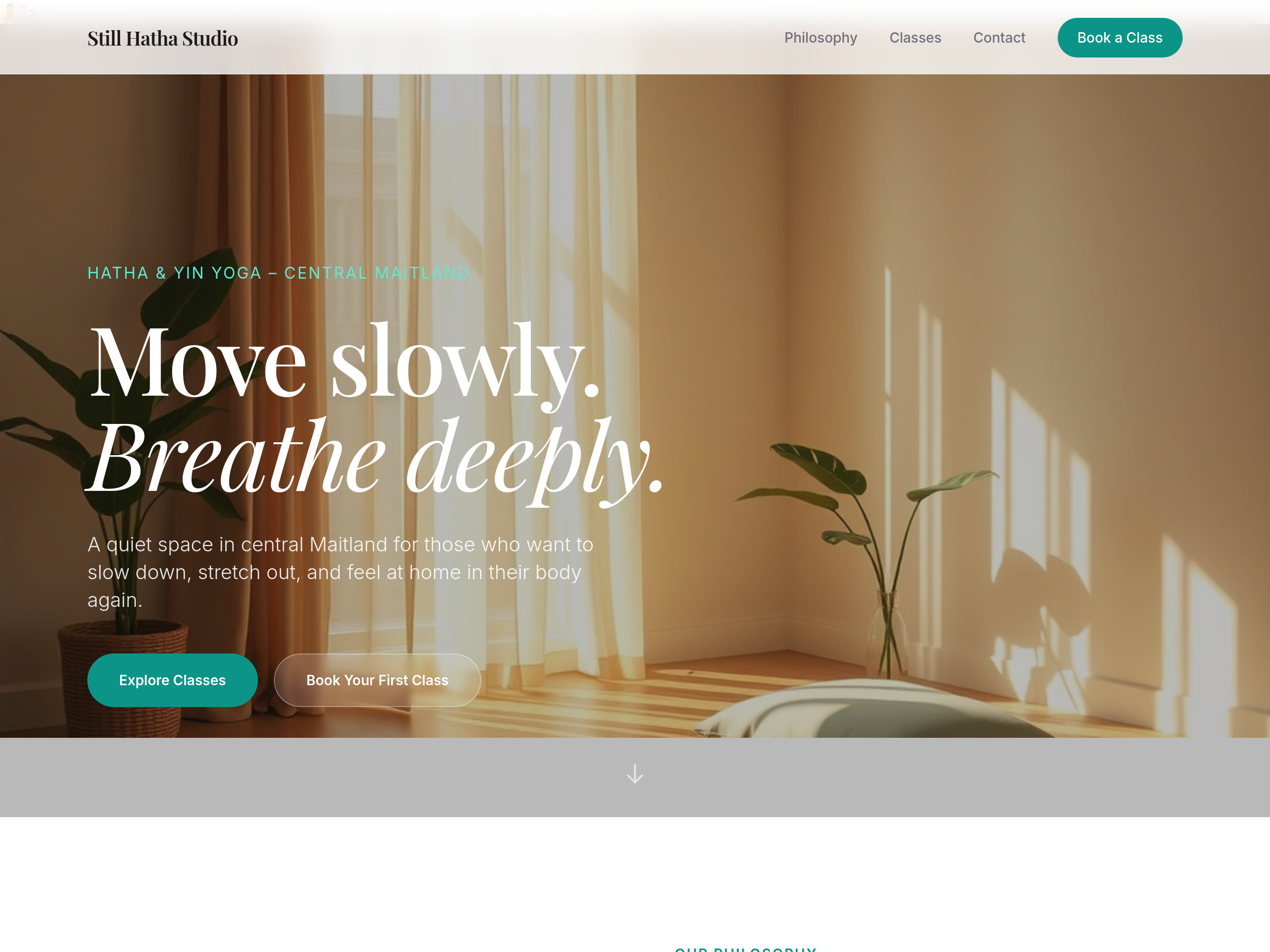
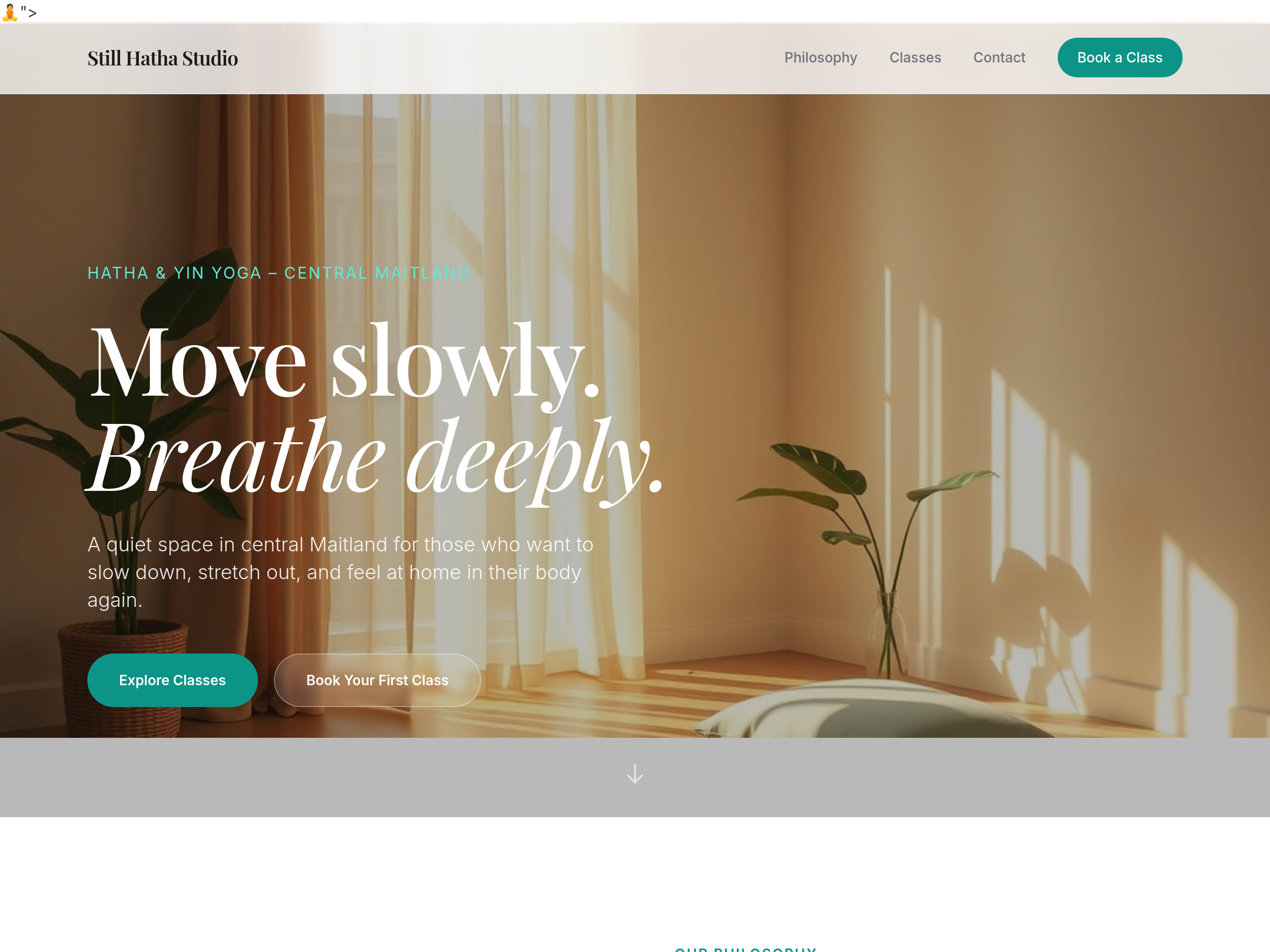
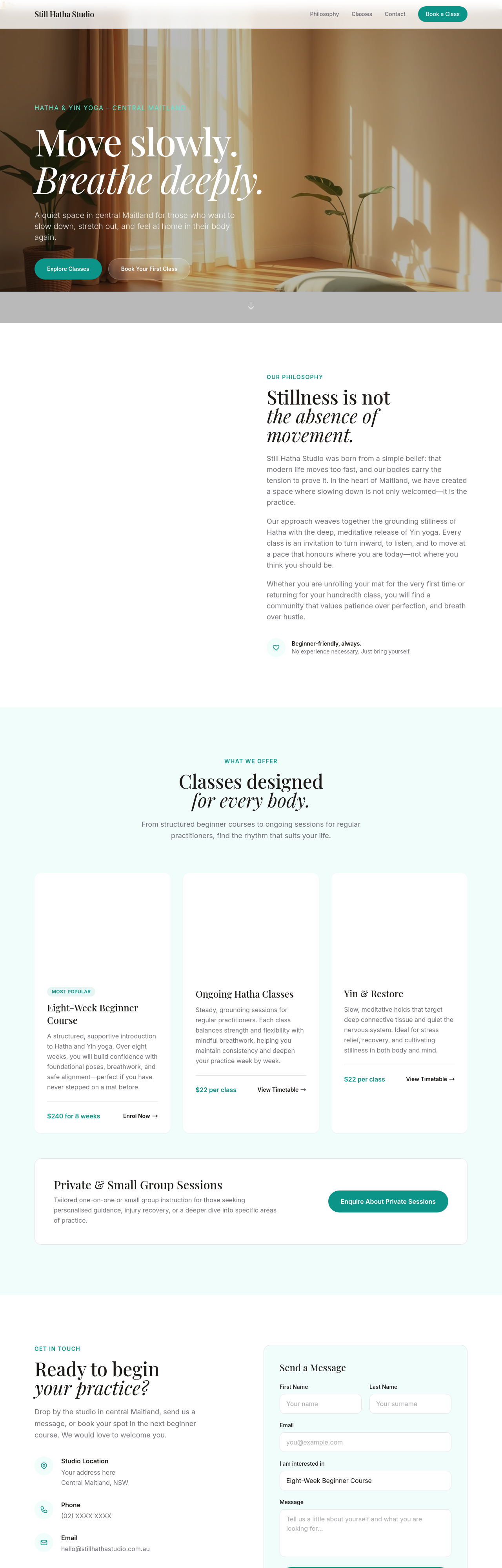
the colour palette is too pink — warm earthy sage + dusty linen tones
Before
After
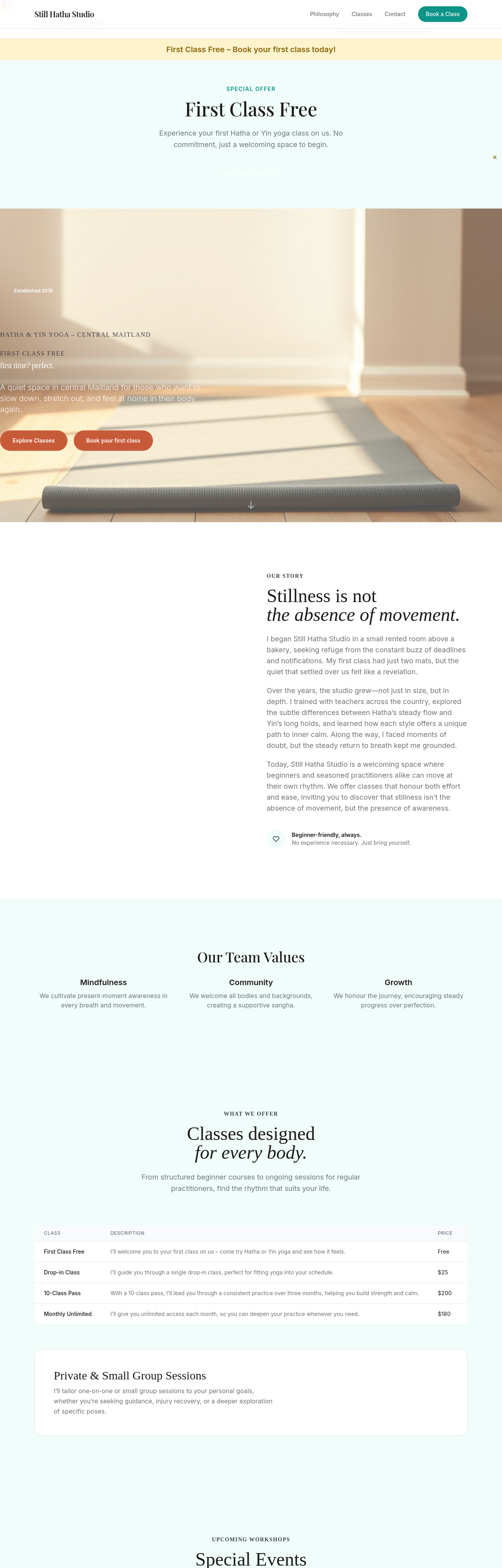
the headings feel commercial — use a soft humanist serif
Before
After
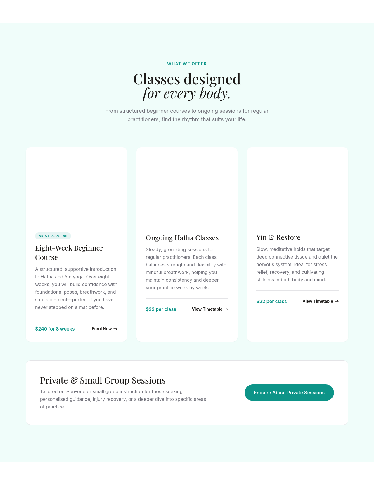
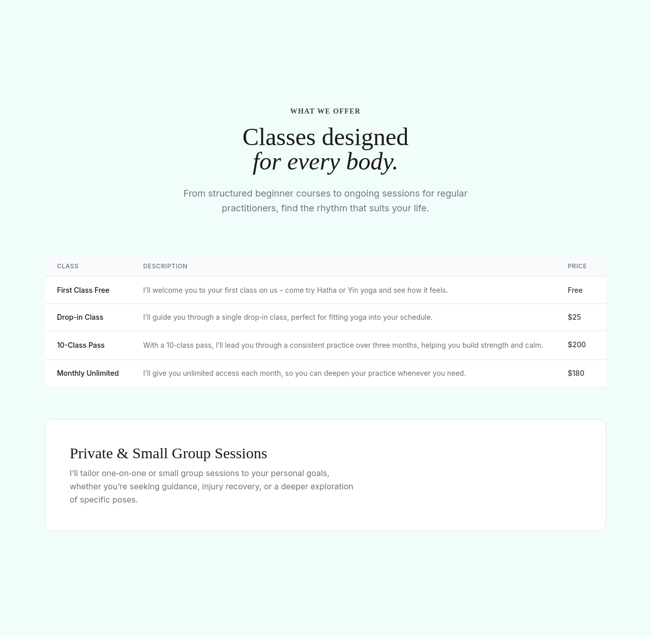
replace 'Sign up now' with 'Reserve your mat' — softer + invitational
Before
After
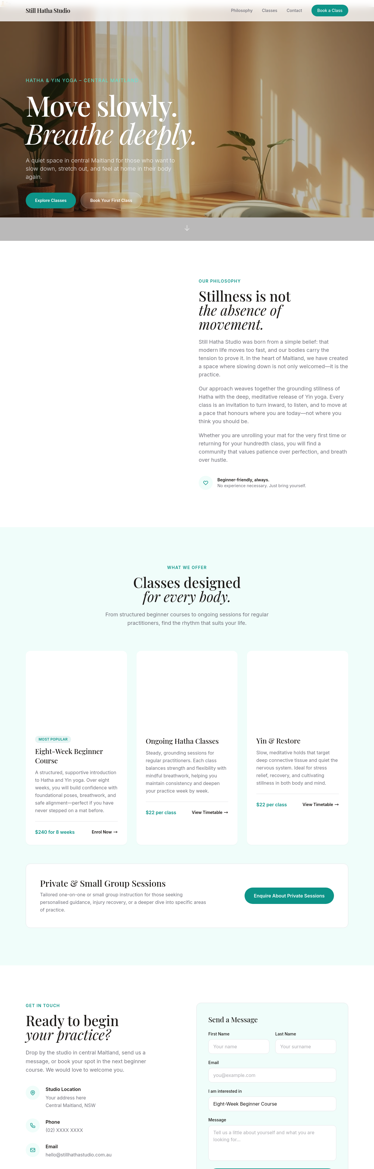
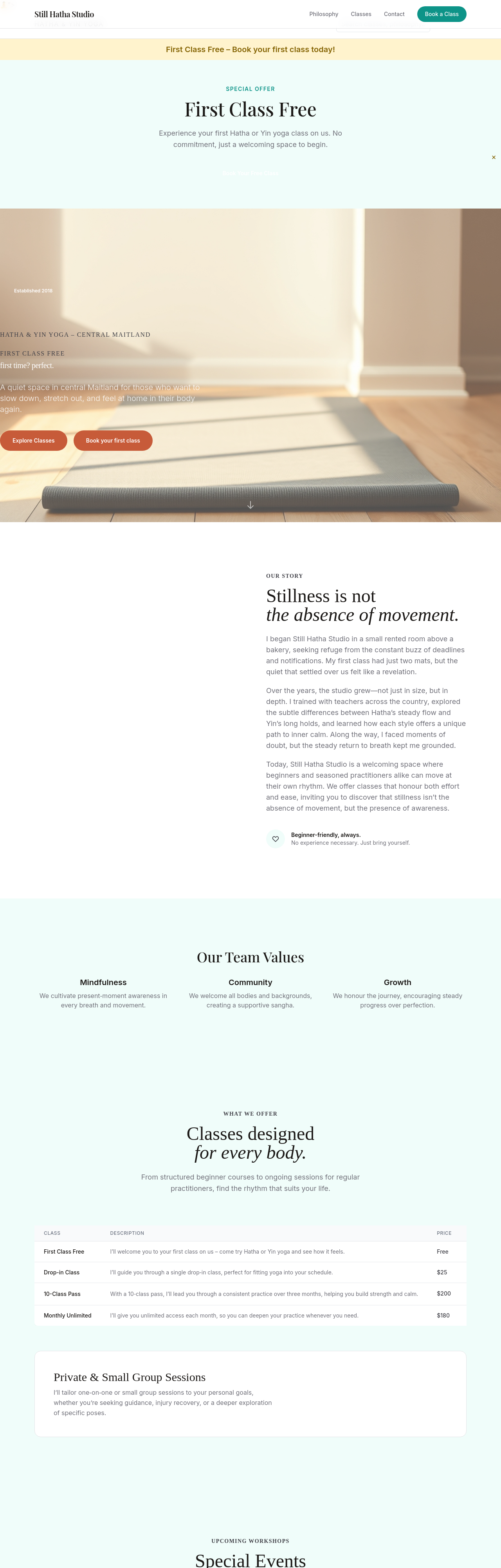
3-tier pricing clearly: drop-in $25, 10-pack $200 (best value), monthly unlimited $180
Before
After
create a /retreats page advertising weekend wellness retreats with placeholder dates