photographer
59 examples run against cap-photographer.flarepages.au.
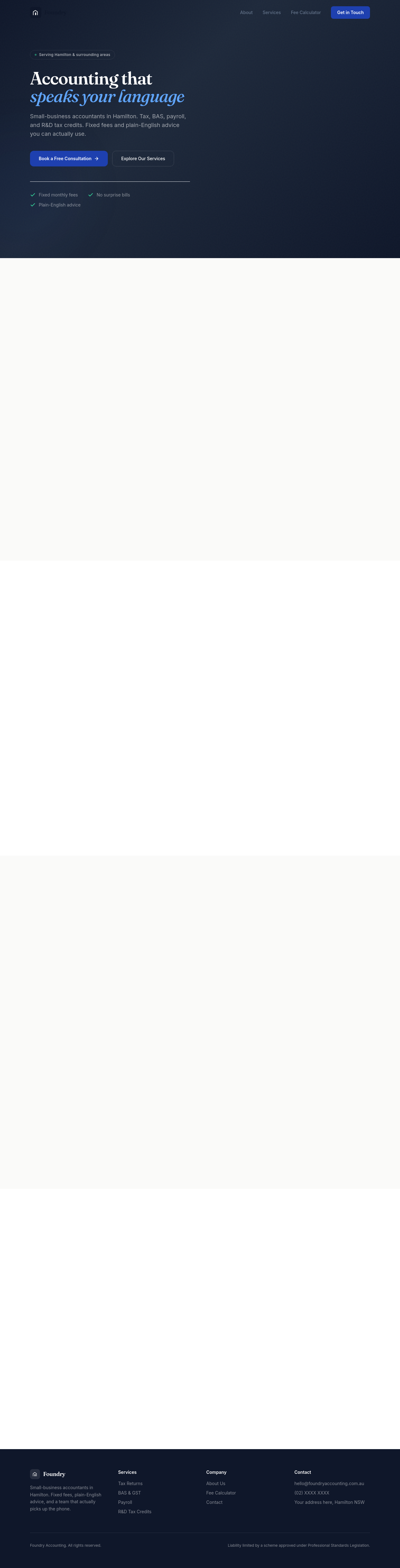
Before

After
create a /pricing page with detailed plan comparison
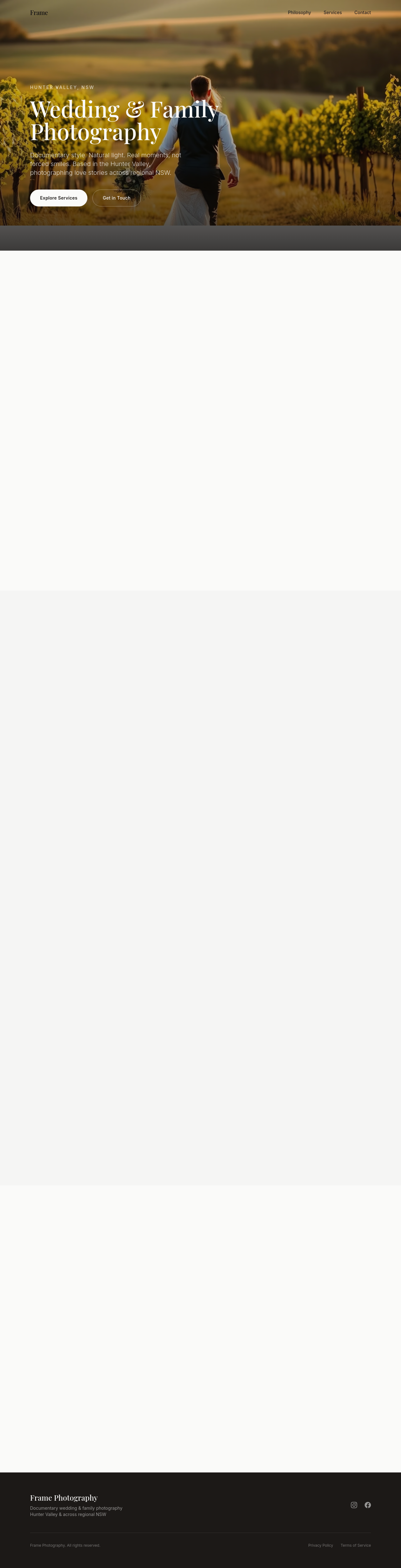
Before

After
create a /about page that's deeper than the home about section
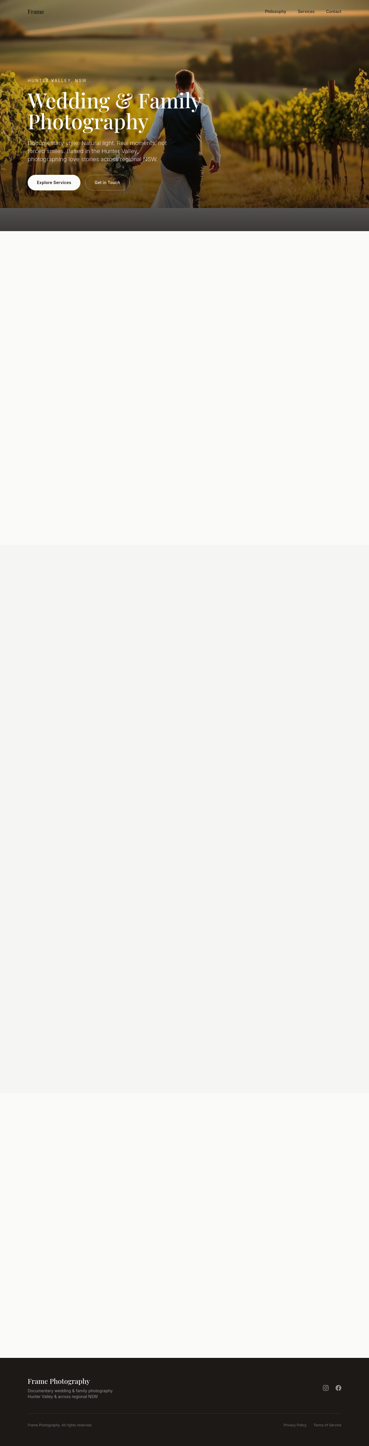
Before

After
create a /faq page with 10 detailed Q&As
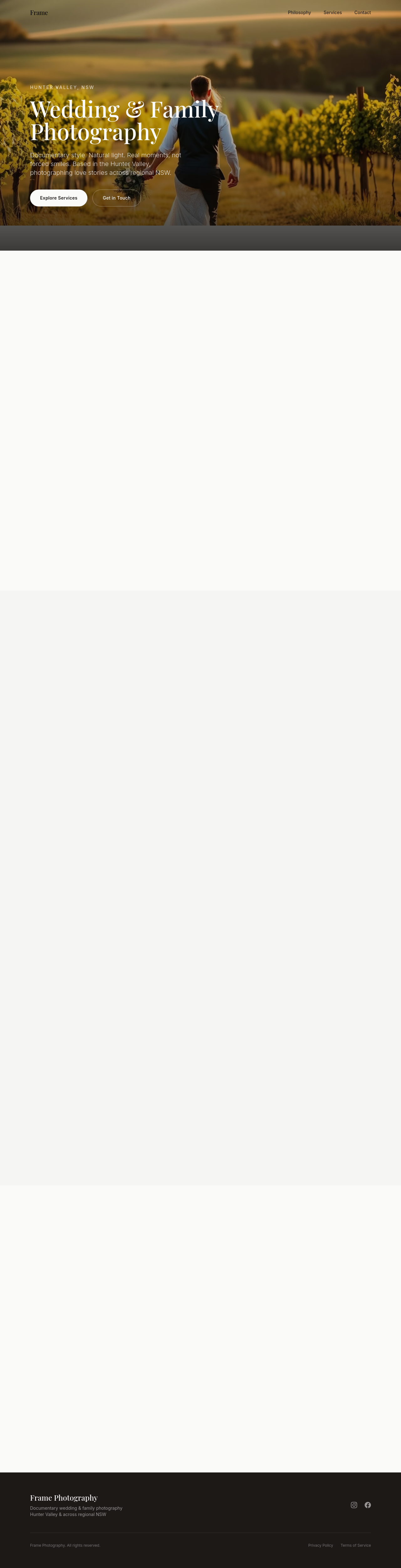
Before

After
create a /contact page with multiple ways to reach us
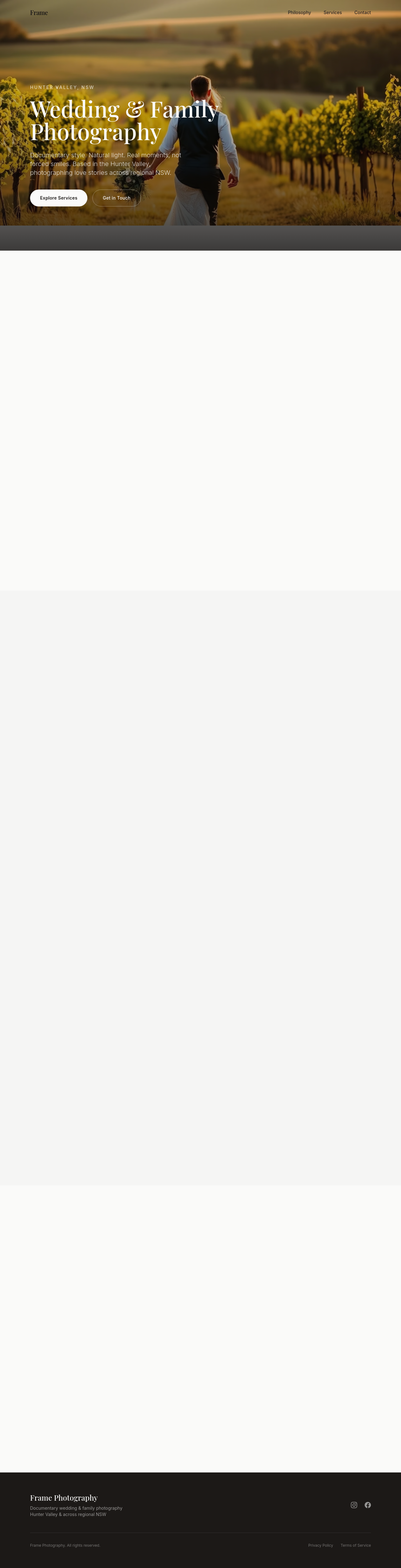
Before

After
create a /blog landing page with 3 placeholder posts
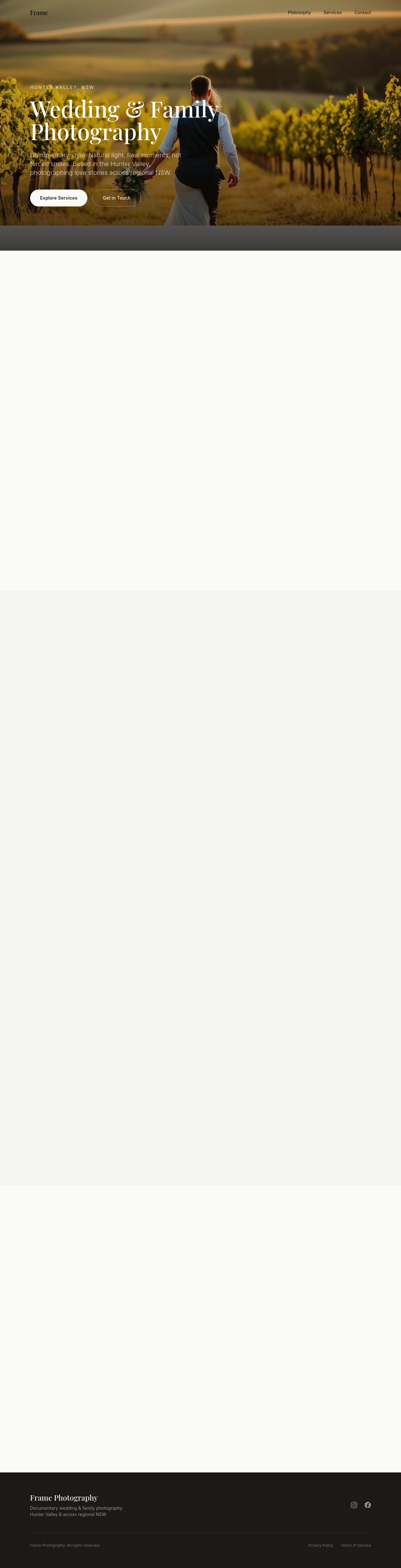
Before

After
create a /careers page with 2 placeholder job listings
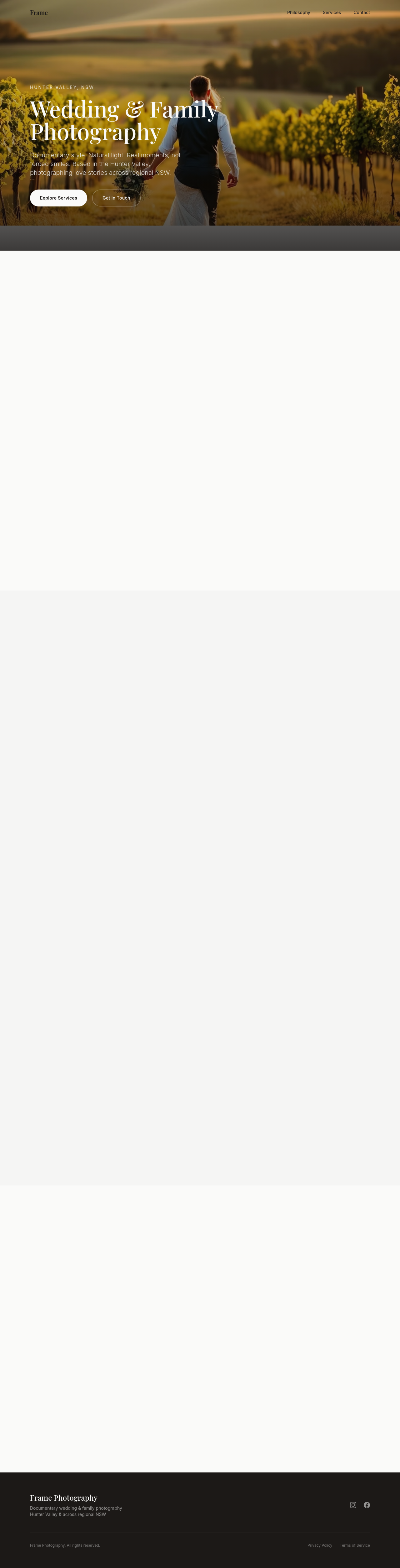
Before

After
add a /terms page with a basic Australian terms of service
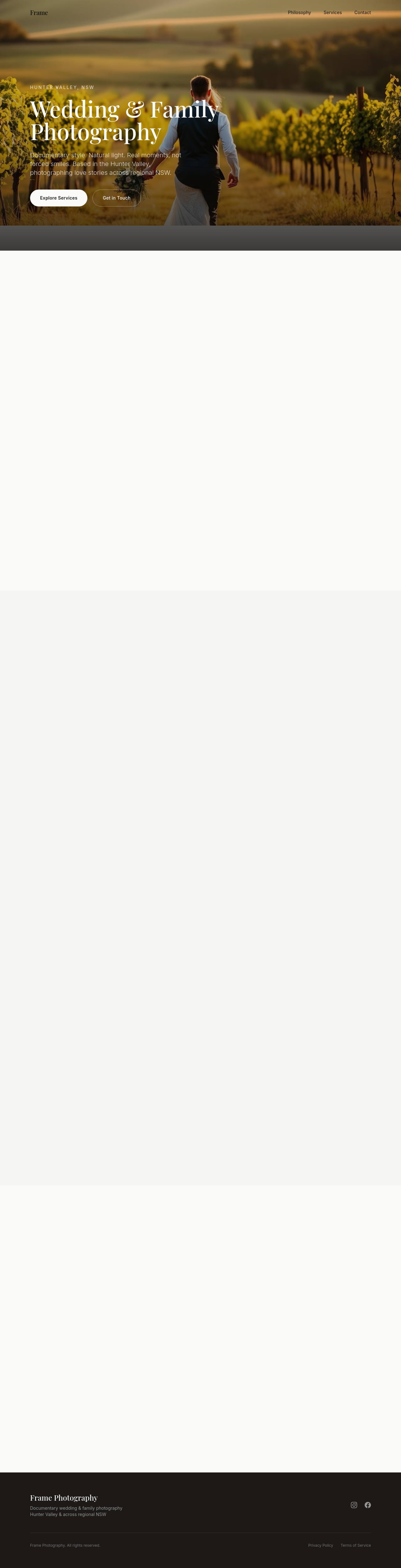
Before

After
add a /privacy page with APP compliance basics
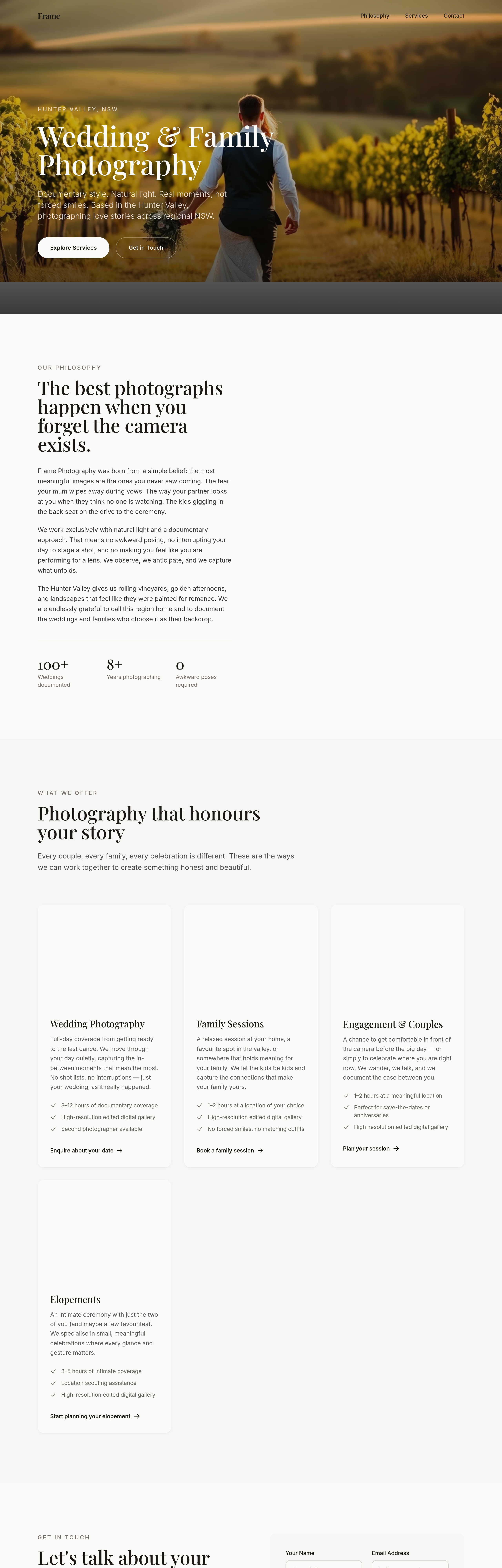
Before
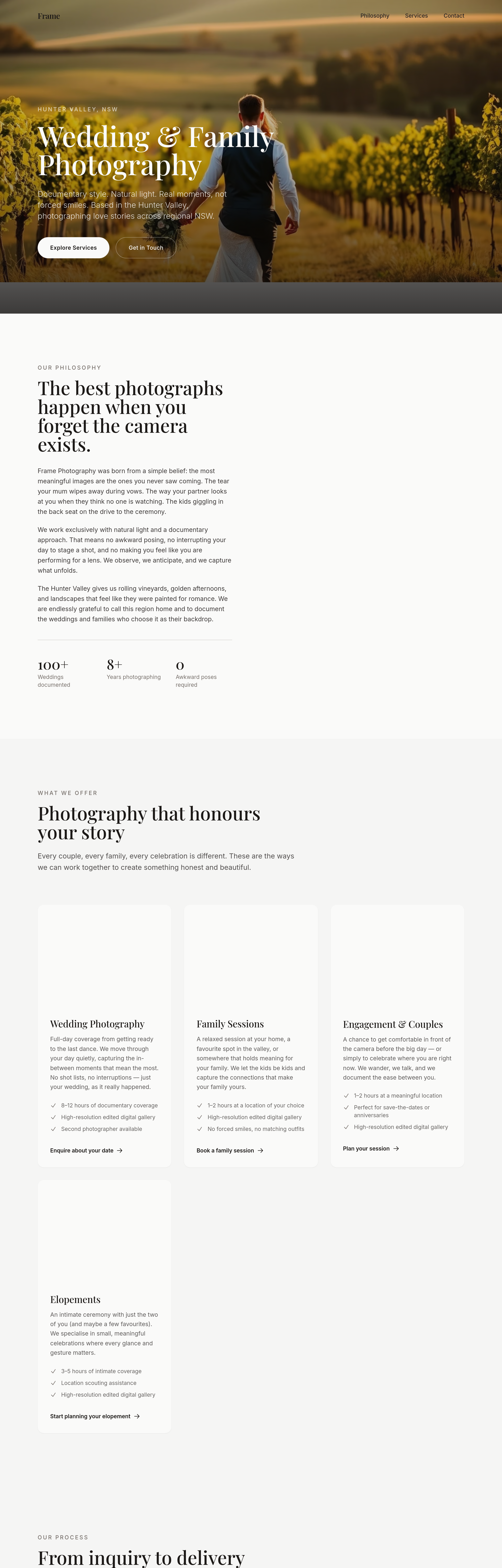
After
add a 'process' section with 4 cards: Inquire → Plan → Shoot → Deliver
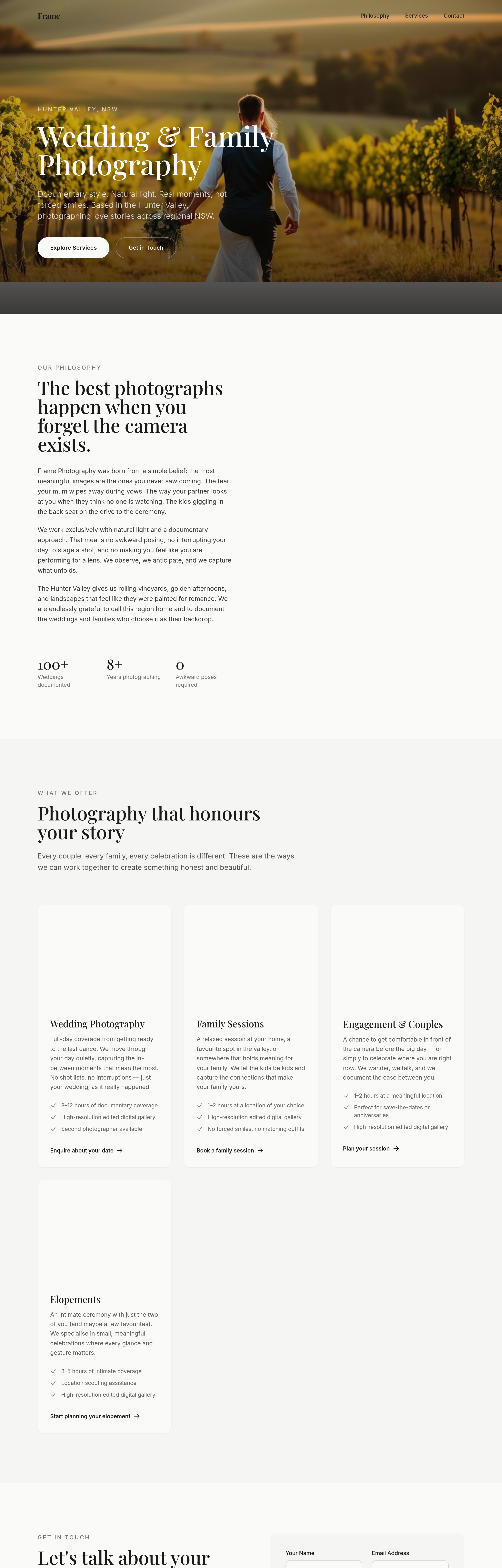
Before
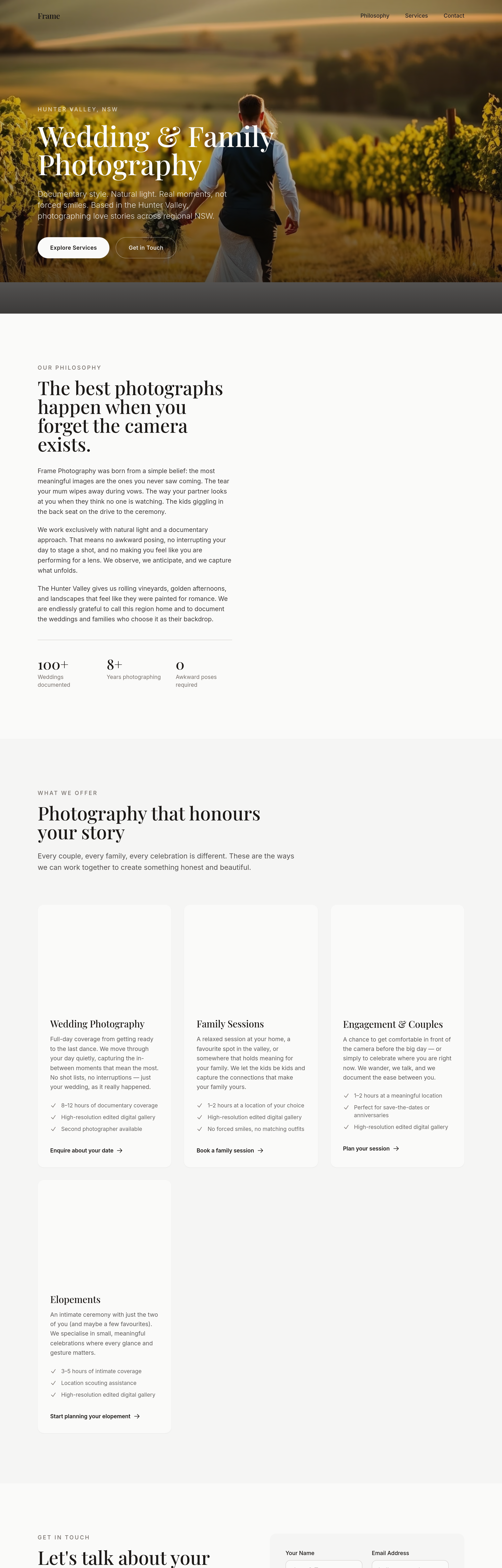
After
add an 'investment guide' section explaining the range honestly, not coy
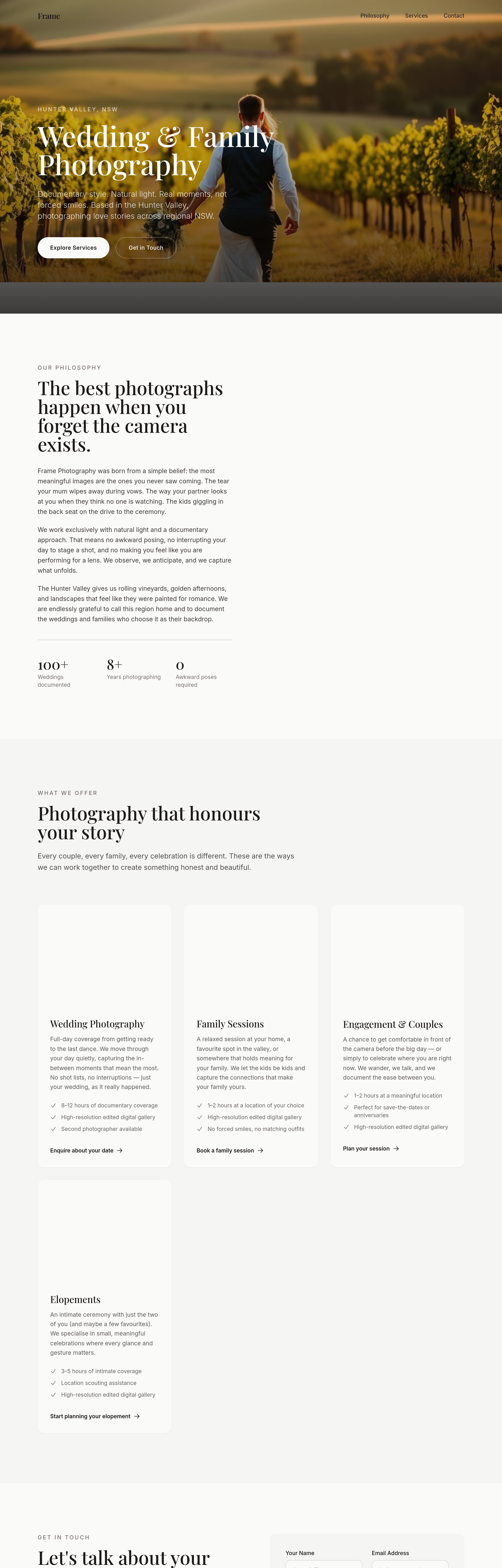
Before
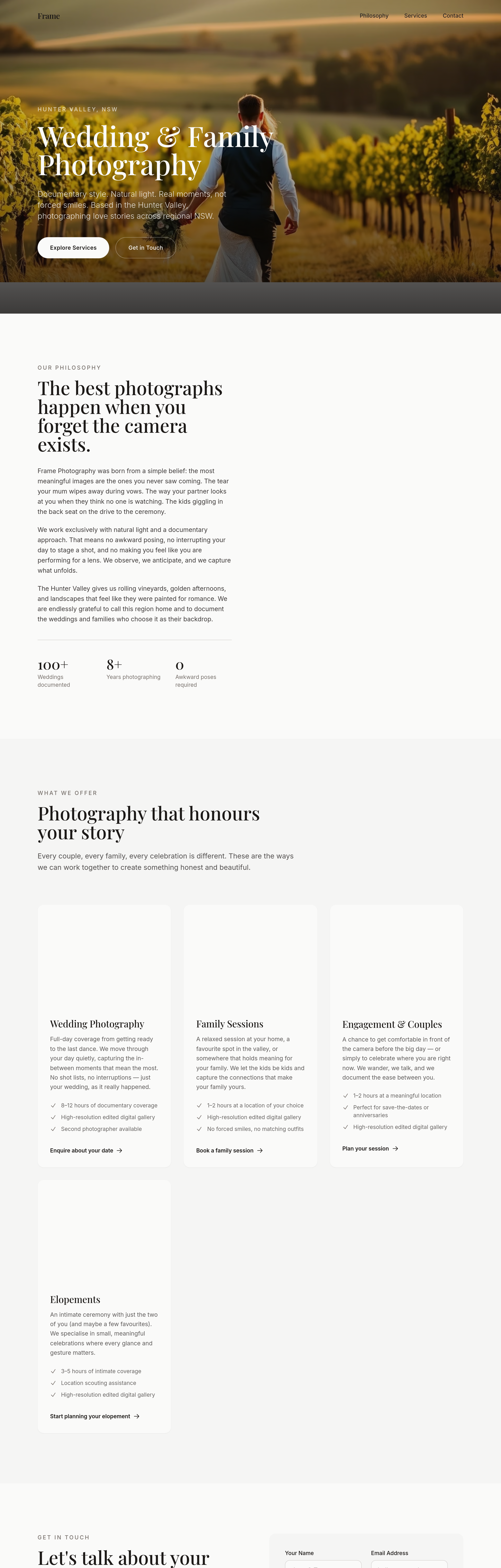
After
add a 'kind words' section with 3 placeholder quotes from past clients

Before

After
add a hero of golden-hour light hitting a couple on a beach silhouette
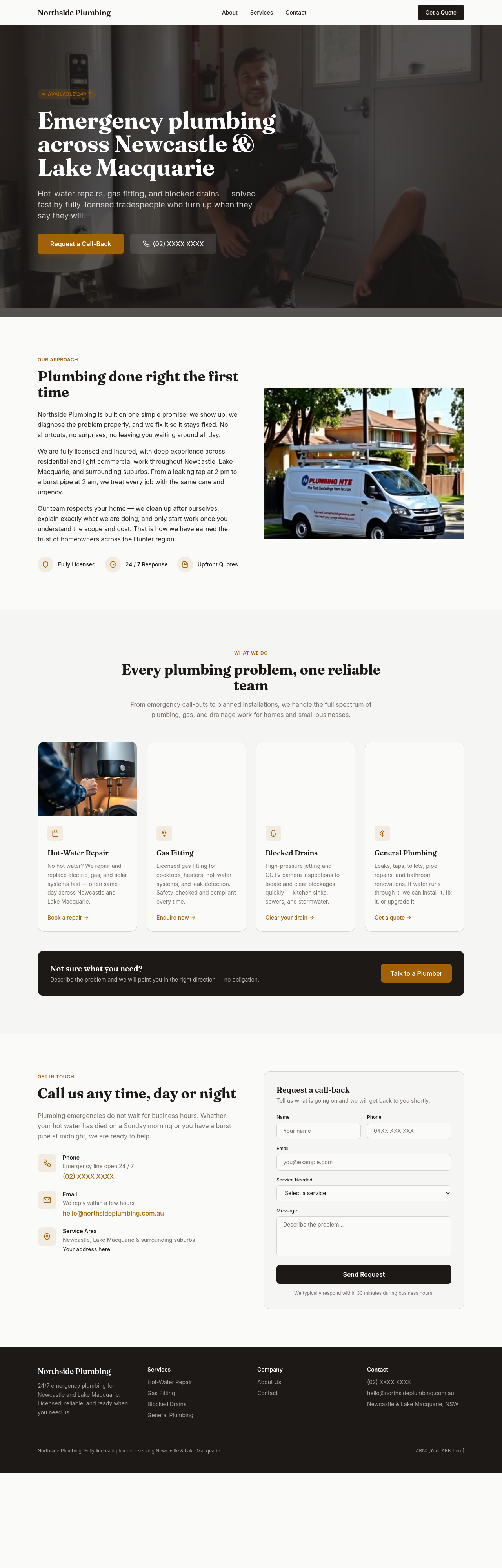
Before
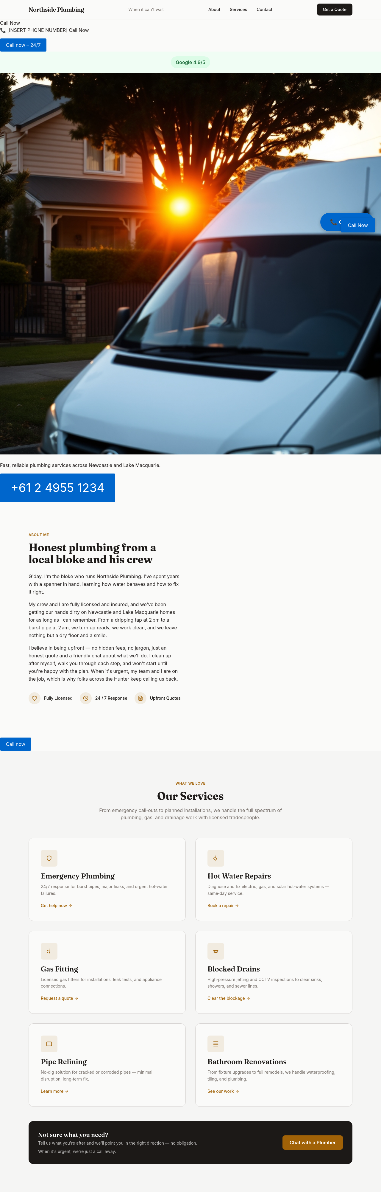
After
add 6 wedding moments in a masonry grid: rings, dress detail, ceremony kiss, candid laugh, sparklers, family group
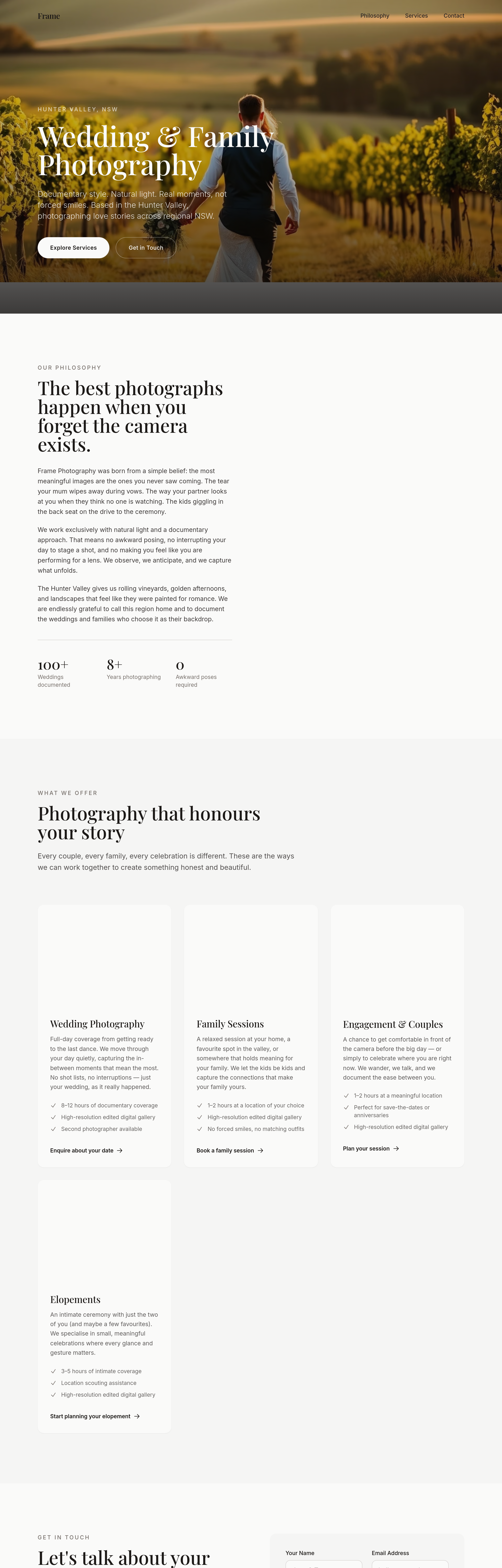
Before
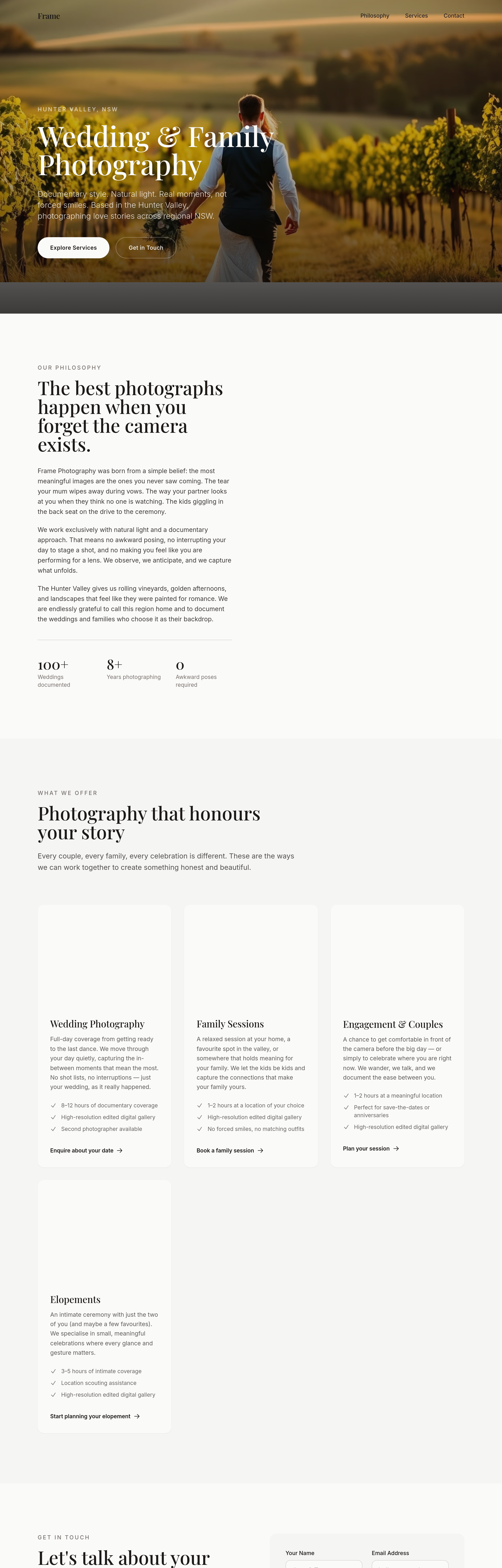
After
shift every CTA from 'Book Now' to softer 'Tell me about your day'
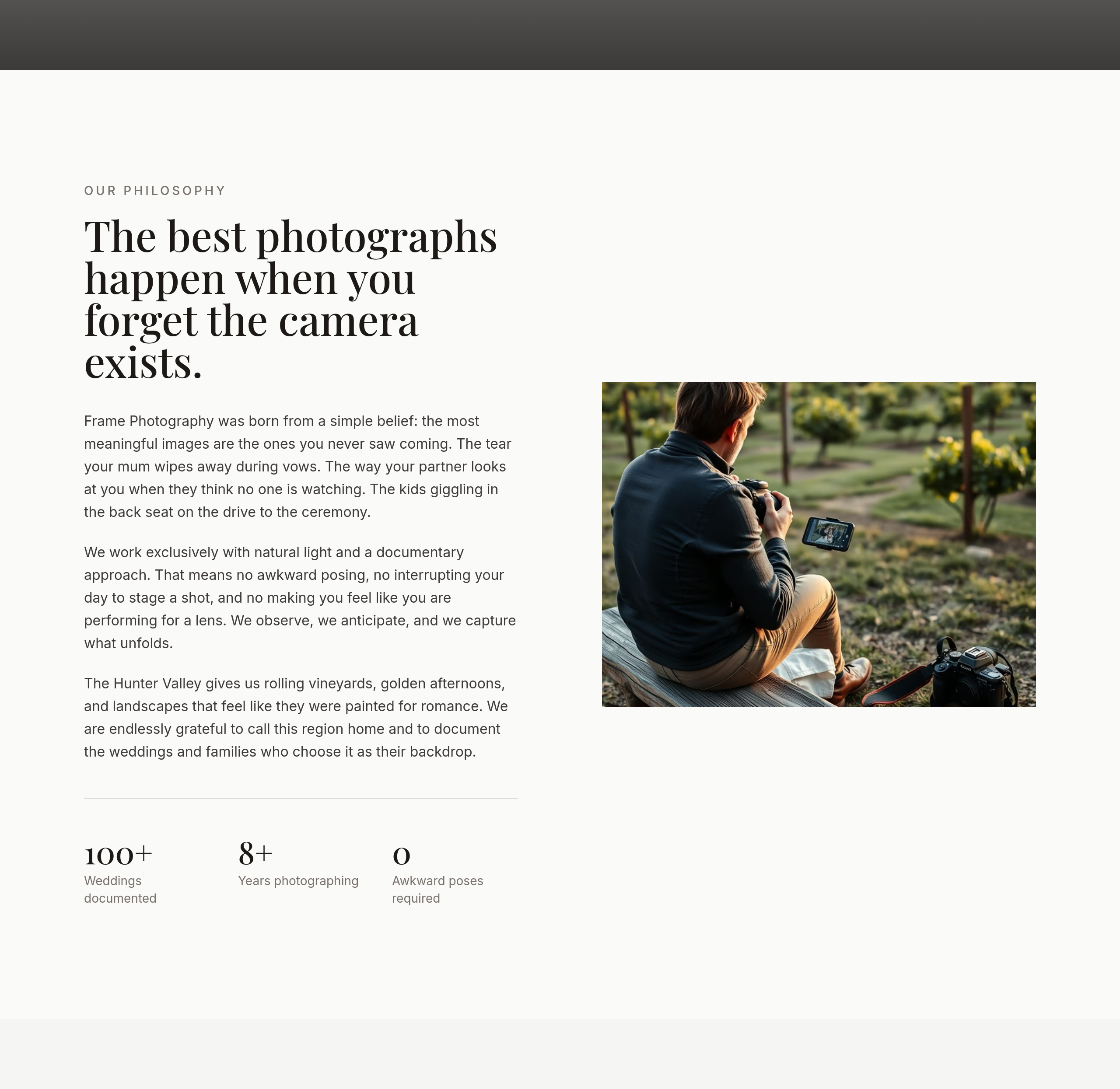
Before
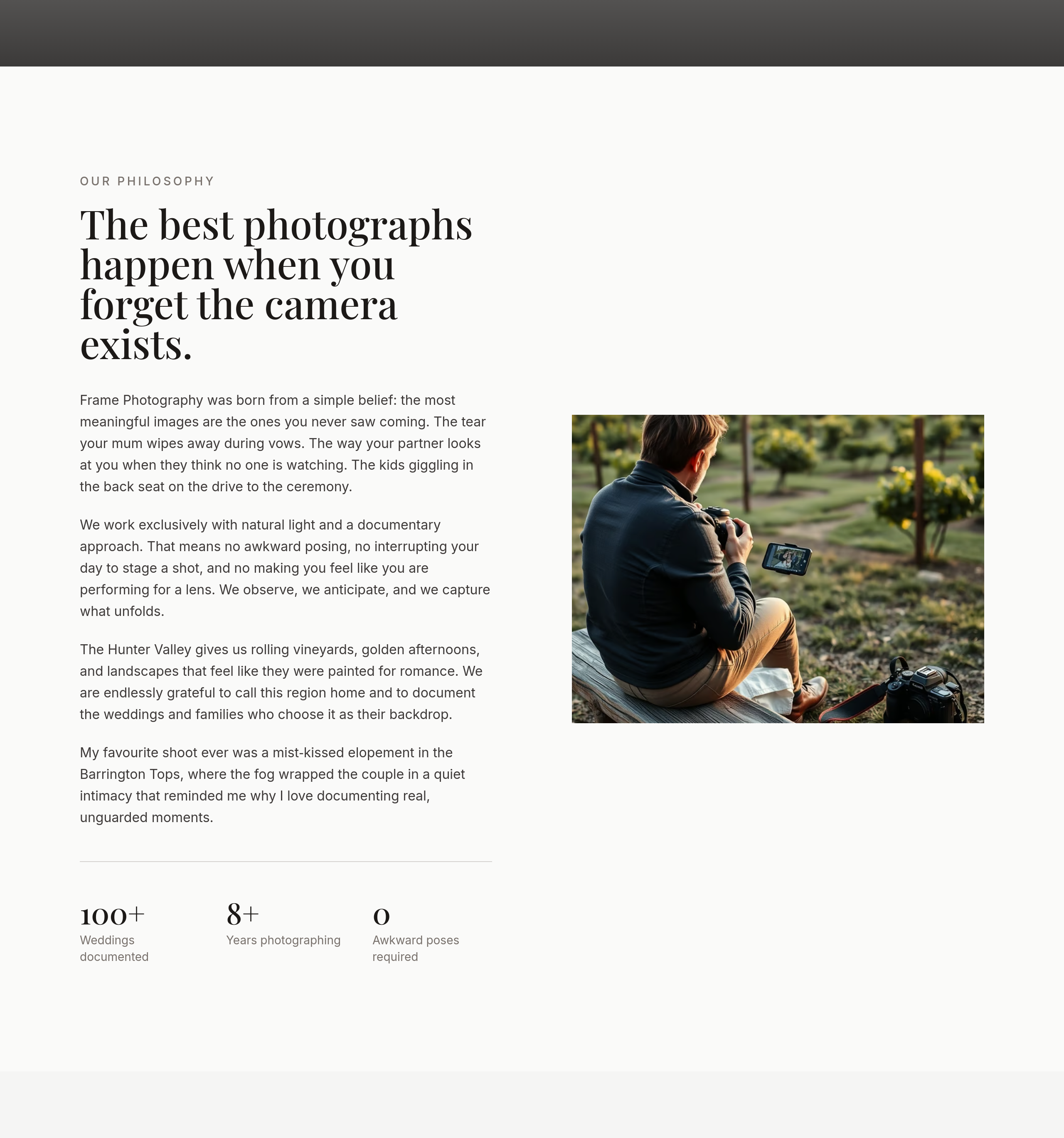
After
the about section is professional bio — add 1 personal sentence (favourite shoot ever, why this work matters)
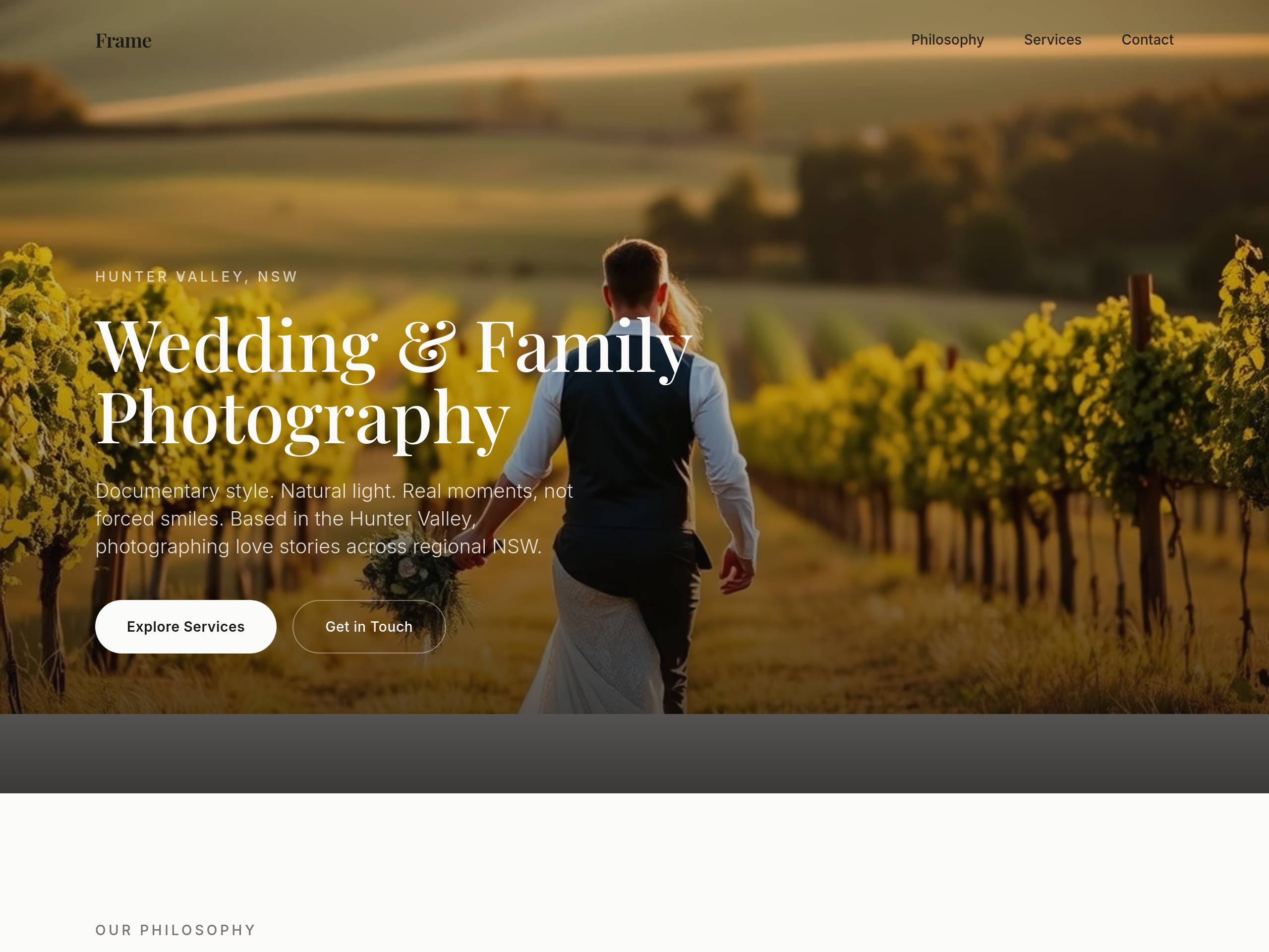
Before
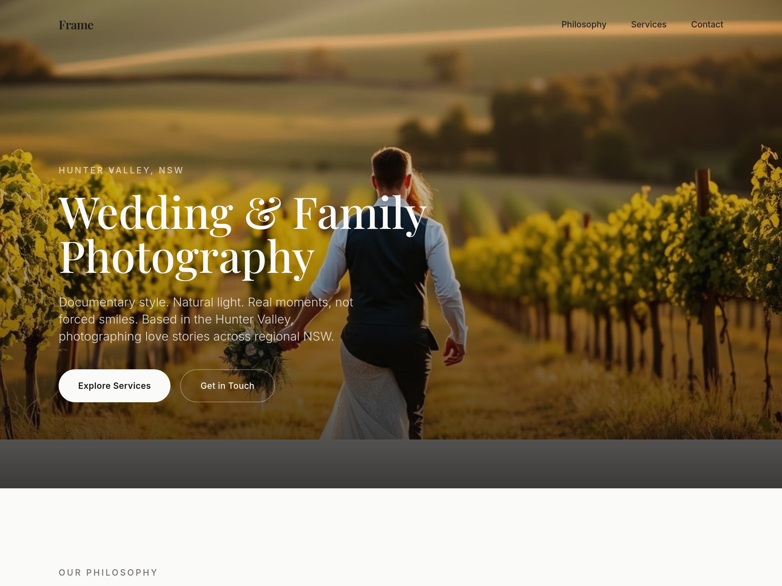
After
the type is too modern — switch to a classic serif headline + clean sans body
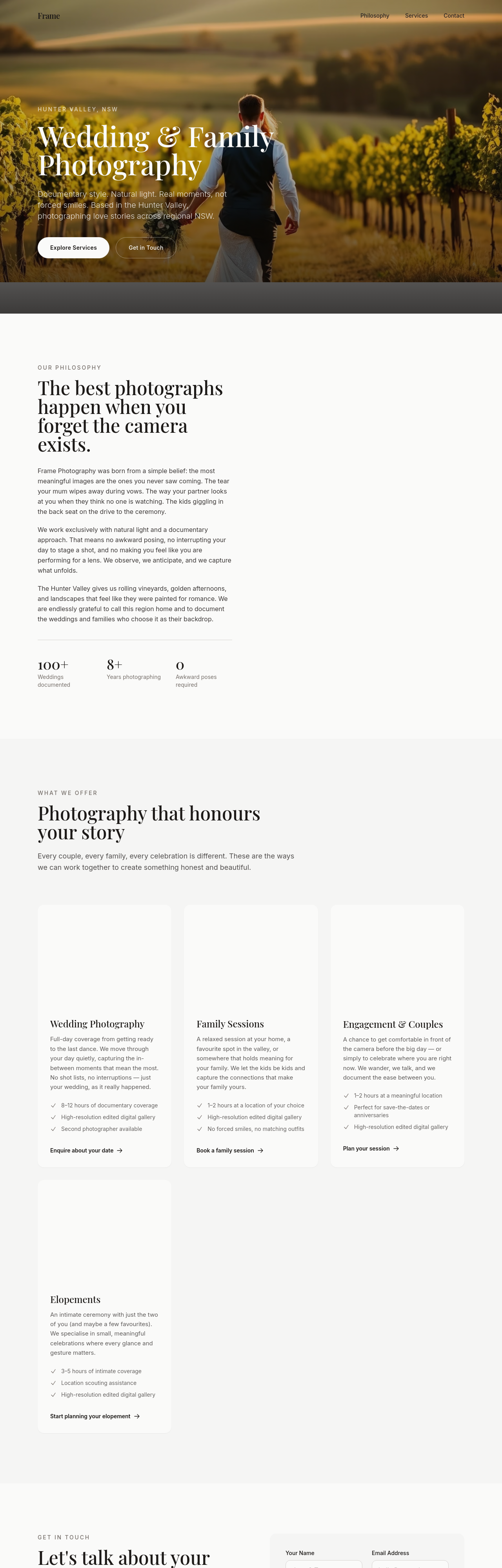
Before
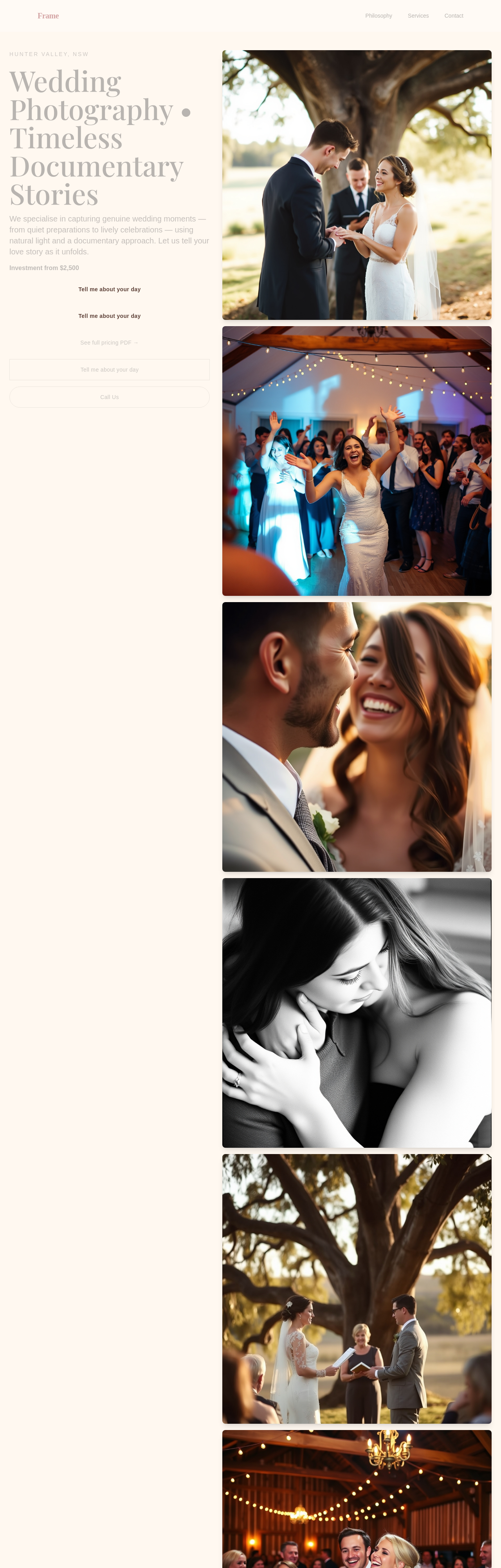
After
refresh whole site: warmer hero + dedicated investment section + soften every CTA + add 3 testimonials
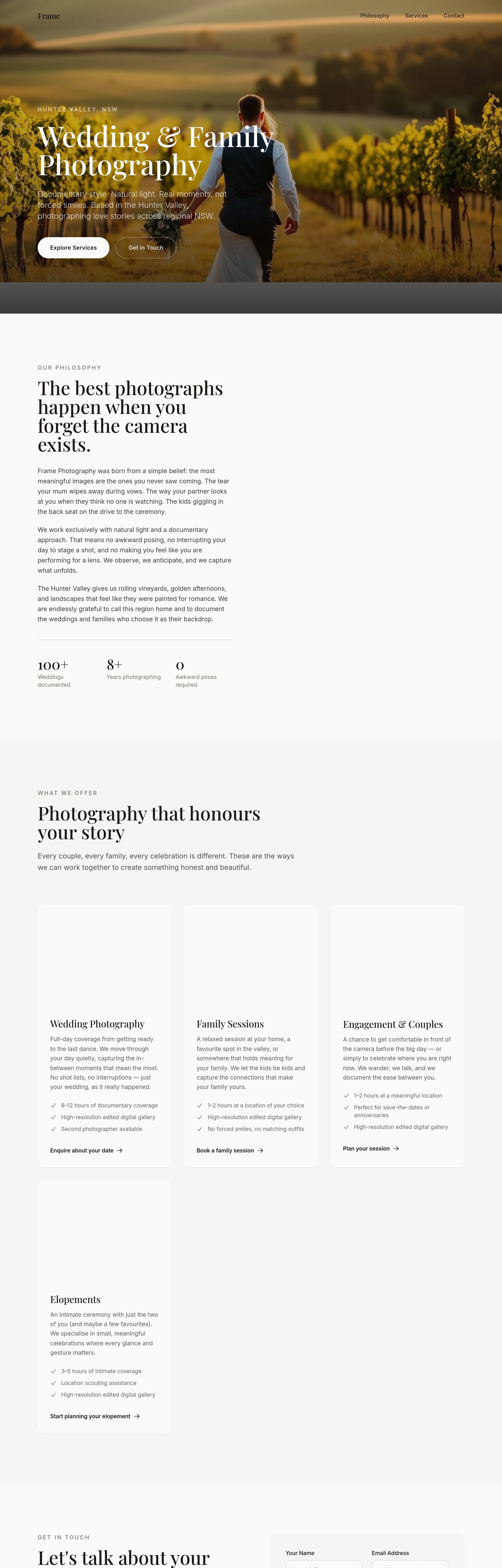
Before
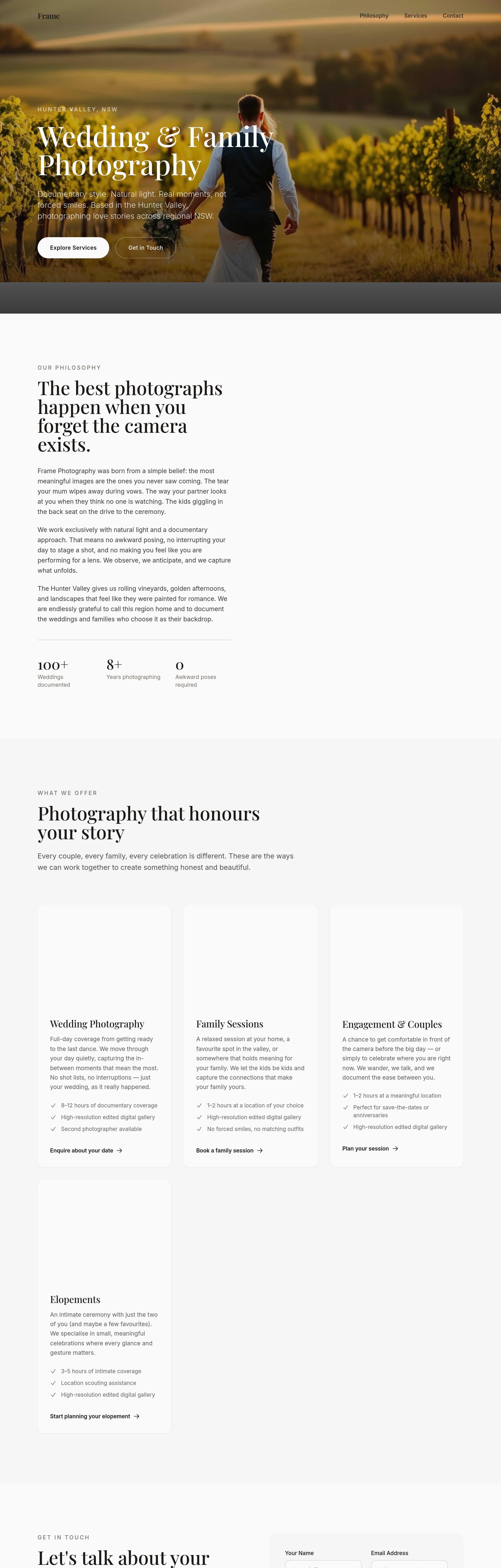
After
the portfolio grid loses impact at 4 cols — change to 3 with bigger images and breathing room
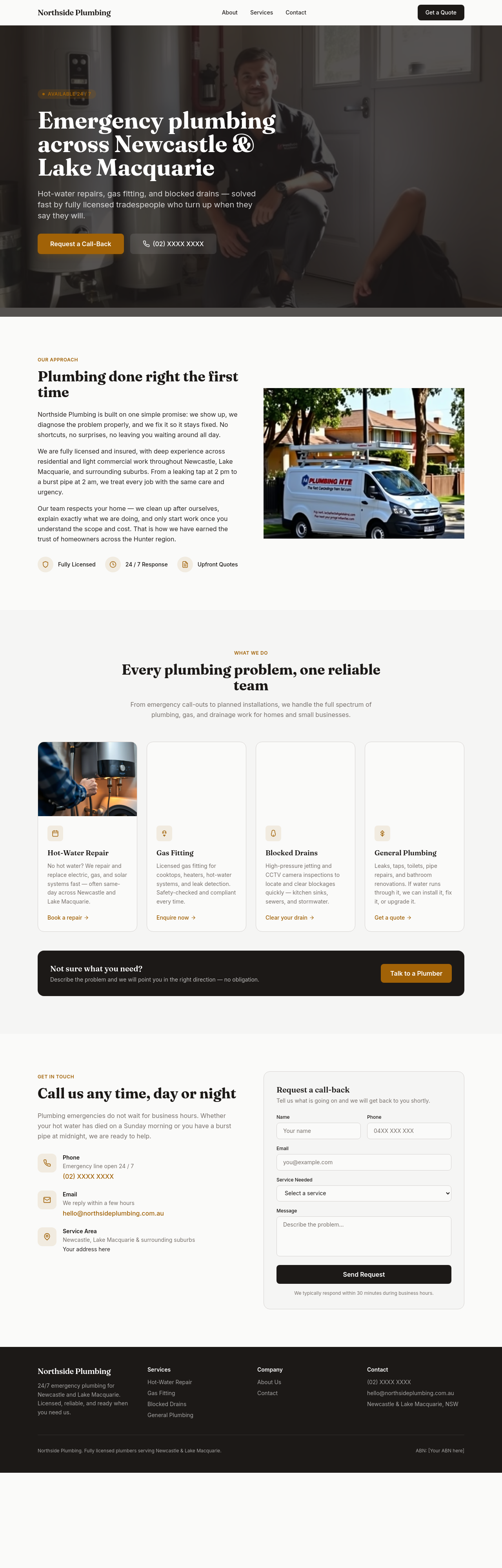
Before
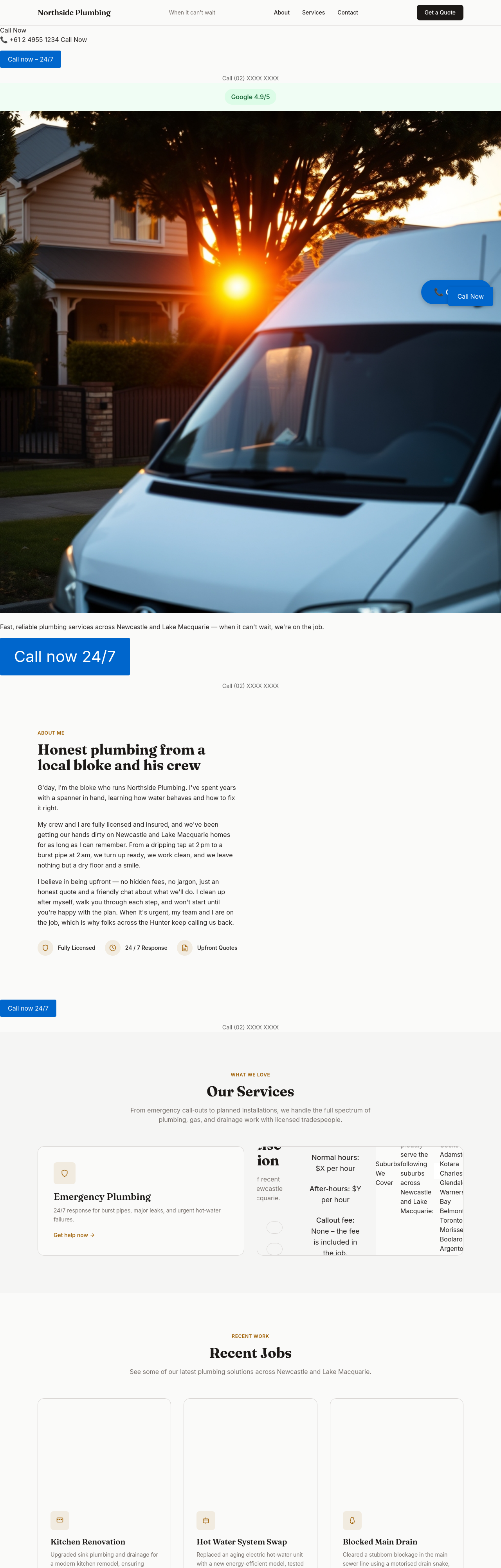
After
add a soft sticky CTA bottom-right: 'Check my date →'
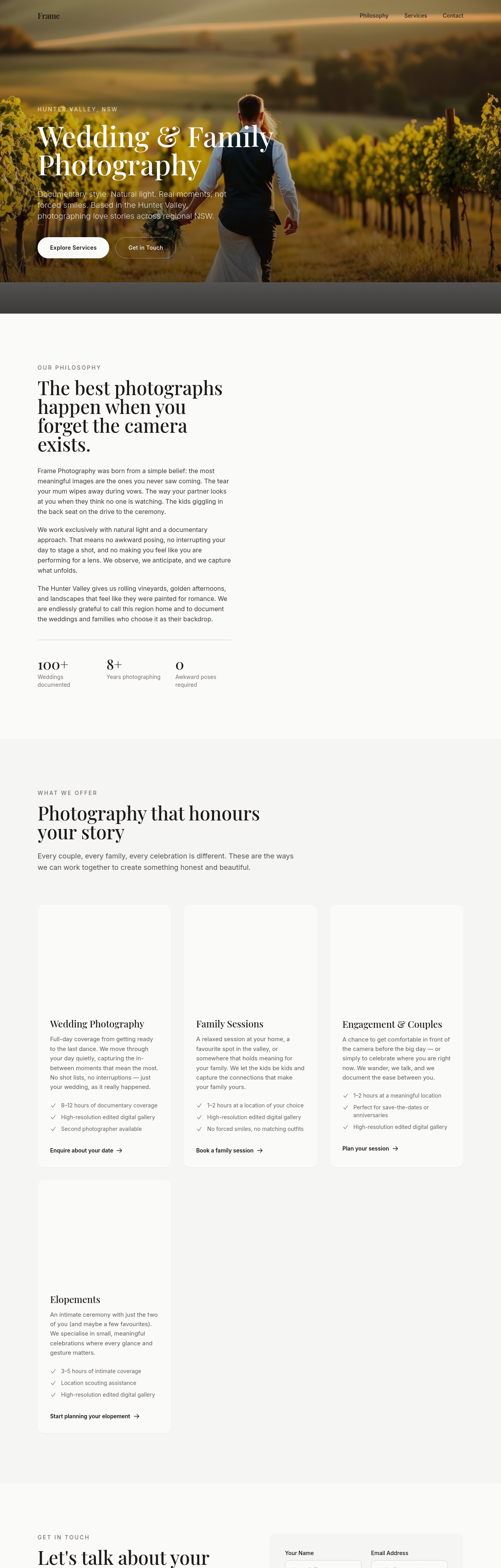
Before
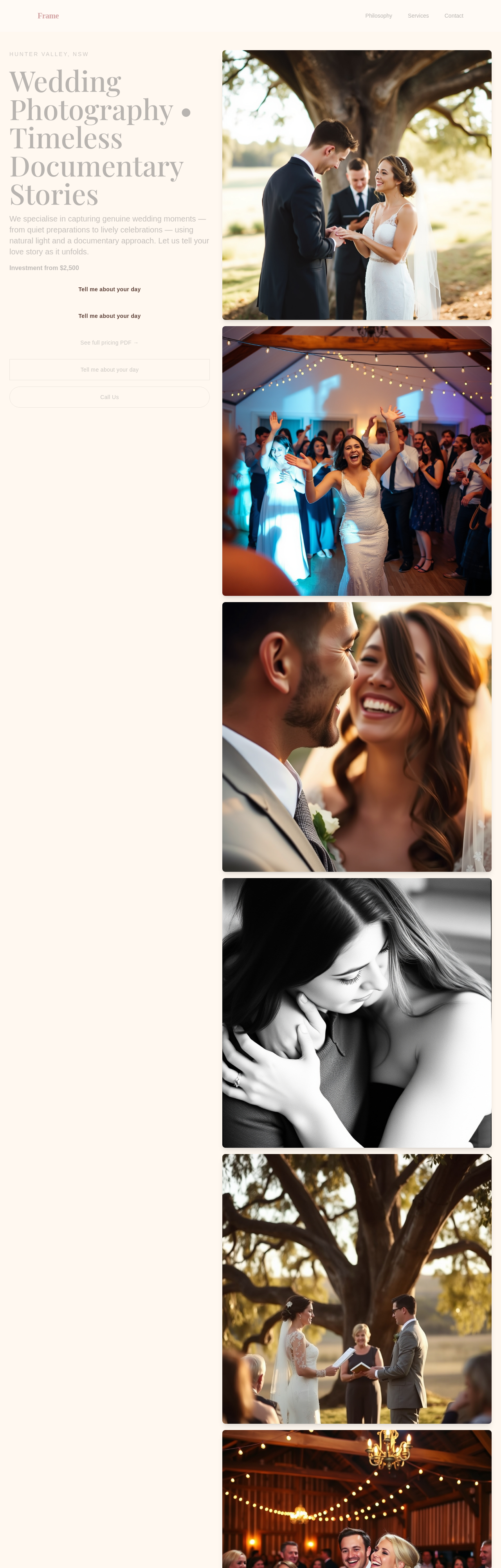
After
create a /pricing PDF-style page with 3 tiers + add-ons
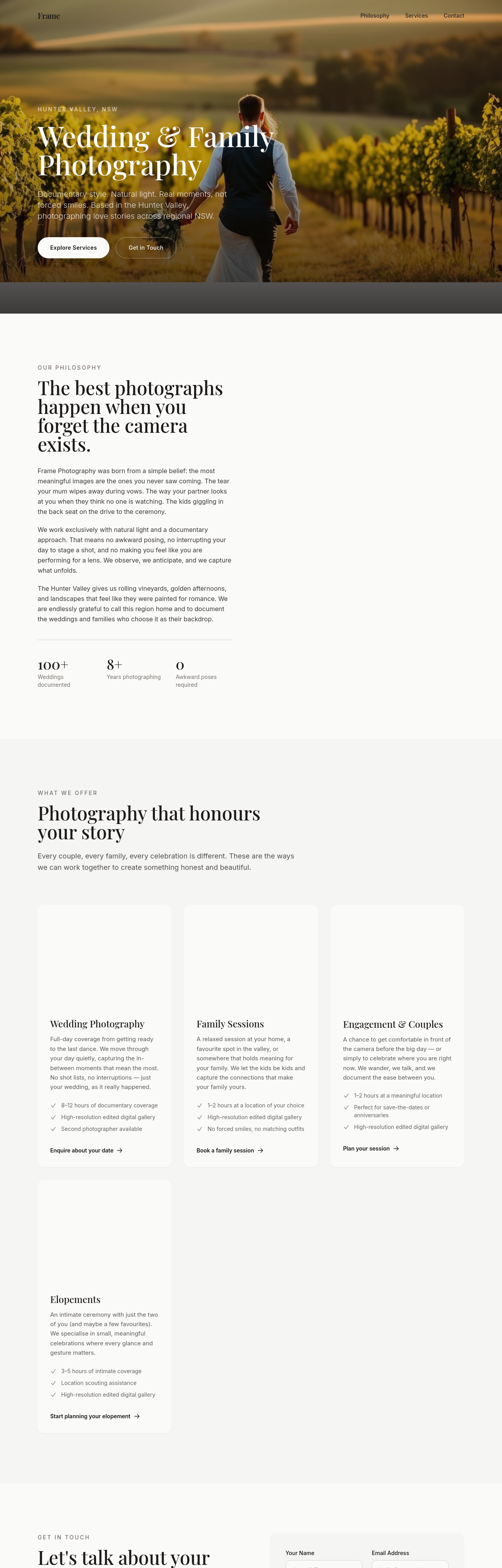
Before
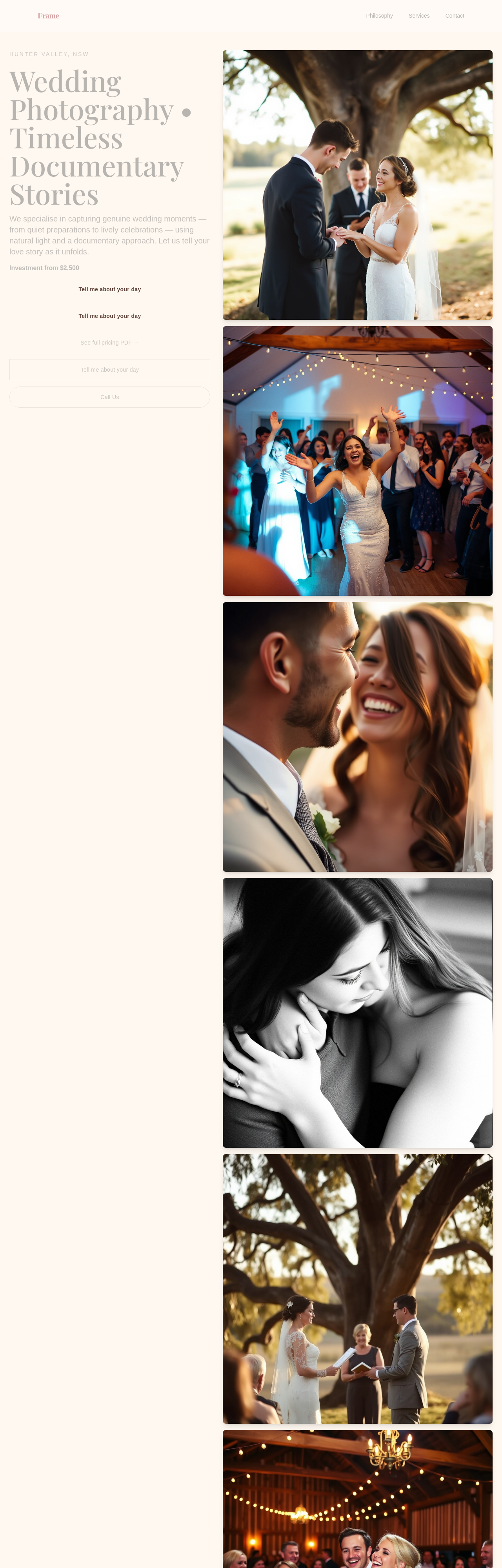
After
create a /faq page with 8 wedding-photography questions
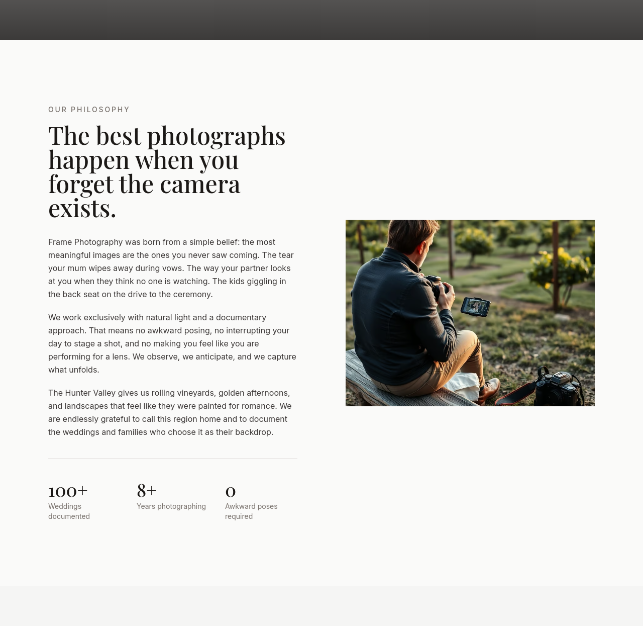
Before
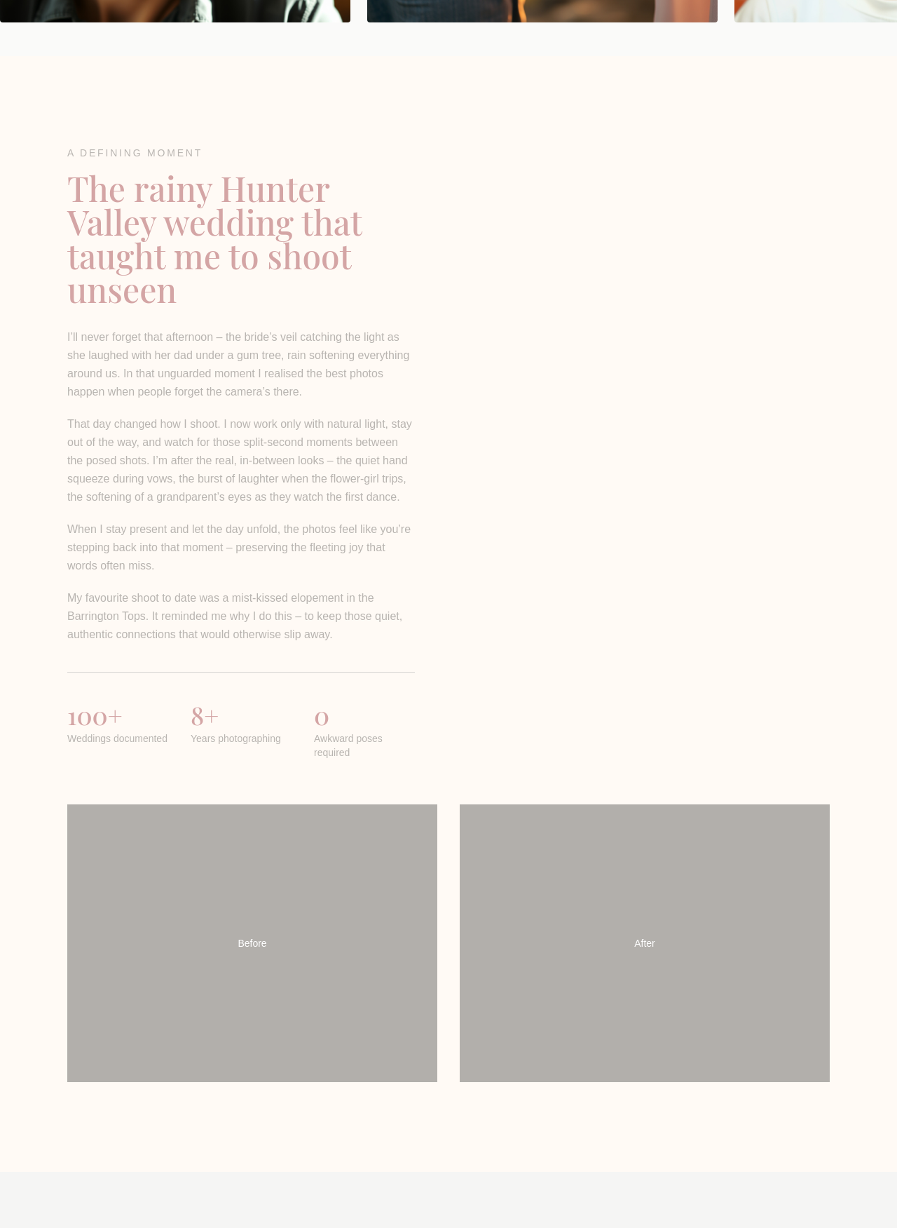
After
the about section is too detached — make it sound like the photographer's own voice
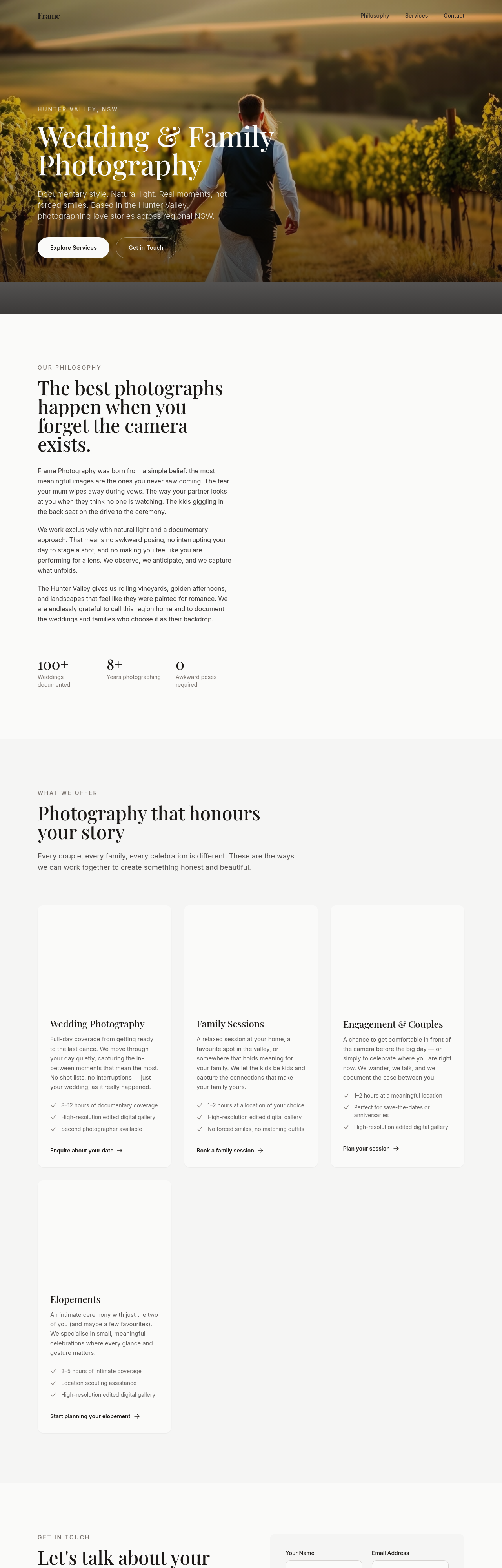
Before
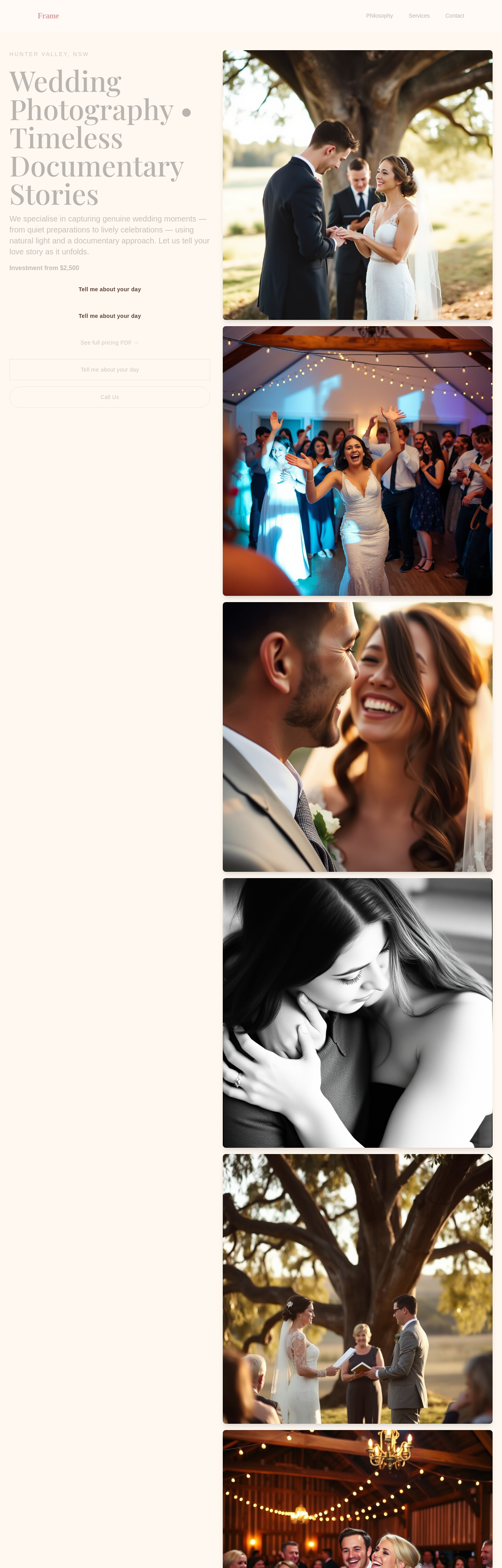
After
add a portfolio gallery section with 6 portrait photo placeholders — couples, families, kids, candid moments
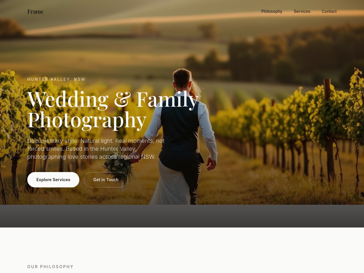
Before
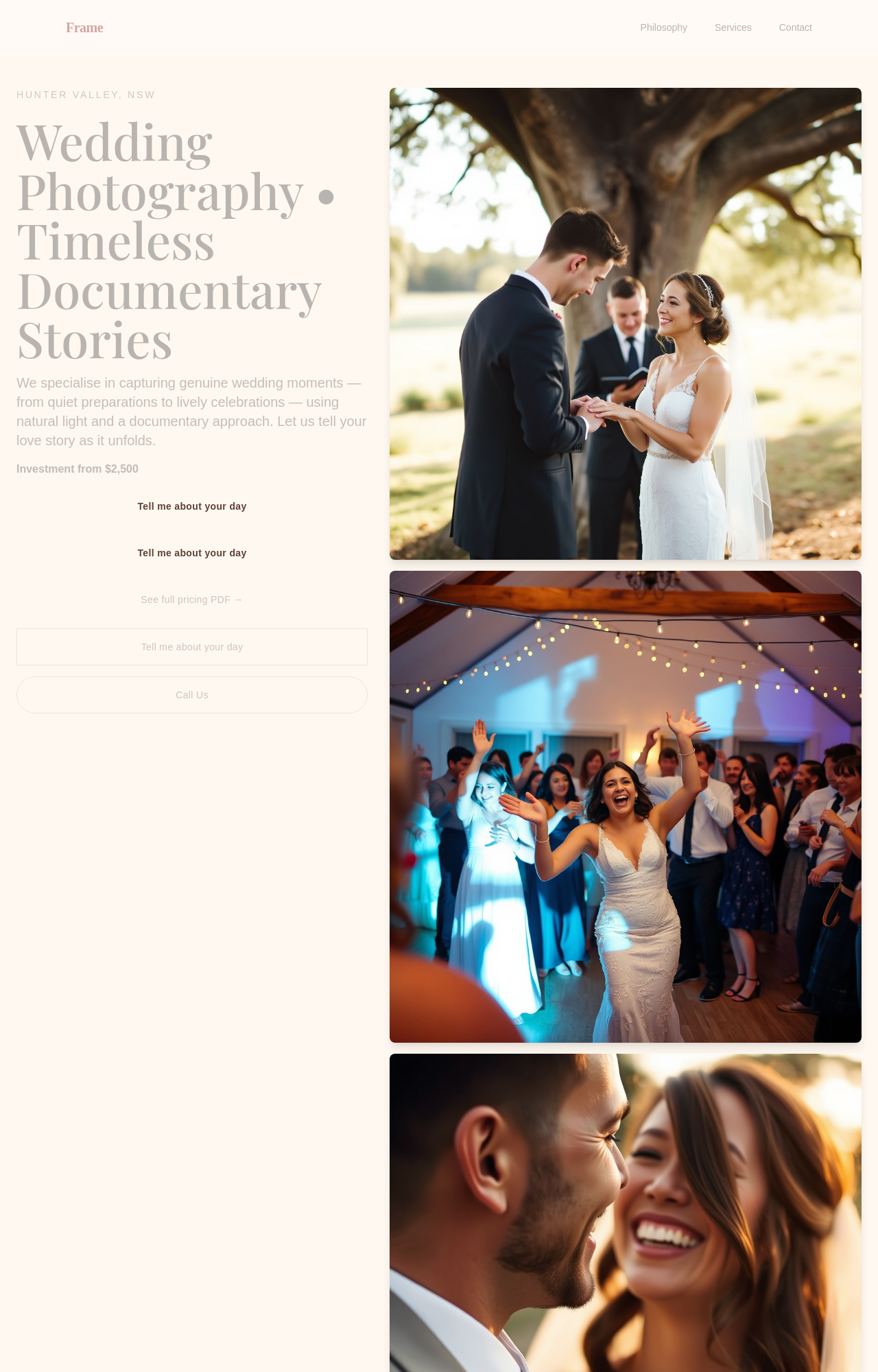
After
add a hero image of golden-hour wedding portraits in the Hunter Valley — documentary style, natural light, intimate
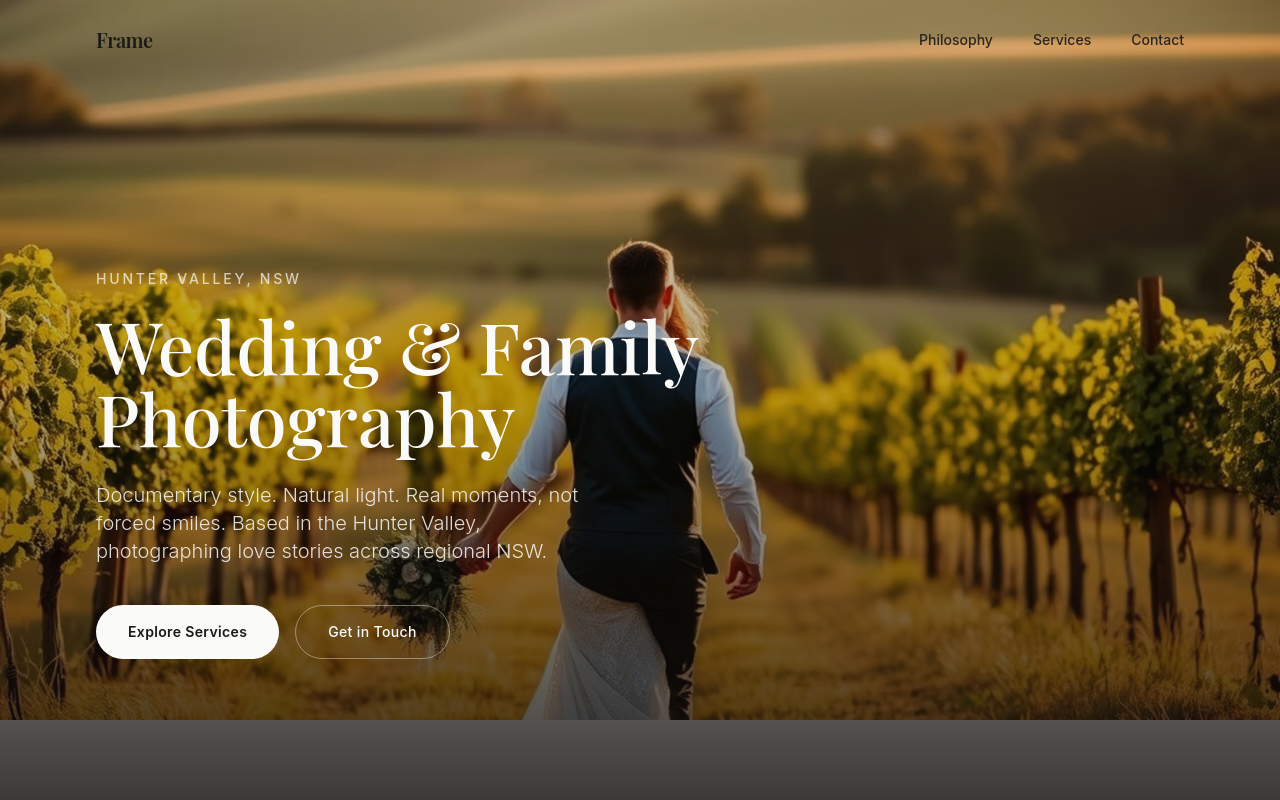
Before
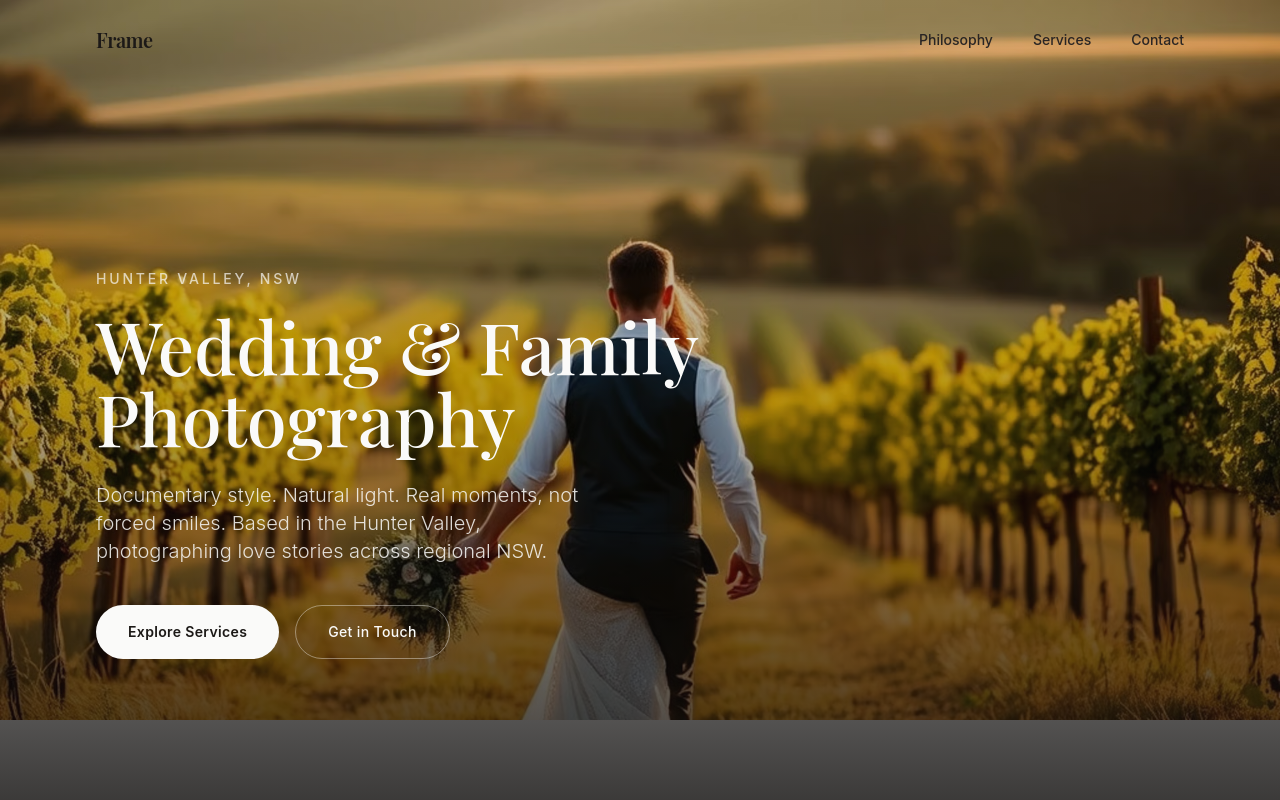
After
rewrite the services to clearly separate weddings, families, and editorial work — different pricing structures
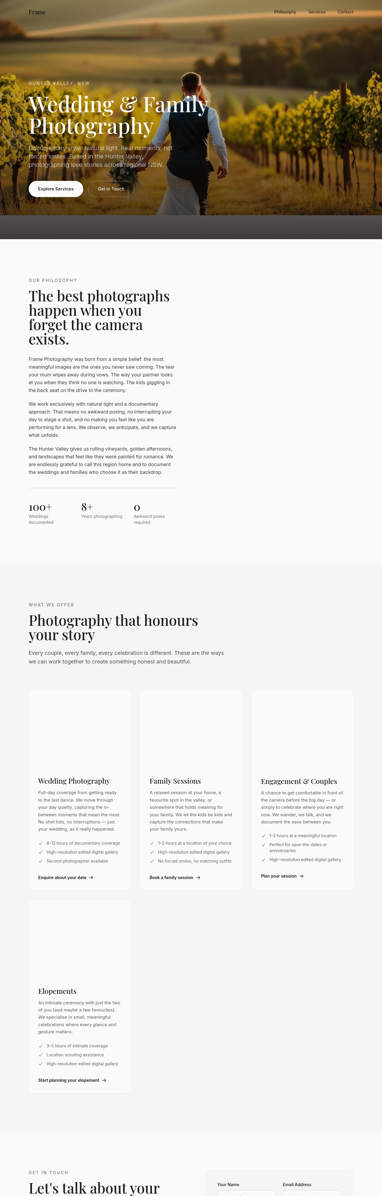
Before
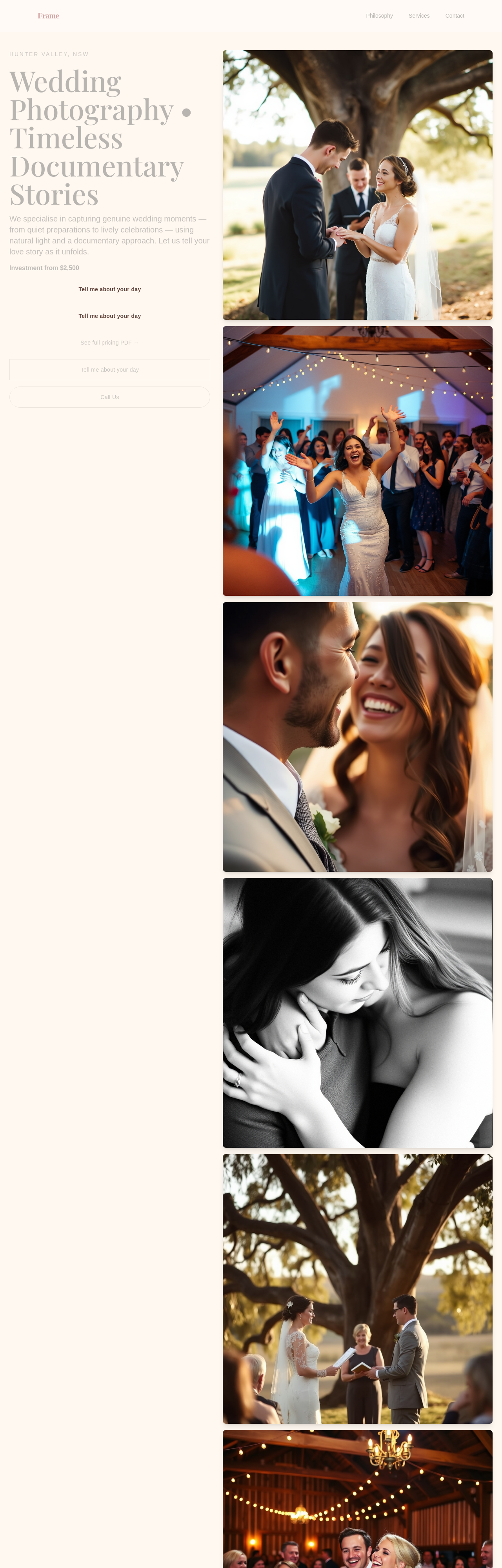
After
add a 'process' section explaining what booking, shoot day, and delivery look like — 4 steps

Before

After
add a contact CTA to the hero AND make the whole tone warmer + less corporate
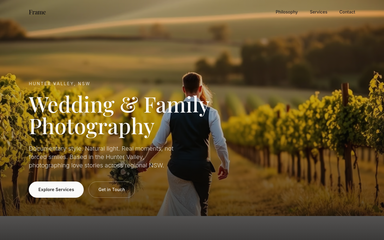
Before
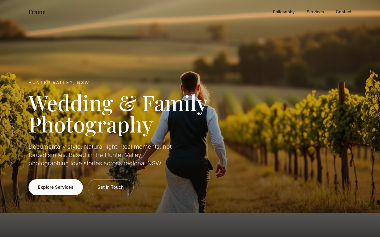
After
add a pricing section — Tier 1 (engagement, $850), Tier 2 (full-day wedding, $4500), Tier 3 (elopement, $2200)
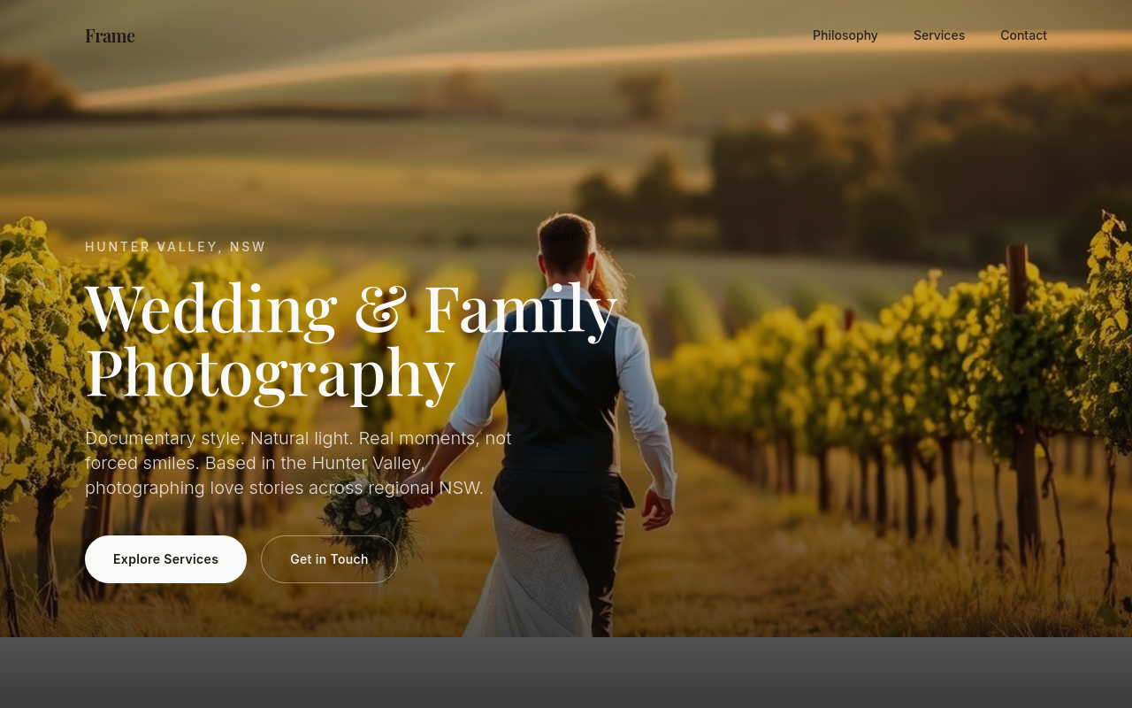
Before
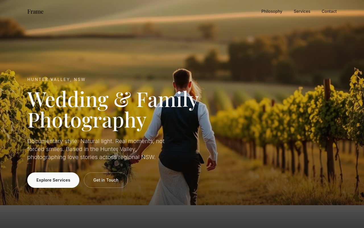
After
add 4 thumbnail photos for the portfolio — bride looking out a window, kids running on a beach, hands holding rings, family at golden hour

Before

After
the colours are too saturated — soften to cream + dusty rose
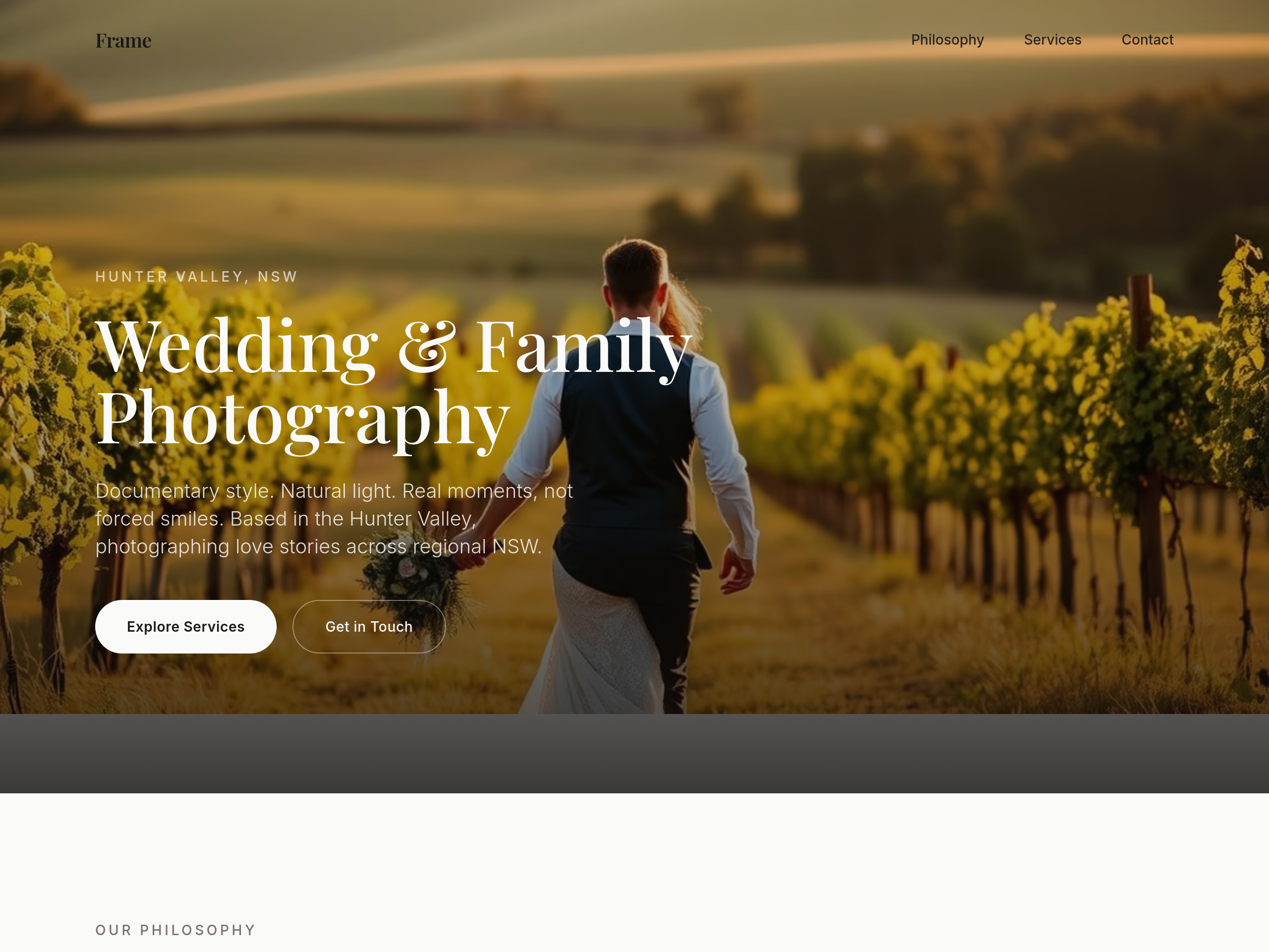
Before
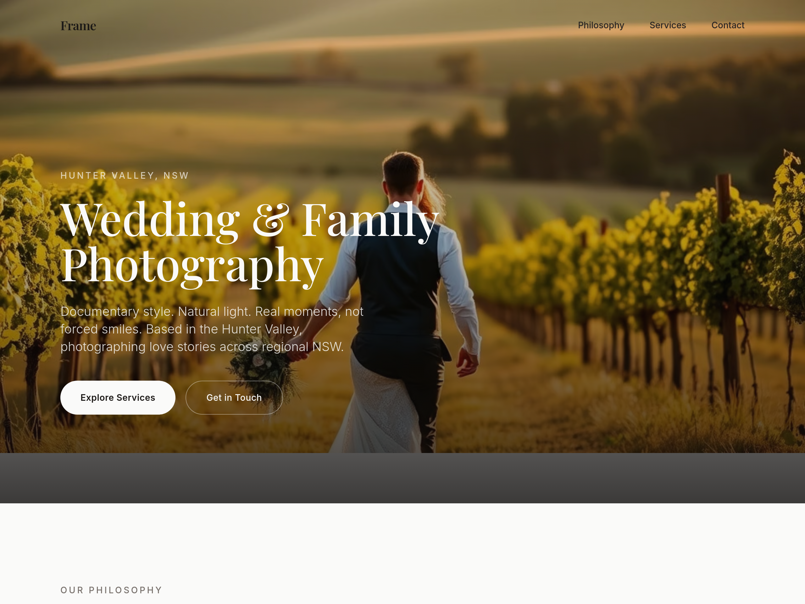
After
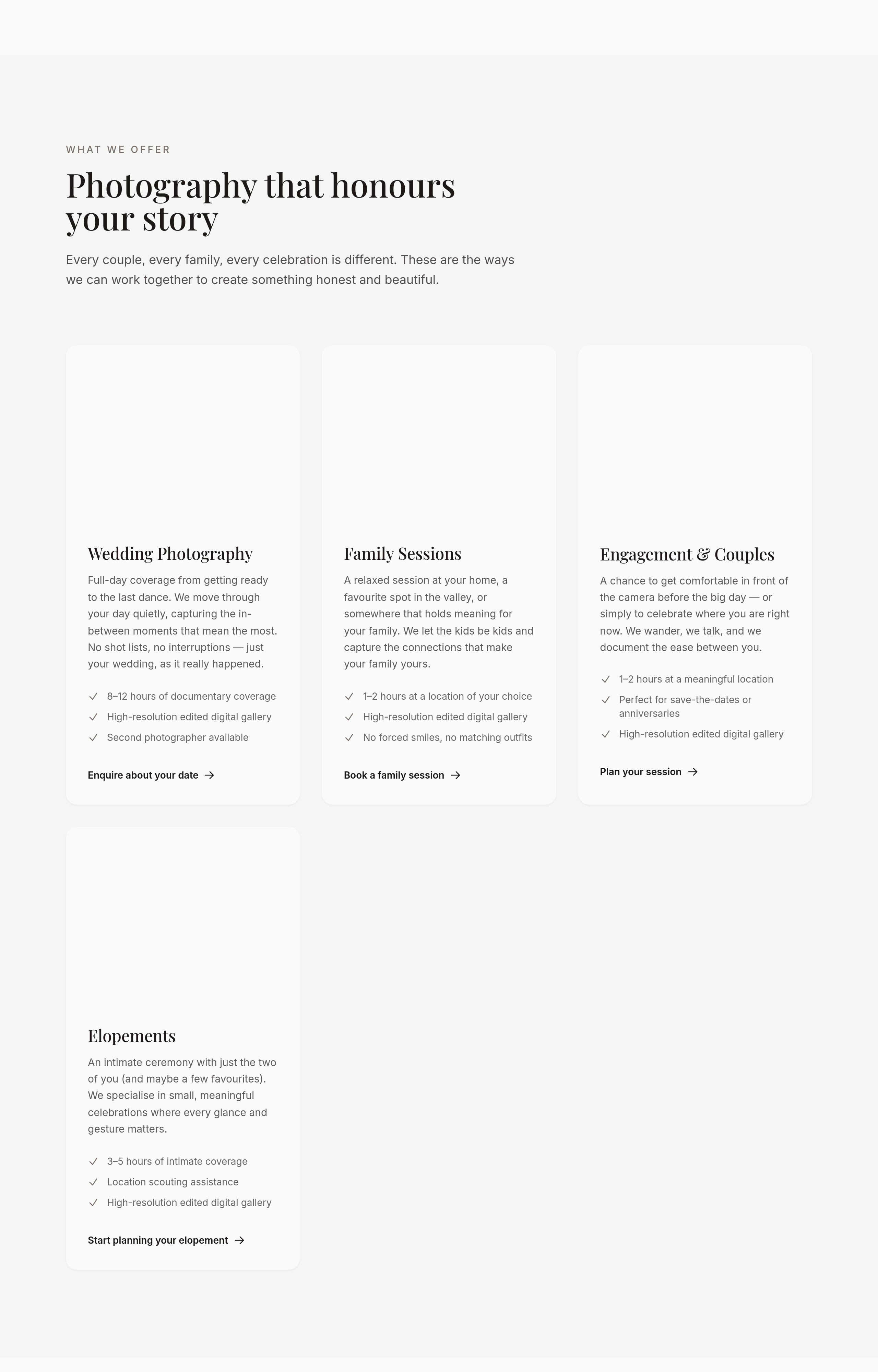
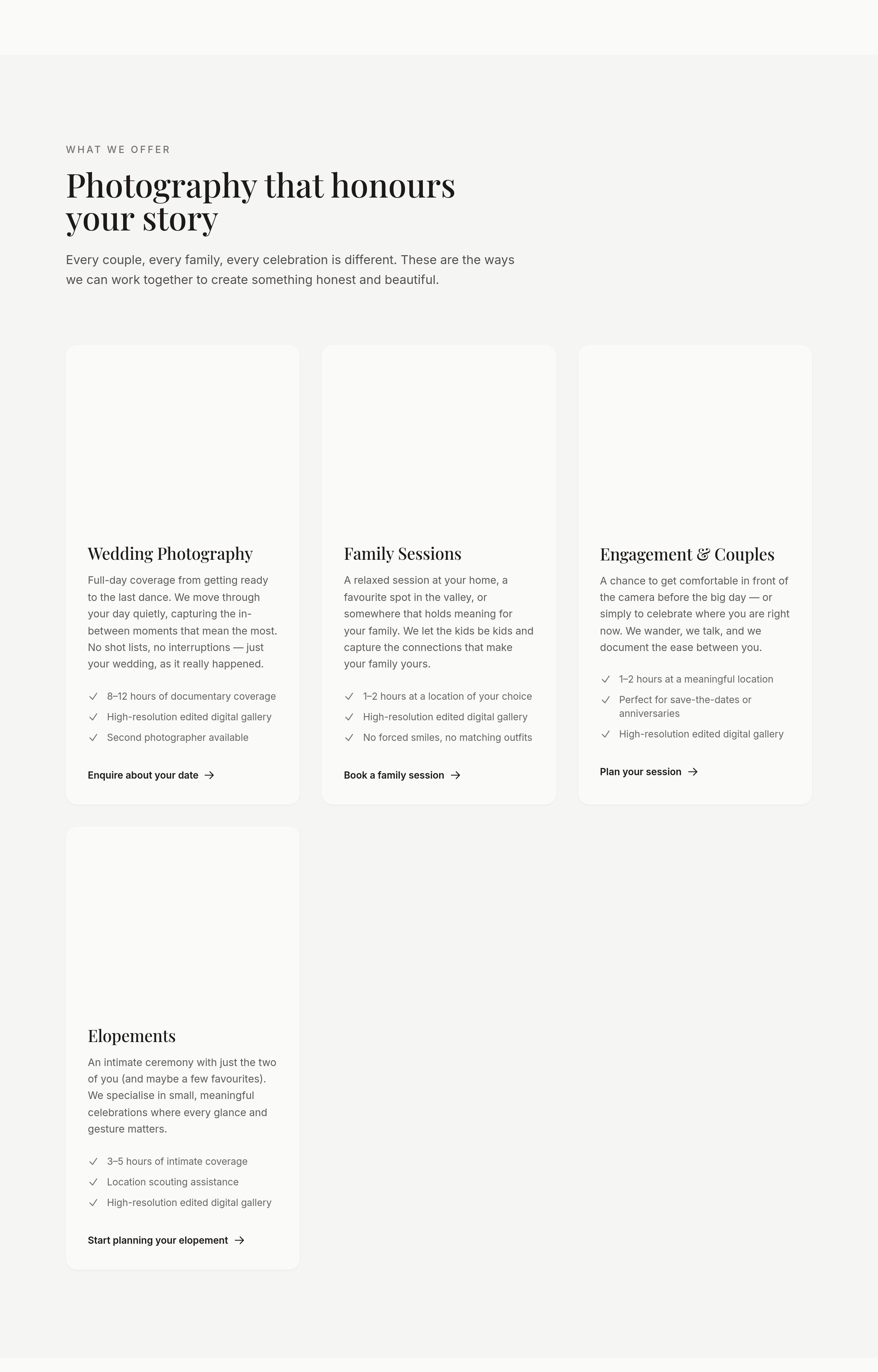
use a serif heading font — feels more editorial
Before
After
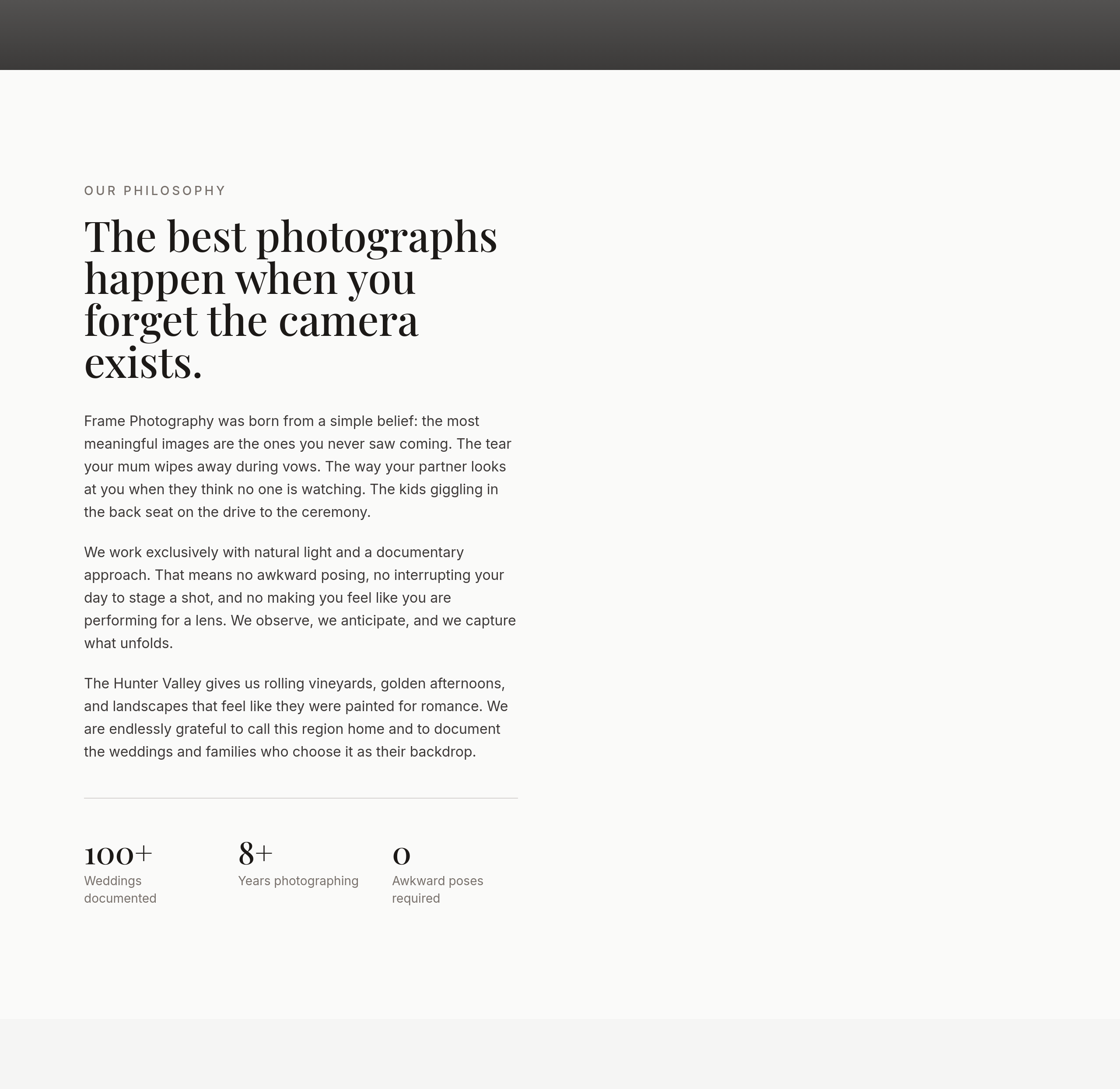
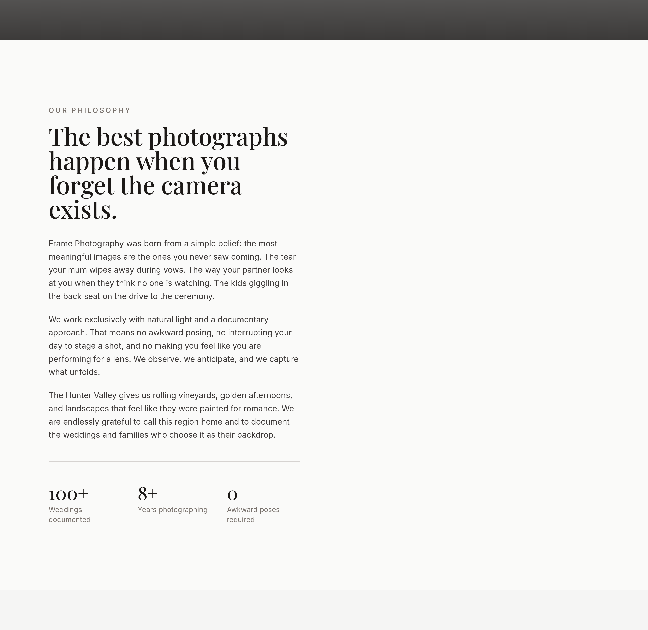
the portfolio should be a masonry grid, not uniform tiles
Before
After
the about photo is small — make it half-width on desktop

Before

After
replace 'Get in touch' with 'Tell me about your day'
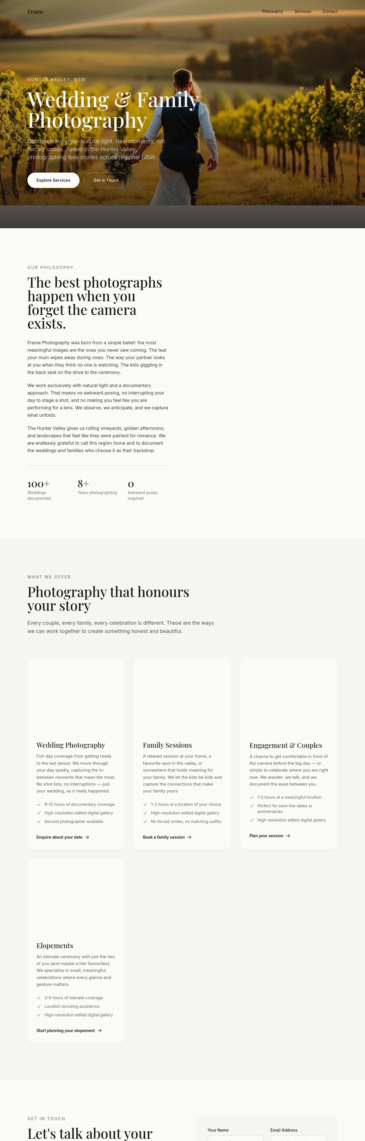
Before
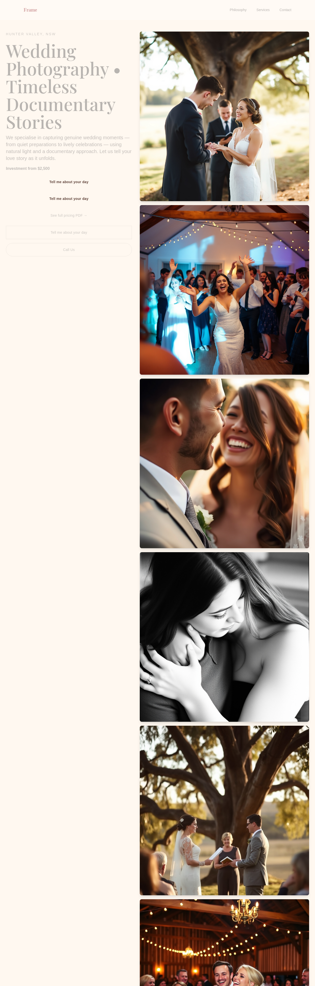
After
add a soft pricing section — 'Investment from $850' rather than full price list
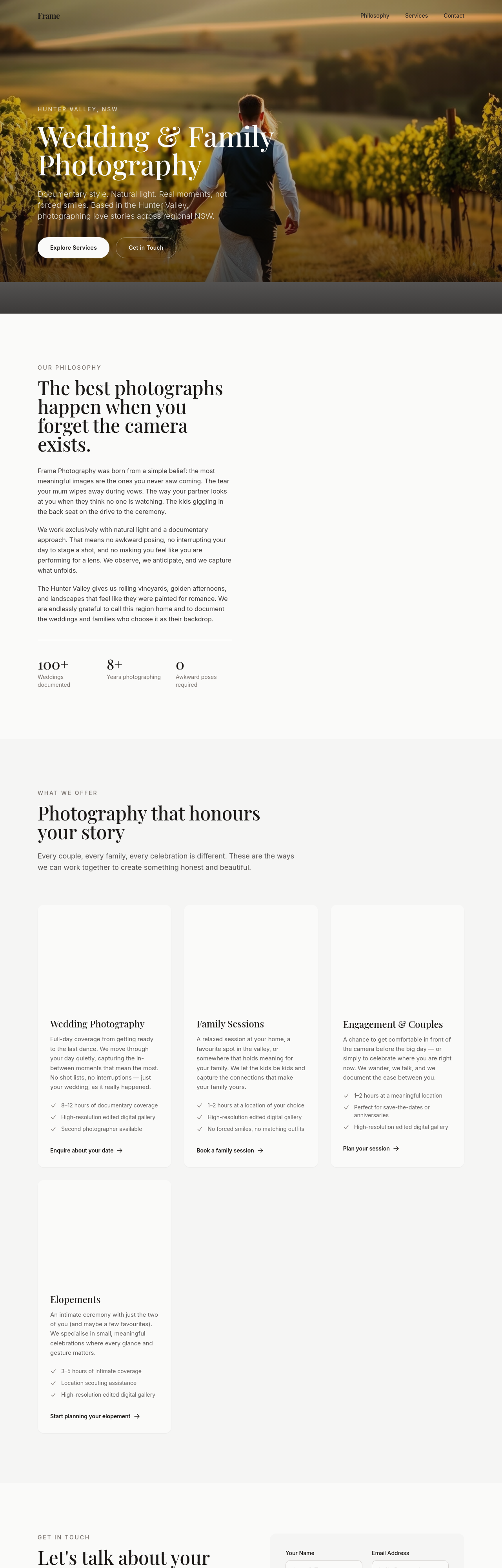
Before
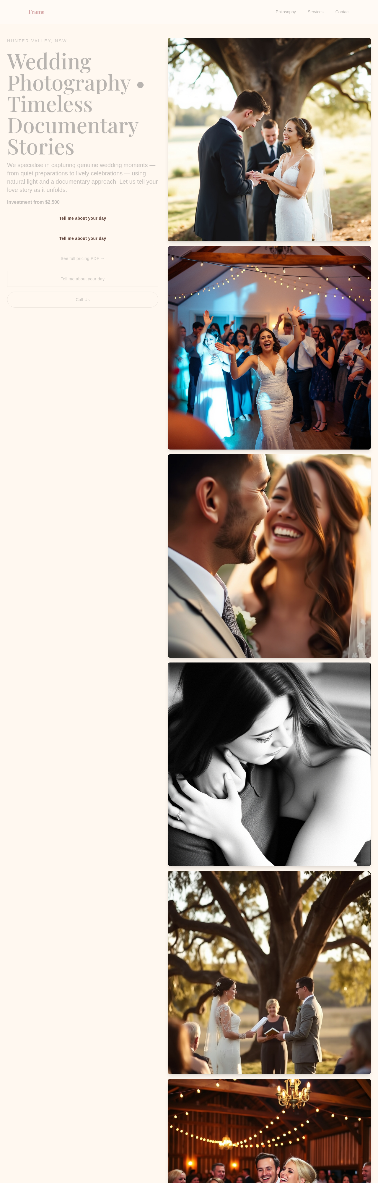
After
the meta description should mention Hunter Valley + wedding + documentary
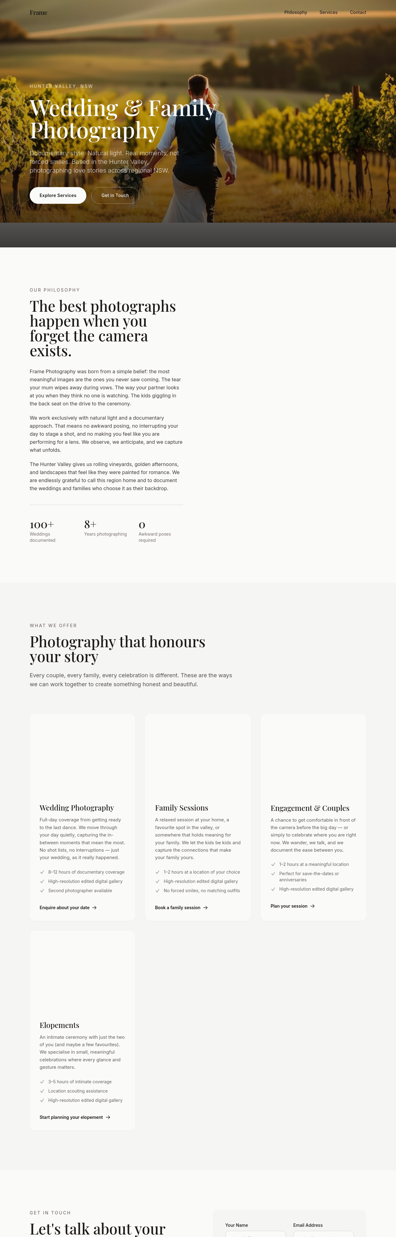
Before
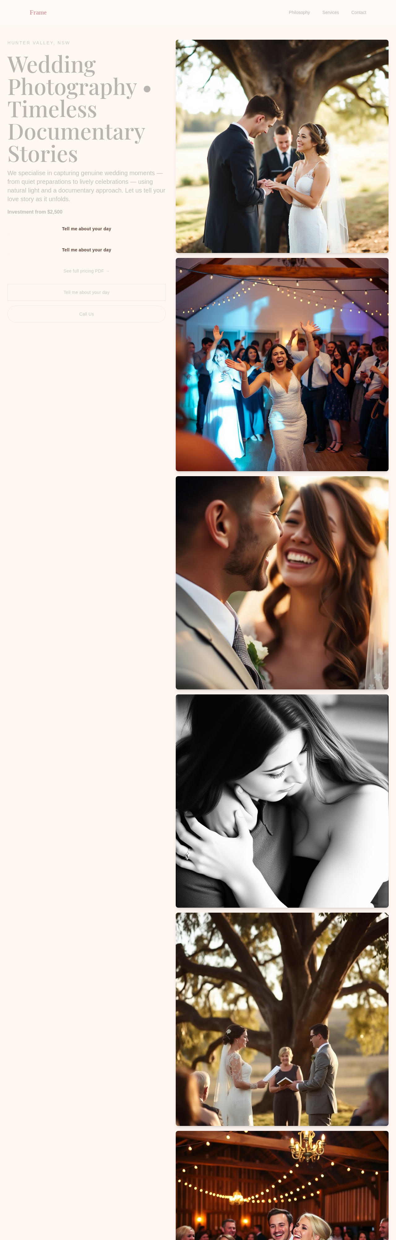
After
add a /process page detailing booking → shoot → delivery
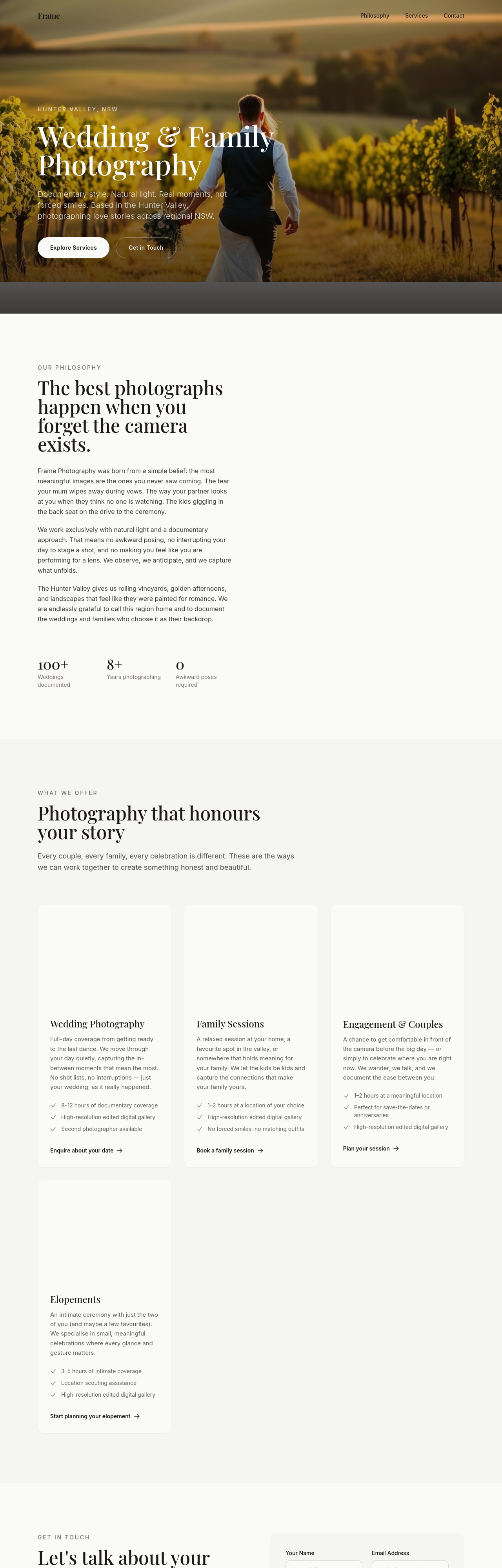
Before
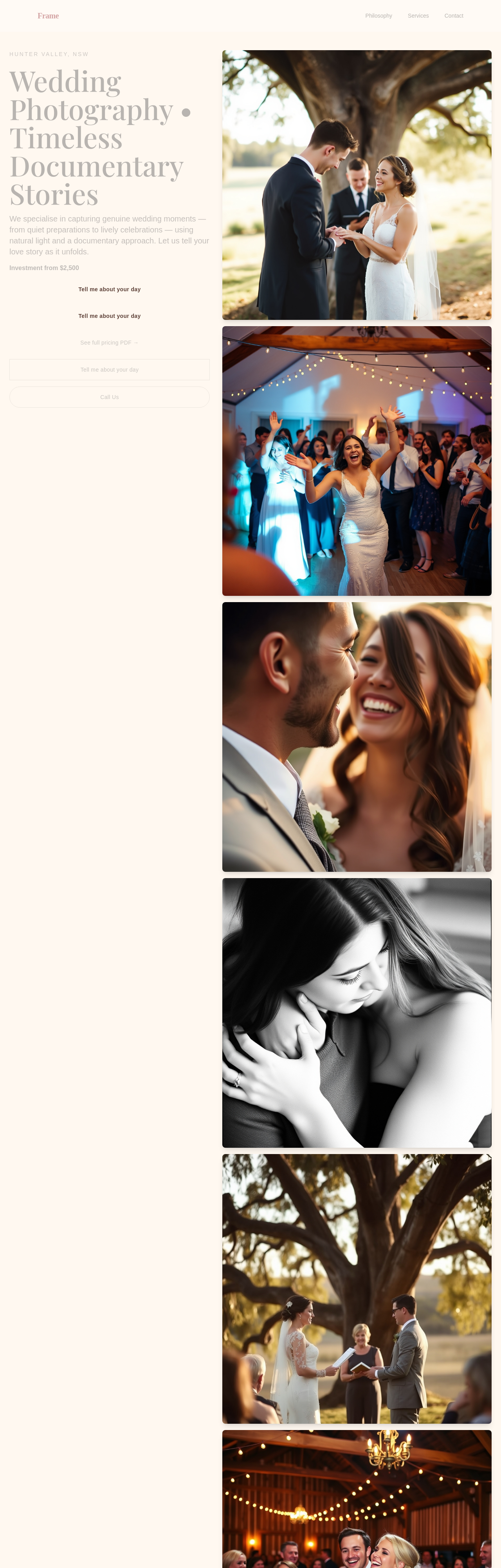
After
add a /testimonials page with placeholders for 6 client quotes
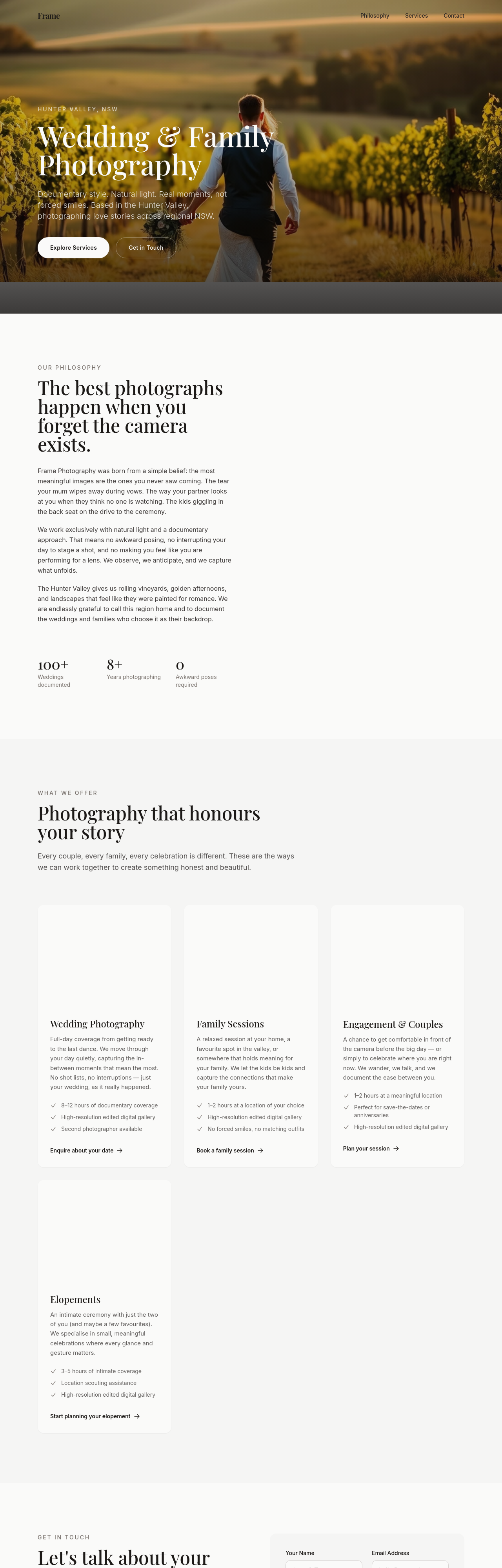
Before
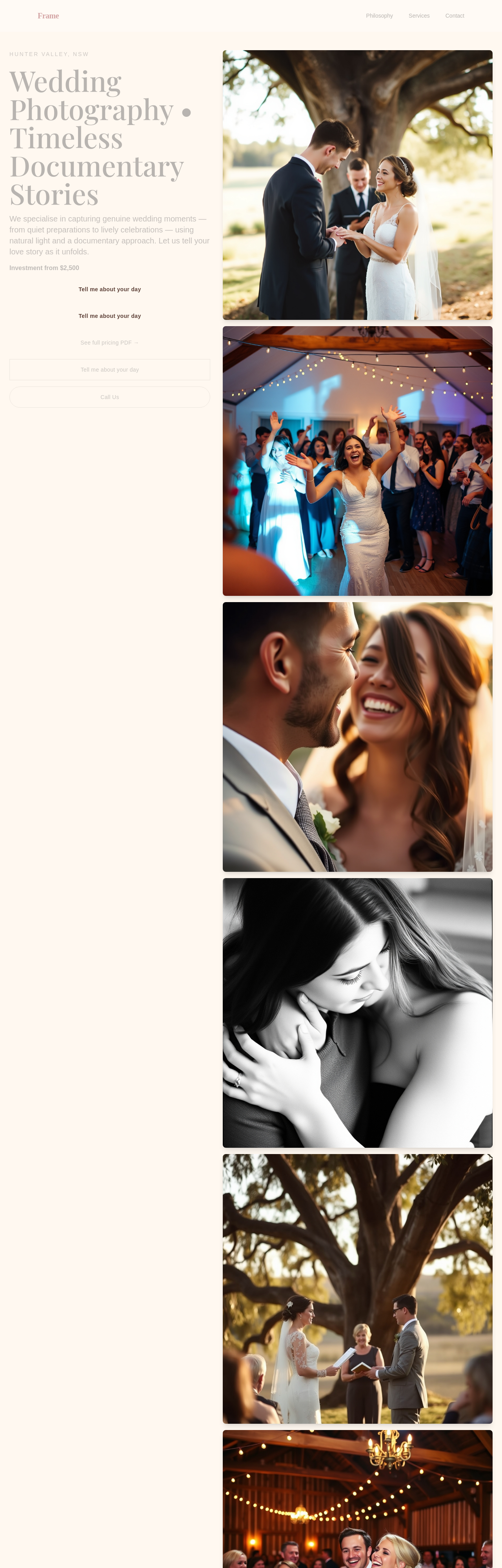
After
add an 'about the photographer' section — 3 paragraphs, first-person, what drew them to documentary work
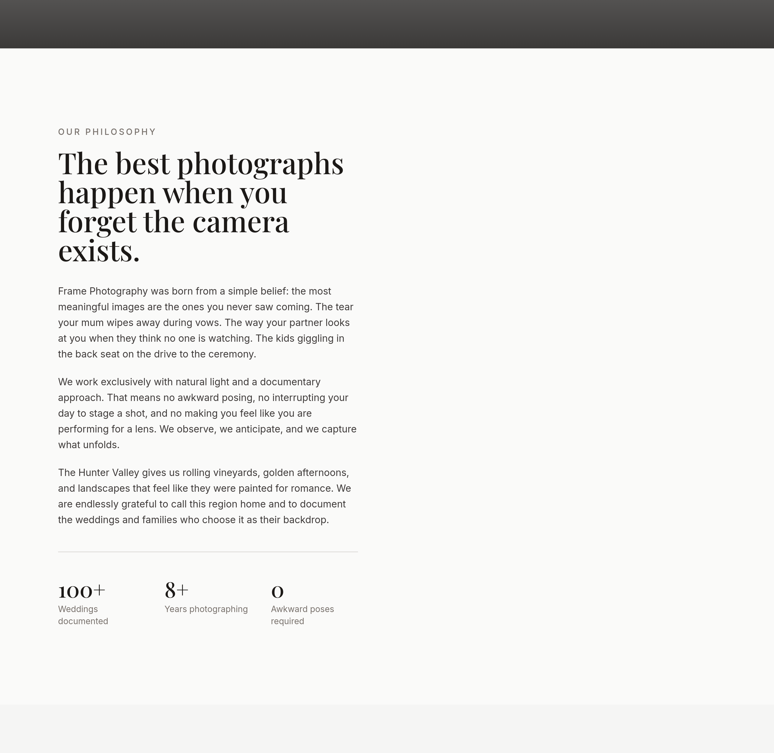
Before
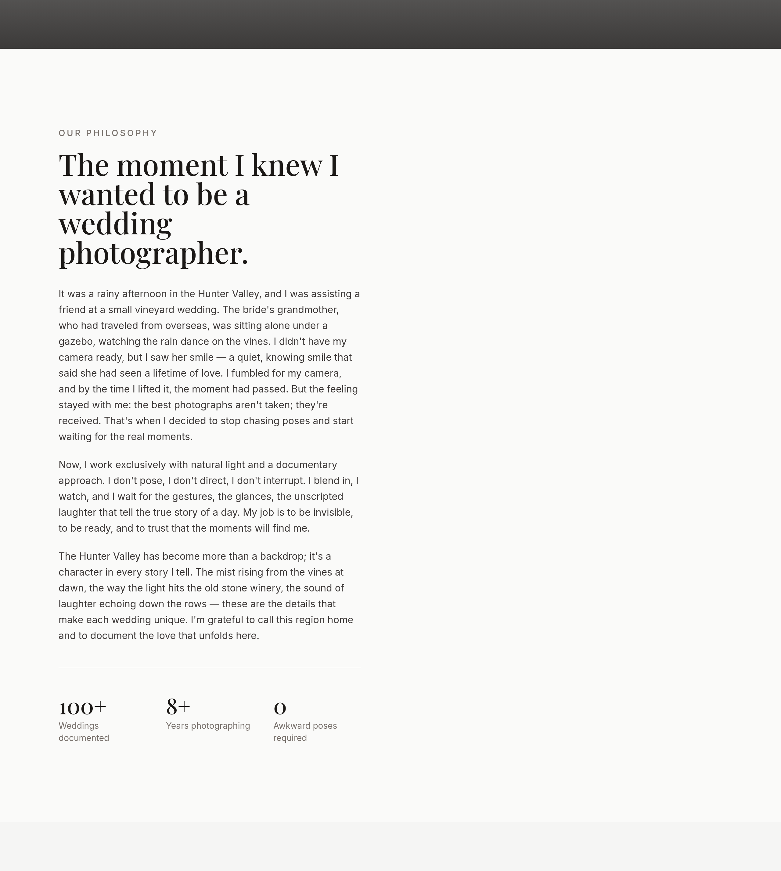
After
the about section is generic — anchor it to a specific moment that shaped the photographer's style
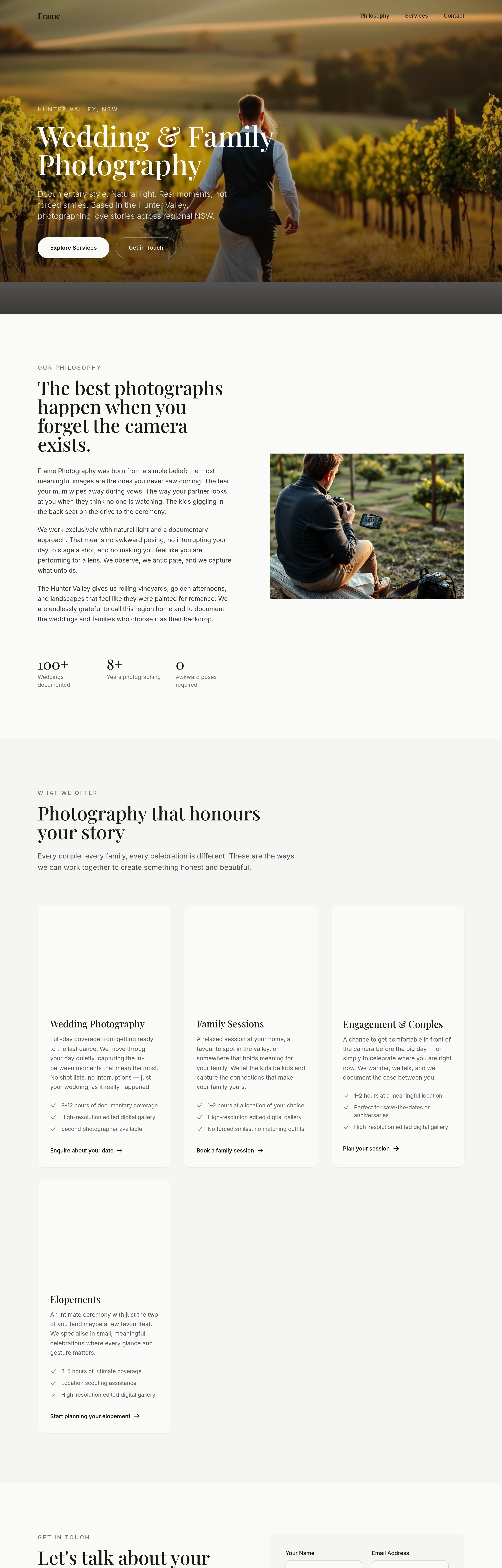
Before
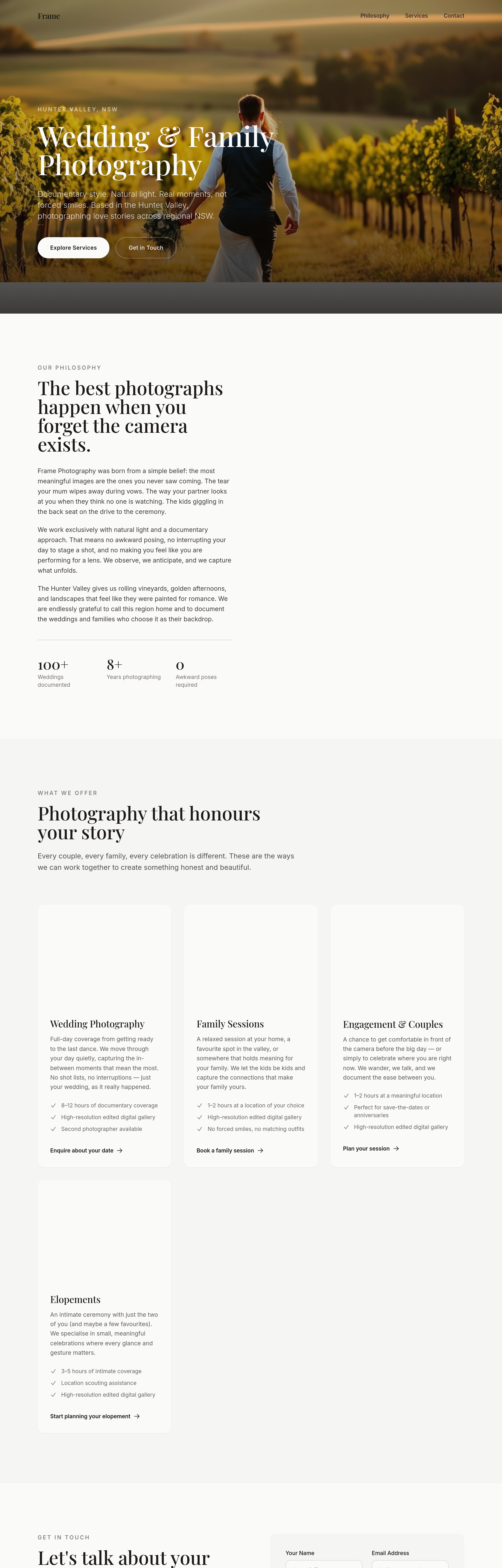
After
the portfolio captions read like file names — write narrative captions for each shot
Before
After
replace 'photographer' with 'storyteller' throughout
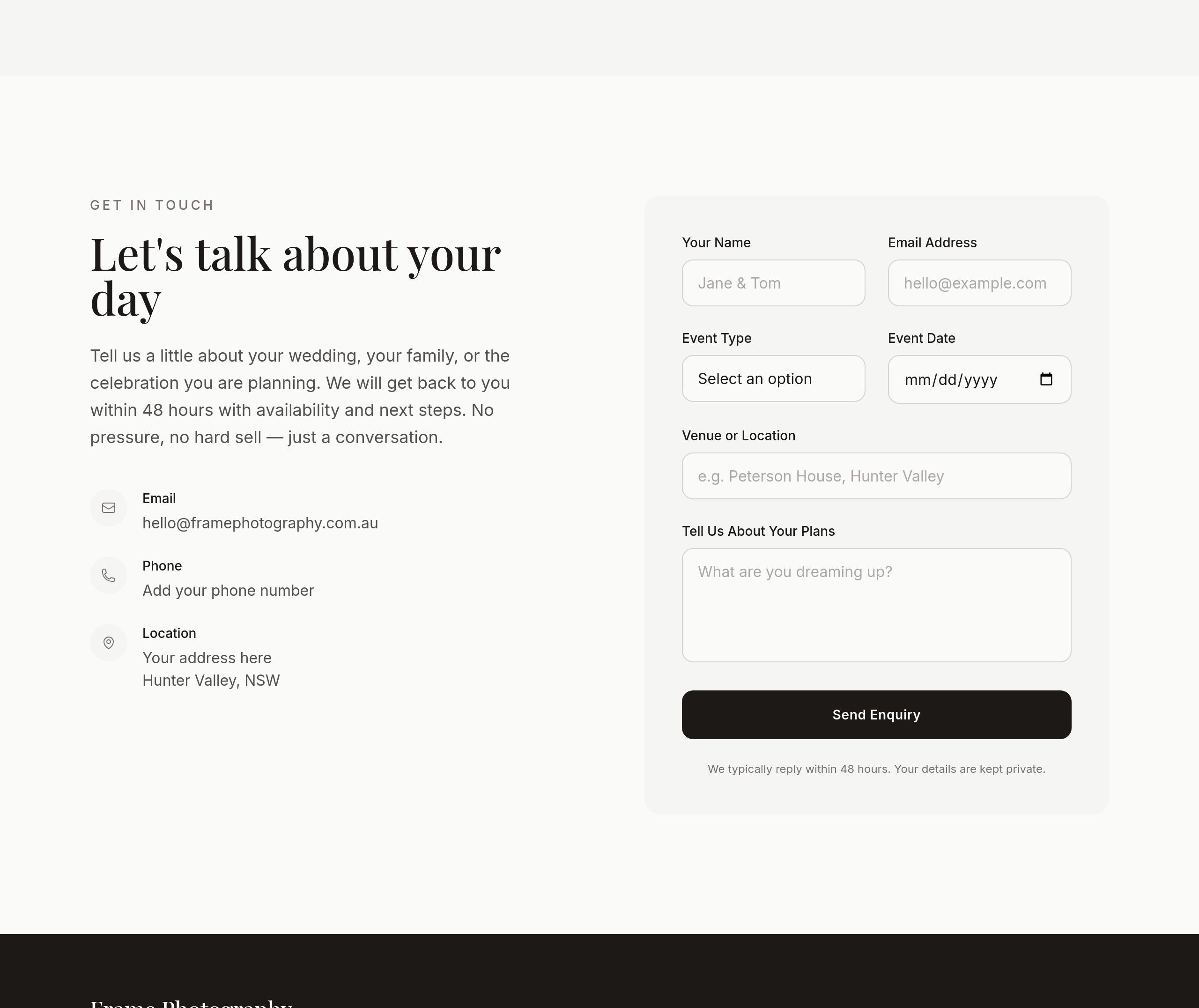
Before
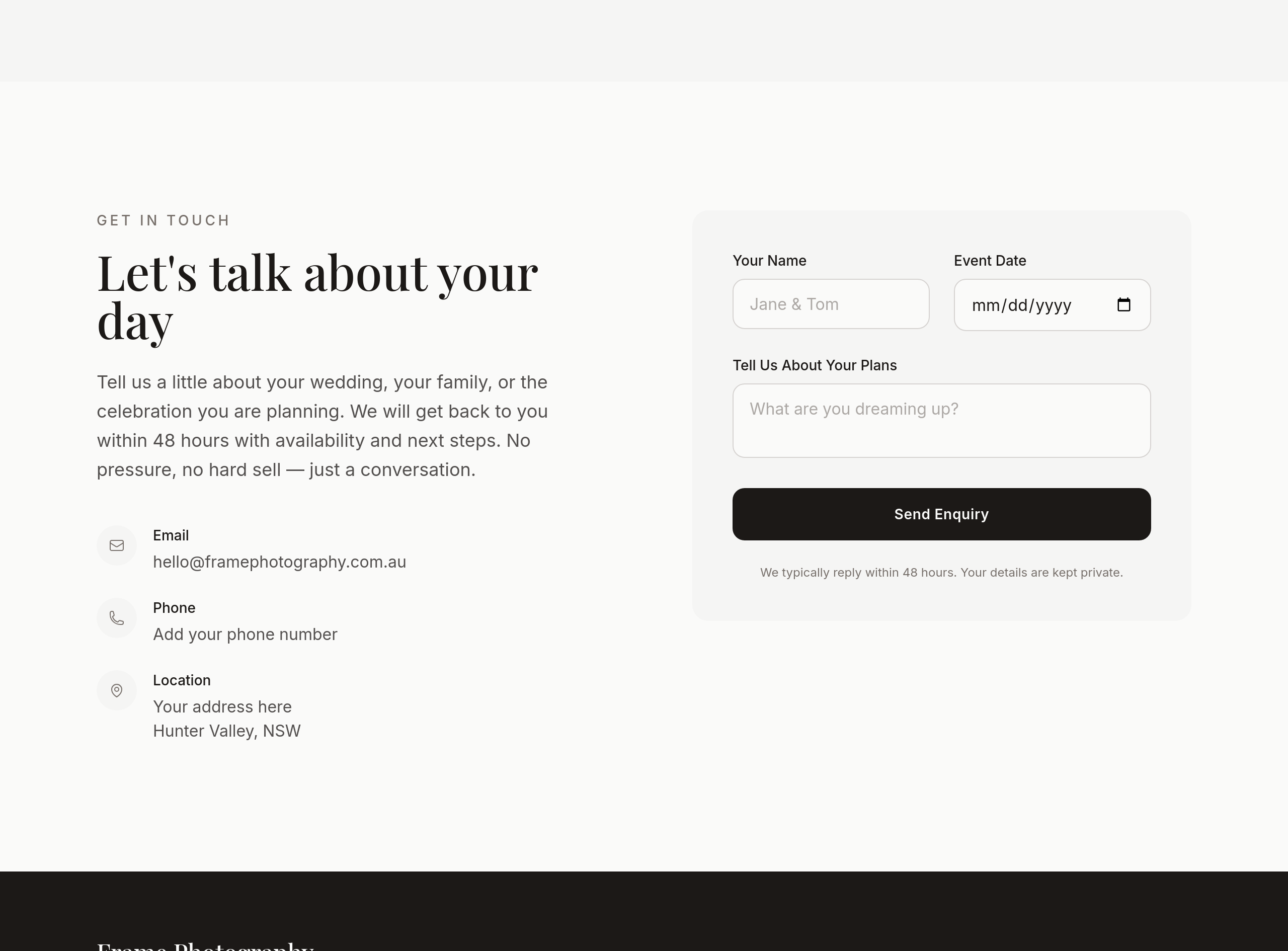
After
the contact section asks for too much info upfront — pare to name + date + 1 line
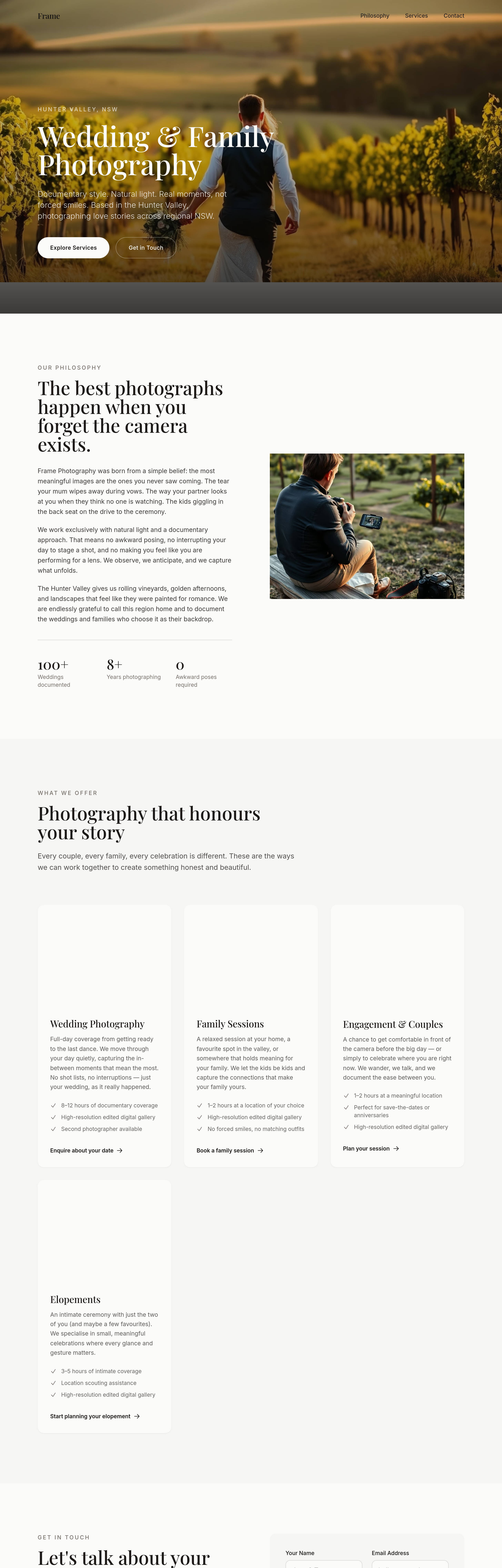
Before
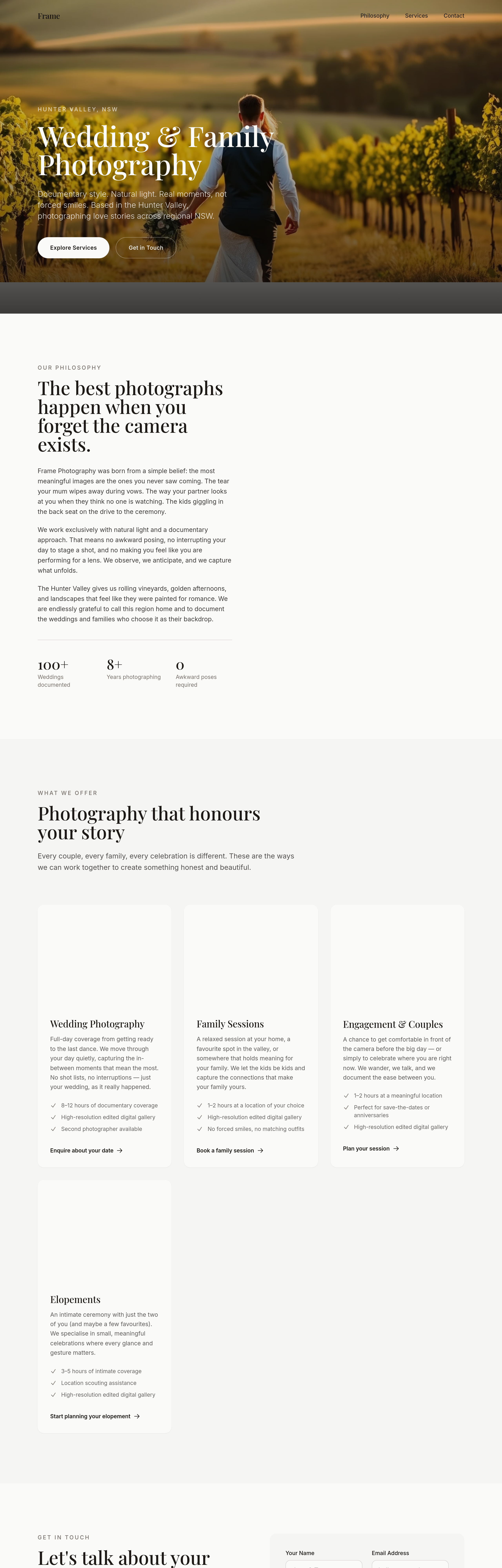
After
add a 'what to expect on the day' section — 4 stages (prep / portraits / candid / send-off)
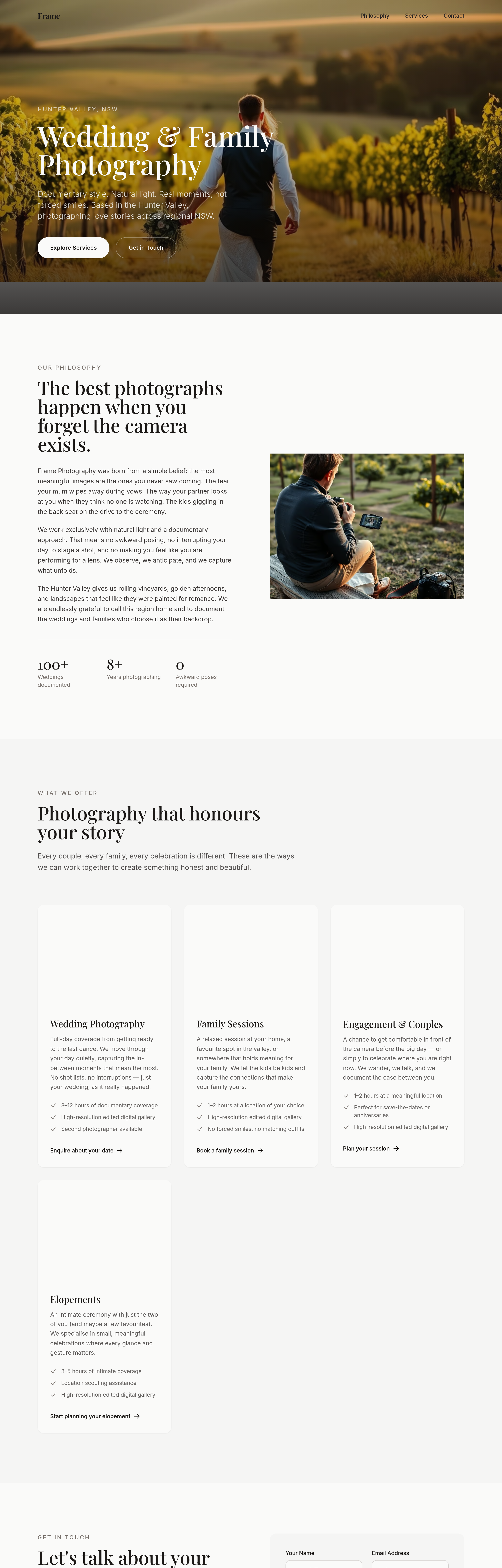
Before
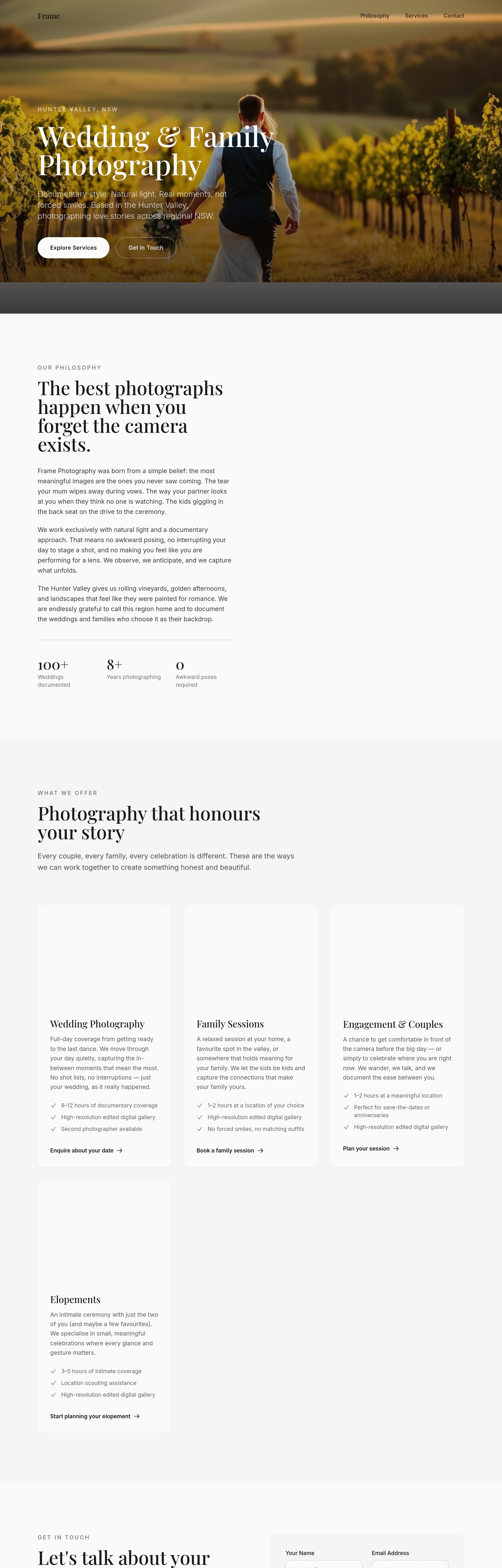
After
add a 'travel + destination' section — interstate + overseas weddings welcome
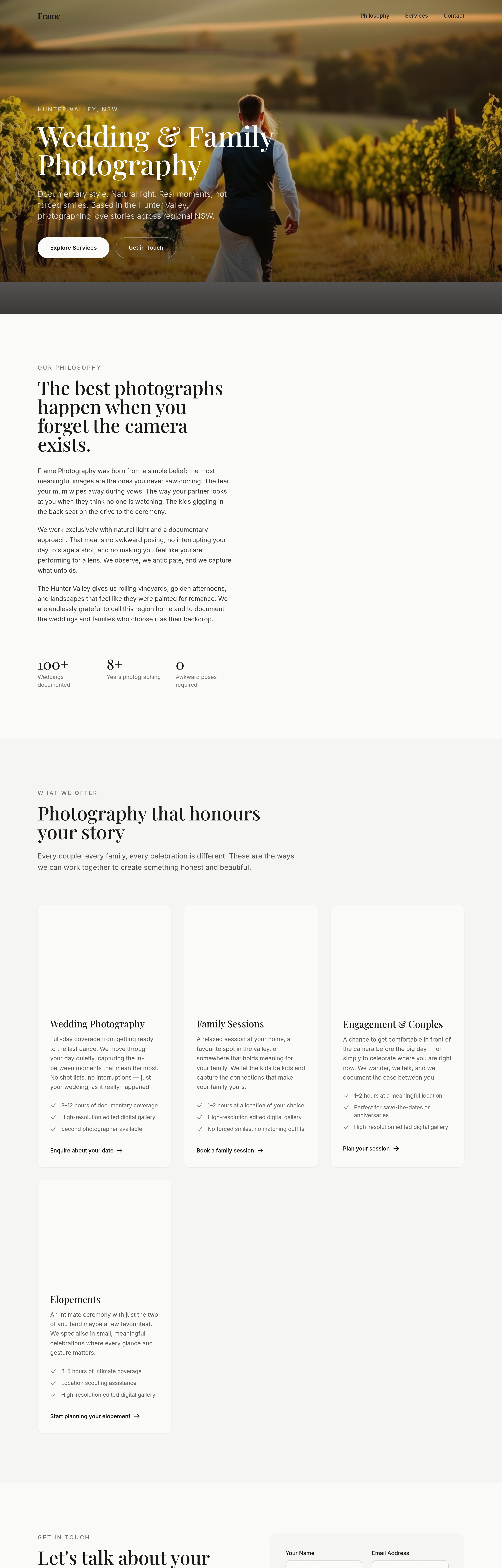
Before
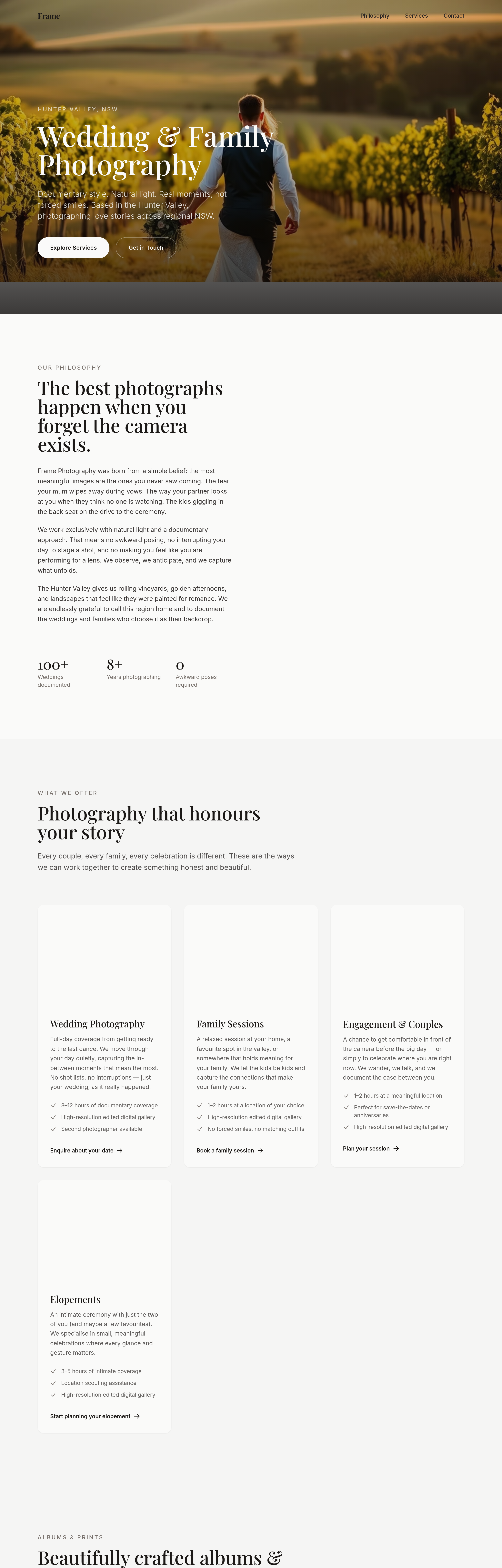
After
add an albums + prints section — 3 product tiers + sample image
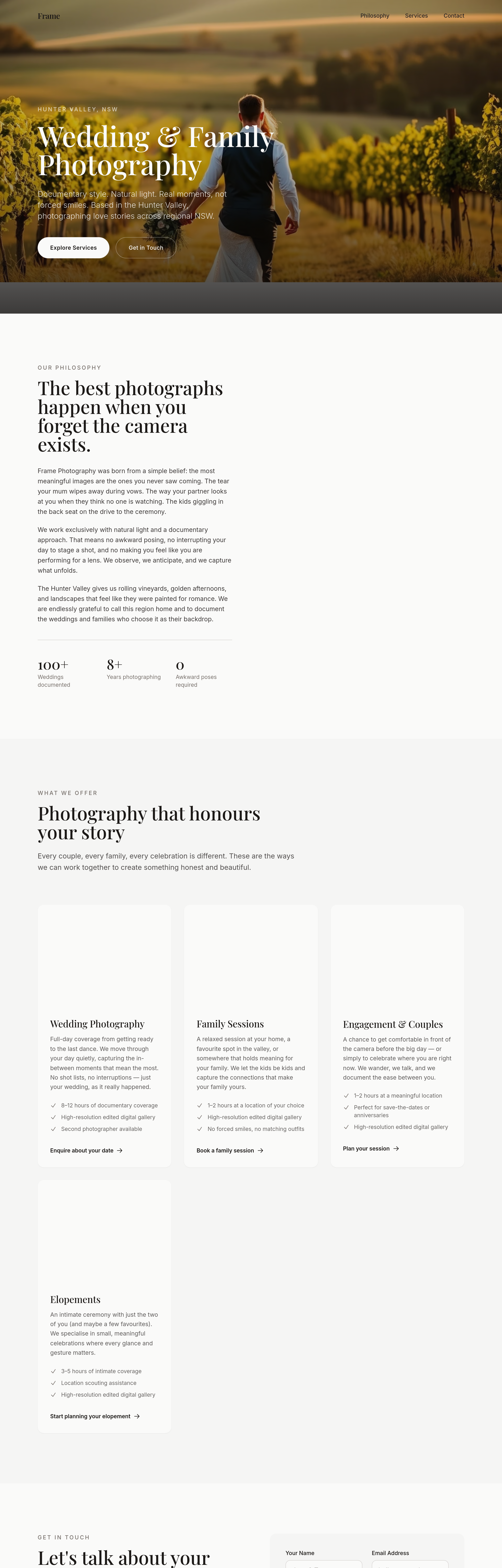
Before
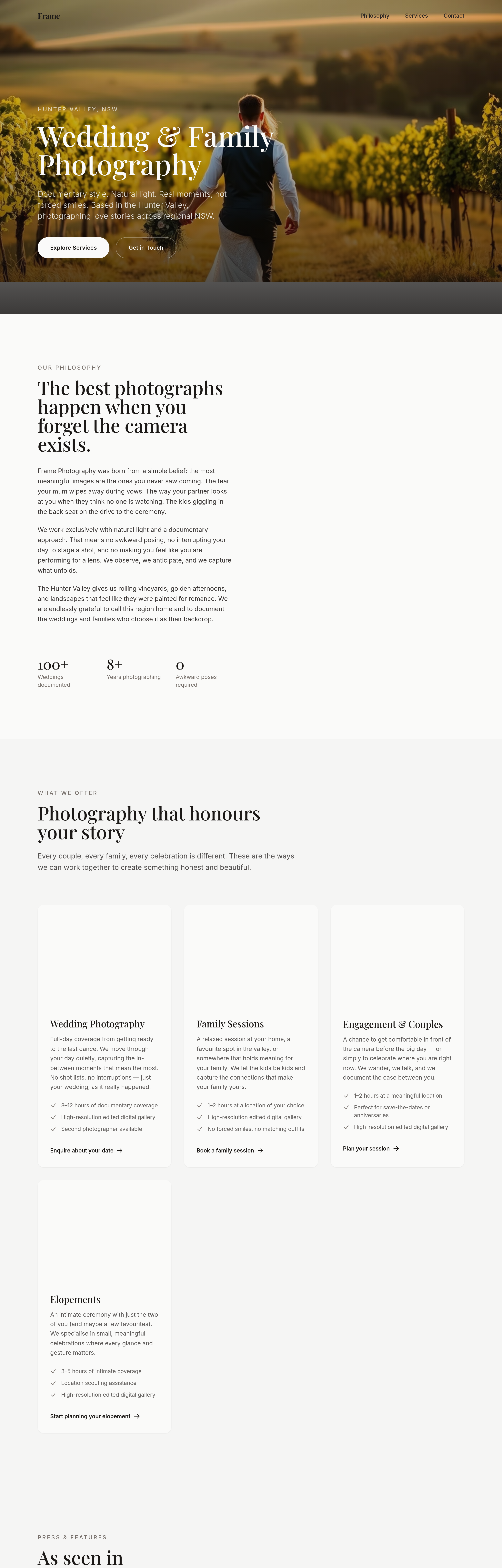
After
add a 'press + features' section — placeholder for 3 publications
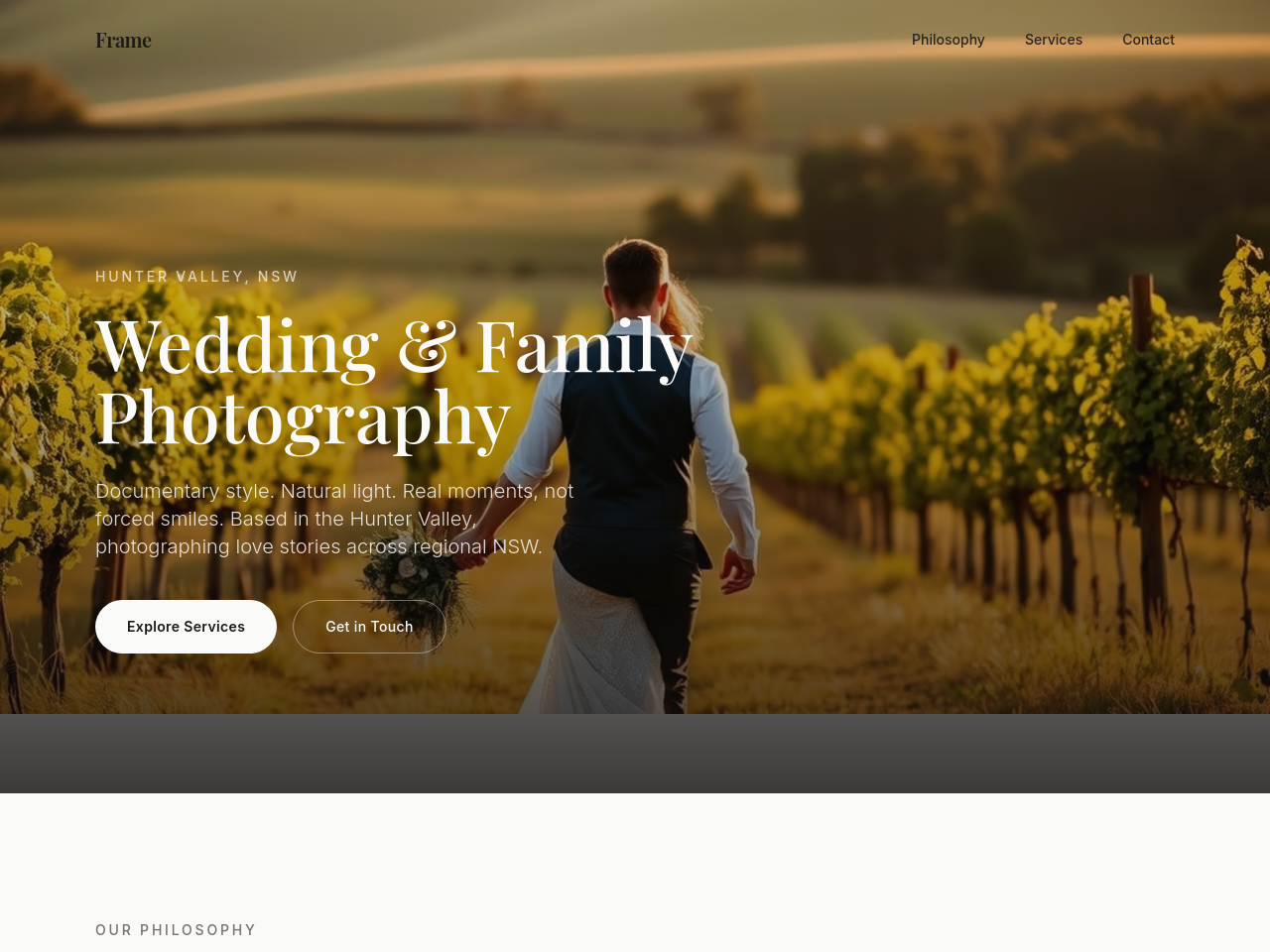
Before
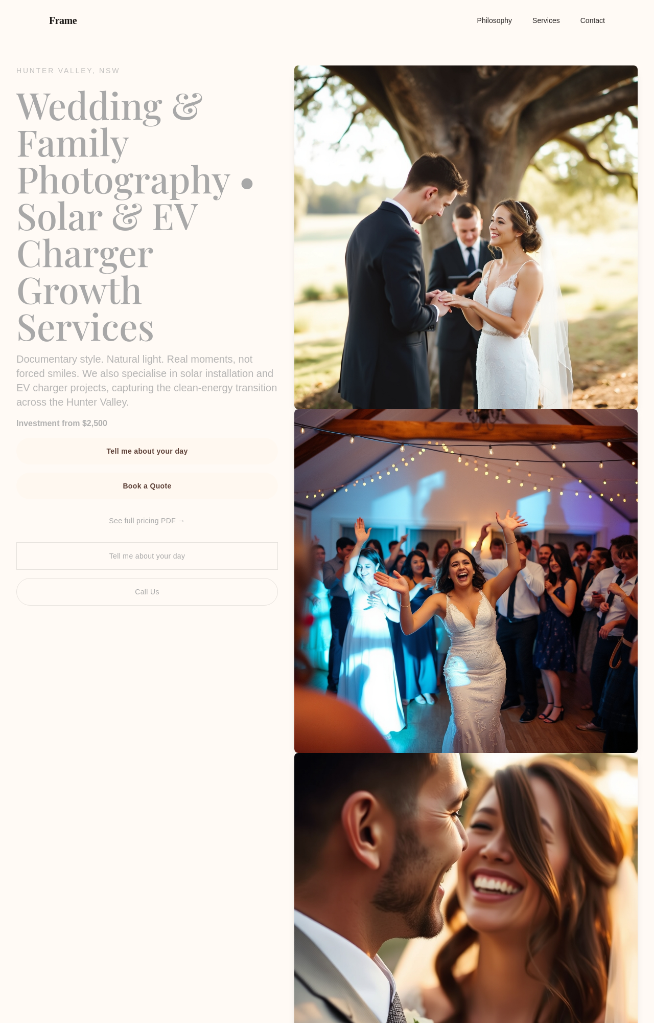
After
add a soft black-and-white film-style hero image of an embrace

Before

After
add a stacked image collage — 3 vertical portraits side by side at the top of the about

Before

After
replace all square thumbnails with portrait orientation — feels more wedding-y
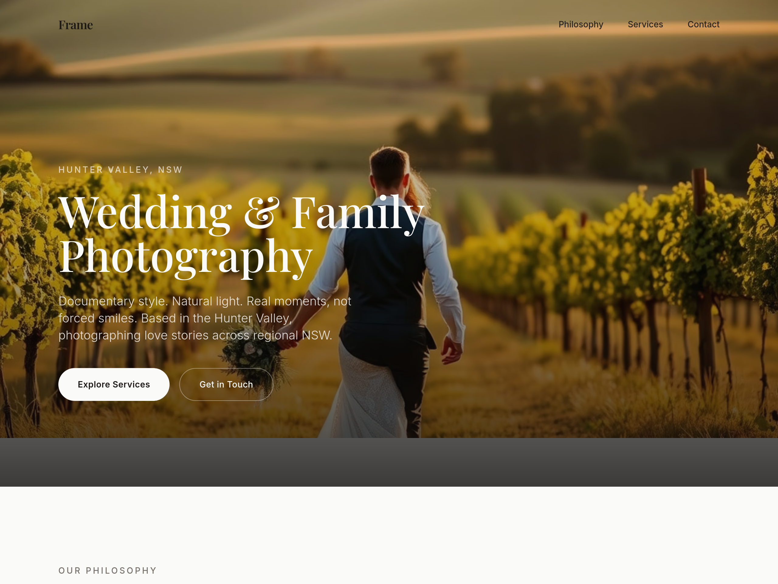
Before
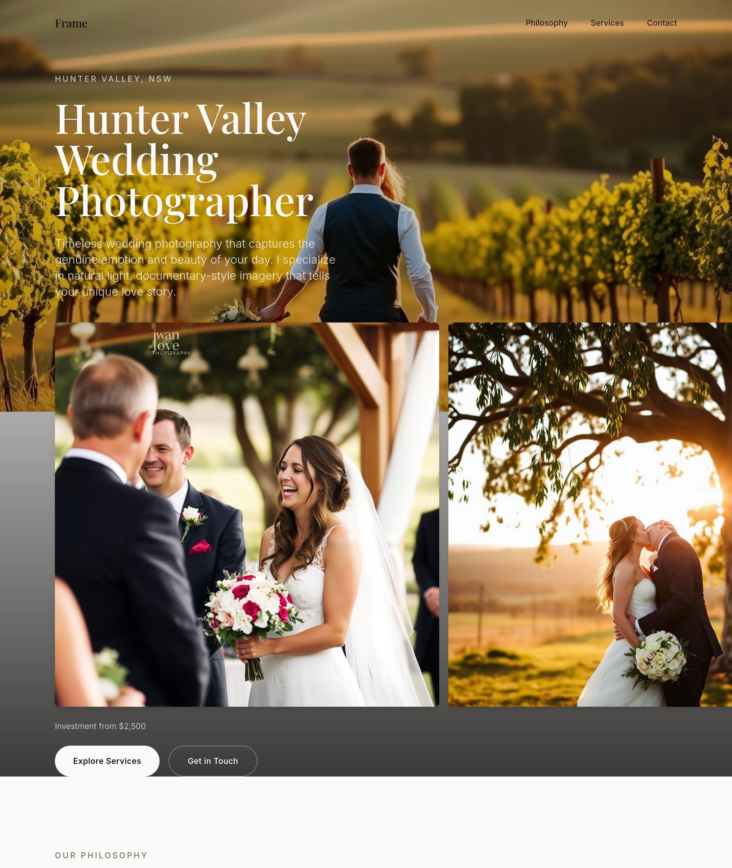
After
the wedding section needs love — rewrite copy + add 3 images + a 'investment from' line
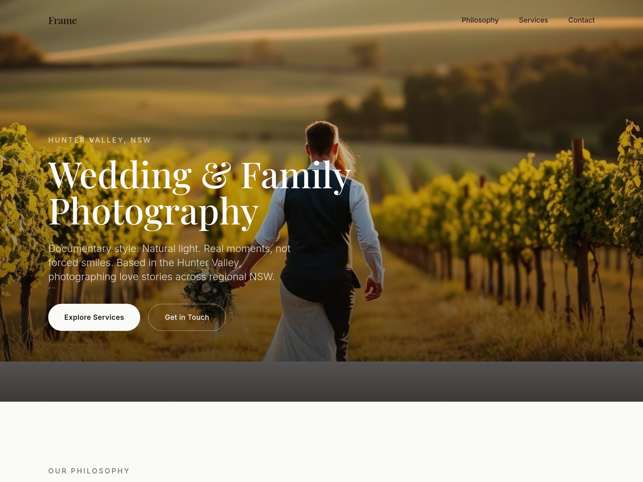
Before
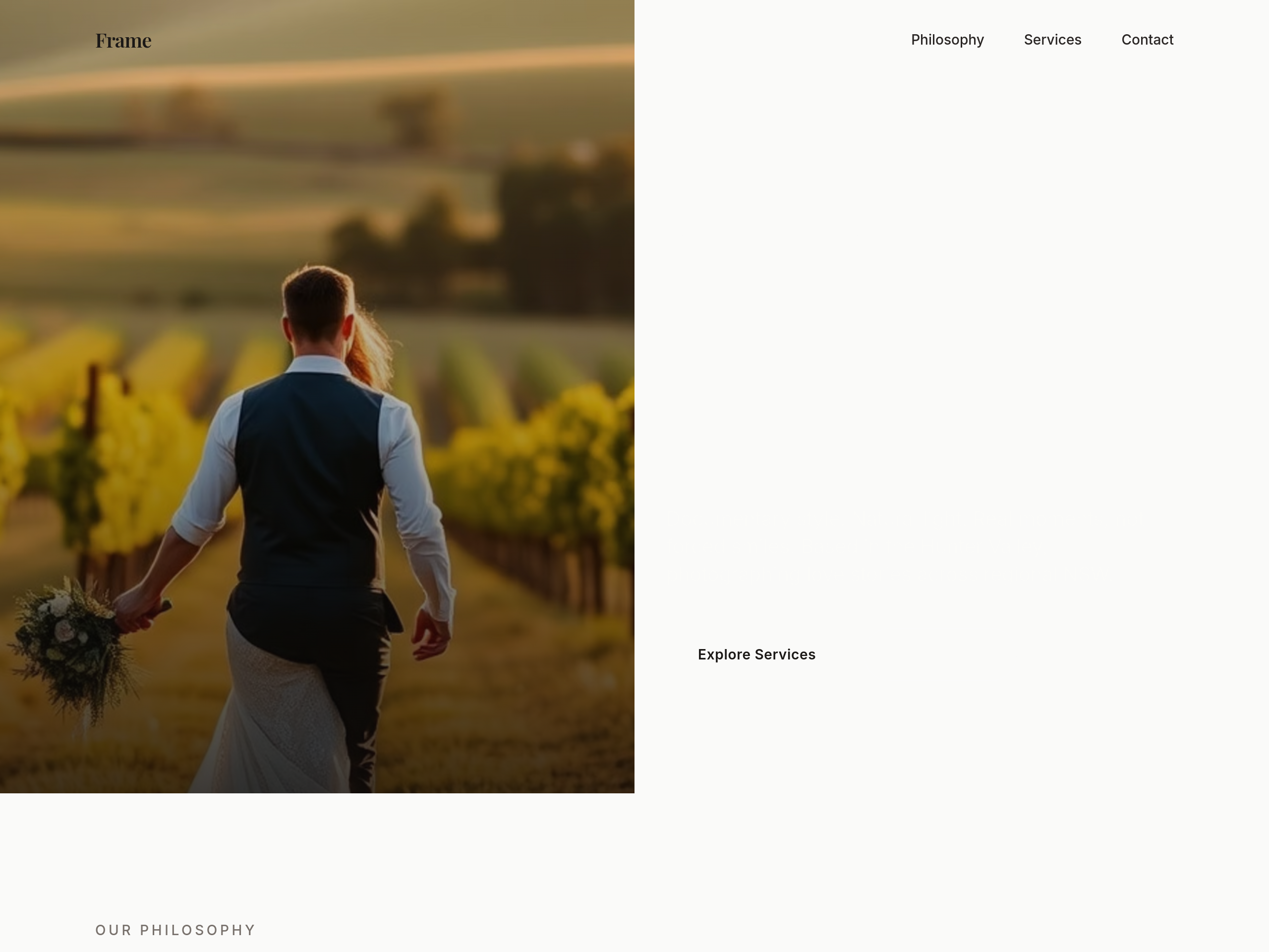
After
the hero is centered — make it a 2-column layout with copy left, image right
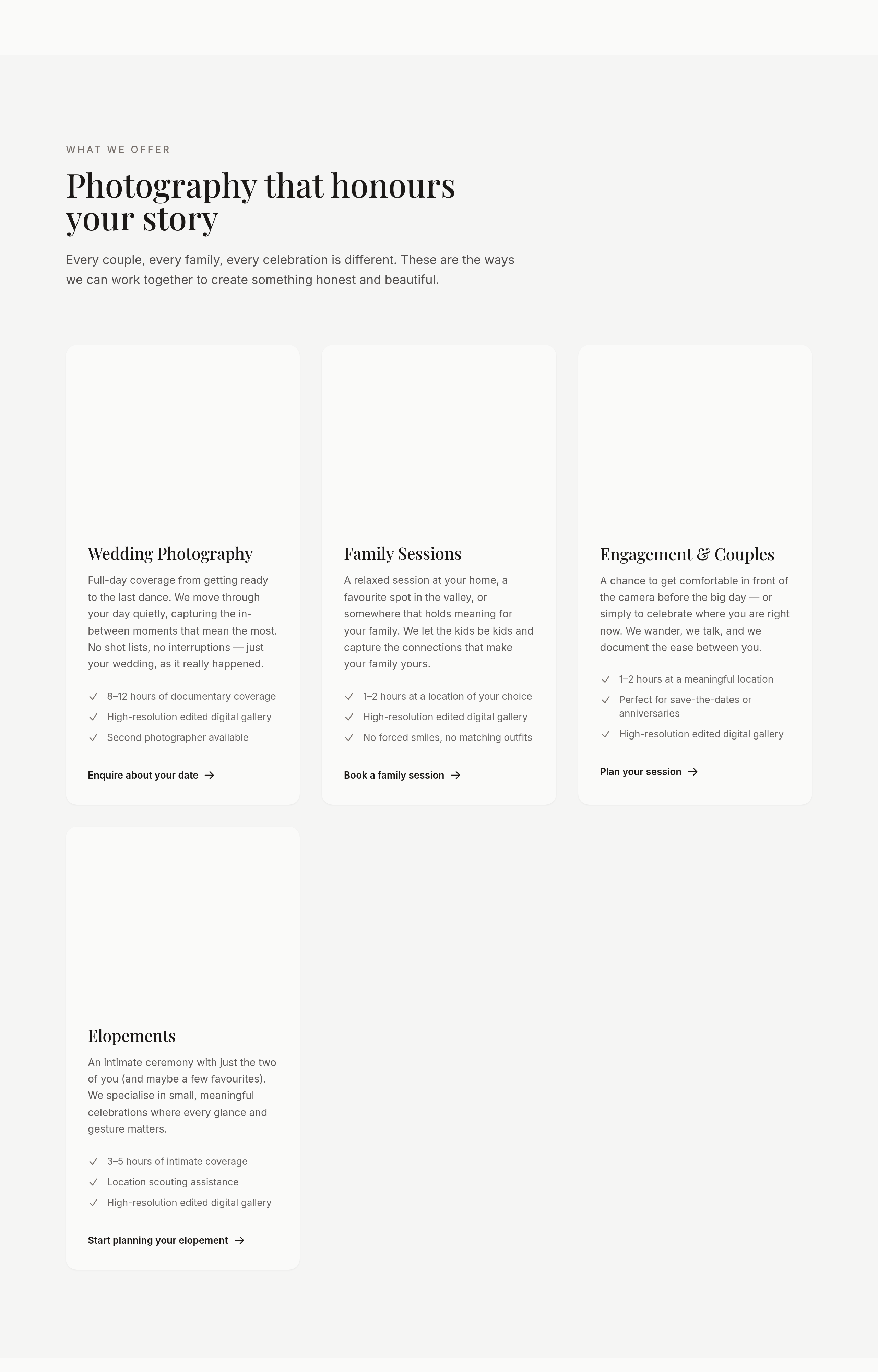
Before
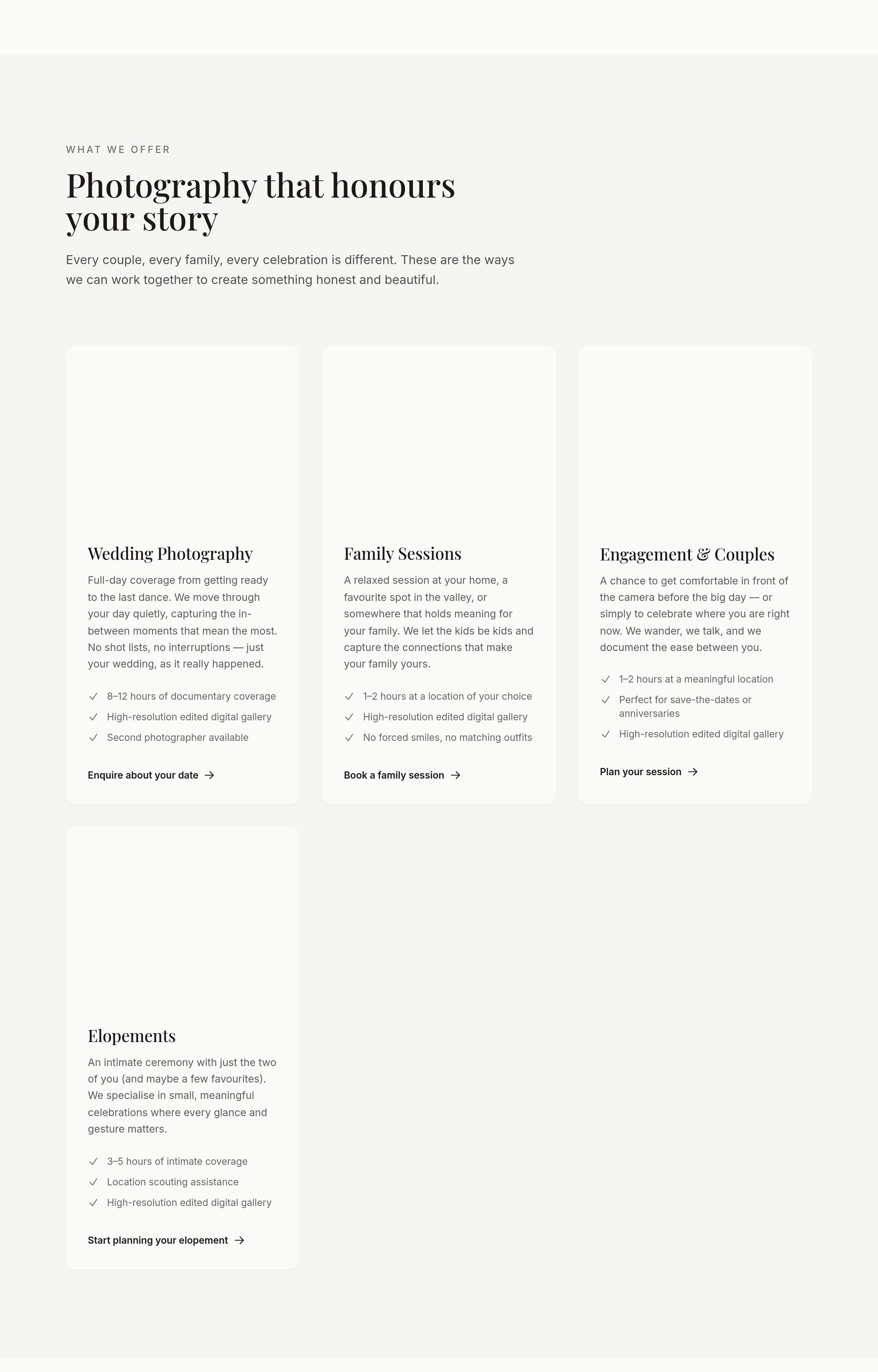
After
the portfolio should be 3 columns desktop, 1 column mobile, with no captions on mobile
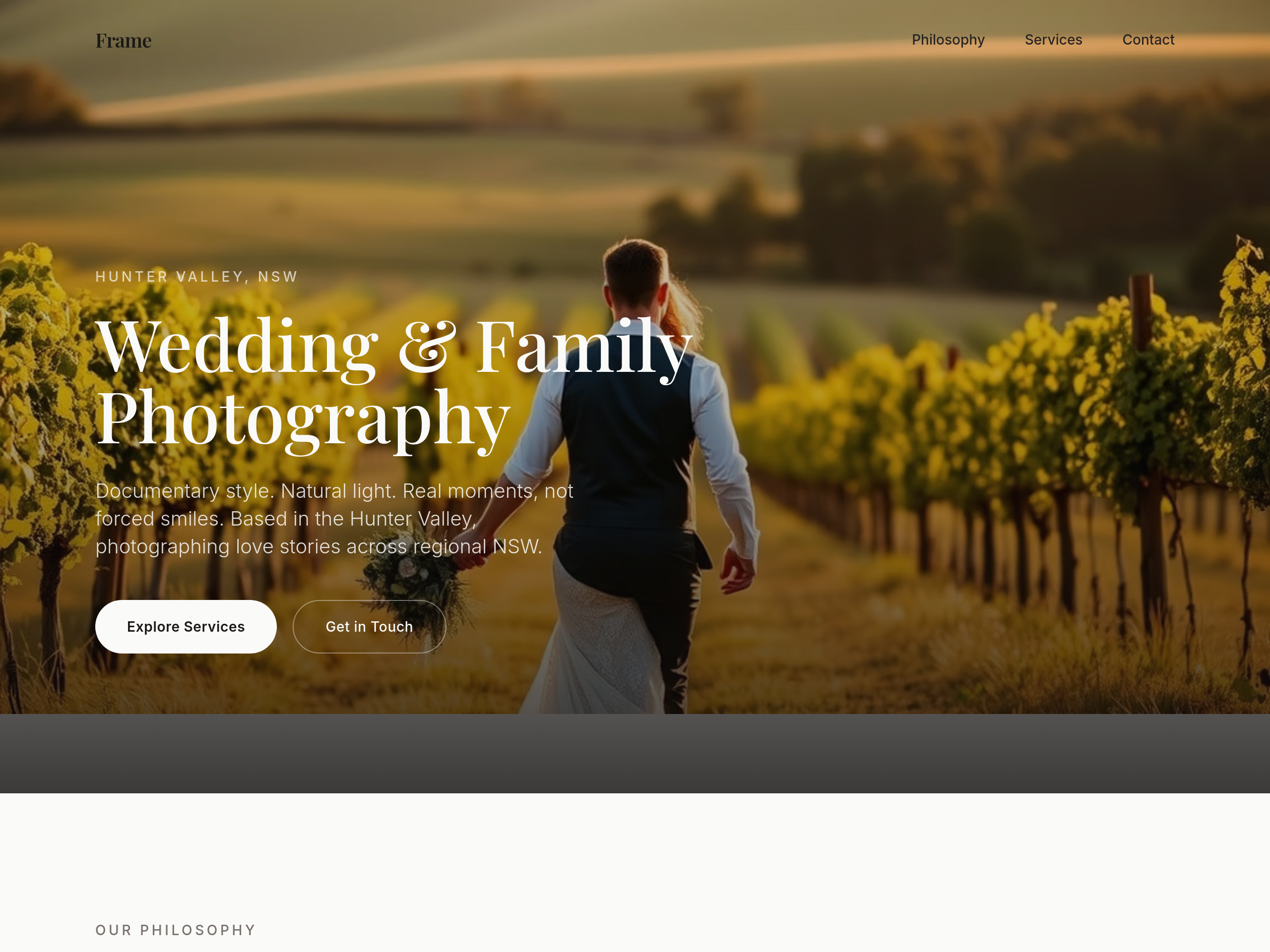
Before
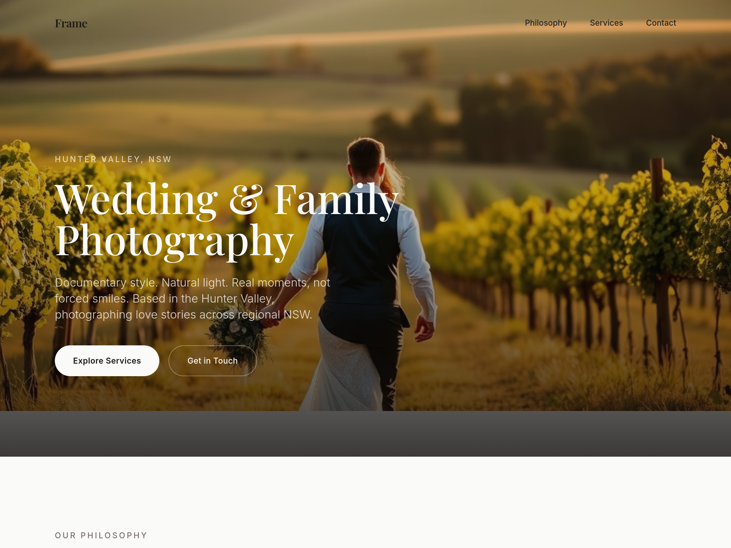
After
the type is too modern — switch headings to a classic serif (think editorial wedding magazine)
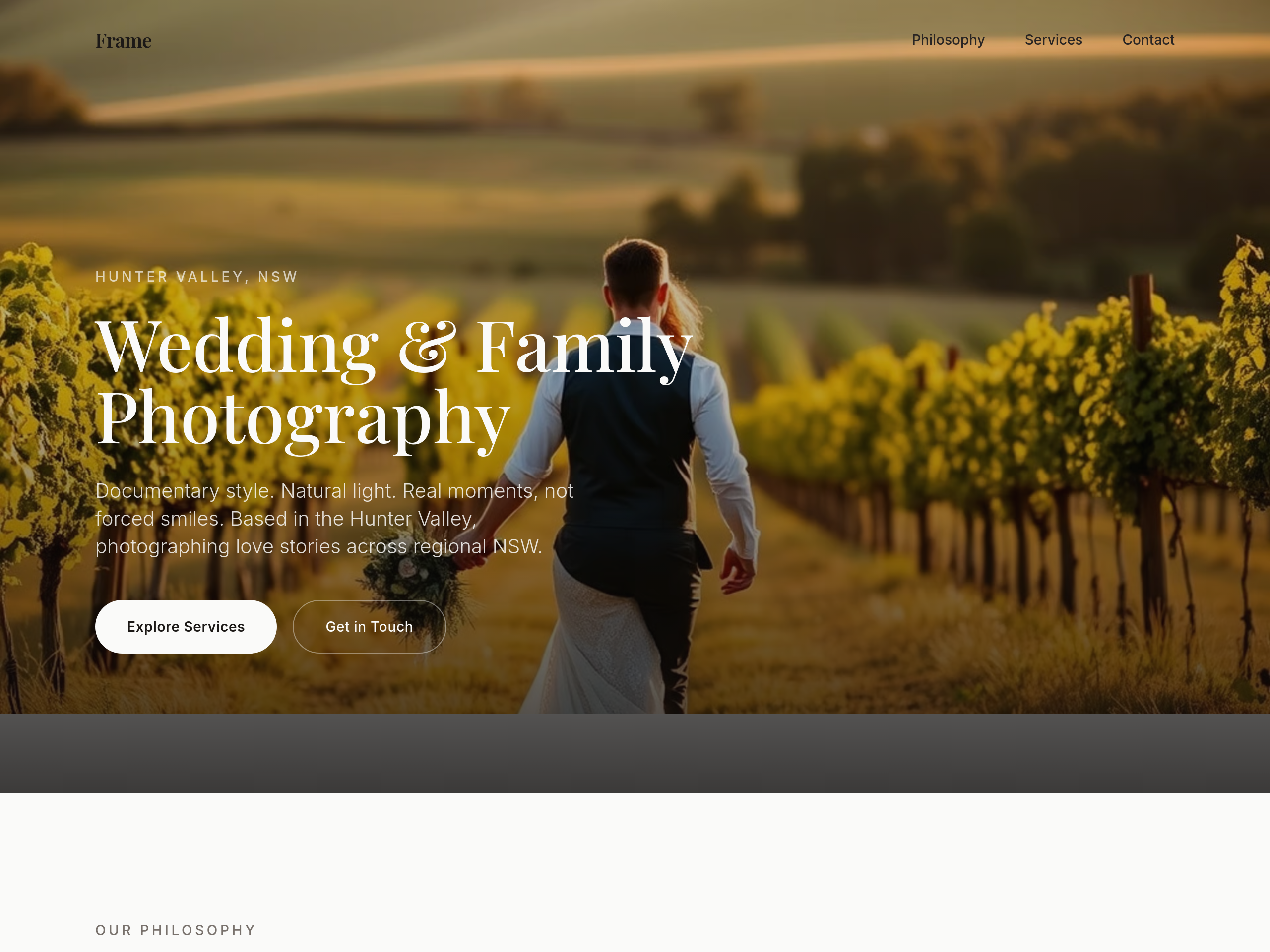
Before
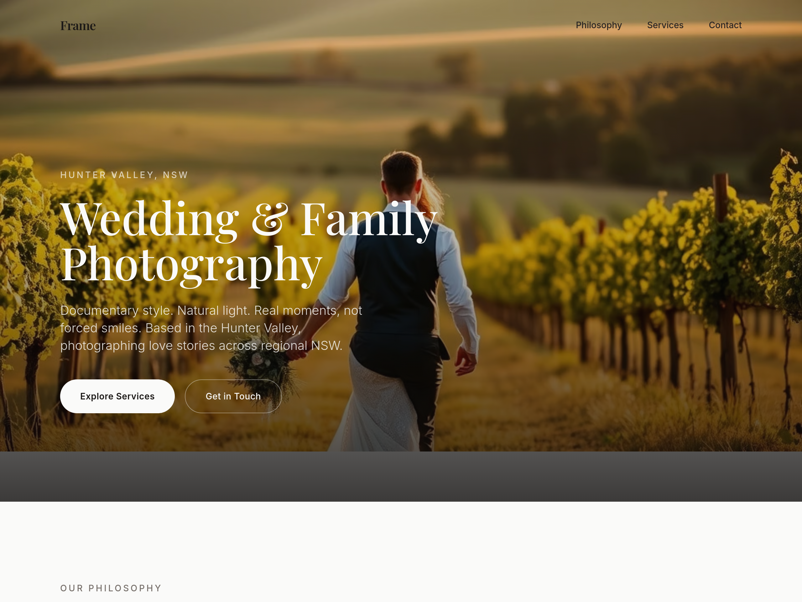
After
add subtle film grain texture as a CSS overlay on every image

Before

After
the colour palette is too cool — soften to ivory, dusty rose, warm grey
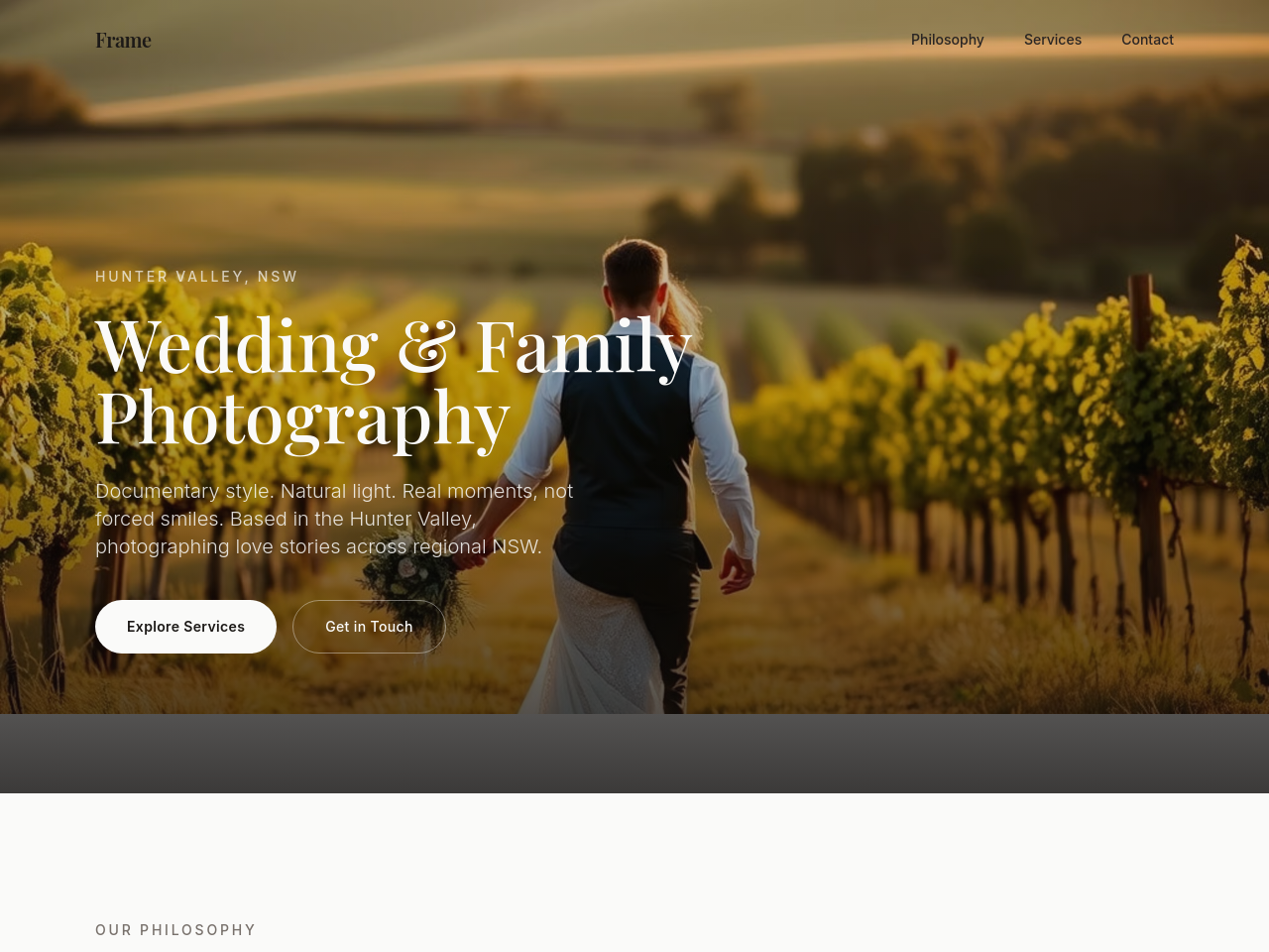
Before
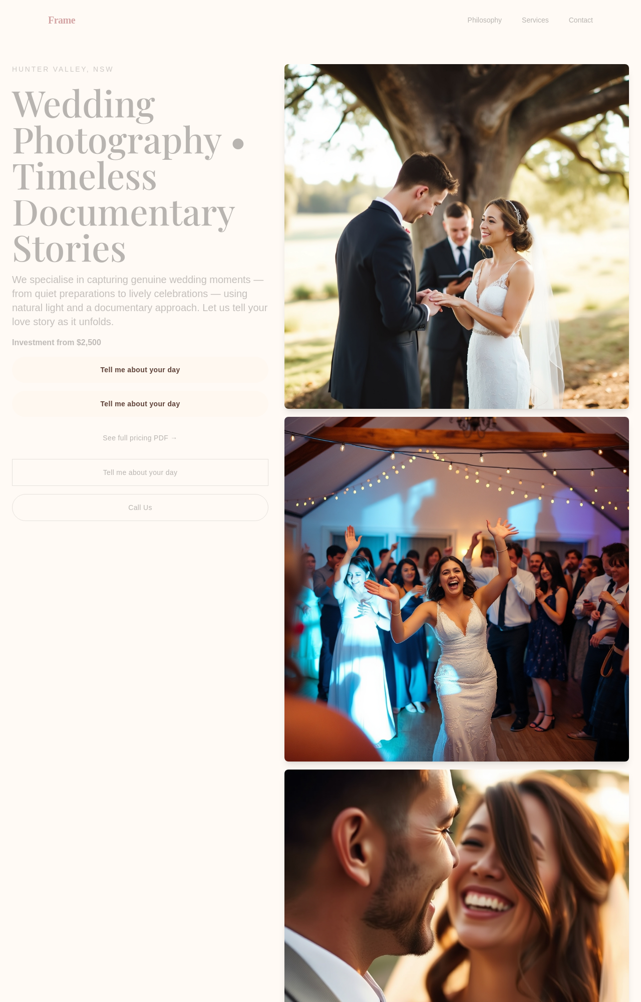
After
replace the booking CTA with 'Tell me about your day' — warmer + invitational

Before

After
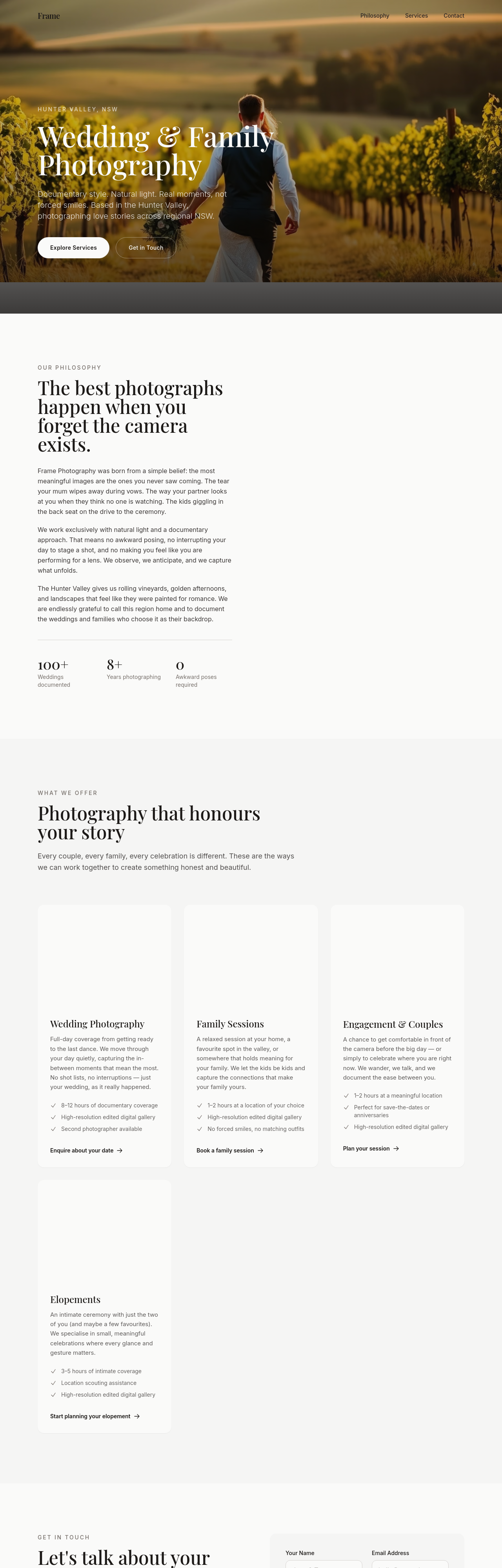
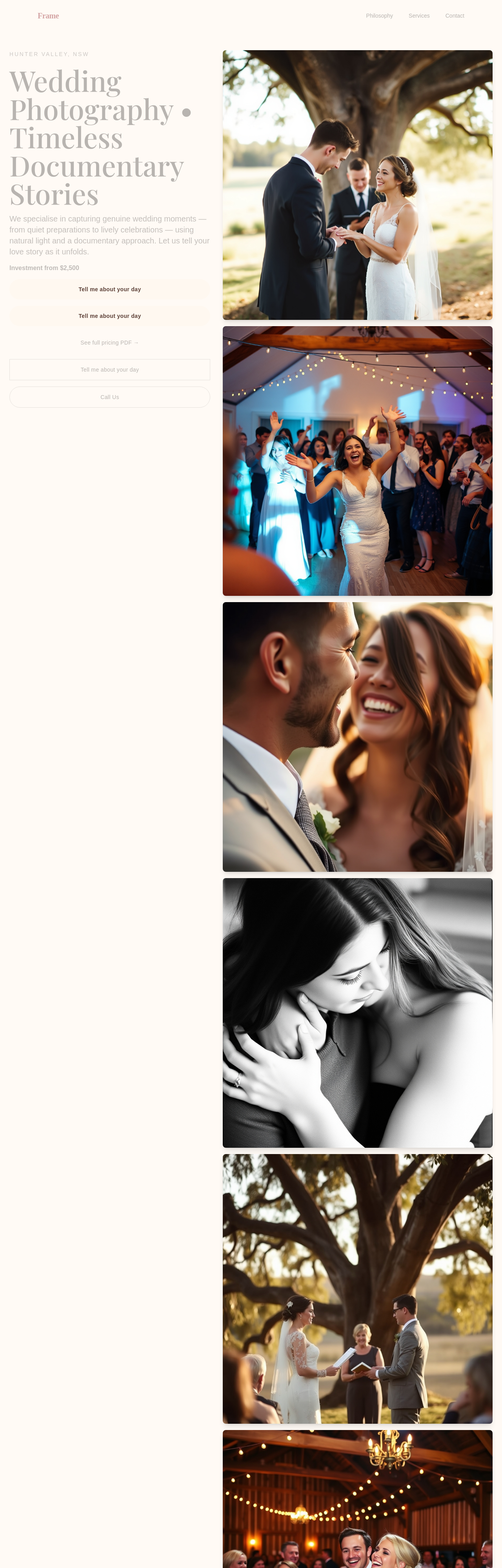
add a soft secondary CTA below the primary: 'See full pricing PDF →'
Before
After
rework the pricing — soft 'from' phrasing + 3 tiers (engagement / half-day / full-day) + custom