electrician
44 examples run against cap-electrician.flarepages.au.

Before

After
the colours feel too utility — try a more premium dark navy + electric-yellow accent
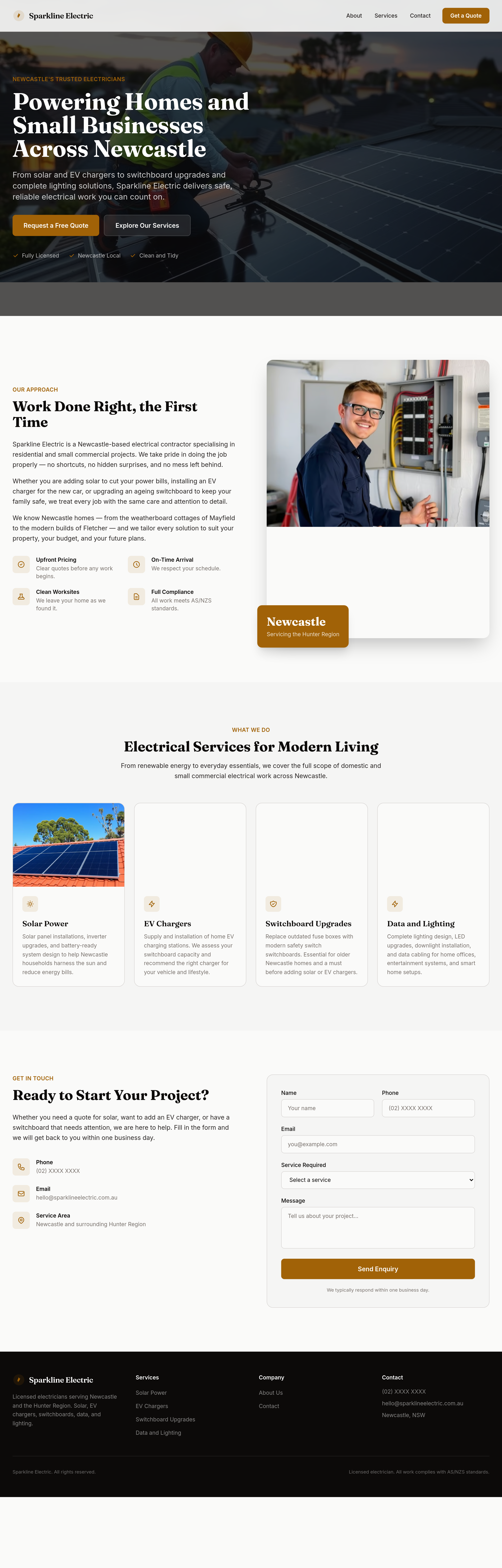
Before
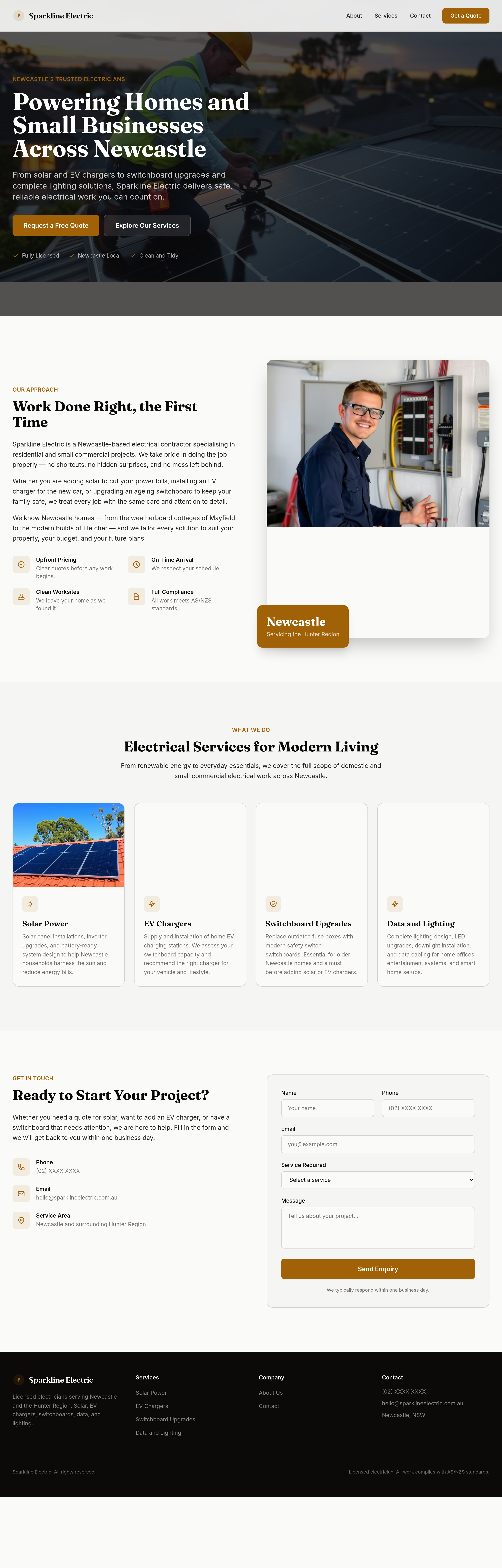
After
make the headings feel confident and capable
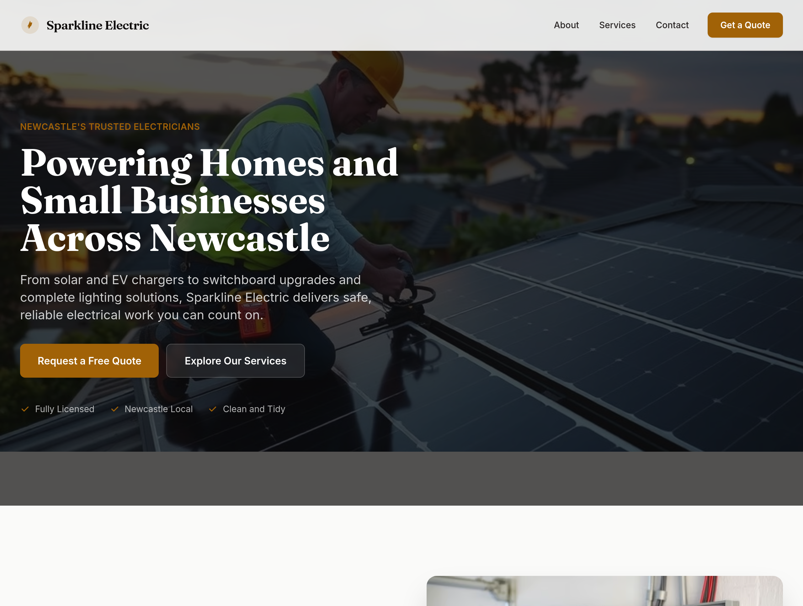
Before
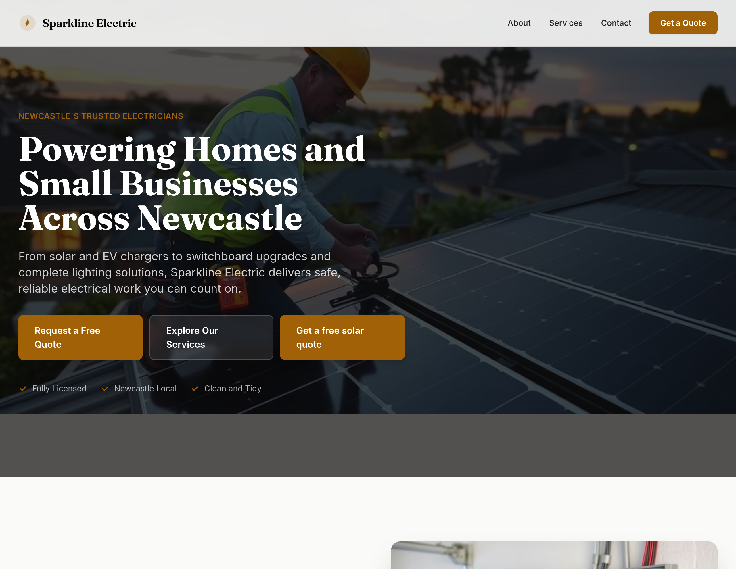
After
add a 'Get a free solar quote' CTA in the hero
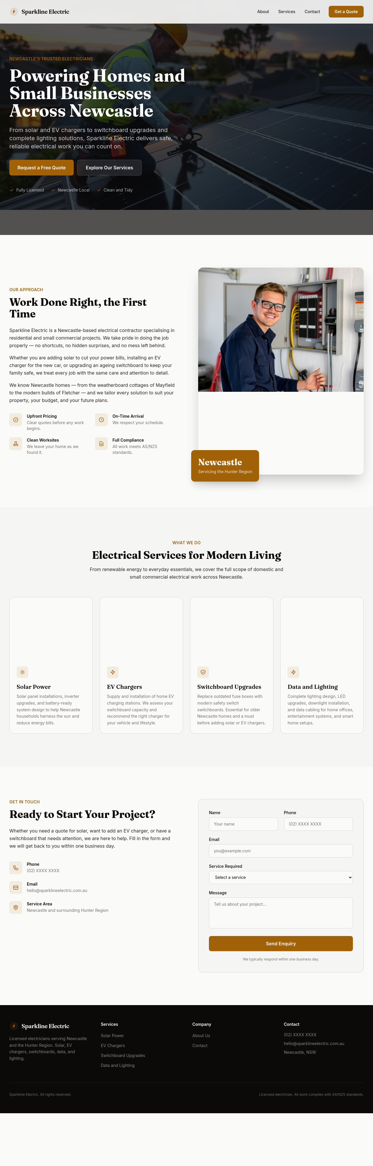
Before
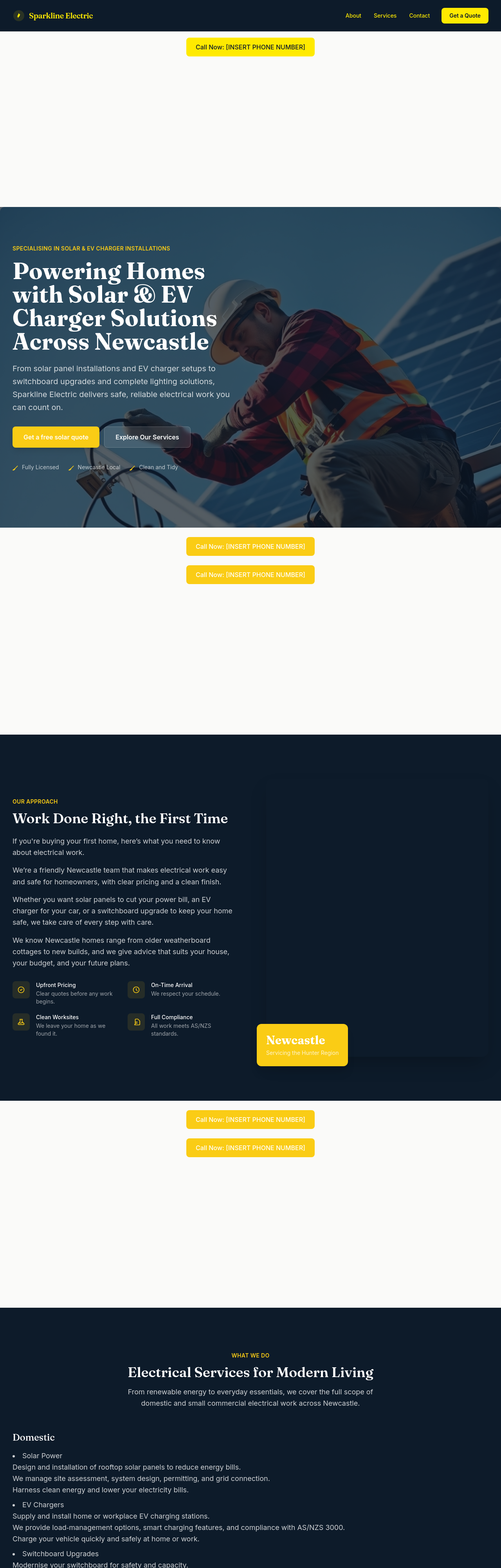
After
add typical-cost ranges for common jobs: switchboard upgrade $1200-$2500, EV charger install $1500-$3000, solar 6.6kW $5500-$7500
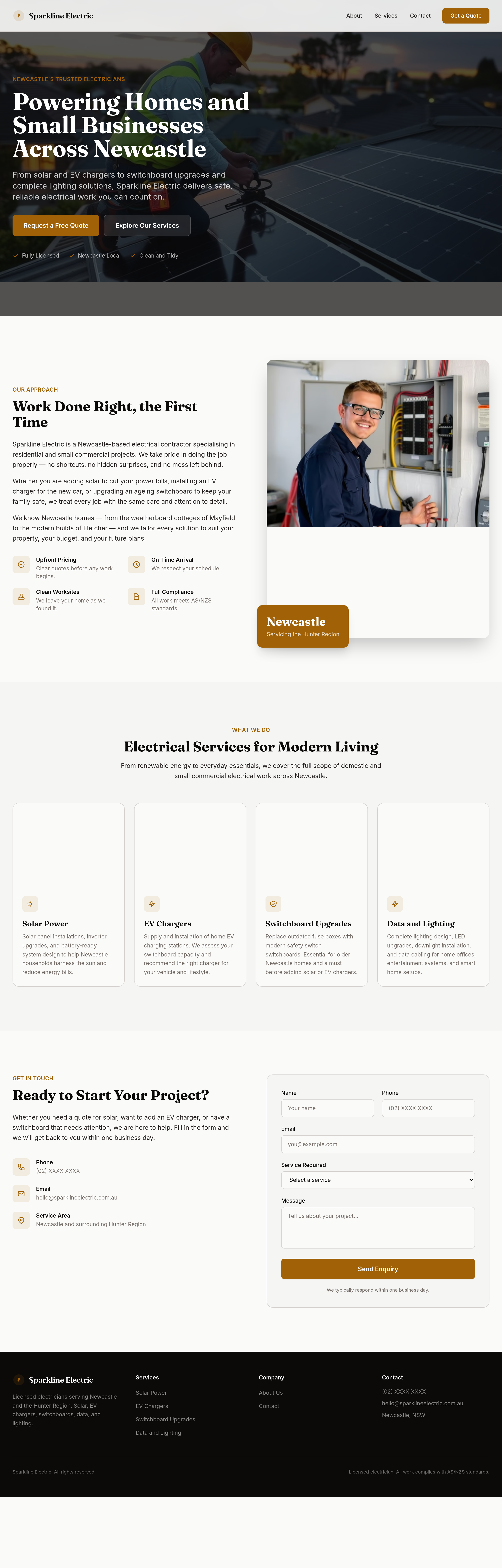
Before
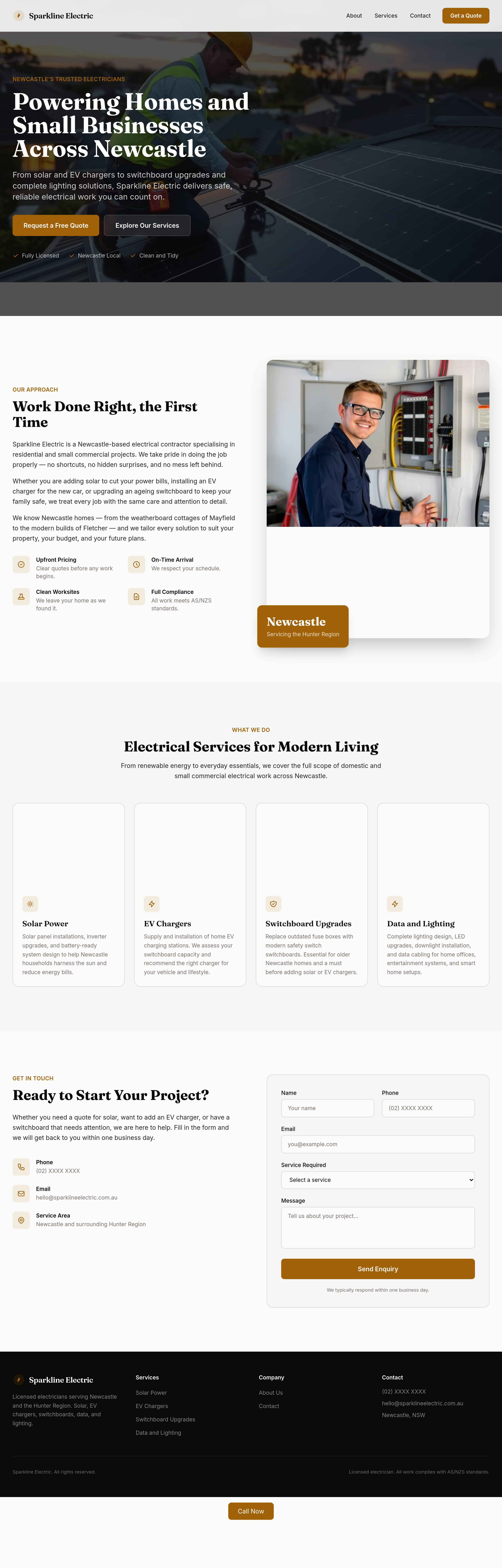
After
the services grid is too dense — split into 'Domestic' and 'Solar + EV' as two visual rows
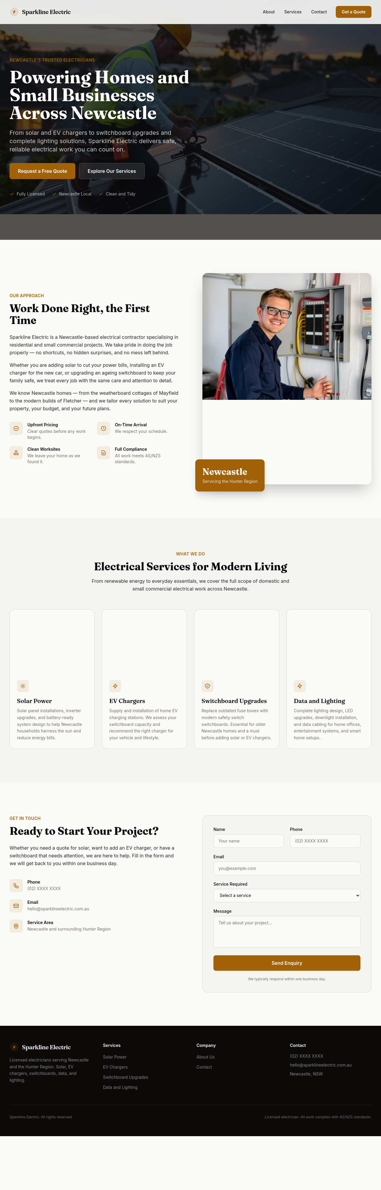
Before
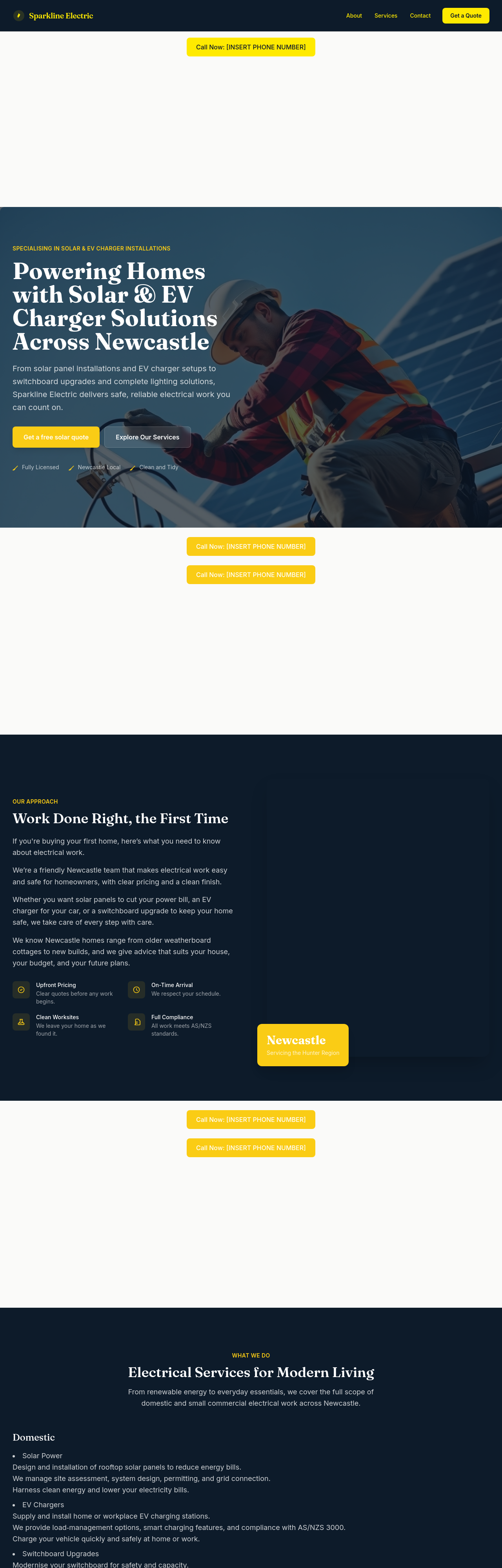
After
the meta description should mention licensed Newcastle electrician + solar + EV charger
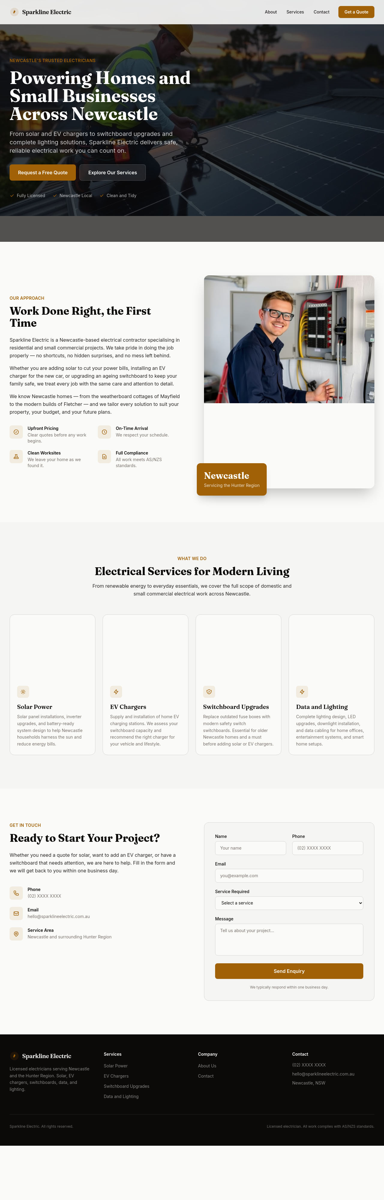
Before
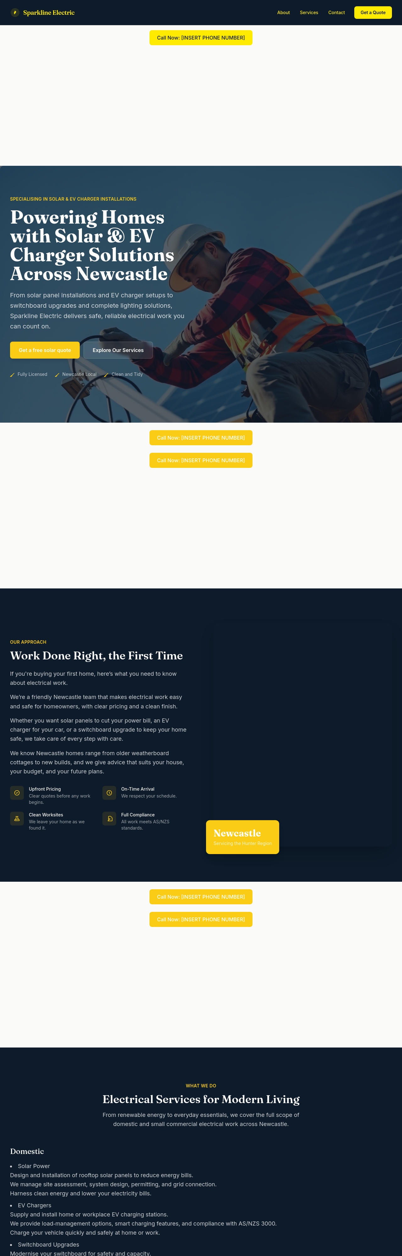
After
add a /solar page going deeper into the solar service offer + rebate details
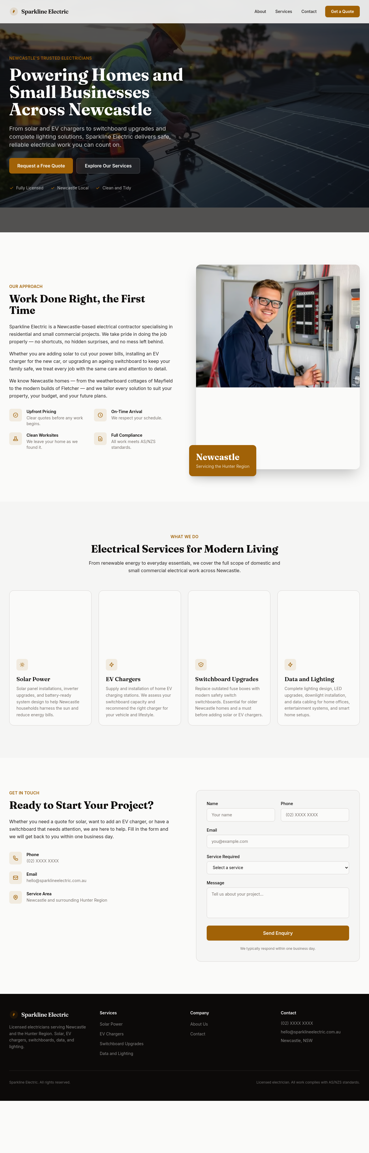
Before
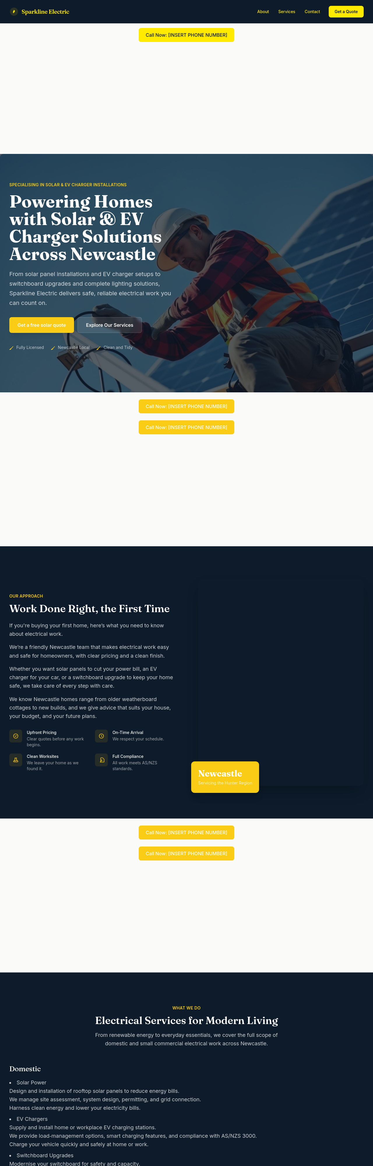
After
add a /commercial page focused on small-business customers
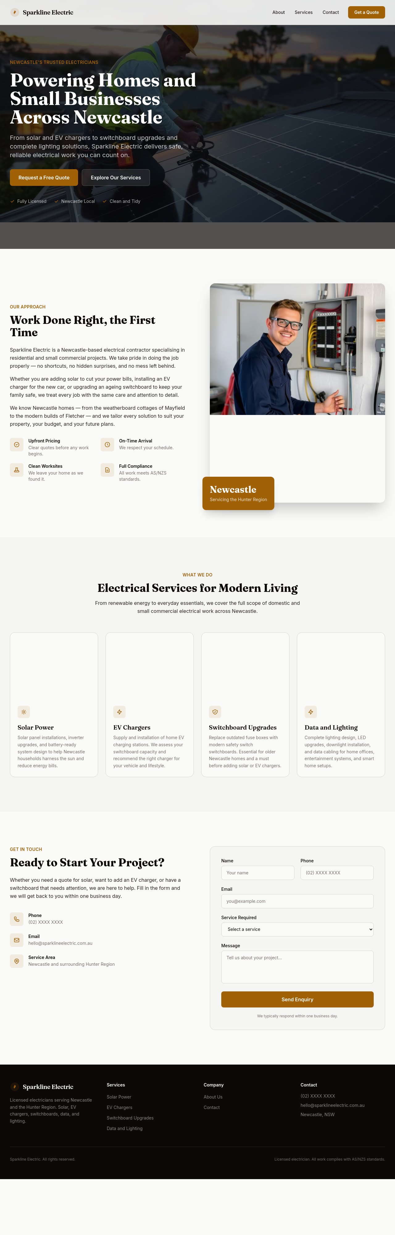
Before
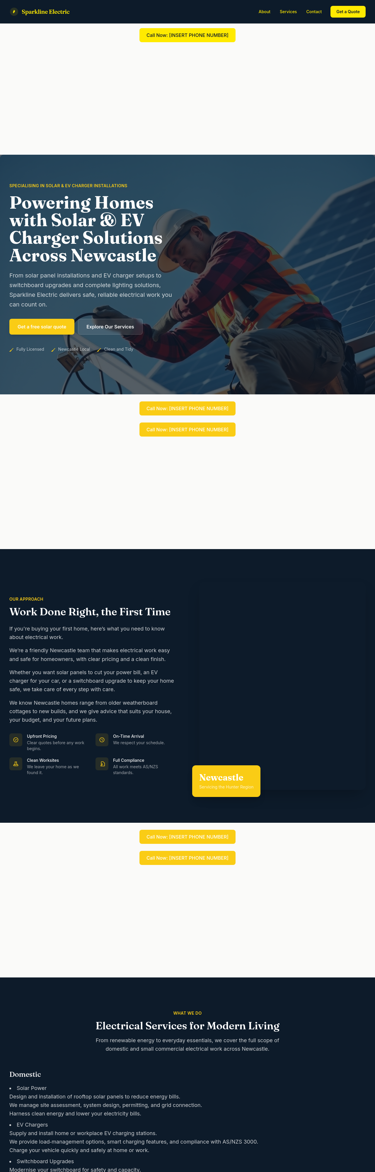
After
add a 'recent jobs' section with placeholders for 3 case studies — solar install, switchboard, EV
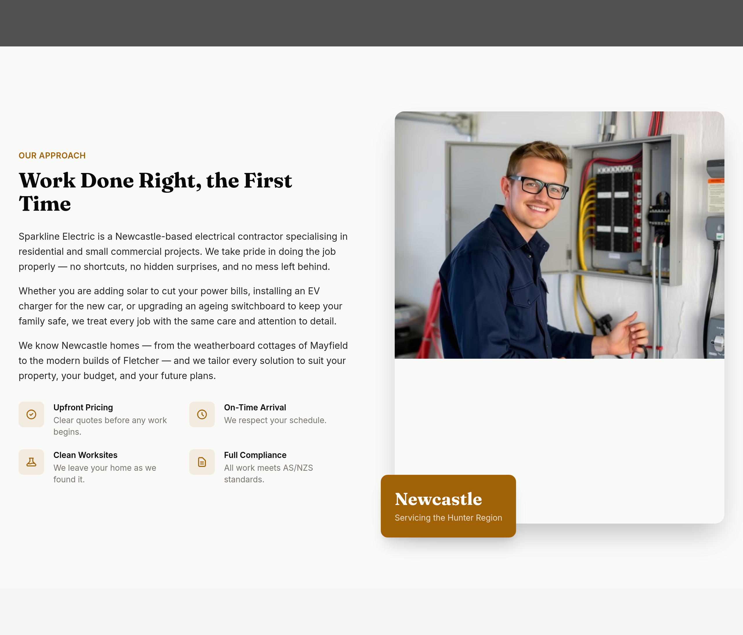
Before
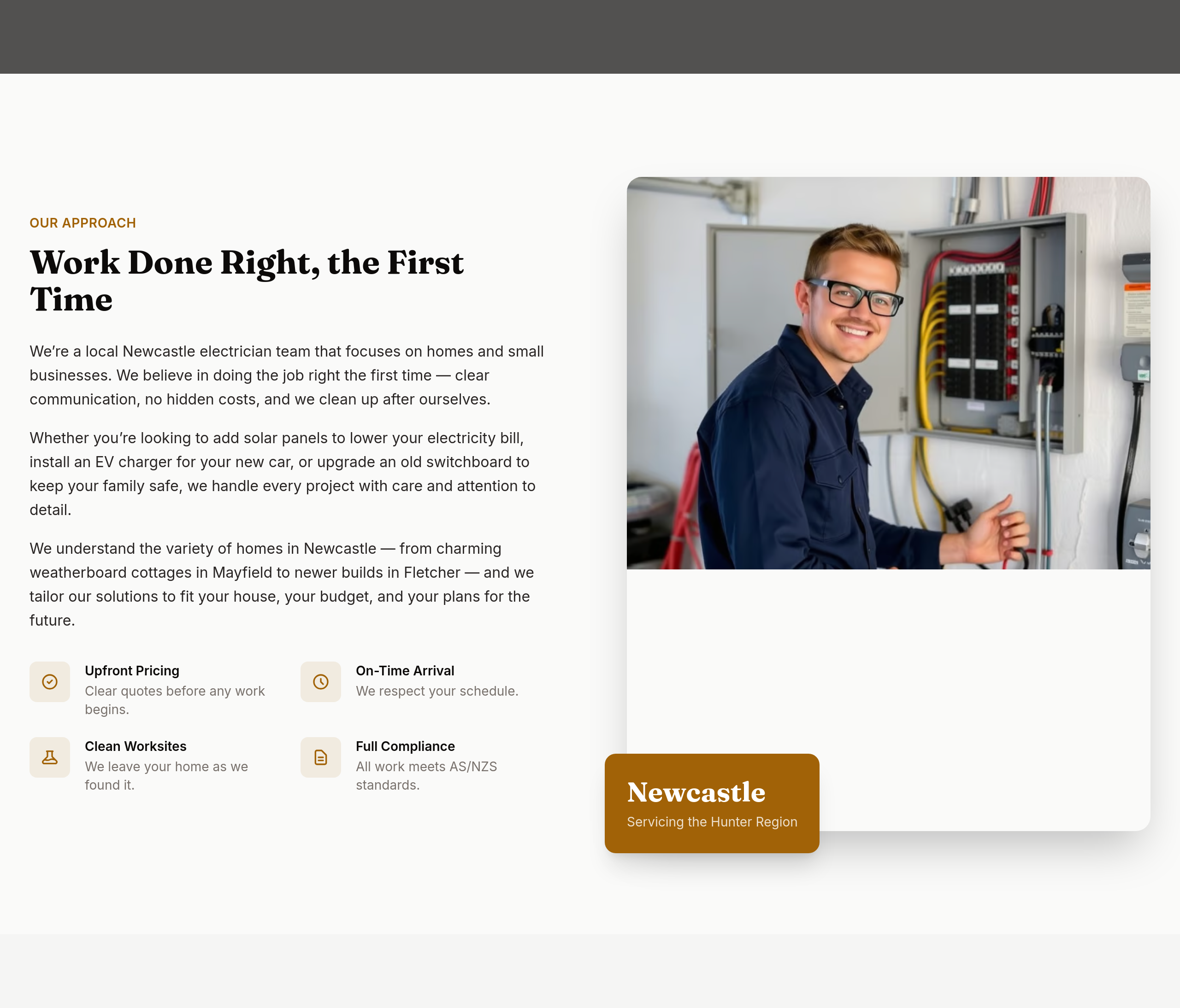
After
the about section is technical — make it accessible to a first-time homeowner
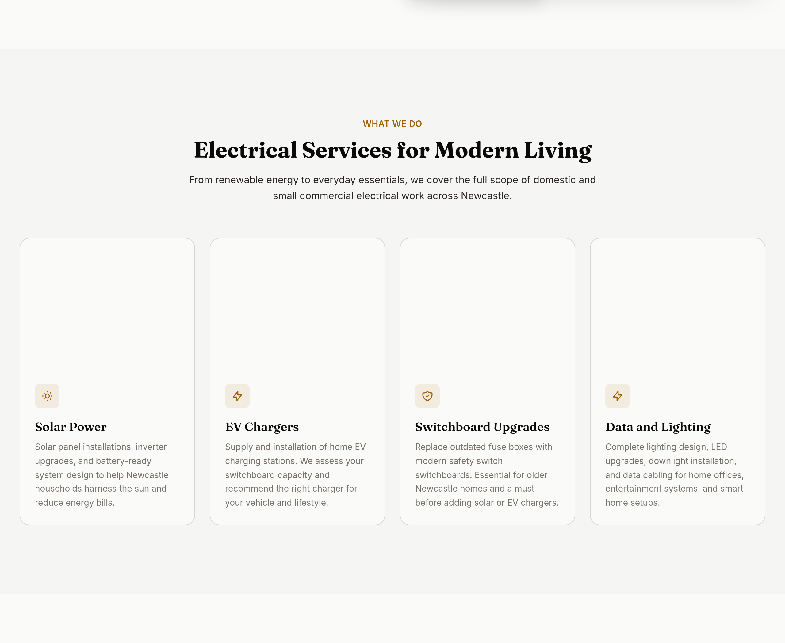
Before
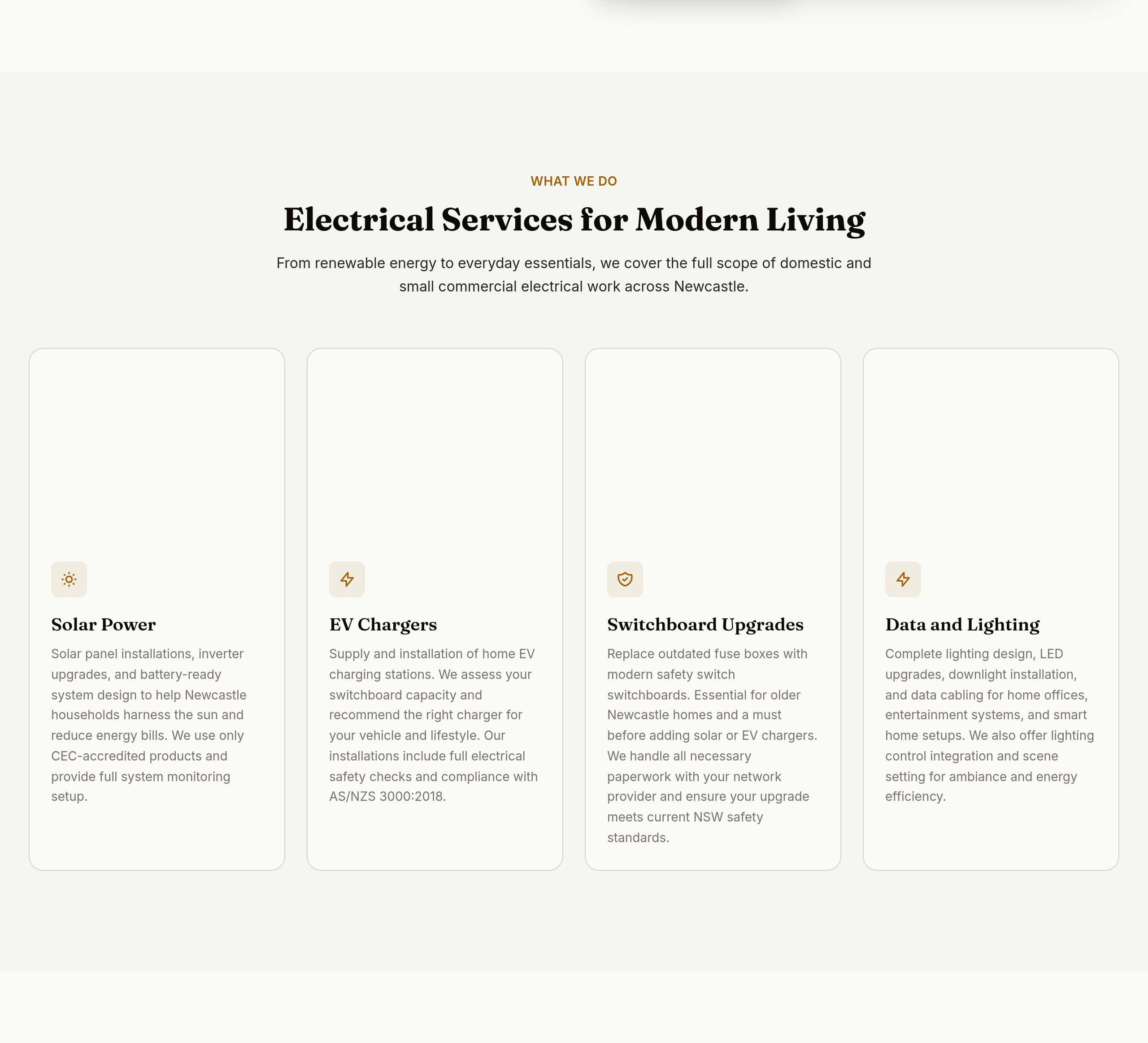
After
the services are listed but not explained — add 1-2 lines per service
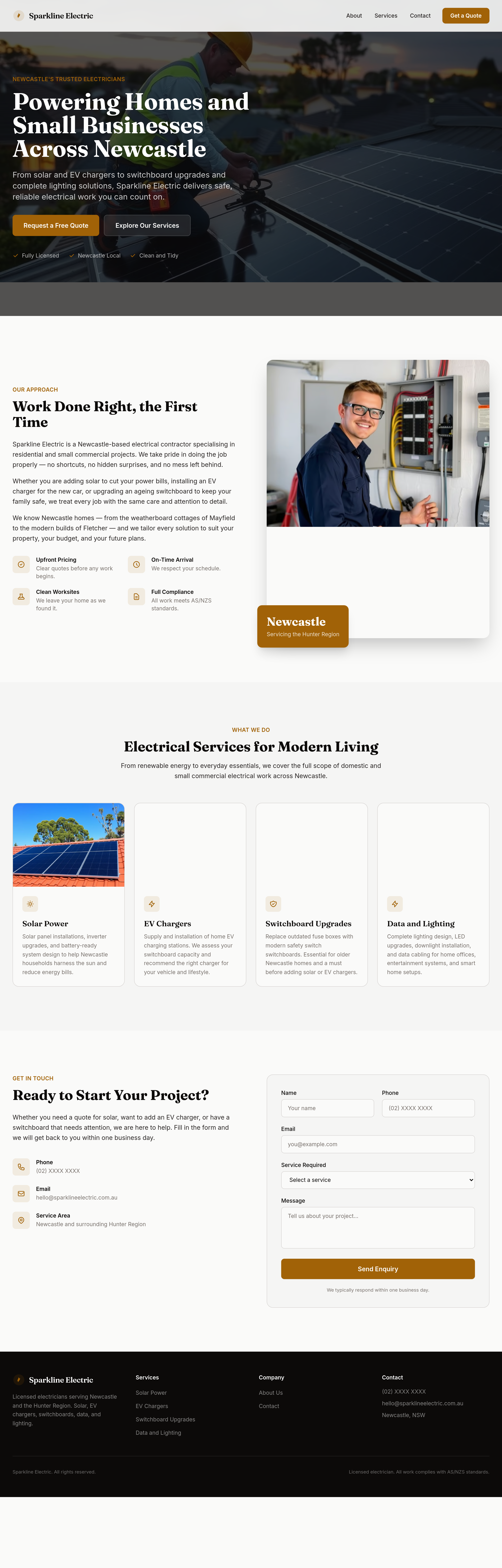
Before
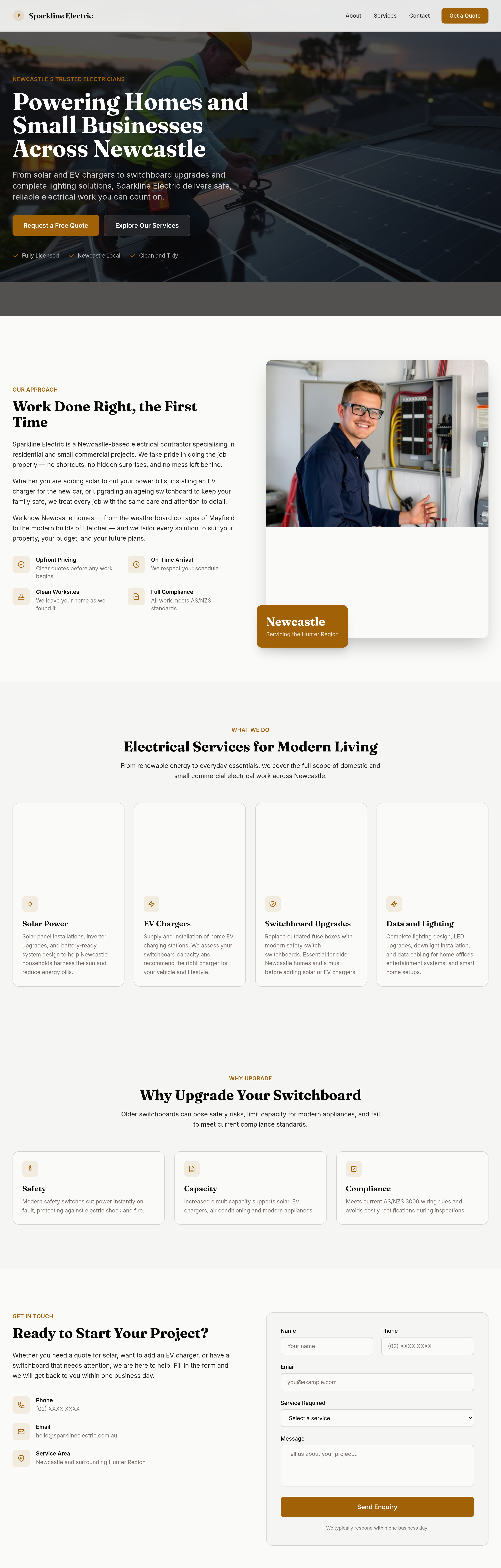
After
add a 'why upgrade your switchboard' section — safety, capacity, compliance
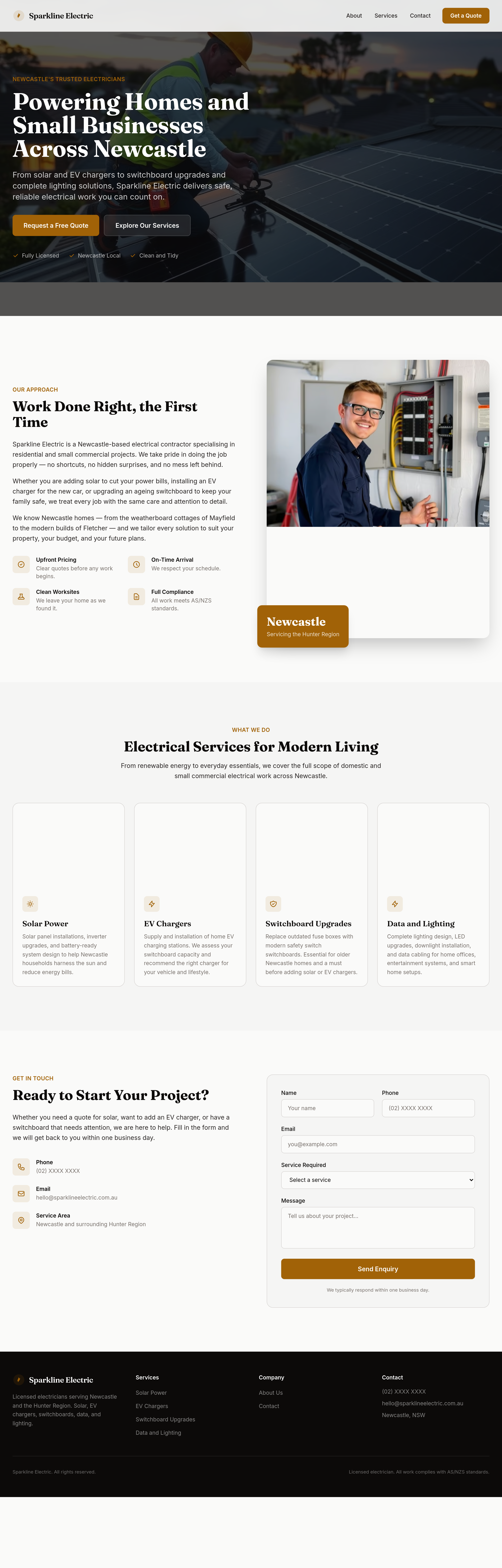
Before
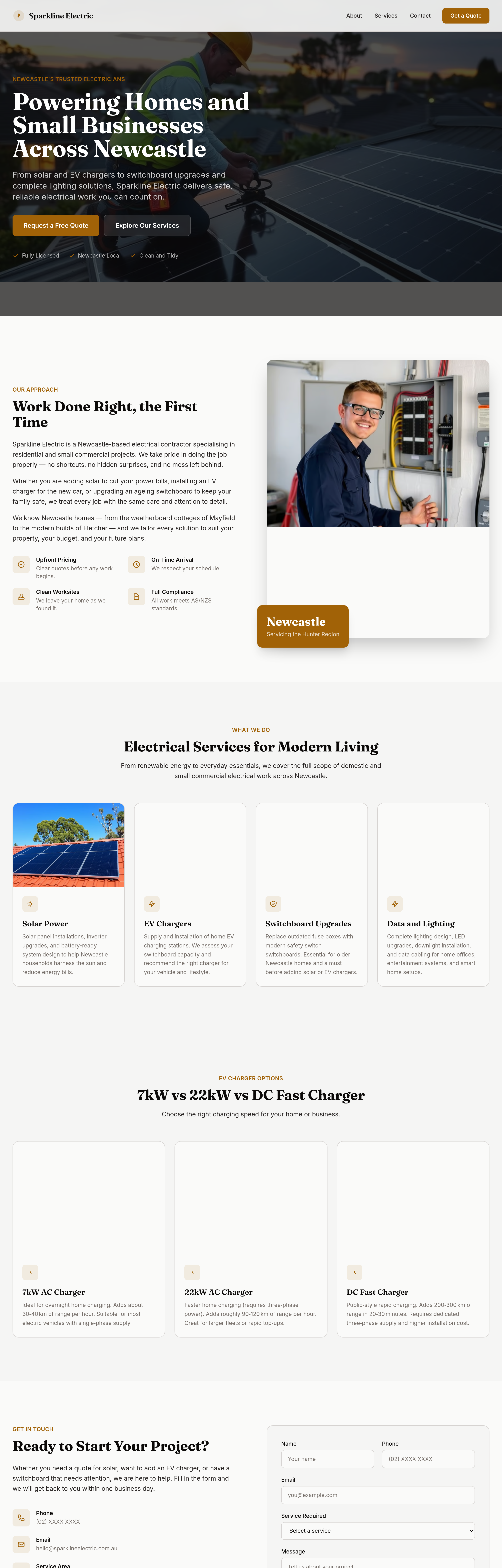
After
add an 'EV charger options' section — 7kW vs 22kW vs DC fast charger
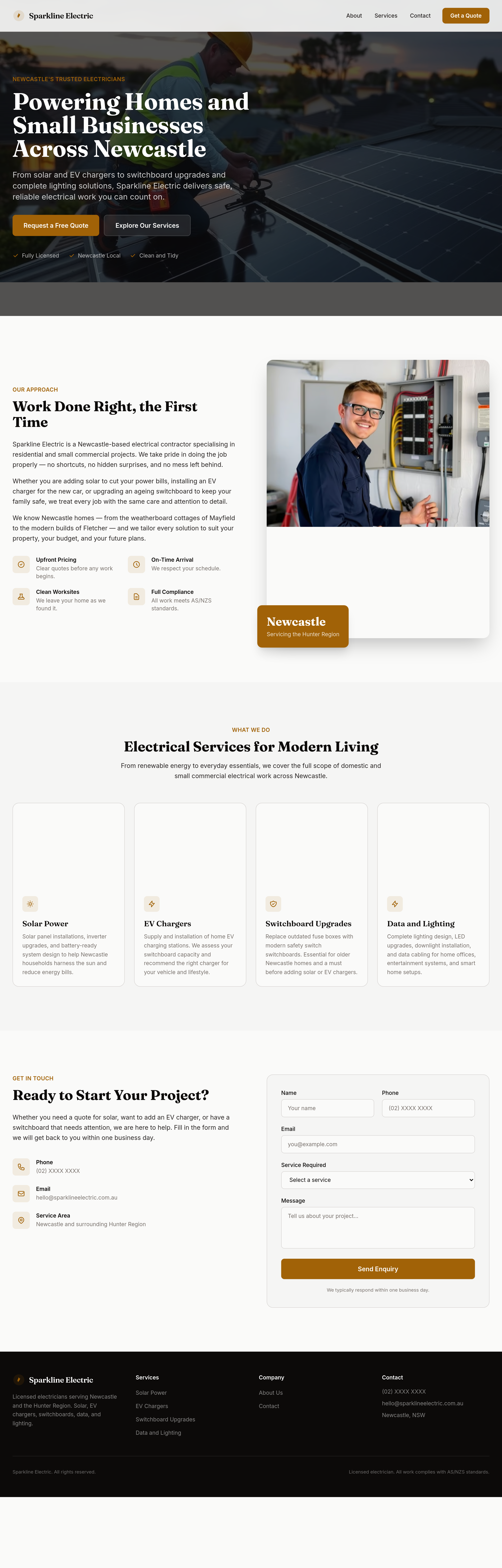
Before
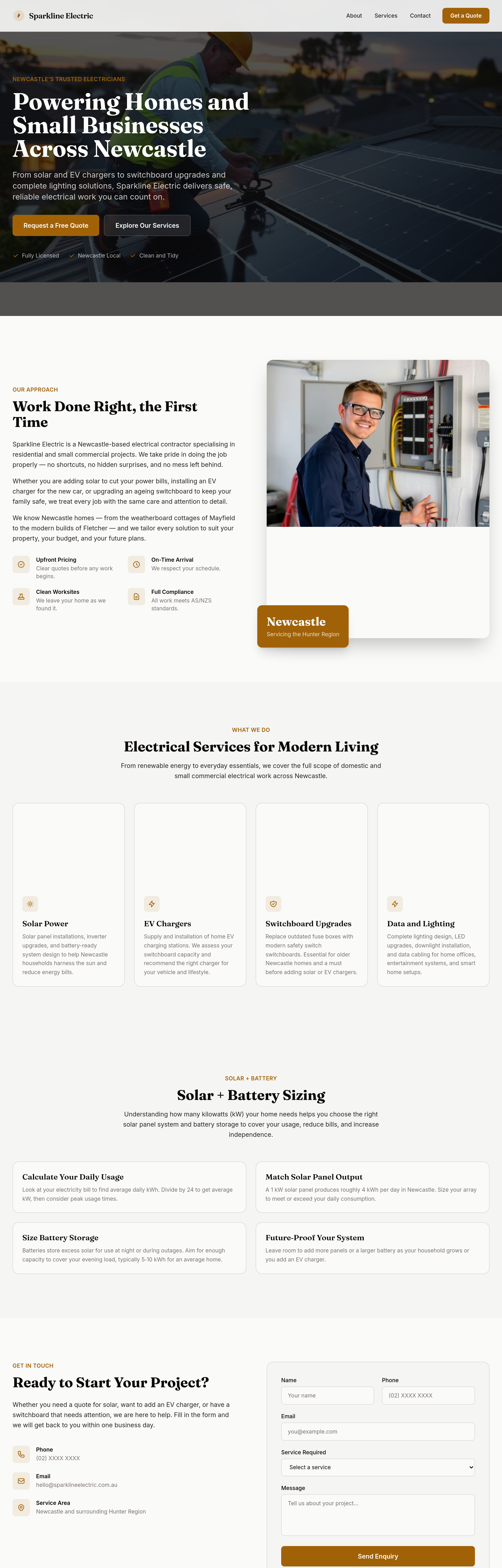
After
add a 'solar + battery sizing' section — how to think about kW for your house
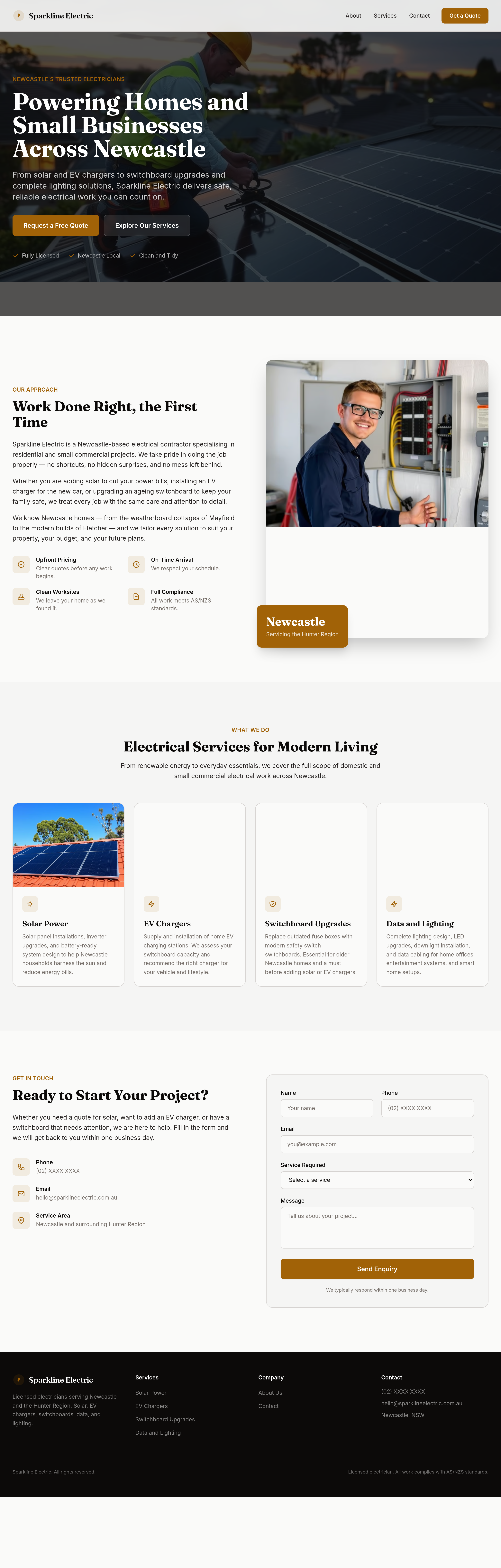
Before
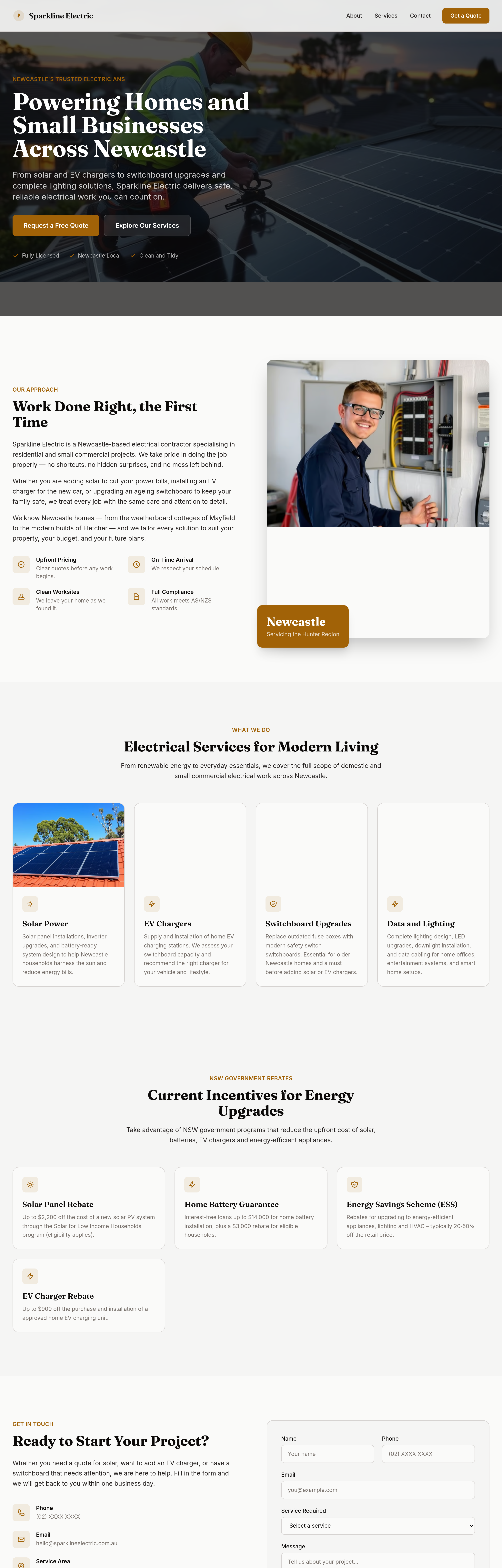
After
add a 'NSW rebates' section with current government incentives

Before

After
add a hero image of an electrician installing rooftop solar with blue sky background
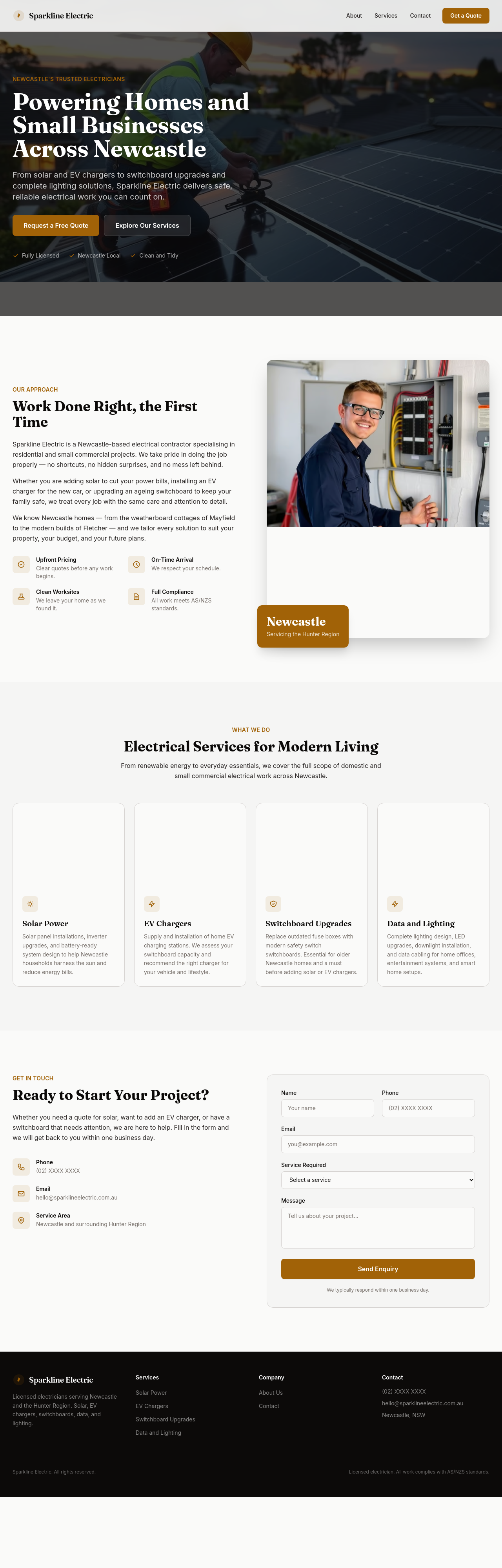
Before
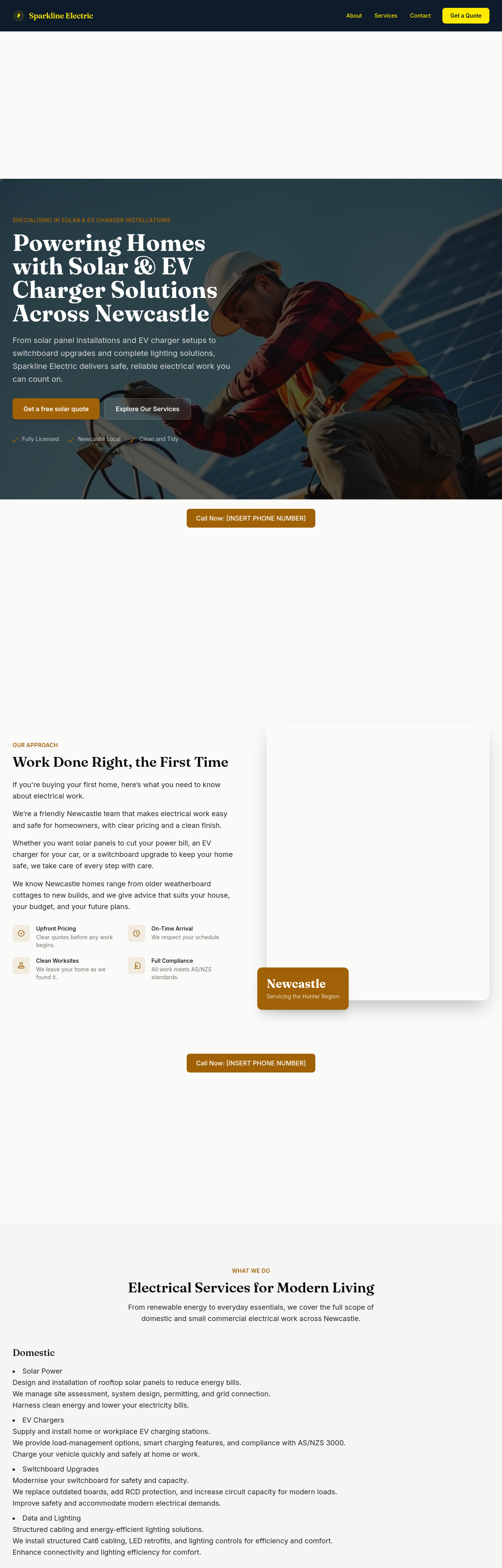
After
add 3 'before/after' style images — old switchboard vs new, old lighting vs LED
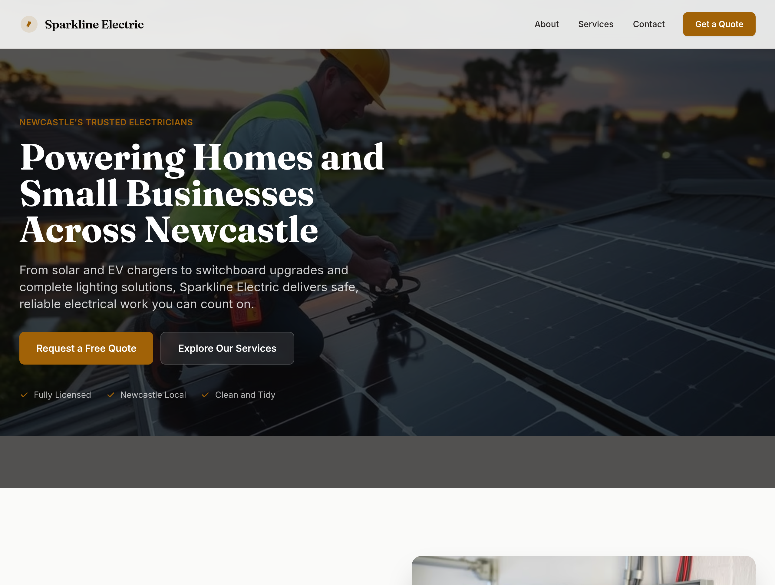
Before
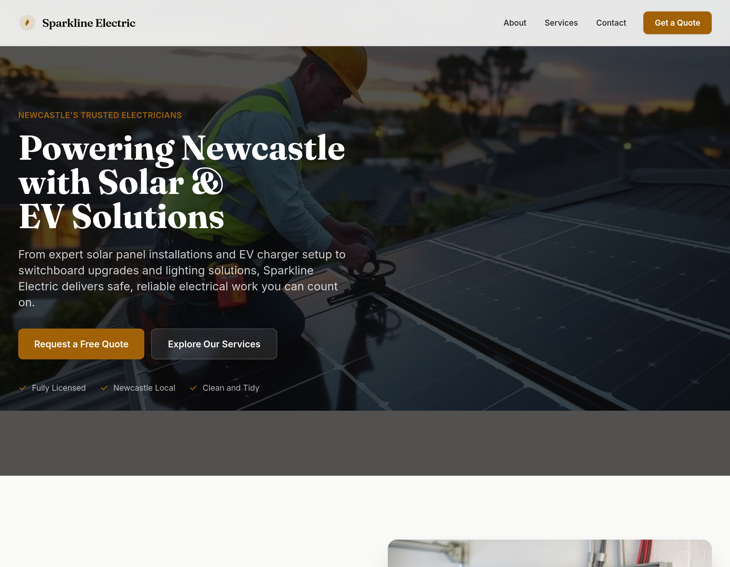
After
shift focus to solar + EV across hero + services + add testimonials
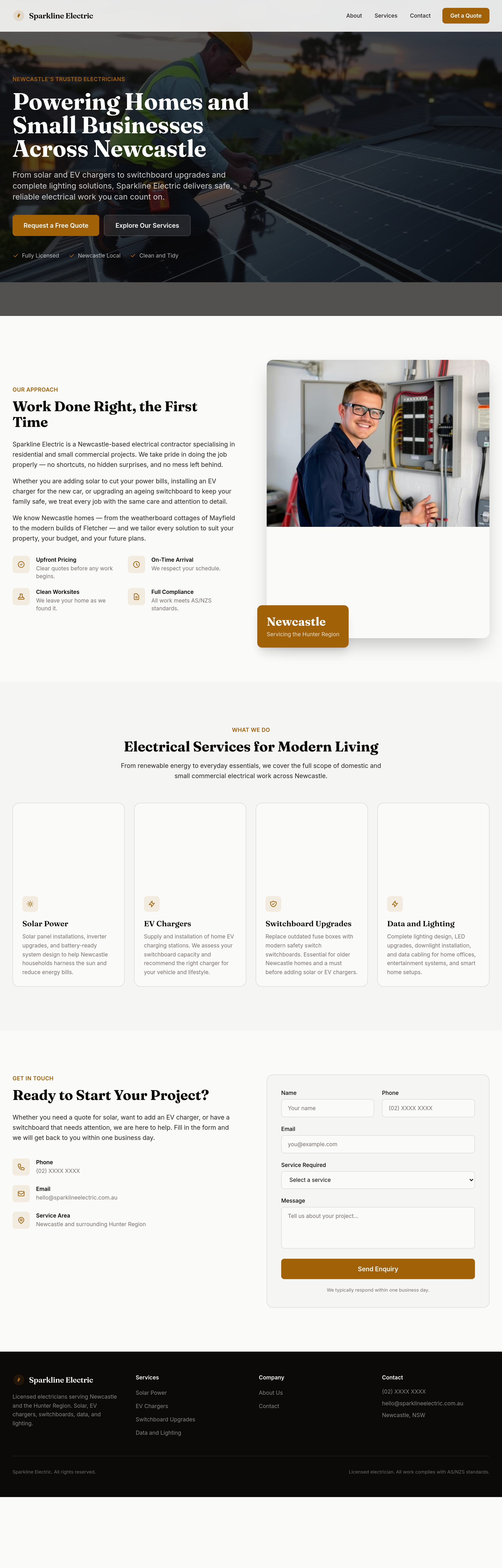
Before
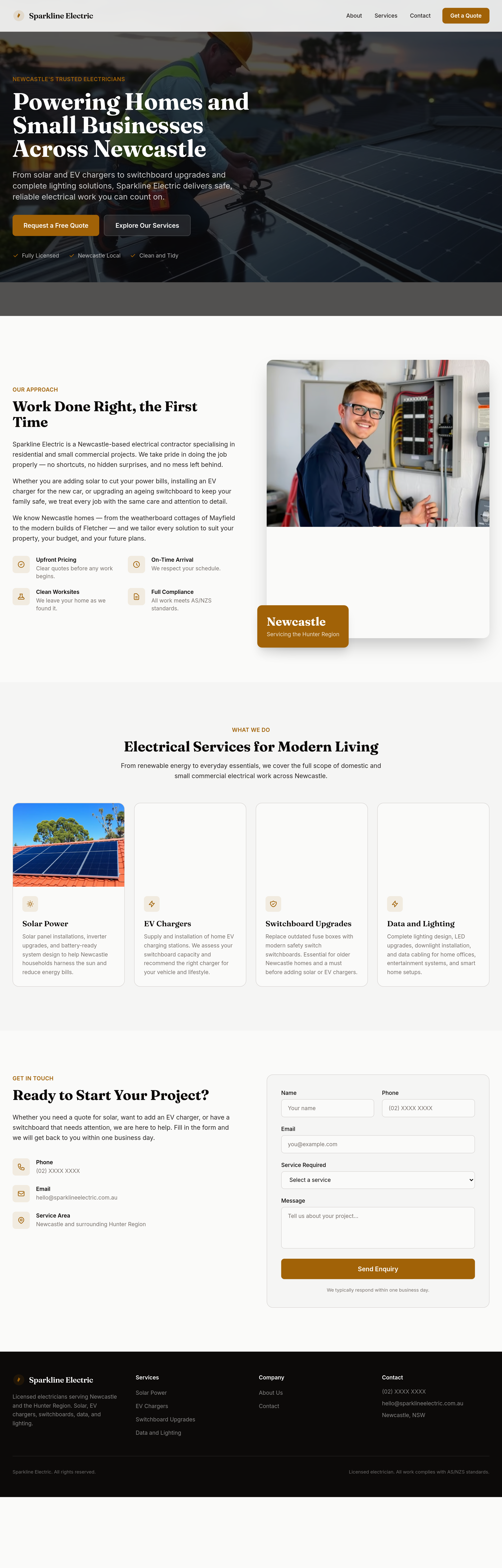
After
split the services grid into two distinct sections: 'Domestic' and 'Solar + EV'
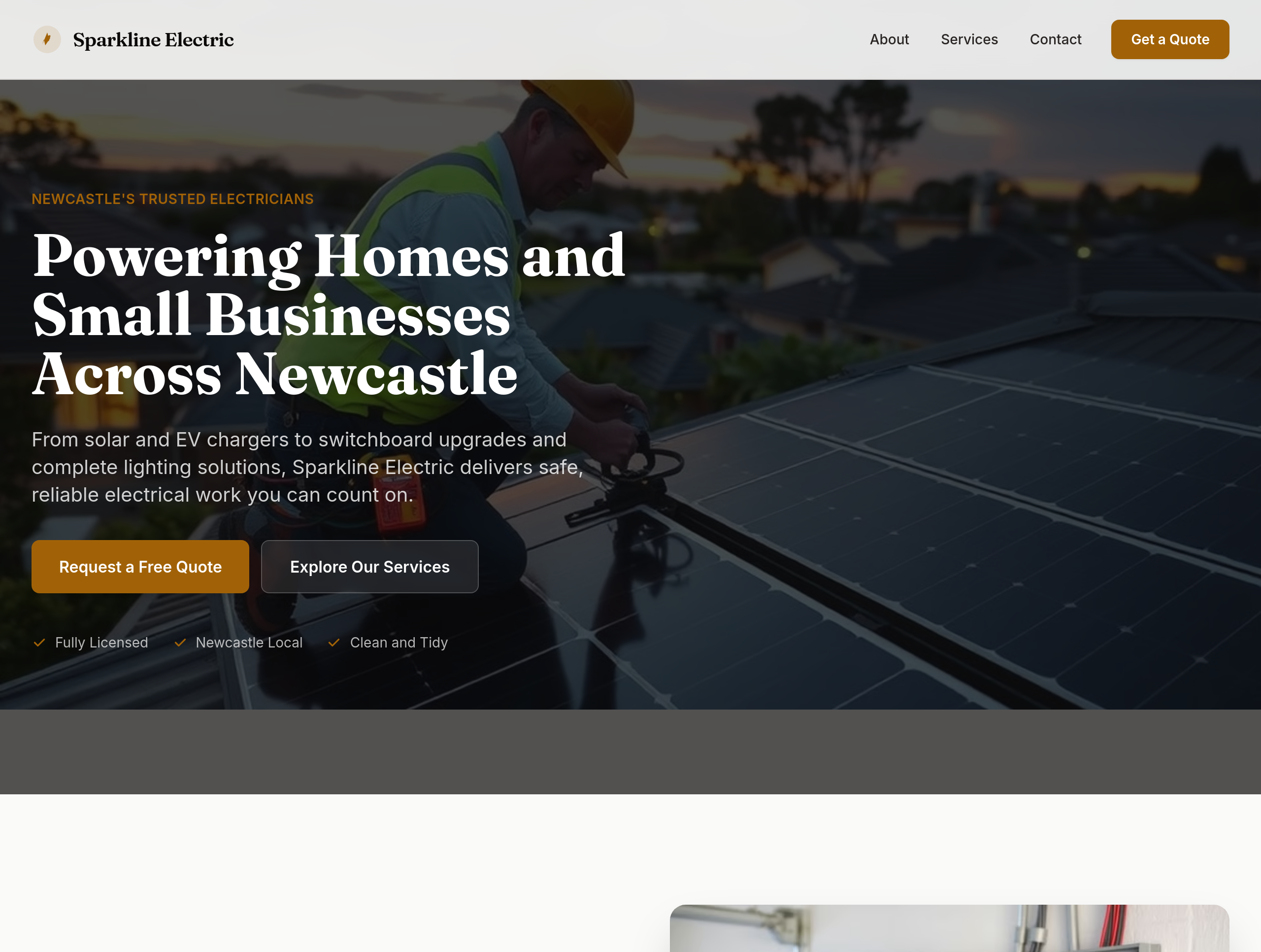
Before
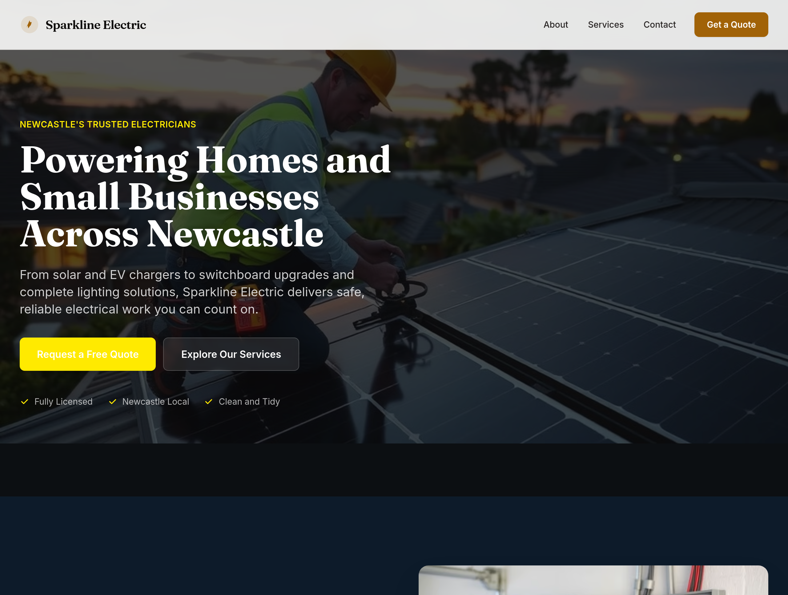
After
the colours feel utility — use deep navy + electric yellow accents for premium feel
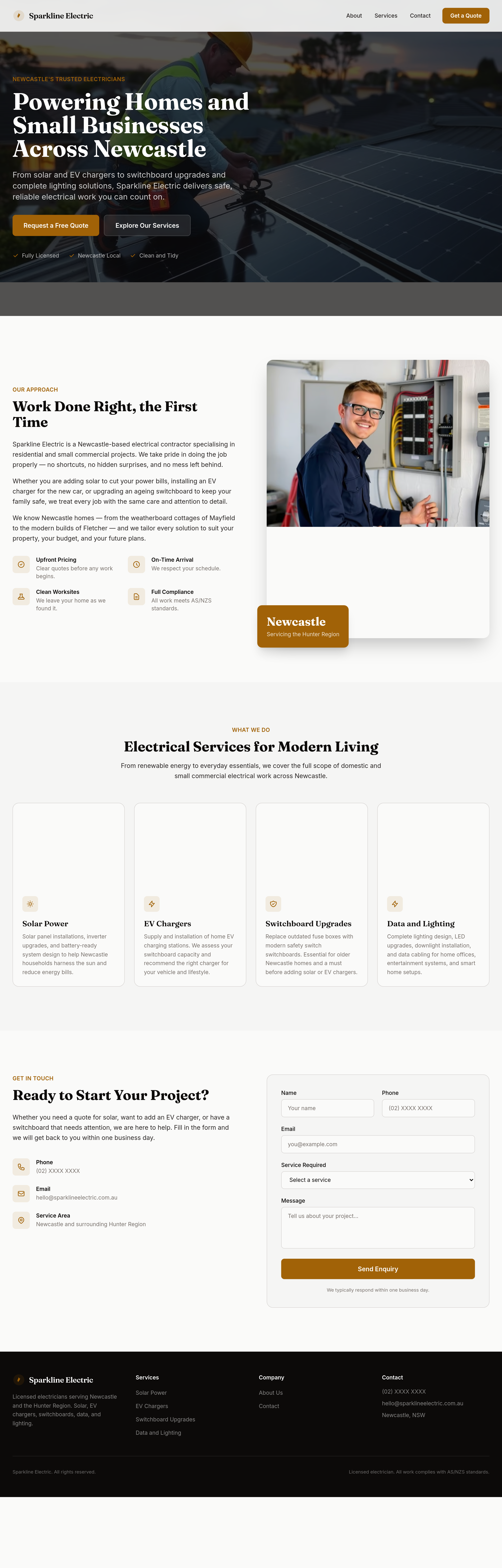
Before
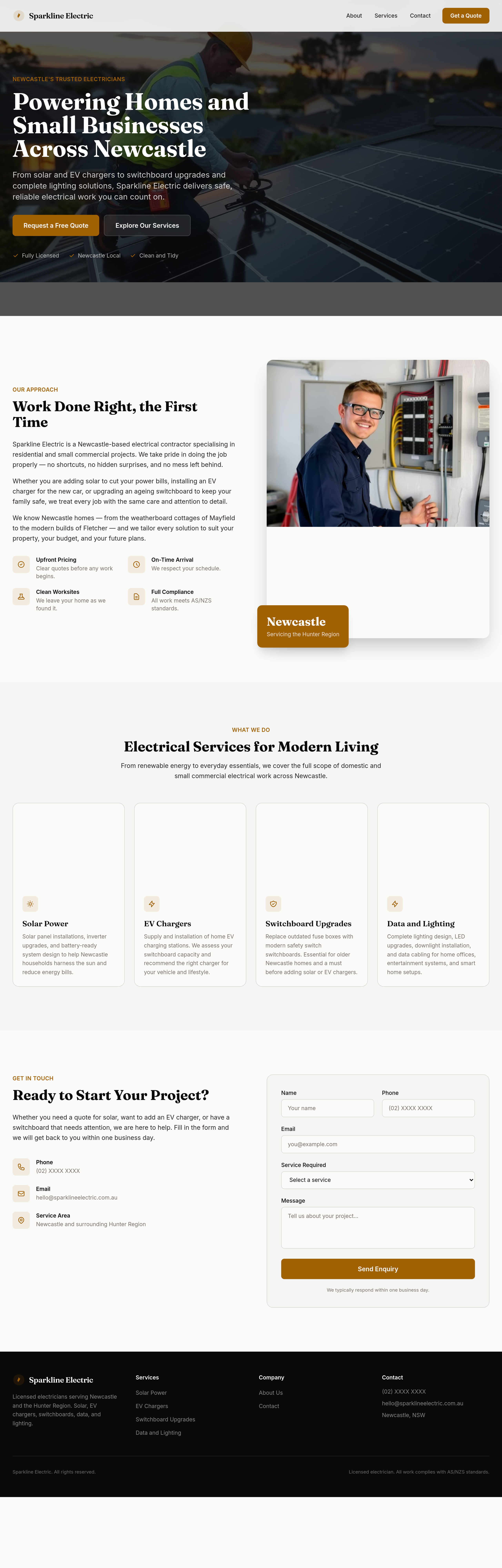
After
add 'Get a free solar quote' as the primary CTA in hero + bottom of solar section
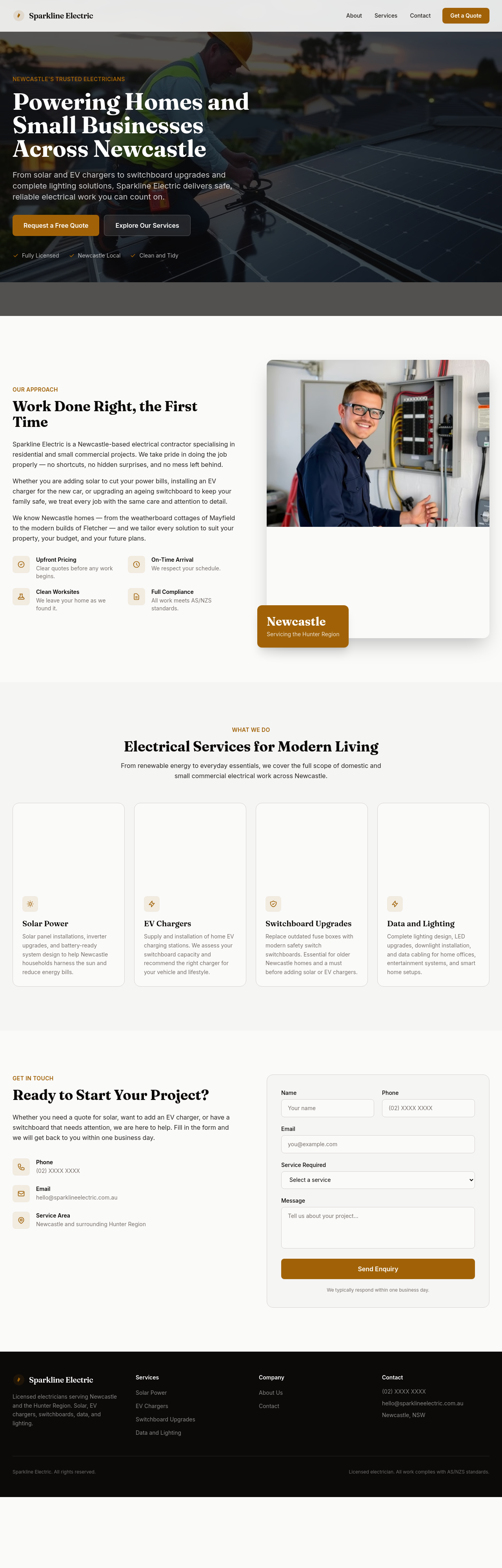
Before
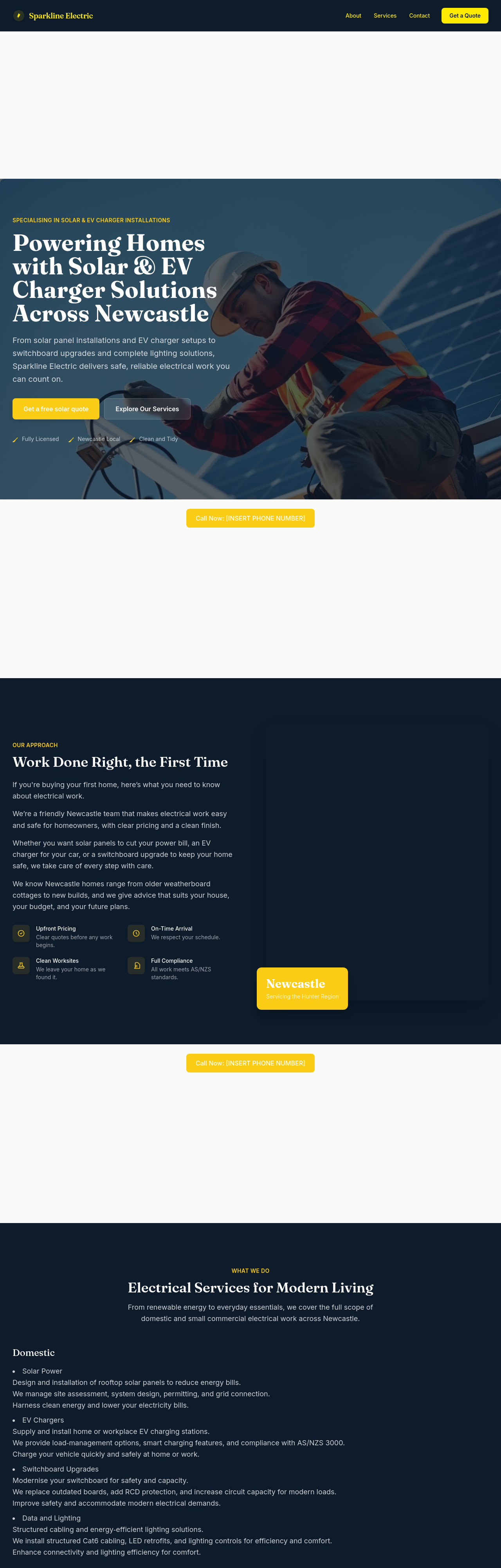
After
add typical-cost ranges: switchboard upgrade $1200-2500, EV charger $1500-3000, solar 6.6kW $5500-7500
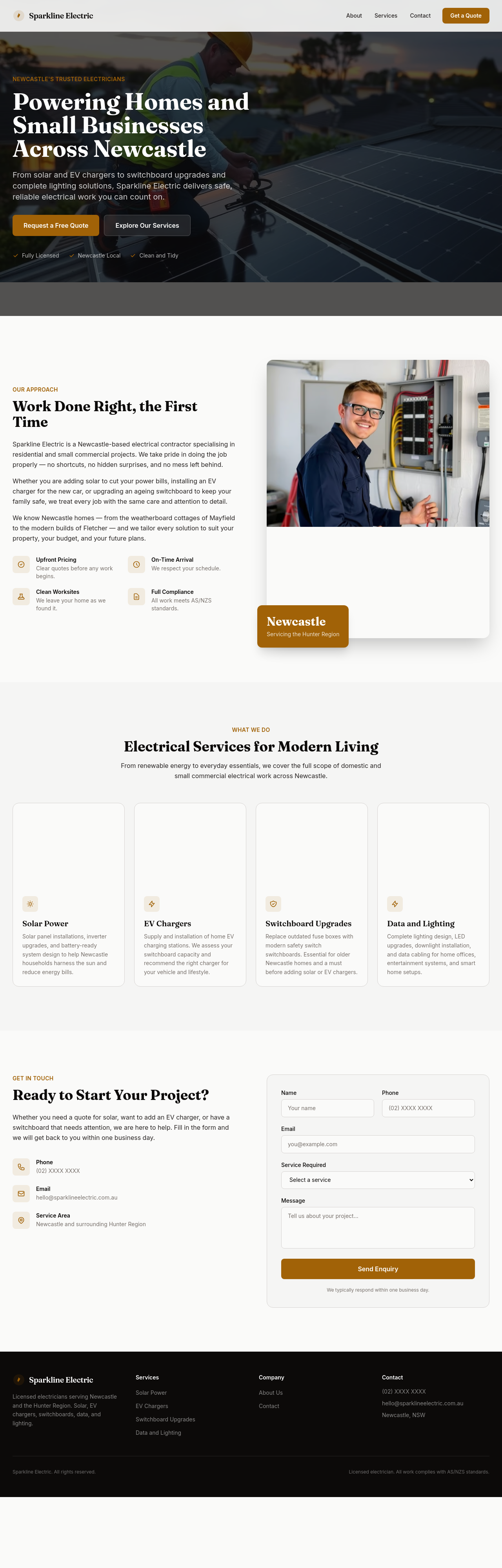
Before
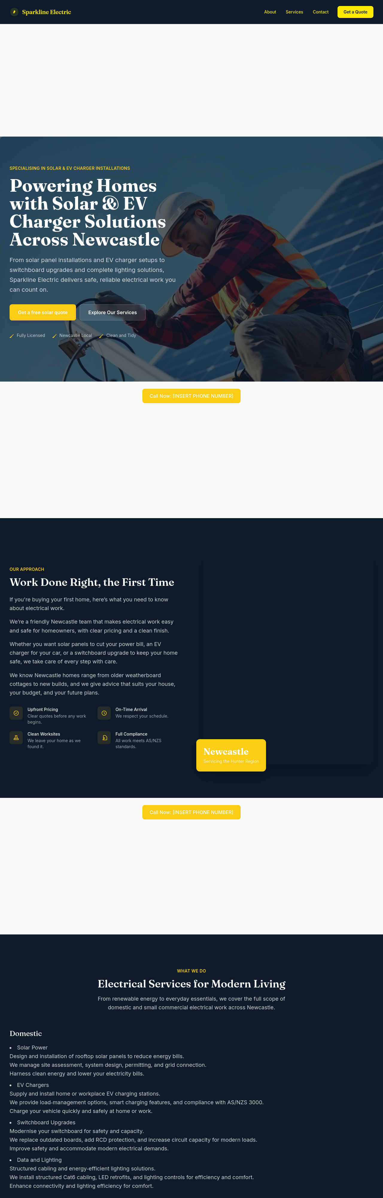
After
add LocalBusiness JSON-LD with type:Electrician + Newcastle service area
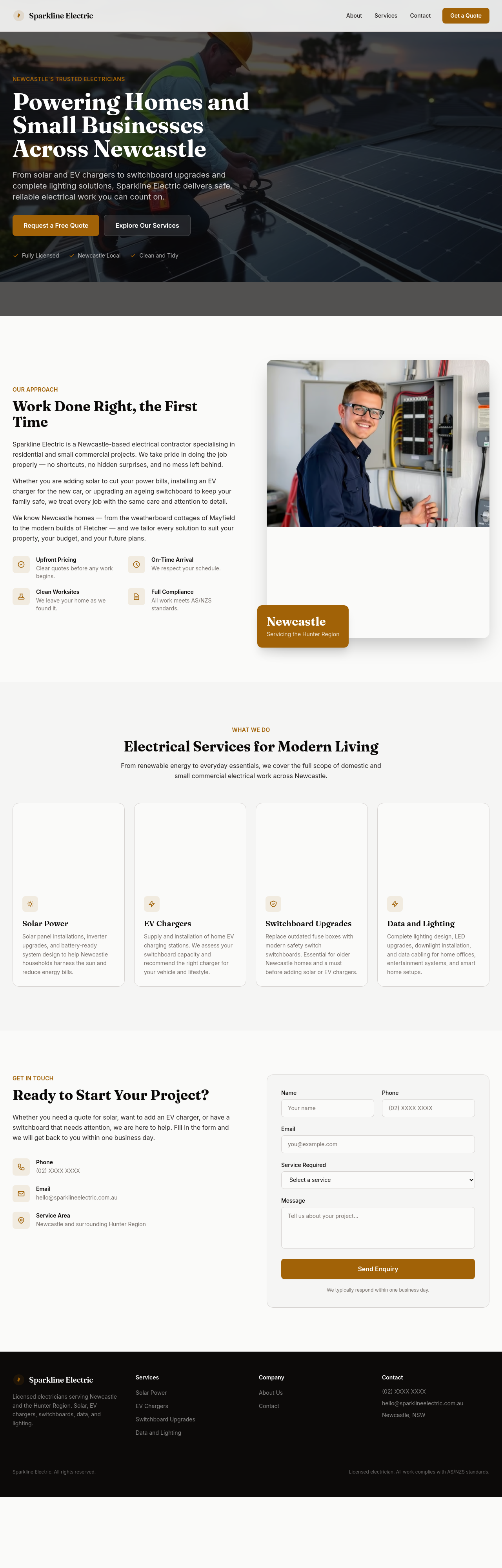
Before
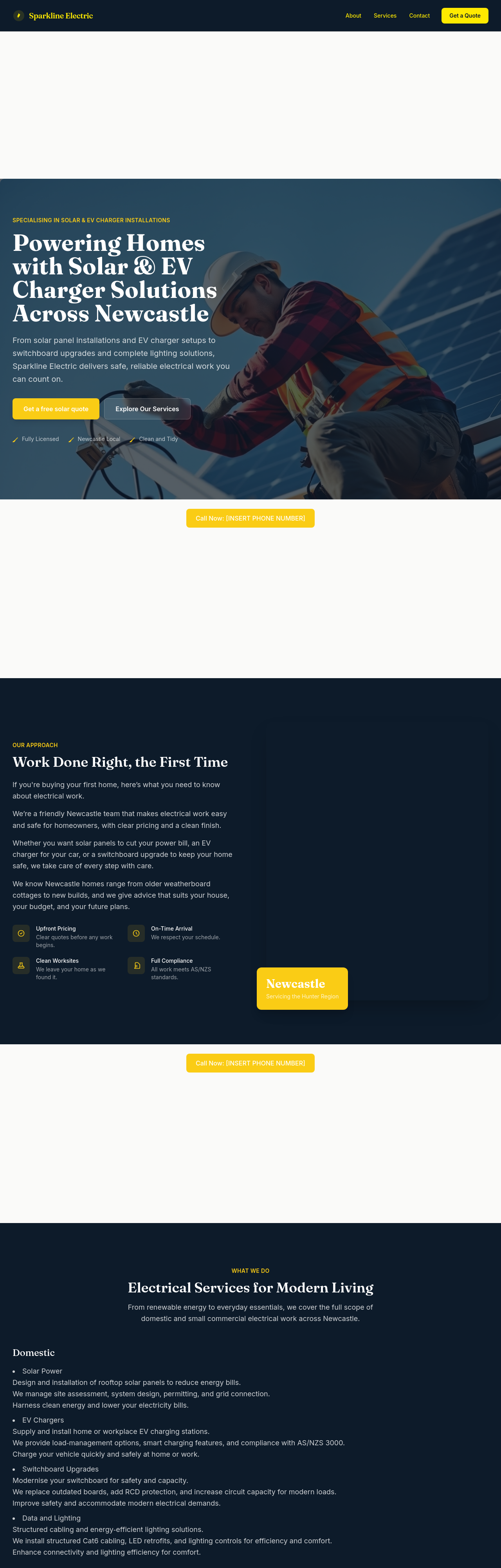
After
create a /case-studies page with 3 placeholder project write-ups

Before

After
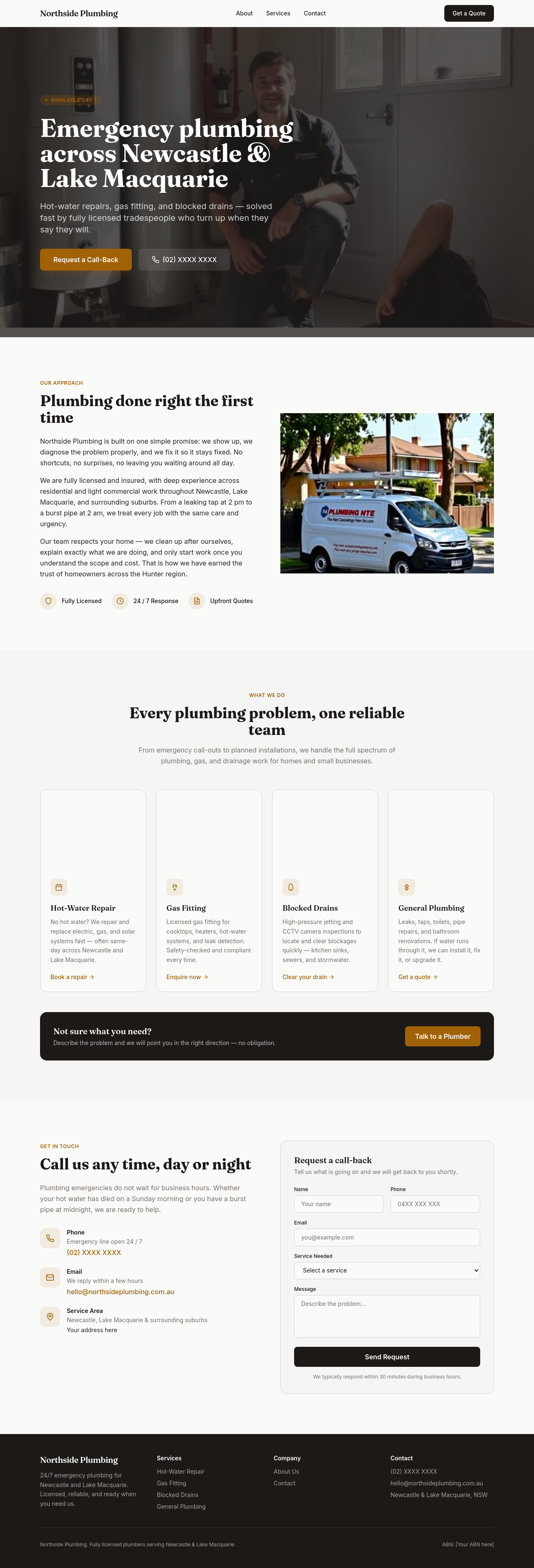
the body text feels small — bump from 16 to 18px
Before

After
the line-height feels cramped — increase to 1.65 for readability

Before

After
all the headings are the same weight — vary: h1 700, h2 600, h3 500

Before

After
the letter-spacing on headings is tight — add 0.5px tracking to balance the serif

Before

After
the primary green clashes with the accent yellow — pick a softer accent

Before

After
text-on-coloured-backgrounds is unreadable — bump contrast to WCAG AA

Before

After
the link colour is too close to the body text — make links clearly distinguishable

Before

After
sections are too close together — add 96px vertical space between them on desktop

Before

After
the cards have inconsistent padding — standardise to 24px all around

Before

After
the hero is too tall — reduce padding-top to 96px from 200px

Before

After
the cards have hard 1px borders — switch to soft 2px shadows for depth

Before

After
buttons have sharp corners — round to 8px for friendlier feel

Before

After
images have no border-radius — round to 12px for a cohesive look

Before

After
add a subtle gradient (white to off-white) to the hero section

Before

After
add a kraft-paper texture to the contact section for warmth

Before

After
buttons have no hover state — add subtle lift + darker shade

Before

After
images in the gallery should zoom slightly on hover (1.05x)

Before

After
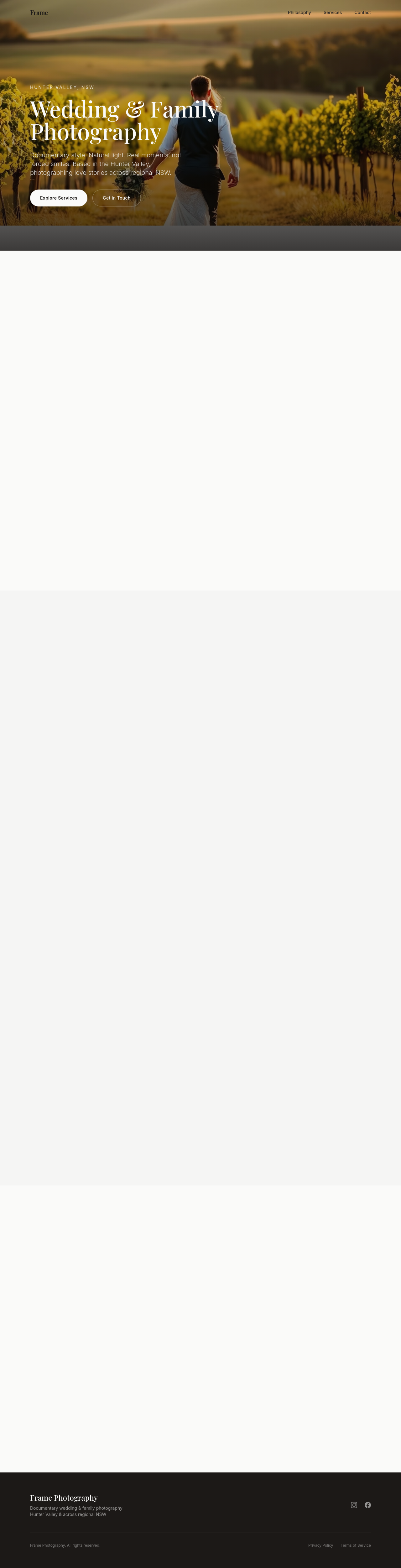
focus rings are invisible — add a clear 2px accent-coloured ring with 2px offset
Before

After
add a subtle fade-in as each section enters the viewport

Before

After
the CTAs are static — add a gentle pulse on the primary button